10,000 search results
(0.036 seconds)
- Scripty by Turtle Arts,
$20.00Scripty is a hand drawn, calligraphy longhand handwritten font. With careful spacing, the letters can be used together to create words that look like theyπve been written with an old≠fashioned fountain pen, or used alone as embellishment to more plebean text. - Jubel by Sine,
$15.00 Jubel font is named after the German word for "celebration". Crafted with a natural, blocky style, Jubel is designed for various creative uses, including magazine titles, captivating headlines, book titles, distinctive logos, vibrant shop banners, attention-grabbing flyers, and impactful advertising headlines.
 - Pear Amigo by Qwrtype Foundry,
$14.00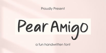 Proudly Present, Pear Amigo Pear Amigo is a Fun Handwritten Font Pear Amigo is perfect for product packaging, branding project, megazine, social media, wedding, or just used to express words above the background. Pear Amigo also come with Multi-Lingual Support. Thank you!
 - Ailee Sofia by Tlatous Type,
$19.00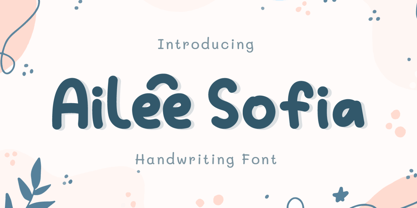 Introducing Ailee Sofia Font by Tlatoustype Ailee Sofia is a Playful Thick Display Font. Ailee Sofia is perfect for book cover, product packaging, branding project, megazine, social media, wedding, or just used to express words above the background.This font also multilingual support.
 - Elmimore by Qwrtype Foundry,
$14.00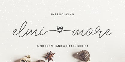 Introducing by Qwrtype Proudly Present, Elmimore Elmimore is a Monoline Script with Swash Elmimore is perfect for product packaging, branding project, megazine, social media, wedding, or just used to express words above the background. Elmimore also come with Multi-Lingual Support. Thank you!
 - Spearmint by Qwrtype Foundry,
$14.00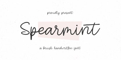 Introducing by Qwrtype Foundry Proudly Present, Spearmint Spearmint is a Brush Handwritten Font Spearmint is perfect for product packaging, branding project, megazine, social media, wedding, or just used to express words above the background. Spearmint also come with multilingual support. Thank you!
 - Crown Heights JNL by Jeff Levine,
$29.00Named for his childhood neighborhood in Brooklyn, NY, Jeff Levine's Crown Heights JNL is a lightline all-caps titling font excellent for short words or phrases. Its inspiration is remotely based on the symmetry of earlier designs such as Beton and Stymie. - Bensonhurst JNL by Jeff Levine,
$29.00 The model for Bensonhurst JNL was a 1930s-era hand-lettered WPA (Works Project Administration) poster for the play "Hell Bent For Heaven". Although the basic style is a classic Art Deco "thick and thin" format, the design (in certain characters) starts to take on the feel of a 1970s revival style. With this in mind, Bensonhurst JNL is a bit of a hybrid between the 1930s and the 1970s.
 - Kaligawe by Locomotype,
$19.00 Introducing Kaligawe, the perfect font for designers looking to make a bold statement with their work. This display sans font boasts a unique blend of mediaeval and sans-serif characteristics that will give your designs a distinct edge. With nine weights available, from Thin to Black, you'll have plenty of options to choose from when it comes to creating eye-catching posters, attention-grabbing headlines, captivating movie titles, and stylish packaging. What sets Kaligawe apart from other fonts is its ability to combine old-world charm with modern style. Its mediaeval touches provide a classic, timeless feel, while its strong sans-serif characteristics give it a contemporary edge. The result is a font that can be used for a wide range of design projects, whether you're creating something with a vintage vibe or a more modern look.
 - Angelic Robe by Pixesia Studio,
$23.00 Introducing Angelic Robe - Modern Blackletter Font Angelic Robe is a modern blackletter font that combines timeless elegance with a contemporary twist. Angelic Robe is perfectly suited for branding, logotype, social media posts, advertisement, product packaging, label, photography, watermark, t-shirt, website design, invitation, stationery and any projects seeking a touch of modern blackletter elegance. FEATURES - Stylistic Alternates - Ligatures - Uppercase and Lowercase letters - Numbering and Punctuations - Works on PC or Mac - Simple Installation - PUA Encoded Characters - Easily accessible without additional design software. - Support Adobe Illustrator, Adobe Photoshop, Adobe InDesign, also works on Microsoft Word - Multilingual Support for 68 languages including Afrikaans, Albanian, Basque, Catalan, Danish, Dutch, English, Estonian, Faroese, Filipino, Finnish, French, Galician, German, Icelandic, Indonesian, Irish, Italian, Malay, Norwegian Bokmål, Portuguese, Spanish, Swahili, Swedish, and Zulu Hope you Like it. Thanks.
 - Down Home JNL by Jeff Levine,
$29.00 In the October 31, 1920 edition of Wid's Daily (the predecessor to The Film Daily), a block of ad copy from a 1920 film called "Down Home" had the text printed in such a fluent pen-lettered style that a bit of a shortcut was used at the beginning of the design process for this typeface. Normally, font inspirations are redrawn [and not by simply using auto-trace] except under specialized circumstances like this one where that feature is a help, rather than a replacement for the creative process. The entire block of text copy was auto-traced, then the necessary letters were selected from the available wording and cleaned up to remove any sharp points and irregular curves in an effort to make the end results as close to the original and unusual hand-drawn text. From there the missing characters needed to produce a finished type font were created utilizing the standard methods of drawing and font construction. The end results turned out very well. Using the film's title as its namesake, this design is now available digitally as Down Home JNL in both regular and oblique versions.
 - Signsurfers Script by Learning Kiddos,
$18.99 Signsurfer is a unique retro font - a signpainter font, handwritten by me. Inspired by the golden ages of handlettering, this script font highlights: - a bouncy baseline - tight spacing - and full Latin support --- Lots of really cool catchwords & shapes (you will get all the catchwords & shapes seen in the preview pics), five alternates and 37 ligatures help you to really get creative with this one. --- What you can use it for: - branding - logotype - poster - t-shirt designs - all kind of labels - greeting cards - wedding invitations ...and so much more --- This font also works great as a running text, too. = ) --- Process behind it: first I drew all of those fancy letters & catchwords with a brush on paper. I then carefully traced all of those letters & catchwords in Illustrator and transferred them into my Font Creator program. This helped getting the unique sign painters flow. --- Note: You will a need program that support OpenType Features for accessing the alternative glyphs.
 - Goudy National by Matteson Typographics,
$19.95 Frederic Goudy designed National Old Style Roman in 1916. It is loosely based on a logo he lettered for the National Biscuit Company in 1901. Steve Matteson expanded on Goudy’s original by designing a bold, semibold and matching italics. While much of Goudy’s work is strongly influenced by Venetian types of the 15th and 16th centuries - this design has a truly American quality about it. The design is useful for text or headlines that captures a sense of Americana.
 - Cutoff Pro by URW Type Foundry,
$49.99 The first plain weight of Cutoff was designed in 2005 to be used in Miele, an independent Italian free magazine. The need was for an elegant, unusual and legible semi-serif with contemporary flavour. I was fascinated by the deconstructivist work of Jeff Keedy (Hard Times Thick), Phil Baines (Can You, You Can) and Otl Aicher (Rotis), so my aim was to get the feeling of a cut transitional typeface; at the same time felt the exigence to work on the whole shape of the glyphs, in order to soften the “90s deconstructivist” effect and obtain a more balanced and readable design. In the last years I further worked on the typeface adding the other styles, extending the character set and refining the letterforms. Finally the precious collaboration with URW++ brought in 2010 to a complete OpenType Pro font family, with multilingual and advanced typographic features. Fulvio Bisca, July 2010
 - Kaonug by Twinletter,
$18.00 This Kaonug display font will make your work stand out. It brings just the right amount of uniqueness and style to whatever project you’re working on, the anatomical shape of the letters makes it unique and artistic. This is a great font to use when creating logos, posters, advertisements, and all your projects or anything else that needs to stand out in a variety of media. What’s Included : Standard glyphs Iso Latin 1 Simple installations We highly recommend using a program that supports OpenType features and Glyphs panels like many Adobe apps and Corel Draw, so you can see and access all Glyph variations. PUA Encoded Characters – Fully accessible without additional design software. Fonts include Multilingual support
 - Andalucia by Pista Mova,
$15.00 Andalucia is a calligraphic script font that comes with beautiful alternate characters. copper plate calligraphy mix with handlettering style. Designed to convey stylish elegance. Andalucia is attractive because it is subtle, clean, feminine, sensual, glamorous, simple and very easy to read. The classic style is very suitable to be applied in all types of formal work such as invitations, labels, menus, logos, fashion, make up, stationery, letterpress, romantic novels, magazines, books, greeting/wedding cards, packaging, labels. Andalucia features a glyph and alternate characters. including multiple language support. It features OpenType with styling, binding, and character strokes, allowing you to mix and match letter pairs to match your design. Files include: To enable the OpenType Stylistic alternative, you need a program that supports OpenType features such as Adobe Illustrator CS, Adobe Indesign & CorelDraw X6-X7, Microsoft Word 2010 or a later version. (Windows), Font Book (Mac) or a software program such as PopChar (for Windows and Mac). How to access all alternative characters using Adobe Illustrator: https://www.youtube.com/watch?v=XzwjMkbB-wQ How to use the font style set in Microsoft Word 2010 or later: https://www.youtube.com/watch?v=NVJlZQ3EZU0 There are additional ways to access the alternative/swash, using Character Maps (Windows), Nexus Fonts (Windows) Font Book (Mac) or a software program such as PopChar (for Windows and Mac). How to access all alternative characters, using the Windows Character Map with Photoshop: https://www.youtube.com/watch?v=Go9vacoYmBw If you need help or advice, please contact me. Thank you for your purchase!
 - Bringline Script by Hrz Studio,
$15.00 Bringline Script is a calligraphic script font that comes with beautiful alternate characters. copper plate calligraphy mix with hand lettering style. Designed to convey stylish elegance. Bringline Script is attractive because it is subtle, clean, feminine, sensual, glamorous, simple and very easy to read. The classic style is very suitable to be applied in all types of formal work such as invitations, labels, menus, logos, fashion, make up, stationery, letterpress, romantic novels, magazines, books, greeting/wedding cards, packaging, labels. Bringline Script features a glyph and alternate characters. including multiple language support. It features OpenType with styling, binding, and character strokes, allowing you to mix and match letter pairs to match your design. Files include: To enable the OpenType Stylistic alternative, you need a program that supports OpenType features such as Adobe Illustrator CS, Adobe Indesign & CorelDraw X6-X7, Microsoft Word 2010 or a later version. (Windows), Font Book (Mac) or a software program such as PopChar (for Windows and Mac). How to access all alternative characters using Adobe Illustrator: https://www.youtube.com/watch?v=XzwjMkbB-wQ How to use the font style set in Microsoft Word 2010 or later: https://www.youtube.com/watch?v=NVJlZQ3EZU0 There are additional ways to access the alternative/swash, using Character Maps (Windows), Nexus Fonts (Windows) Font Book (Mac) or a software program such as PopChar (for Windows and Mac). How to access all alternative characters, using the Windows Character Map with Photoshop: https://www.youtube.com/watch?v=Go9vacoYmBw If you need help or advice, please contact me. Thank you for your purchase!
 - Wall Scrawler by Comicraft,
$39.00 This slick, marker style font was created by our fontmeister, Mr Fontastic, based on the slick, marker style of... Well, Mr Fontastic himself! Check it out in the pages of Marvel's classic DAREDEVIL story GUARDIAN DEVIL. DD scribe and indy movie maker Kevin Smith himself told us it was the coolest font he'd ever seen in his entire life! No, sorry, that is a lie, but he did tell us he liked the design work Mr Fontastic created for the JAY & SILENT BOB trades, No, seriously, he did. We wouldn't lie to you. Well, except for that last time. By the way, this font also doubles as a dynamite sound effect font, that's why we're charging you twice as much as usual. No, sorry, lying again. About the price, not the sound effect thing.
 - Sublime Lettering by Redy Studio,
$17.00 Sublime Lettering Font is a handwritten font with a bold look that makes lovely text. It’s especially useful for making signatures or watermarks in photography studios. Everyone is looking for a luxury signature font with a handwritten texture. We’ve spent a lot of time creating this font. It is unique in uppercase letters that dominate the writing and is equipped with a swash in lowercase letters which makes it beautiful if combined into 1 word. We love to combine it into one word because it looks similar to the original handwriting but more professional and luxurious. Sublime Lettering features: A full set of upper & lowercase characters Numbers & punctuation Ligatures A full set of upper & lowercase characters (Alternates) Lowercase ending swashes Swashes PUA Encoded Characters – Fully accessible without additional design software. Feel free to give me a message if you have a problem or question. Thank you so much for taking the time to look at one of our products.
 - Gothikka - Unknown license

- Garamond Premier by Adobe,
$35.00Claude Garamond (ca. 1480-1561) cut types for the Parisian scholar-printer Robert Estienne in the first part of the sixteenth century, basing his romans on the types cut by Francesco Griffo for Venetian printer Aldus Manutius in 1495. Garamond refined his romans in later versions, adding his own concepts as he developed his skills as a punchcutter. After his death in 1561, the Garamond punches made their way to the printing office of Christoph Plantin in Antwerp, where they were used by Plantin for many decades, and still exist in the Plantin-Moretus museum. Other Garamond punches went to the Frankfurt foundry of Egenolff-Berner, who issued a specimen in 1592 that became an important source of information about the Garamond types for later scholars and designers. In 1621, sixty years after Garamond's death, the French printer Jean Jannon (1580-1635) issued a specimen of typefaces that had some characteristics similar to the Garamond designs, though his letters were more asymmetrical and irregular in slope and axis. Jannon's types disappeared from use for about two hundred years, but were re-discovered in the French national printing office in 1825, when they were wrongly attributed to Claude Garamond. Their true origin was not to be revealed until the 1927 research of Beatrice Warde. In the early 1900s, Jannon's types were used to print a history of printing in France, which brought new attention to French typography and the Garamond" types. This sparked the beginning of modern revivals; some based on the mistaken model from Jannon's types, and others on the original Garamond types. Italics for Garamond fonts have sometimes been based on those cut by Robert Granjon (1513-1589), who worked for Plantin and whose types are also on the Egenolff-Berner specimen. Linotype has several versions of the Garamond typefaces. Though they vary in design and model of origin, they are all considered to be distinctive representations of French Renaissance style; easily recognizable by their elegance and readability. Garamond Pemiere Pro was designed by Robert Slimbach, and released in 2005." - ITC Tyfa by ITC,
$29.99 Some words from the designer, Frantisek Storm... Designed by Josef Tyfa in 1959, digitalized by F. Storm in 1996. This Roman and Italic are well-known perhaps to all Czech graphic artists and typographers ever since their release. Although this type face in some details is under the sway of the period of its rise, its importance is timeless, in contradistinction to other famous types dating from the turn of the sixties which were found, after some time, to be trite. The italics live their own life, only their upper-case letters have the same expression as the basic design. Thin and fragile, they work excellently, emphasizing certain parts in the text by their perfect contrast of expression. When seen from a distance they are a little bit darker than the Roman face. Tyfa Roman was released in 1960 by Grafotechna in Prague for hot setting. Later on, Berthold produced letter matrices - "rulers" for Staromat devices, used for manual photosetting of display alphabets. In the eighties it was available on dry transfers of Transotype and today it is offered also by ITC. The meticulously executed designs of the individual letters in the 288 point size are arranged into a set of signs on a cardboard of about B2 in size. The yellowed paper reveals retouches by white paint on the ink. Blue lines mark the baseline, the capital line, the ascender and descender lines and the central verticals of the letters. With regard to the format of the flat scanner, the designs had to be reduced, with the use of a camera, to the format A4, i.e. to the upper-case letter height of about 30 mm. These were then scanned in 600 dpi resolution and read as a bitmap template to the FontStudio programme. The newly created bold type faces derive from Tyfa's designs of the letters "a", "n", "p", the darkness of which was increased further, approximately by 3%, to enhance their emphasizing function. The text designs have hairstrokes thickened by one third; the contrast between thin and thick strokes has been modified, in order to improve legibility, in sizes under 12 points. We have used electronic interpolation to produce the semi-bold designs. Josef Tyfa himself recommends to choose a somewhat darker design than the basic one for printing of books.
 - CAL Bodoni Casale by California Type Foundry,
$47.00 This typeface has been beloved throughout history. Bodoni used it to print his first masterwork, but it has never before been publicly available. Now available for the first time, CAL Bodoni Casale has been painstakingly crafted from hi-res scans of 4 original Bodoni printings. Unlike many Bodonis drawn from computerized straight lines, this Bodoni follows the original contours of the master himself. With small caps, old style numbers, special options for $, %, £, €, Bodoni Casale allows you to make elegant pricing, sales signs, or logos. Besides it's authentic origins, Casale's 21st century debut includes Features & Alternates never seen before, including Frankenfont (giving the font 6 fun alternative uses with 1 click!). Other alternates, such as the $ and €, give the user options when styling their work. Various word and letter spacing options are also automatically included so the user can choose to preserve Bodoni's original spacings or go with a more modern look. The Bodoni for White on Black Most Bodoni fonts will start to disappear on black. Bodoni Casale’s robust strokes don’t disappear, even when set to smaller sizes. The robust strokes of this Bodoni font also lend visibility and legibility at large sizes with dark background, such as on signage. What You Get ✓Bodoni's original font, Roman + Italic and small caps ✓Style Sets for quick and beautiful formatting ✓5 Unicase Options ✓An army of percentage signs, dollar signs, and money symbols. ✓Punctuation Options for any reading situation ✓A Realistic and Inky look ✓Designed by Bodoni Himself For a Full Tour of Bodoni Casale, here's a video!
 - Breezy Pro by Reyrey Blue Std,
$18.00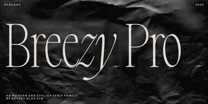 Introducing, Breezy Pro Typeface. A classical typeface with a complementary italic version. It's elegant, modern, and stylish. Mix and match them to create eye-catching effects and make every word a masterpiece. Breezy Pro is perfectly suited for fashion and magazine design, Inspirational quote designs, logo designs, simple and classy Logos, web font, branding, product packaging, and much more. This font is PUA-encoded, which means you can easily access all of the glyphs! Features : All Uppercase and Lowercase Number & Symbol Supported Languages Ligatures PUA Encoded Hope you enjoy our font!
 - Merilee by SummitType,
$25.00 Fonts with handwritten characteristics are always an attractive option when creating projects that call for a personal touch. Merilee helps deliver a natural pattern to computer generated text, helping readers feel a more personal attachment to the words in front of them. Merilee includes a full character set (UPPER and lower case), all punctuation, all special characters, Euro symbol, and all Latin Extended-A characters, making this font a perfect match for a variety of creative projects including holiday and kids projects, signs, logo designs, banners and advertisements.
 - Yin Yang Messages by Ingrimayne Type,
$9.00 YinYangMessages contains two sets of letters, those on the upper-case keys that fit on the left side of a yin-yang symbol and those on the lower-case keys that fit on the left side of a yin-yang symbol. One can alternate the two sets manually but the OpenType contextual alternatives feature does this automatically in any program that supports this feature. The family contains two fonts. In one the filled half is on the left and in the other the filled half is on the right. The slash and backspace keys contain blank halves of the symbol, which are useful for completing words with an odd number of letters. The two styles can be used in layers. YinYangMessages is a fun and playful family that every once in a while may be the ideal typeface for some unusual situation.
 - Text by Alias Collection,
$60.00 Whereas blackletter types were hand written, Text letterforms are drawn using a series of graphic shapes that slot together in a series of permutations, one set for lower case and another for the upper case. As the link between the method of construction of the letterforms has been removed from the appearance (the quill pen with which they were written resulting in the angle and sharp stresses) there is no logic for these stylistic elements to work in any set way. As this fundamental rule of the blackletter style has been removed the typeface has become something other than a typical or derivative blackletter font.
 - FF Kaytek Sans by FontFont,
$50.99 Kaytek™ Sans is a fresh take on the correspondence typefaces of the 90s - which were originally designed for the demands of office environments. Just like its predecessors, this text typeface is robust and hard-working - meaning it works well in challenging design or printing environments - but it’s not without personality. Look closer at the lowercase g and a, especially in the italic, and you can see some unexpected elements of subversiveness within the design. This blend of sturdiness and quirkiness means it’s just as relevant for information-heavy projects, such as annual reports, as it is in more expressive environments. Although first and foremost designed for text, Kaytek Sans’ details shine through in its heavier weights and larger sizes, meaning it also has display potential. Every style of the typeface takes up exactly the same amount of space, thanks to the way Radek Łukasiewicz created the design. He based the entire typeface on a single, master set of proportions. This means designers can switch between styles without the text being reflowed, making it particularly useful in magazines, where space might be limited, and also on the internet, where hover links appear in a different style. As well as its roots in the office, Kaytek Sans draws on a little bit more 90s nostalgia. It’s named for the first and only Polish walkman, and embodies the same solid, no-nonsense shapes that made the analogue technology of the era so charming. Just like these early personal music devices, Kaytek Sans is practical, but not clinical, able to work hard while still exuding warmth and personality. It pairs effortlessly with Kaytek Slab, which is a sturdier and more expressive take on the design. Kaytek Sans comes in 12 weights, from Thin to Black Italic, and offers multi-language support. Kaytek Slab, Kaytek Headline and Kaytek Rounded are also available.
 - PF Bodoni Script Pro by Parachute,
$79.00 Always intrigued by Bodoni's original work, I was set out—back in 2000—to examine his work and study Manuale Tipografico, one of the greatest specimen books ever printed. Issued in 1818 at Parma, Italy by Bodoni's widow, the two-volume work shows an impressive array of 142 roman alphabets and some foreign ones such as Greek and Cyrillic. After a careful examination of all characters, I decided to create a typeface based on the distinct script capitals presented in the book. Matching lowercase italics were later selected and designed to complete the series. Since my intention was not to create simply a digital version of Bodoni's work, this typeface was designed with connected characters and capitals with extra calligraphic elements. The result was released in 2002 and published in our award-winning catalog/book IDEA/Trendsetting Typography vol.1. Later in 2005 we revived a large number of ornaments and borders (credit goes to designer George Lygas). All this work was left behind till recently when it was revisited to create a complete 'Pro' family. Several new uppercase and lowercase glyphs were designed in order to create a distinct typeface, which is based on Bodoni but yet it stands out on its own. The new version also takes care of conflicts between neigbouring letters, something that was not included in the first version. Bodoni Script Pro is a 3-weight superfamily. It supports 10 special opentype features including 'contextual alternates' as well as support for both Latin and Greek. Each font comes with 725 glyphs including a large number of alternates as well as 144 ornaments. Furthermore, when you purchase the whole package you get a bonus font which contains 120 frame parts. These parts, when put together, create some truly amazing borders. -Panos Vassiliou
 - Dunhill Script by Lipton Letter Design,
$29.00 A bit of happenstance and accident are always full of possibility — Richard Lipton’s Dunhill Script is based on observations of the work of his left-handed calligraphy students and then from a small detail generated by his own freehand sketching. Like his other script typefaces, Dunhill was born from the desire to achieve a certain visual drama. Many details show the pen at work, like the terminal shapes and the caps and ascenders. Dunhill also has a range of alternate stylistic glyphs and contextual features that can transform it into a connected script. It’s a great choice for editorial display or advertising and branding settings on its own or paired with a Roman sans or serif.
 - Ford's Folly by Ascender,
$50.99Ford's Folly is a lively yet sophisticated handwriting font designed by Ascender's Jim Ford. It captures the look and spirit of the designer's handwriting using a using a Sharpie™ Extra Fine felt pen. This casual script font evokes an energetic feeling, and has very legible letterforms without quirky distractions. Jim Ford took his hand global by creating a massive multilingual character set. The font features the WGL Pan-European character set (Eastern Europe, Cyrillic, Greek and Turkish) and advanced typographic features for use with OpenType-savvy applications. The font is a fun and attractive handwriting font that is great for greeting cards, menus, advertisements, scrapbooking and many other projects that can benefit a personal appearance. - P22 Tai Chi by IHOF,
$24.95 Experimental lettering Stephen Rapp created in 1999 became the spark that Stephen's imagination transformed into the Tai Chi design. Tai Chi is a display face but it could also be used as a textured calligraphic script. Its delightful sense of movement distinguishes it from other scripts. Individual characters stand poised in a vertical Zen-like balance while at the same time displaying an inner rhythm that makes them appear to dance along the line. Rich in texture and variation, Tai Chi works very well at medium and large point sizes. The font contains several alternate letters that help maintain a hand-lettered look. Tai Chi includes both upper and lowercase letters but works well in all uppercase settings.
 - Airates Script by Maculinc,
$20.00 Airates, this is my first font, as the name suggests and because this is my first font that I introduced to the world. Inspired by a film where someone who loses all and returns to struggle to find meaning in life that actually clings to the edge of the world and that's where the beginning of a story seems to be reborn. Airates Script Fonts is a typeface thick and easy to read so comfortable to wear .You can use it as a logo, badge, insignia, packaging, headline, poster, t-shirt/apparel, greeting card, business card, and wedding invitation and more. The flowing characters are ideal to make an attractive messages to your taste. mix and match with a bunch of alternative characters to fit your project.It will be more interesting if you add swash / alternative swash. The alternative characters in this font were divided into several OpenType features such as Stylistic Alternates, Ligature and Ligature Alternates. Mail support : maculinc@gmail.com Thank you! Maculinc
 - ITC Humana Serif by ITC,
$29.99ITC Humana font is the work of British designer Timothy Donaldson, an extended and versatile font family with a large array of variations. Donaldson first created ITC Humana Script with a broad-tipped pen and then went on to design the corresponding roman. ITC Humana is the perfect font for anything requiring both clarity and a touch of personality. - Gullywasher NF by Nick's Fonts,
$10.00One in the series of fonts called Whiz-Bang Wood Type, intended to be set large and tight. Gullywasher is distinguished by its unusual letterforms and “pineapple” serifs. The font takes its name from a Texas term for a heavy rain. Both versions of this font include the complete Unicode Latin 1252 and Central European 1250 character sets. - El Franco by Fonthead Design,
$19.00El Franco is a family designed by Ethan Dunham that represents what Roman lettering looked like in the 16th century. Derived from a typographic sample of Francisco Lucas, 1577, this font captures the feeling of rustic times. It comes in two versions regular and distressed. The distressed version has been weathered to appear old and worn. - Movie Producer JNL by Jeff Levine,
$29.00 The Nov. 13, 1915 and Nov. 27, 1915 issues of Moving Picture World carried ads for Jesse L. Lasky Productions in which the titles of the upcoming films were hand lettered in an elegant Art Nouveau spurred serif style. This stylish alphabet is now available digitally as Movie Producer JNL in both regular and oblique versions.
 - 2010 Cancellaresca Recens by GLC,
$38.00 This font was inspired by the Cancellaresca pattern (look at our 1491 Cancellaresca and 1610 Cancellaresca), in particular Spanish one, from Francisco Lucas, who was working in the late 1500s. It is a modern variation, including West European accented characters and a lot of initial and final alternates (not in the Mac TT version for technical reasons).
 - P22 Da Vinci by P22 Type Foundry,
$24.95 The great Italian artist, inventor, and visionary Leonardo da Vinci created an extraordinary variety of work which continues to amaze those who study it. This set faithfully captures Leonardo's remarkable imagination and includes an exclusive Da Vinci Backwards font (reflecting the artist's own unique style of handwriting). The 72 extras included are drawn from Leonardo's sketchbooks and journals.
 - Lime Squash by Epiclinez,
$18.00 Bold, playful, and fresh - the lime squash font will make your design stand out from the rest. This fun, bold font will give your work an added creativity boost, whether for a logo, product packaging, or a headline. With its unique style that has been carefully crafted, the lime squash font is perfect for any creative project.
