10,000 search results
(0.064 seconds)
- Luxyna by Krafted,
$10.00 Wish to add a touch of luxury to your design? A deluxe font will transform the way people see your brand. Introducing Luxyna - a Luxury Serif Font. A perfect blend of luxury and modern spirit, Luxyna will appeal to all audiences, young and old. Best of all, it works great on both the web and in print. Give it a go and see how the right font choice improves your image. What you’ll get: Multilingual & Ligature Support Full sets of Punctuation and Numerals Compatible with: Adobe Suite Microsoft Office Keynote Pages Software Requirements: The fonts that you’ll receive in the pack are widely supported by most software. In order to get the full functionality of the selection of standard ligatures (custom-created letters) in the script font, any software that can read OpenType fonts will work. We hope you enjoy this font and that it makes your branding sparkle! Feel free to reach out to us if you’d like more information or if you have any concerns.
 - Omega Pixel by João Henrique Lopes,
$- OmegaPixel Font Description I created this font for the game Hyper Ninja Blast (but made it useful to all kinds of games!). While creating the game, I searched for pixel fonts, but could not find a suitable one. The fonts were generally ugly and lacking the basic variations (italic and bold). So I decided to create my own pixel font. Just as pixel art can be better than a high-resolution painting, so pixel fonts don’t need to be always worse than traditional fonts. In OmegaPixel I tried to achieve elegance, readability and flexibility within the limitations of a 6 pixel x-height. With 4 versions (regular, italic, bold and bold italic), and a neutral feel, OmegaPixel can be used in any genre of games. Considering the general lack of money among indie game devs, I’m giving the regular version for free! For inspiration, I often remebered Minion’s lowercase ‘a’, Galliard italic lowercase ‘g’, and the calligraphy of Chinese emperor Huizong.
 - Teapot by Ingrimayne Type,
$9.00 Teapot is a font with letters on teapots. Upper-case letters have the handles on the right and lower-case characters have the handles on the left. The letters on the teapots are from the typeface InsideLetters. A revision in 2018 added some characters that can be used to create multicolored lettering. A pdf file here shows how to use them.
 - OL Hebrew Qumran Torah by Dennis Ortiz-Lopez,
$30.00 This font contains every variant found in the Hebrew Bible such as the “mutilated” Waw in Numbers 25: verse 12, the small Heh in Genesis 2: verse 4 and the Nun Inversum before Numbers 10: verse 35 and after verse 36 and elsewhere as well as certain oversized consonants such as the Shin with hireq from the beginning of the Song of Songs.
 - Copperplate Alt by Wiescher Design,
$39.50 Copperplate Alt is the sister font to Copperplate Wide. The »Alt« version stands for alternative and has lowercase letters that are slightly smaller than the uppercase. It gives you another possibility to use this elegant typeface. Your forever inventive type designer - Gert Wiescher
 - Schweimann Moderne NF by Nick's Fonts,
$10.00 Here's a typeface from the Art Nouveau era that is equally at home in the world of contemporary science fiction, which is quite an achievement. Both versions of this font support the Latin 1262, Central European 1250, Turkish 1254 and Baltic 1257 codepages.
 - Chino Tattoo by Otto Maurer,
$25.00 Chino Tattoo is best for all Tattooartists and Tattoofans. You can use it to make Tattooflashs for your Tattoostudio. Chino Tattoo is a typical Tattoostyle Font. The Chinostyle comes from the Gangs of the USA (with latin roots). They often have Chist-Symbols.
 - Vividangelo by Wiescher Design,
$24.50 Vividangelo is designed after the handwriting of a real person. I saw it on the pricetags in a small shop and convinced the person to have her handwriting converted into a font. She is very happy about it now, so am I.
 - Talqual by Type-Ø-Tones,
$40.00 Sometimes work done in a rush survives and gets better and better. This is the case of Talqual, a Joan Barjau handwriting font straight from the strokes made with a Wacom tablet while listening to a Barça football match on the radio.
 - Chamfer Engraved JNL by Jeff Levine,
$29.00 An eccentric chamfered sans serif wood type design with a right side engraving line from the 1800s was found within the pages of the Thorowgood foundry of London, England. This font is now available as Chamfer Engraved JNL in regular and oblique versions.
 - Varvid by Cercurius,
$19.95 The characters in this font are composed of rounded lines with even thickness, giving an impression of neon tubes. Although the design is completely new, it has its stylistic roots in the modernistic 20th century world of steel-tube chairs and fluorescent lamps.
 - Hermaphrodite by Volcano Type,
$29.00Hermaphrodite was developed for the Bastard Project and had its origin in the idea of applying the process of an Antiqua on a Grotesque. In other words, a Grotesque font was drawn calligraphically and then digitized. Some inconvenient corners were simply cut off. - Ensemble Inline JNL by Jeff Levine,
$29.00 A 1940s-era edition of the sheet music for the Marine Corps Hymn offered up the hand lettering which comprises Ensemble Inline JNL. Bold, condensed and attention-getting, this titling font commands attention. Available in Inline, Solid, Inline Oblique and Solid Oblique versions.
 - Jattestor by Sabrcreative,
$25.00 Elevate your creative projects with the enchanting allure of the Jattestor Script Font. This typeface seamlessly melds the fluidity of handwritten script with a touch of artistic charm, making it an excellent choice for designs seeking a blend of authenticity and creativity.
 - Gazeta Slab by Vanarchiv,
$35.00 This humanist slab-serif style is an extension from Gazeta font family, the letterform are more sharp, racional and mechanical. Italics are having small differences from roman letterforms, the characters are slightly more narrow (weight) and the proportions are less open (width).
 - Science Fair JNL by Jeff Levine,
$29.00 Science Fair JNL emulates the effect of connecting the broken lines of a stencil alphabet into a solid letter form, such as many students did for posters on their science project. In this case, the base font was Jeff Levine's Paramilitary JNL.
 - Celtics Modern by Dharma Type,
$14.99 Inspired from ancient Celtic lettering such like insular-half-uncial. New interpretation of Celtic letters bring a whole new feel to old letterings. At the same time, the font has handwritten-style glyphs as if they were handwritten same as the ancient letters.
 - Stencil Deco JNL by Jeff Levine,
$29.00Stencil Deco JNL was an experimental modification of Jeff Levine's Cardboard Cutouts JNL font, originally designed from an authentic stencil source circa the 1950s. This version is a fusion of the Art-Deco style and a modern, trendy approach to the stroke weights. - Trade Printer JNL by Jeff Levine,
$29.00Trade Printer JNL is another font design inspired by an old rubber stamp sign printing set. In this case, the lettering has a classic "wood type" look, reminiscent of the letterheads, billheads and fliers made by local printers of the 1880s-1920s. - Spartacus by Alan Meeks,
$45.00 A further development of the Colosseum range but this with a slab serif. Visually monoline and modern in appearence it still retains its Trajan characteristics. The addition of Spartacus black with its unusual Italic gives a the face a strong original headline font.
 - Sophia Marilyn by Timurtype,
$14.00 Introducing by Timur type Proudly Present, Sophia Marilyn Sophia Marilyn A Handwritten Script Font Sophia Marilyn is perfect for product packaging, branding project, megazine, social media, wedding, or just used to express words above the background. This Sophia Marilyn font includes: Sophia Marilyn multilingual support. Embelish your designs with our original fonts.Enjoy the font,Thank you!
 - Concrete Forge by Get Studio,
$10.00 ConcreteForge: A fearless brutalist font with extended shapes, exuding strength, and resilience. Captivating and impactful, it embraces simplicity while making a bold statement for branding and design projects. Inspired by the raw aesthetics of brutalist architecture, this typeface exudes strength and confidence. The family includes 9 fonts in a variety of weights and supports Variable Font.
 - FX Neofara by Differentialtype,
$10.00 FX Neofara is a sans serif font family that comes with 9 weights, 9 italics, and an outline. It’s perfect for documents, font logos, blogs, social media, marketing campaigns, and many other projects! FX Neofara masterfully designed to become a true favorite, this font has the potential to bring each of your creative ideas to the highest level!
 - Kufwan by Twinletter,
$15.00 Kufwan Arabic style display font can be used to give your designs a genuine Arabic touch. The display font displays a beautiful style similar to the handwriting on a typical Arabic book. Use this font in your super projects to grab everyone’s attention. Don’t put off adding an elegant Arabic touch to your designs any longer.
 - Satreva Neue by Balevgraph Studio,
$14.00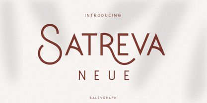 Satreva Neue is a stylish, elegant and distinct sans serif font. Suitable for a wide variety of designs because of its neat and simple style, this font has the potential to become your favorite font, whatever the occasion! What's Included : Uppercase, Lowercase, Numerals & Punctuations Alternate & Ligature Works on PC & Mac Simple installations Multilingual support PUA Encoded
 - TF Bombass by Teenage Foundry,
$19.00 TF Bombass – Groovy Display Font By Teenage Foundry Introducing our latest font creation – a groovy typeface that’s sure to transport you back to the funky, psychedelic era of the 60s and 70s! With its bold, playful style and unique character, this font is perfect for adding a retro feel to your design projects. Features: Uppercase, Lowercase, Numeral, Punctuation & Multilingual.
 - Brother Time by Timurtype,
$14.00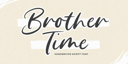 Introducing by Timur type Proudly Present, Brother Time Brother Time A Handwritten Script Font Brother Time is perfect for product packaging, branding project, megazine, social media, wedding, or just used to express words above the background. This Brother Time font includes: Brother Time multilingual support. Embelish your designs with our original fonts.Enjoy the font,Thank you!
 - Mogathe by Invasi Studio,
$16.00 Mogathe was inspired by the west life era. Mogathe is a slab serif font with a vintage western look and feel. Four varieties are available: Regular, Stamp, Spurs, and Spurs Stamp. The use of this font results in carefully-crafted styles. Mogathe font is ideal for branding projects or packaging that need a vintage western feel.
 - Counter Courage by Viaction Type.Co,
$15.00 Counter Courage is a vintage-style sans serif font with an ink effect that’s perfect for industrial and vintage-themed designs. This font is equipped with the opentype feature and supports multilingual. Included in the fonts: Uppercase Lowercase Symbols & Pointing Alternate Characters Multilingual Support Get it now at an affordable price and high value for your needs. Thank You.
 - UT Sugar Cane by Uniontype,
$15.00 Sugar Cane by Uniontype is a fresh and light multilingual script inspired by vintage monoline fonts. It provides advanced typographical support with contextual alternates, ligatures and swashes. That way, you’ll have automatic access to the dozens of extra glyphs in each of the fonts. This font is good for menu, signs, packaging, posters, letterings and logos.
 - Onry Display by NicolassFonts,
$35.00 Onry Display is a modern family based on Willgray font family. It comes in 20 weights, 10 uprights, and matching italics. The ExtraBold weight is free of charge. This font family can be used as a headline or as a body copy typeface. The font features excellent legibility for print, as it does for reproduction on TV screens.
 - Mr Palker by Letterhead Studio-YG,
$35.00 A slab serif Mr Palker and grotesque Mr Palkerson build one superfamily together. These are blank types. In a way even the display ones. Typefaces for newspapers, announcements, cheap advertising and police posters. Mr Palker and Mr Palkerson will turn every language into a fence. And due to six types of faces one can choose what material should the fence be made from — from Thin steel rods to the Black stone blocks. In their simplest appearance Mrs P&P are intended for the solid blank composition in victorian or industrial style. They are quite decent, a bit old-fashioned slab serif and grotesque with closed aperture. All my types have layers. Walker and Palkerson also do. Besides the standard set of symbols, they have 4 add-ons. 1. Alternate glyphs, including unicase ones. 2. Ligatures with A letter. 3. Extra tall small caps. 4. Two-storey ligatures. All this options are intended for the complex composition. The additional letters are rather eccentric as their main function here is to imitate the victorian oddities. Imitate, parody, just not repeat. There are lower-case As and Es in the set in height of small caps and uppercases. They can turn every writing into the unicase. The lower-case A (as well as uppercase and small caps version of it) has deliberately by my taste grown a ludicrous tail. To compensate it I’ve built all the possible ligatures - ад, ал, ая. There are 35 of this ligatures all together. Take a closer look at the Russian letters D, L, K, Ya from the main set as well as their alternates. The additional glyphs are one more comic than the other — on purpose to imitate (not to repeat!) the victorian set. This sets have lowercase numbers. And small caps numbers as well. What a modern typeface without them. They also have an У-letter with a generously curvy tail. As if before the WWI. The Latin of course has alternates as well. It has letters to make the perfect French sound more like the russian provincial version of it. The tails of Js and Ts can be made a little bit more open — or a little bit closed. My favorite feature here, an invention of a kind - extra tall small caps. It allows to compose logos with the small caped uppercases directly from the keyboard. The small caps of this typefaces are usually much taller than the customary ones. This is the kind of small caps that Palker and Palkerson have. More to that, the strokes’ weight and the letters width are corresponded to the uppercases. Just a ready set for making a logo a la 1913 style. With a unicase, one has to mind! One more trick with the tall small caps is a possibility to make them work like lower uppercases. Their height is just in between of lower- and uppercases. Isn’t it great to have an additional set of uppercase working ponies in stock for the case of emergency. And finally — the trademark of Palkers family, two-storey ligatures. They are made in the height of uppercases and turn every writing into an ornament or a puzzle of a kind, while at the same time making them much shorter. Each face has 90 of them. Mainly those are twins: CC, BB, DD and so on. ll this things are for the unhasty compositing, even for lettering. Which means that for the things which are not there you always should have Command+Option+O and some patience. Also — among the two storey ligatures one also can find some belvedere villas. All my types are glasses from the one kaleidoscope. The P&Ps family was preliminary part of the victorian set, which already has 1 Cents and Clarendorf - optionally one can add Costro, Gordoni, Handy, Guardy, Surplus, Red Ring, Red Square, Babaev to the list. And also Sklad, Odessa, Dreamland, Romb, Platinum - here, at Letterhead’s, every second one is victorian. All together our typefaces can allow one to set advertisement of any kind, even the trickiest one, and compose everything, from the coffee place’s menu to the antiquarian magazine.
 - Mr Palkerson by Letterhead Studio-YG,
$35.00 A grotesque Mr Palkerson and slab serif Mr Palker build one superfamily together. These are blank types. In a way even the display ones. Typefaces for newspapers, announcements, cheap advertising and police posters. Mr Palker and Mr Palkerson will turn every language into a fence. And due to six types of faces one can choose what material should the fence be made from — from Thin steel rods to the Black stone blocks. In their simplest appearance Mrs P&P are intended for the solid blank composition in victorian or industrial style. They are quite decent, a bit old-fashioned slab serif and grotesque with closed aperture. All my types have layers. Walker and Palkerson also do. Besides the standard set of symbols, they have 4 add-ons. 1. Alternate glyphs, including unicase ones. 2. Ligatures with A letter. 3. Extra tall small caps. 4. Two-storey ligatures. All this options are intended for the complex composition. The additional letters are rather eccentric as their main function here is to imitate the victorian oddities. Imitate, parody, just not repeat. There are lower-case As and Es in the set in height of small caps and uppercases. They can turn every writing into the unicase. The lower-case A (as well as uppercase and small caps version of it) has deliberately by my taste grown a ludicrous tail. To compensate it I’ve built all the possible ligatures - ад, ал, ая. There are 35 of this ligatures all together. Take a closer look at the Russian letters D, L, K, Ya from the main set as well as their alternates. The additional glyphs are one more comic than the other — on purpose to imitate (not to repeat!) the victorian set. This sets have lowercase numbers. And small caps numbers as well. What a modern typeface without them. They also have an У-letter with a generously curvy tail. As if before the WWI. The Latin of course has alternates as well. It has letters to make the perfect French sound more like the russian provincial version of it. The tails of Js and Ts can be made a little bit more open — or a little bit closed. My favorite feature here, an invention of a kind - extra tall small caps. It allows to compose logos with the small caped uppercases directly from the keyboard. The small caps of this typefaces are usually much taller than the customary ones. This is the kind of small caps that Palker and Palkerson have. More to that, the strokes’ weight and the letters width are corresponded to the uppercases. Just a ready set for making a logo a la 1913 style. With a unicase, one has to mind! One more trick with the tall small caps is a possibility to make them work like lower uppercases. Their height is just in between of lower- and uppercases. Isn’t it great to have an additional set of uppercase working ponies in stock for the case of emergency. And finally — the trademark of Palkerson family, two-storey ligatures. They are made in the height of uppercases and turn every writing into an ornament or a puzzle of a kind, while at the same time making them much shorter. Each face has 90 of them. Mainly those are twins: CC, BB, DD and so on. ll this things are for the unhasty compositing, even for lettering. Which means that for the things which are not there you always should have Command+Option+O and some patience. Also — among the two storey ligatures one also can find some belvedere villas. All my types are glasses from the one kaleidoscope. The P&Ps family was preliminary part of the victorian set, which already has 21 Cents and Clarendorf - optionally one can add Costro, Gordoni, Handy, Guardy, Surplus, Red Ring, Red Square, Babaev to the list. And also Sklad, Odessa, Dreamland, Romb, Platinum - here, at Letterhead’s, every second one is victorian. All together our typefaces can allow one to set advertisement of any kind, even the trickiest one, and compose everything, from the coffee place’s menu to the antiquarian magazine.
 - Orliet Pro by Arttype7,
$15.00 Elevate Your Designs with Elegant Luxury Orliet Pro is a meticulously crafted serif font designed to add a touch of elegance and luxury to your visual creations, especially ideal for enhancing the sophistication of logos. This font stands out for its uniqueness, boasting over 50 ligatures and alternative characters with artistic flair. Its well-designed script optimizes your designs, ensuring a seamless integration into your projects. Key Features: Versatile Ligatures and Alternatives: With over 50 ligatures and alternative characters, Orliet Pro provides a wide range of design possibilities. Each character exudes a unique artistic charm, allowing you to customize your text in a myriad of ways. Elegance in Every Detail: The design of Orliet Pro aims for elegance. The serif style adds a touch of class to your projects, making it perfect for creating logos that exude luxury and simplicity simultaneously. Seamless Font Families: Each member of the Orliet Pro font family complements one another effortlessly. Whether you choose the Orliet Pro script or Orliet Pro icons, they work harmoniously to enhance your overall design. Enhanced Design Flexibility: Orliet Pro script and Orliet Pro icons contribute to the ease of design integration. The script is thoughtfully designed to optimize your creative process, while the icons provide additional elements for a professional touch. Cyrillic Alphabet Inclusion: For an added layer of versatility, Orliet Pro includes the Cyrillic alphabet in regular, italic, bold, and bold italic styles. This ensures that your designs can reach a broader audience with diverse language preferences. Optional Details: Design Concept: Orliet Pro was conceptualized to bring an air of sophistication to your designs, with a focus on creating an elegant and timeless serif font. Creation Inspiration: The font draws inspiration from classic design elements, aiming to provide a timeless aesthetic that resonates with a modern audience. Historical Context: While not a revival, Orliet Pro pays homage to the timeless elegance of serif fonts, adding a contemporary twist to meet the demands of today's design trends. Elevate your designs with the timeless elegance of Orliet Pro. Explore the possibilities of serif and script styles, accompanied by convenient font icons, all seamlessly integrated into one versatile font family. Embrace luxury and simplicity in every character.
 - MFC Memoriam Initials by Monogram Fonts Co.,
$19.95 The inspiration source for Memoriam Initials is the 1934 Book of American Types by American Type Founders. In that specimen book, they had created a sophisticated two color initial design they called “University Initials” which was only available in metal type at 24, 36, and 48 points. This wonderfully detailed initial style is now digitally recreated and revived for modern use. Memoriam Initials is only capable of initial or single letter monograms due to its unique design. The two color aspect of the original design has been preserved and made accessible within all programs. The Capital character slots contain the background color glyphs, and the lowercase slots hold the outline art for the letters. You can choose a color, type a capital letter, then switch to black and type a lowercase letter for the two color effect, or just type a lowercase letter on its own. It’s that easy! Download and view the Memoriam Initials Guidebook if you would like to learn a little more.
 - Van den Velde Script by Intellecta Design,
$68.90 Iza and Paulo W (Intellecta Design) are proud to announce Van den Velde Script. A free interpretation of the work of the famous master penman Jan van den Velde, to be found in the “Spieghel der schrijfkonste, in den welcken ghesien worden veelderhande gheschrifften met hare fondementen ende onderrichtinghe. ” (Haarlen, 1605). Van den Velde Script has evocative ancient ligature forms from the XVII Century Dutch master penman Jan van den Velde. Your indescritible writing-book was important not only with regard to the specific period it represents, but also in relationship to the entire history of calligraphy as an art: Van den Velde is rightly credited with having introduced and perfected a new trend in Dutch calligraphy. Our font, Van den Velde Script merges modern necessities o better legibility without loose the taste of his archaic origins. This enhanced OpenType version is a complete solution for producing documents and artworks whith a evocative and voluptuous style of calligraphic script: - dozens of stylistic alternates for each letter (upper- and lowercase), accessed with the glyph palette; - historical ornaments and fleurons in the typical style (and motifs) from the XVII century at the Lower Countryes accessed with the glyph palette using the Ornaments feature); - an extensive set of ligatures (100s of contextual alternates plus discretionary ligatures) providing letterform variations that make your designs really special, resembling real handwriting on the page; - a tour-de-force kerning work: over 700 gliphs in this font was adjusted to your kern pairs handly. In non-OpenType-savvy applications it works well as an unusual and beautiful script style font. Because of its high number of alternate letters and combinations (over 700 glyphs), we suggest the use of the glyph palette to find ideal solutions to specific designs. The sample illustrations will give you an idea of the possibilities. You have full access to this amazing stuff using InDesign, Illustrator, QuarkXpress and similar software. However, we still recommend exploring what this font has to offer using the glyphs palette: principally to get all the power of the Contextual Alternates feature. You can has an idea of the power of this font looking at the “Van den Velde User Guide”, a pdf brochure in the Galçlery section. Two last things: take a special look at the Van den Velde Words (ready words) font and another super script font, Penabico. Van den Velde Script has original letters designed by Iza W and overall creative direction plus core programming by Paulo W.
 - Exelancer Extra by Popskraft,
$9.00 Introducing the cutting-edge Excelancer Extra font, a modern masterpiece born from the rich heritage of classic sci-fi typography. Our inspiration? The boundless allure of outer space. And bestseller — the Excelancer font! https://www.myfonts.com/collections/exelancer-font-popskraft Excelancer Extra font is a harmonious blend of sleek, contemporary design, drawing from the timeless elegance of its predecessor. What sets Excelancer Extra apart is its captivating fusion of bold, ornate uppercase characters with meticulously crafted lowercase letters that maintain exceptional readability, even in extensive text. With Excelancer, you possess an all-encompassing font toolkit, designed to tackle every facet of forward-looking design. But that's not all. This font isn't just for intergalactic tales; it's also a striking choice for anything related to technology, innovation, progress, and even the world of sports. In essence, Excelancer embodies the pure essence of the future—an infusion of dynamism that knows no bounds!
 - Arabic Scratch by Si47ash Fonts,
$19.00 And now Arabic Scratch font is here! Based on the old Naskh based typeface, this font along with the other Si47ash dirty font Persian Grunge, is introducing new possibilities to use Arabic letters for some of your exciting graphic projects, including book covers, posters, banners, brochures, catalogs, logotypes, and more! Every glyph is unique and all the patterns and textures are distinctively designed and make the font an artwork itself! It's so convenient, you do even have to do anything! Just type the words and the magic happens spontaneously! Shahab Siavash, the designer has done more than 30 fonts and got featured on Behance, Microsoft, McGill University research website, Hackernoon, Fontself, FontsInUse,... Astaneh text and headline font which is one of his latest designs, already got professional typographers, lay-out and book designers' attention as well as some of the most recognizable publications in Arabic/Persian communities.
 - Mattock Germany Script by Alit Design,
$19.00 Presenting the Mattock Germany font duo from alitdesign. The Mattock Germany font duo is inspired by spontaneous and dynamic signature strokes with ink textures that bring the Mattock font to life. The Mattock font looks unique and charming which makes the design using the Mattock font look more prominent and cool. German font with elegant serif characters and has a unique character when combined with the Mattock font creates an elegant, natural and different design. The Mattock Germany duo font is perfect for new font collections on your computer, tablet and smartphone to create unique designs, logos, quotes. The duo Mattock Germany font is perfect for magazine cover designs, brochures, pamphlets. Instagram ads, Canva Design and so on with unique and modern concepts. Besides that, this font is very easy to use both in design and non-design programs because all changes and glyphs are supported by Unicode (PUA). The Mattock Germany duo font contains 769 + 569 glyphs with many unique and interesting alternative options. Language Support : Latin, Basic, Western European, Central European, South European,Vietnamese. In order to use the beautiful swashes, you need a program that supports OpenType features such as Adobe Illustrator CS, Adobe Photoshop CC, Adobe Indesign and Corel Draw. but if your software doesn't have Glyphs panel, you can install additional swashes font files.
 - Daitengu by Hanoded,
$15.00 I have always been fascinated by Tengu - a mythical creature from Japan. Tengu are usually depicted with a red face, a very long nose, white moustaches and a funny hat. They used to be regarded as harbingers of war, but over the centuries, their image softened and they became the protective spirits of mountains and forests. Daitengu means ‘greater tengu’ and stems from the Genpei Jōsuiki - an extended version of the ‘The Tale of the Heike’ - an epic account of the struggle between the Taira and Minamoto clans for control of Japan. So, now you know about tengu, end of the history lesson! Daitengu is an epic brush font. I made it with a soft brush and China ink (like most of my brush fonts), but instead of forming the glyphs I saw in my head, I let the brush do the work. A more ‘zen’ approach to brushwork if you will! The result is a messy, organic brush font with a lot of spirit. Comes with diacritics and double letter ligatures.