10,000 search results
(0.03 seconds)
- Adagio Slab by Borutta Group,
$25.00The Adagio Family is a part of Mateusz Machalski’s, Warsaw Academy of fine arts Master Degree Diploma in multimedia studio, conducted by Professor Stanisław Wieczorek and his brave PhD student Jakub Wróblewski. Adagio is a modern type family. It consists of 3 main varieties: sans, serif and slab. Each has its own “true italic” set. All of the styles together have over 400 characters in 9 different thicknesses. The Adagio family was created mostly for company identities. The idea was to create a wide range of different varieties that are stylistically consistent. Adagio Slab - Slab variety combines qualities of the Sans and Serif varieties. It has the same contrast as Sans. As distinct from Serif, Adagio Slab contains strong, beamy and symmetrical serifs in the form of pillows. Thanks to large X height, and highly stretched descenders, it also works correctly in longer text, while its strong detail is good for headlines. Slab version is a great complement for Adagio Serif and Adagio Sans. - Open TECH Neue by TypoGraphicDesign,
$9.00The typeface Open TECH Neue is designed from 2018—2021 for the font foundry Typo Graphic Design by Manuel Viergutz. 6 font-styles (Sans Serif, Invert, Outline, Slab Serif, Stretch, Box Puzzle) + 1 icon-style with 1097 glyphs (Adobe Latin 3) incl. 400+ decorative extras like icons, arrows, dingbats, emojis, symbols, geometric shapes, catchwords, decorative ligatures (type the word #LOVE for ♥︎ or #SMILE for ☺ as OpenType-Feature dlig) and stylistic alternates (6 stylistic sets). For use in logos, magazines, posters, advertisement plus as webfont for decorative headlines. The font works best for display size. Have fun with this font & use the DEMO-FONT (with reduced glyph-set) FOR FREE! ■ Font Name: Open TECH Neue ■ Font Styles: 6 (Sans Serif, Invert, Outline, Slab Serif, Stretch, Box Puzzle) + Icons + DEMO (with reduced glyph-set) ■ Font Category: Display for headline size ■ Glyph Set: 1097 glyphs (Adobe Latin 3) incl. 400+ icons (decorative extras like arrows, catch words, dingbats, emojis, symbols) ■ Design Date: 2018—2021 - Cartesian by Tyler Jamieson Moulton,
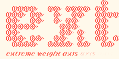
$33.00Cartesian is a modular typeface that gets its namesake from Descartes’s cartesian coordinate plane and Conway’s Game of Life. Each character is composed of cells that each can be considered either on or off (alive or dead.) The Cartesian family includes Cartesian Serif and Cartesian Sans Serif. Furthermore, both Cartesian Serif and Sans Serif letterforms feature two-to-one stroke contrast. - Putrey by Alit Design,
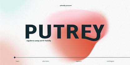
$11.00Introducing PUTREY Typeface PUTREY font is designed with a modern concept that is simple and dynamic. The sans serif style adopted by the PUTRAY font is a 2022 style font, has a unique swash alternative, has a large selection of ligatures. In addition. Sans Serif typefaces such as “PUTREY typeface” are very easy to apply to any design, especially those with an elegant and smooth concept, besides that this font is very easy to use both in design and non-design programs because everything changes and glyphs are supported by Unicode (PUA). The PUTREY typeface contains 837 glyphs with many unique and interesting alternative options. Plus, there's a cool sans serif font family for header and description text from light to black. In the poster preview all the letters are in the PUTREY typeface. - Kidros by Alit Design,
$15.00Introducing KIDROS Typeface The KIDROS font is designed with a sans serif font concept that has a retro display stencil style. Irregular dynamic shapes but impressively regular and unique make the font "KIDROS" different and steal attention. Sans serif typefaces such as "KIDROS" are very easy to apply to any design, especially those with an retro, vintage and strong, besides that this font is very easy to use both in design and non-design programs because everything changes and glyphs are supported by Unicode (PUA). The "KIDROS"contains 540 glyphs with many unique and interesting alternative options. Plus, there's a cool sans serif font family for header and description text from thin to heavy to thin. In the poster preview all the letters are in the KIDROS typeface. - Mongek by Alit Design,
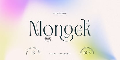
$12.00Introducing Mongek Typeface Mongek Typeface is designed with a modern concept that is simple and dynamic. The serif style adopted by the Mongek font is a 2022 style font, has a unique swash alternative, has a large selection of ligatures. In addition. Serif typefaces such as “Mongek typeface” are very easy to apply to any design, especially those with an elegant and smooth concept, besides that this font is very easy to use both in design and non-design programs because everything changes and glyphs are supported by Unicode (PUA). The Mongek typeface contains 603 glyphs with many unique and interesting alternative options. Plus, there's a cool serif font family for header and description text from Thin to heavy. In the poster preview all the letters are in the Mongek typeface. - Mollyn by Alit Design,
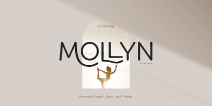
$11.00Introducing Mollyn Typeface Mollyn font is designed with a modern concept that is simple and dynamic. The sans serif style adopted by the Mollyn font is a 2022 style font, has a unique swash alternative, has a large selection of ligatures. In addition. Sans Serif typefaces such as “Mollyn typeface” are very easy to apply to any design, especially those with an elegant and smooth concept, besides that this font is very easy to use both in design and non-design programs because everything changes and glyphs are supported by Unicode (PUA). The Mollyn typeface contains 556 glyphs with many unique and interesting alternative options. Plus, there's a cool sans serif font family for header and description text from thin to heavy. In the poster preview all the letters are in the Mollyn typeface. - Mathery by Alit Design,
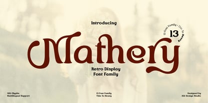
$14.00Introducing Mathery Typeface Mathery font is designed with a modern concept that is simple and dynamic. The serif style adopted by the Mathery font is a 2022 style font, has a unique swash alternative, has a large selection of ligatures. In addition. Serif typefaces such as “Mathery typeface” are very easy to apply to any design, especially those with an elegant and playful concept, besides that this font is very easy to use both in design and non-design programs because everything changes and glyphs are supported by Unicode (PUA). The Mathery typeface contains 806 glyphs with many unique and interesting alternative options. Plus, there's a cool serif font family for header and description text from thin to heavy. In the poster preview all the letters are in the Mathery typeface. - Baldufa Greek Ltn by Letterjuice,
$78.00Baldufa is a charming typeface with strong personality, which looks very comfortable in text. There is a search to obtain complicated curves and detailed features, which gives the typeface a touch of beauty and elegance. However, this is also a self-conscious design that claims through the rounded serifs and irregular vertical stems appreciation for quirkiness and human imperfection. The letterforms in the Latin are inspired by the slight distortions and idiosyncrasies that came with old printing methods. It has distinct, features such as rounded serifs, irregular vertical streams, ink traps and extremely thin junctions. In the Italic, serifs have been removed to enhance movement and expressivity. These experiments in form have not come at the cost of legibility: The typeface remains suitable for both small and display text. Baldufa Greek Ltn covers Greek and Latin. - Cralter by Edignwn Type,
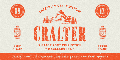
$18.00The Cralter Font is inspired by authentic typefaces in old posters. These font collections contain serif and sans serif fonts. Every font comes with 4 style typefaces (regular, rounded, rough and stamp). Cralter gives more extras 1 pack illustrations. The Cralter matches apply in some designs such as the logo, poster, label, badge, packaging, t-shirt, branding, quotes and more custom design. Cralter features : 4 style typefaces (regular, rounded, rough and stamp) All-caps, numeral, symbol and punctuation Multilingual PUA Encoded Cralter includes : 9 fonts (serif, sans serif and dingbat) 13 hand-drawn illustrations in dingbat - Secret Operation JNL by Jeff Levine,
$29.00 - Paksa by Jipatype,
$17.00 - Kaelorin by RagamKata,
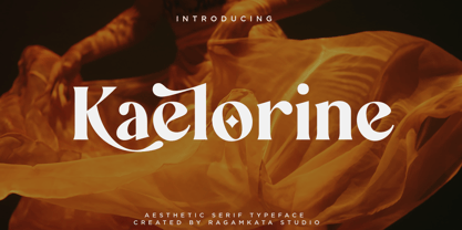
$14.00Say hello to new serif font, Kaelorin! Introducing Rosalind, a stunning modern retro serif font that effortlessly combines aesthetic charm with captivating alternate characters. This typeface falls into the category of modern retro serif fonts and is designed to bring a touch of nostalgia and elegance to your design projects. What sets Rosalind apart are its intriguing alternate characters. These alternates offer a wealth of creative possibilities, allowing you to experiment with various letter combinations and create unique and eye-catching typographic compositions. Each alternate has been thoughtfully designed to ensure visual coherence and seamless integration within the font. - Comma Base by Martin Majoor,
$-Comma Base is a sans typeface for it has no serifs. No wait, it is a typical serif typeface because it has a high contrast. Strictly speaking, Comma Base is a missing link between serif and sans, offering the best of both worlds. Comma Base supports several OpenType features for advanced typographic control. It consists of 16 styles, 8 weights from Hairline to Ultra, in both roman and italic. Comma Base is a uniwidth font. This means changing a text from normal to bold doesn’t effect the set width, a professional feature that is highly appreciated by graphic designers. - Gofar by Ef Studio,
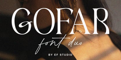
$10.00Gofar is a font duo that combine Serif and Script font. The Gofar Serif font looks contemporary and modern, some letters has unique form. You will also find Gofar Script with ligatures that beautiful to pair with. This font perfect for every project like branding, editorial design, book, logo, website, social media, and any project you like. - Mexican City by Typefactory,
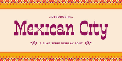
$14.00Mexican City is a slab serif font with western feel. With its neat and beautiful arrangement of letters, this typeface will look outstanding in both formal and non-formal designs. Perfect for headlines or logos, jacket, Porter finds its inspiration in the style of mid-19th century typefaces using generous slab serifs and a hard-working appearance. - Empirez by Almarkha Type,
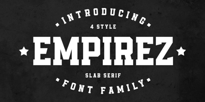
$29.00Introducing A display font that gives you strong and bold typography. Empirez – Slab Serif Family with 4 Style is an adaptation and progression Empirez – Slab Serif Family, giving the user some cool options when creating artwork. This font perfect for both print and digital, in headlines for editorial, posters, banners, websites, apparel, packaging, logos or magazines. Thank’s - Web Serveroff - 100% free
- Romance Fatal Sans - Personal use only
- PR8 Charade - Unknown license
- MACIZA - Personal use only
- Revue by ITC,
$29.99Revue is a display face originally designed for Letraset. The heavy sans serif letterforms of this font are ideal for use in signage, on posters and in advertising display. - Illumini by The Infamous Foundry,
$39.00 - Astagie by Slide Shoot,
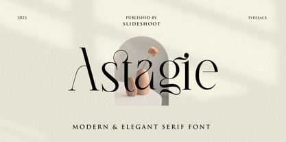
$12.00Astagie Serif is a balanced, smooth, elegant and stylish serif font. It has a beautiful character. It fits perfectly with invitation card designs, company logos, movie titles, movie names, business cards, book titles, brand names and various other designs. Astagie Serif is a subtle serif font that exudes sophistication and elegance. Its stylish alternations and ligatures make this font the perfect partner for any project. FEATURE : - Ligatures - Uppercase and lowercase - Numbering and Punctuation - Works on PC or Mac - Simple Installation - Supports Adobe Illustrator, Adobe Photoshop, Adobe InDesign, also works in Microsoft Word Hope you like it. Thank you. - Town Meeting JNL by Jeff Levine,
$29.00 - Matinee Stencil JNL by Jeff Levine,
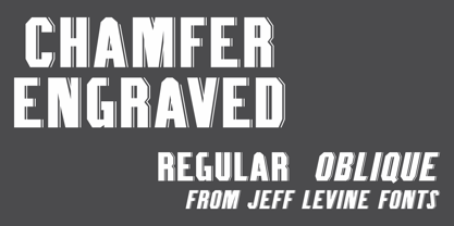
$29.00 - Chamfer Engraved JNL by Jeff Levine,
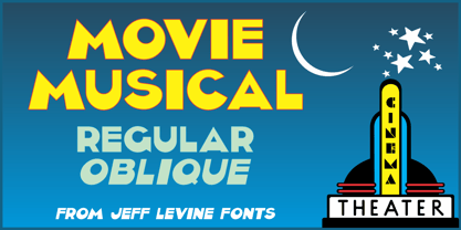
$29.00 - Movie Musical JNL by Jeff Levine,
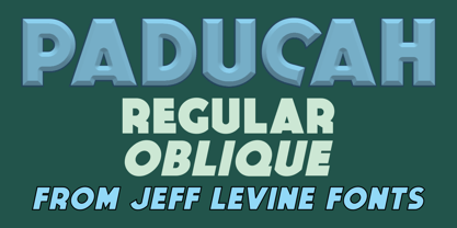
$29.00 - Paducah JNL by Jeff Levine,
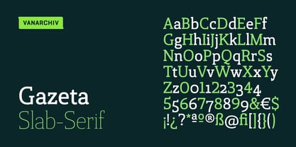
$29.00 - Gazeta Slab by Vanarchiv,
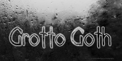
$35.00 - GrottoGoth by Grey Fortress Ent,
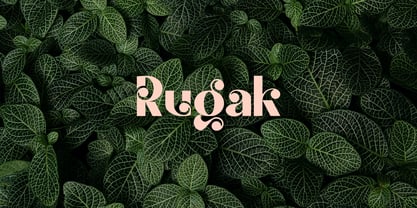
$20.00 - Rugak by Nemelk aka Clément Petit,
$15.00 - Radio Show JNL by Jeff Levine,
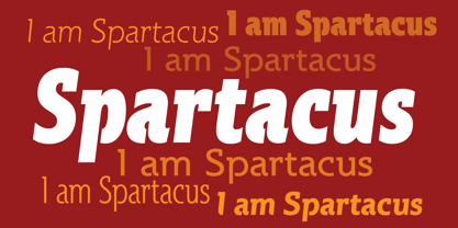
$29.00 - Spartacus by Alan Meeks,
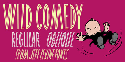
$45.00 - Wild Comedy JNL by Jeff Levine,
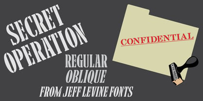
$29.00John Sigvard ‘Ole’ Olsen and Harold Ogden ‘Chic’ Johnson were musicians-turned-comedians who rose to fame in the zany 1938 Broadway musical review “Hellzapoppin'”. They reprised their roles in the 1941 film adaptation of the show, and the opening title card of the film has “Hellzapoppin'” hand lettered in a tall, condensed sans serif design with an inline. This is now available as Wild Comedy JNL in both regular and oblique versions. - SK Pangramma by Shriftovik,
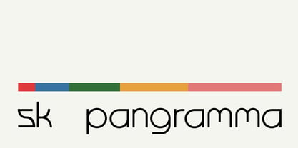
$48.00SK Pangramma is a modern universal geometric typeface. For greater universality, it was developed in two stylistic variations: sans serif and slab serif. The uniqueness of the typeface is supported by stylistic alternatives that give the character set the spirit of modern typeface design. The SK Pangramma typeface is named this way because it supports more than 200 languages, including the Extended Latin Alphabet, Cyrillic, and even Greek. Thanks to a wide range of characters, alternatives, and two stylistic variations, the typeface is great for design projects of any complexity, no matter whether it is printed products or web design. - RoundWhy by Ingrimayne Type,
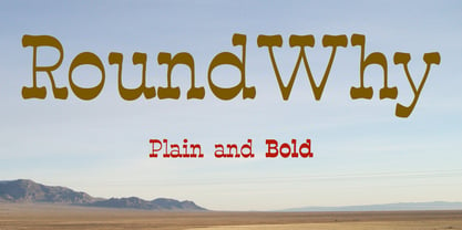
$6.95Font breeding is much like animal breeding, where stallion and mare, or bull and cow, or boar and sow are carefully matched in hopes of yielding a robust and useful offspring. When typefaces RoundUp with fat, rounded serifs and WyomingSpaghetti with fat, squarish serifs were chosen to be parents, it was clear that their offspring would inherit large serifs. But to discover exactly what the offspring would look like, the pairing needed to be consummated, which was done with the “Blend Fonts” commend in Fontographer. The two styles of RoundWhy are the result. - RFX elegant by Xaver Design Studio,
$25.00RFX elegant is an elegant bolder typeface that looks modern and defies previous conventions. Is it a serif typeface? Yes and no. Although it doesn't actually have serifs, the curves give it the elegance of serifs. The curves make it look pleasing and friendly, but the breaks still give it a strong character. It can be used mixed and versal. It is ideal for occasions where friendliness and beauty meet elegance and character. It also offers language support for the entire European region, as well as for North & South America and Oceania. - Areplos by Storm Type Foundry,
$53.00To design a text typeface "at the top with, at the bottom without" serifs was an idea which crossed my mind at the end of the sixties. I started from the fact that what one reads in the Latin alphabet is mainly the upper half of the letters, where good distinguishableness of the individual signs, and therefore, also good legibility, is aided by serifs. The first tests of the design, by which I checked up whether the basic principle could be used also for the then current technology of setting - for double-sign matrices -, were carried out in 1970. During the first half of the seventies I created first the basic design, then also the slanted Roman and the medium types. These drawings were not very successful. My greatest concern during this initial phase was the upper case A. I had to design it in such a way that the basic principle should be adhered to and the new alphabet, at the same time, should not look too complicated. The necessary prerequisite for a design of a new alphabet for double-sign matrices, i.e. to draw each letter of all the three fonts to the same width, did not agree with this typeface. What came to the greatest harm were the two styles used for emphasis: the italics even more than the medium type. That is why I fundamentally remodelled the basic design in 1980. In the course of this work I tried to forget about the previous technological limitations and to respect only the requirements then placed on typefaces intended for photosetting. As a matter of fact, this was not very difficult; this typeface was from the very beginning conceived in such a way as to have a large x-height of lower-case letters and upper serifs that could be joined without any problems in condensed setting. I gave much more thought to the proportional relations of the individual letters, the continuity of their outer and inner silhouettes, than to the requirements of their production. The greatest number of problems arose in the colour balancing of the individual signs, as it was necessary to achieve that the upper half of each letter should have a visual counterbalance in its lower, simpler half. Specifically, this meant to find the correct shape and degree of thickening of the lower parts of the letters. These had to counterbalance the upper parts of the letters emphasized by serifs, yet they should not look too romantic or decorative, for otherwise the typeface might lose its sober character. Also the shape, length and thickness of the upper serifs had to be resolved differently than in the previous design. In the seventies and at the beginning of the eighties a typeface conceived in this way, let alone one intended for setting of common texts in magazines and books, was to all intents and purposes an experiment with an uncertain end. At this time, before typographic postmodernism, it was not the custom to abandon in such typefaces the clear-cut formal categories, let alone to attempt to combine the serif and sans serif principles in a single design. I had already designed the basic, starting, alphabets of lower case and upper case letters with the intention to derive further styles from them, differing in colour and proportions. These fonts were not to serve merely for emphasis in the context of the basic design, but were to function, especially the bold versions, also as independent display alphabets. At this stage of my work it was, for a change, the upper case L that presented the greatest problem. Its lower left part had to counterbalance the symmetrical two-sided serif in the upper half of the letter. The ITC Company submitted this design to text tests, which, in their view, were successful. The director of this company Aaron Burns then invited me to add further styles, in order to create an entire, extensive typeface family. At that time, without the possibility to use a computer and given my other considerable workload, this was a task I could not manage. I tried to come back to this, by then already very large project, several times, but every time some other, at the moment very urgent, work diverted me from it. At the beginning of the nineties several alphabets appeared which were based on the same principle. It seemed to me that to continue working on my semi-finished designs was pointless. They were, therefore, abandoned until the spring of 2005, when František Štorm digitalized the basic design. František gave the typeface the working title Areplos and this name stuck. Then he made me add small capitals and the entire bold type, inducing me at the same time to consider what to do with the italics in order that they might be at least a little italic in character, and not merely slanted Roman alphabets, as was my original intention. In the course of the subsequent summer holidays, when the weather was bad, we met in his little cottage in South Bohemia, between two ponds, and resuscitated this more than twenty-five-years-old typeface. It was like this: We were drinking good tea, František worked on the computer, added accents and some remaining signs, inclined and interpolated, while I was looking over his shoulder. There is hardly any typeface that originated in a more harmonious setting. Solpera, summer 2005 I first encountered this typeface at the exhibition of Contemporary Czech Type Design in 1982. It was there, in the Portheim Summer Palace in Prague, that I, at the age of sixteen, decided to become a typographer. Having no knowledge about the technologies, the rules of construction of an alphabet or about cultural connections, I perceived Jan Solpera's typeface as the acme of excellence. Now, many years after, replete with experience of revitalization of typefaces of both living and deceased Czech type designers, I am able to compare their differing approaches. Jan Solpera put up a fight against the digital technology and exerted creative pressure to counteract my rather loose approach. Jan prepared dozens of fresh pencil drawings on thin sketching paper in which he elaborated in detail all the style-creating elements of the alphabet. I can say with full responsibility that I have never worked on anything as meticulous as the design of the Areplos typeface. I did not invent this name; it is the name of Jan Solpera's miniature publishing house, in which he issued for example an enchanting series of memoirs of a certain shopkeeper of Jindrichuv Hradec. The idea that the publishing house and the typeface might have the same name crossed my mind instinctively as a symbol of the original designation of Areplos - to serve for text setting. What you can see here originated in Trebon and in a cottage outside the village of Domanín - I even wanted to rename my firm to The Trebon Type Foundry. When mists enfold the pond and gloom pervades one's soul, the so-called typographic weather sets in - the time to sit, peer at the monitor and click the mouse, as also our students who were present would attest. Areplos is reminiscent of the essential inspirational period of a whole generation of Czech type designers - of the seventies and eighties, which were, however, at the same time the incubation period of my generation. I believe that this typeface will be received favourably, for it represents the better aspect of the eighties. Today, at the time when the infection by ITC typefaces has not been quite cured yet, it does absolutely no harm to remind ourselves of the high quality and timeless typefaces designed then in this country.In technical terms, this family consists of two times four OpenType designs, with five types of figures, ligatures and small capitals as well as an extensive assortment of both eastern and western diacritics. I can see as a basic text typeface of smaller periodicals and informative job-prints, a typeface usable for posters and programmes of various events, but also for corporate identity. Štorm, summer 2005 - Condell Bio Poster by Letritas,
$5.00Condell Bio Poster is part of the bigger Condell family: a project that involves series of typographies that started to be conceived and developed since 2006. It also includes a bigger legibility version and a sans serif. Condell Bio is very versatile and can be used in the agroindustrial production. Thanks to its strongness and its charm, it can be used in different projects where a short and powerful message is required. For instance in a brand marketing campaign. The Condell project follows in terms of time the design of Comalle (a font also designed by Juan Pablo de Gregorio in 2006), but if we compare them, Condell seems to look for a major range of uses rather than a mere stylistic inspiration. And even if it keeps in its shape some organic forms, Condell seems to be much more similar to a sans serif traditional typography. Condell's fat and soft forms and its nice endings, inspired through spontaneous brush strokes, give it a very peculiar pleasant connotation. Its Italic (10 degrees inclination) have been produced singularly, not automatically calculated by the software. Condell Bio Poster is composed of 2 styles: the regular and the italic. Each one of them have 599 characters and is composed of 206 languages.


