10,000 search results
(0.036 seconds)
- Milgnite by Letterena Studios,
$10.00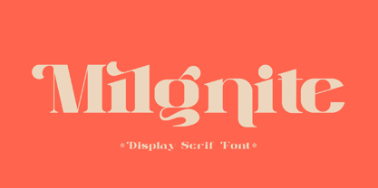 Milgnite is a modern and classic serif font with a unique style and ravishing looks. This typeface is perfect for an elegant & luxury logo, book or movie title design, fashion brand, magazine, clothes, lettering, quotes, and so much more. This font is PUA encoded, which means you can access all of the glyphs and swashes with ease!
 - Qebil by Letterena Studios,
$10.00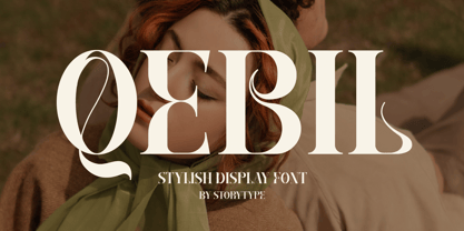 A serif modern and classic typeface that has its own unique style & modern look. This typeface is perfect for an elegant & luxury logo, book or movie title design, fashion brand, magazine, clothes, lettering, quotes, and so much more. This font is PUA encoded which means you can access all of the amazing glyphs and ligatures with ease!
 - Ghakity by Letterena Studios,
$17.00 Ghakity is a modern and classic sans serif font with a unique style and modern look. This typeface is perfect for an elegant & luxury logo, book or movie title design, fashion brand, magazine, clothes, lettering, quotes, and so much more. This font is PUA encoded, which means you can access all of the glyphs and swashes with ease!
 - Fortela Typeface by Letterena Studios,
$17.00 Fortela Typeface is a modern and classic serif font with its own unique style and modern look. This typeface is perfect for an elegant & luxury logo, book or movie title design, fashion brand, magazine, clothes, lettering, quotes, and so much more. This font is PUA encoded, which means you can access all of the glyphs and swashes with ease!
 - Gurland by Sans And Sons,
$19.00 Meet our Gurland - Bold Retro Elegant Serif Font A captivating blend of boldness and timeless charm. This font exudes an elegant, vintage vibe with its strong, distinctive serifs and bold strokes. Perfect for making a statement with a touch of retro sophistication.
 - Home Run by Doyald Young,
$50.00Home Run Script has the formality of 18th-century English roundhands, narrow, tightly fitted and drawn in a very bold weight and inspired by my ITC Eclat font. The x-height is large, and the caps are simply drawn with minimal swashes. Its companion font Home Run Sanscript, sold separately also, has sans serif caps that enable the user to combine script and sanserif caps with the same slope. It has the same lowercase as Home Run Script with a few alternate characters and sans serif lining and Oldstyle figures. Both Young Finesse and Home Run include Richard Isbell’s “interrabang,” appropriately used for statements that are both interrogative and exclamatory. - Holografik by Valley Type,
$17.00 Holografik is a Neo-Grotesk sans serif font inspired by scientific progress, existential wonder, and social oneness. With its wide structure and light airy weights, Holografik is an optimistic take on a Grotesk font. The stark Swiss style of the characters is softened with playful curved details, such as a bowed descender in the lowercase y, connected descenders in the alt lowercase g and y, and the curved bottom serif in the alt uppercase B and D. Featuring three weights and italics, it is ideal for use at larger scales like headlines, packaging, editorial, branding, and posters. Includes punctuation, glyphs, diacritics, numerals, icons, and multilingual support.
 - Bitner by The Northern Block,
$21.90 Bitner is a contemporary styled sans serif font that takes the name from the process of collecting bitcoins ‘bitcoin mining’. The simple, spur-less letterforms with no adornment are a direct influence from the crypto-currency technology and help to give the font a distinct, modern personality. These compact details combined with open apertures provide good readability across body copy. Bitner is a versatile sans serif with charm and geometric quality aimed at the convergence media markets. Details include over 800 characters with alternative lowercase a, e, g and y. 7 variations of numerals, true small caps with accents, manually edited kerning and Opentype features.
 - Big Sur by Mysterylab,
$11.00 Big Sur is a six-width slab serif font family with a unique look. At first glance, it is clearly in the tradition of old west style alphabets, with its chunky top and bottom strokes and serifs. But it also features a whimsical vibe in the curvy and pointed flourishes, the wavy baseline, and the swash terminals on many of the glyphs. It's a true standout with unique identifiers, and is bound to grab the eye as something new and different; yet it's traditional enough to establish a solid Western or vintage Americana style. Great for rodeo, county or state fairs, saloons, pubs & taverns, cowboy gear, and even vintage psychedelic posters.
 - Ecliptica BT by Bitstream,
$50.99Ecliptica is an extended family of five very condensed typefaces in a single bold weight. The creation of Australian designer Robert Bell. Ecliptica has a Sans, a Semi-Serif, a Serif and a single Cursive that can be used with any of the other three styles. As an added bonus, Robert also designed a modern Blackletter companion. The Ecliptica family is an unusual layout of styles and all work equally well with one another. The OpenType versions of the Ecliptica fonts support an extended Latin character set that includes a full array of fractions as well as additional ligatures. The Sans and Cursive fonts contain some cap and lowercase alternates. - Phaistos Disk Glyphs by Deniart Systems,
$25.00 The Phaistos series contains 47 unique characters based on the cryptichieroglyphic symbols depicted on the infamous Phaistos Disk. Measuring approximately 16cm in diameter, the Phaistos Disk was excavated in 1908 at the Minoan palace at Hagia Triada in Crete. The glyphs have not been conclusively deciphered to this day.
 - ZT Yaglo by Khaiuns,
$16.00 ZT Yaglo is a dynamic and expressive display font, from the first impression you may have noticed that this font is a fishing rod-like concept, with a consistent rhythmic curve that gets sharper at the ends. The ZT Yaglo typeface is framed in a sans theme and added a serif feel to produce a bold, geometric typeface in all thicknesses. ZT Yaglo mixes a simple sans style for extra bold serif energy with the feel of calligraphic shapes. The thicker your choice of style, the more striking the flow of changes in shape becomes spiky. ZT Yaglo is a cool alternative for you to create branding projects, Logo designs, Apparel Branding, product packaging, magazine headers or just as a stylish text overlay onto any background image. ZT Yaglo has 9 Styles, 1 Free for Commercial, and one Variable font. each face has 457 glyphs. Includes Standard Ligature, and the "&" character has an alternate letter in each Weight. I hope you have fun using ZT Yaglo. Thanks for using this font ~ Khaiuns X zelowtype
 - Jack Stanislav by deFharo,
$22.00 Very condensed typography, thick line and fun look for headlines and advertising where you are looking for saving space and originality at the same time. The upper inclination of the letters, the combination of horizontal with inclined forms, the ascending and descending short, and the lower elongation of some antlers will allow you to print varied styles with a lot of movement according to the context of the design. I started drawing this font with the intention of creating a new decorative typeface Blackletter style but modernizing the strokes, after drawing several letters imitating the ductus of this type of fonts trying to simplify them, emerged all the DNA of the current Jack Stanislav, finally a retro typography without Serif of linear strokes that mimic the angle of a thick pen. Use the following keys to write the bitcoin symbol and the Jack icon: b #, a #
 - Bandera Text by AndrijType,
$21.00 This serif typeface is a real workhorse. It is a modern tool for text design: extremely legible and well shaped. Bandera Text has six weights with original italics. It catches attention in headlines of posters and magazines or makes reading comfortable in plain texts. Don't forget to try Medium and Medium Italic faces for free. Bandera Text works well with Bandera (slab serif), Osnova (sans serif) and Bandera Display (contrast serif) fonts. Bandera is Spanish for ‘flag’. And Bandera is a symbol of Ukrainian fighting for freedom for many years.
 - Bandera Text Cyrillic by AndrijType,
$21.00 This serif typeface is a real workhorse. It is a modern tool for text design: extremely legible and well shaped. Bandera Text Cyrillic has six weights with original italics. It catches attention in headlines of posters and magazines or makes reading comfortable in plain texts. Don't forget try Medium and Medium Italic faces for free. Bandera Text Cyrillic works well with Bandera Cyrillic (slab serif), Osnova Cyrillic (sans serif) and Bandera Display Cyrillic (contrast serif) fonts. Bandera is Spanish for ‘flag’. And Bandera is a symbol of Ukrainian fighting for freedom for many years.
 - Abbott Old Style by SoftMaker,
$7.99 SoftMaker’s Abbott Old Style is a revival of Joseph W. Phinney’s typeface of the same name, a modified serif typeface. It is charmingly antique and exotic.
 - Otsu Sans by TeGeType,
$- The OTSU SANS family is a new sans-serifs typefaces family based on a geometric design. It can be use for text as for titling applications.
 - Pelago by Adobe,
$35.00Pelago is a semi-formal sans-serif type family by Adobe Principal Designer Robert Slimbach. The family has a crisp contemporary appearance and an understated elegance. - Otsu Slab by TeGeType,
$19.00 The OTSU SLAB family is a new slab-serifs typefaces family based on a geometric design. It can be use for text as for titling applications.
 - Funkywarp by Aah Yes,
$6.95Funkywarp is a simple distorted font, a warped sans-serif typeface. The package contains both OTF and TTF versions - install either OTF or TTF, not both. - Vitali Neue by Borutta Group,
$26.00 Vitali Neue is geometric sans serif typeface family with a friendly feel. The low contrast and high x height is perfect for headlines and display uses.
 - Windlesham Pro by Red Rooster Collection,
$60.00 Windlesham is a more traditional sans serif version of our Guildford typeface. Windlesham contains all the high-end features expected in a quality OpenType Pro font.
 - Knappast by Cercurius,
$19.95 Sans-serif reversed capitals in circles, resembling typewriter keys. The font can be used for logos, signs and labels, and for markings on maps and charts.
 - Retail Monoline JNL by Jeff Levine,
$29.00 Retail Monoline JNL is a light weight sans serif extracted from the inline of Retail Price JNL and is available in both regular and oblique versions.
 - PL Tower by Monotype,
$29.99The original Tower Condensed font design is attributed to Morris Fuller Benton (1934). PL Tower Condensed is a tall, condensed slab serif typeface; good for headlines. - Escritura Hebrew by Vanarchiv,
$21.00 It was my first attempt to drawing a Hebrew alphabet to mach directly with other typeface (Latin) which I already designed. The Latin version is an handwriting display typeface influenced by chancery handwriting from the Italian Renaissance (broad-nib pen). One of the most typographic characteristic is there wavy forms, especially the serifs, where contains some of the main calligraphic references from this font family. The Hebrew script contain reverse contrast, the vertical proportions are more tall and the stroke weight is slightly more strong than latin lowercase to produce a correct visual balance between them, especially on small sizes (text proportions). This Hebrew square book-hand was influenced by Sephardic script style. The Latin characters contains interrupted strokes, the same was made for Hebrew letterforms to transpose correctly the same calligraphic approach between these two different alphabets.
 - Kairos Sans Variable by Monotype,
$314.99 The Kairos™ Sans family melds 19th century wood type design traits from fonts called Grecians with current-as-today sans serif letterforms. The distinctive octagonal corners of the original design are still there, but Kairos Sans has been streamlined through the sensitive shaving of its serifs. Drawn by Terrance Weinzierl to complement his Kairos family, Kairos Sans provides a natural counterpoint sans serif design and stands on its own as a powerful communication tool for everything from two-foot high display copy to the smallest sizes of text content. Kairos Sans is available in 48 styles; 8 weights in three widths, all with matching italics. In addition to a full Latin character set that support most Eastern and Western European languages, it also has the necessary characters to support Greek and Cyrillic scripts. Kairos Variables are font files which are featuring two axis and have a preset instance from Thin to Black and Condensed to Extended.
 - Manche by NamelaType,
$19.00 Introducing our newest font called Manche. is a sans serif font with a geometric feel, The younger brother of Counte, made with the same �blueprint� but this font is developed more from the previous experience of designing Madani fonts. Equipped with 3 types of Width and 9 Weight as well Oblique resulting in 54 font family. This font is designed for the needs of digital printing, text, display and others so that it provides many options for various functions. Available in many languages and opentype features.
 - Galvantur by Ivangard Studios,
$12.00 Galvantur is a sans serif font, suitable for a wide range of applications. The main characteristic of this font is the slightly alien feel it can invoke, allowing it to really appear different and stand out, comparative to what other sans serifs may look like. The multiple styles included can further help customize your designs and projects, whether it's a body of text or an attention grabbing title. For example switching a block of text from regular style to oblique, can drastically change the overall appearance and feel of said text. Comes in 7 different styles - Regular, Oblique, Bold, Bold Oblique, Outlines, Bold Outlines and Oblique Outlines. To get an idea of the various styles, please check out the preview pictures or use the preview field to type in text. A full list of the glyphs included in this font can also be seen in the preview images. Galvantur supports Latin and Cyrillic based languages. The font includes a single alternative character for the letter "h". Because of the lack of ligatures and alternates, the font is rather standardized and will work with any and all software/applications.
 - Dever by insigne,
$24.00 Dever’s brute, industrial lines are rounded up in this new typeface from Jeremy Dooley. Dever combines plenty of inspirations. It’s the flair of the Wild West melded with a shout out to the sign painters and package lettering artists of the 1800s. Dever’s big, bold, and handy frame moves through all three of the family’s strapping members. First is the sans. No doubts on what this brother’s like. Dever Sans is as straight-forward as you’ll find in this family with its four separate weights and numerous distressed options. The second of the kin’s a bit of half-breed, you might say. Pointed serifs bring a sharpness to this outfit. Rounding out the family is Dever Wedge, a bit of wild rodeo all its own. This poke’s a quick draw with any of its 107 font, and with it’s auto-replacing alternates, no two repeating characters are alike. You’re guaranteed a great show anytime Dever leaves the chute. The route to Dever was long, with many a switchback. The Wedge variant was designed first, shelved, then developed into Plathorn. But I wanted to return to those brutish forms and decided to round out the family with a sans, serif and plenty of other options. Any of the Dever family have an extended character set including Central and Eastern European languages. The strong faces have specially adapted sub-families, too, so they’re bound and determined to have an outstanding impact at whatever size you use ‘em. It’s a hard ride ahead corralling all those words. Be sure and add these able-bodied boys to your posse today!
 - Luckywish by Jafar07,
$12.00 Welcome to the world of Luckywish Sans-Serif Handmade Font, a special offering born from hands full of creativity and love. Combining the art of handwriting with the simplicity of a sans-serif, Luckywish font offers a magical script that fulfills all your wishes. Luckywish is a symbol of hope that shines through every stroke found in each character. Crafted with heartfelt dedication, this font showcases the natural beauty of handwriting, bringing warmth and joy to every design composition. Armed with a pen and imagination, Luckywish exudes a unique charm. Its relaxed and delicately intertwined style brings a friendly and inviting ambiance to every formed sentence. When used, this font will infuse happiness and a fresh spirit into every project you undertake. Luckywish is more than just a font; it's a loyal partner to designers, writers, and creators alike. With its sans-serif characteristics, this font is easy to use and suitable for a variety of creative projects, from logo designs to posters, from wedding invitations to company branding. In the palm of your hand, Luckywish offers a perfect balance between boldness and delightful gentleness. Each character is meticulously crafted to provide unparalleled harmony in every usage. It's time to let your hopes and imagination flourish with Luckywish. Let this font bring joy and inspiration into your design world. Get ready to witness your words and messages transform into mesmerizing works of art that capture hearts. Be part of this magical journey with Luckywish. Get the font now and enjoy limitless creativity with an unmatched personal touch.
 - Scastea by Madatype Studio,
$19.00 Scastea is a modern stylish Serif font that will make your designs stand out from the crowd. This font features unique ligatures and alternates that add elegance and flair to your texts. Whether you are looking for a font for fashion and beauty designs, logos, headlines, posters, magazines, or any other creative project, Scastea will give you the perfect look. Scastea is easy to use and customize. You can access the ligatures and alternates through OpenType features or by using a glyphs panel. You can also mix and match the uppercase and lowercase letters to create stunning combinations. Scastea comes with a full set of characters, including numbers, punctuation, symbols, and multilingual support. Scastea is more than just a font. It is a statement of style and sophistication. It is a font that will impress your audience and elevate your brand. It is a font that you will love to use and enjoy. Download Scastea today and discover the beauty of this modern stylish Serif font.
 - Grand Slam SG by Spiece Graphics,
$39.00 Grand Slam is based on an old cardwriting style known as Poster Gothic. This dynamic letterstyle was used in the heyday of the Hollywood movie poster because of its powerful and snappy appeal. The face is of uniform thickness and made as wide as possible without interfering with legibility. Its vertical strokes seem to be thickened slightly where normal serifs would be. It is interesting to note that another group of tiny little serifs populate the entire design. Grand Slam comes with a complete set of alternates including small caps and small figures. A lowercase has been added for greater versatility. Grand Slam is now available in the OpenType format. In addition to small caps, lining figures, oldstyle figures, petite lining figures, and swashes, this expanded OpenType version contains some new stylistic alternates. These advanced features work in current versions of Adobe Creative Suite InDesign, Creative Suite Illustrator, and Quark XPress. Check for OpenType advanced feature support in other applications as it gradually becomes available with upgrades.
 - FS Kim by Fontsmith,
$80.00 Unconventional beauty FS Kim is bold and intriguing – exuberant and unmissable, but playing a supporting role when needed. This typeface shines brightest as a display font, and is perfect for applications across fashion, theatre, cultural projects and pretty much any brand that wants to make a statement. While FS Kim is dramatic, it’s incredibly versatile, too, and works to showcase content in a stylish, striking way. This font makes you look, and makes you curious – perfect for brands and publishers that relish unconventional beauty. A playful text version While FS Kim’s text version is more constrained than the display, the strength and playfulness remain. Modifications for the text version include larger x-heights, longer ascenders and descenders, wider proportions and spacing, longer and more defined serifs and a lower contrast. “The overall idea is that it’s not an optical size,” Radoeva explains. Text and display maintain a strong connection that mean they can be used together. A display with a twist The calligraphic starting point helped to create familiar forms, while a contemporary display feel is achieved through short wedge serifs, with bold touches added through the font’s exaggerated forms and details. FS Kim’s narrow proportions, short ascenders and descenders, and tighter spacing make the font suitably compact for display use. The overall aesthetic feels bold and sharp, but closer inspection reveals that all the corners are softened. Decorative inlines In an unusual twist, FS Kim’s display version was first drawn using a broad-nib pen to create familiar forms and elegance while still breaking from serif traditions and making it all about standout character. There are also two additional styles, based on the Regular and Black with inlines – in uppercase, figures and symbols. The inline brings an extra option for an even stronger, more decorative display use.
 - FS Kim Variable by Fontsmith,
$349.99Unconventional beauty FS Kim is bold and intriguing – exuberant and unmissable, but playing a supporting role when needed. This typeface shines brightest as a display font, and is perfect for applications across fashion, theatre, cultural projects and pretty much any brand that wants to make a statement. While FS Kim is dramatic, it’s incredibly versatile, too, and works to showcase content in a stylish, striking way. This font makes you look, and makes you curious – perfect for brands and publishers that relish unconventional beauty. A playful text version While FS Kim’s text version is more constrained than the display, the strength and playfulness remain. Modifications for the text version include larger x-heights, longer ascenders and descenders, wider proportions and spacing, longer and more defined serifs and a lower contrast. “The overall idea is that it’s not an optical size,” Radoeva explains. Text and display maintain a strong connection that mean they can be used together. A display with a twist The calligraphic starting point helped to create familiar forms, while a contemporary display feel is achieved through short wedge serifs, with bold touches added through the font’s exaggerated forms and details. FS Kim’s narrow proportions, short ascenders and descenders, and tighter spacing make the font suitably compact for display use. The overall aesthetic feels bold and sharp, but closer inspection reveals that all the corners are softened. Decorative inlines In an unusual twist, FS Kim’s display version was first drawn using a broad-nib pen to create familiar forms and elegance while still breaking from serif traditions and making it all about standout character. There are also two additional styles, based on the Regular and Black with inlines – in uppercase, figures and symbols. The inline brings an extra option for an even stronger, more decorative display use. - Joy Of Reading by Typephases,
$25.00The theme in these illustrations is the pleasure of books and reading wherever you are, at any time. This series collects illustrations of people enjoying the pleasure of reading in the most diverse places and situations, some of them frankly absurd and funny, ranging from children reading tales to a witch with her magic brewing manual. A fraction of the contained images comes from other Whimbats, but most of them are exclusive. We hope you will feel like reading and start reading a good book! These illustrations are ready to use at any size and in any application (their vectorial format ensures they can be scaled to any size with no loss of sharpness). They can be used out of the box, or easily customized in any graphics program, adding colour or texture, resizing, combining... the variety of suggested uses is huge, from small spot illustrations to full-page layouts. Use them to great effect in magazine spreads, advertisements, stationery, packaging, bulletins or poster creative designs. - Steravina by Mokatype Studio,
$24.00Steravina is an elegant serif font, inspired by FS Renaissance font for serif form, it has vintage and traditional nuances, but it is still clean, aesthetic, and legible. Steravina Include several alternates and ligatures, suitable for any purpose design, long text or short text, posters, headlines, quotes, paragraph, interfaces, logotype, etc. This font is single-weight only, if you need multi-weight of this font, just tell us! What's you get : Standard glyphs Ligatures (Opentype features) Web Font International Accent Works on PC & Mac Simple installations Accessible in Adobe Illustrator, Adobe Photoshop, Adobe InDesign, and even work on Microsoft Word. PUA Encoded Characters - Fully accessible without additional design software. Fonts include multilingual support Image used: All photographs/pictures/vectors used in the preview are not included, they are intended for illustration only. Thank You - Lakone by Locomotype,
$20.00 Lakone is a modern serif font that brings a touch of sophistication to your designs. With its narrow character and sleek aesthetics, Lakone is the perfect choice for titles and headlines that demand attention. But Lakone offers more than just good looks. With its extensive set of Opentype features, including dozens of ligatures, swashes, and alternatives, this font empowers you to unleash your creativity and elevate your typography game. These features provide you with endless possibilities to customize your designs and add that extra touch of elegance. Stand out from the crowd with Lakone. Whether you're designing a magazine cover, a logo, or a website, this font will captivate your audience and leave a lasting impression. Don't settle for ordinary typography when you can have the allure and versatility of Lakone. Get ready to elevate your design projects and make a bold statement with this modern serif font.
 - DIN Next Slab by Monotype,
$56.99 Now even more design possibilities with the popular DIN Next. With its technical and neutral character, DIN Next has earned a permanent place in contemporary typography. Now, DIN Next Slab expands the font family further, offering new design potential. Now comes the next step, DIN Next Slab, also produced under the direction of Akira Kobayashi. On a team with Sandra Winter and Tom Grace, Kobayashi is creating the new font variant based on the optimized shapes of DIN Next. The expansion will make the popular font all the more flexible and versatile. Apart from that, the geometric slab serifs underline the technical and formal nature of the font and emphasize a central design element of DIN Next. However, the team did have some challenges to overcome. While it is relatively easy to imagine DIN Next Light with slab serifs, the amount of available space quickly disappears when it comes to the Black styles. Winter explains that many tests and trials were necessary to find a compromise between space, letters and the serif shapes. Experiments with modified contrast in the weight or only one-sided serifs were quickly abandoned. The central, technical and powerful character of the font changed too much. Nevertheless, it was necessary to simplify slightly the shape of some letters, such as the ‘k’ or ‘x’, for example. These changes, first developed in the Black styles, were applied to all weights in order to lend the font a consistent appearance. Like DIN Next, DIN Next Slab also has seven weights, which cover the range from Ultralight to Black, each with matching italic. There are various character sets in all of the styles and the four middle weights have small capitals available. DIN Next Slab harmonizes perfectly with the styles of DIN Next: the basic letterforms and weights are identical. Both versions of the font can work together perfectly, not just in headlines and body text, but also within a text; they complement each other very well as design variations. With the new DIN Next Slab, Monotype expands the DIN Next super family consistently. With DIN Next Slab, you can underscore the technical and formal nature of the understated font not only in headlines, but in texts, as well. In this way, you have new and diverse potential for application, thanks to the way the different styles of DIN Next combine perfectly.
 - TT Rationalist by TypeType,
$39.00 Please note! If you need OTF versions of the fonts, just email us at commercial@typetype.org TT Rationalist useful links: Specimen | Graphic presentation | Customization options We thought, "What if we provide the user with a collection of matching fonts, each of which would still be unique?"—and so we started developing TT Rationalist. For those familiar with the bestsellers TT Norms® Pro and TT Commons Pro, the new font will be intuitive to use. It has similar proportions, characteristics and functionality, but yet it is an independent and original font family. Unlike the geometric sans serifs TT Norms® Pro and TT Commons Pro, TT Rationalist is a slab serif typeface. It is functional and original. Slabs are characterized by massive rectangular serifs, but in TT Rationalist they are trapezoidal and refined, which makes them look modern. Speaking of modernity, when creating the typeface, we wanted to avoid the excessive historicism that can be seen in many slab serif fonts. We have been particularly careful working on the Black style, which in the first sketches had something in common with the Wild West posters. When we balanced out the excessive contrast caused by visual compensation, the font stopped evoking retro associations. Now TT Rationalist Black is perfect for headlines, especially on posters and posters, and works great with Light styles in TT Norms® Pro and TT Commons Pro. The new typeface works well for both headings and text arrays. It looks especially aesthetically pleasing in printed production (books, magazines, brochures). The TT Rationalist typeface consists of 22 two styles: 10 upright, 10 real Italics and two variable fonts, each with over 950 glyphs. It supports over 200 languages and contains 27 OpenType features. In addition to the standard ones, there are Small Capitals for Latin and Cyrillic languages, alternative versions of the ampersand and the letter g. The italics have two stylistic sets allowing to switch the design of style-forming characters (k, v, w, y, z) between italic and classical forms. TT Rationalist font field guide including best practices, font pairings and alternatives. FOLLOW US: Instagram | Facebook | Website