10,000 search results
(0.035 seconds)
- Klimaks by Kereatype,
$10.00 Klimaks is a modern serif font family whose design refers to the style of transitional serifs. In the process of working on Klimaks font, we have significantly revised the initial idea and expanded the areas of possible font application, while maintaining the original spirit of the project. Despite a large number of display details, the typeface looks great in small point sizes, and also when it is used in large text arrays. Klimaks - Luxury Serif Font has been crafted from scratch with a structural logic of its own: a fusion of pure geometry and optical balance. By combining a variety of styles Klimaks Font is suitable for Logo, greeting cards, quotes, posters, branding, name card, stationary, design title, blog header, art quote, typography Klimaks - Luxury Serif Font also suitable for art, modern envelope lettering or book design, happening style like the hand-drawn design or watercolor design theme, craft design, any DIY project, book title, wedding font, pop vintage design, or any purpose to make our art/design project look pretty and trendy.
 - Linotype Marcu San by Linotype,
$29.99Marcu San is part of the Take Type Library, which features the winners of Linotype’s International Digital Type Design Contest. Designer Markus McCallion designed his sans serif font with unusual forms based on circles and circle fragments. Legibility is thus decreased for the sake of a unique look and a variety of design possibilities. - Blood Moon by Ardyanatypes,
$20.00 Blood Moon - typeface is a typographic creation that combines unique and captivating elements. Crafted specifically to celebrate the Halloween ambiance, this font carries the aura of a mysterious and thrilling Blood Moon - typeface" With an elegant serif design, the font seamlessly blends sophistication and tension, making it a perfect choice for various design projects.
 - Square Cat by Lalelum,
$12.99 This is a blocky typeface with thick lines and no serifs. It's a modern design with a hint of vintage lettering with a thicker vertical line on one side of each letter. Most letters are square shaped. The two styles are regualar and hollow, with the hollow style having the thicker areas hollowed out.
 - Frankfurter by ITC,
$40.99 Frankfurter font is the work of designer Alan Meeks. The most distinctive feature of this informal, sans serif typeface is its curved or rounded terminals. The letters look best when set closely together. Frankfurter Medium is well-suited to a variety of display applications and comes in four weights, regular, medium, highlight and inline.
 - Radio Actor JNL by Jeff Levine,
$29.00 Bold and squared with rounded corners, the hand lettering found within the November, 1936 issue of Radio Mirror magazine really stands out. This stylized sans serif design, when used in poster displays or headline lettering, is attention-getting and drives the point home. Radio Actor JNL, is available in both regular and oblique versions.
 - Travel Plans JNL by Jeff Levine,
$29.00 A 1930s travel poster from American Airlines had the airline’s name in a classic thick-and-thin Art Deco design of hand lettering. With the addition of angular spurs, some of the characters become semi-serif in nature. This type style is now available as Travel Plans JNL, in both regular and oblique versions.
 - Nimba by Pedroglifos,
$12.00 Inspired by the magic in the clouds, this part paintbrush, part san serif, Nimba is a hybrid display typeface that brings swiftness and joy to any project. Ideal for projects that require a sans type without sacrificing personality. This family contains true italic members, providing a stronger sense of motion and speed. Elegant, yet Vivid, this typeface will make your project stand out from the sans dominated design world.
 - Fonseca by Nasir Udin,
$10.00 Fonseca is a modern sans serif inspired by art deco and typography poster in early 20th century. The key of this all-caps family is simple straight geometric forms and modernized letterforms. This display family is perfect for headlines, posters, logos, branding projects, magazines, and packaging. The modernized retro-look makes this family great to presents any contents related to travel, history & culture in the present/modern way.
 - Helena Handbasket NF by Nick's Fonts,
$10.00The 1888 edtion of James Conner's Sons United States Type Foundry specimen book listed this little gem simply as "Antique Light". Its original, rather anemic outlines have been beefed up and its serifs have been rounded, with the result that this face will get noticed wherever it goes. Both versions of this font include the complete Latin 1252 and CE 1250 character sets, with localization for Romanian and Moldovan. - Kenzox by Canden Meutuah,
$22.00 Serif is a modern serif font packaged in a modern and classy style, complete with access to your OpenType feature to access a large selection of alternative letters and ligatures, the choice of letters you like from various uppercase and lowercase letters for a luxurious impression and elegant appearance. A new elegant serif font that will add a touch of luxury and style to your projects. This is a very versatile font that works well in both large and small sizes. This font is Perfect for branding projects, logo design, clothing branding, packaging, magazine titles, advertisements, t-shirts, postcards, editorials, magazine headlines, product packaging, and displaying masculine and feminine qualities. this is equipped with full uppercase, lowercase, numbers and punctuation + Multi-language support
 - Amiger by Canden Meutuah,
$22.00 Serif is a modern serif font packaged in a modern and classy style, complete with access to your OpenType feature to access a large selection of alternative letters and ligatures, the choice of letters you like from various uppercase and lowercase letters for a luxurious impression and elegant appearance. A new elegant serif font that will add a touch of luxury and style to your projects. This is a very versatile font that works well in both large and small sizes. This font is Perfect for branding projects, logo design, clothing branding, packaging, magazine titles, advertisements, t-shirts, postcards, editorials, magazine headlines, product packaging, and displaying masculine and feminine qualities. this is equipped with full uppercase, lowercase, numbers and punctuation + Multi-language support
 - Yongley by Canden Meutuah,
$15.00 Yongle Serif is a modern serif font packaged in a modern and classy style, complete with access to your OpenType feature to access a large selection of alternative letters and ligatures, the choice of letters you like from various uppercase and lowercase letters for a luxurious impression and elegant appearance. A new elegant serif font that will add a touch of luxury and style to your projects. This is a very versatile font that works well in both large and small sizes. This font is Perfect for branding projects, logo design, clothing branding, packaging, magazine titles, advertisements, t-shirts, postcards, editorials, magazine headlines, product packaging, and displaying masculine and feminine qualities. This is equipped with full uppercase, lowercase, numbers and punctuation + Multi-language support
 - EQuity by Nathatype,
$29.00 Are you looking for a serif font? Do you dream of creating headings that stand out and inspire creativity, imagination, and endless fun? Wait no more, we will give you the best choice. EQuity-A Serif Font EQuity is a modern, luxury, but still authentic serif font. This font is perfect for branding, logos, wedding stationery, cards, gift designs, photography, watermark, product packaging and quotes. You won't get cute, whimsical, funny logos with this font. Only high-end, upscale, sophisticated Branding Design. Our font always includes Multilingual Support to make your branding reach a global audience. Inspire your audience, clients, or guests with this beautiful, statement font. Features: Alternates Ligatures Swashes PUA Encoded Numerals and Punctuation Thank you for downloading premium fonts from Natha Studio
 - Brandy Keita by Canden Meutuah,
$25.00 Serif is a modern serif font packaged in a modern and classy style, complete with access to your OpenType feature to access a large selection of alternative letters and ligatures, the choice of letters you like from various uppercase and lowercase letters for a luxurious impression and elegant appearance. A new elegant serif font that will add a touch of luxury and style to your projects. This is a very versatile font that works well in both large and small sizes. This font is Perfect for branding projects, logo design, clothing branding, packaging, magazine titles, advertisements, t-shirts, postcards, editorials, magazine headlines, product packaging, and displaying masculine and feminine qualities. this is equipped with full uppercase, lowercase, numbers and punctuation + Multi-language support
 - Raiken by Artisticandunique,
$9.00 Raiken - Serif font family - 8 Styles - Multilingual supports Raiken is a stylistic and powerful serif font family with different alternative type designs. You will have the opportunity to enrich the content of your projects with alternative characters. This font comes with multi-language support and 8 styles. It has an elegant structure that can be effective in the development of your projects. According to the purpose of use in typographic compositions that you will create with the aesthetic structure of alternative characters; You can enrich your titles in books or magazines, and your logos in branding. You can take advantage of the elegant structure of standard characters in your plain texts. It provides flexibility in all your projects with the alternatives it offers you with its multi-language option, 8 styles and 441 glyphs. Especially for editorials, magazines, books, branding, logo design, web design, headlines, movie titles etc. If you are looking for a font with stylistic alternatives, Raiken serif font can meet your needs. With this font you can create your unique designs. If you have a question, please contact me. Have a good time.
 - Sugar Pie by Sudtipos,
$79.00 When Candy Script was officially released and in the hands of a few designers, I was in the middle of a three-week trip in North America. After returning to Buenos Aires, I found a few reactions to the font in my inbox. Alongside the congratulatory notes, flattering samples of the face in use, and the inevitable three or four “How do I use it?” emails, one interesting note asked me to consider an italic counterpart. I had experimented with a few different angles during the initial brainstorming of the concept but never really thought of Candy Script as an upright italic character set. A few trials confirmed to me that an italic Candy Script would be a bad idea. However, some of these trials showed conceptual promise of their own, so I decided to pursue them and see where they would go. Initially, it seemed a few changes to the Candy Script forms would work well at angles ranging from 18 to 24 degrees, but as the typeface evolved, I realized all the forms had to be modified considerably for a typeface of this style to work as both a digital font and a true emulation of real hand-lettering. Those were the pre-birth contractions of the idea for this font. I called it Sugar Pie because it has a sweet taste similar to Candy Script, mostly due to its round-to-sharp terminal concept. This in turn echoes the concept of the clean brush scripts found in the different film type processes of late 1960s and early 1970s. While Candy Script’s main visual appeal counts on the loops, swashes, and stroke extensions working within a concept of casual form variation, Sugar Pie is artistically a straightforward packaging typeface. Its many ligatures and alternates are just as visually effective as Candy Script’s but in a subtler and less pronounced fashion. The alternates and ligatures in Sugar Pie offer many nice variations on the main character set. Use them to achieve the right degree of softness you desire for your design. Take a look of the How to use PDF file in our gallery section for inspiration.
 - First March by Nathatype,
$29.00 First March is a captivating display serif font designed with elegance and a touch of modernity. This typeface combines classic serif elements with a contemporary twist, offering a unique and refined look to your creative projects. The elegant letterforms with clean lines and balanced proportions adding a sense of sophistication and grace to your typography. The serif details provide a timeless appeal, while the modern twist brings a fresh and current vibe to the font. This combination creates a harmonious balance between tradition and innovation. What sets First March apart are its swinging endings in select letters. These graceful and subtle flourishes add a touch of dynamism and playfulness to the font, creating an engaging visual experience. The swinging endings bring a sense of movement and fluidity to the letterforms, enhancing the overall elegance of the typeface. Because of its legibility you can use this font in a variation of text sizes. Enjoy the available features here. Features: Ligatures Stylistic Sets Multilingual Supports PUA Encoded Numerals and Punctuations First March fits in headlines, logos, posters, titles, invitations, branding materials, print media, editorial layouts, website headers, and many more. Find out more ways to use this font by taking a look at the font preview. Thanks for purchasing our fonts. Hopefully, you have a great time using our font. Feel free to contact us anytime for further information or when you have trouble with the font. Thanks a lot and happy designing.
 - Sabron by Fontron,
$35.00Sabron Light is a very round font with the thickness at the corners rather than the side as in most typefaces. Serifs are swollen ends coming to a point. - Manufactory JNL by Jeff Levine,
$29.00 Manufactory JNL and its oblique counterpart were re-drawn from examples of a now-antique typeface used within many advertisements found throughout the pages of The American Stationer magazine, circa 1879. The term ‘manufactory’ was popular during this era; the word being a more archaic form of ‘factory’. There is a bit of Western flavor to this type design, as the spurred serifs and the top and bottom strokes are heavier than the vertical and mid-point stroke weights.
 - Minuet by Canada Type,
$24.95 Minuet, an informal script with crossover deco elements giving it an unmistakable 1940s flavor, is a revival and expansion of the Rondo family, the last typeface drawn by Stefan Schlesinger before his death. This family was initially supposed to be a typeface based on the strong, flowing script Schlesinger liked to use in the ads he designed, particularly the ones he did for Van Houten’s cocoa products. But for technical reasons the Lettergieterij Amsterdam mandated the face to be made from unattached letters, rather than the original connected script. Schlesinger and Dooijes finished the lowercase and the first drawings of the uppercase just before Schlesinger was sent to a prison camp in 1942. Dooijes completed the design on his own, and drew the bold according to Schlesigner’s instructions. The typeface family was finished in February of 1944, and Schlesinger was killed in October of that same year. Though he did see and approve the final proofs, he never actually saw his letters in use. It took almost four more years for the Lettergieterij Amsterdam to produce the fonts. The typeface was officially announced in November of 1948, and immediately became a bestseller. By 1966, according to a memo from the foundry, the typeface had become “almost too popular”. This digital version of Schlesigner’s and Dooijes’s work greatly expands on the metal fonts. Both weights include a complete set of lowercase alternates — based on Schlesinger’s own drawings, as well as alternative variations for some of the capitals, a few ligatures, and extended language support covering Western, Eastern and Central European languages, plus Baltic, Celtic/Welsh, Esperanto, Maltese and Turkish. Minuet is available in all popular formats. The OpenType version, Minuet Pro, takes advantage of internal font programming to combine the main and alternate fonts into a single file per weight, making all alternates and ligatures automatically available at the push of a button in OpenType supporting programs.
 - Antique by Storm Type Foundry,
$26.00The concept of the Baroque Roman type face is something which is remote from us. Ungrateful theorists gave Baroque type faces the ill-sounding attribute "Transitional", as if the Baroque Roman type face wilfully diverted from the tradition and at the same time did not manage to mature. This "transition" was originally meant as an intermediate stage between the Aldine/Garamond Roman face of the Renaissance, and its modern counterpart, as represented by Bodoni or Didot. Otherwise there was also a "transition" from a slanted axis of the shadow to a perpendicular one. What a petty detail led to the pejorative designation of Baroque type faces! If a bookseller were to tell his customers that they are about to choose a book which is set in some sort of transitional type face, he would probably go bust. After all, a reader, for his money, would not put up with some typographical experimentation. He wants to read a book without losing his eyesight while doing so. Nevertheless, it was Baroque typography which gave the world the most legible type faces. In those days the craft of punch-cutting was gradually separating itself from that of book-printing, but also from publishing and bookselling. Previously all these activities could be performed by a single person. The punch-cutter, who at that time was already fully occupied with the production of letters, achieved better results than he would have achieved if his creative talents were to be diffused in a printing office or a bookseller's shop. Thus it was possible that for example the printer John Baskerville did not cut a single letter in his entire lifetime, for he used the services of the accomplished punch-cutter John Handy. It became the custom that one type founder supplied type to multiple printing offices, so that the same type faces appeared in various parts of the world. The type face was losing its national character. In the Renaissance period it is still quite easy to distinguish for example a French Roman type face from a Venetian one; in the Baroque period this could be achieved only with great difficulties. Imagination and variety of shapes, which so far have been reserved only to the fine arts, now come into play. Thanks to technological progress, book printers are now able to reproduce hairstrokes and imitate calligraphic type faces. Scripts and elaborate ornaments are no longer the privilege of copper-engravers. Also the appearance of the basic, body design is slowly undergoing a change. The Renaissance canonical stiffness is now replaced with colour and contrast. The page of the book is suddenly darker, its lay-out more varied and its lines more compact. For Baroque type designers made a simple, yet ingenious discovery - they enlarged the x-height and reduced the ascenders to the cap-height. The type face thus became seemingly larger, and hence more legible, but at the same time more economical in composition; the type area was increasing to the detriment of the margins. Paper was expensive, and the aim of all the publishers was, therefore, to sell as many ideas in as small a book block as possible. A narrowed, bold majuscule, designed for use on the title page, appeared for the first time in the Late Baroque period. Also the title page was laid out with the highest possible economy. It comprised as a rule the brief contents of the book and the address of the bookseller, i.e. roughly that which is now placed on the flaps and in the imprint lines. Bold upper-case letters in the first line dramatically give way to the more subtle italics, the third line is highlighted with vermilion; a few words set in lower-case letters are scattered in-between, and then vermilion appears again. Somewhere in the middle there is an ornament, a monogram or an engraving as a kind of climax of the drama, while at the foot of the title-page all this din is quietened by a line with the name of the printer and the year expressed in Roman numerals, set in 8-point body size. Every Baroque title-page could well pass muster as a striking poster. The pride of every book printer was the publication of a type specimen book - a typographical manual. Among these manuals the one published by Fournier stands out - also as regards the selection of the texts for the specimen type matter. It reveals the scope of knowledge and education of the master typographers of that period. The same Fournier established a system of typographical measurement which, revised by Didot, is still used today. Baskerville introduced the smoothing of paper by a hot steel roller, in order that he could print astonishingly sharp letters, etc. ... In other words - Baroque typography deserves anything else but the attribute "transitional". In the first half of the 18th century, besides persons whose names are prominent and well-known up to the present, as was Caslon, there were many type founders who did not manage to publish their manuals or forgot to become famous in some other way. They often imitated the type faces of their more experienced contemporaries, but many of them arrived at a quite strange, even weird originality, which ran completely outside the mainstream of typographical art. The prints from which we have drawn inspiration for these six digital designs come from Paris, Vienna and Prague, from the period around 1750. The transcription of letters in their intact form is our firm principle. Does it mean, therefore, that the task of the digital restorer is to copy meticulously the outline of the letter with all inadequacies of the particular imprint? No. The type face should not to evoke the rustic atmosphere of letterpress after printing, but to analyze the appearance of the punches before they are imprinted. It is also necessary to take account of the size of the type face and to avoid excessive enlargement or reduction. Let us keep in mind that every size requires its own design. The longer we work on the computer where a change in size is child's play, the more we are convinced that the appearance of a letter is tied to its proportions, and therefore, to a fixed size. We are also aware of the fact that the computer is a straightjacket of the type face and that the dictate of mathematical vectors effectively kills any hint of naturalness. That is why we strive to preserve in these six alphabets the numerous anomalies to which later no type designer ever returned due to their obvious eccentricity. Please accept this PostScript study as an attempt (possibly futile, possibly inspirational) to brush up the warm magic of Baroque prints. Hopefully it will give pleasure in today's modern type designer's nihilism. - Maddena by Gold Type,
$12.00 Maddena is a versatile lovely serif font. This font is characterized by a serif style with a luxurious style in the form of a love style, but also has a friendly and playful style in bold,Madden has glyphs to give the crafter more options in designing. This love style will make the design look more classy, elegant, unique and edgy. Maddena is a font suitable for many projects, for modern or even retro vintage designs, branding, logos, crafts, stickers, sublimation, wedding invitations, and more. This font is suitable for a variety of projects such as logos, branding, magazines, signage, fashion, and many more. what you will have: Uppercase and lowercase Numbers and punctuation Multilingual support PUA encoded fonts Alternative styles and ligatures Thank You
 - Motor City by Carmel Type Co.,
$19.00 An industrial strength slab-serif inspired by Detroit itself, Motor City is a heavyweight titan of type that breathes diesel and exudes brawn. Defined by its trapezoidal serifs that were characteristic of many Detroit-centric sign-painters during the dawn of the 20th century, this typeface is a modern adaption of a classic aesthetic. This typeface can be layered with the outline version to add levels of detail quickly and easily making an already strong statement even more powerful and prominent. This uppercase only typeface comes with a set of true small capitals that is certain to add an extra level of style to your next project. Features Include: Over 330 glyphs Uppercase Only Small CapsSupports 75+ Latin Languages OTF files Designed and Developed by Jason Carne
 - Portalica by Letterhend,
$19.00 Introducing our newest typeface called Portalica - A Stylish Italic Serif font. This typeface has many alternates with swashes that can make your lettering / logotype become more interesting. The clean and neat of a serif combined with the swirl swashes makes this font one of a kind! This font perfectly made to be applied especially in logo, and the other various formal forms such as invitations, labels, logos, magazines, books, greeting / wedding cards, packaging, fashion, make up, stationery, novels, labels or any type of advertising purpose. Features : uppercase & lowercase numbers and punctuation multilingual ligatures alternates swashes PUA encoded We highly recommend using a program that supports OpenType features and Glyphs panels like many of Adobe apps and Corel Draw, so you can see and access all Glyph variations.
 - Shalyne Typeface by Krismagraph,
$19.00 Introducing the Shalyne Typeface. This luxury and timeless italic serif is perfectly designed with Ligature & Alternates . can make your lettering/logotype become more attractive. The clean and neat serif combined with the alternate & ligatures makes this font very attractive. This font is perfectly made to be applied especially in logos, and other various formal forms such as invitations, labels, logos, magazine headers, books, greeting/wedding cards, Clothing Branding, product packaging, fashion, makeup, quotes, stationery, novels, cutting, labels and advertising purpose. Features : uppercase & lowercase numbers and punctuation multilingual ligatures stylistic alternates PUA encoded We highly recommend using a program that supports OpenType features and Glyphs panels like many Adobe apps and Corel Draw so that you can see and access all Glyph variations. Thanks & Happy Designing!
 - Amstoven by DYSA Studio,
$19.00 Amstoven is a New Modern Serif Typeface. This another collection of Serif is perfect for your next branding project, excellent for your business. Amstoven have a smooth edges, so this font gives an authentic handcrafted feel style.
 - Elido by Kontour Type,
$50.00 Elido (Odile in reverse) is the sans counterpart to the Odile type. Together they form a sans/serif superfamily with a wide range of variations for editorial use. Elido follows Odile’s proportions and matches the weight and typographic color of its serif twin. Elido is a sans with classical proportions. A slight geometric hint and open counters convey an airy feel. Elido’s family structure and relations within echo the conceptual approach of Odile. The arched stroke low off the stem reveals a script characteristic most pronounced in the Elido Upright Italic. This particular interpretation is gradually diminished in the Italic and becomes even less emphasized in the Regular. Six balanced weights, from an elegant Light to a pronounced Black, are in tune with three display solutions and a set of beautiful Ornaments. These variants allow for a diverse and multifaceted typography for the discerning type user. Sans serif initials amount to a rare finding. The charming monolinear Elido Initials come in two flavors, elaborate and rational, designed to hold their own in editorial and headline sizes. This type design boasts an extensive character set, many OpenType features including roman and italic Small Caps, five sets of numerals, beautiful ligatures, and many more. OT stylistic variants (with accents) offer a one-story “a” for the roman weights, alternate “g” and “s” designs for the italics, and a variant glyph “s” for the Upright Italic. These distinct qualities with its versatile and sincere traits make Elido an excellent choice for text and display use.
 - Ninfa by dooType,
$34.90 Ninfa is a modern semi-serif, characterized by the search for a personal dash with calligraphic influences. The result is a font with unique features.
 - Skeleton Antique by Wooden Type Fonts,
$15.00 A revival of one of the popular wooden type fonts of the 19th century. Suitable for text, a narrow, thin Antique, with flat unbracketed serifs.
 - French Semi by Wooden Type Fonts,
$20.00A revival of one of the popular wooden type fonts of the 19th century, condensed, bold, flat thick serifs, a very useful design for display. - Grecian XX by Wooden Type Fonts,
$15.00A revival of one of the popular wooden type fonts of the 19th century, suitable for display, geometric slab serifs unbracketed, short descenders, very condensed. - Modesfa by Almarkha Type,
$33.00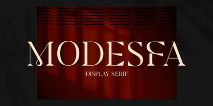 Introducing Modesfa – Modern Display Serif inspired by the famous minimalist logo perfect for the purposes of designing templates, brochures, videos, advertising branding, logos and more.
 - Luxoorea by Almarkha Type,
$25.00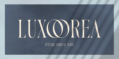 Introducing Luxoorea – Stylish Display Serif inspired by the famous minimalist logo perfect for the purposes of designing templates, brochures, videos, advertising branding, logos and more.
 - Delaproza by Almarkha Type,
$29.00 Introducing Delaproza – Modern Serif font inspired by the famous minimalist logo perfect for the purposes of designing templates, brochures, videos, advertising branding, logos and more.
 - Coupon Clipper JNL by Jeff Levine,
$29.00Coupon Clipper JNL is a fun, playful, casual sans serif font that evokes some of the lighthearted typography of the late 50s and early 60s. - Latin by Wooden Type Fonts,
$15.00 A revival of one of the popular wooden type fonts of the 19th century, suitable for text or display, short ascenders and descenders, serifs triangular.
 - Grecian by Wooden Type Fonts,
$15.00 A revival of one of the popular wooden type fonts of the 19th century, suitable for display, geometric slab serifs unbracketed, short descenders, very condensed.
 - Sangira by Almarkha Type,
$29.00 Introducing Sangira - Modern Ligature Serif inspired by the famous minimalist logo, perfect for the purposes of designing templates, brochures, videos, advertising branding, logos and more.
 - Glamorez by Almarkha Type,
$35.00 Introducing Glamorez - Luxury Display Serif inspired by the famous minimalist logo perfect for the purposes of designing templates, brochures, videos, advertising branding, logos and more.