10,000 search results
(0.135 seconds)
- ITC Golden Type by ITC,
$29.99 Canadian designer Anthony De Meester created the font in 1989. Vienna Extended is a light, elegant sans serif. Simplicity is the hallmark of Vienna and it can be used most effectively where a look of regal elegance is desired. Vienna is a trademark of International Typeface Corporation.
 - Metalmark Stencil JNL by Jeff Levine,
$29.00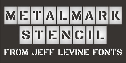 A lot of interesting variations in lettering style can be found in sets of antique tin or brass marking stencils. One such set was the model for Metalmark Stencil JNL, a bold sans with a chamfered look.
 - Party Doodles Too by Outside the Line,
$19.00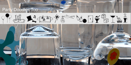 Party Doodles Too is the companion font to the popular font Party Doodles. 29 fun icons including a tray of champagne glasses, appetizers, balloons, pinwheel, stork with a baby, ace of hearts playing card, top hat and tunes, dice, bowling ball and pins, gifts, party umbrellas, cakes, cupcakes, ice cream, lollipop, drinks, corkscrew, noise makers, banners and candy.
 - Penta Rounded by Wiescher Design,
$29.00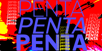 This is the rounded version of Penta! »Penta« is a new Sans typeface, designed in the American tradition with contrast between the up- and downstrokes. The contrast is hardly visible on the »thin« cut, but the heavier the weights get, the more contrast becomes visible. That makes this font very useful, almost linear in the lighter weights and very distinct rhythm in the heavier ones. »Penta« is extremly versatile, it can be used for bodycopy in the lighter weights and for heavy headlines.
 - Davison Spencerian by House Industries,
$33.00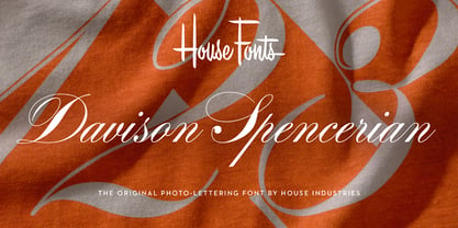 As one of the most distinguished lettering artists of the 20th century, Meyer “Dave” Davison’s greatest contribution to the American visual landscape is arguably Davison Spencerian. The alphabet made its first appearance in Photo-Lettering’s 1946 catalog and remains a benchmark of the ornamental script genre. Thanks to the skillful hands of Mitja Miklavčič and the tireless eyes of House Industries designers Ben Barber and Ken Kiel, we have preserved the poise and precision of Davison’s masterwork in this faithfully-rendered digital incarnation. From automotive exhaust accessories and pirate-themed wedding invites to New Orleans sissy bounce hip-hop CD covers and upmarket bivalve ambrosia packaging, Davison Spencerian offers sober sophistication and unparalleled flexibility. DAVISON SPENCERIAN CREDITS: Typeface Design: Meyer “Dave” Davison Typeface Digitization: Mitja Miklavčič Typeface Direction: Ben Kiel and Ken Barber Like all good subversives, House Industries hides in plain sight while amplifying the look, feel and style of the world’s most interesting brands, products and people. Based in Delaware, visually influencing the world.
 - Unione GX by TOMO Fonts,
$32.00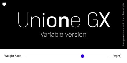 UnioneGX by TOMO FONTS is the variable version of Unione. A clean and modern sans-serif type family with a geometric touch. It has a single axes (Weight / Wgth) that you can control with a slider on Desktop apps or you can use it for the web, dramatically reducing file size for your web project. It's like magic! but no. If you want to learn more about variable fonts, please click here or if your are interested in web context read here. Geometric and modern Sans-Serif VARIABLE FONT! This means, you control the weight! 1000+ glyphs per font. Latin Plus support, Extended Latin Cyrillic support, Basic & Extended Fractions Circled Numerals & Letters Lots of Stylistic Alternates Interested in Unione 'static' family? Check it here
 - Shibuya Dancefloor by Megami Studios,
$10.00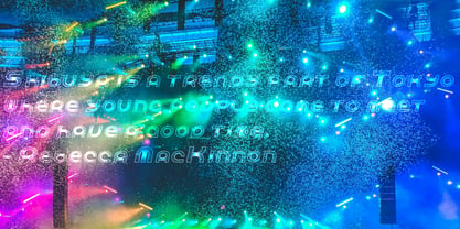 Inspired by Rob’s years of living in Japan, Shibuya Dancefloor is an expanded version of an earlier font that we did, adding hiragana and katakana to the mix. It's perfect for anime artwork, sci-fi lettering or even just making flyers for that party you're planning down in Roppongi!
 - Dezaru Faux by Twinletter,
$15.00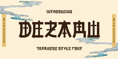 DEZARU is a fictitious Japanese display font created by combining Japanese letters with well-known and understood san serif fonts from throughout the world. Imagine all promotional materials can be understood and understood by all audiences in various parts of the world, your message will reach the hearts of the audience, and your brand will be very easy to remember by many people because the display of this font is contemporary and different from the others. Logotypes, food banners, branding, brochure, posters, movie titles, book titles, quotes, and more may all benefit from this font. Of course, using this font in your various design projects will make them excellent and outstanding; many viewers are drawn to the striking and unusual graphic display. Start utilizing this typeface in your projects to make them stand out.
 - Afri by Krown Creative Factory,
$15.00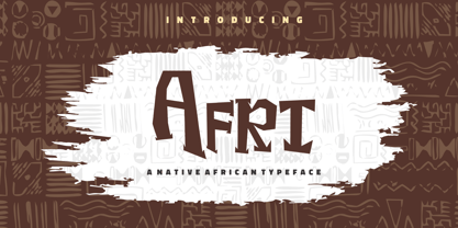 Afri is a funky Native typeface which in a way could be considered as a serif it features edged and freely expressed glyphs. It can be used to create a range of design projects like posters, advertising and marketing flyers and even to printed items. It just requires you to use your imaginative strength and your design projects will look more native and even better pass your message. With this typeface you can create a party poster, movie flyer, advertising and marketing posters, it can also be used on branding items, Native craft design, book covers, music cover arts, or any purpose of your choice to make your designs look African but not too tribal, feel free to play with this typeface.
 - Callingstone by Heinzel Std,
$12.00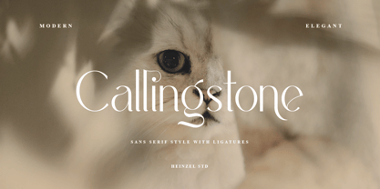 Callingstone is an elegant and modern sans serif font. Fall for its ravishing style and use it to create gorgeous wedding invitations, beautiful stationary art, eye-catching social media posts, and much more! This font is PUA encoded which means you can access all of the amazing glyphs and ligature with ease! Features : Callingstone Regular, sans serif font All Caps, Numerals and more punctuations. Multilingual support for various languages Open Type Format
 - Tenement JNL by Jeff Levine,
$29.00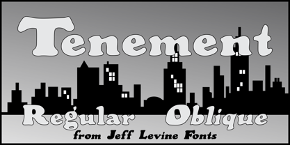 A 1916 book entitled “Lettering” by Thomas Woods Stevens features a number of hand lettered alphabets; some plain, others unique. One of the more novel examples was designed by Harry Lawrence Gage and featured letters and numbers with a crude, wavy style described in the book as “adapted to wood block and linoleum cutting”. To keep the design as close to the original as possible, the image from the book page was auto-traced, with each character given just enough of a clean-up as to retain its own quirkiness while smoothing out any jagged lines and fixing some curves. From there, other necessary characters were created for the digital font, and the end result is Tenement JNL, which is available in both regular and oblique versions.
 - Tin Doghouse - Unknown license

- Beta Dance - Unknown license

- FS Silas Slab by Fontsmith,
$80.00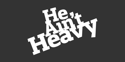 Slab-like sibling Why stop at sans? Rather than leave FS Silas Sans as an only child, the team wanted to extend the family, and create a complete system for brands and editorial. Unsure what the result would be, the team started experimenting with a slab serif version. ‘We didn’t know how it would turn out, but we really liked it and wanted to take it further. A fresh angle ‘We stuck with the angular theme of the sans by drawing angled slab serifs,’ says Phil Garnham, ‘as opposed to the square serifs that slab fonts usually have. That created an inner dynamism in words and sentences on the page, and a very distinctive, crafted character, like a Victorian soul in a contemporary body.’ These crafted touches include details such as the angled ascenders on the ‘i’ and ‘l’, while characters such as the ‘y’, with its abruptly-ending descender, add a mark of distinction. A perfect pair Silas Slab, like its sibling, offers a clear-cut range of five weights, from the elegant Thin to the monumental ExtraBold. Put it together with Silas Sans and you have the full complement, capable of performing the full range of tasks, above the line and below, in headlines, body copy and logotypes, B2B and B2C. Keep them together; they don’t like it when they’re apart.
 - Fransk Nougat by Bogstav,
$18.00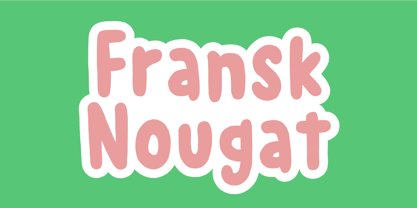 Let me tell you a secret: This font has got absolutely nothing to do with nougat or France. I just love nougat, and I actually ate some while finishing this font! My wife is a good at making cakes, and lucky for me is that she too adores nougat - that way I often get delicious cakes with nougat :) Well, back to the font - a handmade rounded sans-serif, comic, organic, all-purpose with a playful attitude. Goes very well in both UPPERCASE and lowercase. I'd say you can use this for pretty much anything, but categories such as organic, packaging, kids product or sweets come in mind!
 - Aurelux by Andfonts,
$16.00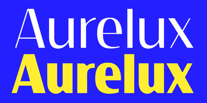 Just imagine, You are searching for the font that should be modern and elegant at the same time, which is not possible with typical sans or serif fonts. So, Aurelux is what You need. This font in your library can be with you for decades, because it is useful and It's open border to create graphic designs that require "modern but elegant touch". : cafe, bar, theatre, spa, hotels, overall entertainment industry, travel, vintage, retro signs. Font is gender neutral. But, when You see Bold and black styles You understand that this font can be in the design of some industrial companies, factories, construction companies that want to show that they have history and heritage. You can contact me if You need questions: andfontscontact@gmail.com
 - Lunar Modular by Comicraft,
$19.00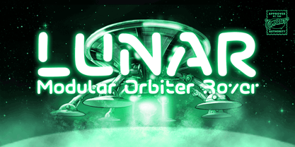 TOUCHDOWN! This is not a Hoax, not a What If, not an Imaginary Font! The Eagle has Landed... Comicraft's latest manned mission: Space Age Faces for Space Age Spaces! Our Apollo Modules have settled in the moondust and our Astronauts are buckled up in the Rover collecting little rocks and looking for suitable spots to play golf. We invested billions and billions of dollars to send these fonts into space using the largest and most powerful rockets ever built, and rest assured, our Orbiter is coated with a phenolic epoxy resin ablative heatshield to protect you for your journey back to Earth. Features: Six fonts (Modular, Modular-Bold, Orbiter, Orbiter-Bold, Rover, Rover-Bold) with upper and lower case characters. Opentype version of Orbiter also includes 52 auto-ligatures.
 - Rogy by Adam Fathony,
$14.00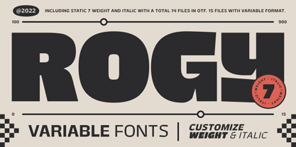 Rogy, A Display Typefaces with Variable Weight and Italic. Rogy is a modern variable font. Basically this is a Sans with rigidity and squared look yet very legible with various width and italic that you can explore, combine, create and help you designing something. The Bolder the Stronger. it has define Rogy, it's Bold, Strong and the italic version of this fonts are very good for Sports design.
 - Daymore by Rillatype,
$15.00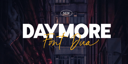 Introducing, Daymore Font duo! Daymore is a duo font that complements each other. By using Daymore, you can simply use one font family without thinking about other fonts to complete the design you need. In the process of making this font, I was careful in choosing what font concept would be able to complement a bold sans serif font so that it could be balanced so that it would produce a blend of firm and strong sans serif fonts, as well as handwritten fonts that flowed naturally. The Daymore font duo is perfect for use as wedding invitations, branding, logos, etc.
 - Lined by Oscar Pastarus,
$18.00The Lined font started out with some scribbles - playing with lines and making shapes fold, underlap and overlap, eventually evolving into letters. This is a display/ornamental font and it was made in 2009, it's meant for decorative use and not in large bodies of text. For example it does well used as a headline font. It is proportionally spaced and uppercase only. - Scion by Type Innovations,
$39.00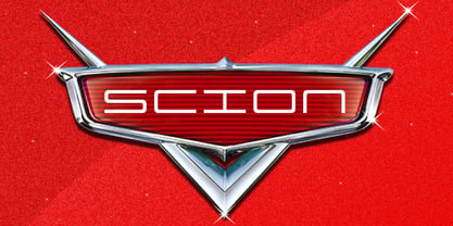 ‘Scion’ is an original design by Alex Kaczun. The inspiration for the typeface came from the Toyota SCION logo, which bears its name. In Alex’s own words, "I loved the simplicity, proportions and hi-tech look of the logo and decided to create an entire new design series based on its unique look". The fonts come in five flavors: thin, light, regular, bold and black. All the font weights were designed systematically on tabular widths so that the user can make adjustments to overall type color without changing the line length. In addition, Alex Kaczun has provided us with several alternate glyph substitions to further enhance the overall appeal of this contemporary new design. The large Pro font character set, which supports most Central European and many Eastern European languages, makes this typeface series ideally suited for display copy as well as text composition. In the near future, Alex plans to include a narrow, compressed and ultra expanded, along with true-drawn italic variations to further expand the possibilities of this great new display series.
 - Brilliant Grunge by Java Pep,
$17.00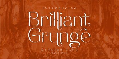 Introducing stylish modern sans serif font. The font builds with many stylistic alternates for forming beauty stylish sans. The font is called Brilliant Grunge font, every glyph or letter builds with more than 3 alternates sets for access to the alternate font you must use compatible software like Adobe Illustrator, Adobe Photoshop, Corel, Affinity, Procreate, Inkscape 01. or the newest and etc. If you are not using compatible software you can use and Install character maps software you can see the tutorial https://www.youtube.com/watch?v=KV7n5nxmsLs .
 - Narrow Path by Ingrimayne Type,
$9.00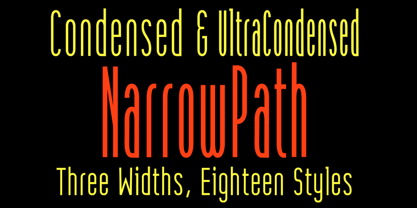 NarrowPath is a family of 18 condensed and ultra-condensed sans-serif typefaces. The family was derived from the font family NarrowWay by adding true lower-case letters. Some alternative letters forms can be reached with the OpenType feature of stylistic sets. The character spacing in most of the styles is quite loose and it can be tightened with an application's character spacing if needed. These typefaces are display faces that can be useful for squeezing tall lettering into tight spaces. Uses may include packaging, signage, and titles.
 - Morl by Typesketchbook,
$55.00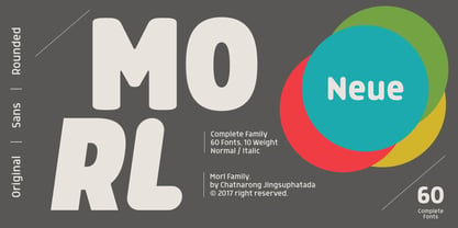 Developed from condensed san serif families of the 90’s to 00’s, Morl brings together the distinctive features of the time but presented in a simpler design. Its potential is increased with Original, Sans, and Rounded options which offer varied moods. Suitable for publications, web and product designs, Morl can fit either headlines or body. It’s also effectively supported in various devices. The family comes in 10 weights, making it available to use for your required tasks in 60 styles.
 - Hogfish by PizzaDude.dk,
$20.00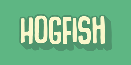 Hogfish comes with contextual alternates that cycles as you type! 6 different versions of each letter for you to play around with!
 - Design System by Dharma Type,
$14.99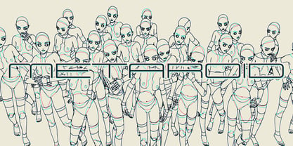 Design System is a great type system consisted of 5X7X2=70 font styles from 70s-style simple square sans to the widest style of all time that are best for titles, logo and text. Their simple form does not limit the target of design and can be used for any creative work. Additionally they all have been designed not to provide a feeling of strangeness when they are used in mixture each others.
 - Cíclope by Andinistas,
$19.95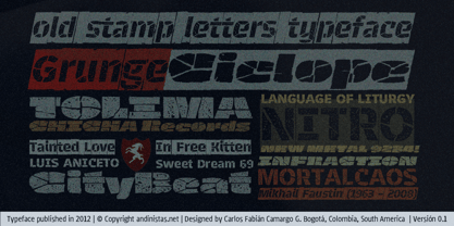 Cíclope is a typeface family designed by Carlos Fabián Camargo in 2012 and used to write the headlines. Its idea is based on an army of stone soldiers that with their size and strength cause earthquakes. Under this concept he obtained stencil and sans serif letters with monstrous shapes and torn counterforms. Its usefulness as well as readability consists in imitate rocks with scars and cracks. For that reason, Cíclope family has three sizes, each with their respective italics distributed at different levels of corrosion. In addition, each file contains 260 glyphs useful for designing words and phrases with systematically eroded treatments for advertisement material. Thus Cíclope works as a raw material in the exploration of new graphic design. Finally, Cíclope concept has grotesque, geometric and humanistics letters roots that seem disastrous but each and every detail has been planned with high definition drawing. Most importantly, it expresses a big amount of grunge style with cracked edges and medium contrast between thin and thick strokes. In that sense, the writing seems impaired and special for design of logos, posters, flyers, brochures and worn, crusty or demolished graphic design.
 - Boundar by Huruforia,
$8.00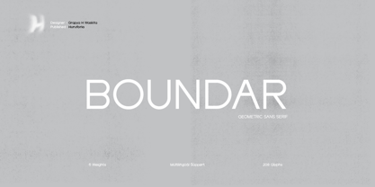 Boundar is a sans serif font with a Geometric style, this font consists of 6 Weights and 208 Glyph. Boundar is taken from the Indonesian word "Bundar" which means circle because in this font there are so many circle elements in the manufacturing process. And I (Grapya) as the designer in this font hope, Boundar Typeface can be useful for you. If there is an error or anything that is less pleasing, you can contact us via our email, we will be happy to receive a review from you so that my team and I can be better in the future. and please note that every font that we upload in front of your monitor screen must have been tested by the curator of MyFonts. Thank You, Grapya & Suratoria Team
 - Cabarno by Katatrad,
$39.00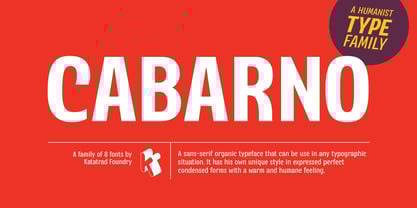 Cabarno is a sans-serif organic typeface that can be use in any typographic situation. It has his own unique style in expressed perfect condensed forms with a warm and humane feeling. This font can function as headings, subheadings and body text with a set of alternative characters for your design in any layout. The family has 4 weights ranging from Light to Black and their italic.
 - Markisa by Showup! Typefoundry,
$34.00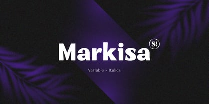 Markisa is a simple, cool, and dynamic Humanist-flavored Sans Serif type family. It consists of eighteen weights from Thin to Black in both Upright and Italic styles. The resilient yet robust typeface. A san-serif with a humanist touch, a steady combination of seriousness and merriment. Works well as texture in small sizes, while at the same time claiming its space on the display. With its distinctive characteristic, can catch anyone’s attention wherever and whenever.
 - Newsbreaker JNL by Jeff Levine,
$29.00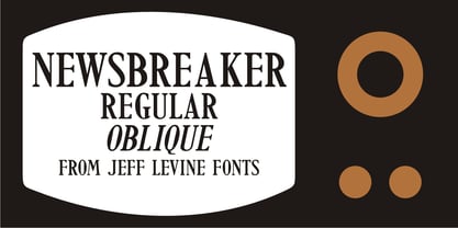 Based on scans of some 1906 newspaper headlines detailing the devastation of the San Francisco earthquake, Newsbreaker JNL is a modern take on vintage typography. With a few letterform characteristics somewhat reminiscent of DeVinne, this typeface was perfect in its day for expressing news headlines - and it holds up just as well today for titling or banner ad copy. Available in regular and oblique versions.
 - Wonder Brush by Canada Type,
$29.95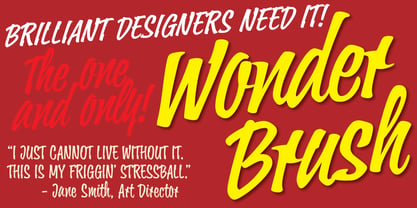 Wonder Brush is a display typographer's guilty pleasure. It's one of very few fonts ever made that can take intense abuse and still look natural. Partly based on a 1969 Friedrich Poppl design called Poppl Stretto, but considerably fused with ideas found in interwar magazine ad lettering and signage, Wonder Brush caters to the idea that most graphic designers would rather use design elements they can enjoy. When you spend your days being "challenged" and "creatively tested" and "communicating the message," you can definitely use a little bit of playtime. And this font gives you just that, playtime on the job. Wonder Brush appears to be a straightforward narrow upright brush script. But it really is made of malleable rubber. Take it into a program like Adobe Illustrator, set something, stretch or squeeze, shear or warp, slant or transform… just play with it like they used to do in the 70s and 80s. You will soon discover that this font really is a big old top hat, and it's up to you and your mischief to pull rabbits or geese out of it. A single font that allows you to emphasize content or manage space mechanically without affecting the integrity of the type setting. And if your playtime includes fiddling with OpenType features, you're in for a bonus treat: Wonder Brush comes with over 800 characters, including a lot of alternates and extended language support. So tweak away until your eyes cry with joy. The only rules are the ones you set, and even those are meant to be broken.
 - Luminaire by Muksal Creatives,
$17.00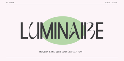 Luminaire is an intriguing and modern sans serif font. With its clean and minimalist characteristics, Luminaire exudes a professional and contemporary impression when used in designs. One of the captivating features of Luminaire is its alternate style, specifically the display style. This unique feature allows users to combine two different styles within a single word, creating a distinct and eye-catching visual appearance. In display mode, Luminaire offers experimental and striking variations of letterforms. Certain characters exhibit alternative shapes with artistic touches, such as curved lines or changes in the basic structure of the letters. This grants greater design flexibility and makes words written in Luminaire font stand out. Luminaire also maintains the essential aspects of clarity and legibility expected from a sans serif font. When used in longer texts or paragraphs, this font remains easy to read and provides a professional and well-organized appearance.Overall, Luminaire is an appealing sans serif font with a modern style and a unique alternate style feature. It can add artistic touches and uniqueness to your designs while preserving the important aspects of clarity and legibility.
 - Nolan by Kastelov,
$55.00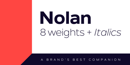 The idea behind Nolan is to create emotional response due to its inviting character and legibility. It is ideal for headlines, presentations, product signage and bespoke logotypes. Due to the structure of the letters, Nolan can also stand its ground in body text, although this is not its primary purpose. Nolan is created slightly wider than what is to be expected from a typical sans font, yet not to the point of being considered a wide typeface. This uniqueness lends the family an air of originality while adhering to already established standards in the creation of contemporary sans typefaces. Nolan has a large x-height, so as to deliver a better punch and be legible at a glance . Its clean and modern lines are reminiscent of architectural aesthetic.
 - Sleepy Bear by Missy Meyer,
$12.00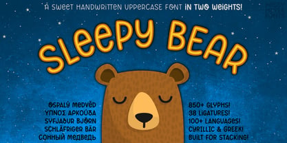 I've been learning to read Cyrillic and Greek letters lately, mainly because I've been playing the game GeoGuessr. (If you haven't played it, I highly recommend! It plops you down somewhere in the world in Google Street View, and you have to figure out where you are.) Cyrillic shows up in so many more places than Russia! You can see it in Bulgaria, Mongolia, Serbia, Montenegro, Kyrgyzstan, and more. Because of that, I made sure to include a fun double-uppercase version of those alphabet sets in Sleepy Bear. They're styled the same way as the Latin characters: all uppercase height, with some lowercase-styled letters thrown in at that same height for a fun look for all ages. I've also made two weights of Sleepy Bear: a plump and smooth regular weight, and a lighter weight that's built to stack on top of the regular (though you can use it on its own). Just type out a word in Sleepy Bear, copy it, and then change the copy to Sleepy Bear Light. You'll get a great outline look in seconds! All characters are extensively cleaned up, with smooth curves and rounded ends. Sleepy Bear is great for all print projects, and also cuts out of all materials like a dream. It's a cute and quirky monoline font family that's great for all of your family's designs. Each font contains over 850 glyphs, and includes: - Latin and extended Latin characters to support over 100 languages; - Cyrillic and Greek double-uppercase alphabet sets; - 18 fractions; - Punctuation galore; - 38 double-letter ligatures for variety (including international pairs like KK and II); - And a half-dozen alternates for even more variety!
 - Claudio by Motokiwo,
$17.00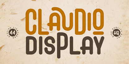 Smooth but crazy wilder, say hello to Claudio! The coolest display font with more than 40 stylish ligatures. As an all caps sans serif, Claudio has different vertical size between uppercase and lowercase. You can mix them to create something wild and eye- catching typography on your work. Claudio is flexible font that can be used for classic retro or vintage project and also great for another modern projects with fresh and colorful design. It's give you all control to use Claudio in any style you need. Features: Uppercase (a taller version) Lowercase Numeral and Punctuations 44 Ligatures Multilingual Supports (AÀÁÂÃÄÅÇEÈÉÊËIÌÍÎÏNÑOØÒÓÔÕÖŠUÙÜÚÛÝŸŽÆŒß) PUA Encoded
 - Melancholia by Barnbrook Fonts,
$75.00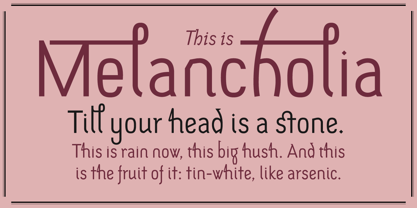 Melancholia is a subtle and beautiful sans-serif inspired by calligraphic letterforms. The name describes a feeling of deep sadness, an intense sensitivity to the world. The design of Melancholia is an attempt to introduce some of that wistfulness into the sans-serif form, a typographic classification that is often characterised by an austere functionality. Melancholia includes a set of true italics influenced by old-style serif italics, such as those found in Claude Garamond’s eponymous typeface, as well as a set of stylistic alternates and calligraphic-style swash characters.
 - Carnova by Typotheticals,
$4.00This is a standard, plain face with no special distinguishing features. It was created over a period of four months for use in small text in a cartographer package. While the face was extremely suitable for the purpose it was designed for, the party who was to purchase the family outright decided upon another design, allowing me to offer it up for sale. The original design for this face is nothing new, and has been greatly influenced by many others already in existence. It was not intended to be flashy, nor eye-catching, and I believe I have managed to escape any individuality that could have affected the face. It displays well in the lower text sizes, and, in my own opinion, displays some characters more clearly than some other similar faces that are currently in use (not all, some). While individuality makes a typeface stand out from all the others, this style of design would have been compromised with it. - Katastrofe by PizzaDude.dk,
$20.00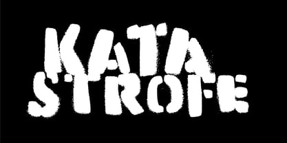 Katastrofe is danish for … well, catastrophe - you may have guessed that! This font was almost a catastrophe to make! I cut out all the letters in a cardboard, and went outside to spray the letters with a spraycan. Everything went smooth as planned, but suddenly the wind started to blow and the papers started to fly away! Luckily I found some stones I used to make the papers stay in place. Lucky for me - otherwise it would have been a catastrophe! Seconds after finishing this font project, it started to rain…I just avoided a catastrophe! But is this font really a catastrophe, or does it just mimic punk/spray/grunge/riot? Make your own statements using Katastrofe, or perhaps your very own punk sayings like “Punk is not dead”, “Anarchy Rebel” or what suits you the best. Whatever you choose to write, you will definitely get that real punk look! Perhaps you could even do a t-shirt print that says “Katastrofe” :) Comes with different upper and lowercase letters along with alternate versions of each letter - and of course a lot of foreign letters, because punk is not dead and punk is universal!
 - Mixcoatl Mono by URW Type Foundry,
$19.99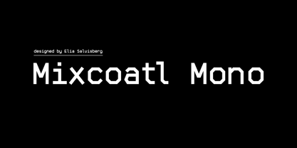 The Typeface «Mixcoatl» by Elia Salvisberg was developed as a part of a course at the Lucerne School of Design and Art in 2016. Based on the book «The Empire of the Inca», a display-font has been created, which is inspired by the graphic language of the South American Empire of the Incas. At the beginning, only capital letters were designed but there was the desire for a complete typeface – which is why the missing signs were added. The font is based on a grid, so the characters are constructed equivalently and a uniform geometric font arose. The name was adopted from the god of hunting who plays an important role in the mythology of the Aztecs and appears in various forms. The uppercase letters can also be represented and combined in two alternative character-sets, so there are a lot of opportunities to combine uppercase words in different forms.

