10,000 search results
(0.079 seconds)
- Linotype Devanagari by Monotype,
$103.99 The new Linotype® Devanagari typeface is a traditional text face now available in five weights (from Light to Black) and suitable for a wide variety of print and digital uses. A compact design, Linotype Devanagari also provides economy of space where textual real estate is at a premium. In addition, its large character set enables the setting of Hindi, Marathi, Nepali and is suitable for Sanskrit passages. The design’s open counters ensure high levels of legibility at small sizes and at modest resolution. The history of Linotype Devanagari is quite extensive. Inspired by the late 19th and early 20th century Nirnaya Sagar designs, it was originally designed in 1977 by Mathew Carter for phototypesetting systems. It was then revised and expanded for digital typesetting by the Linotype letter-drawing studio headed by Georgie Surman under the art direction of Fiona Ross. This new, enhanced revival was designed by Lisa Timpi and Gunnar Vilhjálmsson with Fiona Ross as a consultant. This new Linotype Devanagari is part of a project to refresh the pivotal Linotype Bengali and Linotype Gujarati typefaces and make them available for the first time in the popular OpenType font format.
 - Bodrum Sweet by Bülent Yüksel,
$19.00 Bodrum Collection: 1- Bodrum Sans 2- Bodrum Sweet 3- Bodrum Stencil 4- Bodrum Slab 5- Bodrum Styte 6- Bodrum Soft "Bodrum Sweet" is a sans serif type family. Designed by Bülent Yüksel in 2018/19. The font, influenced by style serifs, popular in the 1920s and 30s, is based on optically corrected geometric forms for better readability. "Bodrum Sweet" is not purely geometric; it has vertical strokes that are thicker than the horizontals, an “o” that is not a perfect circle, and shortened ascenders. "Bodrum Sweet" some corner is rounded. These nuances aid in legibility and give "Bodrum Sweet" a harmonious and sensible appearance for both texts and headlines. Bodrum Sweet provides advanced typographical support for Latin-based languages. An extended character set, supporting Central, Western and Eastern European languages, rounds up the family. The designation “Bodrum Sweet 14 Regular” forms the central point. "Bodrum Sweet" is available in 10 weights (Hair, Thin, Extra-Light, Light, Regular, Meduim, Bold, Extra-Bold, Heavy and Black) and 10 matching italics. The family contains a set of 650+ characters. Case-Sensitive Forms, Classes and Features, Small Caps from Letter Cases, Fractions, Superior, Inferior, Denominator, Numerator, Old Style Figures just one touch easy In all graphic programs. Bodrum Sweet is the perfect font for web use. You can enjoy using it.
 - Roselates by Maulana Creative,
$14.00 Roselates is a modern script and sans font duo. With light script and thin condensed sans stroke, fun character with some of ligatures. To give you an extra creative work. Roselates font support multilingual more than 100+ language. This font is good for logo design, Social media, Movie Titles, Books Titles, a short text even a long text. Make a stunning work with Roselates font. Cheers, MaulanaCreative
 - Intro Rust by Fontfabric,
$25.00 Intro Rust is one of the biggest packages on the market, including 214 fonts. The font family is a rough version of the famous Intro. Intro Rust includes 4 sub-families - Intro Rust, Intro Script, Intro Head and Intro Goodies. It can be used to create almost all types of design projects like print materials and web design. Just use your imagination and your project will become more alive and vivid than ever with one of the Intro Rust fonts. You want to make a greeting card or a package design, or even a brand identity? Feel free to play with all the patterns and shapes, scripts or those cool fonts with the dots and that will lead you to your next successful project.
 - Boldistrike by Letterhend,
$19.00 Boldstrike is a retro bold script which will bring you back to 60s feel. The bold letterform with swash makes this typeface looks standout to be used for your retro theme project. This font perfectly made to be applied especially in logo, and the other various formal forms such as invitations, labels, logos, magazines, books, greeting / wedding cards, packaging, fashion, make up, stationery, novels, labels or any type of advertising purpose. Features : uppercase & lowercase numbers and punctuation multilingual ligatures alternates swashes PUA encoded We highly recommend using a program that supports OpenType features and Glyphs panels like many of Adobe apps and Corel Draw, so you can see and access all Glyph variations. For accessing opentype feature, kindly check this link letterhend.com/tutorials/using-opentype-feature-in-any-software/
 - Annette Bradford by Letterhend,
$22.00 Introducing, Annette Bradford - Ballpoint Signature Script. This typeface made from a natural ballpoint handwriting, so if you need digital signature or natural hand writing for quotes, this is the perfect typeface for you! This font perfectly made to be applied especially in logo, and the other various formal forms such as invitations, labels, logos, magazines, books, greeting / wedding cards, packaging, fashion, make up, stationery, novels, labels or any type of advertising purpose. Features : uppercase & lowercase numbers and punctuation multilingual ligatures alternates extra doodle (in glyphs panel) PUA encoded We highly recommend using a program that supports OpenType features and Glyphs panels like many of Adobe apps and Corel Draw, so you can see and access all Glyph variations. Email us to letterhend@gmail.com if you need something! Happy Designing!
 - Ryo Display PlusN by Adobe,
$79.00Ryo is a Japanese kana typeface design composed of hiragana, katakana and some punctuation marks. Available in five weights--medium, semibold, bold, extra bold and heavy, Ryo Display has been specifically designed for use when setting copy in larger sizes, such as in headlines or posters. Supplied in the cross-platform OpenType format, this special kana font can be used to supplement or replace the existing kana designs in existing Japanese fonts that contain full character sets. Creative professionals using the Japanese version of Adobe InDesign may use that program's Composite Font tool to easily combine Ryo Display with other typefaces. - Risley by Craft Supply Co,
$15.00 Risley: A timeless classic in editorial typography, Risley embodies the essence of a bygone era with its retro 90s serif font. Perfectly suited for editorial projects, Risley infuses a touch of nostalgia and sophistication into your designs. This typeface is ideal for greeting card, packaging, brand identity, poster, or any purpose to make your design project look eye catching and trendy. Feel free to play with this typeface!
 - Farmhouse Children by Abo Daniel,
$13.00 introducing FARMHOUSE CHILDREN - a playful handwritten font - This font is designed for crafters. It is great for branding, packaging, quotes, t-shirt design, card, banners, and anything of craft project that needs kid's style. The combination of uppercase and lowercase is great, unique, and very fun. Let's play with this awesome font! Features: - Uppercase - Lowercase - Numeral - Multilingual - PUA encoded I hope you love it. regards, Abo Daniel Studio
 - Poodle Tails PW by Patty Whack Fonts,
$5.00Poodle Tails PW is suitable for display use for titles, etc. This font contains the basic characters. Uppercase, lowercase, numerals, and basic punctuation. See the character map for all of the included characters. Poodle Tails PW is available in OpenType and TrueType format which are both included in the same package. - Nastarkib by Arabetics,
$39.00 An isolated typeface design with a calligraphic flavor. The Nastarkib font family employs visual features from the Urdu Persian Nastaliq Calligraphy. Visual connectivity is accomplished by overlapping glyphs with downward slopes. This font family has four members including normal and bold weights with two styles each, regular and left-slanted italic styles. This font family design follows the guidelines of Mutamathil Taqlidi type style with one glyph for every basic Arabic Unicode character or letter, as defined in the latest Unicode Standards, and one additional final form glyph, for the freely-connecting letters in traditional Arabic cursive text. Nastarkib employs variable x-height values. It includes only the Lam-Alif ligatures. Soft-vowel diacritic marks, harakat, are selectively positioned. Most of them appear by default on the same level, following a letter, to ensure that they would not interfere visually with letters. Tatweel is a zero-width glyph. Keying the tatweel key before Alif-Lam-Lam-Ha will display the Allah ligature. Nastarkib includes both Arabic and Arabic-Indic numerals, in addition to standard punctuations.
 - Linotype Spitz by Linotype,
$29.00The Chrysler Building's decorative motif acted as the formal language that inspired the Linotype Spitz typeface. Linotype Spitz is a combination of pointed and semicircular elements that develop their own aesthetic value in their interplay. Neither the Chrysler Building nor the Linotype Spitz is designed on the basis of geometric rules; they both take account of optical phenomena in their design. Linotype Spitz is characterized by its elegant appearance, due to its exceptionally fine and pointed design. The font is ideal for posters and advertising. - Rough Motion by Atharuah Studios,
$16.00 Introducing the Rough Motion Font Duo! Rough Motion is strong and high-energy font. Make it a balanced composition in a sans serif font and a brush pen in a script font to show the realistic elements of the font. This is a font that is suitable for you to use in all your creative needs. Such as branding, logos, posters, web design, music artwork, etc. Each font file includes uppercase, lowercase, numbers, punctuation, and multilingual support. Rough Motion Script also includes a set of 10 swashes, ideal for underlining individual words and adding that extra 'custom' style. You can access it in every alternative letter A-J. That's it! I hope you enjoy it. Feel free to comment if there are issues or queries. You can also say hello to me on Instagram: https://www.instagram.com/atharuah_ Thank You!
 - Rossanova by Eko Bimantara,
$21.00 Rossanova is a complete semi-serif font family. Its consist of 36 fonts; 2 optical sizes, 8 weight from thin to black with each matching italics. Rossanova is enriched with beautiful personality, it's shaped in high contrast strokes for the normal optical style and moderate contrast strokes for the text styles which fit for reading. Contains more than 470 glyphs with some OpenType features e.g, stylistic alternates, ligature, discretionary ligature, old number, variation of figures etc.
 - Scrawl Cursive by Scrowleyfonts,
$45.00 Scrawl Cursive pushes the boundaries of OpenType contextual alternates to present a font which emulates natural, modern, casual handwriting. It includes 2006 glyphs, many of these lower case alternates so that there are minimal compromises when it comes to forming and joining letters naturally. Another unusual feature is that many capital letters also join when preceding lower case letters, which creates a much more realistic flow than is normally achieved. Please view with the contextual alternates option turned on.
 - Bayors by Ekahermawan,
$18.00 Bayors is an unique display font that will make your design looks more unique and attractive. Bayors also comes with a lots of alternative and ligatures characters that you can play with. Bayors is perfect font for many different projects such as logo design, branding, poster, magazines, labels, merchandise, invitation, presentation, promotion, advertising and so much more! Features : OpenType support, alternates & ligatures characters, multilingual support & PUA Encoded
 - MGT Vallery Hills by Magetype,
$15.00 When I was surfing the internet, with rock n 'roll music. I accidentally found a picture of a hotel sign with a very unique style, namely: Mid-century Modern (MCM). It looks very pretty and charming to me. And inspired me to create Font Family. And I am proud to present the Vallery Hills Font Family. This font is in the Retro style of the 50s to 60s. Okay, here are the specifications. 1. Vallery Hills Schrift There is one unique thing about this font. Usually, script fonts with Retro style always have an angled anatomical shape, but I made this font upright. The goal is to make a difference with other script fonts I've seen. By the way, this font comes in two styles, namely: Regular and Bouncy. Why do I make it like that? Because I want to make this font into two different functions, namely: If you want to make it a Display Font, which is usually used for Headings, then use the Bouncy style. And if you want to use it as Bodytext, then use Regular. 2. Vallery Hills Sherift This second font is a font that is very synonymous with the Mid-century Modern (MCM) era. A very distinctive form of the serif font of that era. Similar to the first font, this font also has 2 styles, namely: Regular and Bouncy. You can combine this font with the other two fonts in Vallery Hills. It could be Title, or Bodytext. And you can also combine two styles, namely: Regular and Bouncy. Try! 3. Vallery Hills Suns Sherift This last font is Sans Serif. Also has 2 styles like his two brothers, namely: Regular and Bouncy. The goal is actually the same. I am sure you are cooler to create a design that uses this font family. Well, there is one advantage of this font from its two siblings, which is that it has a feature, namely: SMALLCAPS. Which will be an option when you are bored with the mediocre shape or style of Lowercase. Try combining the Smallcaps with Uppercase or Lowercase. Must be cool! : D Oops, almost forgot. This font consists of several font formats, namely: OTF, TTF, and Webfonts. And of course everything is MULTILANGUAGE. OK, friends. That's all I can describe about the Vallery Hills Family. Hopefully it will please all of you. Cheers!
 - Chevane Dream by GuseType,
$15.00 Chevane Dream is a decorative serif font, this font is inspired by starlight. The characteristic of this font is its sharpness and light weight, which makes this font look more elegant and luxurious. Chevane Dream can be used for various projects such as branding & identity, posters, magazines, logos, albums and much more. Chevane Dream also has several features including multilingual support glyphs, alternative glyphs and ligatures, this feature can make your writing look more stylish.
 - Big Bang by Haksen,
$12.00 Big Bang! Cute Sans with Additional Swashes Introducing the elegant "Big Bang!" Cute Sans with Additional Swashes If you are needing a touch of funnies chic cute sans for your designs, this font was created for you! Big Bang was built with OpenType features cute characters for uppercase and lowercase letters, loads of different swash character for numerical, uppercase and lowercase letters in file with the name Big Bang Swashes, in other side for Bing Bang regular and slant version include numbers, punctuation, ligatures and it also supports other languages :) Accessing the swashes / opentype features / glyphs: This font works best in a program that supports OpenType features such as Adobe Indesign, Adobe Illustrator CS, or Adobe Photoshop CC. You can access the swashes and alternates from the 'Glyphs Panel' in these programs. More Questions? Here are some (potential) answers! You are not permitted to resell this font in any way. Multilingual Support is included for Western European Languages Cheers!
 - Moon Cresta by Typodermic,
$11.95 Introducing Moon Cresta, a charming typeface with a soft design that’s sure to captivate your audience. The font draws inspiration from the timeless Goudy Sans, while embracing a modern and minimalist style. Moon Cresta’s smooth curves and effortless flow give it a welcoming and friendly vibe, perfect for any design project. Initially, Moon Cresta only came in one style—Regular, which boasts a bold weight that demands attention. However, as designers fell in love with its delicate charm, a lighter weight was later added. To avoid any confusion, the original bold style was still named Regular, and the newer weight became known as Light. So, now you can enjoy the gentle touch of Moon Cresta in two weights—Regular and Light. To take your design to the next level, Moon Cresta also includes discretionary f-ligatures and custom ligatures for KA and RA. Simply use your application’s Discretionary Ligatures feature to access them and enhance the uniqueness of your design. In short, Moon Cresta is the perfect font for those seeking a soft, organic design with a touch of modernity. So why not try it out and see how it can add a touch of warmth to your project? Most Latin-based European writing systems are supported, including the following languages. Afaan Oromo, Afar, Afrikaans, Albanian, Alsatian, Aromanian, Aymara, Bashkir (Latin), Basque, Belarusian (Latin), Bemba, Bikol, Bosnian, Breton, Cape Verdean, Creole, Catalan, Cebuano, Chamorro, Chavacano, Chichewa, Crimean Tatar (Latin), Croatian, Czech, Danish, Dawan, Dholuo, Dutch, English, Estonian, Faroese, Fijian, Filipino, Finnish, French, Frisian, Friulian, Gagauz (Latin), Galician, Ganda, Genoese, German, Greenlandic, Guadeloupean Creole, Haitian Creole, Hawaiian, Hiligaynon, Hungarian, Icelandic, Ilocano, Indonesian, Irish, Italian, Jamaican, Kaqchikel, Karakalpak (Latin), Kashubian, Kikongo, Kinyarwanda, Kirundi, Kurdish (Latin), Latvian, Lithuanian, Lombard, Low Saxon, Luxembourgish, Maasai, Makhuwa, Malay, Maltese, Māori, Moldovan, Montenegrin, Ndebele, Neapolitan, Norwegian, Novial, Occitan, Ossetian (Latin), Papiamento, Piedmontese, Polish, Portuguese, Quechua, Rarotongan, Romanian, Romansh, Sami, Sango, Saramaccan, Sardinian, Scottish Gaelic, Serbian (Latin), Shona, Sicilian, Silesian, Slovak, Slovenian, Somali, Sorbian, Sotho, Spanish, Swahili, Swazi, Swedish, Tagalog, Tahitian, Tetum, Tongan, Tshiluba, Tsonga, Tswana, Tumbuka, Turkish, Turkmen (Latin), Tuvaluan, Uzbek (Latin), Venetian, Vepsian, Võro, Walloon, Waray-Waray, Wayuu, Welsh, Wolof, Xhosa, Yapese, Zapotec Zulu and Zuni.
 - Buinton Rough by Melvastype,
$35.00 Buinton Rough is roughed up version of Buinton. There are three versions with increasing distress level. Buinton Rough is a script typeface with noble and vintage looks. It has serifs at the beginnings of the strokes, swash capitals and formal design. Buinton Rough has lots of alternate characters, swashes and ligatures. It has also a bunch of tails with different shapes and widths to give the vintage logotype or sports look to your design. These alternates makes Buinton Rough very versatile. You can design beautiful, elegant and diverse typographic elements with it. It’s well suited for logos, lettering artwork, t-shirt designs, editorial illustrations to name a few.
 - Tecna Dark Up Triangle BNF by Descarflex,
$30.00 The Tecn@ Dark&Light Triangle Background Nomenclature Font family is differentiated by the direction of the triangle tip in the 4 cardinal points. The family were designed to head, enumerate, indicate or highlight writings or design plans, for this reason, the characters are available only in capital letters and some signs or symbols that can serve such purposes. A triangle or empty character is included so that the user can use it overlaying any character of his choice or to be used alone. What is Lorem Ipsum? Lorem Ipsum is simply dummy text of the printing and typesetting industry. Lorem Ipsum has been the industry's standard dummy text ever since the 1500s, when an unknown printer took a galley of type and scrambled it to make a type specimen book. It has survived not only five centuries, but also the leap into electronic typesetting, remaining essentially unchanged. It was popularised in the 1960s with the release of Letraset sheets containing Lorem Ipsum passages, and more recently with desktop publishing software like Aldus PageMaker including versions of Lorem Ipsum. Why do we use it? It is a long established fact that a reader will be distracted by the readable content of a page when looking at its layout. The point of using Lorem Ipsum is that it has a more-or-less normal distribution of letters, as opposed to using 'Content here, content here', making it look like readable English. Many desktop publishing packages and web page editors now use Lorem Ipsum as their default model text, and a search for 'lorem ipsum' will uncover many web sites still in their infancy. Various versions have evolved over the years, sometimes by accident, sometimes on purpose (injected humour and the like). Where does it come from? Contrary to popular belief, Lorem Ipsum is not simply random text. It has roots in a piece of classical Latin literature from 45 BC, making it over 2000 years old. Richard McClintock, a Latin professor at Hampden-Sydney College in Virginia, looked up one of the more obscure Latin words, consectetur, from a Lorem Ipsum passage, and going through the cites of the word in classical literature, discovered the undoubtable source. Lorem Ipsum comes from sections 1.10.32 and 1.10.33 of "de Finibus Bonorum et Malorum" (The Extremes of Good and Evil) by Cicero, written in 45 BC. This book is a treatise on the theory of ethics, very popular during the Renaissance. The first line of Lorem Ipsum, "Lorem ipsum dolor sit amet..", comes from a line in section 1.10.32. The standard chunk of Lorem Ipsum used since the 1500s is reproduced below for those interested. Sections 1.10.32 and 1.10.33 from "de Finibus Bonorum et Malorum" by Cicero are also reproduced in their exact original form, accompanied by English versions from the 1914 translation by H. Rackham. Where can I get some? There are many variations of passages of Lorem Ipsum available, but the majority have suffered alteration in some form, by injected humour, or randomised words which don't look even slightly believable. If you are going to use a passage of Lorem Ipsum, you need to be sure there isn't anything embarrassing hidden in the middle of text. All the Lorem Ipsum generators on the Internet tend to repeat predefined chunks as necessary, making this the first true generator on the Internet. It uses a dictionary of over 200 Latin words, combined with a handful of model sentence structures, to generate Lorem Ipsum which looks reasonable. The generated Lorem Ipsum is therefore always free from repetition, injected humour, or non-characteristic words etc.
 - Variant by Letterara,
$14.00 Variant is a wild style outstanding sans serif font. Urban and incredibly bold, this font will most certainly make your designs stand out. It will add a unique spark to any design project that you wish to create! This font is PUA encoded which means you can access all of the amazing glyphs and ligatures with ease!
 - Ranger by Letterena Studios,
$10.00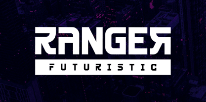 Ranger is a modern and classy sans-serif font with a futuristic style and fancy look. This typeface is perfect for an elegant & luxury logo, book or movie title design, fashion brand, magazine, clothes, lettering, quotes, and so much more. This font is PUA encoded, which means you can access all of the glyphs and swashes with ease! **Uppercase
 - Ghakity by Letterena Studios,
$17.00 Ghakity is a modern and classic sans serif font with a unique style and modern look. This typeface is perfect for an elegant & luxury logo, book or movie title design, fashion brand, magazine, clothes, lettering, quotes, and so much more. This font is PUA encoded, which means you can access all of the glyphs and swashes with ease!
 - Urban Starblues by Prioritype,
$21.00 Urban Starblues - Font Duo Strong paired fonts as the main design display. Yes, it is very good for design with graffiti theme. You can apply it to t-shirt designs, posters, covers, video thumbnails, merchandise and so on to make it look special. Features: Uppercase, Lowercase, (All Caps Sans) Numeral, Punctuation, Multilingual, Alternate (Graffiti) & PUA Encoded. Multilingual contained: Afrikaans, Albanian, Asu, Basque, Bemba, Bena, Breton, Catalan, Chiga, Cornish, Danish, Dutch, English, Estonian, Filipino, Finnish, French, Friulian, Galician, German, Gusii, Indonesian, Irish, Italian, Kabuverdianu, Kalenjin, Kinyarwanda, Luo, Luxembourgish, Luyia, Machame, Makhuwa-Meetto, Makonde, Malagasy, Manx, Morisyen, North Ndebele, Norwegian Bokmål, Norwegian Nynorsk, Nyankole, Oromo, Portuguese, Quechua, Romansh, Rombo, Rundi, Rwa, Samburu, Sango, Sangu, Scottish Gaelic, Sena, Shambala, Shona, Soga, Somali, Spanish, Swahili, Swedish, Swiss German, Taita, Teso, Uzbek (Latin), Volapük, Vunjo, Zulu. Thanks.
 - Many Weatz - Personal use only

- Beckasin - Personal use only

- Sketchica - Personal use only

- Choriza by Huy!Fonts,
$5.00 Choriza is a multilayered font and a kind of spicy spanish sausage. With three layers you can colour any salami, salchichen, sausage, wurst or pudding. Chorizo also means burglar in spanish, so it's some sort of typographical joke about the today's spanish politicians. It comes with Choriza Sans, with its cutted ends to make a sans serif version.
 - Slope Slab Pro by URW Type Foundry,
$39.99 Slope Sans is an original design that combines a technological shape model borrowed from the early Macintosh system fonts with organic, open elements looking futuristic in a retrospective manner. Designed as part of a font family without different weights, Slope Sans Pro provides OpenType features for alternate letter forms in two stylistic sets. The basic version works similar to a stencil font, an alternative set has consistently closed shapes and a more rigid appearance, while the second stylistic set offers some alternative letter forms. Headlines and shorter texts set in Slope Sans provide a variable, modern appearance. Slope Slab Pro goes very well with Slope Sans Pro and can be used as style variant or display.
 - Penta by Wiescher Design,
$29.00 »Penta« is a new Sans typeface, designed in the American tradition with contrast between the up- and downstrokes. The contrast is hardly visible on the »thin« cut, but the heavier the weights get, the more contrast becomes visible. That makes this font very useful, almost linear in the lighter weights and very distinct rhythm in the heavier ones. »Penta« is extremly versatile, it can be used for bodycopy in the lighter weights and for heavy headlines.
 - Vertrina by Greater Albion Typefounders,
$8.95 Vertrina marries four virtues: elegance, simplicity, character and usefulness. It started as an idea to combine two things: the elegance of classical Roman typefaces and of classical Roman architecture. The result is that rarest of all things - a truly new face that is elegant yet characterful but not so obtrusive as to be restricted to display work. All the faces' uprights mirror the elegant taper of Roman columns, as used in the most simple and elegant form of Roman architecture. The serifs are a subtle shape that mirrors the pediments and corbels of that same order of architecture. Vertrina is a family of eight faces, four upper and lower case faces, suitable for the elegant setting out of text, and four small capitals faces ideal for headings and titles. You'll find regular and bold weights and normal and condensed width, as well as a range of Opentype ligatures. All faces are offered individually and in family groups. Bring some simple elegance to your work.
 - 99 Names of ALLAH Attached by Islamic Calligraphy75,
$12.00 We have transformed the “99 names of ALLAH” into a font. That means each key on your keyboard represents 1 of the 99 names of ALLAH Aaza Wajal. The fonts work with both the English and Arabic Keyboards. We call this Calligraphy "Attached" because the "alef" and "lam" are attached together. The first "Alef" has a "fatha", this indicates to pronounce the first letter. So instead of saying "R-RAHMAAN" you say "AR-RAHMAAN" (in the zip file you will find a pdf file explaining the differences in the "harakat", pronunciation & spelling according to the Holy Quran). You will also notice that the decorative letters in this font are bigger than usual, we also used the traditional "soukoun" instead of the "Quranic soukoun" & we were a little bit more generous than usual with the decorative symbols. Decorative letters used in this calligraphy: "Mim, Aain, Sin, HHe, He, Kaf, Alef, Tah & Saad". Purpose & use: - Writers: Highlight the names in your texts in beautiful Islamic calligraphy. - Editors: Use with kinetic typography templates (AE) & editing software. - Designers: The very small details in the names does not affect the quality. Rest assured it is flawless. The MOST IMPORTANT THING about this list is that all the names are 100% Error Free, and you can use them with your eyes closed. All the “Tachkilat” are 100% Error Free, all the "Spelling" is 100% Error Free, and they all have been written in accordance with the Holy Quran. No names are missing and no names are duplicated. The list is complete "99 names +1". The +1 is the name “ALLAH” 'Aza wajal. Another important thing is how we use the decorative letters. In every font you will see small decorative letters, these letters are used only in accordance with their respective letters to indicate pronunciation & we don't include them randomly. That means "mim" on top or below the letter "mim", "sin" on top or below the letter "sin", and so on and so forth. Included: Pdf file telling you which key is associated with which name. In that same file we have included the transliteration and explication of all 99 names. Pdf file explaining the differences in the harakat and pronunciation according to the Holy Quran. --------------------------------------------------------------------------------------------------------------------------- Here is a link to all the extra files you will need: https://drive.google.com/drive/folders/1Xj2Q8hhmfKD7stY6RILhKPiPfePpI9U4?usp=sharing ---------------------------------------------------------------------------------------------------------------------------
 - Wafterby by Paramajan,
$8.00 Wafterby is a handsome sans serif typeface family. It comes in eight weights which have a minimal and clean feel. Its design is based on circle and line geometric shapes. It can be used as a cute minimal-style header display or as a stylish text for magazine, blog, corporate branding, packaging, wedding invitation project, etc.
 - Daymore by Rillatype,
$15.00 Introducing, Daymore Font duo! Daymore is a duo font that complements each other. By using Daymore, you can simply use one font family without thinking about other fonts to complete the design you need. In the process of making this font, I was careful in choosing what font concept would be able to complement a bold sans serif font so that it could be balanced so that it would produce a blend of firm and strong sans serif fonts, as well as handwritten fonts that flowed naturally. The Daymore font duo is perfect for use as wedding invitations, branding, logos, etc.
 - CCS Monterio by Creative Corner Studio,
$29.00 CCS Monterio sans is a all-caps sans serif contemporary Art Deco typographic style , If you're into classic/vintage letter designs, then this typeface suits best for you. Packed with 300+ glyphs (alternate and multilingual characters included), now it’s your time to go crazy and explore the uniqueness of this typeface!
 - Labyrinthus Pro by Cerri Antonio,
$40.00 LABYRINTHUS PRO is a multiline decorative font, works very well as a type of identity logo, poster and 3d works. It continues the tradition of precedent LABYRINTHUS but with a hard linear impact. Its interesting to note that with it its possible to play with the multiline concept to create endless overlapping geometric creations.
 - Fong Shay Noon JNL by Jeff Levine,
$29.00 Fong Shay Noon JNL is a non-traditional approach to an Oriental-styled font as there are some letter forms with curves and others with straight lines. The name derives from a Chinese restaurant in North Miami Beach, Florida during the 1960s, which in turn took its name from a play on a Yiddish phrase.
 - Valerie by Solotype,
$19.95Here is another attempt to create a font for invitation work unlike any already out in the world. In casting about for a name, I decided to call it Valerie after Valerie Hope, a mindreader of days long gone, who played California theatres in the 1930s and 1940s. And who, incidentally, was my mother.


