10,000 search results
(0.051 seconds)
- Letterstitch Plain by TypeArt Foundry,
$45.00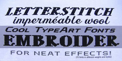
- Norma by Linotype,
$29.99 - EnglishTowne-Normal - Unknown license

- Scrypticali Normal - Unknown license

- Kismet-Normal - 100% free

- Platonick-Normal - Unknown license

- WildWest-Normal - Unknown license

- FirstGrader-Normal - Unknown license

- Eklektic-Normal - Unknown license

- So Normal - Unknown license

- Heidelbe-Normal - Unknown license

- Nickerbocker-Normal - Unknown license

- Present-Normal - Unknown license

- Viking-Normal - Unknown license

- Slogan-Normal - Unknown license

- Flemish-Normal - Unknown license

- Juniper-Normal - Unknown license

- Domino normal - Unknown license

- StrangePhenomena Normal - Unknown license

- Houters-Normal - Unknown license

- Ironick-Normal - Unknown license

- Chizzler Normal - Unknown license

- DearTeacher-Normal - Unknown license

- StrangePhenomena [normal] - Unknown license

- Coliseo-Normal - Unknown license

- Slam Normal by Wiescher Design,
$12.00
- Sagata Normal by Lemonthe,
$10.00
- Fabrikat Normal by HVD Fonts,
$40.00
- CA Normal by Cape Arcona Type Foundry,
$40.00
- Paine by James J. Connell,
$19.00 - Plans by Graphicxell,
$19.00
- Plan by Characters Font Foundry,
$17.50
- Right In The Kisser by Comicraft,
$29.00
- Darkness of the Night by Letterara,
$10.00
- Tecna Light Right Triangle BNF by Descarflex,
$30.00
- Behind The Nineties Sans by Casloop Studio,
$9.00
- Damn the Man - Unknown license

- In The Sun by Ana's Fonts,
$15.00
- Tight - Unknown license

- Slight by Up Up Creative,
$29.00


