10,000 search results
(0.069 seconds)
- Gelegar by Locomotype,
$19.00 Introducing Gelegar, the extraordinary ultra-wide display sans serif font meticulously crafted for commanding visual and emotional impact. Gelegar offers three distinctive styles – expanded regular, rounded, and press – each exuding its own unique character to suit your creative vision. Whether you're designing posters, social media posts, headlines, titling, or large-format prints, Gelegar ensures you stand out from the crowd. Embrace the font that demands attention and amplifies your message.
 - ArgentaBobbed by Ingrimayne Type,
$5.00ArgentaBobbed is an informal, "hand-printing" font with little balls that some people, often children, like to add to the ends of strokes. Maybe it could be called a ball-serif or dot-serif font. The family has six members. Each of the two weights, plain and bold, have oblique styles. There are also two variants: ArgentaBobbed-Wig is squiggly handwriting with the dots, and ArgentaBobbed-Squish is condensed handwriting with dots. - Moku Brush by Deltatype,
$49.00 Moku Brush is a structural brush script inspired from handwriting with brush, with straight letterform you will get less formal but more sweet! Moku Brush come with nine weights, so you can use as body text or even better with headline. With nine variations, you can use this font in different sizes with different weights, you will get better balance when do type setup.
 - SF Hypocrisy by ShyFoundry,
$19.95 SF Hypocrisy is a simplistic san serif with an x-height that goes all the way up and curves in all the right places. This baby works great for all your sexy headlining needs and more...
 - Neumatic Gothic Round by Arkitype,
$16.00 Neumatic Gothic Round is a condensed sans-serif family. It has a tall Cap Height as well as x-height to balance it. Neumatic Gothic Round is versatile in use as a Headline font or as a text font. Neumatic Gothic Round has loads of options to play around with. Included in the glyph set are small caps, a stylistic uppercase superscript, stylistic alternates and circled numbers to name some. The typeface was designed with the graphic designer in mind to make beautiful typographic layouts with ease by using all the options you have in Neumatic Gothic Round.
 - LD Wedding by Illustration Ink,
$3.00This font is more formal. It is stylish and perfect for your wedding journaling. - LeakorLeach by Ingrimayne Type,
$9.95 An early drawing tablet was largely responsible for the LeakorLeach typefaces. They resemble hand lettering using cake icing or done with an ink pen that leaves lots of ink blobs or ink blots. The family has two widths, plain and condensed, and in addition to each having an oblique style, each also has a leftward-inclined style. There may not be many uses for a leftward-inclined typeface, but for those needing one, the LeakorLeach family offers two. The LeakorLeach typefaces are unlike any other faces from IngrimayneType.
 - Retro Drink by holyline design,
$14.00 Retro Drink Groovy Typeface by holyline. Retro Drink is inspire by 80s character and come with modern, groovy, playful and bold characters. This font comes in 4 style. Which consists of Regular, Outline, ShadowUp and ShadowDown. This font very easy to use and combine them with a trending design style. Retro Drink perfect for headline, sub headline, custom logo, packaging, quote, label , merchandise and all design you need for make the vibe more retro and anything for your creativity. And Retro Drink s perfect font if you want something new with your project, you can play the 4 font style and mix with your design, its very satisfy. Happy creating!
 - Duran by The Northern Block,
$- Duran is a strong, versatile geometric sans with industrial quality. Inspired by technical style letterforms with simple construction, the typeface is useful in both large format and body text. Its compact lateral shape helps save space across layouts and is good to go across a wide range of modern applications. Details include seven weights with matching italics and over 670 characters per style. Opentype features consist of eight variations of numerals, including inferiors, superiors, fractions, case figures and circled figures. Additional features include case-sensitive forms, stylistic alternates, ligatures, game symbols, arrows and language support covering Western, South and Central Europe.
 - Ervha by Yukita Creative,
$9.00 Introducing Ervha Modern Sans Serif Typeface Ervha is a modern sans serif font with a minimalist and trendy style. This font has 10 styles from thin to extra black Perfect font for print and digital projects. Quality fonts can help your projects become more modern and classy. This font also supports other languages The clean and sharp lines of sans serif fonts are the main reason many graphic designers prefer this font style for both screen and print use. Clean lines and sharp edges can be displayed more clearly on the screen which improves legibility for users. What do you get when you buy this font? Ervha is one font you need Affordable and versatile Multilingual support and complete character set Designed by a Typeface Designer Get one font for any occasion Multilingual support in this modern sans serif font Well known for its exceptional readability Enhance your Project by using Ervha Sans Serif Modern as your font of choice.
 - Sidiqie by Chococreator,
$5.00 Sidiqie is a modern sans serif with a monoline and minimalist style. With smooth, neat lines, and with just a hint of contrast, Sidiqie works beautifully for logos, branding, and web titles. See examples for some examples of how you can use them. Includes Sidiqie Light Sidiqie Reguler Sidiqie Bold Sidiqie Black Support for western languages
 - Just Boys by j.dsky,
$19.00 Silhouette font designed to be used as a decorative element within layouts and illustrations. Featuring boys and toys in everyday life situations. Inspired by my kids and their friends playing, running, fighting and expressing different emotions. To create this set of 81 glyphs I used photographs that I hand-traced. Picture font recommended for a variety of illustrative purposes.
 - Hagen Kids by Heypentype,
$20.00 Hagen Kids is a great font for your fun design project. Supports most Latin-based languages and comes with standard and discretionary ligatures. This font is packed with alternates that you can play with. Hagen kids is suitable for long text writing, subhead, or headlines for your content. This font gives a sense of informality, friendly and personal feel to your design. You can apply this fonts onto text books aimed at children. Try it for yourself.
 - Mix Sonic by Mix Fonts,
$13.00 MIX SONIC is a font pair inspired by the night sky. You get a round, bouncy and plump decorative san serif in MIX SONIC MOON and an all-uppercase and moon and stars dingbat hybrid in MIX SONIC STAR. The shapes of these glyphs capture the various phases of the moon, and how it lights up eerily lights up the night sky at each phase. MIX SONIC MOON and MIX SONIC STAR are great additions to your font collection. Make it a go-to font for all your projects of the mystic, astrology, magic, zodiac, elemental, witchcraft or divine variety. Use together, or separately, both font sets are sure to delight! MIX SONIC MOON comes with the following glyphs: ABCDEFGHIJKLMNOPQRSTUVWXYZ abcdefghijklmnopqrstuvwxyz 0123456789 !@#$%^&*()`~♥♥✿•· ÷×+−±≈=≠≥≤[]<>:;’”,.\|/?{}“”‘’-–—_… ©®™‹›«»°¹²³ªº¡¿₱¢€£¥½¼¾¶§№† ÁÀÂÄÃÅĂĀĄÆĆĈČÇÐĐÉÈÊËĖĒĘĜĤIÍÌÎÏĪĮĴŁŃÑŇÓÒÔÖÕŌŐ ØŒŔŘŚŜŠŞȘŤȚÚÙÛÜŮŰŬŪŲẂẀŴÝŶŸŹẐŽŻÞẞ áàâäãåăāąæćĉčçðđéèêëėēęĝĥıíìîïīįĵłńñňóòôöõōő øœŕřśŝšşșťțúùûüůűŭūųẃẁŵýŷÿźẑžżþß MIX SONIC STAR comes with the following glyphs: ABCDEFGHIJKLMNOPQRSTUVWXYZ abcdefghijklmnopqrstu-vwxyz 0123456789 !@#$%^&*()`~+= []<>:;’”,.\|/?{}“”‘’-_‹›₱¢€£¥ Fellow witches, enjoy!
 - Academica by Storm Type Foundry,
$44.00 Josef Týfa first published the Academia typeface in 1967-68. It was the winning design from competition aimed at new typeface for scientific texts, announced by Grafotechna. It was cut and cast in metal in 1968 in 8 and 10 point sizes of plain, italic and semi-bold designs. In 2003 Josef Týfa with František Štorm began to work on its digital version. During 2004 Týfa approved certain differences from the original drawings in order to bring more original and timeless feeling to this successful typeface. Vertical stem outlines are no more straight, but softly slendered in the middle, italics were quietened, uppercase proportions brought closer to antique principle. Light and Black designs served (as usual) as starting points for interpolation of remainig weights. The new name Academica distinguishes the present digital transcription from the original idea. It comprises Týfa’s rational concept for scientific application with versatility to other genres of literature.
 - Akrux by Harvester Type,
$20.00 Akrux is a futuristic variable wide font. It is inspired by forms that are close to futurism, stars and space. Everything related to space, movies, cartoons, art, books, spaceships. Ideas came from everywhere. The font is suitable for headlines, posters, logos, large typography, magazines, everything related to cars and anything that can be futuristic and meaningful. It has great language support, and Cyrillic is planned in the future.
 - Al American Legend by Aluyeah Studio,
$125.00 Hello Aluyeaholics! So we tried playing with the script, we hope you like it. American Legend is inspired by vintage handwriting. Comes with 220+ stunning alternates and ligatures. Super easy to use alternates and ligatures. Super Easy to Use alternates - You can easily call alternates using special combination like a.2 a.3 b.5 e.r a.r l.l etc. To get results like the preview just type Ame.rican Leg.9end
 - Gorod.Volgograd by FontCity,
$15.00The general idea: Can You imagine to yourself, what the hydroelectric power station is? The building of this electricity production foundry is half hidden under the water, but the visible above-water part astonishes your sense. It is a construction almost 1,5 km length dammed out the powerful river stream. Besides thousand of electricity conduction lines supports it bears also the highway and the railroad. From a faraway distance the train seems like a caterpillar that has climbed up the stout tree. There are also the navigable sluices, the flood channels and other erections. The idea of this typeface outlines arrived to the authors exactly on the viewing platform, under the impression of the waterfalls, which are escaping from the dam womb, falling from almost 50 meters altitude and becoming white-haired during this flight. Release: in the form of "gorod.Volgograd" font with the one style. We work with other styles now and sometime we will be very glad to introduce the Bold and Italic styles to You. We should explain the font name meaning. "Gorod" is "city of" in Russian and Volgograd is the old, big and famous Russian city. The Volga hydroelectric power station of a name of XXII congress of the CPSU caused the Volgograd sea formation. It expands of 14 km width and more than 600 km along the Volga river-bed. But HEPS isn't the sole Volgograd sight. There are many interesting places here. The most known tourist sight, the visit card of Volgograd is the Mamaev Hill. Being here You can see almost all 100 kilometers of city length. Due to its geographical position, Mamaev Hill has got a great importance during the Great Patriotic War (1941-1945). It became and still is the Main Height of Russia. Soviet people have built the huge stately memorial ensemble here. There are many other witnesses of the heroic past of Volgograd: the Alley of Heroes, the Perished Fighters Square, the Soldiers Field and others. The line of tank turrets is stretched out along all town not far from Volga bank. It marks the line, where fascist troops was stopped in 1943. It is very amazingly when You dive under the ground on a usual tram. Volgograders have built a few underground station for the high-speed tramway. The river tram need a quarter of an hour to get an island in the Volga. And You need the same time to walk across the river station. The Volga-Don navigable channel starts from Volgograd. There are planetarium, circus, some theatres, many museums in Volgograd. One of football matches of Euro-2004 qualifying round took a place in the "Rotor" stadium in Volgograd. Volgograd holds the longest - above 50 km - park in the world. Its avenues, squares, embankments are beautiful, Volgograd central districts are built in unique architecture style called the Stalin Empire. You can enjoy fountains, parks, attractions, water-pools and other Volgograd sights. If You visit Volgograd once You'll never forget it. You can read about the ancient history of Volgograd city on the Tsaritsyn font page. Also we plan to create the Stalingrad font and give You a short story about another period in Tsaritsyn-Stalingrad-Volgograd history. - Zawlbuk by Richard Khuptong,
$20.00 Zawlbuk is a type inspired by Blackletter (sometimes black letter), also known as Gothic script, Gothic minuscule, or Textura. The Letters are drawn using a flat nib pen on a paper, scanned and drawn into a vector format.
 - Slatz by CozyFonts,
$20.00 The Slatz Font Family is Vertical. It has a slender, consistent weight that is best used in limited, left to Right, space limitations as to maximize font height. Slatz font variations all have extremely clean edges and even the serif versions are crisply defined with a flat-pointed serif for an added unique character. The designed intent was for a tight kern, however evenly letterspacing these family members give a distinct personality and continues to command the negative space just as in tight kerned examples. The compatible relationship of these font family members, serif to sans serif, and regular to italic is seamless and the overall design coloring of words as sentences is well balanced and extremely legible. The Slatz Family fonts are matching members glyph to glyph yet there is a noticeable difference between the serif and sans serif members. The sans serif works in contemporary and vintage settings. The serif members work particularly well in vintage, period applications. The Bold and Drop versions of Slatz also fit the above descriptions and also work on their own.
 - Kahlo by Latinotype,
$25.00 Kahlo is a latin-style hipster type family. It's a formal and elegant option for designers. The family has four weights and italics, initial capital letters, and some alternate characters. This typeface is most suitable for magazine headlines, posters, logos, cosmetics packaging, advertising etc. Photography by Damien Vignaux (www.elroy.fr) Languages include: Basic Latin, Western European, Euro, Catalan, Baltic, Turkish, Central European, Romanian and Pan Africa Latin. Kahlo is a renaming of Frida.
 - Torcao by insigne,
$24.00 Torcao is one of the sporks of the font universe, a useful and functional outlier. Half square, half circle, this uncommon squircle of a family with its asymmetry of curved and angular shapes drives through headlines and body copy with forward velocity. The robust, technical appearance is light-hearted and inviting, and its organic nature plays off of its one-of-a-kind kinks and hybrid forms. Torcao is not merely an experimental font, though. The figures have been crafted and refined into a functional, hard-working typeface that lends itself to many sizes and environments. The font family features a tall x-height and light modulation, which give the typography its unique color highly effective in headlines but still quite legible in longer text. This family contains a comprehensive range of nine weights--slender to black--and features condensed and extender selections for a complete set of forty-eight fonts. The font has been decked out for experienced typographers, together with swash alternates and simplified titling. The typeface also contains a range of numeral sets, together with fractions and old-style figures. OpenType-capable programs including Quark or the Adobe suite allow quick changes to ligatures and alternates. Previews of these options can be found in the .pdf brochure. Torcao also features the glyphs to enable all Central, Eastern, and Western European languages. In all, the font supports around forty languages that utilize the prolonged Latin script, making it an excellent option for multi-lingual publications and packaging. Simple, technical, and open, the Torcao type family could just be the perfect choice for your web type or print project.
 - SK Klyaksa by Shriftovik,
$32.00 SK Klyaksa is an experimental font inspired by the most striking and unusual artistic techniques of graffiti art. Its non-standard shapes, rounded points and hypnotic curved lines immerse you in the world of bright colors and unlimited creative freedom on the streets of the city. The SK Klyaksa font plays on the contrast between lightness and heaviness, creating an effect of brightness and dynamism, creating bright and emotional compositions that perfectly emphasize youth and individuality. Like graffiti art, the font speaks its own language and provokes bold decisions in graphic design, bringing originality and character to any project.
 - Eurotypo Bodoni by Eurotypo,
$48.00 Talking about the numerous types that today bear the name of Giambattista Bodoni are a kind of tribute as much to his reputation as a printer as to his ability as designer and engraver. In fact, all of them tent to be more in the way or style of Bodoni than simply copy of his letterforms. Like many other type designers, we’ve been seduced also to develop our own point of view of his work, nowadays enriched by some features of OpenType format that allows a variety of combinations: standard ligatures, discretional ligatures, stylistic alternates and old styles figures. Whereas the Bodoni serif in the capitals was of the same weight as the thin stroke but joined with a very slight fillet (Bracket) and the lowercase serif were like his French rivals, the Didots, featured straight- edged serifs that were unbracketed. The ascenders and descenders of this new Bodoni are shorter, giving in this way, more space for enlarge x high. Specially designed for editorial design and advertising, can be used in magazines, annual reports and all kind of fine print materials or web pages. The beauty of his letterforms can enrich headlines; this font can also be used as body text for its good legibility and accurate kerning.
 - Markout by wearecolt,
$12.00 Markout is a chunky marker pen font. With a casual style and loose baseline, it's a great display font for titles, headings and logos. The Markout family has regular and alt versions, where some of the characters are different. Most notable is the 'k' in the Alt version this has a more normal size and shape when compared to the regular. Also includes five marker pen emoji ligatures and double letter ligatures.
 - Overbillions by Almarkha Type,
$35.00 Introducing Overbillion - Brush Script is a Authentic brush script that is written casually and quickly. Letters are made with brushes on paper. Then scanned and carefully drawn into vector format. That is why Overbillion has charming, authentic and relaxed characteristic more natural look to your text with a more natural look to your text. You can activate Ligature OpenType panel, Overbillion Perfect for designs,branding projects, Logo design, Quotes product packaging.
 - Reinkies by Almarkha Type,
$35.00 Introducing Reinkies - Brush Script is a Authentic brush script that is written casually and quickly. Letters are made with brushes on paper. Then scanned and carefully drawn into vector format. That is why Reinkies has charming, authentic and relaxed characteristic more natural look to your text with a more natural look to your text. You can activate Ligature OpenType panel, ReinkiesPerfect for designs,branding projects, Logo design, Quotes product packaging.
 - Unofficial by Gassstype,
$25.00 Introducing Unofficial – Brush Script is a Authentic brush script that is written casually and quickly. Letters are made with procreate. Then scanned and carefully drawn into vector format. That is why Unofficial has charming, authentic and relaxed characteristic more natural look to your text with a more natural look to your text. You can activate Ligature OpenType panel, Better At class Perfect for designs,branding projects, Logo design, Quotes product packaging.
 - FS Pimlico by Fontsmith,
$80.00 Born in the 70s Personal influences are unavoidable in type design and usually find their way through into finished fonts. At Fontsmith, one period in particular provides inspiration, according to FS Pimlico designer, Fernando Mello. “Jason and Phil have always known that I’m very into the visual language of the 70s. I know that Jason shares my love of the 70s and Phil will sometimes admit to being a fan, too. I think that’s the reason they were both so supportive in the development of this font. “And, of course, we all share an interest in good-humoured and intelligent design. We like to think it’s a Fontsmith characteristic.” Back from black FS Pimlico started in an unusual place: with a tubby, penguin-like lowercase “a” that Fernando Mello had been sketching. From “a” grew the rest of the alphabet – a bubbly, fat, friendly family with a brush-written quality that became FS Pimlico Black. The black weight certainly isn’t the normal starting point for creating a regular and bold weight, but Fernando pressed on, driven by a glut of influences: brush-writing; Letraset and early digital systems catalogues; the type of Herb Lubalin and Tony di Spigna; 70s clothes and vinyl; and 70s revival disco nights in London’s Pimlico and Vauxhall. Natural or flourished Not often do fonts come along that seem to span the ages. FS Pimlico is at home in an office environment providing a fresh clear identity in communications or providing text that’s clear and easy to read. But it likes to party, too, 70s style. With the OpenType features switched on, a designer can totally change the look of their work, and create point-of-sale, headlines and titles that stand out and get noticed.
 - FS Pimlico Variable by Fontsmith,
$249.99Born in the 70s Personal influences are unavoidable in type design and usually find their way through into finished fonts. At Fontsmith, one period in particular provides inspiration, according to FS Pimlico designer, Fernando Mello. “Jason and Phil have always known that I’m very into the visual language of the 70s. I know that Jason shares my love of the 70s and Phil will sometimes admit to being a fan, too. I think that’s the reason they were both so supportive in the development of this font. “And, of course, we all share an interest in good-humoured and intelligent design. We like to think it’s a Fontsmith characteristic.” Back from black FS Pimlico started in an unusual place: with a tubby, penguin-like lowercase “a” that Fernando Mello had been sketching. From “a” grew the rest of the alphabet – a bubbly, fat, friendly family with a brush-written quality that became FS Pimlico Black. The black weight certainly isn’t the normal starting point for creating a regular and bold weight, but Fernando pressed on, driven by a glut of influences: brush-writing; Letraset and early digital systems catalogues; the type of Herb Lubalin and Tony di Spigna; 70s clothes and vinyl; and 70s revival disco nights in London’s Pimlico and Vauxhall. Natural or flourished Not often do fonts come along that seem to span the ages. FS Pimlico is at home in an office environment providing a fresh clear identity in communications or providing text that’s clear and easy to read. But it likes to party, too, 70s style. With the OpenType features switched on, a designer can totally change the look of their work, and create point-of-sale, headlines and titles that stand out and get noticed. - Earth Tone by Sarid Ezra,
$15.00 Introducing, Earth Tone - Organic Sans Family Earth Tone is a handmade font family with natural and organic feels! Contain three weight. Including Light - Regular - Bold. You can use this font for every project. Suitable for branding logo, hand lettering, or apparel design. When you want a handmade touch in your design, this font will never disappoint. This font family also support multilingual, number and symbol.
 - Anthony Writters by Gassstype,
$25.00 Hello Everyone, Introduce our new collection Anthony Writters is A Handwritten Script,This font Stylish Script is great for your creative projects such as watermark on photography, and perfect for logos & branding, photography, invitation, watermark, advertisements, product designs, stationery, wedding designs,label, product packaging, special events or anything that need taste. Anthony Writters is Font Authentic that is written casually and quickly. Then scanned and carefully drawn into vector format. This handmade font will make your design has a beautiful natural touch for each details. You can activate Ligature OpenType panel design more interesting.
 - Endless Revisions by Gassstype,
$25.00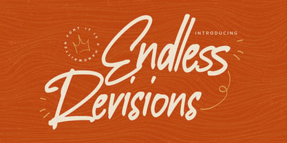 Hello Everyone, Introduce our new collection Endless Revisions It's A Handwritten Font,This font Stylish Script is great for your creative projects such as watermark on photography, and perfect for logos & branding, photography, invitation, watermark, advertisements, product designs, stationery, wedding designs,label, product packaging, special events or anything that need Signature taste. Endless Revisions is Font Authentic that is written casually and quickly. Then scanned and carefully drawn into vector format. This handmade font will make your design has a beautiful natural touch for each details. You can activate Ligature glyphs OpenType panel.
 - Farela by Asenbayu,
$14.00 The Farela font is a serif ligature font that has an attractive elegant appearance. You can use this font in vintage, classic, and retro designs. This font gives a beautiful, classy and luxurious feel to your designs. This font is perfect for projects such as logos, branding, fashion, magazines, labels, posters, album covers and many more. This font features Open Type Format, Kerning, Ligature Style, Alternative Style, Numeral, Symbol and Multilingual Supports. Note: To use the alternate and ligature features, please look in the Glyph Panel / Character Map in your software to be able to access all the glyphs in this font. The ligature style in this font is simply "Standard Ligature", meaning it appears automatically. To set your desired letter binding, you can block letters or add them from the glyph panel. Thank you!
 - Carabelle by Typejockeys,
$25.00 Carabelle is based on the Nebiolo type foundry’s Calipso design. Newly redrawn and with many original details added, this old typeface has been revitalized. Noble and sweet, Carabelle plays the elegant companion for cup cake shops, wedding invitations or culinary tours through France and Italy.
 - Mollas by Alit Design,
$15.00 Introducing Mollas Typeface Thank you for clicking this page and finding Mollas Typeface, one of the best font collections I've made. Mollas typeface is formal, elegant and can be applied to any design concept. For branding design, header text, online shop, logo design, social media and so on. Mollas typeface has 14 total families from Thin to Heavy, besides that there are many amazing and unique alternative glyphs for your design creation. Its use is very easy and simple. It can be run in design or non-design programs because the Mollas typeface has PUA unicode support. Besides that, the Mollas typeface also has multilingual support. Thank you and enjoy
 - Landepz by Zamjump,
$9.00 Landepz Typefamily includes three normal styles, grunge texture and glitch, Landepz is a family of bold hand-printed types, celebrating the style of the original printing press and all its beautiful imperfections. Its solid, robust shape lends itself to a robust design, while its texture provides an authentic sound.
 - FF Kaytek Rounded by FontFont,
$50.99 Kaytek™ Rounded completes the Kaytek typeface family with seven carefully rounded weights. Every style of the typeface takes up exactly the same amount of space, thanks to the careful creation by Radek Łukasiewicz. This means designers can switch between styles without the text being reflowed, making it particularly useful in magazines, where space might be limited, and also on the internet, where hover links appear in a different style. Kaytek Rounded comes in seven weights, from Thin to Black. It pairs also with Kaytek Sans, Kaytek Slab, and Kaytek Headline.
 - Vikive by Eurotypo,
$23.00 Vikive is a family of Sans Serif fonts, better known in its origins as "Gothic" in America or "Grotesque" in Europe. Some authors divide them into three categories: Grotesque, Geometric and Humanistic. Probably, it can be defined that Vikive has some characteristics of the first two: Grotesque and Geometric, high x-height, slight squareness of the curves, wide set, open tail, simple construction. The family concept provides several weights and widths for one face and its matching italics, therefore this family of types is more suitable for text settings, enriched with strong contrast fonts (condensed thin or expanded black) for headlines.
 - Butcher by RodrigoTypo,
$25.00 Butcher is a Rough font with 2 styles, a medium and a black to play with the weights, it contains the Greek and Cyrillic alphabet, special for action titles