10,000 search results
(0.064 seconds)
- Plinc Tuggle by House Industries,
$33.00 While we can’t comment of the suggested definitions for ‘tuggle’ that you might encounter online, we are happy to expound on Tuggle’s quirky and endearing characters. The gravity of its bellbottom slab-serif structure is mitigated by soft rounded corners, while surging swashes and globular stroke endings further attenuate Tuggle’s otherwise would-be uptight tenor. The ideal typographic solution for children’s blocks, candy packaging, vape shop signage, and hospital way finding. Pair Tuggle with an equally juicy script like Dave West’s Superstar. Designed by the Photo-Lettering staff, and digitized by Susana Carvalho. TUGGLE CREDITS: Typeface Design: Photo-Lettering Staff Typeface Digitization: Susana Carvalho Typeface Production: Bas Smidt Typeface Direction: Erik van Blokland, Ben Kiel Like all good subversives, House Industries hides in plain sight while amplifying the look, feel and style of the world’s most interesting brands, products and people. Based in Delaware, visually influencing the world.
 - Plinc Buffalo by House Industries,
$33.00 Just as its eponymous ancestors graced vast Western vistas, Buffalo fills broad horizontal typographic topography with distinctive dignity. Buffalo’s migration across a visual landscape that straddles two millennia saw it survive the threat of extinction similar to its mammalian ancestors and emerge with rotund relevance. Now fortified with modern character sets and digital flexibility, nothing espouses an artisanal post-western industrial craft renaissance quite like Buffalo. Legendary lettering artist and type designer Ed Benguiat created the original film version of Buffalo for Photo-Lettering Inc. Working under the direction of the current Photo-Lettering partners, Dutch type designer Donald Roos digitized and expanded Buffalo while expertly maintaining the organic nuances found in the original version. Like all good subversives, House Industries hides in plain sight while amplifying the look, feel and style of the world’s most interesting brands, products and people. Based in Delaware, visually influencing the world.
 - Lunga by Lián Types,
$24.50Lunga is a wonderful condensed font. It was designed to be a legible type. It has lots of decorative glyphs and ligatures which were possible thanks to the open-type format! Lunga Real Ligada is the most complete style. The Open Type format contains all the ligatures and alternates. It also contains the SMALLCAPS function. Lunga Exacta has the right quantity of glyphs. The necessary ones if you are not a ligature lover. Lunga Versalita is a SMALLCAPS font. These glyphs are also contained in Lunga Real Ligada. Lunga Extras shows some ligatures and alternates which are actually contained in Lunga Real Ligada thanks to the Open Type format. - Cherston by Larin Type Co,
$15.00 Cherston this is a beautiful font family that includes 10 styles. Display Sans with sharp corners, rounded and rough style, made in three weights, light, regular and bold. This family also includes handwritten script fonts, it fits perfectly with this family, you can use it as an additional or main one. In this font, all the letters are uppercase, you will find a variety of ligatures and alternates that will help you create a unique design for your project, try to change the ligatures and alternatives and you will see how many options you can choose.
 - Overnight Oats by Hanoded,
$11.00 I recently walked part of the South West Coast Path in the UK. A couple of days in the hike, I came across a small cafe and I decided to have an oat latte (I am lactose intolerant). Since it was early in the morning, the breakfast menu was out and one of the items I noticed was ‘Overnight Oats’. I normally cook my oats with some lactose free milk and water, but apparently you can soak them overnight, add fruit and nuts and eat it like that. I tried it, it’s ok, but I think I prefer the cooked version. Overnight Oats is a bit of an odd font: it is very higgledy piggledy, yet legible and unique. If you want something out of the ordinary, then this may be your font!
 - Mofita by Alit Design,
$15.00 Introducing Möfita font This time we launched a formal font that is unique with the others. This font looks simple and elegant, the font is also very easy to read and suitable to be applied anywhere. Möfita fonts are supported with multilingual characters, and in the future, they will always be updated for additional characters and alternatives. This font is perfect for your collection for making designs that are elegant, unique and slightly formal. Very good for logotype, header texts, quote design, menu design, etc. We are sure you will not be sorry if you choose the Möfita font to be your collection. Thank you Alit
 - Yaungtinai by IM Studio,
$18.00 Yaungtinai is actually a unique font, I made it with the relaxed spontaneity of my hands. designing formal fonts but with a classic elements, which makes it very suitable for wedding media, book covers, greeting cards, logos, branding, business cards and certificates, even for any design work that requires a classic, formal or fancy appearance. Try Yaungtinai, enjoy the wealth of OpenType features and let the powerful yet elegant excitement delight you and increase your creativity! You can use this font very easily. There are many features in it. Yaungtinai contains the full set of lowercase and uppercase letters, punctuation, numbers, and multilingual support. This font also includes several alternative Ligature and Stylistic Set styles for those of you who have software that can work with OpenType (Corel Draw / Photoshop / Illustrator / InDesign). If you don't have a program that supports OpenType features like Adobe Illustrator and CorelDraw X Version, you can access all alternative glyphs using Font Book (Mac) or Character Map (Windows). Don't forget to see, buy, like, and share with friends.
 - Rockwell by Monotype,
$40.99 Whether you call them slab serif, square serif, or Egyptian, you know them when you see them – sturdy, nearly monoweight designs with blunt, straight-edged serifs and a no-nonsense attitude. The Rockwell® Nova family is a fine example of this appealing and eminently usable type style. This is a design that is both robust and adaptable. Marked by the flat top-serifs on the cap A, unusual Q tail and high-legibility two-storied lowercase a, Rockwell has a bit of handmade charm that distinguishes it from the cool, more modern interpretations of the slab serif style. The family is excellent for branding, headlines and other display uses. The simple shapes and hearty serifs also make it a good choice for short blocks of textual content in both print and on-screen environments. The light and bold weights are perfect for setting blocks of text copy, while the extra bold and condensed designs bring authority to display copy. Throw in a little color, and you amp up Rockwell’s messaging power. The regular and italic designs perform handsomely, in the most modest of screen resolutions. With four weights of normal proportions, each with a complementary italic, and three condensed designs, two with italics, the family is a commanding and versatile graphic communicator. Rockwell’s large x-height, simple character shapes and open counters, make for an exceptionally legible design. It should not, however, be set so tight that its serifs touch, as this will erode legibility and impair readability. A benefit to Rockwell’s slab serifs, however, is that the design combines beautifully with both sans serif typefaces and a variety of serif designs. Rockwell OpenType® Pro fonts have an extended character set supporting Greek, Cyrillic, most Central European and many Eastern European languages, in addition to providing for the automatic insertion of ligatures and fractions. Looking for its perfect pairing? Look no further than ITC Berkeley Old Style, Between™, ITC Franklin Gothic®, Harmonia Sans™, Metro® Nova or Frutiger® Serif.
 - Screwby by Pink Broccoli,
$14.00 A slightly offbeat latin typestyle, Screwby started as a digitization of a film typeface called Surf by Lettergraphics. From there, this wonderful typeface was expanded into a giant family of fun widths and weights to play with: from spindly thin and light weights, to chunky bold and blacks. An all-around fantastic treat!
 - Sidecar by Fenotype,
$30.00 Sidecar is an elegant monoline font family of four weights of Script and Sans. Sidecar Script and Sans are designed to play together but they also work great on their own. Sidecar Script is packed with OpenType alternates: keep Contextual Alternates on for smooth flow and try Swash or Titling Alternates for more flashy letters. From Discretionary Ligatures you’ll find Ordinal Suffixes (st, nd, rd, th). Sidecar is a great display family for any project from logo to packaging or actual neon sign design and from print to online!
 - Clean Deco JNL by Jeff Levine,
$29.00 Normally, a short paragraph or two on this page tells the backstory to a font design. In this particular case, that story has been lost to time. Whatever the original source – whether a vintage bit of typography or an original idea – the beginnings of this font lay unfinished for quite a while as it was perceived to duplicate another previous release. However, after recently checking a sample of the design against other Jeff Levine Fonts, it’s reasonably certain this type face may have similar characteristics, but can stand on its own merit. That said, Clean Deco JNL is available in both regular and oblique versions.
 - Milroy Upright SG by Spiece Graphics,
$39.00 As a beautiful yet eccentric unconnected script, Milroy Upright SG Regular can be a refreshing alternative to the formal upright scripts seen on so many anniversary and wedding announcements today. This nineteenth century classic was designed by Max Rosenow and Julius Schmol for Barnhart Brothers & Spindler in 1895. Milroy Upright was originally known as Oliphant. It was later renamed Advertisers Upright Script in 1925. This new version, Milroy Upright, contains many new alternative characters including a modified cap X and cap Z, a two-story lowercase g, and a matching set of oldstyle figures. Milroy Upright SG Regular is now available in the OpenType format. Some new characters have been added to this OpenType version including stylistic alternates, discretionary ligatures, and oldstye figures. Advanced features currently work in Adobe Creative Suite InDesign, Creative Suite Illustrator, and Quark XPress. Check for OpenType advanced feature support in other applications as it gradually becomes available with upgrades.
 - Unranked by Gassstype,
$23.00 Here comes our new font Unranked this is a sans handwritten that is written casually and quickly. this font are made with brushes on Procreate. Then crafted carefully drawn into vector format. That is why Unranked has Rough and strong characteristic more natural look to your text with a more modern look to your text.
 - Axelby JNL by Jeff Levine,
$29.00 Axelby JNL was modeled from a set of die-cut, self-adhesive cardboard letters from the 1960s. The design is reminiscent of some early wood type in the way it has letters of varying widths that do not conform to any set standard. The font is perfect for plain, easy-to-read and attention-getting headlines.
 - Prospect Heights JNL by Jeff Levine,
$29.00 While the inspiration for Prospect Heights JNL may have been a piece of vintage sheet music entitled "My Ohio Lullaby", the name is classically New York. To be precise, it's a neighborhood in the Borough of Brooklyn. Prospect Heights JNL is available in both the regular version (with an engraving line) and a solid (plain) version.
 - Yardbird Numerals by Coniglio Type,
$9.95Yardbird, insinuating prison numerals, was lifted from a wooden block print poster press, that would have indeed besides providing dates for the local carnival would have just as easily ink-chucked them over the backs of those denim blues. Part of Market LTD, a collection of limited faces, mostly alpha-numeric and some just plain numeric, used primarily in retail and display situations and titling. - HGB Santo by HGB fonts,
$16.00 Must a letter always have a symmetrical basic form? What happens when the shape of the letters stretch like an arc in the reading direction? When writing with a broad nib, this is easily achieved. The HGB Santo examines the effect of this formal principle on the readability of a text. First attempts have shown a warm and reader-friendly typeface. Six shades from Light to Black, each with an italic should be sufficient for most applications. Small caps and old-style figures are available via OpenType features as well as some ornamental forms in the italics.
 - Notebug by PizzaDude.dk,
$15.00 Notebug looks like there was a bug playing around with an inky pen. Notebook with a bug = Notebug! Made with a hefty inky pen and quick strokes. You got 3 layers to play around with: Regular (the outline) Fill (The "inside" of the Regular version and Layer (best used as a background layer for Regular)
 - Finery JNL by Jeff Levine,
$29.00 A 1949 piece of piano solo sheet music entitled "Playing Jacks" contained the title beautifully hand-lettered in a stencil-like alphabet. Finery JNL is the digital version of this design.
 - St Friska by Stereotypes,
$34.00 St Friska, based on old movie title lettering, is made just for headlines. It comes with a slight touch and feeling of art deco but it’s designed to be contemporary in 2010 and beyond. Friska comes with a big bunch of OpenType features, so a designer can play with it like Lego, using it alongside old or new typefaces. It has stylistic sets and lots of ligatures.
 - RM Whiteletter by Ray Meadows,
$19.00 It is reasonable to assume that a majority of people interested in typography will attempt some variation on the blackletter theme at some time or another. However, there seems to be a paucity of open-faced designs in this style and, having played around with a few thoughts, eventually I came up with RM Whiteletter. Light in appearance but classical in design, this clean looking open-face font provides a good counterpoint to more traditional blackletter designs. This font includes both the full Latin-1 Supplement & Latin Extended-A sets.
 - Iva by Type-Ø-Tones,
$40.00 Ivà by Joan Barjau / OpenType, 2 styles. Ivà, a very personal script based on the handwriting of the cartoonist called Ramón Tosas "Ivà, digitised by Joan Barjau in two plain weights. These fonts were set for the credit titles of a film in 1994 and remain in our collection as an icon of those times.
 - Seasick by Ingrimayne Type,
$8.95Seasick and Seasick-Mirror features wobbly, wavy, distorted letters. They were derived from the almost monoline font Kwersity. The letters of Seasick have a slight backward slant and the letters of SeasickMirror have a slight forward slant. Each of them comes in four weights: Light, Regular, Bold, and ExtraBold. - Decima Nova Pro by TipografiaRamis,
$39.00 Decima Nova Pro is a geometric sans serif typeface family, built in eight styles. The typeface is ideal for use in display sizes, but also is quite legible in text and is well suited for editorial and brand design. Features include extended language support, small caps, multiple numeral styles, slashed zero, ligatures... Decima Nova Pro is released as font family in OpenType format with a Latin Western 1252, Eastern European 1250, Baltic 1257, Turkish 1254 and Cyrillic 1251 character set.
 - Abigail by Fonthead Design,
$19.00Abigail is a font designed by Ethan Dunham that looks like it is made of ribbons. It comes in two versions, plain and dots. This whimsical font is perfect for headlines that need a contemporary but informal feel. - Mic 32 New Stencil by moretype,
$25.00 Mic 32 New Stencil is the third variation of the popular Moretype family Mic 32 New. This stencil version provides an industrial flavour to the futuristic rounded geometry of Mic 32 New. Mic 32 New Stencil still has all the normal Opentype features including small caps, tabular, proportional and old style numerals and ligatures.
 - Monk SPF by S6 Foundry,
$19.00 Monk is a multi-language geometric harmoniously balanced font in Arabic and Latin. The font family has its origins in Benedictine and Franciscan writing. Both Arabic and Latin work seamlessly together having shared counters, stem thickness, and curved forms. Monk is a type family that seeks a balance between the openness and legibility of humanist sans serifs. Letterforms have a distinct direction of the ductus, a wide overall stance, large open counters that help in its legibility. The typeface is versatile and can be successfully used in magazines, posters, branding, websites, headlines, large-format prints, brand identities, social media, advertising, editorial design, posters. The family contains over 40 alternative glyphs and over 50 ligatures in each style and comes in 10 styles with their corespondent italics. The family Latin supports Western, Central, South Eastern, South American, Oceanian, Pan African, Vietnamese, Sámi & Arabic
 - Akageeh by Twinletter,
$18.00 We are pleased to present Akageeh Retro Condensed Sans, a contemporary, elegant, and bold font. Your projects will have a timeless, refined, and contemporary feel thanks to this font. This font is excellent for branding and logo design. Akageeh is a lovely option to add elegance to your designs because of this font’s special qualities, which include ligatures, alternatives, and many others. You can play around with this font easily to produce fancy designs. What’s Included : - All glyphs to fulfil ISO Latin 1 - Alternate, ligatures - Simple installation - We recommend using applications supporting OpenType features and Glyphs panels like many Adobe apps and Corel Draw so that you can see and access all Glyph variations. - PUA Encoded Characters – Fully accessible without additional design software. - Fonts include multilingual support
 - Metilda by Raditya Type,
$14.00 Metilda is a quirky, fun and versatile serif Font with ligatures and alternates that you can combine to get beautiful curves and shapes in just seconds. Play with it to make the display even more stunning. This font is suitable for use in many forms of design, such as magazines, postcards, logos, vintage looks, old classics, 60s, 70s, 80s, wedding projects and more.
 - Bison by EllenLuff,
$38.00 Bison is a sophisticated and strong family of sans serif fonts. Its sturdy uncompromising style is felt through controlled letterforms and modern touches. A balance of hard lines and smooth curves, each font in the family can stand on its own — dynamic and authoritative in its own right. FEATURES Bison includes ten all-caps fonts: Four weights / Italics / Outlines / Numbers & Punctuation / Extensive Language Support Bison Bold - bold and commanding Bison Demibold - the persuasive middleweight Bison Regular - a sturdy midground between light and bolds Bison Light - quiet but confident Bison Outline (Thick and Thin) - edgy and engaging USE Bison works great in any branding, logos, magazines, films. The different weights give you full range to explore a whole host of applications, while the outlined fonts give a real modern feel to any project.
 - Stepra Murtinella by Wontenart,
$20.00 is a sans serif font with a wide range of uses, This san serif output can cover any product from fashion products, such as beauty equipment, clothes, shoes, magazines, women's knick-knacks to anything related to today's women. I made this font more subtle than the typical san serif family. because it is intended for more detailed beauty. You can see a preview of it in the image I made. Thank you
 - GS Franklin Ave. by Great Scott,
$18.00 Franklin Ave. is a condensed sans serif in the style of the classics Franklin Gothic and News Gothic. Nostalgic and gives a great vintage feel. It's bold and comes in two styles: Regular and Oblique. Franklin Ave. is best used in headlines and large formats or in logos or branding.
 - Okaytext by Okaycat,
$24.50The inspiration for the Okaytext family came from seeing so many fun, highly individualized special-use fonts. Alongside this massive selection, the choice of simple, plain & readable typefaces is relatively spartan. As a newly established foundry, we feel it a "must" to contribute our very best work to this important but oft-neglected genre of fonts. So the construction of the Okaytext family began. We feel that a rounded, sans serif font should be easily read, and very clean looking. It does not need to tire the eyes with any needless twists or silly quirks. So is Okaytext, it exists simply to be read, and hopes that it is a pleasant read. Okaytext is perhaps our most versatile font yet, its ultra-simplicity makes it adaptable to the demands of almost any typeset environment. Okaytext is extended, containing the complete West European diacritics & ligatures, making it suitable for multilingual environments & publications. - Kinn by Stawix,
$30.00 Kinn is an industrial san-serif typeface with an essence of squared structure inspired by a futuristic look. Kinn is robust but portray a friendly touch with a little roundness to its shape, it can also be very formal when it needs to but it is flexible and fun to use at the same time. Its wide proportion makes it ideally suited a wide range of modern applications and variety of usage from heavy display, headlines or even text. Kinn comes in 9 consecutive weights, each weight accompany with italics. Equipped with Alternates, Ligatures and 10 Cryptocurrency signs.
 - Pompano by Letterhend,
$17.00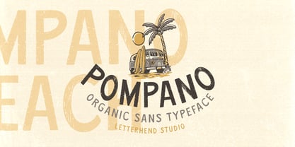 Pompano is an organic sans serif typeface which is purposely made for headline, display or logotype.This type of font perfectly made to be applied especially in logo, and the other various formal forms such as invitations, labels, logos, magazines, books, greeting / wedding cards, packaging, fashion, make up, stationery, novels, labels or any type of advertising purpose. Features : regular & stamp version uppercase & lowercase numbers and punctuation multilingual alternates & ligatures PUA encoded We highly recommend using a program that supports OpenType features and Glyphs panels like many of Adobe apps and Corel Draw, so you can see and access all Glyph variations.
 - Moxtas by holyline design,
$24.00 MOXTAS by Holyline, MOXTAS is a retro serif font family, This font very elegant and unique comes in seven weight with italic. It's very unique, playful, elegant and very easy to combine with your design style. MOXTAS perfect for headline, sub headline ,custom logo,packaging, quote, invitations, watermark,social media posts, label, anything for your creativity and MOXTAS is perfect font if you want something new with your project, you can play the 14 font style, and you can pairing this font with the weight, its very satisfy. Happy creating!
 - Absurdies by Typephases,
$25.00 Absurdies is a trilogy of pictorial typefaces with lots of mischief, fun, weirdness, black humour and amusement. It includes 143 digitized illustrations. You will find many inexplicable behaviours, madmen, strange occupations, absurd and chaos-loving characters, and general whimsy. This little crowd can be used in many ways, from spot illustration to big illustration work or graphic designs, taking advantage of the vectorial format of the font file. The characters in Absurdies (together with their kin, the Illustries, Whimsies, Ombres, Bizarries and Genteta dingbats) are drawings from the sketchpad of Joan M. Mas, drawn from imagination and with no reference, except in a handful of cases pulled from historical photography. He wanted an easy-to-use format to collect his hundreds of imaginary ink drawings and he realized a digital typeface was an ideal solution. Having the illustrations gathered in a font file means you can use them instantly in any program you like. You may choose to use the images out of the box, or further customize them with colours and textures. The possibilities are endless.
 - KG Kiss Me Slowly by Kimberly Geswein,
$5.00 Super curly letters with a playful vibe. Whimsical, fun, and cute- yet still legible enough that you can read it! Cute doesn't have to be painful to read!
 - Modulus Pro by Arkitype,
$16.00 Modulus Pro, the extensive update to Modulus. This update was built around the original Modulus Font. This rounded sans-serif has a larger glyph set which covers many languages. Modulus Pro now comes in 8 weights from Extra-Light to Black. This updated version was designed with the designer in mind, you have many stylistic alternates to get creative with and make some really cool customised typography. A large range of examples have been designed to show just how versatile and creative you can get with this font family. It's fun but has a cool, edginess to it at the same time. Modulus Pro is not just another rounded sans-serif, you are going to want this in your font list.
 - Tact Slab New by Pesic,
$29.00 Tact Slab New is geometrically a slab serif font, with 3 weights, condensed looks glyphs, with an alternative glyph set to improve its use in different graphic contexts. Tact Slab New is compatible with the sans serif font Tact New. It is suitable for use in the fields of science, art, architecture, urban planning, techniques, electronics, advertising, posters, corporate designs, futuristic themes, sport, film, computers, phones, video games, publishing... Contains all the Latin and Cyrillic glyphs.