10,000 search results
(0.059 seconds)
- Mobley by Sudtipos,
$29.00Based on ten characters found on the cover of a 1960s Blue Note jazz album. The source characters were originally designed for film-based typesetting by Wayne Stettler as part of a single typeface published by Visual Graphics Corporation (VGC) under the name Neil Bold. Mobley Sans, along with its condensed and serifed counterparts, constitute a brand new typographic whole molded around the original inspirational source. The family embodies the independent creative spirit of that era - yet manages to remain contemporary with several modern design traits - creating its own unique visual theme through the use of odd counters, generous curves and sharp corners. Mobley delivers your message in a bold, yet friendly, and subtly discerning fashion. Perfect for music artwork, packaging and book covers. Available with both sans and serif versions, in regular and condensed widths. - Broadster by IKIIKOWRK,
$19.00 Introducing Broadster - Classic Brush Type, created by ikiiko. Broadster is a decorative sans serif typeface, inspired by typography from classic 60s American advertising & automotive visual styles of the time. This typeface is designed to give the appearance of a formal yet expressive style. The Broadster has bold, contrasting strokes. A style commonly used in print, magazine, and sign advertisements of the era. This typeface is perfect for an formal layout, poster, newspaper, magazine ads, and also good for vintage product, food & beverages, quotes, or simply as a stylish text overlay to any background image. What's included? Uppercase & Lowercase Number & Punctuation Multilingual Support Works on PC & Mac
 - Makro by Tokotype,
$50.00 Makro is a family of extended display sans fonts with an imposing profile with six weights, ranging from Light to Black. This series is distinguished by the excessively contrasting shapes and tones of the shapes on each opening joint and adjusted open counter. This font was designed primarily for large display text that demands more space, such as on out-of-home graphics, headings, titles, or another similar application. The most recent version of Makro supports variable weight and italic axes, as well as OpenType features such as alternatives, circled numbers, etc. In addition, the family has enlarged its linguistic repertoire to incorporate Cyrillic in addition to Latin.
 - ITC Zapf Chancery by ITC,
$29.99 Zapf Chancery font is a work of German designer Hermann Zapf. It was named after a typeface used in Anglo-Saxon lands during the Renaissance as well as inspired by such scripts. This font makes it possible to give printed items an individual character. The handwriting of the designer can be seen in the forms of this classic, elegant font.
 - Owah Tagu Siam NF by Nick's Fonts,
$10.00Not your garden-variety utility typeface but, if you need a faux Thai font, this is the one for you. The upper and lowercase positions feature variant letterforms, so you can mix and match to create JUST the look you're after. This font contains the complete Latin language character set (Unicode 1252) plus support for Central European (Unicode 1250) languages as well. - Omaha Bazoo NF by Nick's Fonts,
$10.00Based on a typeface named "Viola Flare", issued by Franklin Photolettering in the 1970s, this version has been kerned for every possible letter combination, so you can mix the swash uppercase letters with the lowercase as you please, creating distinctive and delightful headlines. Both versions of this font include the complete Unicode Latin 1252 and Central European 1250 character sets. - Curves Accent by Blackout,
$20.00Curves accent is based on the idea of accents. We add small details to increase interest. Some say small details make all the difference; the font seeks to prove this. This font is fun, open, and ready to accent any work it is placed on. It may very well be used to add the special touch most people would love to see. - Cissarz Latein NF by Nick's Fonts,
$10.00This classically elegant typeface is based on a 1912 design by Johann Vincenz Cissarz for the Ludwig & Mayer Foundry. To add a little more visual interest, alternate letterforms can be found in various positions throughout the font: consult the expanded character map. This font contains the complete Latin language character set (Unicode 1252) plus support for Central European (Unicode 1250) languages as well. - Bugisha Display by Masa Type,
$20.00 Bugisha Display - a sans serif look with simple, clean and visual elegance with smooth curves and beautiful ligatures, A very versatile font that works in both large and small sizes. This font is suitable for a wide variety of projects such as: headlines, logos, labels, branding projects, magazines, homeware designs, product packaging, mugs, quotes, posters, and more. It can also be more expressive and fun, thanks to the many alternatives and binders that combine harmoniously in this font and make it more interesting and versatile. Try to change alternatives, binders and you will get many options for your project which will make it bold & beautiful. Features: • Full set of uppercase, lowercase • Ligatures • Alternative • A wide variety of numbers, symbols & punctuation • Characters with accents • Support Multiple Languages • PUA encoded WHAT IS INCLUDED: • Bugisha Display– Regular This type of family has become the work of true love, making it as easy and fun as possible. I really hope you enjoy it! I can't wait to see what you do with Bugisha Display! Feel free to use the #Masa Type and #Bugisha Display font tags to show what you've done Thank You.
 - Stanger by Dora Typefoundry,
$20.00 Stanger - a sans serif look with simple, clean and visual elegance with smooth curves and beautiful ligatures, A very versatile font that works in both large and small sizes. This font is suitable for a wide variety of projects such as: headlines, logos, labels, branding projects, magazines, homeware designs, product packaging, mugs, quotes, posters, and more. It can also be more expressive and fun, thanks to the many alternatives and binders that combine harmoniously in this font and make it more interesting and versatile. Try to change alternatives, binders and you will get many options for your project which will make it bold & beautiful. Features: • Full set of uppercase, lowercase • Ligatures • Alternative • A wide variety of numbers, symbols & punctuation • Characters with accents • Support Multiple Languages • PUA encoded WHAT IS INCLUDED: • Stanger – Regular • Stanger – Italic This type of family has become the work of true love, making it as easy and fun as possible. I really hope you enjoy it! I can't wait to see what you do with Stanger Display! Feel free to use the #Dora Typefoundry and #Stanger Display font tags to show what you've done visit my Instagram : https://www.instagram.com/doratypefoundry/ Thank you!
 - Stoner PS by pentagonistudio,
$19.00 Stoner PS Is New Geometric Family Sans Inspired By Modern and Elegant Font. SOFTWARE REQUIREMENTS : Fonts and alternate : No special software required they may be used in any basic program /website apps that allows standard fonts That's it folks! You can go ahead and get cracking :) Follow My Shop For Upcoming Updates Including Additional Glyphs And Language Support. And Please Message Me If You Want Your Language Included or If There Are Any Features or Glyph Requests, Feel Free to Send me A Message. Have a Good Day !
 - Fluence PS by pentagonistudio,
$12.00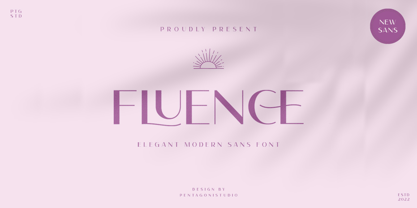 Fluence PS Is An Elegant Sans Serif Font Inspired By Feminine and Elegant Character. SOFTWARE REQUIREMENTS : Fonts and alternate : No special software required they may be used in any basic program /website apps that allows standard fonts That's it folks! You can go ahead and get cracking :) Follow My Shop For Upcoming Updates Including Additional Glyphs And Language Support. And Please Message Me If You Want Your Language Included or If There Are Any Features or Glyph Requests, Feel Free to Send me A Message. Have a Good Day !
 - Spring Garden by Supersemarletter,
$11.00 Spring Garden is a modern and neat sans serif font. It can be matched to a large set of projects, so add it to your creative ideas and notice how it makes them stand out! Font Features : • Regular version • Character set A-Z in uppercase and lowercase • Alternates option • Numerals & Punctuation • Accented Characters • Multiple Languages Supported • Format File: OTF Recommended to use in Adobe Illustrator or Adobe Photoshop with opentype feature. If you have questions, just send me a message and I'm glad to help. Best Regards, Supersemar Letter
 - Prapen by TypeClassHeroes,
$29.00 Prapen and Prapen Neu is a Monospaced sans serif family. Design with various width and weight that you can explore and combine creating rhythm and texture for comfortable reading. This font supports more than 100 Latin-based languages and has extensive Cyrillic and Greek support for languages like Russian, Bulgarian, Ukrainian, and many more.In variable version, it allows multiple options when designing, adapting to different composition solutions. Feature Uppercase & Lowercase Number & Symbol International Glyphs (Cyrillic & Greek) Multilingual support Ligature Feel free to drop us a message any time and follow my shop for upcoming updates
 - Modeling SS by Sensatype Studio,
$15.00 Modeling is a Modern Fashion Sans Serif In a new generations, we analyze that any designer or brand owner need to make their brand standout. As our focus that analyze any typeface that helps to leverage any logo design to look more modern, fashionable and unique. We prepared this font with expanded style characters to help you create a classy branding in any projects. Modeling Modern Fashion font ready with: Creative Expanded Characters Preview as a inspirations that you can do with Modeling font Ready with Lowercase and Uppercase characters Wish you enjoy our font. :)
 - Magnolia Cora Script by Get Studio,
$10.00 Introducing Magnolia Cora Script, a handwritten font with a casual and strong character crafted with real brush textures, giving you a custom-made feel to your design work. Magnolia Cora Script also comes with a smooth version it can be used for various types of design needs such as branding materials, Invitation, social media templates, t-shirts, business cards, logos, promotional flyers, posters, and more. With multilingual support, this font is also suitable to be combined with san-serif to get an extraordinary result for your design projects.
 - Orbit Gate by pentagonistudio,
$19.00 Orbit Gate Is Modern Display Sans Serif Typeface with Variable Style Condensed and Extended. SOFTWARE REQUIREMENTS : Fonts and alternate : No special software required they may be used in any basic program /website apps that allows standard fonts That's it folks! You can go ahead and get cracking :) Follow My Shop For Upcoming Updates Including Additional Glyphs And Language Support. And Please Message Me If You Want Your Language Included or If There Are Any Features or Glyph Requests, Feel Free to Send me A Message. Have a Good Day !
 - Scene by Monotype,
$29.99 Work on Scene began some time after designer Sebastian Lester joined Monotype Imaging in 2000. Clean, calm, and highly legible — thus the design brief Lester set for himself. With Scene, he wanted to provide graphic designers and creative directors with a suite of fonts that would serve as a strong foundation for identity projects, incorporating what he had learned about on-screen and print legibility. Scene was developed during two years of after-hours and weekend work. The family comes in six weights with matching italics, there is a set of “semi-sans” characters to introduce more expressive word rhythms into headlines and blocks of copy.
 - Gyllene Elgen by Mans Greback,
$69.00 Gyllene Elgen, created by Mans Greback, is a delicate and captivating handwriting font that exudes romance and charm. With its thin, beautiful lines, and loopy, decorative swirls, this typeface brings a touch of elegance and sophistication to your design projects. Perfect for invitations, personal notes, and other heartfelt communications, Gyllene Elgen captures the essence of delicate, handcrafted beauty. The font was inspired by the golden hues of the Swedish landscape during autumn, as well as the mythical golden elk that roams the forests. Mans Greback sought to bring this enchanting story to life through the graceful curves and fine details of Gyllene Elgen. The font is built with advanced OpenType functionality and has a guaranteed top-notch quality, containing stylistic and contextual alternates, ligatures, and more features; all to give you full control and customizability. It has extensive lingual support, covering all Latin-based languages, from Northern Europe to South Africa, from America to South-East Asia. It contains all characters and symbols you'll ever need, including all punctuation and numbers. Mans Greback is a Swedish typeface designer, celebrated for his innovative and diverse portfolio. With a keen eye for detail and innovative designs, Mans has earned a reputation for creating fonts that resonate with people across the globe, inspiring creativity and capturing the imagination.
 - Ultine by insigne,
$- No frills. No fluff. Still friendly. Keep your look clean and simple with the utilitarian but gentle Ultine. This font with a slightly extended geometric architecture gets straight to the point without pushing your reader away with too firm an approach. Ultine covers a large set of multi-Latin languages. It includes a wide range of other OpenType features, too, including ligatures and contextual alternates. Moreover, small caps of Utline and titling alternates are available for deepening your design capabilities with this basic face. The Ultine family consists of 42 fonts with three different widths and italics counterparts for every style. The design is well suited for graphic design and any use of the screen. It can easily operate as a webfont, as text for banner ads and for branding as well as editorial design. And just to show you how simple and friendly the font can be, the regular weight is free, so you can use it to your heart's content.
 - ITC Cinderella by ITC,
$29.99Some typefaces are staid, somber design tools. Then again, there's ITC Cinderella from Patricia Lillie: a typeface that's light-footed as a ballerina and joyful as a child at play. “There is a group of display faces that I simply love. Type that just seems to dance, type that makes me smile, designs that, when I see them, I say, "Boy, do I wish that was one of mine" says Lillie. “Although I never wanted to imitate these designs, when Cinderella started to emerge, I felt like it was the closest I've come to that quality.” ITC Cinderella projects gaiety and freedom. Capitals harmonize with a lowercase that bounces along with a lively, carefree attitude. Stroke weight stress is, well, all over the place. Curlicues abound. This delightful design is just that: brimming with delight. - Sunnyletter by Juncreative,
$24.00 Sunnyletter is a elegant script font. This font is neatly crafted and highly detailed. Whatever the topic, this font will be a wonderful asset to your font library, as it has the potential to enhance any creation. This font is PUA encoded which means you can access all glyphs and swashes with ease!
 - Springbee by Letterafandi Studio,
$10.00 Springbee is a dazzling script font. This font is neatly crafted and highly detailed. Whatever the topic, this font will be a wonderful asset to your font library, as it has the potential to enhance any creation. This font is PUA encoded which means you can access all glyphs and swashes with ease!
 - Whirled Peas NF by Nick's Fonts,
$10.00In his book Showcard Alphabets, Dan X. Solo called this little gem "Whitestone Scrawl". This version is beefed up slightly and the letter proportions have been altered somewhat, but it's still LOADS of fun. The Opentype version of this font supports Unicode 1250 (Central European) languages, as well as Unicode 1252 (Latin) languages. - Westmount by Rook Supply,
$14.00 Westmount is a geometric grotesque sans font that is both versatile and contemporary. The wide spacing between letters gives your text room to breathe and have the perfect amount of presence and balance. The strong capital letters are perfect for clean layouts and timeless branding. Try using Westmount Outline for a clean classic look.
 - Madani by NamelaType,
$49.00 Madani is a geometric sans serif consisting of 9 weights ranging from Thin to Black and matching Oblique. With a touch of character choice, adding tails to some glyphs on the stylistic set 1 and pointing joined at some of the tapered characters in the stylistic set 2, suitable for display and body text font.
 - ITC Tiepolo by ITC,
$29.99ITC Tiepolo font is from the design team at AlphaOmega Typography and named after Italian artist Dominic Tiepolo. The designers describe it as a sans serif with serifs" and it has also been referred to as a calligraphic design. Similar to Asian calligraphy, ITC Tiepolo font has personality yet does not detract from the text." - Tristero by Illuminaut Designs,
$10.00 “Behind the hieroglyphic streets there would either be a transcendent meaning, or only the earth.... Another mode of meaning behind the obvious, or none.” Tristero is an expansive geometric sans with letter forms that are both classic and quirky. There are over 550 characters in 3 weights. A versatile typeface with a friendly character.
 - Marching Band JNL by Jeff Levine,
$29.00 The cover of "Intermediate Steps to the Band" (an instructional book for marching band originally published by Mills Music in 1947) featured the title in a hand lettered multi-line sans serif with Art Deco influence. Re-drawn as a digital typeface named Marching Band JNL, it is available in both regular and oblique versions.
 - Cluster by PintassilgoPrints,
$24.00A hand-drawn shadowed and textured display sans. Strong and stylish, definitely. Two glyphs per letter for a nice natural feel. And let's not forget to remark the hi-versatile solo versions. These fit many design applications, with the amazing ability of looking slightly serious or slightly fun. But always genuine, you bet! - Maree by Ashton,
$5.00 If you want to write something sincere and genuine but not too formal then this is the font for you. It is based on real handwriting, not some artificial calligraphy made to be either too haphazard or spiky or have loads of elegant flourishes but an ordinary person's writing, and designed to look as natural and as close to the original lettering as possible. Like any person's writing it is individual and distinctive, but so easy going on the eye those differences sit comfortably with you. It is friendly and open with easy to read glyphs both as lowercase and uppercase. The letters are relatively wide with clearly shaped distinct outlines. This font may be ideal for projects where you expect a wide readership with different reading abilities from young to old. When you are using this font a slightly bigger point size usually gives a better result so for a standard letter or similar you should size up to 15 points or more. Maree has been individually crafted to the smallest detail. To create a realistic handwriting font that looks relatively simple but works in a wide variety of languages requires a complexity and attention to detail most fonts will never require. This font in any ordinary business environment would never have been made, the effort required to make it too great, the length of time too long. There have been no shortcuts in this font, no automatic scanning or tracing, no automatic generation, no class kerning. Not only is each glyph individual but the width of letters, the height, the accents and the positions of the accents are all different. Even the line weight of the letters is designed to have natural variation but yet similar enough that the font appears as though it were written effortlessly in the same pen. And in order to keep the spacing consistent even though the letters have different widths, heights, lengths of descenders and so on, there are a vast number of kerning pairs, letter to letter, number to number, letter to number... All kerning has been individually assessed with an eye to proportionality taking in character shape, size and weight. For instance if you write a telephone number the numbers all sit close together but if you write a number before a letter such as in a UK post code or before a unit of measurement an extra little bit of space has been added which makes the number more distinct and therefore readable. That space is so natural to the eye that you don’t even know it is there. However even in the spacing allowance has been made for the fact it can’t be too perfect because when you write by hand the spacing is inconsistent. There have to be some letters which are too close or far apart otherwise the font would look artificial. For similar reasons if you are going to print out this font for a letter, etc, check the print version before you make any letter spacing changes because with the zoom functions in modern applications that uneven spacing and lettering can seem more pronounced than it actually is. When this font is printed out you will find it is surprisingly neat. This font is what it is, simple clear handwriting. You will not go wow. But if you want something unique and different and looks good on the page you won’t be disappointed. This font is not a work of art but it is a work of love. This font has a soul. How many fonts can you say that about?
 - ALS Zwoelf by Art. Lebedev Studio,
$63.00 The design of Zwoelf stems from a letter created by Oleg Pashchenko for the poetry book called “They Talk.” Modified in several ways, the lettering gained readability and a more neutral look. This typeface combines Modern and Gothic styles, ugliness and beauty, the horrifying and the funny. Typographers may highlight any of this. Zwoelf features elements that can be found in both Roman and Gothic styles, but has no real historical prototype. It creates coarse body copy that feels like blackletters. The type is well-suited for use with rough line graphics. Zwoelf is a good choice for short texts, headings, witchcraft potion recipes, madrigals, spells and treasure map naming.
 - Pablo by ITC,
$29.99 Pablo is the work of British designer Trevor Pettit, who based this dramatic typeface on the signature of Pablo Picasso. The chunky lowercase reflects the very essence of Picasso's influence and the initial capitals can also be used on their own. Pablo is excellent for work requiring a vivid, cutting edge appearance.
 - Aramaic 450 by Archaica,
$30.00This font provides a typical set of characters for the ancient Imperial Aramaic language (the form of Aramaic that saw widespread use in the Persian Empire during the sixth to fourth centuries BC). It includes a full set of alphabetic characters, including some variant shapes, as well as the ancient numeral forms. - Rockingham by Atharuah Studios,
$21.00 Introducing Rockingham! A handwritten font designed with balance to create a stunning typeface. It's the perfect choice for personal branding & logo projects, product packaging, handwritten quotes, editorial design, and more. What's Included: Rockingham comes with a single font file that includes uppercase, lowercase, numbers, punctuation, and multilingual support. That's it! I hope you enjoy it. You can also say hello to me on Instagram: https://www.instagram.com/atharuah_ Thank You!
 - Langith by Twinletter,
$12.00 Introducing Langith font, a very simple and clean san serif family, there is artistic value in this font, both from the width of the letters, corners, and spacing between letters, this font is also equipped with ligatures. start creating incredible designs with this font This font is perfect for games, sporting events, branding, banners, posters, movie titles, book titles, quotes, clothing, logotypes, and more. of course, your various design projects will be perfect and extraordinary if you use this font because this font is equipped with a complimentary font family, both for titles and subtitles and sentence text. start using our fonts for your amazing projects.
 - EraMax Radial by Our House Graphics,
$16.00 EraMax Radial is a geometric sans serif meant to be set BIG, for big statements. It's the perfect face for signage, packaging posters, branding and so on and on, where a strong voice is needed. It has a modern look that will work in a retro setting. Or, should that be a vintage look that will work in a modern setting. This is the first of what is to be a series to typefaces inspired by the original hand painted signage found in the TH&B train station in Hamilton Ontario. This classic Art Deco, Or, more precisely, Art Moderne building designed by the New York architectural firm of Fellheimer and Wagner and completed in 1933. The original lettering included about 75% of the uppercase letters only, so the balance of the uppercase and the lowercase plus all the other glyphs were extrapolated from the look and feel of the existing uppercase letters. Figures are based on the numerals on the station clock, with adjustments made to harmonised with the letters.
 - Valuxe by Gholib Tammami,
$14.00 Valuxe — modern and minimalist sans serif. This font pairs well with a basic font like Arial and any script with an elegant style.
 - Woodlawn JNL by Jeff Levine,
$29.00 Woodlawn JNL is based on an open face wood type. A bold outline sans, this design is excellent for headline and titling applications.
 - Parma by Monotype,
$29.99Giambattista Bodoni (1740-1813) was called the King of Printers; he was a prolific type designer, a masterful engraver of punches and the most widely admired printer of his time. His books and typefaces were created during the 45 years he was the director of the fine press and publishing house of the Duke of Parma in Italy. He produced the best of what are known as modern" style types, basing them on the finest writing of his time. Modern types represented the ultimate typographic development of the late eighteenth and early nineteenth centuries. They have characteristics quite different from the types that preceded them; such as extreme vertical stress, fine hairlines contrasted by bold main strokes, and very subtle, almost non-existent bracketing of sharply defined hairline serifs. Bodoni saw this style as beautiful and harmonious-the natural result of writing done with a well-cut pen, and the look was fashionable and admired. Other punchcutters, such as the Didot family (1689-1853) in France, and J. E. Walbaum (1768-1839) in Germany made their own versions of the modern faces. Even though some nineteenth century critics turned up their noses and called such types shattering and chilly, today the Bodoni moderns are seen in much the same light as they were in his own time. When used with care, the Bodoni types are both romantic and elegant, with a presence that adds tasteful sparkle to headlines and advertising. Parma was designed by the monotype Design Team after studying Bodoni's steel punches at the Museo Bodoniana in Parma, Italy. They also referred to specimens from the "Manuale Tipografico," a monumental collection of Bodoni's work published by his widow in 1818.