10,000 search results
(0.048 seconds)
- Delfin Scripts by Eclectotype,
$40.00 Delfino Script is a cool, connecting script that can appear both retro and contemporary. Curved on the outsides of strokes, and jagged inside, the forms look like an abstraction of strips of tape, folding and flowing, or even marker pen style lettering. This script is not created by any pen though - its forms are constructed, not painted. Typographic features like ink traps add sparkle to the text. OpenType features include ligatures, contextual alternates (for more realistic connections) and stylistic sets. Stylistic Set 1 changes certain upper case letters into forms more suited for all caps setting, although they can also be used freely with the lower case. Set 2 changes the r into a less scripty form and set 3 adds a connecting tail to the q. Delfino Script would find itself at home in cookery books, fashion blogs, vintage car magazines and set large and proud on expanses of concrete, or, most likely, whatever you might have in mind for it! Delfina Script is practically identical to Delfino save for round tittles, periods and any other dot shaped glyph components. Strangely for such a little change, it does seem to give the face a different character.
 - Ongunkan Proto Bulgarian Runic by Runic World Tamgacı,
$70.00 Kъnig – the old Bulgar runes The writing kъnig emerged in the places of ancient Thraco-Bulgarian migrations in ante-deluvial times and developed in stages paralleling the other ancient writings. There have been many interactions and loanings between kъnig and these other writings. The root of the word kъnig (OBg: кънигъı) comes from the Old Chinese k'üen 'scroll' (ModCh: 纸卷 zhǐjuǎn) [57]. The word was loaned directly in the Bulgar language (*kün'ig > *küniv) restoring two individual Old Chuvash forms: 1. *k'ün'čьk > кўнчěк kind of ornament on a woman's garment; *k'ün'-gi / *k'ün'-üg > k'ün'iv book, codex, which is evidenced by the Hungarian könyv book and Mordvinian konov paper borrowings; 2. *k'ün'i- > *k'ün'i-gi > к'әn'iγь > кънигъı. This word has been preserved in Sumerian as kunuku (inscription) and kəniga (writing, knowledge). It is inherited from Bulgar to Slavic: книга (Bulgarian and Russian), књига (Serbian, Croatian and Slovenian), kniha (Czech and Slovak), książka (Polish), and non-Slavic: könyv (Hungarian) languages. Kъnig letters (kъni) have been known from archeological finds for more than 100 years already; however, until recently, no attempt has been made to decipher them, find their phonological value, or connect them to their natural successors: the Glagolitic and Cyrillic alphabets. The oldest mention on the Bulgar runes is found in the mid-9th c. AD work On the Letters by the Bulgarian writer Chernorizets Hrabъr. Being already a Christian, he wrote pejoratively about the pagan Bulgars
 - Times New Roman PS Cyrillic by Monotype,
$67.99In 1931, The Times of London commissioned a new text type design from Stanley Morison and the Monotype Corporation, after Morison had written an article criticizing The Times for being badly printed and typographically behind the times. The new design was supervised by Stanley Morison and drawn by Victor Lardent, an artist from the advertising department of The Times. Morison used an older typeface, Plantin, as the basis for his design, but made revisions for legibility and economy of space (always important concerns for newspapers). As the old type used by the newspaper had been called Times Old Roman," Morison's revision became "Times New Roman." The Times of London debuted the new typeface in October 1932, and after one year the design was released for commercial sale. The Linotype version, called simply "Times," was optimized for line-casting technology, though the differences in the basic design are subtle. The typeface was very successful for the Times of London, which used a higher grade of newsprint than most newspapers. The better, whiter paper enhanced the new typeface's high degree of contrast and sharp serifs, and created a sparkling, modern look. In 1972, Walter Tracy designed Times Europa for The Times of London. This was a sturdier version, and it was needed to hold up to the newest demands of newspaper printing: faster presses and cheaper paper. In the United States, the Times font family has enjoyed popularity as a magazine and book type since the 1940s. Times continues to be very popular around the world because of its versatility and readability. And because it is a standard font on most computers and digital printers, it has become universally familiar as the office workhorse. Times?, Times? Europa, and Times New Roman? are sure bets for proposals, annual reports, office correspondence, magazines, and newspapers. Linotype offers many versions of this font: Times? is the universal version of Times, used formerly as the matrices for the Linotype hot metal line-casting machines. The basic four weights of roman, italic, bold and bold italic are standard fonts on most printers. There are also small caps, Old style Figures, phonetic characters, and Central European characters. Times? Ten is the version specially designed for smaller text (12 point and below); its characters are wider and the hairlines are a little stronger. Times Ten has many weights for Latin typography, as well as several weights for Central European, Cyrillic, and Greek typesetting. Times? Eighteen is the headline version, ideal for point sizes of 18 and larger. The characters are subtly condensed and the hairlines are finer." - Times New Roman Seven by Monotype,
$67.99In 1931, The Times of London commissioned a new text type design from Stanley Morison and the Monotype Corporation, after Morison had written an article criticizing The Times for being badly printed and typographically behind the times. The new design was supervised by Stanley Morison and drawn by Victor Lardent, an artist from the advertising department of The Times. Morison used an older typeface, Plantin, as the basis for his design, but made revisions for legibility and economy of space (always important concerns for newspapers). As the old type used by the newspaper had been called Times Old Roman," Morison's revision became "Times New Roman." The Times of London debuted the new typeface in October 1932, and after one year the design was released for commercial sale. The Linotype version, called simply "Times," was optimized for line-casting technology, though the differences in the basic design are subtle. The typeface was very successful for the Times of London, which used a higher grade of newsprint than most newspapers. The better, whiter paper enhanced the new typeface's high degree of contrast and sharp serifs, and created a sparkling, modern look. In 1972, Walter Tracy designed Times Europa for The Times of London. This was a sturdier version, and it was needed to hold up to the newest demands of newspaper printing: faster presses and cheaper paper. In the United States, the Times font family has enjoyed popularity as a magazine and book type since the 1940s. Times continues to be very popular around the world because of its versatility and readability. And because it is a standard font on most computers and digital printers, it has become universally familiar as the office workhorse. Times?, Times? Europa, and Times New Roman? are sure bets for proposals, annual reports, office correspondence, magazines, and newspapers. Linotype offers many versions of this font: Times? is the universal version of Times, used formerly as the matrices for the Linotype hot metal line-casting machines. The basic four weights of roman, italic, bold and bold italic are standard fonts on most printers. There are also small caps, Old style Figures, phonetic characters, and Central European characters. Times? Ten is the version specially designed for smaller text (12 point and below); its characters are wider and the hairlines are a little stronger. Times Ten has many weights for Latin typography, as well as several weights for Central European, Cyrillic, and Greek typesetting. Times? Eighteen is the headline version, ideal for point sizes of 18 and larger. The characters are subtly condensed and the hairlines are finer." - Times New Roman WGL by Monotype,
$67.99 In 1931, The Times of London commissioned a new text type design from Stanley Morison and the Monotype Corporation, after Morison had written an article criticizing The Times for being badly printed and typographically behind the times. The new design was supervised by Stanley Morison and drawn by Victor Lardent, an artist from the advertising department of The Times. Morison used an older typeface, Plantin, as the basis for his design, but made revisions for legibility and economy of space (always important concerns for newspapers). As the old type used by the newspaper had been called Times Old Roman," Morison's revision became "Times New Roman." The Times of London debuted the new typeface in October 1932, and after one year the design was released for commercial sale. The Linotype version, called simply "Times," was optimized for line-casting technology, though the differences in the basic design are subtle. The typeface was very successful for the Times of London, which used a higher grade of newsprint than most newspapers. The better, whiter paper enhanced the new typeface's high degree of contrast and sharp serifs, and created a sparkling, modern look. In 1972, Walter Tracy designed Times Europa for The Times of London. This was a sturdier version, and it was needed to hold up to the newest demands of newspaper printing: faster presses and cheaper paper. In the United States, the Times font family has enjoyed popularity as a magazine and book type since the 1940s. Times continues to be very popular around the world because of its versatility and readability. And because it is a standard font on most computers and digital printers, it has become universally familiar as the office workhorse. Times?, Times? Europa, and Times New Roman? are sure bets for proposals, annual reports, office correspondence, magazines, and newspapers. Linotype offers many versions of this font: Times? is the universal version of Times, used formerly as the matrices for the Linotype hot metal line-casting machines. The basic four weights of roman, italic, bold and bold italic are standard fonts on most printers. There are also small caps, Old style Figures, phonetic characters, and Central European characters. Times? Ten is the version specially designed for smaller text (12 point and below); its characters are wider and the hairlines are a little stronger. Times Ten has many weights for Latin typography, as well as several weights for Central European, Cyrillic, and Greek typesetting. Times? Eighteen is the headline version, ideal for point sizes of 18 and larger. The characters are subtly condensed and the hairlines are finer."
 - Times New Roman by Monotype,
$67.99 In 1931, The Times of London commissioned a new text type design from Stanley Morison and the Monotype Corporation, after Morison had written an article criticizing The Times for being badly printed and typographically behind the times. The new design was supervised by Stanley Morison and drawn by Victor Lardent, an artist from the advertising department of The Times. Morison used an older typeface, Plantin, as the basis for his design, but made revisions for legibility and economy of space (always important concerns for newspapers). As the old type used by the newspaper had been called Times Old Roman," Morison's revision became "Times New Roman." The Times of London debuted the new typeface in October 1932, and after one year the design was released for commercial sale. The Linotype version, called simply "Times," was optimized for line-casting technology, though the differences in the basic design are subtle. The typeface was very successful for the Times of London, which used a higher grade of newsprint than most newspapers. The better, whiter paper enhanced the new typeface's high degree of contrast and sharp serifs, and created a sparkling, modern look. In 1972, Walter Tracy designed Times Europa for The Times of London. This was a sturdier version, and it was needed to hold up to the newest demands of newspaper printing: faster presses and cheaper paper. In the United States, the Times font family has enjoyed popularity as a magazine and book type since the 1940s. Times continues to be very popular around the world because of its versatility and readability. And because it is a standard font on most computers and digital printers, it has become universally familiar as the office workhorse. Times?, Times? Europa, and Times New Roman? are sure bets for proposals, annual reports, office correspondence, magazines, and newspapers. Linotype offers many versions of this font: Times? is the universal version of Times, used formerly as the matrices for the Linotype hot metal line-casting machines. The basic four weights of roman, italic, bold and bold italic are standard fonts on most printers. There are also small caps, Old style Figures, phonetic characters, and Central European characters. Times? Ten is the version specially designed for smaller text (12 point and below); its characters are wider and the hairlines are a little stronger. Times Ten has many weights for Latin typography, as well as several weights for Central European, Cyrillic, and Greek typesetting. Times? Eighteen is the headline version, ideal for point sizes of 18 and larger. The characters are subtly condensed and the hairlines are finer."
 - Times New Roman Small Text by Monotype,
$67.99In 1931, The Times of London commissioned a new text type design from Stanley Morison and the Monotype Corporation, after Morison had written an article criticizing The Times for being badly printed and typographically behind the times. The new design was supervised by Stanley Morison and drawn by Victor Lardent, an artist from the advertising department of The Times. Morison used an older typeface, Plantin, as the basis for his design, but made revisions for legibility and economy of space (always important concerns for newspapers). As the old type used by the newspaper had been called Times Old Roman," Morison's revision became "Times New Roman." The Times of London debuted the new typeface in October 1932, and after one year the design was released for commercial sale. The Linotype version, called simply "Times," was optimized for line-casting technology, though the differences in the basic design are subtle. The typeface was very successful for the Times of London, which used a higher grade of newsprint than most newspapers. The better, whiter paper enhanced the new typeface's high degree of contrast and sharp serifs, and created a sparkling, modern look. In 1972, Walter Tracy designed Times Europa for The Times of London. This was a sturdier version, and it was needed to hold up to the newest demands of newspaper printing: faster presses and cheaper paper. In the United States, the Times font family has enjoyed popularity as a magazine and book type since the 1940s. Times continues to be very popular around the world because of its versatility and readability. And because it is a standard font on most computers and digital printers, it has become universally familiar as the office workhorse. Times?, Times? Europa, and Times New Roman? are sure bets for proposals, annual reports, office correspondence, magazines, and newspapers. Linotype offers many versions of this font: Times? is the universal version of Times, used formerly as the matrices for the Linotype hot metal line-casting machines. The basic four weights of roman, italic, bold and bold italic are standard fonts on most printers. There are also small caps, Old style Figures, phonetic characters, and Central European characters. Times? Ten is the version specially designed for smaller text (12 point and below); its characters are wider and the hairlines are a little stronger. Times Ten has many weights for Latin typography, as well as several weights for Central European, Cyrillic, and Greek typesetting. Times? Eighteen is the headline version, ideal for point sizes of 18 and larger. The characters are subtly condensed and the hairlines are finer." - Times New Roman PS Greek by Monotype,
$67.99In 1931, The Times of London commissioned a new text type design from Stanley Morison and the Monotype Corporation, after Morison had written an article criticizing The Times for being badly printed and typographically behind the times. The new design was supervised by Stanley Morison and drawn by Victor Lardent, an artist from the advertising department of The Times. Morison used an older typeface, Plantin, as the basis for his design, but made revisions for legibility and economy of space (always important concerns for newspapers). As the old type used by the newspaper had been called Times Old Roman," Morison's revision became "Times New Roman." The Times of London debuted the new typeface in October 1932, and after one year the design was released for commercial sale. The Linotype version, called simply "Times," was optimized for line-casting technology, though the differences in the basic design are subtle. The typeface was very successful for the Times of London, which used a higher grade of newsprint than most newspapers. The better, whiter paper enhanced the new typeface's high degree of contrast and sharp serifs, and created a sparkling, modern look. In 1972, Walter Tracy designed Times Europa for The Times of London. This was a sturdier version, and it was needed to hold up to the newest demands of newspaper printing: faster presses and cheaper paper. In the United States, the Times font family has enjoyed popularity as a magazine and book type since the 1940s. Times continues to be very popular around the world because of its versatility and readability. And because it is a standard font on most computers and digital printers, it has become universally familiar as the office workhorse. Times?, Times? Europa, and Times New Roman? are sure bets for proposals, annual reports, office correspondence, magazines, and newspapers. Linotype offers many versions of this font: Times? is the universal version of Times, used formerly as the matrices for the Linotype hot metal line-casting machines. The basic four weights of roman, italic, bold and bold italic are standard fonts on most printers. There are also small caps, Old style Figures, phonetic characters, and Central European characters. Times? Ten is the version specially designed for smaller text (12 point and below); its characters are wider and the hairlines are a little stronger. Times Ten has many weights for Latin typography, as well as several weights for Central European, Cyrillic, and Greek typesetting. Times? Eighteen is the headline version, ideal for point sizes of 18 and larger. The characters are subtly condensed and the hairlines are finer." - Times New Roman PS by Monotype,
$67.99In 1931, The Times of London commissioned a new text type design from Stanley Morison and the Monotype Corporation, after Morison had written an article criticizing The Times for being badly printed and typographically behind the times. The new design was supervised by Stanley Morison and drawn by Victor Lardent, an artist from the advertising department of The Times. Morison used an older typeface, Plantin, as the basis for his design, but made revisions for legibility and economy of space (always important concerns for newspapers). As the old type used by the newspaper had been called Times Old Roman," Morison's revision became "Times New Roman." The Times of London debuted the new typeface in October 1932, and after one year the design was released for commercial sale. The Linotype version, called simply "Times," was optimized for line-casting technology, though the differences in the basic design are subtle. The typeface was very successful for the Times of London, which used a higher grade of newsprint than most newspapers. The better, whiter paper enhanced the new typeface's high degree of contrast and sharp serifs, and created a sparkling, modern look. In 1972, Walter Tracy designed Times Europa for The Times of London. This was a sturdier version, and it was needed to hold up to the newest demands of newspaper printing: faster presses and cheaper paper. In the United States, the Times font family has enjoyed popularity as a magazine and book type since the 1940s. Times continues to be very popular around the world because of its versatility and readability. And because it is a standard font on most computers and digital printers, it has become universally familiar as the office workhorse. Times?, Times? Europa, and Times New Roman? are sure bets for proposals, annual reports, office correspondence, magazines, and newspapers. Linotype offers many versions of this font: Times? is the universal version of Times, used formerly as the matrices for the Linotype hot metal line-casting machines. The basic four weights of roman, italic, bold and bold italic are standard fonts on most printers. There are also small caps, Old style Figures, phonetic characters, and Central European characters. Times? Ten is the version specially designed for smaller text (12 point and below); its characters are wider and the hairlines are a little stronger. Times Ten has many weights for Latin typography, as well as several weights for Central European, Cyrillic, and Greek typesetting. Times? Eighteen is the headline version, ideal for point sizes of 18 and larger. The characters are subtly condensed and the hairlines are finer." - Stencil Decor JNL by Jeff Levine,
$29.00 Stencil Decor JNL is loaded with all kinds of antique designs, embellishments and borders to work well alongside your favorite stencil lettering to create a totally retro look. Of course, these designs also make beautiful additions to many other kinds of print and craft projects. PLEASE NOTE: The purchase of this font does not include the right to reproduce the images for resale as stand-alone products (including, but not limited to stencils, ink stamps, stickers, wallpaper, etc.). For this kind of use, contact Jeff Levine Fonts through the email address provided in the EULA to discuss special licensing options and fees.
 - Theadzan by Almarkha Type,
$29.00 Hello everyone, we introduce our new product, Thadzan - Super Bold Condensed inspired by the title of the sports poster, We make it very energetically, so it has very strong characteristics, taking into account the thickness and density of each gliph, along with a ligature that makes this font look unique. Thadzan font with strong and challenging nuances. It is also equipped with 10 glyph ligatures, which make the characteristics of this font even more extraordinary. very suitable for the title, typography, clothes, Poster, magazines, brochures, packaging,Websites and much more for your design needs, making your designs more modern and professional.
 - Delgado by Gaslight,
$30.00 Delgado is a narrow elegant serif font with drops. Delgado is a good choice for large journal titles and small amounts of text. This font was made for one of the independent magazine - but it all went wrong and Delgado was freed from the shackles and went to the free swimming. A large number of both Latin and Cyrillic ligatures makes Delgado playful and at the same time it remains faithful. Delgado received a citation for excellence in type design the in international competition "Modern cyrillic 2014".
 - Nouveau Moderne JNL by Jeff Levine,
$29.00 The cover of the 1904 sheet music from the Tibetan comic opera “The Forbidden Land” had the title hand lettered in an unusual Art Nouveau style. Mostly squared with rounded corners, many of the characters twisted, turned and extended in ways that took on the look of the Far East. This became the design model for Nouveau Moderne JNL, which is available in regular and oblique versions.
 - ITC Weidemann by ITC,
$29.99 The Weidemann typeface's original name was Biblica, which was designed for the collaborative publication of a Bible by the German Catholic and Protestant Churches. The mass of text which the face was intended to set required that the design allow many characters to fit onto one line without rendering the words illegible. Thus, narrow spacing does not compromise the legibility or the elegance of Weidemann.
 - Miracle Fairway by Nathatype,
$29.00 Miracle Fairway is a display serif font in a thick weight design with which you can create elegant, modern, interesting designs full of fun energy. The letters’ proportions and the high contrasts are at the same level for a great legibility reason to make this font applicable to any text sizes. You may also enjoy various features available in this font. Features: Ligatures Multilingual Supports PUA Encoded Numerals and Punctuations Miracle Fairway fits best for various design projects, such as posters, banners, logos, magazine covers, quotes, headings, printed products, invitations, name cards, merchandise, social media, etc. Find out more ways to use this font by taking a look at the font preview. Thanks for purchasing our fonts. Hopefully, you have a great time using our font. Feel free to contact us anytime for further information or when you have trouble with the font. Thanks a lot and happy designing.
 - Guadalupana by JVB Fonts,
$30.00 On October 12th 1976 a new basilica was inaugurated in honor and in gratitude to the Patron Saint, the Virgin of Guadalupe, loved by the Mexican people. This basilica was designed by the Mexican architect Pedro Ramírez Vázquez (died on April 16th 2012). It stands out by its hug spacious interior, generously decorated with bronze elements. The aesthetic value of these items even includes many signs and text inscriptions in a particular typeface and style, of which this font is a reinterpretation. The purpose of this project is to revival this eclesiastical written letter forms in bronze and taking them to digital format. I was inspired to this on my last trip to Mexico in September of 2012.
 - Lianhua by Quatype,
$15.00 Lianhua is a handwritten font with a soft touch, given by a Chinese ink brush. There are lots of Chinese western fonts having a strong, sharp visual feeling, like the strokes of Chinese characters, so I decide to do the opposite: soft. Because except for Yang, there is also Yin in Chinese culture. The name 'Lianhua' means lotus in Chinese. This font is flexible and widely-used, it's suited for book titles, posters, brochures, flyers, even for menus of a Chinese restaurant. The total glyphs in this font is 351, including basic Latin letters and symbols, Latin-Expand A, 10 ligatures and 2 alternate letters, which are the letter g and letter y.
 - Lila Pro Heavy by Eurotypo,
$27.00 The Lilac (or Syringa vulgaris), a slightly vigorous plant, gives a nice colour to the place where its located, well maintained from one season to another and even when not in flower, the colour of its foliage and compact form makes it attractive enough. Lila Pro was created on the coast of Andalucía, inspired by its vibrant colour’s contrasts, and lush climate. This new script has all the advantages of OpenType technology that allows a variety of combinations: standard ligatures, contextual alternates, discretional ligatures, word ending and tails. Specially designed for creating logos for products and packaging, this font can also be used as body text for its good legibility and accurate kerning.
 - Tomatoes Cake by Balpirick,
$15.00 Tomatoes Cake is a Cute Handbrushed Font. Whether you’re using it for crafts, digital design, presentations, or making greeting cards, this font has the potential to become your favorite go-to font, no matter the occasion! This font only has allcaps letters. - also multilingual support Enjoy the font! Feel free to comment or feedback! Thank you!
 - Fernburner NF by Nick's Fonts,
$10.00This stunning display face is based on Hans Bohn’s 1929 opus for Gebr. Klingspor, originally named Orplid. One of the treasures discovered in the legendary green vinyl binder that launched Nick’s love of type, it’s a real crowd pleaser. Both versions of this font include the complete Latin 1252, Central European 1250 and Turkish 1254 character sets. - Old Skull by Gleb Guralnyk,
$14.00 Hi, presenting a blackletter font named Old Skull. This vintage gothic look typeface was originally made using a flat calligraphic pen what makes it more organic and natural. Old Skull typeface suits the best for original t-shirt prints and tattoo designs. This font supports most of the European languages, please check out the screenshot with all available characters.
 - Cupid Gummies by Balpirick,
$15.00 Cupid Gummies is a Sweet and Cute Handbrushed Font. Whether you’re using it for crafts, digital design, presentations, or making greeting cards, this font has the potential to become your favorite go-to font, no matter the occasion! This font only has allcaps letters. - also multilingual support Enjoy the font! Feel free to comment or feedback! Thank you!
 - Herkules by Nandatype Studio,
$15.00 Herkules is a whimsical script font with a relaxed theme, with a series of hooking hooks for a beautiful style. Whatever the topic, this font will be a great asset to your font library, as it has the potential to enhance any creation. This font is PUA encoded which means you can access all the glyphs and sweeps easily!
 - LTC Fournier Le Jeune by Lanston Type Co.,
$24.95 Based on the all caps decorative face Fournier le Jeune of 1768 by Pierre Simon Fournier for the Peignot Foundry. This version uses more elaborate "Vouge Initials" caps which were offered by ATF in 1920s. Because of the decorative nature of this design, a full character set is not included, but accented characters and basic punctuation are included.
 - Purple Bread by Balpirick,
$15.00 Purple Bread is a Tall Handwritten Font. Whether you’re using it for crafts, digital design, presentations, or making greeting cards, this font has the potential to become your favorite go-to font, no matter the occasion! This font only has allcaps letters. - also multilingual support Enjoy the font! Feel free to comment or feedback! Thank you!
 - Queens Burger by Balpirick,
$15.00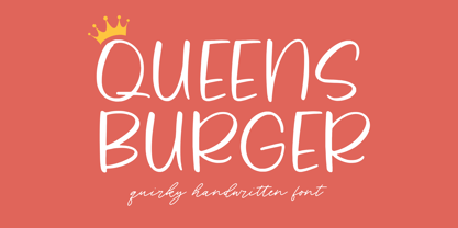 Queens Burger is a Quirky Handwritten Font. Whether you’re using it for crafts, digital design, presentations, or making greeting cards, this font has the potential to become your favorite go-to font, no matter the occasion! This font only has allcaps letters. - also multilingual support Enjoy the font! Feel free to comment or feedback! Thank you!
 - Petre Devos NF by Nick's Fonts,
$10.00At first glance, this unusual display face might appear to be a product of the 1960s, with its highly unconventional letterforms and its plastic, fantastic highlight treatment. However, this font is in fact inspired by a ca. 1930 poster for a Belgian beer of the same name. The uncredited Flemish designer was clearly a head of his time (ouch!). - Winder by Sarid Ezra,
$15.00 Introducing, Winder, a modern font Winder is a modern and stylish sans based font. You can find the uniques from the forms in lowercase. You can combine the lowercase and uppercase to get more stunning and approachable design. You can use this font for poster, logotype, branding and get stunning and unusual looks. This font also support multilingual!
 - Nerwyn NF by Nick's Fonts,
$10.00This snappy little number was inspired by a PLINC typeface by Murray Fuchs called Erwin, which has been redrawn and improved for the digital age. Use Contextual Alternates to "bounce" the text, and Discretionary Ligatures to enable some interlocking letter combinations. Both versions of this font include the complete Latin 1252 and Central European 1250 character sets. - Almond Cookie by Balpirick,
$15.00 Almond Cookie is a Monoline Handwritten Font. Whether you’re using it for crafts, digital design, presentations, or making greeting cards, this font has the potential to become your favorite go-to font, no matter the occasion! This font only has allcaps letters. - also multilingual support Enjoy the font! Feel free to comment or feedback! Thank you!
 - Planscribe NF by Nick's Fonts,
$10.00This family of faces take their inspiration from the standard faces used by the Leroy® Automatic Lettering Machine, a mainstay for architects and draftsmen in Ye Olden Days of t-squares and triangles. Crisp, clean and retro-techno. Both versions of this font include the complete Latin 1252, Central European 1250 and Turkish 1254 character sets. - Estika by ZetDesign,
$15.00 estika is a modern handwritten font and pays attention to the anatomy of some text to create a flexible yet elegant form. This font is available in regular and italic forms with open type features to enrich the choice of style when used. This font is perfect for informal uses while maintaining the beauty of writing
 - Write Marker by Balpirick,
$15.00 Write Marker is a Bold Marker Font. Whether you’re using it for crafts, digital design, presentations, or making greeting cards, this font has the potential to become your favorite go-to font, no matter the occasion! This font only has allcaps letters. - also multilingual support Enjoy the font! Feel free to comment or feedback! Thank you!
 - Hyomenha by Lafitte 58,
$16.00 Hyomenha is an elegant script fon and handwritten font. Its natural and unique style makes it incredibly fitting to a large pool of designs.No matter the topic, this font will be an incredibly asset to your fonts library, as it has the potential to elevate any creation, this font was designed to enhance the beauty of your projects.
 - Mercantile Display NF by Nick's Fonts,
$10.00This older, somewhat funkier relative of the classic face, Engravers Roman, made its last appearance in the 1912 ATF Specimen Book. Here, it has been revived to do yeoman-like duty in a new century. This font contains the complete Latin language character set (Unicode 1252) plus support for Central European (Unicode 1250) languages as well. - Amoresa by Andrey Sharonov,
$22.00 Amoresa script was handwritten under inspiration of traditional calligraphy and the wonderful mystic soundtrack of Wojciech Kilar. This font comes with a clean and aged version, beautiful uppercase and lowercase alternates, ligatures and end-swashes. You can easy get alternate characters just by adding number 2, 3, or 4 after any uppercase. Each of them has from one to four stylistic alternates. Lowercase has alternates too. Aurora has eight lengths of end-swashes. Just add underscore and a number from 1 to 8 after any letter at the end of the word ( _1 _2 _3 ... _8). Amoresa has multi-lingual support (Western European characters) for the following languages: English, Danish, Dutch, Estonian, Faroese, Filipino, Finnish, French, German, Hungarian, Icelandic, Irish, Italian, Norwegian, Polish, Portuguese, Spanish, Swedish. In my examples I show how this script can be used. It's very well suited for logotypes, wedding invitations, alcohol labels, romantic cards and others. Recommended to use in Adobe Illustrator or Photoshop. The special features don't work in Microsoft Word.
 - South Roman by CBRTEXT Studio,
$15.00 South Roman is a beautiful handwritten monoline style font. Having a unique character shape completes its beauty. South Roman is the right choice to support your business. The strokes are firm and clean, making them elegant and classy. It has a long tail and heart-shaped character alternative that is perfect for logos, greeting cards, weddings, magazines, book covers, Valentine's Day, and more. This font also has multilingual support. Have this font now and make your project look beautiful and elegant. Thank you and have a nice day.
 - Mission Art by Woodside Graphics,
$19.95Mission Art contains 26 design elements from many of the California missions. From a dove about to alight on a mission wall, to floral accents of all kinds, to a mission cross, there's a design here for everyone and every purpose. An important part of this collection is 6 decorative borders that are designed in such a way that they can be used as single elements by themselves, or repeated to make a long border across a page. They join seamlessly by simply typing the appropriate letter over and over again. - Birch by Adobe,
$29.00Birch was designed in 1990 by Kim Buker Chansler, who based her forms on the designs of the turn of the 20th century. The new age needed new typefaces for an ever-increasing commerce and its advertisements. This time period therefore saw a profusion of new typefaces, all of which were meant first and foremost to catch the eye of consumers. To this end, style elements of past ages were reused, changed, and combined. Birch is modelled after a woodtype, a style made famous by its use on wanted posters in western movies. The narrow and space-saving Birch is perfect for headlines in display point sizes. - Cedar Heaven by Putracetol,
$22.00 Cedar Heaven - Wild Forest Display Font, a playful and adventurous typeface that encapsulates the spirit of the wilderness and outdoor exploration. This font is meticulously crafted, embodying elements of nature, adventure, and childhood wonder. With eight distinct variations tailored to fit its thematic design, Cedar Heaven is versatile and adaptable. Whether you’re branding an outdoor equipment store or designing invitations for a woodland-themed event, this font elevates your design with its unique character. The letters are imbued with elements of the forest, camping, and playful adventures making it perfect for children’s books, crafters’ creations or any project echoing the call of the wild.