10,000 search results
(0.085 seconds)
- Cinema Macabre by Wing's Art Studio,
$10.00 Cinema Macabre: Horror Fonts Torn from the Pages of Giallo A Hand-drawn Display Font for Creating the Most Diabolical Horror Titles This loose and inky brush font takes its inspiration from the classic Giallo film posters of the 1960s to 1980s - a cult cinematic subgenre beloved for its stylish visuals, haunting soundtracks and exploitation led marketing. It's a devilishly drawn design that aims to capture the feeling of vintage horror, preserving analogue details of old print while remaining versatile enough to work across a variety of digital designs. The Cinema Macabre font family boasts six fonts, each containing a unique set of uppercase and lowercase characters, as well as numerals, punctuation and language support. Add to this a host of custom ligatures, underlines and graphic elements and you have an essential toolbox for creating truly hand-made looking title designs. Cinema Macabre if a font that rewards experimentation by mixing all the various upper and lowercase alternatives, with interesting combinations waiting to be found and inspire terror across your own movie posters, book covers, albums and editorials. Few other fonts offer the versatility to create such diabolical designs! A Brief Introduction to Giallo: In popular cinema, Giallo is a genre of mystery fiction and thrillers often containing slasher, psychological horror, exploitation, supernatural and erotic elements. The term giallo (meaning yellow) derives from a series of pulp novels published by Mondadori from 1929 taking the name from its trademark yellow covers. The series consisted of Italian translations of mystery novels by well-known authors such as Agatha Christie, Edgar Allan Poe and Raymond Chandler. The popularity of these cheap paperbacks eventually established the word Giallo as a synonym in Italian for a mystery novel. The cinematic Giallo subgenre developed during the 1960-80s and are noted for their vivid cinematography, memorable soundtracks and inventive gore-filled scenarios. Key examples include Dario Argento's Suspiria, Tenebrae and Deep Red - stylish films that at once influenced the American slasher (see Black Christmas and Friday 13th) up to todays horror in Censor and Last Night In Soho.
 - Freitag Display by Zetafonts,
$39.00 Probably as a reaction to the pragmatism of modernist design, the seventies saw an explosion of buoyant, vivacious typography. Psychedelia fueled a return to the melting, lush shapes of Art Nouveau while Pop culture embraced the usage of funky, joyful lettering for advertising, product design and tv titling. New low-cost technologies like photo-lettering and rub-on transfer required new fonts to be expressive rather than legible, pushing designers to produce, bubbly, high-spirited masterpieces, where geometric excess and calligraphic inventions melted joyfully. Freitag is Cosimo Lorenzo Pancini's homage to this era and its typography. His starting point was the design of a heavy sans serif with humanist condensed proportions, flared stems and reverse contrast, that generated both the main family, and a variant display subfamily. The main typeface family slowly builds the tension and design exuberance along the weight axis - a bit like our desire for the weekend increases during the week. In Light and Medium weights the font shows a more controlled, medium-contrast design, tightly spaced for maximum display effect. The Book weight follows the same design but uses a more relaxed letter spacing to allow usage in smaller sizes and short body copy. As weight increases in the Bold weight the style becomes more expressive, with a visible reverse contrast building up and culminating in the Heavy weight with his clearly visible "bell bottoms" feel. In the display sub-family the design is pushed further by introducing variant letterforms that have a stronger connection to calligraphy and lettering. Also, the weight range becomes a optical one, with weights marked as Medium, Large, XLarge, as bringing the contrast and the boldness to the extreme creates smaller counterspaces that require bigger usage sizes. Another important addition of the display sub-family is the connected italics that sport swash capitals and cursive letterforms, developed with logo design and ultra-expressive editorial design in mind. To balance the extreme contrast in the XL weight, contrast of punctuation is reduced, creating a rich, highly-dynamic texture wherever diacritics and marks are used in the text. The full family includes 16 styles + 4 variable fonts, allowing full control of the design over its tree-hugging design space. All 20 fonts share an extended latin charset with open type features including case sensitive forms, single and double story variants and alternate glyphs. According to its creator, "Freitag is the typeface that sounds like an imaginary Woodstock where on the stage with Jimi Hendrix with Novarese, Motter, Excoffon and Benguiat playing onstage with Jimi Hendrix". Jeepers creepers!
 - Distill by MADType,
$19.00 Distill draws its inspiration mainly from Theo van Doesburg's De Stijl era lettering. The type he designed for the Aubette Café, De Stijl Magazine, etc was used as a starting point and then expanded upon. While this typeface was inspired by historical references, it also has the ability to invoke a contemporary feel under the right conditions. Distill will work hard whether you are designing a neo-constructivist poster or a futuristic website. Distill is a family of 12 fonts: 4 weights, each containing condensed, regular, and expanded widths. It also features several alternate characters.
 - Leonardian by Cubo Fonts,
$25.00 The Vitruvian Man is a world-renowned drawing created by Leonardo da Vinci circa 1487. The drawing depicts a male figure in two superimposed positions with his arms and legs apart and simultaneously inscribed in a circle and square. The drawing and text are sometimes called the Canon of Proportions or, less often, Proportions of Man.The drawing is based on the correlations of ideal human proportions with geometry described by the ancient Roman architect Vitruvius in Book III of his treatise De Architectura. Vitruvius described the human figure as being the principal source of proportion among the Classical orders of architecture. That's how "Leonardian" was buid as well: a quest for ideal proportions, a harmonious design springing up from a geometric "collision", circle and square's intersections.
 - Antique Tuscan No 9 by HiH,
$8.00 Antique Tuscan No.9 was one of the earlier wood-type designs by William Hamilton Page. It was first shown among the specimens produced in 1859, shortly after Page entered into a new partnership with Samuel Mowry, owner of the Mowry Axle Company. The new company was named Page and Company and was located at the Mowry facility in the Greenville section of Norwich, Connecticut. Antique Tuscan No.9 is an extra-condensed version of the tuscan style that had been released in moveable type by Vincent Figgins of London in 1817 and had become so popular for advertising in the intervening years. Because of the extreme compression in the design, we might be tempted to describe it as "Triple-X," but that might be misleading. The analogy would, of course, be to clothing sizes, not movie ratings. Because of the compression, this typeface reads best when set extra-extra-extra large. For printing, we recommend 36 points or larger. For the screen, we suggest at least 72 points. An unusual and distinctive design, it is best used with discretion. If I were doing a term paper for school or submitting an article to a magazine for publication, I might use it for the title page, to grab someone’s attention. I would certainly not use it for the main body of text - not if I expected anyone to read what I wrote. If you wonder why we make this recommendation, take the Ten-Point challenge. Print this paragraph using Antique Tuscan No.9 and set the font size at 10 points. If you are young and blessed with good eyesight, you will probably be able to read it - with effort. So, here is the challenge: hand it to your Grandmother and ask HER to read it.
 - Dynamique by PizzaDude.dk,
$15.00 I wouldn't recommend that you use this font for massive text, or text written in CAPS ... but then again, go ahead and try - I even kerned all the capital letters ... just in case that you would do something so crazy! :) Dynamique is a kind of a "straight out of the highway" grid-font. But then again, not ... if you use the lowercase alone, you have this almost monospaced font - try starting every word with a capital letter, and let it end with the alternate ligature, your words suddenly got even more power! If you want to go lightspeed - then use the same technique, but only with the italic version!
 - Milea lover by Mega Type,
$12.00 Milea Lover is a beautiful script font with an irregular baseline. Milea Lover comes with a feminine and trendy style that gives a touch of love to your design projects. Milea Lover looks very beautiful for branding, logo, wedding invitations, greeting cards, fashion, book covers, posters, labels, quotes and other romantic projects. Have fun using Milea Lover!!! I really hope you enjoy it! Feel free to follow, like and share. Thank you so much for checking out my shop!
 - Moula by 38-lineart,
$16.00 Moula is a modern sans serif with a geometric touch. Containing of 18 font, 9 uprights and its matching italics. It's shown a clean, minimalist, elegant, warmth, quirky, yet still purposed to be versatile and easy to read. Fit for various design or creative project. Support extended language (+ Cyrillic), fractions, tabular figures, ligatures and more. Perfectly suited for graphic design and any display use. It could easily work for web, signage, corporate as well as for editorial design.
 - Black Stay Script by madjack.font,
$15.00 Black Stay Script is a signature collection font with natural movement creating an elegant, classy and beautiful look for your latest project. Black Stay Script is perfect for branding projects, logos, wedding designs, social media posts, advertising, product packaging, product design, labels, photography, watermarks, invitations, stationery and any project that requires a handwritten feel. Full set of standard alphabet and punctuation Additional set of brushed lowercase letter endings Handwriting binder. Thank you so much for checking out my shop!
 - Zzzap by Comicraft,
$19.00 Run your hand under the tap and then thrust your fingers in the electrical outlet nearest to you* and you'll get the same effect that our latest release, ZZZAP will have on comic book readers everywhere when Electro, The Shocker, Black Lightning, Storm and Darth Sidious turn the dark side of the force on them. *The management accepts no responsibility for any adverse effects experienced by comic book font users who stick moistened digits into the power supply after installing this font for the purposes of comparison (it's probably best to just take our word for it). Batteries not included, void where prohibited.
 - Amigo by Monotype,
$29.00Amigo was designed by Arthur Baker in 1989 and consists of a single weight. Its basic forms are based on Venetian old face types, as can be seen for example in the slightly slanted cross stroke of the lower case e. But Baker also gave his figures eccentric contours, for example, a marked stroke contrast which gives the look of having been written with a broad-tipped pen, and the change in stroke is by no means regular in the lower case characters. The heavier upper parts become thinner as they progress downward, in contrast to the tendency of most text typefaces. The eccentricity of the forms give the characters a lively almost comic look and is best highlighted in large point sizes. However, Amigo is also legible in point sizes as small as 10 and well-suited for middle length texts and headlines. - Royal Crescent by Sharkshock,
$100.00 Royal Crescent is an all caps display sans with an emphasis on elegance and simplicity. The uniform width is consistent throughout creating low contrast in all three weights. There are slight variations, between a few upper and lowercase characters which can be used interchangeably. Titling was its primary purpose but will prove useful in a variety of situations. Use it for web headers, a magazine, or a luxury logo. This family is equipped with Basic/Extended Latin, punctuation, symbols, diacritics, Cyrillic, kerning, and fractions.
 - Starlikes by Say Studio,
$15.00 Starlikes - classic duo typeface with stencil serif and regular typeface, which can be adapted to your needs and desires Starlikes is a beautiful, nostalgic lowercase and uppercase typeface that works best as focus display text (think logos, headers, pretty quotes, calls to action, etc.) think logos, headers, pretty quotes, calls to action, etc.). Upper and lower case give it great versatility, but I honestly can't get over all the crumpled uppercase letters. This is too good. Including: Numbers & punctuation Foreign language support Have a wonderful day SayStudio :-)
 - Messy Linocut 2D by 2D Typo,
$24.00 Don't try to find logic in this font, nor the harmony of the forms. It is meant to be crank. All the letters were first cut in linoleum and then digitized. Hence, everything is alive. You will find no uniform elements. We think this font will find its use in the hands of a brave designer.
 - FF Info Pict by FontFont,
$62.99 Erik Spiekermann, working in collaboration with Ole Schäfer, originally designed FF Info® Display for use in the context of wayfinding systems. The variants FF Info™ Text and FF Info™ Correspondence were developed later for text setting and office communication. FF Info Display The sober and clear forms of the sans serif FF Info Display have been deliberately molded to make them perfect for use on wayfinding systems. The font by Ole Schäfer and Erik Spiekermann not only takes the problem of lack of space into account - it is some 15% narrower than comparable typefaces - the characters have also been designed to ensure they remain legible even in adverse conditions for reading. As text on signs often contains words with which readers are unfamiliar and which are thus deciphered letter for letter rather than perceived as whole words, it is essential to provide for a clear differentiation between glyphs. Additional serifs on the lowercase "i" and uppercase "I" and a small arch on the terminal of the lowercase "l" ensure that it is possible to readily discriminate between these particularly problematic letters. Moreover, sharp corners on glyphs can also make it difficult to read signs with backlighting or when driving past. The rounded corners of FF Info Display counteract this effect and make sure that the character forms remain well defined.FF Info Display is available in five carefully coordinated weights, from Regular to Bold. In the corresponding italic variants, the letters appear overall more rounded while the lowercase "a" has a closed form and the "f" has a descender. Also included among the glyphs of FF Info Display are several ligatures and arrow symbols. Pictograms with different themes that complement the typeface are also available in four weights. FF Info Text Thanks to his know-how gained through designing other typefaces, Erik Spiekermann became aware that fonts created for use in problematic environments can be used in many different situations. In smaller point sizes, FF Info Display cuts a fine figure when used to set longer texts. So Spiekermann carefully reworked FF Info Display to produce FF Info Text, a font perfected for use in this context. Not only can the characters be more generously proportioned, certain features, such as additional serifs to aid with the differentiation of problematic letters, are also no longer necessary in textual surroundings. The upright styles have a double-story "g" while Spiekermann has added oldstyle figures and small caps. FF Info Correspondence FF Info Correspondence has also been designed for setting block text although it recalls the style of old typewriter characters and is specifically intended for use in office communication. The characters of this third member of the family are thus more formal, without rounded terminals but with rectangular punctuation marks. The narrower letters are provided with large serifs to give them more space although, at the same time, this reduces the differences in terms of letter width among the alphabet. In contrast with its two siblings, FF Info Correspondence has only three weights, each with corresponding italic.The three styles of the FF Info super family cover an extensive range of potential applications. If the different kerning is adjusted manually, the three styles harmonize happily with each other and can be readily used in combination to set, for example, headlines and texts and also creative display options.
 - Angelica Rytes by Zamjump,
$17.00 Angelica Rytes is a handwritten font created with a romantic feel, it's perfect for creating signature logos and watermarks for photography studios or wedding invitations, quotes, fashion, and good for initial logo or brand signatures. Angelica Rytes includes a full set of beautiful handwritten upper and lower case letters, numbers, assorted punctuation marks and bindings. All lowercase letters include the final stroke, giving it a realistic handwriting style. You will get : Angelica Rytes TTF Angelica Rytes OTF Angelica Rytes WOFF In order to use the beautiful swashes, you need a program that supports OpenType features such as Adobe Illustrator CS, Adobe Photoshop CC, Adobe Indesign and Corel Draw.
 - Carson by Supfonts,
$15.00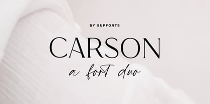 Carson Font Duo is a combination of a sophisticated serif typeface and a relaxed handwritten script. It has a contemporary and uncomplicated design that adds an elegant and tidy touch to various projects such as websites, logos, branding, social media quotes, wedding stationery, and more. I appreciate you visiting my shop. Don't hesitate to contact me if you have any inquiries. -Dima Carson Font Features: - Full Set of standard alphabet and punctuation - Ligatures - PUA Encoded - no special software needed to access extra characters - Language support: All European languages - Multilingual Characters AÁĂÂÄÀĀĄÅÃÆBCĆČÇĊDÐĎĐEÉĚÊËĖÈĒĘẼFGĞĢĠḠHĦIIJÍÎÏİÌĪĮĨJKĶLĹĽĻŁMNŃŇŅÑ OÓÔÖÒŐŌØÕŒPÞQRŔŘŖSŚŠŞȘẞTŤŢȚUÚÛÜÙŰŪŲŮŨVWẂŴẄẀXYÝŶŸỲỸZŹŽŻ aáăâäàāąåãæbcćčçċdðďđeéěêëėèēęẽfgğģġḡhħiıíîïìijīįĩjȷkķlĺľļłmnńňņñoóôöòőōøõœpþ qrŕřŗsśšşșßtťţțuúûüùűūųůũvwẃŵẅẁxyýŷÿỳỹzźžż
 - Magical Daisy by Supfonts,
$12.00 Magical Daisy is a cute handwritten signature font. Perfect for greeting cards, wedding stationery, photographer watermarks logos, modern websites, apparel design and more. Magical Daisy features handwritten ligatures and beginning and end swashes for lowercase letters. Thanks so much for checking out my shop, and please get in touch if you have any questions! --- Magical Daisy Font Features - Full Set of standard alphabet and punctuation - Extra set of beginning and ending swashed lowercase - 78 handwritten ligatures - PUA Encoded - no special software needed to access extra characters - Multilingual Characters AÁĂÂÄÀĀĄÅÃÆBCĆČÇĊDÐĎĐEÉĚÊËĖÈĒĘẼFGĞĢĠḠHĦIIJÍÎÏİÌĪĮĨJKĶLĹĽĻŁMNŃŇŅÑ OÓÔÖÒŐŌØÕŒPÞQRŔŘŖSŚŠŞȘẞTŤŢȚUÚÛÜÙŰŪŲŮŨVWẂŴẄẀXYÝŶŸỲỸZŹŽŻ aáăâäàāąåãæbcćčçċdðďđeéěêëėèēęẽfgğģġḡhħiıíîïìijīįĩjȷkķlĺľļłmnńňņñoóôöòőōøõœpþ qrŕřŗsśšşșßtťţțuúûüùűūųůũvwẃŵẅẁxyýŷÿỳỹzźžż
 - Paramour by Redy Studio,
$15.00 Paramour is a handwritten font that is the perfect way to add some flirty elegance to your design. Use it to create inked-style logos, wedding stationery & photographer watermarks, or to add a handwritten look to your website's typography. Paramour includes a full set of gorgeous uppercase and lowercase letters, numerals, a large range of punctuation, and 93 ligatures. This handcrafted typeface has been engineered to perfectly fit together. Paramour Features: A full set of upper & lowercase characters Numbers & punctuation 93 Gorgeous ligatures Multilingual symbols PUA Encoded Characters – Fully accessible without additional design software. Thank you for checking out Paramour! I hope you find it enjoyable, and feel free to give it a try below!
 - Elise Dafisa by Great Studio,
$15.00 Elise Dafisa is a modern calligraphy font with classic, sophisticated accents. It is perfect for branding, wedding invites and cards. Elise Dafisa includes a full set of lovely uppercase and lowercase letters, multilingual symbols, numerals, punctuation, and ligatures. All lowercase letters include beautiful and unique beginning and ending swashes (each letter has own "unpatterned" ending) . Also includes many multilingual symbols. WHAT'S INCLUDED : Elise Dafisa.otf SOFTWARE REQUIREMENTS : The fonts can be opened and used in any software that can read standard fonts - even MS Word. No special software is required , and a friendly little help file is included to get you started :) For folks who DO have OpenType capable software : The alternates are accessible by turning on 'Stylistic Alternates' and 'Ligatures' buttons on in Photoshop's Character panel, or via any software with a glyphs panel, e.g. Adobe Illustrator, Photoshop CC, Inkscape. How to access alternate glyphs? you can see it on this link ( http://goo.gl/1vy2fv ) If you have any questions, please don't hesitate to contact me by email: Greatstudio92@gmail.com
 - Swipe by Ahmad Jamaludin,
$15.00 Say hello to our new retro bold font, Swipe! Swipe - An seventies font that has both a retro and fun look. It comes with a smooth curve and soft bold with a regular and oblique style that will make your project more stunning with nostalgic feels. Swipe - Have 105 beautiful alternates and ligatures which consist of 4 stylistic sets. Contains 2 styles regular and italic, this font is best used for headings, logotype, quotes, apparel design, posters, flyers, packaging, book cover, and many more. Super-versatile, have a scroll through all the previews to see how wide the range of uses that can be with Swipe, it's so limitless! What you get Letters, numbers, symbols, and punctuation Has 105 beautiful alternates and ligatures Use in many programs even in Canva Multilingual Support Language Support: Danish, English, Estonian, Filipino, Finnish, French, Friulian, Galician, German, Gusii, Indonesian, Irish, Italian, Luxembourgish, Norwegian Bokmål, Norwegian Nynorsk, Nyankole, Oromo, Portuguese, Romansh, Rombo, Spanish, Swedish, Swiss-German, Uzbek (Latin) Come and say hello over on Instagram! https://www.instagram.com/dharmas.studio/ Dharmas Studio
 - Breathing Austria by Natural Ink,
$12.00 Breathing Austria- Duo Font is a new modern script font with an irregular base line. Trendy and feminine style. Breathing Austria- Duo Font With Extras looks beautiful in wedding invitations, thank-you cards, quotes, greeting cards, logos, business cards, and more. Perfect for use in ink or watercolors. Including initial letters and terminals, alternatives and support for many languages. To activate the OpenType Stylistic alternative, you need a program that supports OpenType features such as Adobe Illustrator CS, Adobe Indesign & CorelDraw X6-X7, Microsoft Word 2010 or newer versions. There are additional ways to access alternatives / swash, using Character Map (Windows), Nexus Fonts (Windows), Font Books (Mac) or software programs such as PopChar (for Windows and Mac). How to access all alternative characters: https: //www.youtube.com/watch? v = Go9vacoYmBw https: //www.youtube.com/watch? v = XzwjMkbB-wQ need help or have questions, let me know. I am happy to help :) Thank you & Congratulations on the Design!
 - Lust Sans by Positype,
$39.00 Lust Sans is the penultimate exploration of producing a high-contrast sans wholly influenced by its bracketed ancestor. The aspect of this endeavor I enjoyed the most was finding sneaky ways to infuse warmth and whimsy into the letterforms when you least expect it. The result, however, is subtle and uniquely balances against Lust and Lust Didone without becoming cold and overbearing. To accomplish this, Lust Sans has 6 weights. What I found during development was, based on any setting where Lust or Lust Didone were in the same layout, the amount of contrast shown with Lust Sans needed to be adjusted. Expanding the weight offering, produces opportunities for Lust Sans to modulate the rhythm of the layout comfortably while keeping contrast—this is even more obvious with the Italics. I love those. You will too. If you don’t, you do not have a soul. Not sorry. The Lust Collection is the culmination of 5 years of exploration and development, and I am very excited to share it with everyone. When the original Lust was first conceived in 2010 and released a year and half later, I had planned for a Script and a Sans to accompany it. The Script was released about a year later, but I paused the Sans. The primary reason was the amount of feedback and requests I was receiving for alternate versions, expansions, and ‘hey, have you considered making?’ and so on. I listen to my customers and what they are needing… and besides, I was stalling with the Sans. Like Optima and other earlier high-contrast sans, they are difficult to deliver responsibly without suffering from ill-conceived excess or timidity. The new Lust Collection aggregates all of that past customer feedback and distills it into 6 separate families, each adhering to the original Lust precept of exercises in indulgence and each based in large part on the original 2010 exemplars produced for Lust. I just hate that it took so long to deliver, but better right, than rushed, I imagine.
 - Rough Love by Positype,
$27.50 Rough Love, it’s fair to say, came before Love Script. The brushed letter specimens that would ultimately serve as the template for the much ‘cleaner’ Love Script have now been turned into a typeface. As I packed these up, I just kept coming back to them and staring at the texture and movement caught on the page. On a lark, I decided it would be fun to let people see an almost a before and after scenario of how one led to the other and decided to produce a typeface from these specimens… Rough Love. For the most part, in typical fashion for me when I brush out a typeface idea, I try to brush the entire character set along with each of the planned variants for swashes, titling, and other alternates—the reason for that is simple -- each letter looks and acts a bit differently when the same movements are imposed on them. With Rough Love, I tried to adhere to that and made very few modifications to the originals, and only had to ‘borrow’ in a few occasions when I happened to forget to brush a variant.
 - Cristal Ttris by Johannes Krenner,
$7.00 This Font is inspired by the Nintendo game: Tetris® It has 2 styles: BOLD and THIN. They both have simulated greyscale and can be used out of the box like you see them on the pictures. It comes with more than 450 glyphs per style. More than capable of supporting all european languages, small caps and different numeral figures.
 - One Feather by Supfonts,
$15.00 Hello dears! My new font with unpredictable stroke width looks very fresh and interesting. Have fun :) Feather will look beautiful on holiday invitations, wedding invites and stationery, logos, and more. Test it out below to see how it could look for your next project! Includes: Uppercase and lowercase Numbers and punctuation Foreign language support Check out my blog: https://www.instagram.com/zloillev pinterest.com/dmitriychirkov7
 - Bosch by iframe,
$32.00 Bosch is a serif font, its soft curves and refined details create a sense of elegance. Bosch is known for creating restlessly imaginative works rich in religious symbolism, allegory, and fantastical elements depicted in bustling scenes across expansive compositions. FEATURES 1 weight Upper / lower case, numbers, punctuation Supported Languages: Latin & Greek
 - Shellana by Rochart,
$10.00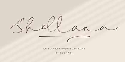 Give your designs an authentic handcrafted feel. "Shellana" is perfectly suited to signature, stationery, logo, typography quotes, magazine or book cover, website header, clothing, branding, packaging design and more. A handwritten script font containing upper and lowercase characters, numerals, a large range of punctuation,International language, ligatures, stylistic alternate and Swashes.
 - Black Bison by Linecreative,
$16.00 Black Bison is display font featuring a unique, strong and versatile style with alternates and Ligatures to create a more stunning display. Black Bison includes: 1. Upper and Lowercase characters (All Caps) 2. Ligatures (39 characters) and Stylistic Set (52 Characters) 3. Multilingual Support (Latin Western Europe), Numbers and Punctuation
 - Librum Sans by Hackberry Font Foundry,
$24.95 This is the companion sans family to make the Librum serif families work as well as they do. By companion, I do mean stylistically compatible. But mainly, they have the same vertical metrics. So they work very well for run-in heads, inline character styles, and all the rest of the needs in large books with complex formatting. They are designed for use in InDesign, and they work very well in that environment. The fonts use the same OpenType feature files as the rest of the Librum families. The feature files for the italic and bold are more limited—as I have rarely used things like that [over the past 20+ years]. The character shapes are a bit whimsical. The original ancestor of this book design sans was a very playful font I released as Aerle. It’s been calmed down a lot but is still loose and friendly. For a great deal, see Librum Book Design Group , for a package containing all fifteen fonts!
 - Hirradista by Rastype Studio,
$20.00 Hirradista Script is modern calligraphy font. This font is casual and pretty with swashes. Can used for various purposes. such as logo, product packaging, wedding invitations, branding, headlines, signage, labels, signature, book covers, posters, quotes and more. Hirradista Script features OpenType stylistic alternates, ligatures and International support for most Western Languages is included. To enable the OpenType Stylistic alternates, you need a program that supports OpenType features such as Adobe Illustrator CS, Adobe Indesign & CorelDraw X6-X7, Microsoft Word 2010 or later versions. How to access all alternative characters using Adobe Illustrator: https://www.youtube.com/watch?v=XzwjMkbB-wQ Hirradista Script is coded with PUA Unicode, which allows full access to all the extra characters without having special designing software. Mac users can use Font Book , and Windows users can use Character Map to view and copy any of the extra characters to paste into your favourite text editor/app.How to access all alternative characters, using Windows Character Map with Photoshop: https://www.youtube.com/watch?v=Go9vacoYmBw If you need help or have any questions, please let me know. I'm happy to help :) Thanks & Happy Designing!
 - Lady Angelina Script by Mega Type,
$14.00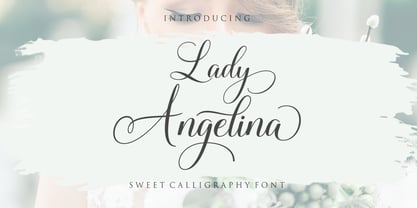 Lady Angelina Script is a sweet calligraphy font. This font is casual and pretty with swashes and can be used for various purposes including logos, product packagings, wedding invitations, branding, headlines, signage, labels, signature, book covers, posters, quotes and more. Lady Angelina Script features OpenType stylistic alternates, ligatures and International support for most Western Languages. To enable the OpenType Stylistic alternates, you need a program that supports OpenType features such as Adobe Illustrator CS, Adobe Indesign & CorelDraw X6-X7, Microsoft Word 2010 or later versions.How to access all alternative characters using Adobe Illustrator: https://www.youtube.com/watch?v=XzwjMkbB-wQ Lady Angelina Script is coded with PUA Unicode, which allows full access to all the extra characters without having special designing software. Mac users can use Font Book , and Windows users can use Character Map to view and copy any of the extra characters to paste into your favourite text editor/app. How to access all alternative characters, using Windows Character Map with Photoshop: https://www.youtube.com/watch?v=Go9vacoYmBw If you need help or have any questions, please let me know. I'm happy to help :) Thanks & Happy Designing!
 - Forked Tongue by Comicraft,
$19.00 Are you Troubled by Ghostly Voices in the night? Do you hear the Terrifying Tones of Demons and Ghouls in your Attic or Cellar? Have you or any of your family spoken with "Forked Tongue? Well, talk of the devil, Forked Tongue happens to be the latest offering brought to you buy our courteous and efficient staff this month (now on call twenty-four hours a day to serve all your supernatural lettering needs). If it Sounds Spooky, it most probably speaks with Forked Tongue. Oh, but if you really have got ghosts or poltergeists, well, um, we don't know who you gonna call. Features: Four weights (Regular, Italic, Bold & Bold Italic) with upper and lower case alphabets. Includes Western and Central European international characters.
 - Space Colony by Dharma Type,
$19.99 Before the original sketches, I had imagined and dreamed this font was used for side characters of retro robot animations such as Gundam and Ideon. But the sketches were put in a PENDING folder. It was a few years ago. In the begining of 2011, I restarted working with the sketches to complete as a font file. Detail and some shape were improved retaining the original concept and they were completed, then named ‘Space Colony’. Just as the name implies, this wide and geometric font family consisting of six weights was designed targeting at use for futuristic product of game, movie, logo and so on. Not only that but the rounded shape makes a lovely, cute and soft impressions so this font is also suited for cartoons, animations and character merchandise too. We released 4 big Sci-Fi families in 2013. Check it out! Clonoid Controller Geom Graphic Space Colony
 - Classicloud by LetterStock,
$25.00 **Classicloud Font** This pair was inspired by vintage poster design that i saw on some coffee shop, It was crafted by hand specially to add natural handmade feeling in its brand identity than i make it clean with pentool. **Opentype features** Classicloud font has 204 character set included Classicloud Font is very good looking in logo, labels, t-shirt prints, product packaging, invitations, advertising and others. * Multilingual support (Western European characters). This fonts works with folowing languages: Afrikaans, Albanian, Asu, Basque, Bemba, Bena, Chiga, Cornish, Danish, English, Estonian, Filipino, Finnish, French, Friulian, Galician, Gusii, Indonesian, Irish, Italian, Kabuverdianu, Kalenjin, Kinyarwanda, Low German, Luo, Luxembourgish, Luyia, Machame, Makhuwa-Meetto, Makonde, Malagasy, Malay, Manx, Morisyen, North Ndebele, Norwegian Bokmål, Norwegian Nynorsk, Nyankole, Oromo, Portuguese, Romansh, Rombo, Rundi, Rwa, Samburu, Sango, Sangu, Scottish Gaelic, Sena, Shambala, Shona, Soga, Somali, Spanish, Swahili, Swedish, Swiss German, Taita, Teso, Vunjo, Zulu.
 - Conserta by Konstantine Studio,
$15.00 Inspired by the vintage label and packaging design, we do a very fun research about the typeworks in the old era. We drown too deep in every single reference that we found. Super mesmerized with how each letters flow so uniquely in every brand's packaging display. We sum up every idea, build the characters one by one, carefully crafting in every single click, till the day that we've been waiting for finally come. Proudly present, CONSERTA. A beautiful vintage display serif typeface. Packed up with a bunch of features like Stylistic Alternates, Ligatures, and Oldstyle Numbering, To expand the flow and characteristic in every single letters. Perfectly fit for any of your vintage touch of branding and visual content.
 - Geometria by Brownfox,
$44.99 Although geometric Sans Serifs have been in vogue for nearly a century, they have never been as ubiquitous. It is not improbable that the old adage would be phrased: “When in doubt, set it in geometric sans”, had it been composed today. Have we not had enough? We think, not. Postmodern times demand a variety of expressions. The vision behind Geometria was to revisit the perennial favorite to lend subtle individuality to its tried and true forms. Geometria stands out in the crowd of similar fonts thanks to its complicated nature. It combines dynamic elements with a certain degree of stability. A slightly higher waistline of the capitals contributes to their distinctive appearance. If the upper case refers to the American grotesques of the 19th century, the lower case tends toward the forms of the Renaissance in its proportions. Geometria is a typeface of clean shapes that is well-suited for continuous reading, and it sets remarkably well. At the same time, it can be friendly, even flirtatious. Its distinct personality combines seeming opposites. At times it may appear serious, at times playful. On occasion, it may be deliberate, other times dynamic. It could seem rigid, then elegant. It is a typeface that could be perceived either as cutting-edge, or as nostalgic. A careful and discerning typographer will bring out and emphasize those aspects of its multifaceted personality that are needed to solve the problem at hand. Geometria consists of 24 fonts — eight weights with matching italics and narrow styles. The font includes multiple sets of figures and currency signs, alternate glyphs, a variety of experimental ligatures, and punctuation marks for the two cases. The 835 glyphs support 72 languages. Granshan 2013 award.
 - Selfie Neue Rounded by Lián Types,
$29.00 INTRODUCTION When I started the first Selfie back in 2014 I was aware that I was designing something innovative at some point, because at that time there were not too many, (if any) fonts which rescued so many calligraphy features being at the same time a monolinear sans. I took inspiration from the galerías’ neon signs of my home city, Buenos Aires, and incorporated the logic and ductus of the spencerian style. The result was a very versatile font with many ligatures, swashes and a friendly look. But… I wasn’t cognizant of how successful the font would become! Selfie is maybe the font of my library that I see the most when I finally go out, (type-designers tend to be their entire lives glued to a screen), when I travel, and also the font that I mostly get emails about, asking for little tweaks, new capitals, new swashes. Selfie was used by several renowned clients, became part of many ‘top fonts of the year’ lists and was published in many magazines and books about type-design. These recognitions were, at the same time, cuddles for me and my Selfie and functioned as a driving force in 2020 to start this project which I called Selfie Neue. THE FONT "Selfie for everything" Selfie Neue, because it’s totally new: All its glyphs were re-drawn, all the proportions changed for better, and the old and somehow naive forms of the first Selfie were redesigned. Selfie Neue is now a family of many members (you can choose between a Rounded or a Sharp look), from Thin to Black, and from Short to Tall (because I noticed the feel of the font changed notoriously when altering its proportions). It also includes swashy Caps, which will serve as a perfect match for the lowercase and some incredibly cute icons/dingbats (designed by the talented Melissa Cronenbold) which, as you see in the posters, make the font even more attractive and easy to use. You'll find tons of alternates per glyph. It's impossible to get tired with Selfie! Like it happened with the old Selfie, Selfie Neue Rounded was thought for a really wide range of uses. Magazines, Book-covers, digital media, restaurants, logos, clothing, etc. Hey! The font is also a VF (Variable Font)! So you can have fun with its two axes: x-height and weight, in applications that support them. Let me take a New Selfie! TECHNICAL If you plan to print Selfie Neue VF (Rounded or Sharp), please remember to convert it to outlines first. The majority of the posters above have the "contextual" alternates activated, and this makes the capitals a little smaller. I'd recommend deactivating it if you plan to use Selfie for just one word. Use the font always with the "fi" feature activated so everything ligatures properly. The slant of the font is 24,7 degrees, so if you plan to have its stems vertical, you may use Selfie with that rotation in mind. THANKS FOR READING
 - Loubag by Creativemedialab,
$15.00 Loubag is a combination of modern sans serif and serif with a retro touch which makes Loubag unique. This family has 9 weights from thin to black, also includes a Variable style as well as multilingual support, numbers, and currency symbols. This versatile font is suitable for use in many design forms, for example magazines, postcards, logos, DIY Projects, invitation card, quotes, vintage look design, old classic ,60s, 70s, 80s era, wedding projects and much more. We recommend using Adobe Illustrator or Photoshop. how to access alternate? Adobe Photoshop go to Window - glyphs Adobe Illustrator go to Type - glyphs
 - Burma by Runsell Type,
$25.00 Burma perfectly represents vintage aesthetics sans serif display typefaces. This project is inspired by beautiful lettering on old label. It come with 4 style (regular, soft, rough and outline). Some letters contain beautiful stylistic alternates characters (ss01 - ss04) and feature ligatures. Burma can be applied in designs such as logotypes, posters, packaging, branding, quotes, badge and more custom design. It features uppercase, lowercase, numeral, punctuation & symbol, ligatures, alternates, multilingual support, and is PUA encoded (fully accessible without additional design software). How to get access alternate glyphs with designing software to open type fonts check this link: http://adobe.ly/1m1fn4Y