10,000 search results
(0.052 seconds)
- Mozer by Fontfabric,
$29.00 Mozer is a semi-condensed neo-grotesque type family of 16 styles ranging from Thin to Black matched with true italics. With a generous x-height, economical width, moderate contrast and overall solid appearance this typeface shows an uncompromising legibility merged with a contemporary spirit that has not lost its individuality, even in the small details like the discreet ink traps. Mozer covers Extended Latin, Cyrillic and Greek and is suited with plenty of OpenType features, such as localisations, ligatures; four type of numerals including figures and tabular; case-sensitive forms; alternatives etc. Mozer comes accessible and closer to all designer’s needs. Features: • Over 790 glyphs in 16 styles (Thin to Black); • Extended Latin, Cyrillic and Greek scripts for more than 130 languages; • Tall and balanced x-height; • Semi-condensed width proportions; • Moderate contrast and vertical stress; • Neo-grotesque characteristics and terminals with humanistic flavor. Designers: Ani Petrova, Mirela Belova, Nikolay Petroussenko
 - Celover by Balevgraph Studio,
$12.00 Celover is an elegant and modern sans serif font. It can easily be matched with your various projects, so add it to your creative ideas and watch how it makes it stand out. Features: Multilingual Ligatures Alternates PUA encoded Files Included: Celover Regular & Italic TTF
 - Display Squares Two by Gerald Gallo,
$20.00 Display Squares Two is a display font not intended for text use. It was designed specifically for display, headline, logotype, branding, and similar applications. Display Squares Two has upper and lowercase alphabets, numbers, and punctuation.
 - Display Dots One by Gerald Gallo,
$20.00 Display Dots One is a display font not intended for text use. It was designed specifically for display, headline, logotype, branding, and similar applications. Display Dots One has upper and lowercase alphabets, numbers, and punctuation.
 - Aerotis by Ef Studio,
$15.00 Introducing Aerotis, a classy modern calligraphy font. Aerotis is perfect for invitations, branding, websites, red wine labels, and editorial designs. Includes all upper and lowercase letters, multilingual support, punctuation, binding and initial and final swash.
 - Display Dots Seven by Gerald Gallo,
$20.00 Display Dots Seven is a display font not intended for text use. It was designed specifically for display, headline, logotype, branding, and similar applications. Display Dots Seven has upper and lowercase alphabets, numbers, and punctuation.
 - Display Squares One by Gerald Gallo,
$20.00 Display Squares One is a display font not intended for text use. It was designed specifically for display, headline, logotype, branding, and similar applications. Display Squares One has upper and lowercase alphabets, numbers, and punctuation.
 - Lust Text by Positype,
$29.00 Yes, finally. This one took the most time and the most restarting. Years went into imagining what Lust Text should look like and how it should structurally behave in order to truly improve upon a setting that includes any of the Lust typefaces. I approached it as much from the side of the type designer, as I did a potential user. The flow, the warmth, the personality needed to be there, but all of the excess had to be removed responsibly. In the process, and in need of inspiration, I looked backward to historical artifacts and precedent. In each early Lust Text approach, the solution was lackluster and/or vanilla and not actually a ‘Lust’ typeface. The exercise was not in vain though. By exploring past examples, I found my footing drawing for media now and how it might be used later—all the while, producing seamless, elegant curves and restrained indulgence (that sounds almost silly to say, but I like it). The Lust Collection is the culmination of 5 years of exploration and development, and I am very excited to share it with everyone. When the original Lust was first conceived in 2010 and released a year and half later, I had planned for a Script and a Sans to accompany it. The Script was released about a year later, but I paused the Sans. The primary reason was the amount of feedback and requests I was receiving for alternate versions, expansions, and ‘hey, have you considered making?’ and so on. I listen to my customers and what they are needing… and besides, I was stalling with the Sans. Like Optima and other earlier high-contrast sans, they are difficult to deliver responsibly without suffering from ill-conceived excess or timidity. The new Lust Collection aggregates all of that past customer feedback and distills it into 6 separate families, each adhering to the original Lust precept of exercises in indulgence and each based in large part on the original 2010 exemplars produced for Lust. I just hate that it took so long to deliver, but better right, than rushed, I imagine.
 - Confitería by Sudtipos,
$39.00 Confitería is the Spanish word for a shop where sweets and chocolates are made and sold, which sometimes has a tea room. And now Confitería is also a font that brings to mind lettering piped on delicate cakes ... sweet but never sickly. This font captures something of that simple and innocent beauty of traditional confiterías, where good manners will never go out of fashion, menus are elegant and time comes to a standstill to make way for life’s little pleasures. A confitería is a perfect place to share sweet tidbits with a friend or date, eavesdrop on the conversation at the next table, read a book, or just people-watch from the window. I celebrated my last birthday at one. There is one iconic confitería in Buenos Aires that I love more than the rest because, some 60 years ago, it put up its marvellous sign and never took it down. Walking by it is sure to bring a smile to your face. It’s big. Very big. And the lettering in its name is written in a timelessly beautiful vertical script – the most attractive I have ever seen. I joined forces with Sol Matas – who worked with me to update the Montserrat font –to design this geometrical connected font with pleasant, even strokes. It is elegant and saccharine-free. And to top it off, it comes in several flavors. Welcome! What can we get you?
 - Chin Up Buttercup by Nicky Laatz,
$16.00 Introducing Chin up! Buttercup! A Perfectly Playful new font pair with a handy doodle font consisting of 40 complimentary Illustrations. Consisting of a Script, a Cute Sans Serif and a handy doodles font, Chin Up Buttercup are perfect companions for designing greeting cards, quotes, typographic designs, wall art, branding, packaging, websites, photos, photo & photography overlays, signs, window art, scrapbooking, tags and so much more. The script has an alternate upper and lowercase character set, as well as a large selection of Standard Ligatures - allowing you to make your design truly unique. Not to be left out , the ‘Cutecaps’ comes with alternate characters in the uppercase set and cute little ligatures as well.
 - Cherry Blossoms by Positype,
$15.00 It’s spring and the Cherry Blossoms are in bloom… and so is the new typeface by Neil Summerour and Positype. Cherry Blossoms is the new relaxed script family in the same vein as Good Karma. Produced from hand and sumi brush of Neil Summerour, Cherry Blossoms is a natural brush textured font family. Cherry Blossoms is blooming with personality, reliable and genuine movements, and a wide range of letter options to befit any project needing an honest hand-lettered look. Each typeface comes with an expansive set of stylistic alternates (upper AND lowercase), that harmonize wonderfully when you have the Opentype Ligature feature active. Additionally, special double-letter smart ligatures have been produced for specific combinations in need of more expressive flair, as well as a few swashes that work with the economical strokes originally produced from the sumi brush. To further expand the usefulnesss of this bright script, a separate Caps/Lowercase font has been added that provides the simple contrast needed to bring the script fonts forward. Rather than limit the personality of this script, various styles have been produced to compliment the original Regular… Wide and Tight as well as the afforementioned Simple’ fonts are included in hopes of helping you find the perfect variation needed for your composition. Cherry Blossoms is the second release of the Positype Relaxed Script Collection of typefaces—all focused on fluid, effortless script fonts for simple use.
 - Lady Rene by Sudtipos,
$59.00 Looking back on my production to date, neither so little nor so large, it does not come as a surprise to find myself now introducing Lady René. A brief review of my career would read as follows: graphic designer graduated from Buenos Aires University, a 10-year professorship in Typography in the same institution, an illustrator in the making. For almost 15 years now my work has focused on the design of editorial pieces, predominantly books and CD sleeves. Typography proper has always been central to my research projects. All my obsessions eventually embodied as much the search for a perfect, spotless text as for a daring and provoking one. In my view, "how-to-say-something" ranks highest amongst a graphic designer’s responsibilities. It was in this vein that I called in the written word to illustrate, to draw, to narrate. Why not reverse the saying and proclaim that “a word is worth a thousand images”? If so, one single word could trigger endless meanings, associations, ideas, and memories in every reader’s mind. Language, we know, has a strong power and is a living expression of a culture. In my illustrations, letters and drawings reunite in one synergy said and unsaid, the finiteness of the message and the freedom of the free reading. And this is how and when, Lady René, my first born type font sees the light of day conceived out of a love of illustration and a reverence for the written word, recalling the whimsicality of the handmade drawing and reflecting its sensitive, warmth and spontaneity. Enabled by the characteristics of Open Type and the hard, outstanding work of designer Ale Paul, Lady René succeeds in composing texts in a simple, organic way by means of its contextual and stylistic alternates, swash characters, ligatures and connecting words. A bundle of decorative miscellanea completes the set of signs, enabling the user considerable freedom to create new typographic landscapes. Lady René is then prepared, very much like a character in a short story, to come to life in the reader’s mind. I expect you will enjoy her as much as I did creating her. Laura Varsky
 - Bochan by HansCo,
$15.00 Bochan is incredibly elegant and beautifully rounded sans serif and also include with serif version font that will add a timeless look to any design project!. Very suitable for logo, brand identity pack, packaging designs, wedding invitations, quotes, advertisements and many more.. This font is PUA encoded which means you can access all of the glyphs and swashes with ease! Features : uppercase & lowercase numbers and punctuation multilingual alternates PUA encoded We highly recommend using a program that supports OpenType features and Glyphs panels like many of Adobe apps and Corel Draw, so you can see and access all Glyph variations. Tutorial how to Install & use Alternate / Special Character : https://hanscostudio.com/tutorial/ Enjoy!
 - Vilgorda by Letterhend,
$19.00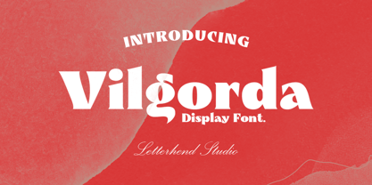 Vilgorda is a unique bold display font. This type of font perfectly made to be applied especially in logo, headline, signage and the other various formal forms such as invitations, labels, logos, magazines, books, greeting / wedding cards, packaging, fashion, make up, stationery, novels, labels or any type of advertising purpose. Features : uppercase & lowercase numbers and punctuation multilingual PUA encoded We highly recommend using a program that supports OpenType features and Glyphs panels like many of Adobe apps and Corel Draw, so you can see and access all Glyph variations. How to access opentype feature : letterhend.com/tutorials/using-opentype-feature-in-any-software/ Email us to letterhend@gmail.com if you need something! Happy Designing!
 - Amillia Rochete by Letterhend,
$19.00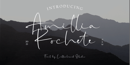 Amillia Rochete is an script font based on authentic hand writing with natural signature style. This type of font perfectly made to be applied especially in logo, and the other various formal forms such as invitations, labels, logos, magazines, books, greeting / wedding cards, packaging, fashion, make up, stationery, novels, labels or any type of advertising purpose. Features : uppercase & lowercase numbers and punctuation multilingual alternates and ligatures swashes PUA encoded We highly recommend using a program that supports OpenType features and Glyphs panels like many of Adobe apps and Corel Draw, so you can see and access all Glyph variations. How to access opentype feature : letterhend.com/tutorials/using-opentype-feature-in-any-software/
 - Thousand Brights by Letterhend,
$19.00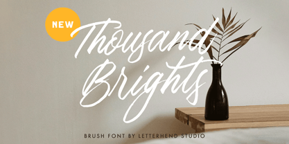 Thousand Brights is a script font based on authentic hand writing with natural signature style. This type of font perfectly made to be applied especially in logo, and the other various formal forms such as invitations, labels, logos, magazines, books, greeting / wedding cards, packaging, fashion, make up, stationery, novels, labels or any type of advertising purpose. Features : uppercase & lowercase numbers and punctuation multilingual alternates and ligatures swashes PUA encoded We highly recommend using a program that supports OpenType features and Glyphs panels like many of Adobe apps and Corel Draw, so you can see and access all Glyph variations. How to access opentype feature : letterhend.com/tutorials/using-opentype-feature-in-any-software/
 - Shopie Minclair by Letterhend,
$19.00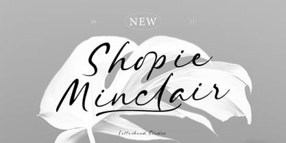 Shopie Minclair is a script font based on authentic hand writing with natural signature style. This type of font perfectly made to be applied especially in logo, and the other various formal forms such as invitations, labels, logos, magazines, books, greeting / wedding cards, packaging, fashion, make up, stationery, novels, labels or any type of advertising purpose. Features : uppercase & lowercase numbers and punctuation multilingual alternates and ligatures swashes PUA encoded We highly recommend using a program that supports OpenType features and Glyphs panels like many of Adobe apps and Corel Draw, so you can see and access all Glyph variations. How to access opentype feature : letterhend.com/tutorials/using-opentype-feature-in-any-software/
 - Merthiana by Gatype,
$12.00 Merthiana is a modern calligraphy design. This font is elegant and beautiful with a stroke. Can be used for various purposes. such as logos, product packaging, wedding invitations, branding, headlines, signage, labels, signatures, book covers, posters, quotes and much more. Merthiana is encoded with PUA Unicode, which allows full access to all additional characters without having to design special software. Mac users can use Font Book , and Windows users can use Character Map to view and copy any additional characters to paste into your favorite text editor/application. How to access all alternative characters, using the Windows Character Map with Photoshop: https://www.youtube.com/watch?v=Go9vacoYmBw Thank you very much for viewing and Enjoying it.
 - Distoniare by Letterhend,
$19.00 Distoniare is a pretty script font based on authentic hand writing with natural signature style. This type of font perfectly made to be applied especially in logo, and the other various formal forms such as invitations, labels, logos, magazines, books, greeting / wedding cards, packaging, fashion, make up, stationery, novels, labels or any type of advertising purpose. Features : uppercase & lowercase numbers and punctuation multilingual alternates and ligatures swashes PUA encoded We highly recommend using a program that supports OpenType features and Glyphs panels like many of Adobe apps and Corel Draw, so you can see and access all Glyph variations. How to access opentype feature : letterhend.com/tutorials/using-opentype-feature-in-any-software/
 - Marina Bullock by Letterhend,
$19.00 Marina Bullock is a script font based on authentic hand writing with natural signature style. This type of font perfectly made to be applied especially in logo, and the other various formal forms such as invitations, labels, logos, magazines, books, greeting / wedding cards, packaging, fashion, make up, stationery, novels, labels or any type of advertising purpose. Features : uppercase & lowercase numbers and punctuation multilingual alternates and ligatures swashes PUA encoded We highly recommend using a program that supports OpenType features and Glyphs panels like many of Adobe apps and Corel Draw, so you can see and access all Glyph variations. How to access opentype feature : letterhend.com/tutorials/using-opentype-feature-in-any-software/
 - Musk by Eko Bimantara,
$21.00 Taking the name from substance of the best quality perfumery, Musk present an elegant form of high contrast sans serif combine with an expressive connected script. The sans serif contain three weight; regular, medium and bold within it’s quality for display and also text. Each glyphs shown an unique variation of forms, especially the terminals in regards to achieve legibility and readability. The sans serif contain three weight; regular, medium and bold within it’s quality for display and legible for body text. With over than 240 glyphs. Some open type features contain in Musk sans; old style figures and standard ligature and the Musk script contain swash.
 - Coventry Garden NF Pro by CheapProFonts,
$10.00 I have improved and added diacritics to this elegant alphabet, and generally cleaned it up to a professional standard. It is well suited to logos, menus, invitations and other things wanting a touch of elegance. Nick Curtis says: "I came across this particular treatment for swash caps in an old book on letterhead design. The original had been handlettered, but I though it might be convenient to have a ready-made font to accomplish the same effect, and here it is. As an extra added feature, the “§” sign is an ampersand with a long tail." ALL fonts from CheapProFonts have very extensive language support: They contain some unusual diacritic letters (some of which are contained in the Latin Extended-B Unicode block) supporting: Cornish, Filipino (Tagalog), Guarani, Luxembourgian, Malagasy, Romanian, Ulithian and Welsh. They also contain all glyphs in the Latin Extended-A Unicode block (which among others cover the Central European and Baltic areas) supporting: Afrikaans, Belarusian (Lacinka), Bosnian, Catalan, Chichewa, Croatian, Czech, Dutch, Esperanto, Greenlandic, Hungarian, Kashubian, Kurdish (Kurmanji), Latvian, Lithuanian, Maltese, Maori, Polish, Saami (Inari), Saami (North), Serbian (latin), Slovak(ian), Slovene, Sorbian (Lower), Sorbian (Upper), Turkish and Turkmen. And they of course contain all the usual “western” glyphs supporting: Albanian, Basque, Breton, Chamorro, Danish, Estonian, Faroese, Finnish, French, Frisian, Galican, German, Icelandic, Indonesian, Irish (Gaelic), Italian, Northern Sotho, Norwegian, Occitan, Portuguese, Rhaeto-Romance, Sami (Lule), Sami (South), Scots (Gaelic), Spanish, Swedish, Tswana, Walloon and Yapese.
 - Barrista by Typodermic,
$11.95 Welcome to our cozy coffee shop! Come on in, take a seat and savor the aroma of freshly brewed coffee. Speaking of coffee, have you seen our new font? Meet Barrista! Its relaxed, curly script perfectly captures the whirling curls of steam rising from a hot cup of Joe. Barrista is not just any font. Thanks to OpenType ligatures, certain letter combinations will automatically be substituted with customer pairings. This creates a natural, relaxed look that’s perfect for our laid-back atmosphere. Imagine jotting down your order in Barrista, watching as our talented baristas create your perfect cup of coffee. As you wait for your order, you can admire the intricate details of Barrista’s flowing script, which is inspired by the art of coffee-making itself. So, come on down to our coffee shop and experience Barrista for yourself. Most Latin-based European writing systems are supported, including the following languages. Afaan Oromo, Afar, Afrikaans, Albanian, Alsatian, Aromanian, Aymara, Bashkir (Latin), Basque, Belarusian (Latin), Bemba, Bikol, Bosnian, Breton, Cape Verdean, Creole, Catalan, Cebuano, Chamorro, Chavacano, Chichewa, Crimean Tatar (Latin), Croatian, Czech, Danish, Dawan, Dholuo, Dutch, English, Estonian, Faroese, Fijian, Filipino, Finnish, French, Frisian, Friulian, Gagauz (Latin), Galician, Ganda, Genoese, German, Greenlandic, Guadeloupean Creole, Haitian Creole, Hawaiian, Hiligaynon, Hungarian, Icelandic, Ilocano, Indonesian, Irish, Italian, Jamaican, Kaqchikel, Karakalpak (Latin), Kashubian, Kikongo, Kinyarwanda, Kirundi, Kurdish (Latin), Latvian, Lithuanian, Lombard, Low Saxon, Luxembourgish, Maasai, Makhuwa, Malay, Maltese, Māori, Moldovan, Montenegrin, Ndebele, Neapolitan, Norwegian, Novial, Occitan, Ossetian (Latin), Papiamento, Piedmontese, Polish, Portuguese, Quechua, Rarotongan, Romanian, Romansh, Sami, Sango, Saramaccan, Sardinian, Scottish Gaelic, Serbian (Latin), Shona, Sicilian, Silesian, Slovak, Slovenian, Somali, Sorbian, Sotho, Spanish, Swahili, Swazi, Swedish, Tagalog, Tahitian, Tetum, Tongan, Tshiluba, Tsonga, Tswana, Tumbuka, Turkish, Turkmen (Latin), Tuvaluan, Uzbek (Latin), Venetian, Vepsian, Võro, Walloon, Waray-Waray, Wayuu, Welsh, Wolof, Xhosa, Yapese, Zapotec Zulu and Zuni.
 - Helvetica Now Variable by Monotype,
$328.99 Helvetica Now Variable Helvetica Now 2.0 builds on the groundbreaking work of 2019’s Helvetica Now release—all of the clarity, simplicity, and neutrality of classic Helvetica with everything 21st-century designers need. In this 2021 release, we introduce Helvetica Now Variable and add condensed weights to the Helvetica Now static fonts. Helvetica Now 2.0 includes 96 fonts in three distinct optical sizes (Micro, Text, and Display), now with 48 new condensed weights. The Helvetica Now Variable fonts include even more: 144 instances—48 normal, 48 condensed, and 48 compressed. Helvetica Now Variable gives you over a million new Helvetica styles in one state-of-the-art font file (over two-and-a-half million with italics!). Use it as an extension of the Helvetica Now family or make custom-blends from its weights (Hairline to ExtraBlack), optical sizes (four point to infinity), and new Compressed and Condensed widths. Create infinite shades of expression, incredible typographic animations, and ultra-refined typography. Its single font file makes it easier to use and wickedly fast. Load one file and access a million fonts—in a fraction of the size of a traditional font family. More freedom. More expression. More power. More. Helvetica. Now. Each one of the Helvetica Now static fonts has been carefully tailored to the demands of its size. The larger Display versions are drawn to show off the subtlety of Helvetica and spaced with headlines in mind, while the Text sizes focus on legibility, using robust strokes and comfortably loose spaces. Helvetica Now's Micro designs are simplified and exaggerated to maintain the impression of Helvetica in tiny type. There's also an extensive set of alternates, which allow designers the opportunity to experiment with and adapt Helvetica's tone of voice. The new Condensed weights put more type into smaller spaces—for intense emphasis, sophisticated contrast, or just everyday space-fitting. Helvetica Now 2.0 is, quite simply, more: more versatility; more power; and more creative possibilities. “For more than six decades, Helvetica has been the essential typeface,” says Monotype Type Director Charles Nix. “The release of Helvetica Now insures that it will be a typographic force for decades to come.”
 - Searches by Redy Studio,
$17.00Searches – Elegant Ligature Fonts Searches is a font that you should give a chance, if you are looking for a different look, Searches is a good place to start! There is always inspiration in fonts! Searches is an elegant, messy and lovely script. But Searches is not your ordinary script font; it has been developed to perfection by its creator, and it is sure to inspire you as well. You will fall in love with the movement of the letters, and you will find yourself using this font for many design projects to come. It comes with 92 ligatures, numbers, and other necessary glyphs. Searches features: A full set of upper & lowercase characters Numbers & punctuation 92 Gorgeous ligatures accents characters PUA Encoded Characters – Fully accessible without additional design software. Feel free to give me a message if you have a problem or question. Thank you so much for taking the time to look at one of our products. - Jack Stanislav - Personal use only

- Girard by House Industries,
$33.00 Whatever the medium, Girard’s love for typography was the common thread that wove his work together. We are honored that the Girard family has entrusted us to celebrate and expand upon the legacy of this design icon with this collection of fonts. The Girard Slab family gracefully synthesizes illustrative sensibilities into a practical typographic framework. Slab’s three widths and four weights ensure versatility in a modern editorial setting while its gentle curves transcend the sterility of traditional typography to add an unprecedented warmth and personality. From boutique chocolate packaging to the titling sequence for an indie vegan superhero cartoon, Girard Script deftly adds a contemporary sophistication to text and display settings. Inspired by a workhorse lettering style that helped Alexander Girard implement thousands of design elements in his overhaul of the Braniff identity system, Girard Sky pulls its weight in any contemporary application. In Girard Sansusie, each character stands alone as an illustrative element while coming together with its counterparts as a whimsical yet functional typeface. FEATURES: The ligatures feature substitutes specially-drawn letter combinations that combine two, three or even four characters to create smoother transitions and simulate lettering sensibilities. Girard Slab’s three widths and four weights ensure versatility in a modern editorial setting while its gentle curves transcend the sterility of traditional typography to add an unprecedented warmth and personality. Copious alternate characters and “smart” OpenType programming allow Sansusie to escape the rigid confines of typography to come alive as if flowing from Girard’s sketchpad. This animation shows a sampling of the swash characters available in the font. GIRARD CREDITS: Typeface Design: Alexander Girard, Ben Kiel, Ken Barber, Laura Meseguer Typeface Production: Ben Kiel Typeface Direction: Christian Schwartz, Andy Cruz, Ken Barber Like all good subversives, House Industries hides in plain sight while amplifying the look, feel and style of the world’s most interesting brands, products and people. Based in Delaware, visually influencing the world.
 - Vortices by Jorsetype,
$12.00 Vortices is a font that made the hand by having the character up and down like a dancer. Vortices has a very unique style of calligraphy, it is very suitable for use in the work of modern design. combines from copperplate to contemporary typeface with a dancing baseline, modern and elegant touch. Vortices features 531 glyphs and alternate characters Include . including initial and terminal letters, alternates, ligatures and multiple language support. Programs that support in this font is a Adobe Photo Shop, Adobe Illustrator, Adobe Indesign, Corel Draw and Microsoft Office. Languages supported: Breton, Catalan, Czech, Danish, Estonian,French, German, Hungarian, Icelandic, Italian, Romanian, Scottish Gaelic, Slovak, Latvian, Lithuanian, Norwegian, English, Finnish, Polish, Portuguese, Slovenian, Spanish, Swedish, Turkish, Welsh. Basically, all european languages that are based on latin alphabet Can be used for various purposes.such as headings, logos, wedding invitation, t-shirt, letterhead, signage, lable, news, posters, badges etc. To enable the OpenType Stylistic alternates, you need a program that supports OpenType features such as Adobe Illustrator CS, Adobe Indesign & CorelDraw X6-X7
 - Grava by Positype,
$35.00 Grava is Neil Summerour’s injection of warmth within the geometric sans font category. Historically, geometric sans families have been based on primal shapes — triangle, circle, square — and the more closely they held to those rigid rules, the more internal inconsistencies they showed. Angles won’t match up correctly, letters will lean, overshoots complicate clean typesetting, and idealized circles become grotesque and unwieldy in some weights. Because of issues like these, geometric sans fonts have a reputation of being cold, austere, even a bit “off”. Grava was made to hold a T-square and triangle in one hand while giving a welcoming handshake with the other. The Grava font family comes in two styles (a normal and a Display), each with 20 weights (Thin to Ultra) and paired with italics. Its design allowed the three scripts of Latin, Cyrillic, and Greek to emerge seamlessly, ensuring Grava will find its home in multilingual publications. Even better, each character in the three scripts is spaced with every other character for a beautifully matched fit, and it’s a buy-one-get-all-three deal since they are all packaged together. The normal style’s large x-height won’t let you down in paragraphs, headings, and any call-out text. And have you seen the angles on those numerals? Pairing Grava’s numerals on a jersey is sure to catch some eyes, just sayin'. Grava Display is purposefully quirky and sharp, and made for poster sizes, book and album covers, and those websites with a well-defined character — somewhere between playfully self-aware and overtly vintage. Flat edges are abandoned to make way for sharp points and conspicuousness, for geometrical attitude and respectful expressiveness. Corporate reports use Grava Display to take on a professional and current look. The optional ligatures (N–T, L–L, G–A, C–O, almost anywhere an ‘A’ is placed, and more) in both the normal and Display styles invoke a midcentury modernist and high art feel. Now that introductions are done, you can let go of Grava’s hand and put it to work for you.
 - Balter Serif by Art Grootfontein,
$19.00 Balter Serif is a hand-drawn layered typeface family inspired by sign painting, 1960’s movie posters and jazz album lettering. It can look fresh and modern or exquisitely vintage. Combine upper, lowercase and alternates to create a handmade custom lettered look, then layer the styles using colors to add value and depth to your designs ! Balter Serif works perfectly in short headlines. It is suitable to create a wide range of projects from posters to branding, logos, packaging, magazines and more. Features Uppercase & Small caps Numbers & Symbols International Glyphs 60 Alternates & swashes 70 Ligatures 30 Letter combinations Quick tip for layered fonts in Adobe Illustrator : Click and drag out a text frame to start (don’t just click with the cursor on the page). Then select the stacked text frames, go to Type in the menu bar > Area Type Options > Offset: First Baseline and select “Fixed”.
 - Perfect Dream by Sealoung,
$17.00 Introducing Perfect Dream – a new serif with all the nostalgic vibes! A classy eighties magazine-inspired serif - with a complementary italic version :) Comes in two normal and condensed versions, mix them together to create an interesting effect. Perfect Dream is a beautiful nostalgic upper and lower case typography that looks amazing in both large and small settings as display and body text. I love combining regular and italics, either all in one word (as in the Missfits sample) or in body text! Don't forget to use all caps as well in your blending and matching - this adds contrast and impact to your type design.
 - MVB Solitaire Pro by MVB,
$39.00 A typeface is a tool. Sure, there are frilly fonts that are more art than craft, showy faces that exist merely to call attention to themselves. But, in the end, any functional typeface worth its salt lives to serve one thing first: the text, the content. Everything else—the fashion of the moment, the allure of individual words and letters—is secondary. MVB Solitaire™ epitomizes this universal typographic mandate. As a tempered sans serif somewhere between a humanist and a gothic, MVB Solitaire captures a 21st-century neutrality. But practical doesn’t have to mean banal. MVB Solitaire has a soul. While some “neutral” type is dead the moment the ink hits the page, MVB Solitaire delivers text that feels lively, contemporary, relevant. Readers will not tire of this type. Behind the useful exterior is an arsenal of thoughtful technical features. It’s no surprise that this family’s creator, Mark van Bronkhorst, was first a graphic designer before becoming a type designer. Mark built all the goodies into MVB Solitaire that he would appreciate as a user: case-sensitive punctuation; alternate forms that can be invoked individually or together; oldstyle and lining figures in both tabular and proportional widths; slightly shorter lining figures that don’t stand out in running text, but also cap-height figures for all-cap settings; and the ability to speak nearly any Latin-based language. MVB Solitaire aspires to be the sort of workhorse that a designer keeps installed on their system at all times. It is a family bound to have a permanent spot in the font menu, always at the ready for projects (those most common of all) where the typography mustn’t mask the message. It has that quality that all truly useful typefaces have: the capacity to get the job done without getting in the way.
 - Hobo Symbols Chaulk by SymbolMinded,
$29.99 During the period of the Great American Depression, “hobos” created a system of symbols to communicate and assist fellow travelers. These symbols would mark a home, farm, fence or other structure to indicate what to expect in the area. They would tip off travelers on how to find food, stay safe and what to avoid and more. In some areas of the USA, these symbols are still visible and have also become part of the American popular culture. These 96 symbols are accompanied by a pdf describing what the symbol was used to indicate. The meanings and symbols are by no means the complete list and there may be additional or alternative meanings. These are for casual use and not historical or anthropologically completely accurate.
 - Journey Signature by Azetype,
$19.00 Presenting Journey Signature! An Authentic Script Font crafted carefully. Based on original signature hand scratches that look Classy and Vintage style. This font can be used at any time and in any project. You can see in the presentation picture above, how it's working! So, this font can give a different touch to all your design projects e.g. watermark, quotes, logotype, poster design, personal branding, lettering, photography needs, blog header, wedding, letter, invitation, stationery, etc. WHAT'S INCLUDED? 1. Journey Signature • This one comes with Standard Characters and 3 Stylistic Alternates (uppercase, lowercase) numeral, punctuation, symbols, and huge multilanguage support e.g. Afrikaans, Albanian, Catalan, Czech, Danish, Dutch, English, Estonian, Finnish, French, German, Hungarian, Icelandic, Indonesian, Italian, Latvian, Lithuanian, Maltese, Malay, Norwegian, Polish, Portuguese, Spanisch, Slovak, Slovenian, Swedish, Zulu, and Many More). • Multilingaul Glyphs: ÀÁÂÃÅÄĀĂǺĄÆǼǢÇĆČĈĊĎÐÈÉÊËĘĒĖĚĔĞĢĠĜÌÍÎǏÏĪĮĬĨļĶĿĽĻĹŁÑŃŇŅŊÒÓÔÕÖŌŐŎØŒÞŔŘŖŚŠŞŜ ŦŤŢÙÚÛÜŪŮŰŲŨŬŴÝŸŶŻŹŽàáâãåäāăǻąæǣçćčċĉďđðèéêëęěēėĕğģġĝĥħıìíîǐïīįĭĩķłŀĺñńňŋʼnņòóôõöőŏøœ þŕřŗśšşşŝßŧťţùúûüūůűųŭŵýÿŷżźž 2. Journey Signature Swash • This One comes with an underline swash that makes your design project looks standout and classy. For feature, you just type A-Z or a-z, choose the Swash version, and than ready to use. Thank You Azetype Std.
 - Cross Stitch Elaborate by Gerald Gallo,
$20.00 Cross Stitch Elaborate is based on upper case characters 25 stitches tall. It is not intended for text use. It was designed specifically for use as fancy monograms or initials. Cross Stitch Majestic has an uppercase alphabet located under the shift+character set keys.
 - Redoura by Letterhend,
$16.00 Redoura Font is a script typeface inspired by 70's font style and Script Sports font style which is absolutely awesome for logotype / wordmark, especially for sports theme logos. Redoura Script font includes upper & lowercase characters, punctuation, numerals, and multilingual support. It also has many open type alternates and ligatures.
 - Kingthings Lupine Pro by CheapProFonts,
$10.00 I loved this monster font the second I saw it - it reminded me of Franquins Idées Noires... Reworking it and adding the missing glyphs and diacritics was quite time-consuming - but a lot of fun! Lots of details. The Lupineless variant is Lupine with eyes, decorations and stray hairs removed - which leaves just a very usable fuzzy font for your monster-related headline. Kevin King says: "I love fantasy writing and my favorite author is Terry Pratchett. In Reaper man, my favorite book, there is a werewolf character called Lupine, I wanted to make a font for him and for Ludmilla... It's a long story, it's a hairy font." All fonts from CheapProFonts have very extensive language support: They contain some unusual diacritic letters (some of which are contained in the Latin Extended-B Unicode block) supporting: Cornish, Filipino (Tagalog), Guarani, Luxembourgian, Malagasy, Romanian, Ulithian and Welsh. They also contain all glyphs in the Latin Extended-A Unicode block (which among others cover the Central European and Baltic areas) supporting: Afrikaans, Belarusian (Lacinka), Bosnian, Catalan, Chichewa, Croatian, Czech, Dutch, Esperanto, Greenlandic, Hungarian, Kashubian, Kurdish (Kurmanji), Latvian, Lithuanian, Maltese, Maori, Polish, Saami (Inari), Saami (North), Serbian (latin), Slovak(ian), Slovene, Sorbian (Lower), Sorbian (Upper), Turkish and Turkmen. And they of course contain all the usual "western" glyphs supporting: Albanian, Basque, Breton, Chamorro, Danish, Estonian, Faroese, Finnish, French, Frisian, Galican, German, Icelandic, Indonesian, Irish (Gaelic), Italian, Northern Sotho, Norwegian, Occitan, Portuguese, Rhaeto-Romance, Sami (Lule), Sami (South), Scots (Gaelic), Spanish, Swedish, Tswana, Walloon and Yapese.
 - Growlies by Letterhend,
$19.00 Growslies is a cute script font with playful looks. This type of font perfectly made to be applied especially in storybook children or child theme which is need a standout font, and the other various formal forms such as invitations, labels, logos, magazines, books, greeting / wedding cards, packaging, fashion, make up, stationery, novels, labels or any type of advertising purpose. Features : Uppercase and lowercase numbers and punctuation multilingual ligatures PUA encoded We highly recommend using a program that supports OpenType features and Glyphs panels like many of Adobe apps and Corel Draw, so you can see and access all Glyph variations. How to access opentype feature : letterhend.com/tutorials/using-opentype-feature-in-any-software/ Email us to letterhend@gmail.com if you need something! Happy Designing!
 - Lokacore by Letterhend,
$19.00 Lokacore is a ligature display font with fun and playful looks. This type of font perfectly made to be applied especially in storybook children or child theme which is need a standout font, and the other various formal forms such as invitations, labels, logos, magazines, books, greeting / wedding cards, packaging, fashion, make up, stationery, novels, labels or any type of advertising purpose. Features : Solid version and svg version Doodle dingbats numbers and punctuation multilingual ligatures PUA encoded We highly recommend using a program that supports OpenType features and Glyphs panels like many of Adobe apps and Corel Draw, so you can see and access all Glyph variations. How to access opentype feature : letterhend.com/tutorials/using-opentype-feature-in-any-software/
 - Beast Party by Letterhend,
$19.00 Beast Party is a font which is can be used in fun spookish concept, and looks great in Halloween theme. This type of font perfectly made to be applied especially in movies or children which is need a standout font, and the other various playful forms such as invitations, labels, logos, magazines, books, greeting / wedding cards, packaging, fashion, make up, stationery, novels, labels or any type of advertising purpose. Features : numbers and punctuation multilingual alternates PUA encoded We highly recommend using a program that supports OpenType features and Glyphs panels like many of Adobe apps and Corel Draw, so you can see and access all Glyph variations. How to access opentype feature : letterhend.com/tutorials/using-opentype-feature-in-any-software/
