10,000 search results
(0.255 seconds)
- Muscle by Positype,
$15.00 Muscle came from the original sketches for Sneakers. At the time my concentration with Sneakers was to create a curvier, chunkier display. I left Muscle behind, thinking it was too masculine. Rather than discard those original sketches, I decided to make it even heavier, reduced the total number of weights, create a function small cap system that when integrated with the lowercase makes a great biform component for short display settings.
 - Alphonse Mucha by K-Type,
$20.00 Alphonse Mucha is a decorative display font in the Art Nouveau style which originated over a century ago. The font is extrapolated from just nine capital letters in Mucha's 1913 concert poster for the cellist Zdeňka Černý. Letters and numerals are consistently top-heavy, imbuing text with a graceful uniformity and evenness of type color. A full repertoire of Latin Extended-A characters is contained within the font.
 - Blippo by Linotype,
$40.99Blippo Black with its constructed style is a typical headline typeface. Its robust figures with their even strokes were composed using the basic forms of the circle and rectangle. Its curves are often not completely closed. The figures of Blippo Black form dark, heavy lines, making the typeface suitable only in middle and larger point sizes. Blippo Black will make an impression when used for flyers and correspondence. - Nokio Slab by TypeUnion,
$25.00 Nokio Slab is the big brother to the popular Nokio & Nokio Sans fonts and provides even more uses for the Nokio range. Nokio Slab is made up of 5 weights + italics and also features an alternate font that uses more traditional character structures to offset the playful original. Nokio Slab is built for multiple uses, from digital applications such as Apps and Websites to logotypes and print applications.
 - Drunken Hour by PizzaDude.dk,
$20.00Drunken Hour is not your everyday-ransom-note font! It has autoligatures for both double numbers and letters, and a good handful of the most common letter combinations...even the accented characters has got their own unique look! Well, that means you can make your next punk-grunge project look like YOU actually did all the cutting of letters! :) You will need to use OpenType supporting applications to use the autoligatures. - Irritation by Ingrimayne Type,
$12.95 Have you ever had to read text from a cheap dot-matrix printer which is not aligned quite right, so that the tops of the letters are either darker or lighter than the bottoms? Now with IrritationOne and IrritationTwo you can relive that experience even though you no longer use a dot-matrix printer. IrritationOne has dark tops and fading bottoms, while IrritationTwo has the opposite. Naturally both are monospaced.
 - Dazzle Unicase by Device,
$39.00 An elegant, stylish unicase font with alternative lower-case letter-forms designed to fit the capital’s X-height. The lower-case forms are available in many of the lower-case keystrokes, with even more available as “stylistic alternates” or a “stylistic set”, which can be activated in Adobe apps. Eye-catching, sophisticated and contemporary. Available in five weights. A more sober companion to the original op-art version of “Dazzle” .
 - Wilhelm Klingspor Gotisch by Linotype,
$40.99Wilhelm Klingspor Gotisch appeared in 1925 with the Klingspor font foundry in Offenbach, Germany. Designer Rudolf Koch based his work on the Gothic forms of the 14th century and his broken letter font is often seen in advertisements. However, the ornamental letters do not match today’s legibility standards and Wilhelm Klingspor Gotisch is therefore recommended for use in headlines and short texts with a point size of 12 or larger. - Bodoni Classic Swashes by Wiescher Design,
$39.50 Bodoni Classic Swashes is my personal addition to Bodoni’s family of typefaces. Bodoni did not design a decorative version. His quest was for purity in book design. Even though in his days it was not called design; he thought of himself purely as a printer. But I think, especially after visiting the Bodoni museum in Parma, if Giambattista were alive today he would design a decorative typeface. Yours classico, Gert Wiescher
 - Rankday by Alit Design,
$14.00 Presenting the 🎃 Rankday Typeface 🦇 by alitdesign. Rankday typeface is designed for the needs of design concepts themed about Halloween and events in October and November. The Rankday font has a horror character with a character shaped like dripping blood, making the horor Halloween themed design concept even better and unique. The Rankday font also gets a bonus character of 150 Halloween-themed illustrations that make creating designs even easier. Simply by downloading the Rankday font, creating a Halloween themed design is very quick and easy. The Rankday Typeface is perfect for magazine cover designs, brochures, flyers. Instagram ads, Canva Design and so on with halloween and dark concepts. besides that this font is very easy to use both in design and non-design programs because everything changes and glyphs are supported by Unicode (PUA). The Rankday Typeface contains 607 + 150 bonus glyphs with many unique and interesting alternative options. Language Support : Latin, Basic, Western European, Central European, South European,Vietnamese. In order to use the beautiful swashes, you need a program that supports OpenType features such as Adobe Illustrator CS, Adobe Photoshop CC, Adobe Indesign and Corel Draw. but if your software doesn't have Glyphs panel, you can install additional swashes font files.
 - Tropicola by Krafted,
$10.00 You, me, sea, and Tropicola Handwritten font! This font is handcrafted with tropical palm trees and sunny vibes! Use this font on different projects, promotions, websites, banners, and even printed materials! Feel the tropical breeze with your audience, clients, or guests with this stylish font now! What you’ll get: Multilingual & Ligature Support Full sets of Punctuation and Numerals Compatible with: Adobe Suite Microsoft Office KeyNote Pages Software Requirements: The fonts that you’ll receive in the pack are widely supported by most software. In order to get the full functionality of the selection of standard ligatures (custom created letters) in the script font, any software that can read OpenType fonts will work. We hope you enjoy this font and that it makes your branding sparkle! Feel free to reach out to us if you’d like more information or if you have any concerns.
 - Voix by Wilton Foundry,
$9.00 VOIX Regular and Italic is a stylish, modern & monospaced font ready to make your work hard for you! It has several unique glyphs that create a unique style. VOIX is not your typical monospaced boring font - from the outset the goal was to develop an exuberant, dynamic and contemporary mono-spaced font. Ideal for coding, writing and has plenty of attitude to stretch into display formats!
 - Dante Alighieri by RMU,
$35.00 From the great Schelter & Giesecke collection, Dante Alighieri is a splendid companion to Aldo Manuzio. With its rather condensed characters it makes an ideal body text font even for narrow columns. Dante Alighieri comes with the historical long s and swash letters of H and T. It can be used for all major West and Central European languages.
 - Comforting Sounds by PizzaDude.dk,
$17.00 Sometimes the way forward is simplicity. That goes for your personal life as well as designing. Sometimes what catches the eye is something simple. My Comforting Sounds font is a handmade sans serif font. It has a crunchy line, an organic look and legibility even at very small sizes. And in a charming way, it is quite simple!
 - Media Blackout by KC Fonts,
$14.00 Media Blackout is a handmade font with rugged good looks. The Media Blackout Family consists of three fonts: Normal, Italic & Marker. Media Blackout Marker takes the handcrafted look one step further by adding heavy hand etched lines for a truly unique look. For an even more handmade look, switch between uppercase and lowercase for a change of etching.
 - Flicka by PizzaDude.dk,
$20.00 Flicka is a super funky font that oozes of fun and games. Every single letter has got it's personality of its own! And, what's even better: the Flicka font comes with ligatures for both lowercase-lowercase, uppercase-lowercase and uppercase-uppercase! 154 different ligatures in total! You will need to use OpenType supporting applications to use the autoligatures.
 - Ring Legs by Ochakov,
$9.00 An integral part of Ring Family beauty are the Legs... Ring Legs! In addition, elegant and stylish. Ring font family even more so now. More opportunities, more ambitions, more likely! Ring Legs and all other is always prepared for any surprise. Comes in 8 weights, but so many combinations. The Ring Font Family continues to grow steadily!
 - Unicorn by DavidMatos,
$15.00 Unicorn is a super-condensed Display font with a subtle dramatic flair that works especially well in titles, headers and editorial design. It was firstly inspired by a lowercase set seen on a furniture ad in Domus (the architecture magazine) #192, from 1943. For maximum drama, use with a bright & smart colour palette. Appointed by the Unicorn. Of course.
 - Onyx by Monotype,
$29.99 Gerry Powell, typographer, industrial designer, and director of typographic design for American Type Founders, designed Onyx font for ATF in 1937. A very popular advertising type in the 1940s, Onyx resembles an extremely condensed, bold member of the Bodoni family. Onyx is a good display font, with proportions that make it readable even when space is at a premium.
 - Game Paused by Ahmad Jamaludin,
$17.00 Dive into the world of retro nostalgia with the GAME PAUSED font. With its 6 unique styles in each type - Regular, Slant, Outline, Extrude, Outline Slant, and Extrude Slant Features: Game Paused Main File Has 6 Variable: Regular, Slant, Outline, Extrude, Outline Slant, and Extrude Slant Instructions (Access special characters, even in Cricut Design) Enjoy Designing! Dharmas Studio
 - Cuba by Design is Culture,
$39.00 The inspiration for Cuba comes from a sign for the restaurant "La Flor de Cuba" on Bergenline Avenue in Union City, New Jersey. Its blocky, dimensional forms are reminiscent of letterforms seen in signs throughout Latin America from, Colombia, to Mexico, to Spain, to Union City. Its quirky forms are meant to evoke a sense of hand painted signage.
 - Baron by Juraj Chrastina,
$39.00 After Baronessa - funny but not crazy cartoon style font, Baron is an other handmade typeface, warm and friendly but not excessively childish. If Baronessa is a little feminine, Baron is neutral and it's funny and serious at the same time. Baron can tell jokes without smiling. Because a joke can be funny even if the teller doesn't smile.
 - ITC Zapf International by ITC,
$39.00 Zapf International font is the work of German designer Hermann Zapf, formal enough for widespread use yet tempered with calligraphic warmth. Vigor in the italics is achieved more from design than from slant. One of the distinguishing characteristics of Zapf International is its graduation of weights. Light and medium are relatively close and equally eloquent for text. Demi is a full two steps heavier than medium and heavy several steps beyond demi.
 - Fondamento Pro by Stiggy & Sands,
$29.00 Fondamento and Fondamento Italic are calligraphic lettering styles based on the traditional Foundational Hand, a basic teaching style created by Edward Johnston in the early 20th century. The letterforms are clear and cleanly legible, basic and formal. Opentype features include: - Stylistic Alternates for a collection of alternate Small Caps - Full set of Inferiors and Superiors for limitless fractions - Lining and Proportional figure sets, several discretionary ligatures/alternates as well as a collection of ligatures.
 - Specials Board by Borderline Artistic,
$9.00 Specials Board is a clear, quirky handwritten display font in 6 weights. The font delivers a handcrafted personal feel and is great for clear messaging or to create an artisan, organic, natural aesthetic. Originally created for use in a coffee shop the font's handwritten playful nature allows it to work well across numerous use cases such as food and drink, retail, children / kids products and more. The font also includes alternatives for several glyphs.
 - Honey Love by Dhan Studio,
$15.00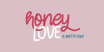 Honey Love is a pretty font that has a unique and attractive style, this font also has a lovely alternatives, which will make your designs even more perfect if you want to mix them in each of your designs. Perfect for logos and quotes or you can use it in any design you want to use.
 - Tihlsand by Hart Foundry,
$20.00 Introducing a new font from Hart Foundry, Tihlsand. This rounded and rough font are made with carefully, so it look good in pair, this font are also good for Logotype, Branding or even a quotes. With this neutral font are also good for you to make a modern or vintage design, With a bunch of an alternate and ligature you can make a good combination for your design. What's Included: -Character set A-Z -Uppercase & Lowercase -Numerals & Punctuation -Multilingual -Some Ligature & Stylistic alternates -Works on PC & Mac There is the details about the font, if there any other question about this font. Do not hesitate to let me know... Thanks
 - Kelasik Handmade by FadeLine Studio,
$15.00 Kelasik a new handmade script with a style natural, sweet and simple. Made with great care to provide the natural and modern elements. This font will look beautiful if used single even with other pairing fonts. The great thing about this font is you can find some style when you use it, examples such as natural handwriting style, unique, simple, elegant, and bold. With a style like this, this font will be suitable in use for logo's, branding projects, homeware designs, product packaging, mugs, quotes, posters, shopping bags, logo's, t-shirts, book covers, name card, invitation cards, greeting cards, and all your other lovely projects.
 - Gemini Cows by RVM Creative,
$9.00 Gemini Cows is the perfect funky, retro, bubbly font family! It includes every style you'll need to create a comprehensive website, clothing brand, poster, label, sticker, art cover, or any other graphic! This typeface is great for any project that needs both boldness and femininity. It comes with seven fonts, including Great for any projects needing a retro or throwback feel, restaurant menus, along with book, movie, and album covers. It has a feminine and juvenile feel simultaneously and can be layered for cool effects. It also has swash alternates to give your words some flare :) It has 460 glyphs, supporting a variety of languages!
 - Debira by Nasir Udin,
$25.00 Debira is a contemporary display wedge-serif typeface. Its sharp and longer serif makes Debira a versatile type family that can be used in many different themes of design projects, from classic style to modern. It comes in seven weights from thin to bold with matching italics. Its mixture of weights provide a wide range of styles that will help you find the best vibe for your projects, for headlines or a short paragraph. The set of special ligatures can be perfect mates for your brand. It is well suited for book covers, editorial, branding, advertising and more.
 - Hadriano by Monotype,
$29.99When traveling in Paris, American designer Frederic W. Goudy did a rubbing of a second century marble inscription he found in the Louvre. After ruminating on these letterforms for several years, he drew a titling typeface in 1918, all around the letters P, R, and E. He called the new face Hadriano" as that name was in the original inscription. Robert Wiebking cut the matrices, and the Continental Typefounders Association released the font. Goudy designed a lowercase at the request of Monotype in 1930, though he didn't really like the idea of adding lowercase to an inscriptional letterform. The lowercase looks much like some of Goudy's other Roman faces. Compugraphic added more weights in the late 1970s, and made the shapes more cohesive. Hadriano has nicely cupped serifs and sturdy, generous body shapes. Distinctive individual letters include the cap A and Q, and the lowercase e, g, and z. Hadriano™ is an excellent choice for impressive headings and vigorous display lines." - Proprietor by Sudtipos,
$59.00 The great value of something crafted thoroughly by hand has been observed for years by Guille Vizzari throughout a wide spectrum of clients and projects developed at «Yani & Guille» —the studio he runs cheek by jowl with Yani Arabena—, and they both noticed that recently it has been taking on a new meaning. From barbers at their shops, to a barista that passionately prepares coffee every morning, or a bartender that deeply enjoys diving towards unknown ingredients, and even Guille’s admiration for sign painters worldwide that keep spreading their passion for the perfectly constructed letter. This wide trades universe, where craftsmanship represents a huge difference, is where «Proprietor» lives, and it’s the reason why it exists. «Proprietor» was born in a Moleskine notebook —just pencil, paper and ink— as a tribute to those crafts, and to regain the art behind Type Design that involves the fusion between tools, materials and the action of the hand. Fed by these principles, every single glyph within the whole «Proprietor» Family has been fully designed and illustrated by hand by its author (including all the ornaments, frames and crafts icons that can be seen along this specimen), showcasing Vizzari’s solid formation in the drawing field. Proprietor can be described as a compact type family system illustrated by hand, intended and designed to be able to create solid —but beautifully ornamented— paragraphs, and elaborate compositions. For this purpose, Proprietor Roman and Open displays a notorious x-height which goes perfectly with plenty of ornaments that unfold along the ascenders and descenders, but always containing its swashes inside the text line. The icing on the cake, Proprietor Script, a copperplate-based font unbelievably flooded with ornamented capitals, flourishes and endings to break through the coarse feeling of the Proprietor non-script sets, with a huge load of delicate and warm letterforms. Proprietor Wide and Wide Open hand a complete font set to complement the family for composing extended words in uppercase, matching in style and adding a striking personality. And as being part of Sudtipos’ catalogue «Proprietor» comes packed with full Open Type support —thanks to Ale Paul, fearless to tame this hand–drawn beast, supported by his vast knowledge in programming and optimization—. 7 imperfectly elegant and completely handmade fonts join the «Proprietor» system, bringing life to designs that are meant to represent the spirit of the genuine and skilled craftsmen, showing respect for their trade, and at the same time being part of it.
 - Lilith Script Pro by Monday Type,
$15.00 Lilith Script Pro is a family inspired from hand lettering and calligraphic typography that I've seen when in urban cities when I've travelled the world. Its strength is the magical mix of contextual alternates and 104 ligatures. Both open type enabled and completely automatic make sure that the flow of the writing will always be pleasant and perfect. The ligatures will always be substituted automatically through the "liga" feature, while the contextual alternates can be turned on and off through the "calt" feature. Lilith Script Pro is perfect for special logos and playful invitations or headlines. With its 574 glyphs per style there is really nothing you can't do with this family.
 - Fatimurgeno by Greentrik6789,
$21.00 Sans serif fonts, hundreds, or maybe thousands. There have been a lot of sans serif fonts that have been created and circulated on the internet. This font is here to increase the number of sans serif fonts circulating on the internet to be even more. Fatimurgeno comes with variable font. You can adjust the size of the weight which is suitable for the needs you want. Fatimurgeno is a various sized, clean and modern looking sans serif font. Whether you’re using it for crafting, digital designing, presentations or greeting cards making, it’s perfect! The Thick version will be perfect for a clean and strong look, and the slim version will be perfect for a soft and seductive look.
 - FF Info Pict by FontFont,
$62.99 Erik Spiekermann, working in collaboration with Ole Schäfer, originally designed FF Info® Display for use in the context of wayfinding systems. The variants FF Info™ Text and FF Info™ Correspondence were developed later for text setting and office communication. FF Info Display The sober and clear forms of the sans serif FF Info Display have been deliberately molded to make them perfect for use on wayfinding systems. The font by Ole Schäfer and Erik Spiekermann not only takes the problem of lack of space into account - it is some 15% narrower than comparable typefaces - the characters have also been designed to ensure they remain legible even in adverse conditions for reading. As text on signs often contains words with which readers are unfamiliar and which are thus deciphered letter for letter rather than perceived as whole words, it is essential to provide for a clear differentiation between glyphs. Additional serifs on the lowercase "i" and uppercase "I" and a small arch on the terminal of the lowercase "l" ensure that it is possible to readily discriminate between these particularly problematic letters. Moreover, sharp corners on glyphs can also make it difficult to read signs with backlighting or when driving past. The rounded corners of FF Info Display counteract this effect and make sure that the character forms remain well defined.FF Info Display is available in five carefully coordinated weights, from Regular to Bold. In the corresponding italic variants, the letters appear overall more rounded while the lowercase "a" has a closed form and the "f" has a descender. Also included among the glyphs of FF Info Display are several ligatures and arrow symbols. Pictograms with different themes that complement the typeface are also available in four weights. FF Info Text Thanks to his know-how gained through designing other typefaces, Erik Spiekermann became aware that fonts created for use in problematic environments can be used in many different situations. In smaller point sizes, FF Info Display cuts a fine figure when used to set longer texts. So Spiekermann carefully reworked FF Info Display to produce FF Info Text, a font perfected for use in this context. Not only can the characters be more generously proportioned, certain features, such as additional serifs to aid with the differentiation of problematic letters, are also no longer necessary in textual surroundings. The upright styles have a double-story "g" while Spiekermann has added oldstyle figures and small caps. FF Info Correspondence FF Info Correspondence has also been designed for setting block text although it recalls the style of old typewriter characters and is specifically intended for use in office communication. The characters of this third member of the family are thus more formal, without rounded terminals but with rectangular punctuation marks. The narrower letters are provided with large serifs to give them more space although, at the same time, this reduces the differences in terms of letter width among the alphabet. In contrast with its two siblings, FF Info Correspondence has only three weights, each with corresponding italic.The three styles of the FF Info super family cover an extensive range of potential applications. If the different kerning is adjusted manually, the three styles harmonize happily with each other and can be readily used in combination to set, for example, headlines and texts and also creative display options.
 - Haboro Squared by insigne,
$25.00 Haboro Squared is a formidable typeface, created for a variety of uses. Clean and consistent, it evokes the 1950s and 1960s. Haboro Squared conveys accuracy and utility with its clean, consistent strokes. In the 1950s and 1960s, designers and the general public began to reject the austerity of the war years in favor of a new sense of American optimism. This era is reflected in Haboro Squared’s gently rounded letters, playful alternates, and multi-purpose use. Whether you are creating a logo, crafting a website, or designing a magazine article, Haboro balances modernity with a hint of nostalgia. Haboro Squared achieves a balance between fashion and practicality. Even though it has an angular, modern design, it radiates friendliness and warmth. Haboro Squared works well for headings and brief texts. This collection of fonts consists of eight weights, from Thin to Black, each with a corresponding italic. Your design will seem robust and fashionable with so many options. Haboro plenty of alternate glyphs from which you can select an alternative or adjust the appearance of each letter. You’ve found a secret weapon. The Haboro Hyperfamily features a whole array of options, from Haboro Sans, Serif, to Haboro Didone. Take a look at the entire family. Even the most serious texts have a touch of whimsy thanks to the quirky alternate terminals in this multipurpose text face. Impress clients with your next branding package, web site, or magazine spread. Let the nostalgia of America’s post WWII heyday fill you with inspiration! Supercharge your next branding package, web site, or magazine spread with Haboro Squared!
 - Takatsuki Style by Putracetol,
$28.00 Takatsuki Style - Japanese Display Font. Takatsuki Style combine ethnic and cultural elements in each of the glyphs. Takatsuki Style font is suitable for those of you who like japanese culture, besides this font is also suitable for those of you who have a japanese restaurant, japanese clothing brand, japanese arts, and business purpose related with japanese culture The alternative characters were divided into several Open Type features such as Swash, Stylistic Sets, Stylistic Alternates, Contextual Alternates, and Ligature. The Open Type features can be accessed by using Open Type savvy programs such as Adobe Illustrator, Adobe InDesign, Adobe Photoshop Corel Draw X version, And Microsoft Word. This font is also support multi language.
 - Golden Partline by MJB Letters,
$17.00 Golden Partline is a modern handwritten font with strong characters in each letter. This font also has several alternatives, ligatures, and swashes as a compliment that will make the design you create look more elegant and professional. This font is very suitable for branding, packaging, fashion design, logo design, wedding invites, wedding invitations, posters, and more. To use the beautiful swashes, you need a program that supports OpenType features such as Adobe Illustrator CS, Adobe Photoshop CC, Adobe Indesign, and Corel Draw. but if your software doesn't have Glyphs panel, you can install additional swash font files: if you have questions about the latest fonts, please provide a short message to us Thank You! MJB Letters
 - Metro New One by JAB'M,
$15.00The main inspiration is from Art Nouveau which flourished in Europe at the end of the 19th and beginning of the 20th centuries. This design included furniture (Majorelle, Lalique) and architecture (Victor Horta, Henry Van de Velde, Gaudi, Alfons Mucha). But Hector Guimard remains the favorite for all aspects of its art and, of course, its typefaces used on the Parisian Metropolitan posters. In particular, the various kerning of the various letters he used to make the poster a whole design from singular designs, leading to numerous variations. As a designer, I first worked with the individual glyphs Hector Guimard designed and I discovered that they vary constantly from a poster to another, depending on the overall result he was looking for. Another difficulty in transferring his design to printing is that there was no lower case. I was excited to create the whole font from the original designs of Hector Guimard, incorporating its variations and "crazy kerning". After several attempts, it appeared to be impossible to include all variations and I slightly moved to my own new design as a complete font, upper and lower case, with kerning. I voluntarily limited the ascenders and descenders to the usual typography so that it can be used from 10 / 12 points. This version can be used to edit letters and books in the context of Art, specially Art Nouveau and Art Deco of course, posters of any kind. - Nazare Exuberant by Ndiscover,
$39.00 Nazare Exuberant is the Poster version of Nazare. This version makes the vintage design more elegant and luxurious. It has super high contrast and the semi-serifs were turned into opulent serifs. Some shapes were redesigned by adding a slight calligraphic feel, making it even more vibrant. This way this design got more organic, more human, more serious, more trustworthy and more luxurious. This is the design for your posters, headlines and actually anything where the letters have a big point size. If you need a more text suitable version you can always use the original Nazare. Another feature is the insertion of some Opentype features: Ligatures were added as well as old style numbers. With its six weights you will have plenty of room for many variations. From the Regular that focus more on elegance to the Heavy that focus more on the lavishness. Regardless of which style you choose Nazare Exuberant is so unique that your designs will not remain unnoticed.