10,000 search results
(0.087 seconds)
- Stabile by PintassilgoPrints,
$26.00 Stabile is a rather stylish casual font with loads of good vibes and alternates: there are four glyphs for each letter, two for each numeral plus swashes to this side and the other. Two for each side, in fact. It's a flexible font that looks unique and quite distinctive, with its charming uneven look that gets even more uneven when Contextual Alternates are turned on. Stabile family brings a delish accompanying font, Stabile Toys, packed with organic shapes inspired by the breathtaking work of the american artist Alexander Calder. These play together deliciously well, you can bet. Are you prepared to balance them? Enough reading, then, just go ahead! A couple quick notes on usage: . Go with Contextual Alternates to instantly cycle glyphs. Eye-catching results guaranteed! . Swash feature turns on (guess what...) swashes. But there's always alternative swashes, like to this side going up or to this side going down, that side up or down, so it's cool to pick your choices through a glyphs palette.
 - Bumper by HVD Fonts,
$19.00 Bumper is the ideal ultra-black Sans Serif if you wanna make noise. The three widths could even be mixed in one single word, which creates a hand-made, edgy look. Bumper falls between glossy mags and poster art, and has a great effect when used for flyers.
 - Nadsat by Typogama,
$19.00 Nadsat is a unicase display typefaces with a condensed, art deco styling. Best suited for short texts or display settings, the lowercase and capital letters can be combined to offer more layout possibilities. The typeface also includes a series of ligatures and alternate characters for even more layout options.
 - Disposable by PizzaDude.dk,
$20.00 Disposable is somewhat similar to some letters that are about to disintegrate. The letters are a little worn and give a good impression of something eco or organic. I've created 6 different versions of all the letters, just so your text will look even more organic and handmade!
 - Capital by Fenotype,
$19.00 Capital is a multifunctional super family with modernist roots. It is comprised of two distinct subfamilies: Gothic and Serif. Both share the same structure and proportions and come in seven weights – thin, light, regular, bold, extra bold and black, along with corresponding italics. Both Capital families are equipped with a full set of Cyrillic characters, making them a versatile choice for multinational use. All Capital fonts come with the following Open Type features: Small Caps, Old Style Figures, Fractions, Numero-sign & Ligatures. Features specific for Gothic roman versions only are Circle Numerals, Titling alternate for the R character and Arrows. The Gothic italics have a Titling alternates feature where the true italic forms are omitted and replaced with simpler stroke endings. Both Capital gothic and Serif families are true workhorse fonts that can carry out almost any typographic task. Combine them both for the best results – multi-pack available for a no-brainer price.
 - ZT Vollun by Khaiuns,
$29.00 ZT Vollun is a work of awakening from my valley of boredom in making fonts, it is not only a transformation of thickness, but also in terms of theme, aura, shape and beauty. Maybe this is a superstition of adulthood and also as we get older, our taste in cigarettes can change too. And the taste of the coffee is also getting bitter, in fact there is no sugar anymore, but the enjoyment is increasing. ZT Vollun consists of seven weights, starting from the thin one with curves combined with thin strokes, offering a playful aura, to the thickest one with a firm design that will present a thick modern atmosphere. Whether you're working on a branding project, an editorial project, or any other graphic project, ZT Vollun is the perfect choice for a modern, elegant look or any design vibe you can get your hands on. I hope you have fun using ZT Vollun. Thanks for using this font
 - Donnerstag by insigne,
$22.00 Donnerstag is an extended slab serif and a new companion to insigne's Montag, Dienstag and Mittwoch typefaces. Donnerstag conveys power and personality with its strong slab letterforms and ball terminals. Donnerstag's seven different weights give it a great deal of versatility, from its beefy and masculine black weight to the delicate and feminine hairline. Because of Donnerstag's width, this typeface is best used for logotypes, headlines or short blocks of text. Donnerstag includes many useful OpenType features, including a set of upright italic swash alternates, ligatures, small caps, fractions and old style figures, alternates for the ball terminals and simplified characters for titling. OpenType-capable applications such as the Adobe suite or Quark can take full advantage of automatically replacing ligatures and alternates. This family also includes the glyphs to support a wide range of latin based languages. For complementary companions, be sure to check out the rest of the typeface super family, also available from insigne.
 - Morris by HiH,
$10.00 Morris is a four-font family produced by HiH Retrofonts and based on the work of the very English William Morris. William Morris wanted a gothic type drawn from the 14th century blackletter tradition that he admired both stylistically and philosophically. He drew from several sources. His principal inspiration for his lower case was the 1462 Bible by Peter Schoeffer of Mainz; particularly notable for the first appearance of the ‘ear’ on the g. The upper case was Morris’s amalgam of the Italian cursive closed caps popular throughout the 12th through 15th centuries, a modern example of which is Goudy’s Lombardic Capitals. The gothic that Morris designed was first used by his Kelmscott Press for the publication of the Historyes Of Troye in 1892. It was called “Troy Type” and was cut at 18 points by Edward Prince. It was also used for The Tale of Beowulf. The typeface was re-cut in at 12 points and called “Chaucer Type” for use in The Order of Chivalry and The Works of Geoffrey Chaucer. Morris' objective is designing his gothic was not only to preserve the color and presence of his sources, but to create letters that were more readable to the English eye. ATF copied Troy and called it Satanick. Not only was the ATF version popular in the United States; but, interestingly, sold very well in Germany. There was great interest in that country in finding a middle ground between blackletter and roman styles -- one that was comfortable for a wider readership. The Morris design was considered one of the more successful solutions. Our interpretation, which we call Morris Gothic, substantially follows the Petzendorfer model used by other versions we have seen, with the following exceptions: 1) a larger fillet radius on the upper arm of the H, 2) a more typically broadpen stroke in place of the foxtail on the Q, which I do not like, 3) inclusion of the aforementioned ear on the g and 4) a slightly shorter descender on the y. We have included five ornaments, at positions 0135, 0137, 0167, 0172 and 0177. The German ligatures ‘ch’ & ‘ck’ can be accessed using the left and right brace keys (0123 & 0125). Morris Initials One and Morris Initials Two are two of several different styles of decorative initial letters that Morris designed for use with his type. He drew from a variety of 15th century sources, among which were Peter Schoeffer’s 1462 Mainz Bible and the lily-of-the-valley alphabet by Gunther Zainer of Augsburg. Each of the two initial fonts is paired with the Morris Gothic lower case. Morris Ornaments is a collection of both text ornaments and forms from the surrounding page-border decorations.
 - LoveYaHoney by Typadelic,
$14.95 Aw, aren't they sweet? This lettering is based on a 1950s note a husband wrote to his wife shortly after they were married. His beautifully controlled and strong handwriting knows no lowercase characters; he gets his point across in uppercase only. In today's world of email and internet writings, we know that uppercase means shouting and is considered quite rude, but he didn't know that when he wrote this letter to his lovely wife! Love Ya Honey is very legible and looks beautiful when used for headlines, titling or even long expanses of body copy. Perfect for scrapbooking too!
 - Blantic by Zamjump,
$17.00 BLANTIC is a modern and dynamic sans font that contains all caps and alternative fonts. The combination of futuristic and geometric elements creates a modern design. very suitable for use in various logo designs, posters, book covers, films, sports and several other formal designs, very easy to read, try some alternative letters to get the impression of dynamism and harmony between letters. WHAT IS INCLUDED This font contains standard characters, uppercase letters, numbers, punctuation marks. Includes: Uppercase Numbers Punctuation Symbols multilingual support Alternate
 - Goudy Lombardy by CastleType,
$19.00 Based on drawings of Medieval versals (capitals used at beginning of verses in manuscripts) by Frederic W. Goudy. Works beautifully as initials with Goudy Text Oldstyle. Uppercase only, no numerals or punctuation; several letters have alternates. Framed, inversed caps are also included. This version of Lombardy Capitals is purposely less regular and clean-cut than some available to maintain a more hand-drawn look similar to the irregularities that would be found in a Medieval manuscript. The alternates help contribute to that look.
 - Comply Slab by Arkitype,
$12.00 Comply Slab is inspired by action and extreme sports, Comply gets it's name from the well known skate trick the “No Comply”. This type family doesn't mess about! With 9 weights from thin to black, Comply Slab will give you some great options to use. This font family will “kill it” in both print and digital, in headlines for editorial, posters, banners, websites, apparel, packaging, logos or magazines just to name a few. If you want to make a statement that gets the message across in a slick way with some cool looking glyphs Comply Slab is the font! There is an alternate R and S so you can choose to go with the cool default sharp glyphs or swap them for a more traditional chamfered corner version. Each of the 9 weights has an italic version to add even more action.
 - EFCO Brookshire by Ephemera Fonts,
$45.00 Brookshire was inspired by the lettering seen on the Almanac ephemera paper when I visited the flea market in France. The result is a lovely piece of neo-Victorian fun that brings back the joy of 19th-century shop signs and flamboyant design ethos. Brookshire is ideal for poster work and signage, or anywhere that you want to bring back the joy of high Victorian design ethos.
 - Wood Gothic JNL by Jeff Levine,
$29.00 One of the classic designs of the wood type era is Hamilton Gothic Bold [from the Hamilton Wood Type Foundry circa 1889]. Clean and timeless, it even had found a resurgence during the rock and roll posters of the 1960s, where vintage wood types and Art Nouveau influences merged with the “Hippie Counterculture”. Wood Gothic JNL is available in both regular and oblique versions.
 - Anglaise by Ladyfingers,
$39.00 Anglaise was designed for display and it likes to be big and present, filling the width of a whole spread. The repetition of vertical black and white space holds the typeface together and the contrasting straight and round shapes add the personality... for even more... use the OpenType features, and Anglaise will start merging and building new characters for you to play around with... Enjoy!
 - Milafleur by ParaType,
$25.00 Milafleur presents the second member in the series of pictorial fonts with calligraphic miniatures by Lyudmila Mikhailova. The first font of the series, Milanette, was released one month earlier. Milafleur contains more than 60 pictures -- mostly flowers which define the origin of its name. In contrast to Milanette the pictures in Milafleur are less abstract and thus can be used as small illustrations in greeting texts, postcards, intimate notes, diaries and even in Christmas cards because some of the pictures show strobiles instead of flowers and coniferous branches instead of leaves. Released by ParaType in 2011.
 - SK Pangramma by Shriftovik,
$48.00 SK Pangramma is a modern universal geometric typeface. For greater universality, it was developed in two stylistic variations: sans serif and slab serif. The uniqueness of the typeface is supported by stylistic alternatives that give the character set the spirit of modern typeface design. The SK Pangramma typeface is named this way because it supports more than 200 languages, including the Extended Latin Alphabet, Cyrillic, and even Greek. Thanks to a wide range of characters, alternatives, and two stylistic variations, the typeface is great for design projects of any complexity, no matter whether it is printed products or web design.
 - Tango Silver by Letterara,
$16.00 Tango Silver is a Bold serif font family with a unique style. It has a modern and strong look. this font is suitable for many projects, for modern or even retro vintage design, branding, crafting, sticker, sublimation, wedding invitation, advertising, vintage mood boards, logotype, packaging, titles, editorial design, and many more. This font is PUA encoded, which means you can easily access all of the glyphs and swashes!
 - Nancy Walner by Yukita Creative,
$14.00 Nancy Walner fonts are perfect for high-end design branding, cinematic videos, social media titles and other cutting-edge creations! What sets this typeface apart from the others? This typeface is easy to read yet sophisticated. And even if you already have a few talents, you don't need to go overboard and add others. Just use fonts of different sizes and layouts—and you'll end up with a truly stunning
 - Fructosa by Typo5,
$14.95This unique type treatment was born after working in a mixture between a pixel based font and a retro logo. With lot of details it looks great a bigger sizes, but you can also apply it to write long sentences or even as body text! This font was chose as the official online font of our favorite band Foo Fighters some time ago, when it was just a work in progress. - Great Warrior by Letterara,
$16.00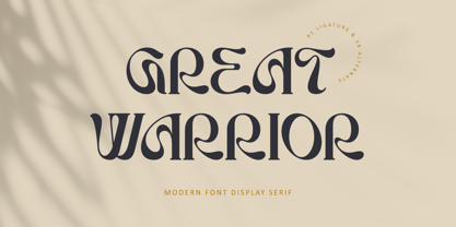 Great Warrior is a modern serif font family with a unique and classy style. It has a modern and vintage look. this font is suitable for many projects, for modern or even retro vintage design, branding, crafting, sticker, sublimation, wedding invitation, advertising, vintage mood boards, logotype, packaging, titles, editorial design, and many more. This font is PUA encoded, which means you can easily access all of the glyphs and swashes!
 - Rapidone by Nurf Designs,
$19.00 Rapidone is a display font with a sporty style. This font is perfect for Logotype, branding and all things sports related. This font comes with 2 types variations, namely Solid and Rough, both of which have their respective advantages. Works on PC & Mac Simple installations Accessible in the Adobe Illustrator, Adobe Photoshop, Adobe InDesign, even work on Microsoft Word. PUA Encoded Characters – Fully accessible without additional design software.
 - Lunar Outline by RagamKata,
$12.00 Lunar - Retro Serif Font Introducing Lunar, a charismatic font that seamlessly fuses playfulness with a touch of nostalgia. This unique typeface falls under the playful retro serif display category, offering not just one, but two distinctive personalities in its regular and outline versions. Features : - Regular & Outline - Ligatures & Alternates - Letters, numbers, symbols, and punctuation - No special software is required to use this typeface even work in Canva - Multilingual Support
 - MBF Ligione by Moonbandit,
$15.00 Ligione is a multi function font family, consist of uppercase and lowercase with 4 weight and 4 width option making it a big 8 styles in total. This typeface is a modern display sans serif packed with a geometric modular assembly in mind, combine the regular and expanded style for a unique touch on your design. This font is perfect for a big size display, title, body text and even logo.
 - Sregs Serif Display by Propertype,
$18.00 Sregs Serif Display Family A Serif family inspired by popular 1960s-80s typography. Combined with modern nuances that are much in vogue in now days. Reflexive serifs with soft transitions make the letters easy to read and recognize. Its 7 weight with 2 style (Standard and Italic) variations provide several options that will help you find the ideal typographic feel for your project. Made for use in branding projects, large-scale printing such as billboards, signboards, titles, headlines, writing on short paragraphs, books title, page titles, taglines, websites, apps, logos, etc. Several Alternatives letters can be used to create a variety of design style or to make changed some letter in text.
 - ITC Manhattan by ITC,
$29.99Manhattan was designed in 1970 for ITC by Tom Carnase, who also created Avant Garde Gothic. The distinguishing characteristic of this designer's work is found in the emphasis on the thick-thin constrast. In this case, Carnase approached the border of the impossible. The heavy vertical strokes stand opposite the finest of lines and the thick columns dominate the overall look. The basic forms are strictly constructed, as are those of Morris F. Benton's Broadway of 1925, to which many parallels can be found. Manhattan is best used for applications which will not be placed too far from the viewer, as at too great a distance the fine lines can no longer be seen. It should be used exclusively for headlines in medium point sizes. - HWT Brylski by Hamilton Wood Type Collection,
$24.95 HWT Brylski is a typeface by Nick Sherman, named for retired wood type cutter Norb Brylski and designed to be cut as wood type at the Hamilton Wood Type & Printing Museum. This font is the digital counterpart to the wood type made as part of the Hamilton Legacy Project . It incorporates several themes that were common in 19th-century type design, including split tuscan serifs with angled mansard-style sides, heavy weight placement at the top and bottom of letters (traditionally referred to as French or Italian/Italienne, regardless of any actual relation to those countries), and an extended overall width. This digital version contains over 400 glyphs for full European language coverage.
 - Geometos Soft by Graphite,
$17.00 Geometos Soft is a geometric sans-serif display typeface family. It is a rounded version of Geometos Neue. An all caps family of seven weights, Geometos Soft is especially suitable for headlines, headings, branding, posters, packaging, titles and logos.
 - Nafise by Sulthan Studio,
$10.00 A modern font with a Typeface display style, very attractive, coupled with several lowercase ligatures. This font is available in 3 thickness styles such as regular, Bold, and Out line . This font has uppercase, lowercase, numbers, punctuation, and language support.
 - Wondershine by Handpik,
$13.00 wondershine is elegant,beauty and smoothless serif display .This font is suitable for invitation cards, decorations, clothing products, greeting cards and others. This font also has uppercase, lowercase, numeric, puntuation and multilingual. and there are several ligature and stylistic alternate.
 - Senella Script by Aktab Studio,
$16.00 Senella is a script font with more than 350 characters and covers several languages based on the Latin alphabet; the whole font design has also been completed with extensive alternates, ligatures and swashes sets. Senella is suitable for any design project, vintage, fashion, branding, print design and whatever design you want Thank you for visits and happy branding !
 - Calligraphia Latina 2 by Intellecta Design,
$24.90 One of the most successful ornament fonts is CalligraphiaLatina. It is part of a trend that’s been quite popular lately: messed-up calligraphy. CalligraphiaLatina is a worldwide best-seller from IntellectaDesign. Besides the original CalligraphiaLatina, its family of fonts (13 different sets) represents a complete solution of intrincate fleurons and ornaments to use with several styles of artwork.
 - Calligraphia Latina Soft 2 by Intellecta Design,
$24.90 One of the most successful ornament fonts is CalligraphiaLatina. It is part of a trend that's been quite popular lately: messed-up calligraphy. CalligraphiaLatina is a worldwide best-seller from IntellectaDesign.. Besides the original CalligraphiaLatina, its family of fonts (13 different sets) represents a complete solution of intrincated fleurons and ornaments to use with several styles of artworks.
 - CalligraphiaLatinaSquareEdition by Intellecta Design,
$24.90 One of the most successful ornament fonts is CalligraphiaLatina. It is part of a trend that's been quite popular lately: messed-up calligraphy. CalligraphiaLatina is a worldwide best-seller from IntellectaDesign.. Besides the original CalligraphiaLatina, its family of fonts (13 different sets) represents a complete solution of intrincated fleurons and ornaments to use with several styles of artworks.
 - Quincey by AdultHumanMale,
$20.00 Quincey is a display font with the feel of old style signpainter’s works with a hint of hand drawn elements too. It has over 350 glyphs and several variations on the standard alphabet with all those €xtra pesk¥ foreign characters too. Some extra Glyphs in there too. It is available in 2 weights regular and medium.
 - System Overload by Hanoded,
$15.00 I sometimes think that we live in strange times: a lot of good (and bad) things seems to happen all at once. System Overload font is based on the protest posters from the seventies. You can use it for your own protest posters, your restaurant signs or whatever you fancy. Comes with several interesting discretionary ligatures as well!
 - SusiScript by Ingrimayne Type,
$9.00 SusiScript is an friendly, informal typeface family with three weights, each with an oblique style. The idea for SusiScript came from a girl named Suzi who wrote her "e"s in a peculiar way. The typeface does not replicate her handwriting, which was very hard to read; it merely drew inspiration from several of her letters.
 - Calligraphia Latina Soft 4 by Intellecta Design,
$25.90 One of the most successful ornament fonts is CalligraphiaLatina . It is part of a trend that's been quite popular lately: messed-up calligraphy. CalligraphiaLatina is a worldwide best-seller from IntellectaDesign.. Besides the original CalligraphiaLatina, its family of fonts (13 different sets) represents a complete solution of intrincated fleurons and ornaments to use with several styles of artworks.
 - Mane by BaronWNM,
$14.00 Mane is a display font with a slant block shape. thick on the vertical line and thin on the horizontal line. have a firm and solid impression. Suitable for writing titles, posters, games, ad taglines, sports, space, etc. has an alternate start and end on each capital letter and several ligatures in order to add variations to each usage.
 - Leco 1983 by CarnokyType,
$15.00 LECO 1983 is a headline display OpenType typeface with its three styles: LECO 1983: regular LECO 1983 Blind: without interiors of signs LECO 1983 Negative: in its inverse form. The inspiration for creating this font came from the label on a 1983 bottle of Lečo. The characteristic feature of this font is an embedded diacritic. The monolinear character of drawings is dominant. This font is drawn as capital letter type for both: upper case and lower case letters. It contains alternatives of some signs (e, f, g, m, n, y) and (& and a glyph No) but it consists several interesting alternatives (ligatures) of pairs as (in, on, of, by) as well. This font is best used on strong posters or as a headline display typeface.