10,000 search results
(0.101 seconds)
- Typer Pro by (v) design,
$25.00 Typer Pro (formerly Consul Typewriter Pro) is a modern OpenType font family reviving the look of old typewriters. Its carefully converted forms are detailed enough even for high pointsizes while keeping a reasonable number of outline points. Typer Pro comes in two variants: Typer Pro Mono is strictly monospaced (all characters occupy the same amount of horizontal space – this way old typewriters usually operated). However, sometimes a more even appearance may be desirable. Therefore, Typer Pro Text has been proportionally altered for a more pleasant and balanced look. Moreover, it is possible to achieve both proportional and monospaced look in both families via Stylistic Sets. You can choose from four different weights in each family and pick characters from its extensive glyph set. Typer also contains a number of Stylistic alternates, randomly replaced alternative letters to avoid the repetition of letters in a word. Typer Pro is a versatile typeface and is perfectly legible even at small sizes and on-screen. When printed, it looks best at its original size around 11–12 pt. Typer supports many OpenType features and offers great multilingual support for most of Latin-based languages. Feel free to download the detailed PDF Specimen.
 - ITC Klepto by ITC,
$50.99The ITC Klepto™ typeface from Phill Grimshaw is a hunkered down, bulldog blunt design. It's bold, rough around the edges, and more than a little quirky. ITC Klepto's extended character set, however - which even includes Greek and Cyrillic designs - makes the face a versatile international player. Grimshaw claimed that the name "Klepto" was a natural because the design was stolen from a series of headlines he drew for an advertising campaign - Mayayo by Type-Ø-Tones,
$40.00 We usually describe Mayayo as no good for condolence letters, nor for carving inscriptions, etc. Indeed, as we have seen, the designers who choose Mayayo used it in funny different ways.
 - ITC Vintage by ITC,
$40.99ITC Vintage is a collaborative effort by California designer Holly Goldsmith and Ilene Strizver. It was inspired by several character shapes found in an all caps headline from a 1915 magazine advertisement. Working under Strizver's art direction, Goldsmith sketched the remaining caps in pencil on vellum, revised them, and after scanning them, added the final adjustments in Fontographer. It includes a caps and small caps alphabet. ITC Vintage is a classic and dignified headline design that suggests elegance and simplicity. - Bassanova by Julia Bausenhardt,
$35.00 Bassanova is a dynamic display font inspired by lettering on the "Love in the Afternoon" movie poster by Saul Bass. The font captures the minimalistic, yet very distinct look that is so typical for his designs. Bassanova offers four versions for each letter that change automatically and give the font a handlettered feel. It also contains over 100 discretionary ligatures to add even more dynamic letter combinations to the mix. This cool all-caps typeface fits a wide range of design applications, and it features a full international character set. Please activate Open Type Features to get the most out of this font.
 - Killer Garbage by PizzaDude.dk,
$19.00 Killer Garbage is a grunge version of my Spitzenklasse font. It's worn and torn real bad - but not more than the font is still legible even at very small sizes. I don't fancy grunge fonts that only has one or two versions of each letter available. The text usually gets very static and predictable, because the same letters are repeated again and again. That's why I have included 6 different versions of each letter in this font! And the great thing about this is that the letters automatically cycles as you type! Forget everything about repeating the same letters all the time!!!
 - Quatsity by Ingrimayne Type,
$5.00 Quatsity is a squarish or boxy serifed font with rounded corners. Quatsity is is suitable for titles or signage and legible enough for small blocks of text. Quatsity-Light was constructed in 1995 by blending two very different faces, a typeface very similar to Kwersity (with low contrast) and one similar to Qwatick (with high contrast). The other seven styles were added in 2020.
 - Bradley by Oddsorts,
$29.00 Oddsorts is delighted to present Bradley Wayside and Bradley Chicopee as its début offerings. Begun in 2000 as a wedding gift for the designer’s wife and used privately for years, they’re finally available to the public. The fonts were inspired by the masterful art nouveau lettering of Will H. Bradley, whose posters for Ault & Wiborg printing inks and Victor Bicycles continue to draw collectors after more than a century. Wayside and Chicopee expand the twenty-odd characters Bradley drew into a comprehensive multiscript system that includes modern Greek and extended Cyrillic alphabets, ordinals, automatic fractions, and ornaments. Bradley Wayside and Chicopee derive much of their charm from an organic mix of shape and spacing intrinsic to hand drawings. Mimicking that spirit in type used to mean painstaking substitution and adjustment of characters. The Bradley fonts make imaginative use of OpenType’s power to achieve the same effect — minus all the work. Wayside and Chicopee contain alternate forms for every letter — up to seven for some characters. Part of what makes these Bradley types delightfully “smart” fonts is that the fonts themselves actually choose the variation best suited to a letter’s place in a word. All you need to do is turn on your software’s “Ligatures” or “Contextual Alternates” option and the Bradleys do the rest. The alternates even work in most word processors. Bradley Wayside and Chicopee are available in “Standard” and “Pro” editions. The Pro editions sport all the bells and whistles, including the alternates. They support over one hundred forty languages and include localized forms especially for setting Bulgarian, Serbian, Polish, Romanian, and Turkish. The Standard editions are geared toward casual use and are ideal for license as webfonts, where streamlined character sets mean faster load times.
 - Leenyx by ActiveSphere,
$30.00 Leenyx is a geometric display font family and works best in display applications, such as posters, signage, logos and label. The Leenyx family comes in 2 versions: Leenyx AX and Leenyx BX. Leenyx AX has lines of even width and no serifs. Leenyx BX has lines of even width with slight curve on the ends of the strokes. Each Leenyx font version has two weights: regular and bold, each available in italic, making a total of eight styles for. Each style has a full upper and lower-case, accents, punctuation and a selection of monetary symbols.
 - Hyper Fatos by Bisou,
$15.00 Crafted with passion in La Chaux-de-Fonds, Switzerland, the Hyper Fatos typography was born in a moment of pure delight as the creator (Bisou) indulged in a delicious pizza. Inspired by the excitement and satisfaction that come from the most indulgent culinary pleasures, he designed this unique typography to capture the essence of gluttony and the irresistibility of the most appetizing dishes. Hyper Fatos was meticulously crafted to evoke an undeniable sense of indulgence. Its boldness and rounded forms bring to mind juicy hamburgers, crispy fries, and donuts overflowing with icing. It's the perfect typography for fast-food restaurant signs, tantalizing menus, or even advertising campaigns for giant burgers and decadent milkshakes. Picture Hyper Fatos in bright letters above a hot dog stand, and you'll see lovers of greasy food rushing to satisfy their most voracious cravings. This typography is the ultimate choice to whet your customers' appetites and encourage them to indulge in culinary delight.
 - Talking Cat by Bogstav,
$12.00 There is no such thing as a talking cat, however, you can often find these in adventures, movies and other stories. At least, now you can have your own font called "Talking Cat", and perhaps even your cat will like it! Mine did! Talking Cat works very well with packaging, toys, posters, postcards or perhaps even flyers - the smoothly rounded edges makes sure your design keeps that handmade look!
 - Wargear by Grontype,
$12.00 Wargear is a black display type. Simple in a good way and tough look. This font designed with tight kerning making this font a perfect choice if you want a bold way in your design. The font is great to create a logo tagline, flyer header, or even magazine title. Features: All Standard Glyphs Multilingual Support Numbering & Punctuation Thankyou for Choosing this font Regard, Grontype
 - Roughpen by Putracetol,
$28.00 Roughpen is a bold, hand-drawn brush typeface. With this font you can create stunning custom hand drawn brush looks. Roughpen also includes lots of binding characters which make the project even more amazing. You can use this font for making an awesome logos, header, titles, prints, apparel, logotype, quotes, packaging, flyer, poster, cover & other creative process possibilities. This font also support multi language.
 - Yahosch by Ingrimayne Type,
$9.00 Yahosch replicates informal hand writing. The typeface is based on egg-shaped circular elements, with the larger part of the oval on the bottom. It comes in three weights, each with an italic style. The regular is very readable even at smaller point sizes where it appears much like neat hand printing.
 - Good Eatin Pro AOE by Astigmatic,
$24.95 A heavy weight - softened sans serif that is not only friendly, but easy on the eyes. Good Eatin was inspired by the title screen from the 1942 Warner Bros. cartoon titled, "Dog Tired". The original all capitals setting had a charming & quiet nature to it, which became even more pronounced when drawn out to include a lowercase set. Later expanded upon to include a Small Caps set, Good Eatin Pro achieves a wider, even more electric appeal. Loaded with personality, Good Eatin Pro is joyful and stands out without being an eyesore, and while being based on vintage lettering it has a contemporary feel.
 - Altissimo by Soneri Type,
$32.00 Altissimo is a display type family, derived from the Ample typeface, it has large x-height, optical mono linear and a bit squarish in nature. It has a smooth curve instead of sharp angles formed by the junction of two strokes, which is a prominent feature of its design. It is designed to be a little eye-catching yet legible. It has clear and distinguishable letterforms, which helps to elaborate and emphasise the message. It is graphically strong and commands viewer's attention. The overall appearance of this type is suitable in setting it as heading, title, headline, etc. The type family consists of seven weights viz. Thin, ExLight, Light, Regular, Medium, Bold and ExBold. Altissimo is designed by Aakash Soneri in a period between 2017 and 2018.
 - Toska by Locomotype,
$20.00 Toska is a geometric sans serif font. This font has a strong but friendly impression because the rounded corners make the eyes feel comfortable. Suitable for headings, poster titles, logotypes, signage, packaging and Toska can even be used for interesting paragraphs. Comes in eight weights, each weight having an italic version so you are free to pair various weights to make your typography more attractive.
 - Framboisier by Hanoded,
$15.00 Framboisier means ‘Rasberry Bush’ in French. Even though it’s early spring, I already spotted raspberries at the greengrocers, so I figured a nice raspberry-related name would suit this font just fine. Framboisier is a hand painted script font. It’s a little messy, a little shaky, but legible and cute as well. Comes with all the diacritics and a whole bunch of alternate glyphs.
 - Quote Note by PizzaDude.dk,
$16.00 With Quote Note I did my best to make a simple and unsophisticated font. I wanted the letters to come out as if they were made with a fat marker on a note. Well, I'll let you be the judge on how I succeeded. I've added 4 different versions of each lowercase letter and even did a simple complimentary dingbat. And of course there is multilingual support!
 - PiS Wallride by PiS,
$34.00 This font is the byproduct of a T-shirt line for a punk/hardcore band I did a while ago. The guys like it skatestyle, so I scribbled their bandname and tagline with fat edding markers, which was so much fun that I decided to make it into a whole font. PiS Wallride features ligatures and OpenType alternates for an even grittier and more authentic feel.
 - Bodoni FB by Font Bureau,
$40.00 Working at American Type Founders from a Bruce Foundry recutting, Morris Fuller Benton worked out the dramatics of the English Fat Face, and in 1928 produced Ultra Bodoni, a headline spectacular. Using Benton’s 1933 Ultra Bodoni Extra Condensed, Richard Lipton digitized Bodoni FB Bold Condensed, then took compression even further and designed Bodoni FB Bold Compressed, a real technical tour de force; FB 1992
 - Squared by Krown Creative Factory,
$5.00 Squared is a Geometric Display typeface with a box like sharped edge feel to pass the message of being Trendy but also candid in sending the desired message. It can be used to create a range of design projects like posters, advertising and marketing flyers and even to printed items. It just requires you to use your imaginative strength and your design projects will look more Bold and trendy and even better pass your message. With this typeface you can create a party poster, movie flyer, advertising and marketing posters, it can also be used on branding items, Advert Posters, book covers, music cover arts, or any purpose of your choice to make your designs look Sharp and a bit trendy, feel free to play with this typeface.
 - Typewriter DirtY by Matthias Luh,
$32.00 Typewriter DirtY is related to the Typewriter BasiX and Typewriter Revo fonts. While Revo has a very clean and simple outline, BasiX is a bit washed out and looks worn. DirtY goes a step further and has a very dirty, worn, fuzzy, grungy vintage look – even more so than BasiX. Typewriter DirtY is especially suitable for headlines, logos, covers, slogans and much more. BasiX and Revo are recommended for longer texts. Although Typewriter DirtY looks good even in small font size, it is a bit more complex to render because of its detailed outlines. Typewriter Revo, BasiX and Dirty are monospaced typewriter fonts, which are matched to each other. They have the same dimensions and generally somewhat similar contours. Therefore, they can be perfectly mixed and matched with each other.
 - Octagen Condensed by deFharo,
$11.00 Octagen is a family of 16 condensed Sans Serif fonts of geometric construction and neo-Gothic style with short descenders and a humanistic finish in the curves and auctions of the tiny letters to avoid the coldness of the grotesque typographies, providing expressiveness, energy, warmth and docility , resulting in a friendly typography with a lot of personality and readability, specially drawn for the composition of short and medium texts, signage or headlines where horizontal space saving is needed. The typography has 529 glyphs (Latin Extended-A) with advanced OpenType functions, several number games, a complete set of neutral-style alternative lower case letters and the Bitcoin symbol. For Octagen cursive styles I used a set of lowercase letters without terminal finishes, more neutral than the regular versions, this being compensated by the expressiveness of the italics inclination, thus achieving important morphological, coherent differences within the conceptual development of this typographic family.
 - Featherly Handlettered by Joanne Marie,
$10.00 I had to do it :-) - A hand lettered version of featherly is here! As always with featherly, it's perfect for anything to do with romance, weddings and love but this hand lettered version can give you an even more authentic, handmade look to your designs. There are 26 left and right swashes. No alternates with this one though. Hence the lower price.
 - Hebrew Text Tanach by Samtype,
$125.00 This is a font to build a Hebrew Bible (Tanach) or any Hebrew prayer book. Magalith Tanach Pro has all Unicode Hebrew marks and others like ShevaNa, Dagesh Chazak, Qamats Katan, and Cholam Chaser. You can even hide marks You don't want to use. This font has a complex and exclusive Programmation of Opentype features. Adobe InDesign is the best program to use.
 - Desira by Sarid Ezra,
$15.00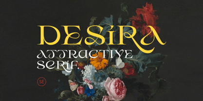 Desira is an attractive and modern serif that comes with stylish shape. With unique uppercase and lowercase, this fonts will make your presentation, poster, or logo even more stunning and stand out! You can mix and match the uppercase and lowercase for unlimited form. This fonts support Multi Language. Features Uppercase with unique lowercase Number & Symbol Multi language Happy Creating!
 - Toma Sans by JAM Type Design,
$- Toma Sans is a sans serif type family of seven weights plus matching italics. Influenced by the geometric-style sans serif faces that were popular during the 1920s and 30s, the fonts are based on geometric forms that have been optically corrected for better legibility. Toma Sans has a functional look with a friendly open touch. While the ExtraLight and the black weights are great performers in display sizes the light, regular and medium weights are well suited to longer texts. The small x-height and the restrained forms lend it a distinctive elegance. The typeface has an extended character set to support most European languages.
 - Ringo by typoland,
$9.00 Whassup y’all! Me and my bros got this li’l gang together: we is Ringo, and we got da bling, yo! We is da typeface family for ya all! We got some real sweet stuff for ya, some nice characters. We got all ’em OpenType features like fractions and proportional figgers, we even got da cubic root, man! And check out da question mark, man, is real sweet. And the ampersand, yeah! I luv ’em ampersands. Now my brothers over here got some light action for ya, and they got some real bold action for ya. We got some nice foxy curves goin’ on, some nice tension, and some nice relaxation. My bro Light over here is kind of like the subtle guy, ya know. He’s in for the female fans, ya know. Heh! Hell, yeah! And man, we speak like 84 languages: we speak the German, and the French, and the Spanish, and we speak the Polish, and the Czech, and the Hungarian, and we even speak Shambala and Swahili and Rundi, and we got some Esperanto thing as well for ya. And check out my bro Black right over here, he’s like the action superhero, man! He’s got impact, man! Yeah yeah, but you know, my bros Regular and Bold are the real deal. Them is like da word of da street, man! Like da word of you, and you. And we got a message for y’all: life is hard, life is real, but you should work your mojo, be smooth, be nice, chill. We got all them kerning pairs, and all them weights, and we got ’em alternate letters. So check us out, yo!
 - Cuckoo by Very Good Fonts,
$19.00Cuckoo was first seen in 1988 when I painted it on a record shop's window. Since then this hand lettered font has been there and done that. Cuckoo is strong, classic and informal display font designed to work well on any job. - Illyrian by Solotype,
$19.95Our font of the original was only ten point, so we had to use our imagination to a great extent. As specialists in Victorian typography, we have found that many people do not like the "center alignment" idea, used on several old time faces, but we have been faithful to the original. So there! - Lunair by Seventh Imperium,
$22.00 Lunair is a display script layered font. Feature the modern script layered The base layer is regular; add an extrude and extrude shadow to create a dimensional look. the font styles can be mixed and matched together to create different style details. are several fonts with a stand-alone script Base, Emboss And Inline,
 - Vermicello by ParaType,
$30.00 An original display typeface was designed for ParaType in 2007 by Isabella Chaeva. Informal handwriting shapes of letters are formed by several separate elements — traces of monoline writing tool like broad felt-tipped pen. The name of the font reveals the fact that curvy strokes resemble worms. For use in advertising and display typography.
 - ITC Isbell by ITC,
$29.99ITC Isbell font is the work of Dick Isbell and Jerry Campbell of Detroit, Michigan, a highly stylized roman typeface which retains an exceptional legibility. The unusual arches and curves of several lowercase characters give the typeface its individuality. ITC Isbell font is ideal for advertising, brochures, menus, and a variety of other applications. - Lubaline by Lián Types,
$39.00 Who haven't heard the phrase that ‘any past time was better’?. Although I sometimes find this phrase a little too pessimistic (because I try to think that the best is yet to come), it may be true regarding my passion, typography. I'm too young (29) unfortunately, and this means I did not have the pleasure of being contemporary with maybe the man who has influenced my work the most (1). The man that showed that letters are more than just letters to be read. Herb Lubalin (1918-1981), also called sometimes as ‘the rule basher’ (2), smashed the taboos and sacred rules of type design and gave it personality. He rejected the functionalist philosophy of europeans in favor of an eclectic and exuberant style. To him, letters were not merely vessels of form, they were objects of meaning. (3). Nowadays, when looking at his portfolio, who dares to deny that the term ‘typography’ and ‘beauty’ may go hand-in-hand without any problem? Ed Benguiat, one of Herb’s partners, still likes making jokes with the phrase “screw legibility, type should be beautiful” and what I understand of this is not to forget the rules, but to know and break them carefully. In an era of pure eclecticism, we, the lovers of flourishes and swashes, can't do nothing but admire all the legacy that Lubalin, this wonderful type-guru, left. My font Lubaline read as “the line of Lubalin” is my humble tribute to him. Those who know his work, may see the influences easily like in his ‘Beards’ (1976) and ‘The Sound of Music’ (1965) posters; the art-deco forms in many of his amazing logos and practically in all his creations where letters seem to be alive just like you and me. I really hope that the future finds me still learning more and more about type-design and letterforms, and like him, always willing to make innovations in my field: Because letters are not just letters to be read. NOTES (1) These are some of my fonts in which some of Lubalin’s influences can be seen (in order of creation): Reina, Aire, Erotica, String, Beatle, Heroe, Selfie, Model, Seventies, and many others that are still in progress. (2) (3) Steven Heller. Herb Lubalin: Rule Basher. U&lc (1998) http://www.printmag.com/imprint/my-favorite-lubalin/
 - Pilot Point NF by Nick's Fonts,
$10.00One in the series of fonts called Whiz-Bang Wood Type, intended to be set large and tight. Pilot Point is based on an older font found in Dan X. Solo’s book on Circus Type; the designation fits perfectly. The font gets its name from a small town in Northeast Texas, where several scenes from Arthur Penn’s Bonnie and Clyde were filmed. Both versions of this font contain the Unicode 1252 Latin and Unicode 1250 Central European character sets, with localization for Romanian and Moldovan. - Tritura by estudioCrop,
$19.90 Tritura is my personal take on textura fonts. Several methods of drawing were used, both analog and digital, to bring its overall rough feel. Each and every character was designed not from historical references, but from my view on this very peculiar typographic style. Instead of following established rules of character construction, I preferred to just keep in mind the mechanics of the pens used in textura drawings, as well as the little I already knew from the style, to create my own characters from there.
 - Heartstrong Script by Get Studio,
$15.00 Heartstrong Script is a monoline script and carefully crafted with personality. It easily for creating the traditional style logos, labels, package designs, lettering for t-shirts, and many others. Mix and match Heartstrong with a bunch of alternative characters to fit your project. The alternative characters in this font were divided into several OpenType features such as Stylistic Alternates, Swash, Stylistic Sets, and Ligature. The OpenType features can be accessed by using the OpenType program such as Adobe Illustrator, Adobe Photoshop, and Adobe InDesign.
 - Blah Blah Blah by Comicraft,
$49.00 It Had to Happen! Here Comes The World's Greatest Comic Book Font! It's A Collector's Item Classic! It's One of Comicraft's Greatest! You Wanted Our Silver Age Style Font -- last seen in the Pulse Pounding Pages of DC's SUPERBOY and Marvel's FLASHBACK titles -- and Now You've Got It! Three Thrilling Feature-Length Fonts! They're the Strangest Sans Serif Fonts of All! Proof Yet Again That This is Indeed the Comicraft Age of Comics! Etcetera, etcetera, etcetera, Blah Blah Blah...
 - Beau's Varsity by Beau Williamson,
$4.99 I designed this font a few years ago to address a direct problem. My work demanded small paragraphs of text to be screenprinted in a varsity font style. The house varsity was rather uneven and created small blobs of ink at sharp angles when printed. I designed Beau's Varsity to address both of these problems. The new font eliminated the blobbing, and I like to think my original design is a step up in evenness from the other options.