10,000 search results
(0.044 seconds)
- Symposium Pro by Canada Type,
$49.95 Philip Bouwsma's Symposium Pro is a wide Carolingian script that can be set simply or with a wide range of flourishes. It takes its inspiration from the scriptoria of the twelfth century, particularly in Spain, where Christians, Muslims and Jews lived harmoniously in a brilliant culture for two centuries. As manuscripts were translated and copied to meet the Western demand for classical texts, calligraphic elements from Arabic and Hebrew spread throughout Europe, sparking a proliferation of new styles that brought the simple book hand to a higher level. Symposium Pro spans a broad range of time and space, from the court of Charlemagne to the Arabian nights and Renaissance Florence. Symposium Pro comes in four weights, ranging from Light to Bold, with each font containing over 1200 glyphs. Variations on every letter form, from swashes to subtle alterations, are plenty, with some even having up to 40 alternates. Also plenty are the embedded ornaments and flourishes, over a hundred of them. Keep that glyph palette handy for many pleasant surprises and easy setting solutions.
 - Fearlessly Authentic by Ahmad Jamaludin,
$19.00 Say hello to the new classic nineties retro font, Fearlessly Authentic! The trend is to make thin serif fonts that made the 80s and 90s style, so we wanted to make them too but with a different touch. Make it slightly rounded for a retro look and make your design look great! Fearlessly Authentic - A classic nineties retro with a complementary italic version. In the italic family, we make it different from the regular and make a shape with a unique uppercase so it looks more classic, retro but a little modern We've also been loving combining the regular and italic, especially for logos (see the "Symphatize logo, image #3) Included : Regular and Italic Letters, numbers, symbols, and punctuation Use in many programs even in Canva Multilingual Support Language Support: Danish, English, Estonian, Filipino, Finnish, French, Friulian, Galician, German, Gusii, Indonesian, Irish, Italian, Luxembourgish, Norwegian Bokmål, Norwegian Nynorsk, Nyankole, Oromo, Portuguese, Romansh, Rombo, Spanish, Swedish, Swiss-German, Uzbek (Latin) Come and say hello over on Instagram! https://www.instagram.com/dharmas.studio/ Dharmas Studio
 - Quarantinus by JOEBOB graphics,
$33.00 The Quarantinus font was created during the 2020 covid 19 lock-down. Tranquility being all around, the JOEBOB graphics studio almost felt like a monastery, and as a result my style of writing and my choice of pen had to fit. All this writing was turned into an authentic handwritten script font with over 150 ligatures, which make it look very credible and spontaneous. The font is especially suitable for personalized 'handwritten' notes, cards and messages. It can be used on T-shirts and on shop-windows. It has an 'instant logo' quality, it can be used for tattoo-designs and it screams home-made everything. And in case you are a writer you now have an option to print your work in a way that seems as if you wrote it yourself. Please note that even though the font comes with a complete set of Western characters, accents and special signs, the Cyrillic and Greek characters that are in the font do not make a complete set.
 - Anziano Pro by MAC Rhino Fonts,
$59.00 Anziano follows the direction staked out with Delicato. When creating traditional typefaces, it is inevitable to be influenced by earlier designs. Anziano does show touches of another classic typeface – Weiss (by Emil Rudolf Weiss, 1926). Weiss is often misjudged and overlooked. Perhaps the most well known Swedish typeface – Berling (by Karl-Erik Forsberg, 1914–1995) is actually based largely on Weiss. MRF have appreciated the design of Weiss uprights for a long time. When Stefan Hattenbach bought the first Swedish edition of The Lord of the Rings (1959–61), in 2004, he was amazed by the excellent flow of the text presented on each page. Despite the very original character that Weiss has, it was a pleasure to read a book set in such a typeface. MRF realized that several major foundries had already done interpretations of Weiss, more or less true to the original. MRF didn’t want to add on to that list! Instead Stefan tried to find his own path. Anziano consists of three core styles, Regular, Italic and Bold; each with small caps, ornaments, stylistic ligatures, and extended Latin accents. Lining, tabular, oldstyle and smallcap numerals help round out Anziano’s typographic range and function.
 - Tempora LGC Uni - 100% free

- Bethlehem Star by HiH,
$10.00 For much of the world, the last half of December encompasses the beginning of winter and the a season of gift-giving, marked by Hanukkah and Christmas. It is generally accepted that the tradition of giving of gifts at this time was begun by The Three Wisemen. As described in The Gospel According to Matthew, the wisemen, led by a star from a distant land to the east, found the baby Jesus. First, they worshipped him and then, "they presented him with gifts: gold, frankincense and myrrh." (Matthew 2:11). Thus began the tradition of celebrating the birth of Christ with the giving of gifts. There is a parallel tradition in the Jewish faith of the giving of gelt or gold at Hanakkuh to help support poor students, in keeping with the rich history of scholarship that is fundamental to the rabbinic system. Inevitably, in our secular culture, there has been a blending and a secularization of these traditions. The reasons have gotton lost in the “gimme.” What is often overlooked is what Paul realized when he told Timothy, “Neglect not the gift that is in thee.” The most importent gift is the gift inside of us, the gift of sacrificial love for others. When we let that gift be diminished in our minds amid the clutter of modern day material seeking, we can recall the prophesy of Micah over 2800 years ago, But thou, Bethlehem Ephratah, though thou be little among the thousands of Judah, yet out of thee shall he come forth unto me that is to be ruler in Israel: whose goings forth have been from of old, from everlasting." (Micah 5:2 KJV) Never underestimate the impact you have on others. Words of kindness can change people’s lives. The Talmud says that the highest form of wisdom is kindness. Be wise this holiday season. The font BETHLEHEM STAR was originally designed for the church to which I belong, The Star Bethlehem Church of Ansonia, Connecticut, USA and is based on the typeface Accent with the permission of URW++ of Hamburg, Germany. You might choose BETHLEHEM STAR for your personal greetings as well as for flyers and programs at your church this holiday season. Like most display fonts, it is most effective at 18 points and larger. Like most script fonts, it is most effective when set with both upper and lower case. All caps with this font is like eating two pieces of pecan pie — too much of a good thing.
 - Stack by James Todd,
$40.00 Stack brings the spirit of industrial chimney lettering from the early twentieth century to the digital age. The typeface is designed to work both horizontally and vertically. Additionally, the fonts can work together in myriad chromatic expressions—providing limitless design possibilities. The family is true to the spirit of masonry lettering without being a direct lift of any specific lettering style from the industrial age. Like some of its masonry predecessors Stack is built as a typeface of 15 courses (horizontal rows) of ‘bricks.’ Based on several years of research a collection of 150+ photographs and roughly two dozen archival engineering drawings were amassed. The value of the historical references is a type family that is a legitimate reflection of masonry lettering styles of the period. In updating Stack for the digital age, the proportions of the base-unit ‘bricks’ and the thickness of ‘mortar’ joints have been optically adjusted to work in both screen-based and print media. Stack would not have been possible without the research and design input from Craig Welsh and Jenna Flickinger of GoWelsh.
 - Output Volume by Hanoded,
$15.00 I recently bought a small, portable speaker. I can now listen to music when I am making fonts! Output Volume is a name I came up with after reading the quick start guide that came with the speaker. Output Volume is a 100% handmade display font - it was based on a protest sign, but after a few glyphs it started to morph into something unique. I created 2 sets of contextual alternates (including the most used accented glyphs), that will cycle as you type. I also added some discretionary ligatures, to get an even more random effect. Output Volume comes with a vast array of accented letters, including Vietnamese.
 - Stefani by Okaycat,
$19.50 Stefani EHYO was designed ultimately with pure simplicity in mind, to carry an inviting, friendly style. The result is an ultra clean look with versatility: useful for either full bodies of text or for a nice headliner. The simplified smooth forms are highly legible and carefully well-matched, so can even be used over a busy background or at very small point settings. Stefani is extended, containing the full West European diacritics & a full set of ligatures, making it suitable for multilingual environments and publications. Choose Stefani for any application where you want solid readable text, any time you want a pleasant and clean feel to your presentation.
 - Herold by HiH,
$10.00 Herold is a bold Art Nouveau advertising face released by H. Berthold, Berlin, Germany in 1901. It is also seen under the name “Herold Reklame.” The design is attributed to Hermann Hoffmann by the Klingspor Museum. A herold (‘herald’ in English, ‘heraldus’ in Latin) is one who delivers proclamations and announcements. Medieval heralds are often pictured with a horn with which to get everyone’s attention prior to performing his function. His only PA system was his own voice. Left and right glyphs of a herald with horn may be found at positions 137 and 172. Herold is quite compact with a high x-height, just right for making -- what else? -- announcements.
 - Ethos by Fonts With Love,
$- Ethos is a contemporary serif fontfamily by Fonts With Love. It comes in 36 fontstyles with true italics and a huge bunch of opentype features like small caps, ligatures, nominators and denomiators, fractions and many more. Its x-height is pretty high, which makes it legible even on small fontsizes. Above that, the lighter weights have a rather low-contrast linestyle, which improves the legibility on display application especially on smaller sizes. On larger fontsizes, the typeface stands out with a distinctive character of geometrically shaped letters with soft rounded corners. Each fontface contains 500+ glyphs, supporting a huge amount of languages, mathematical operators, symbols and punctuations.
 - Audiowide Pro by Stiggy & Sands,
$29.00 Our Audiowide Pro has vague inspirations from other styles like that of Handel Gothic and the Converse logo, yet it veers off in a direction of its own for a slightly more techno-futuristic and yet cleanly readable format. Great for both headlines and shorter body copy, its cleanly legible forms lend itself to a plethora of uses. The SmallCaps and extensive figure sets offer Audiowide an even wider breadth of design options. Opentype features include: - SmallCaps. - Full set of Inferiors and Superiors for limitless fractions. - Tabular, Proportional, and Oldstyle figure sets (along with SmallCaps versions of the figures). - Stylistic Alternates for Caps to SmallCaps conversion.
 - Mozsar by Miklós Ferencz,
$59.00 Mozsár, named after Mozsár Street in the downtown of Budapest (pronounced ‘mo-zhar’, meaning mortar in Hungarian.) Mozsár is a unicase display typeface with constructivist characteristics from the early 20th Century. It uses pure geometric shapes and purposefully departs from strict typographical rules to give a more friendly look. With Mozsár you can create really unique and awesome looking displays, titles and even name plates for your business. It works very well in big size. The central idea behind the design was that two variants of the typeface would randomly alternate as the user types. The typeface uses Contextual Alternates (CALT) created with the OpenType’s semi-random feature to mix the variants. The width and height of the letter shapes are generally equal, but I made some exceptions to lend the type a character of unexpectedness. The curves are identical in both versions of each letter, and the intersections of the axes are always perpendicular (with some evident exceptions).
 - Schadenfreude by Comicraft,
$19.00 We don't mean to gloat, but we have to say that it gives us immense, malicious pleasure and joy to supplant other popular germanesque letterforms with this, remarkably superior font. This successful addition to our DEAD cool POOL of ACHTUNG BABY alphabets will, no doubt, make you feel that your own library of teutonic fonts is now severely lacking. We're that mercenary, we're Mercs with Mouths, you might say. Wait, did we say that we DON'T mean to gloat? Actually, we do.
 - Tilda Script by Roman Polishchuk,
$25.00 Tilda Script Family is a clean and lining script with regular and non-connect versions in four weights. With this family you can craft solid logotypes with a unique look, set posters and ads, and even run longer lines of copy on packaging. Tilda Script is a versatile family with extensive language support and advanced typographic features including:Ligatures, Stylistic Alternates, Stylistic Sets.
 - Humble Boys by Abo Daniel,
$15.00 Introducing HUMBLE BOYS - a playful font - It's great for branding, packaging, logo, quotes, and another project that needs a cheerful feel. It came with 3 styles Regular, Solid, and Accent Humble Boys Solid and Humble Boys Accent is a perfect combination. It is multilingual support This font is very easy to use...even for a beginner. Regards, Abo Daniel Studio
 - Bethanien by Rezastudio,
$9.00 Bethanien is beautiful sweet calligraphy font. It is fresh, modern, and maintaining its elegance. This font is so perfect for many designs, from wedding invation, greeting card, social media quotes, branding, logo, and many more. Features: +Tons of Glyphs, including beautiful alternate glyphs. +Can be used in any software, like Adobe Photoshop, Illustrator, even Microsoft Word, PowerPoint and others. +Multilingual glyphs.
 - Jules Otonomi by Maulana Creative,
$12.00 Jules Otonomi is a Classy look signature font. Jules Otonomi included opentype features Rich Ligatures. Jules Otonomi support multilingual more than 100+ language. This font is good for logo design, Movie Titles, Books Titles, a short text even a long text letter and any awesome project you create. Make a stunning work with Jules Otonomi classy signature font. Cheers, MaulanaCreative
 - Fruit Viesta by Epiclinez,
$18.00 Fruit Viesta is a simple, fun, and relaxed handwritten font. A little bit bouncy, this smooth and bold font looks incredibly adept in a wide variety of contexts, whether you're using it for crafting, digital designing, presentations, or even school projects, it's perfetto! Get creative with its childlike playfulness, and use it to brighten up any of your wonderful projects.
 - Tropican by Letteralle,
$23.00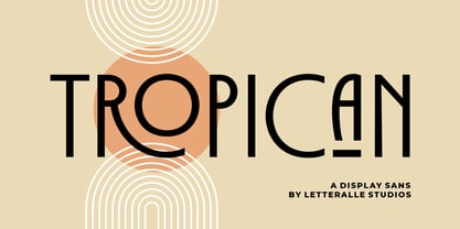 Tropican is an uppercase sans serif font with a vintage and minimal style. Tropican brings many ligatures that will make this font even more interesting and different. Tropican is a versatile font, perfect for display, editorial projects, Logo design, Wedding, Clothing Branding, product packaging, magazine headers, or simply as a stylish text overlay to any background image. I hope you enjoy! Letteralle Studios
 - Hexanova by Jetsmax Studio,
$15.00 Hexanova is a handmade display font that is text friendly but will give an elegant touch in its alternative characters. With its free style, this font specifically design to elevate your project and make it stand out even more. Hexanova Font best uses for poster, logotype, branding, cover, events, advertisements, animation, social media post, advertisements, and many more. Let your imagination run free!
 - Marshlord by Maulana Creative,
$11.00 Marshlord is a modern handwriting font with signature style. It included opentype features Ligature. Marshlord support multilingual more than 100+ language. This font is good for logo design, Movie Titles, Books Titles, a short text even a long text letter and good for your secondary text font with sans or serif. Make a stunning work with Marshlord font. Cheers, MaulanaCreative
 - Ayres Mono by Ayres,
$5.00 The Ayres Mono font is a clear and geometric mono-spaced font. It is easily legible and has Regular and Bold variants. It has keyboard friendly characters for drawing curved boxes and tables from the 'curly brackets' characters. These can be laid out in the text with the even spacing. It also features easy to use simple maths and music symbols. Some punctuation marks are made half-spaced along with a half-space key for more layout options. It supports many languages including English, French, Spanish, Italian, Portuguese, German, Dutch, Norwegian, Icelandic, Welsh, Finnish, Polish, Danish, Swedish, Hungarian, and Mauri. It includes symbols such as a tick, card suits and smiley face. The geometric layout is ideal for guitar tablature and text art.
 - Typewriter by Monotype,
$29.00The Monotype Typewriter" series contains three typefaces. These were made to enable type to be set that could emulate output from real typewriters. Use where a typewritten look is required for reports, tabular work, where the fixed pitch nature of these faces is an advantage, technical documentation and correspondence. Typewriter Regular is the base style of the family. Typewriter Elite is lighter than Typewriter Regular, and is monotone in weight, being designed to retain readability even when multiple carbon copies are produced. Typewriter Gothic is a medium weight sans serif typewriter face designed to give good readability from a fixed pitch typeface. Originally made for daisy wheel printers, the Typewriter Gothic font is useful for tabular work, technical documents, correspondence and reports." - Darka by Sudtipos,
$49.00 Darka is a splendid, mysterious dark lady reincarnated in digital vectors as an original blackletter font. Her gothic, medieval, nocturnal attributes take the form of sharp terminals, seductive curves, calligraphic flair and complex character. Darka blends the balance of Textura, the flow of Fraktur and the elegant lowercase-to-uppercase ratio of Bâtarde into a stylish, inventive typeface with a Mexican soul. Starting as a personal, calligraphic hand, Darka slowly evolved into digital type, developing alternate glyphs, flourishes and special signs to preserve its hand-written origins and delicate tension, making it an excellent display typeface and, surprisingly, even a distinctive, crisp font for short texts. Darka received an Award of Excellence at the Type Directors Club of New York annual competition.
 - Lina sans Arabic by Zaza type,
$24.00 Lina sans is an Arabic typeface from Lina type family, it expresses modern vigor based on simplicity and clarity. It's Strong, Bold, legible, clear, simple, Modern. With a handful set of OpenType features and alternatives. Lina type family consists of Lina soft, Lina sans, Lina round. the design is inspired by the Kufic calligraphic style and influenced by the Naskh style. Lina sans was highly crafted in order to perform well both on screen and in print. The large x-height and open counters make it function well even on small font sizes. It has a wide range of use possibilities headlines, logotypes, branding, books, magazines, motion graphics, and use on the web and Tv. Lina sans consists of 7-weight versions from thin to bold.
 - Lina Soft Arabic by Zaza type,
$24.00 Lina soft is an Arabic typeface from Lina-type family, with a warm and humane feeling. It's legible, soft, clear, flexible, simple, and contemporary. With a handful set of OpenType features and alternatives. Lina type family consists of Lina soft, Lina sans, Lina round. The design is inspired by the Kufic calligraphic style and influenced by the Naskh style. Lina soft was highly crafted in order to perform well both on screen and in print. The large x-height and open counters make it function well even on small font sizes. It has a wide range of use possibilities headlines, logotypes, branding, books, magazines, motion graphics, and use on the web and Tv. Lina Soft consists of 7-weight versions from thin to bold.
 - Brevier by CAST,
$45.00 Compact sans, ideal for setting long texts in small or very small type sizes: for packaging, instruction booklets, drug information leaflets and anything else that has to be legible at very small sizes. Lean and rhythmical, designed ideally to be used at less than 8 points (Brevier was the old typefounders’ name for 8-point type), Brevier holds up well even under adverse printing conditions. The apparently geometric letterforms hide Renaissance characteristics, the x-height and openings are very generous and the strokes slightly modulated. In order to offset ink spread – which is inevitable when printing very small sizes of type – Brevier has large white spaces between the letters. All internal angles have deep ink traps and many connections have been left open.
 - Breadley Serif by Ardyanatypes,
$10.00 Breadley Serif It was a continuation version of the previous one (Breadley Sans) that come up with Serif type look, surely including small decorative on the ends of some of the strokes that make it more expressive. Still stunning great with an elegant look and stands strongly on its own as a heading and brand logo. This Serif version of BREADLEY fancier within sexy touch for business utilities use like business card, name sign, uniform as brand elevation, and many more. This serif BRADLEY typeface, obviously fit to embossed as an exclusive brand tag or even decorating your enormous office corner. You can view all of the available characters in the screenshots above, and you can try out the brand new BRADLEY SERIF now for any design matter. Breadley Serif also has five weights, plus an extra superbold weight, Ligatures, small caps, old-style numerals, and other OpenType features Latin and multilingual support A guide to accessing all alternatives can be read at http://adobe.ly/1m1fn4Y Adobe Photoshop go to Window – glyphs Adobe Illustrator go to Type – glyphs Thank you and have a nice day
 - Rough Hearts by Nathatype,
$29.00 Do you want a handwriting style font in consistent, professional displays? Well, finding such fonts can be tough and time-consuming work. Therefore, Rough Hearts is here for your perfect choice. Rough Hearts is a font in a handwriting style with different, more natural shapes looking like spontaneously written letters. Each letter detail is made in swinging styles and this font also has high letter contrast, which means the thickness and thinness differences of the lines on each letter can be clearly seen. This font produces personal and creative impressions resulting in its legibility and attractiveness to apply for simply interesting design projects. You can use this font for big text sizes to be greatly legible and also enjoy the available features here. Features: Alternates Ligatures Stylistic Sets Multilingual Supports PUA Encoded Numerals and Punctuations Rough Hearts fits best for various design projects, such as brandings, headings, magazine covers, quotes, printed products, invitations, greeting cards, name cards, merchandise, social media, etc. Find out more ways to use this font by taking a look at the font preview. Thanks for purchasing our fonts. Hopefully, you have a great time using our font. Feel free to contact us anytime for further information or when you have trouble with the font. Thanks a lot and happy designing.
 - Neuzeit Grotesk by URW Type Foundry,
$39.99 Neuzeit Grotesk was originally designed by Wilhelm Pischner (1904-1989) and was released by the font foundry D. Stempel in 1928-1939. In 1970, the German Standards Committee advised the standard use of Neuzeit-Grotesk for official signage and traffic directional systems, and the abbreviation DIN was added to the name of the font. DIN" stands for Deutsches Institut für Normung (The German Institute for Industrial Standards). Neuzeit Grotesk was also once the standard in the German printing industry. It has been seen as a straightforward and utilitarian typeface, with no unusual or distracting features. Like other typefaces from the 1920s, it reflects the philosophy of those times, "Form is Function." Today, however, because of its familiarity and practicality, Neuzeit™ Grotesk has acquired an almost cheerful and reassuring aura. Try it out for signage, magazine headlines, or flyers. See also Neuzeit S for text weights of Neuzeit Grotesk.
 - Senegal by BA Graphics,
$45.00A Large and Small cap design great for Headlines Sub heads and even works great in text. A unique look. Allows you to fit a lot of copy in a small space. - Lamoreli by AVP,
$19.00Lamoreli is a strong rounded face that provides high impact in a non-aggressive way. It is suitable for display, titling and headlines. It retains integrity even when considerably expanded or condensed. - Remissis by Typodermic,
$11.95 Introducing Remissis—the sans-serif typeface that’s the perfect balance of casual and refined. With its off-grid letterforms, Remissis has a natural and organic feel that’s hard to come by in other typefaces. It’s not too laid-back to be dismissed as whimsical, but it’s not too rigid either. It strikes the perfect balance of being approachable yet professional. If you’re looking for a typeface that can convey the idea of softness and naturalness without coming off as too playful or zany, then Remissis is the perfect choice. Its delicate horizontal angles add a touch of elegance, making it ideal for projects that require a refined and sophisticated aesthetic. Designed for high-resolution displays and print, Remissis’s unique “lining old-style” numerals are available in OpenType-capable apps, giving you even more design flexibility. And with numerous mathematical symbols, monetary symbols, and diacritical marks, Remissis is versatile and functional. Available in seven weights and italics, Remissis is a typeface that’s sure to elevate any project. So if you’re looking for a typeface that’s both approachable and refined, choose Remissis. Most Latin-based European, Vietnamese, Greek, and most Cyrillic-based writing systems are supported, including the following languages. Afaan Oromo, Afar, Afrikaans, Albanian, Alsatian, Aromanian, Aymara, Azerbaijani, Bashkir, Bashkir (Latin), Basque, Belarusian, Belarusian (Latin), Bemba, Bikol, Bosnian, Breton, Bulgarian, Buryat, Cape Verdean, Creole, Catalan, Cebuano, Chamorro, Chavacano, Chichewa, Crimean Tatar (Latin), Croatian, Czech, Danish, Dawan, Dholuo, Dungan, Dutch, English, Estonian, Faroese, Fijian, Filipino, Finnish, French, Frisian, Friulian, Gagauz (Latin), Galician, Ganda, Genoese, German, Gikuyu, Greenlandic, Guadeloupean Creole, Haitian Creole, Hawaiian, Hiligaynon, Hungarian, Icelandic, Igbo, Ilocano, Indonesian, Irish, Italian, Jamaican, Kaingang, Khalkha, Kalmyk, Kanuri, Kaqchikel, Karakalpak (Latin), Kashubian, Kazakh, Kikongo, Kinyarwanda, Kirundi, Komi-Permyak, Kurdish, Kurdish (Latin), Kyrgyz, Latvian, Lithuanian, Lombard, Low Saxon, Luxembourgish, Maasai, Macedonian, Makhuwa, Malay, Maltese, Māori, Moldovan, Montenegrin, Nahuatl, Ndebele, Neapolitan, Norwegian, Novial, Occitan, Ossetian, Ossetian (Latin), Papiamento, Piedmontese, Polish, Portuguese, Quechua, Rarotongan, Romanian, Romansh, Russian, Rusyn, Sami, Sango, Saramaccan, Sardinian, Scottish Gaelic, Serbian, Serbian (Latin), Shona, Sicilian, Silesian, Slovak, Slovenian, Somali, Sorbian, Sotho, Spanish, Swahili, Swazi, Swedish, Tagalog, Tahitian, Tajik, Tatar, Tetum, Tongan, Tshiluba, Tsonga, Tswana, Tumbuka, Turkish, Turkmen (Latin), Tuvaluan, Ukrainian, Uzbek, Uzbek (Latin), Venda, Venetian, Vepsian, Vietnamese, Võro, Walloon, Waray-Waray, Wayuu, Welsh, Wolof, Xavante, Xhosa, Yapese, Zapotec, Zarma, Zazaki, Zulu and Zuni.
 - Cyan Sans by Wilton Foundry,
$29.00The design of Cyan was inspired by features found in classic Roman and styles like Trajan and Bodebeck. The characters stay true to the same features as the capitals, resulting in an unusually distinctive style. The Capitals version contains Roman numerals. Cyan's weight is similar to Trajan's but the horizontal strokes are slightly bolder resulting in better legibility for small sizes, especially for lowercase characters. Cyan Sans evolved out of the hugely successful Cyan Serif family. Cyan Sans retains the same geometric Roman proportions with open centers in B,P,R b, d, p . This helps create a thick and thin stroke illusion since the actual strokes don't vary much. There are many subtle details in Cyan Sans that become more interesting in larger sizes. The beauty of Cyan Sans is that it has no features that "jar" the eye. The result is a very pleasing and distinctive sans that scales well. Cyan Sans is a robust font that will exceed expectations in areas never explored before. The name is inspired by the Greek word cyan, meaning "blue". Blue as a primary color that has many hues and uses. Cyan the font, we hope will be seen in a similar light. Obviously Cyan Sans is a perfect companion to the Cyan Serif family. - Rigid Square by Dharma Type,
$19.99 Rigid Square There is a rule, Octagonal shape and 45 degree cuts. Very geometric shape but designed especially for body text, long sentence such like a mechanical instructions. Capital I and lower l have distinguishable shape. Neo-humanist shape on lowercase b.d.g.p.q is for further smooth readability. However, Also useful for display, titling, captions by their sophisticated glyph shapes and their eye-catching geometry. Consists of seven weights and their matching italics. Supporting almost all latin languages.
 - Wayfinder CF by Connary Fagen,
$35.00 Wayfinder® CF imparts both elegance and urgency to any text. Equally warm and intense, Wayfinder is a display font family made for logos, headlines, titles, and other short texts. Seven weights cover everything from an airy thin to a brilliant heavyweight. Wayfinder® CF pairs nicely with simple, unadorned typefaces. Great options include Artifex Hand CF and Greycliff® CF. All typefaces from Connary Fagen include free updates, including new features, and free technical support.
 - Hello Freeday by Nathatype,
$29.00 Hello Freeday is a striking display font that combines a bold and clean font weight with playful swinging endings. With its uniform letter proportions and unique character details, this typeface effortlessly balances sophistication and a touch of whimsy. The bold and clean font weight of this font commands attention and adds a sense of strength and impact to your designs. Each letter is meticulously designed with precise geometric forms, resulting in a polished and professional appearance. The consistent proportions of the letters contribute to the font's overall coherence, ensuring a harmonious and balanced visual experience. What sets this display apart is the charming swinging endings found in select letters. These decorative details add a hint of playfulness and movement to the font, injecting a touch of personality and delight into your designs. The swinging endings give the letters a sense of rhythm and flow, making Hello Freeday an excellent choice for projects that require a dynamic and captivating visual presence. The font's bold and clean aesthetic ensures legibility and readability, even at smaller sizes. Enjoy the available features here. Features: Stylistic Sets Ligatures Multilingual Supports PUA Encoded Numerals and Punctuations Hello Freeday fits in headlines, logos, attention-grabbing titles, product packaging, greeting cards, branding materials, editorial layouts and website headers. Find out more ways to use this font by taking a look at the font preview. Thanks for purchasing our fonts. Hopefully, you have a great time using our font. Feel free to contact us anytime for further information or when you have trouble with the font. Thanks a lot and happy designing.
 - Vala by Monotype,
$29.99 Vala™ dances across printed pages and shines on screen. This is a high-energy design that blends the grace of an English Roundhand script with the gravitas of an extra bold Bodoni. There is even a bit of romance in the design. Vala speaks with a resonant voice – and knows few bounds. The typeface enhances print headlines, subheads, cover art and packaging. The design also brings its distinctive melding of verve and poise to banners, headings, navigational links and branding in web sites, blog posts, games and apps. Oscar Guerrero found inspiration for Vala in shop window lettering near his home in Bogotá, Colombia. “The capital A, R and V caught my attention and I photographed the window for future reference,” he explains. “Later I started to draw more letters inspired by the ones in the window.” Guerrero admits that he has always admired the work of Giambattista Bodoni and allowed his classic Didone designs to infuse Vala. Striking contrast in stroke weights, lively ball-terminals and a large x-height give Vala the grace and force of a Waikiki wave. Not satisfied with just a basic character set, Guerrero also took advantage of OpenType’s capabilities and drew a complete set of swash capitals, a bevy of fancy ligatures, and a suite of lowercase alternative designs. The result is that Vala easily emulates custom lettering in posters, headlines and logotypes. The “romantic” part of Vala? Guerrero dedicated the design to his girlfriend, Valentina, and named it after her.
 - Rotis Sans Serif by Monotype,
$45.99 Rotis is a comprehensive family group with Sans Serif, Semi Sans, Serif, and Semi Serif styles, for a total of 17 weights including italics. The four families have similar weights, heights and proportions; though the Sans is primarily monotone, the Semi Sans has swelling strokes, the Semi Serif has just a few serifs, and the Serif has serifs and strokes with mostly vertical axes. Designed by Otl Aicher for Agfa in 1989, Rotis has become something of a European zeitgeist. This highly rationalized yet intriguing type is seen everywhere, from book text to billboards. The blending of sans with serif was almost revolutionary when Aicher first started working on the idea. Traditionalists felt that discarding serifs from some forms and giving unusual curves and edges to others might be something new, but not something better. But Rotis was based on those principles, and has proven itself not only highly legible, but also remarkably successful on a wide scale. Rotis is easily identifiable in all its styles by the cap C and lowercase c and e: note the hooked tops, serifless bottoms, and underslung body curves. Aicher is a long-time teacher of design and has many years of practical experience as a graphic designer. He named Rotis after the small village in southern German where he lives. Rotis is suitable for just about any use: book text, documentation, business reports, business correspondence, magazines, newspapers, posters, advertisements, multimedia, and corporate design.
