10,000 search results
(0.222 seconds)
- Sabbatical by Fontforecast,
$17.00 Sabbatical is a no nonsense brush font family with lots of character. The family contains 3 hand-lettered fonts, Regular, Bold and Basic. This dry textured script font is inspired by travel journals written by adventurous souls, hence the name. The design is perfect for any type-based creations, quotes, invites, packaging, branding and much more! Sabbatical Basic has his own unique form which complements Sabbatical Regular and Bold. It consists of a fun caps font with an even more playful variation. All Sabbatical fonts have alternate glyphs that can either be accessed by the swashes feature, stylistic sets, or glyphs panel, depending on the application you are using. There are lots of discretionary ligatures that offer more variation. With over 880 glyphs the design options are unlimited.
 - Soto by Thinkdust,
$10.00 A grungy, blocky, sans-serif font, Soto has one goal: get the message across. Saying it plain and simple, in a way that no-one can misunderstand, Soto’s very slight angles and thick style carry a weight and impact that make it stand out. With the textured finish it even jumps out from the backgrounds it’s placed on, so you can make use of the contrast to draw people in. Soto is best used in headlines and announcements that want to get their message across in an interesting and quick way. Stand out from the crowd and make people want to read what you’re writing by using a font like Soho to shout it out. If you like Soto but you're not feeling the grunge texture, then check out Ebisu.
 - LLT Good Vibes by Latam Type Foundry,
$10.00 A good typography created with love for you, can be used in logos, posters, postcards, graphic arts in general. Good vibes is created from a brush stroke from there its effect finished brush type. Good vibes for you. Thank you! Good Vibes includes several extras to speed up your creative process by opening the glyphs in any vectorization program, Adobe Illustrator, Freehand, Corel Draw and others.
 - PR Scrolls 04 by PR Fonts,
$15.50 Inspired by food labels, signs and coats of arms, PR-Scrolls is a collection of images which can be used for framing text in contexts where antiquity, craftsmanship, or traditional quality are conveyed. There are several sets of glyphs which work together to make a variety of shapes, or banners of custom length. Most of the glyphs are presented in a range of four or more widths.
 - Redmarch by BaronWNM,
$12.00 Redmarch is a monoline script font that gives a natural-looking impression that is perfect for those of you who want to use a signature font. Redmarch is very suitable for branding, advertising, name cards, product labels, printing t-shirts, greeting cards, invitation cards, etc. Redmarch has several ligatures, begining and anding swashes to give a sweet touch at the beginning and end of words.
 - PR Scrolls 02 by PR Fonts,
$10.00 Inspired by food labels, signs and coats of arms, PR-Scrolls is a collection of images which can be used for framing text in contexts where antiquity, craftsmanship, or traditional quality are conveyed. There are several sets of glyphs which work together to make a variety of shapes, or banners of custom length. Most of the glyphs are presented in a range of three or more widths.
 - Rainbowie by Stephan Kamperman,
$18.00 Rainbowie is a font that's ideally used for festivals, artists and logos. It has 3 different widths to make it ideal to use in small and wide spaces. The font has a stencil style that can be used in suprising ways for an unique touch in your design. It also provides several special characters with a star, sun, cloud, trees, guitar, lightning bold and heart.
 - Manju by Eko Bimantara,
$19.00 Manju font family represents retro 70s styles which have soft and chewy characteristics. Designed to be fit for display, titling, good for logo, header, and large size usage. The light styles can be also used for short text. It consists of 10 styles from thin to heavy with matching obliques. It has several opentype features such as alternates and ligatures, it also supports broad latin languages.
 - Le Rock by URW Type Foundry,
$39.99 Le rock is the newborn sister of my first typeface Jazmo and a relative of my music-inspired font family. Le Rock seems to wiggle and jiggle a little as if it invites you to dance. This is caused by the gaps in the individual characters. The typeface can also be seen as eroded, carved and sculpted by mother nature. But besides, the design of Le Rock can also be associated with the characteristics of stones: Solid and since ever, here, there and everywhere. To walk on, lean against, to be surrounded by, to build with and to shelter in. It cannot be denied, that there are also some comic art influences. The font is outspoken enough to be used in any form of graphic design, like poster and flyers, but at the same time it remains readable enough for longer texts.
 - Brushability by My Creative Land,
$29.00The Brushability is a brush-written font family that contains 9 fonts, all united by a brushy look. All fonts compliment each other perfectly and can be used either together or with many other brush-looking fonts on the market. The script contains a lot of alternates, swashes, ligatures, arrows etc. while the Extras font has quite a few design elements with the same brush look - such as arrows, frames and swashes - to add more personality to the design. The 5 sans serif fonts (ranging from Light to Black) also contain alternate glyphs for certain letters - just to make your design process even more fun. All fonts, as usual, are fully unicode mapped so you can use them in any application. Just be aware that if your application doesn’t support OpenType features, you’ll have to choose the glyphs you need manually. - Fluire by Lián Types,
$37.00 MAS AMOR POR FAVOR (1) (more love, please) Fluire means -to flow- in Italian and that’s what this font is all about. The story began when a friend of mine asked for a tattoo with the word -Fluir- (to flow in Spanish). She didn't want a tattoo full of swashes and swirls, like I'm used to doing, but something more fluent, soft and minimal. My very first attempts were more related to copperplate calligraphy but I wasn't even close: I discovered that I needed to forget a little bit about the classic contrast and speed of the engrosser's nib and started playing with a tiny flat metal nib. Letters started to flow, and I immediately thought of turning them into a font. Inspired by the tattoo I created and by other tattoos I saw, I started the journey of what would be a very fun process. The result is a very cute, almost monoline font with a wide range of uses. USES If not used for a tattoo (my first ‘target’), the font delivers amazing results in combination with Fluire Caps: These two need each other, they go together, they talk. I designed Fluire Caps Down and Fluire Caps Up so it’s easier to manage their colors. Also there’s Fluire Caps Down Lines, which has a decorative thin line to add yet another dimension. Use the fonts in magazines, book covers, posters, greeting cards, weddings, lettered walls, storefronts! TIPS Since the font is Open-Type programmed, I strongly recommend using it in applications that support that feature. Also, the font looks way better when -contextual alternates- are activated, but it’s your choice :) Try Fluire, and keep flowing. NOTES (1) The phrase alludes to maybe the most tattooed phrase in Latin America.
 - Radja Wolly by Alit Design,
$19.00 ✒️Radja Wolly✒️is a font inspired by the Blackletter typeface, made with a modern impression but still looks strong and stencil tyle. Supported by alternative options such as swash, ligature and alternative characters, making The Radja Wolly Typeface very easy to create designs with strong or vintage themes. In addition, The Radja Wolly Typeface font is also supported with multilingual characters that can be used in several international languages. The Radja Wolly Typeface is very suitable for use in making music album cover designs, tattoo logos, wishkey labels, packaging pomades and so on which are made with dark and strong concepts.
 - Belong Faith by Alit Design,
$18.00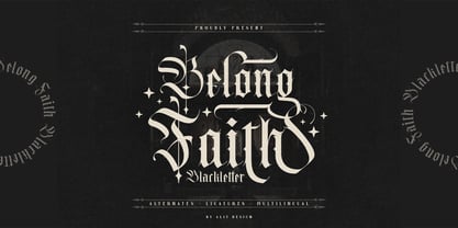 ✒️Belong Faith✒️is a font inspired by the Blackletter typeface, made with a modern impression but still looks strong and unique. Supported by alternative options such as swash, ligature and alternative characters, making the Belong Faith font very easy to create designs with strong or dark themes. In addition, the Belong Faith font is also supported with multilingual characters that can be used in several international languages. The Belong Faith font is very suitable for use in making music album cover designs, tattoo logos, wishkey labels, packaging pomades and so on which are made with dark and strong concepts.
 - Belligoes by Alit Design,
$16.00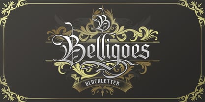 ✒️⬛Belligoes⬛✒️ Font is a font inspired by the Blackletter typeface, made with a modern impression but still looks strong and unique. Supported by alternative options such as swash, ligature and alternative characters, making the Belligoes font very easy to create designs with strong or dark themes. In addition, the Belligoes font is also supported with multilingual characters that can be used in several international languages. The Belligoes font is very suitable for use in making music album cover designs, tattoo logos, wishkey labels, packaging pomades and so on which are made with dark and strong concepts.
 - Hello Mytoys by Alit Design,
$18.00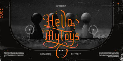 ✒️Hello Mytoys✒️is a font inspired by the Blackletter typeface, made with a modern impression but still looks strong and unique. Supported by alternative options such as swash, ligature and alternative characters, making The Hello Mytoys Blackletter very easy to create designs with strong or dark themes. In addition, The Hello Mytoys Blackletter is also supported with multilingual characters that can be used in several international languages. The Hello Mytoys Blackletter is very suitable for use in making music album cover designs, tattoo logos, wishkey labels, packaging pomades and so on which are made with dark and strong concepts.
 - ALS Malina by Art. Lebedev Studio,
$63.00 Malina (raspberry) is a plump, sweet-tempered display typeface. It comes in one style that includes small caps, ligatures, and ornaments. The face “speaks” several languages. Malina works wonders in titles and bite-size text nuggets. On top of the regular set of characters, the typeface hosts with ease a duck and fox, owl and crocodile, mammoth and pig. They’re irresistible when used by one or in bunches forming patterns. The typeface is ideal for signs, posters, sweets and kids product packaging; will feel at home in fun & entertainment stuff design and as a part of playful projects.
 - Ghosthey by Alit Design,
$14.00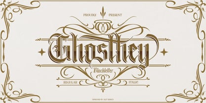 ✒️Ghosthey Typeface✒️is a font inspired by the Blackletter typeface, made with a modern impression but still looks strong and unique. Supported by alternative options such as swash, ligature and alternative characters, making The Ghosthey Typeface Blackletter very easy to create designs with strong or dark themes. In addition, The Ghosthey Typeface Blackletter is also supported with multilingual characters that can be used in several international languages. The Ghosthey Typeface is very suitable for use in making music album cover designs, tattoo logos, wishkey labels, packaging pomades and so on which are made with dark and strong concepts.
 - Maboth Typeface by Alit Design,
$12.00 ✒️Maboth Typeface✒️is a font inspired by the Blackletter typeface, made with a modern impression but still looks strong and unique. Supported by alternative options such as swash, ligature and alternative characters, making The Maboth Typeface very easy to create designs with strong or dark themes. In addition, The Maboth Typeface font is also supported with multilingual characters that can be used in several international languages. The Maboth Typeface is very suitable for use in making music album cover designs, tattoo logos, wishkey labels, packaging pomades and so on which are made with dark and strong concepts.
 - Remboland by Alit Design,
$18.00 ✒️Remboland Typeface✒️is a font inspired by the Blackletter typeface, made with a modern impression but still looks strong and unique. Supported by alternative options such as swash, ligature and alternative characters, making The Remboland Typeface Blackletter very easy to create designs with strong or dark themes. In addition, The Remboland Typeface Blackletter is also supported with multilingual characters that can be used in several international languages. The Remboland Typeface is very suitable for use in making music album cover designs, tattoo logos, wishkey labels, packaging pomades and so on which are made with dark and strong concepts.
 - Cypher by Typeco,
$29.00Cypher is a techno looking font that attempts to employ the Gestalt principal of closure. It may, at larger sizes look like some sort of code or a bunch of dots and dashes, but when viewed at smaller sizes it falls together into legible words. This font family was first inspired by an experiment to try to make a legible upper and lower alphabet with the smallest grid possible that would still describe the letterforms. The original conclusion was that it could be done in a 3x6 grid. This made a fun design exercise, but it makes a lousy font. The grid was expanded a bit for aesthetic reasons to a 3x8 grid, But not restricted so severely and so occasionally goes wider than 3 for the certain letterforms. From this a whole family of widths and weights was born, and rather than simply obliquing for italics, a true italic of sorts was created. Cypher is a versatile family of 24 fonts – 4 widths, each with 3 weights and their accompanying italics. - Duarose by Sarid Ezra,
$15.00 This is the vintage version from my best selling font - Duarose, you can check it from this link - https://crmrkt.com/8dVKRE Duarose - Vintage Version is a classic and vintage serif with a bunch of alternates up to 6 style for each characters that will make your presentation or logo even more stunning and stand out! With two style, Rough & Stamp, this font will make your design looks more handmade and vintage. You can use this font for any adventure and outdoor design. Duarose also support Multi Language. and already PUA Encoded! Features Rough & Stamp Style All Uppercase Number & Symbol Multi language Alternates for each characters PUA Encoded
 - Moveri by Twinletter,
$12.00 Moveri is a lovely sans-serif typeface with powerful curves and a minimalist design. Whatever the theme, this versatile typeface gives a clean and impressive style that’s excellent for branding, digital products, and creative ventures. Moveri fills every room with its beautiful and clean appearance, whether seen up close or from afar. Don’t miss out on this fantastic font — get it right now! of course, your various design projects will be perfect and extraordinary if you use this font because this font is equipped with a font family, both for titles and subtitles and sentence text, start using our fonts for your extraordinary projects.
- Saturday Script by Nicky Laatz,
$16.00 Say hello to Saturday Script! A a care-free, casual, handwritten script with authentic tell-tale dry brush imperfections. Saturday Script has the added bonus of having 'multiple personalities'! Saturday Script has 2 sets of lowercase stylistic sets, allowing you to make each word look completely unique to the next. Whether you need "flaunty & loud" or "soft & romantic" Saturday Script has the look for you. There are 2 variants of Saturday Script, to add even more flexibility to your designs: Regular, and Oblique
 - Silver by Fenotype,
$45.00 Silver is a clean and elegant connected script. Silver is packed with more than 1000 glyphs. Click on Swash, Stylistic or Titling Alternates or manually choose from Glyph Palette from even more alternate characters. Keep on Standard Ligatures for maximum smoothness. Silver is best used on creating elegant headlines, logos & posters for packaging and branding purposes. Silver family has Regular and Black script fonts and an ornament set that is designed to support the typeface. For the best price purchase the whole family.
 - Marseille by Louise Fili Ltd,
$35.00 Marseille is an Art Deco-inspired typeface which is based on Louise Fili’s iconic cover design for the hauntingly beautiful Marguerite Duras novel, The Lover. The font is available in six irresistible weights: thin, light, regular, medium, semibold, and bold. Each weight features both caps and lower case, and supports over 200 languages. Marseille will satisfy all your typographic needs, from book jackets to monograms to packaging, logos, and even wedding invitations—timelessly elegant, with a distinctive flair that exudes La Belle France.
 - Voyager Mono by Anton Kokoshka,
$29.00 Voyager Mono is a geometric monospaced grotesque family. It has two width styles - Voyager Mono (630em) and Voyager Mono Cond (580em). Available in 7 weights plus matching italics and alternate styles without slope with italic letters "a" and "g". Particular attention was paid to the problematic letters for monospaced fonts - "m" and "w". The optimal solution was found so that all signs looked good even in black style. Voyager Mono is perfect for the brand design, advertising, logo, gaming and packaging.
 - Haymer by Greater Albion Typefounders,
$9.50 Haymer stands at the apogee of legibility and clarity. Its design embodies symmetry, even stroke widths and a subtle rounded quality to give an instinctive appeal to the reader and to the designer. Haymer is modern yet characterful and is ideal for use as a text family, online and wherever instant easy readability is required. An extensive family is offered, in four weights, regular and condensed widths, lower case and capital (small and petite) forms as well as display inline faces.
 - Chewy Caramel by Hanoded,
$15.00 I really don’t like candy. In fact, I even hate the smell of candy! But… You can wake me up for caramel in any form or shape! When I was a kid, we used to get a tin of wrapped English ‘quality’ toffees for Christmas. My favourites were the big, flat chewy caramels in a bright purple wrapper! Chewy Caramel is a happy handmade font, ideal for book covers, candy wrappers and labels. Comes with double-letter ligatures for the lower case.
 - VLNL Berlagebrug by VetteLetters,
$30.00 VLNL Berlagebrug Designer Donald DBXL Beekman daily crosses the Berlage bridge spanning the Amstel river in Amsterdam. The Berlagebrug was built as part of the city planning project ‘Plan Zuid’ by H.P.Berlage and opened in May 1932. Its name, carved out of two granite headstones, sparked the design of this font family. The original lettering is attributed to Anton Kurvers in the early 19th century, and can be seen on many Amsterdam buildings and bridges. It’s typical lettering of the Amsterdamse School, the Dutch equivalent of the expressionist art deco architectural style, and mostly known for its extravagant brick work. VLNL Berlagebrug is a rounded display font that comes in three outline styles matching the building materials used in the bridge. Gietijzer (cast iron) is smooth, Zandsteen (sandstone) has a softly distressed outline, and Graniet (granite) is outspoken rough and crumbled. The capital letters in VLNL Berlagebrug are in the Amsterdamse school style, the lowercases are more straight alternate capitals, giving you more design options.
 - Moskau Pattern by Letter Edit,
$49.00 The design of the typeface Moskau Grotesk and Moskau Pattern is based on the signage created for the Café Moskau in Berlin by the graphic artist Klaus Wittkugel in the beginning of the 1960s. The Café Moskau, across from the Kino International on Karl-Marx-Allee in Berlin Mitte was one of the prestige edifices of the former DDR (German Democratic Republic). Built in the early 1960s, it advanced over the years and changing social developments to a trademark building of the capital. The lettering display on the roof was created by the graphic artist Klaus Wittkugel (October 17, 1910 – September 19, 1985). He had been Professor at the School for Applied Arts in Berlin, and, in addition to the creation of many posters, book covers and postage stamps, he was responsible for the signage of the Kino International as well as for the complete graphic treatment for the Palace of the Republik. The signage for the Café Moskau with the words »RESTAURANT«, »CAFÉ«, »KONZERT« and »MOCKBA« set in capital letters, becomes the basis for the Moskau Grotesk which was developed by Björn Gogalla in 2013. This face should not be seen as an imitation. A few shortcomings were »fixed«. In favor of maintaining the core characteristics some unique features were, however, not relinquished. Lower case letters and the missing capital letters were designed from scratch. It is not surprising that the plain, unassuming geometrical direction of the basic character style forms a bridge to the architecture of the 1960s. Inspired by the then favored, diverse possibilities inherent in the architectural example and wall reliefs, two complimentary pattern fonts emerged.
 - Moskau Grotesk by Letter Edit,
$39.00 The design of the typeface Moskau Grotesk is based on the signage created for the Café Moskau in Berlin by the graphic artist Klaus Wittkugel in the beginning of the 1960s. The Café Moskau, across from the Kino International on Karl-Marx-Allee in Berlin Mitte was one of the prestige edifices of the former DDR (German Democratic Republic). Built in the early 1960s, it advanced over the years and changing social developments to a trademark building of the capital. The lettering display on the roof was created by the graphic artist Klaus Wittkugel (October 17, 1910 – September 19, 1985). He had been Professor at the School for Applied Arts in Berlin, and, in addition to the creation of many posters, book covers and postage stamps, he was responsible for the signage of the Kino International as well as for the complete graphic treatment for the Palace of the Republik. The signage for the Café Moskau with the words »RESTAURANT«, »CAFÉ«, »KONZERT« and »MOCKBA« set in capital letters, becomes the basis for the Moskau Grotesk which was developed by Björn Gogalla in 2013. This face should not be seen as an imitation. A few shortcomings were »fixed«. In favor of maintaining the core characteristics some unique features were, however, not relinquished. Lower case letters and the missing capital letters were designed from scratch. It is not surprising that the plain, unassuming geometrical direction of the basic character style forms a bridge to the architecture of the 1960s. Inspired by the then favored, diverse possibilities inherent in the architectural example and wall reliefs, two complementary pattern fonts emerged.
 - Duran by The Northern Block,
$- Duran is a strong, versatile geometric sans with industrial quality. Inspired by technical style letterforms with simple construction, the typeface is useful in both large format and body text. Its compact lateral shape helps save space across layouts and is good to go across a wide range of modern applications. Details include seven weights with matching italics and over 670 characters per style. Opentype features consist of eight variations of numerals, including inferiors, superiors, fractions, case figures and circled figures. Additional features include case-sensitive forms, stylistic alternates, ligatures, game symbols, arrows and language support covering Western, South and Central Europe.
 - Gunydrops by Ahmad Jamaludin,
$17.00 Presenting for you, Gunydrops! Gunydrops - it's retro, bold, and playful, really ties together your piece to give it that retro feel. Perfect for make any project like header, quote, layout magazine and other. Even better if you use it on 60s and 70s design project Embracing the psychedelia era combine with groovy style, it came with vector extras and open type features such as stylistic alternates What's you get? Extras AI and EPS Unique letterforms Works on PC & Mac Simple Installations Accessible in Adobe Illustrator, Adobe Photoshop, Microsoft Word even work on Canva! PUA Encoded Characters Fully accessible without additional design software. Come and say hello over on Instagram! https://www.instagram.com/dharmas.studio/ Dharmas Studio
 - Museum Ornaments by T4 Foundry,
$7.00Museum Borders and Ornaments is part of a typographical treasure, the Norstedts type collection in Sweden. Type designer Torbjörn Olsson has painstakingly translated the original 34 Ornament matrices in the collection to Open Type. Among them are several of Granjon's arabesques, as well as symbols from both Swedish and Danish typefoundries. The signs were cut in the 16th, 17th and 18th centuries. The old Swedish name for these "type trademarks" were "rössjor". Museum Borders and Ornaments is an OpenType creation, for both PC and Mac. Swedish type foundry T4 premiere new fonts every month. Museum Borders and Ornaments is our tenth introduction. Museum Borders and Ornaments is part of the growing Museum type family. Museum also includes Museum Tertia Cursive, an exquisite 1700's typeface with modern additions, and Museum Fournier, a set of Rococo capitals designed by Pierre Simon Fournier le Jeune circa 1760. - Snuggels by Ingrimayne Type,
$9.95 Snuggles began as a set of hexagons and hour-glass shapes that fit together. Letters were formed from these shapes with effort made to preserve as much as possible the original outlines. The result is two sets of letters that by themselves are awkward and misshapen and that only look good when mixed together. The OpenType contextual alternatives (calt) feature automatically alternates the sets in computer programs that support this feature. Snuggles-Lower replaces the letters of Snuggles-Regular with lower-case shapes, but without ascenders or descenders, and the results are jarring. Several of these lower-case shapes (D, N, T, W, and Y) are available as OpenType stylistic-set alternatives in the Snuggels-Regular font. Both Snuggels-Regular and Snuggels-Lower have light versions. Snuggels loves to be noticed so it likes to be large and it considers foolish anyone who would use it as body text.
 - Acuta by Anatoletype,
$27.00 Acuta is a new all-purpose text serif with a good readability and a contemporary, robust look thanks to its low-medium contrast. The differences between thicks and thins are less strongly marked than in oldstyle text faces; yet the diagonal stress needed to facilitate reading is partly provided by the letter shape itself: sharp angles and italic construction give the right dynamism to the text. Acuta becomes very distinctive as a headline, while its big x-height makes it suitable for texts at rather small sizes too. The family consists of seven weights & correspondent italics, with a large character set. The Book and Medium weights, relatively close to each other, can both be used as “plain” weight depending on the size of the text, background color or backlighting. Small caps, oldstyle and tabular figure alternates, superiors and inferiors and ligatures are available in all styles through OpenType features. The real italics include unobtrusive swash alternates to emphasise the written feeling. Please find a specimen of Acuta (PDF) in the Gallery section.
 - F2F Poison Flowers by Linotype,
$29.99The techno sound of the 1990s, a personal computer, font creation software, and some inspiration all came together to inspire the F2F (Face2Face) font series. Alessio Leonardi and his friends had the demand to create new unusual typefaces, which would be used in the leading German techno magazine of the day, Frontpage. Even typeset as small as 6-points, in nearly undecipherable layouts, it was a pleasure for the kids to read and try to decrypt the messages. F2F Poison Flowers is a psychedelic trip back in time to the era of peace and love. Who would have ever thought that grunge or techno could be so groovy? - Linotype Go Tekk by Linotype,
$29.00Linotype Go Tekk is a part of the Take Type Library, selected from the contestants of Linotype’s International Digital Type Design Contest. The font was designed by the German artist Critzler and is available in three weights, thin, medium and black. Go Tekk is a cool, constructed with unusual cross strokes, appearing in almost every character at exactly the same height. The capital letters do not end on the baseline, rather drop even farther down than the descenders of the lower case letters, making it necessary to allow for generous line spacing. Linotype Go Tekk is a relatively static font designed exclusively for headlines and displays. - Agakê by Sea Types,
$19.00 Agakê is a typography for comics with 03 weights, variations in italics and shadow. It has 432 glyphs with support for multiple languages and was designed to adapt to a variety of styles and narrative genres, whether adventure, fiction, graphic novel or even superhero. Traditionally, the typeface in the comics are applied in capital letters, seeking the optimization of the space without losing the readability. But Agakê was designed to work also in lowercase, allowing a greater number of combinations and an incredible reading experience. Valuing the foundations of the graphic narrative, Agakê obtains total harmony next to the most diverse styles of illustration of the comic books.
