10,000 search results
(0.044 seconds)
- Cordially Yourz by Outside the Line,
$19.00 Cordially Yourz is a bouncy, witty little font. Sometimes there are no caps, or there are only caps… there is no real baseline… it is a headline font but can be used sparingly as body copy. I wouldn't set a whole book in it but a paragraph could be fun. And fun is what this little font is all about. Cordially Yourz can be seen in the 2012 Typodarium Page-A-Day Calendar on 5-29-2012.
 - Qanthorely Castigra by Alcode,
$23.00 Qanthorely Castigra an elegant and unique calligraphy font. Carefully designed to work together in harmony that makes it perfect for wedding media, book covers, greeting cards, logos, branding, business cards and certificates, even for any design work that requires unique, formal or luxury. Try Qanthorely Castigra, enjoy the richness of OpenType features and let her fun and elegant excitement make you happy and enhance your creativity! You can use this font very easily. Included Multilingual Support And Special Ligatures
 - Photomark Signature by MJB Letters,
$17.00 Photomark Signature is a Casual and Stylish Signature font, it has unique style in uppercase and lowercase character and very perfect for branding, signature, card designs, wedding designs, watermarks, logos and other. Photomark Signature includes full set of uppercase and lowercase letters, numeral, punctuations and ligatures. Included in this set: Works on PC & Mac Simple installations Accessible in the Adobe Illustrator, Adobe Photoshop, Adobe InDesign, even work on Microsoft Word. PUA Encoded Characters – Fully accessible without additional design software
 - Retroscript BF by Bomparte's Fonts,
$39.00 Service with a smile. Fifties style. Retroscript BF is sure to please. Inspired by handlettering for a headline on a 1940’s furniture ad, it’s got a cool Forties and Fifties flavor; and gee whiz, the capital letters of this script font even go together well! Retroscript BF contains a number of ligatures and contextual alternates. Enable these features in OpenType-savvy programs (such as InDesign CS+, Illustrator CS+ and QuarkXpress 7 and later) to enhance your typography.
 - Calla Script by Great Lakes Lettering,
$30.00 Calla is a scripted typeface with an interesting personality. Each letter was created many times so you can get a truly distinctive look to your designs. Notice when you type with open type feature switched on, your letters will bounce around and change as you type? This feature ensures you get a new version of each letter throughout the words you use! Want to get even more custom? Pair all caps words with your lowercase words to create hierarchy!
 - Diesel Rudolf by Ingo,
$82.00 Write like the inventor of the diesel engine — it’s possible with the Diesel Rudolf Script (patterned after the original handwriting of Rudolf Diesel)... In 2008 the city of Augsburg and the MAN Group celebrated the 150th birthday of Rudolf Diesel, inventor of the diesel engine which was named after him. With the help of a few preserved original letters, it was possible to create a convincing digital version of Rudolf Diesel’s personal handwriting. The engineer and inventor Rudolf Diesel was born in Paris in 1858 and also went to school there. In1870 his family moved to England and Rudolf was sent to relatives in Augsburg where he continued going to school. Later, after completing his studies in Munich, he began working as an engineer in the machine factory Linde. Alone this part of his life makes clear why Rudolf Diesel’s handwriting was so ”jerky,“ hesitant and inconsistent. He learned to write according to the French style, that is, Latin cursive — completely different from the very correct and neat German handwriting taught at that time which he had to learn at 13 years of age. These circumstances explain why his handwriting is ”messy“ (especially for those days) with its mixtures of letter forms within a text, even within individual words. Plus, he obviously did not attach much importance to ”pretty writing.“ Sometimes the characters are wide, then narrow, sometimes large and clear and then again crammed and primitive. The individuality is emphasized with characteristics derived from quill and ink. The diversified images of the font Diesel Rudolf Script make more than 80 ligatures and stylistic alternates possible which can be selected with help from the OpenType functions Ligatures and Discretional Ligatures.
 - Monotype Clearface Gothic by Monotype,
$29.99Clearface Gothic first appeared in 1910, designed by Morris Fuller Benton, the world-famously prolific typeface artist. In addition to Clearface Gothic, Benton also designed classics like Franklin Gothic, Century Expanded, and many other types. Clearface Gothic is a sans serif face with light forms displaying the Zeitgeist of the turn of the 20th century. Distinguishing characteristics are the open forms of the a" and "c," the arched "k," and the upward-tilting horizontal stroke of the "e." The relatively narrow typeface, with its open inner white spaces, is extremely legible even in small point sizes. There is no accompanying italic." - Single Bound by Comicraft,
$19.00 Placed in a hastily designed spaceship and launched toward Earth, SINGLE BOUND was found by a passing motorist who was astounded by this font's feats of strength and agility! As this collection of tall and handsome characters matures, you will discover more of its abilities and perhaps use them for the benefit of all mankind. Even in its secret identity, SINGLE BOUND can lift many times its own body weight and leap great distances, much like its alter ego, UP UP AND AWAY! Single Bound includes weights from Light to Heavy, with clean ("modern") and worn ("vintage") versions, support for Western & Central Europe and Vietnamese, and an available Variable Font for precise control of weight & italic.
 - Gold Rush by FontMesa,
$25.00This old classic font has an interesting history, it was originally cut with lowercase by the Bruce Type Foundry in 1865 and listed as Ornamented No. 1514. Around 1903 the Bruce foundry was bought by ATF, in 1933 this font was revived by ATF as Caps only and was given the Gold Rush name but was sometimes called Klondike. A similar version of this font with lowercase and radiused serifs was produced by the James Conner's Sons Type Foundry around 1888. In the past other foundries such as the Carroll foundry, Type Founders of Phoenix and the Los Angeles Type Foundry have produced an all caps version of this font. After examining several printed sources of this font from more recent books I found that the original from Bruce's 1882 book was by far the best in design quality, it was also the only printed source that included the lowercase. New open faced, ornamented and distressed versions have been added to this old classic font, there are also many extended characters for Western, Central and Eastern European countries. The Gold Rush Trail OpenType version has alternate double letter pairs included in the font and will automatically be substituted when used in Adobe CS products or other software that takes advantage of OpenType features. Also available is a spurred version of this font listed under the name Gold Spur. - Mundbind DK by PizzaDude.dk,
$15.00 A few days ago, my good friend David from Hanoded.com visited me for a few days. We drank a lot of coffee and walked the streets of Copenhagen - we even took a trip up in Rundetårn! :) Well, on one of our walk (of course looking for inspiration for new fonts) we spotted this handmade sign. We agreed to make a font of the 7 letters available, using our own imagination and style! I called my font Mundbind DK and David named his Mundbind NL - of course it is the landcodes of Denmark and Holland. As you can tell, the font is uneven and somewhat unpredictable - following only the "rules" of the person who handprinted that sign ... and not many of the rules of the good old and respected painter who make beautiful signs ... however, this sign had it's beauty in a natural and innocent way.
 - Quarzo by Corradine Fonts,
$39.95 This script font is inspired by the flexible nib strokes to create a concatenation of refinement with character mixing the contrast with pronounced but rounded angles. This angles along with the inktraps give the font a better performance when printing. Texts will have a very even rhythm due to its consistency on the stroke’s angle and spacing. The words can receive a dramatic touch by using the wide range of glyphs with curly and refined ornamentation. There are lots of caps and number variants dressed up with a variety of swashes. Also, two sets of versatile ornaments will be found: a first set of ending flourishes that match with any lowercase letter and a second set of independent flourishes to be placed around the words. Quarzo will give a great sophistication level to invitations, cards, tags, menus, advertising and packaging. Its character map covers Western and Central European characters.
 - Butter Slices by Letterhend,
$19.00 Introducing, Butter Slices - Brush Script. A beautiful modern calligraphy script based on manual hand writing. The natural flow with the swashes make this font looks even more prettier. This type of font perfectly made to be applied especially in wedding invitation, labels, logos, magazines, books, greeting / wedding cards, packaging, fashion, make up, stationery, novels, labels or any type of advertising purpose. Features : uppercase & lowercase numbers and punctuation multilingual swash and ligature alternates PUA encoded We highly recommend using a program that supports OpenType features and Glyphs panels like many of Adobe apps and Corel Draw, so you can see and access all Glyph variations
 - Cambria Math by Microsoft Corporation,
$49.00OpenType Layout features: smallcaps, stylistic alternates, localized forms, standard ligatures, uppercase-sensitive forms and spacing, oldstyle figures, lining figures, smallcap figures, arbitrary fractions, superscript, subscript. Cambria has been designed for on-screen reading and to look good when printed at small sizes. It has very even spacing and proportions. Diagonal and vertical hairlines and serifs are relatively strong, while horizontal serifs are small and intended to emphasize stroke endings rather than stand out themselves. This principle is most noticeable in the italics, where the lowercase characters are subdued in style, to be at their best as elements of word-images. This font is suitable for business documents, email, web design. - Flexion Pro by Red Rooster Collection,
$60.00 Flexion developed out of design philosophy and ambigramatic artwork of John Langdon. Based on the contents in John’s book Wordplay, author Dan Brown hired John to create ambigrams for his forthcoming novel Angels & Demons. Mr. Brown was so impressed with his work he even named the main character Robert Langdon after John. After the success of Angels & Demons, Dan Brown wrote The Da Vinci Code. When the movie adaptation of that book was in the works, Dan suggested that John create titles for the movie based on ambigrams. John contacted Hal Taylor to create a font based on the lettering treatment to be used for the credits at the end of the movie. Unfortunately, it was decided that the film was running long and the original title concept was scrapped. By this time, Hal was well into developing a full type family, including small caps, alternate characters, lining and ranging figures. John was impressed with the way the design was turning out and decided that it had enough merit to be released as Flexion.
 - Jugendstil Initials by HiH,
$16.00 Jugendstil Initials were designed by Heinrich Vogeler around 1905, based on the German blackletter tradition. A similar set of initials by Vogeler, but based on roman letters was released by Rudhardsche Geisserei of Offenbach at about this time. I believe the originals were woodcuts. The backgrounds to the letterforms may be seen as examples of Heimatkunst, an art movement within Germany that drew deliberate inspiration from the rural countryside. Like the Arts and Crafts Movement in England a little earlier, Heimatkunst may be seen, in part, as a romantic rejection of urban industrialization, while at the same time representing a back-to-roots nationalism. Like any river, it was fed by many streams. Jugendstil Initials is an experiment with which I am most pleased. It is far and away the most complex font HiH has produced and I was uncertain whether or not it could be done successfully. To oversimplify, a font is produced by creating outlines of each character, using points along the outline to define the contour. A simple sans-serif letter A with crossbar can be created using as few as 10 points. We decided to make a comparison of the number of points we used to define the uppercase A in various fonts. Cori, Gaiety Girl and Page No 508 all use 12 points. Patent Reclame uses 39 and Publicity Headline uses 43. All the rest of the A’s, except the decorative initials, fall somewhere in between. The initial letters run from 48 points for Schnorr Initials to 255 for Morris Initials Two, with 150 being about average. Then there is a jump to 418 points for Morris Initials One and, finally, to 1626 points for Jugendstil Initials. And this was only after we selectively simplified the designs so our font creation software (Fontographer) could render them. The average was 1678, not including X and Y. There was no X and Y in the original design and we have provided simple stand-ins to fill out the alphabet, without trying to imitate the style of the orginal design. We did a lot of looking to find a compatible lower case. We decided that Morris Gothic from the same period was the best match in color, design and historical context. We felt so strongly about the choice that we decided to produce our Morris Gothic font for the purpose of providing a lower case for Jugendstil Initials. The long s, as well as the ligatures ch and ck are provided. at 181, 123 (leftbrace) and 125 (rightbrace) respectively. This font was a lot of work, but I think it was worth it. I hope you agree.
 - Fabrica by Fenotype,
$40.00 Fábrica is an exquisite display letter with flair. Its delicate curves have been carefully honed; yet its beauty is seemingly effortless. To add to its appeal, Fábrica is equipped with several handy features such as ligatures (there are plenty of them), old style figures and fractions. Its true crown jewel, however, is the finely tuned hairline accents – no longer will a diacritical mark ruin your heading. Find those under a feature called Thin accents. Use Fábrica to turn your communication into statements of divine elegance.
 - Santika Script by Pista Mova,
$12.00 Santika Script with 172+ glyphs. Alternative characters are divided into several Open Type features such as Swash, Stylistic Sets, Stylistic Alternates, Contextual Alternates. The Open Type feature can be accessed using Open Type savvy programs such as Adobe Illustrator, Adobe InDesign, Adobe Photoshop version of Corel Draw X, and Microsoft Word. And this Font has provided PUA unicode (custom coded font). so that all alternative characters can be easily accessed in full by a craftsman or designer. Santika Script Santika Script Italic Happy Designing
 - ITC Coventry by ITC,
$29.99ITC Coventry is the work of American designer Brian Sooy. ITC Coventry is what type would look like if you left a gothic font out in the rain. IF you look close, you'll see the roots of a handsome sans serif font buried under a layer of grime and rust, basically." The low-budget student flyers that Sooy saw in the Coventry section of Cleveland Heights, Ohio, inspired him to design this font and the result is a typeface which looks as though it has been faxed or photocopied many times. "While it looks very irregular in text, it's very carefully spaced to give that effect," says Sooy. ITC Coventry was designed to work just as well in text as in headlines or even on billboards." - P22 Zaner Pro by IHOF,
$39.95P22 Zaner is based on ornamental penmanship from the turn of the 20th century. The Zaner font set includes four unique fonts that complement the other fonts in the set. Each font is available in PostScript and TrueType formats as well as OpenType which offers even more characters, options and overall functionality. Set options include PostScript and TrueType with a bonus set of extras and a “super” pro set containing over 3,000 characters. Zaner is perfect for wedding invitations and documents that require a touch of elegance. - P22 Zaner Basic by IHOF,
$24.95 P22 Zaner is based on ornamental penmanship from the turn of the 20th century. The Zaner font set includes four unique fonts that complement the other fonts in the set. Each font is available in PostScript and TrueType formats as well as OpenType which offers even more characters, options and overall functionality. Set options include PostScript and TrueType with a bonus set of extras and a “super” pro set containing over 3,000 characters. Zaner is perfect for wedding invitations and documents that require a touch of elegance.
 - Swissra Condensed by Abjad,
$- Following the great success of Swissra, the condensed cut was designed on the same principles of Swiss graphic design. Originally Swissra was designed to create a neutral and carefully crafted Arabic font family that can be used on many different applications. Now it creates even more possibilities to help designers in applications such as signage and editorial design where the condensed cut is needed. The typeface is one of very few Arabic condensed typefaces. Swissra Condensed comes in eight weights which range from Ultralight to Black.
 - Cabrito Inverto by insigne,
$- Life’s always more fun when you reverse the stress. The same goes for the new member of the Cabrito family. Cabrito itself is a recently developed slab serif made for the kid’s book The Clothes Letters Wear. Cabrito proved to be more popular than I thought, and I promised I would create an inverted style for this new addition to the font world--a variant that would pair well with the original or even stand well on its own. And so now, here it is. Cabrito Inverto, which features the reversed stress of the strokes from a font’s “normal” traits. Inverted stress fonts are most often associated with cowboys and the Old West. The inverted stress gives it a happy-go-lucky appearance, not to be taken too seriously. It’s a pleasantly rounded, not-so-strictly geometric typeface with handwriting-inspired forms. Whew, that’s a mouthful! Inverto’s bundle of alternates is accessible in any OpenType-enabled program. It contains a workforce of alternates, swashes, and alternate titling caps to embellish the font. Also bundled are swash alternates, aged design and style figures, and compact caps. Peruse the PDF brochure to examine out these solutions in action. OpenType-enabled purposes such as Adobe suite or Quark will allow ligatures and alternates. This font family also includes the glyphs for 72 different languages. Cabrito Inverto does pair well with Cabrito. There is even an extra font weight, Black, for when you want to punch it up a bit. Jeremy Dooley designed Inverto to be a welcoming, day-to-day font family. Use it to express friendliness on just about anything, from candy to food to children’s toys. Cabrito Inverto’s one-of-a-kind visual appearance brings a bundle of fun to the party. Buy Cabrito Inverto to give a boost to your designs every day of the week.
 - Alumni by TypeSETit,
$29.00 At first glance, there is something familiar about this font, but one may not be sure... “Where have I seen this font before?” Known for his diverse portfolio of script style display fonts, typographic designer and lettering artist Rob Leuschke has taken a step back in time with Alumni™. A true departure from present trends, this font resurrects the clean and simple forms made popular in the 1950s. Originally inspired by the black face Impact™, it soon evolved to include numerous weights from the Black flavor of its progenitor to a super thin Pinstripe. The extreme weights (Pinstripe, Hairline and Black) are designed for display situations while the remaining weights may be used for more traditional textual design applications. The Inline and Collegiate flavors offer added display options. Alumni™ is available in Roman and Italic versions of each weight. Extensive kerning and OpenType programming have been applied to give it optimal functionality.
 - Octynaz by Typodermic,
$11.95 The world has ended, and all that remains is chaos and destruction. The remnants of civilization are scattered, and the once-great cities are now nothing more than ruins. In this post-apocalyptic wasteland, communication is more critical than ever. Your message needs to cut through the noise and grab attention, but how can you do that when everything around you is broken and damaged? Enter Octynaz—a typeface that perfectly captures the desperate spirit of this new world. With its severe damage and broken counters, Octynaz embodies the shattered landscape of the post-apocalypse. But it’s not just a broken typeface—in fact, it’s even more powerful because of its flaws. OpenType-aware programs will automatically substitute bespoke pairs to produce a grungy, realistic appearance that will make your message stand out. When you use Octynaz, you infuse your words with frantic authority and shattered vigor. You’re not just communicating—you’re commanding attention. Your message becomes a rallying cry for those who remain, a beacon of hope amidst the darkness. Most Latin-based European writing systems are supported, including the following languages. Afaan Oromo, Afar, Afrikaans, Albanian, Alsatian, Aromanian, Aymara, Bashkir (Latin), Basque, Belarusian (Latin), Bemba, Bikol, Bosnian, Breton, Cape Verdean, Creole, Catalan, Cebuano, Chamorro, Chavacano, Chichewa, Crimean Tatar (Latin), Croatian, Czech, Danish, Dawan, Dholuo, Dutch, English, Estonian, Faroese, Fijian, Filipino, Finnish, French, Frisian, Friulian, Gagauz (Latin), Galician, Ganda, Genoese, German, Greenlandic, Guadeloupean Creole, Haitian Creole, Hawaiian, Hiligaynon, Hungarian, Icelandic, Ilocano, Indonesian, Irish, Italian, Jamaican, Kaqchikel, Karakalpak (Latin), Kashubian, Kikongo, Kinyarwanda, Kirundi, Kurdish (Latin), Latvian, Lithuanian, Lombard, Low Saxon, Luxembourgish, Maasai, Makhuwa, Malay, Maltese, Māori, Moldovan, Montenegrin, Ndebele, Neapolitan, Norwegian, Novial, Occitan, Ossetian (Latin), Papiamento, Piedmontese, Polish, Portuguese, Quechua, Rarotongan, Romanian, Romansh, Sami, Sango, Saramaccan, Sardinian, Scottish Gaelic, Serbian (Latin), Shona, Sicilian, Silesian, Slovak, Slovenian, Somali, Sorbian, Sotho, Spanish, Swahili, Swazi, Swedish, Tagalog, Tahitian, Tetum, Tongan, Tshiluba, Tsonga, Tswana, Tumbuka, Turkish, Turkmen (Latin), Tuvaluan, Uzbek (Latin), Venetian, Vepsian, Võro, Walloon, Waray-Waray, Wayuu, Welsh, Wolof, Xhosa, Yapese, Zapotec Zulu and Zuni.
 - Neue Swift by Linotype,
$50.99 The original Swift (1985) proved its worth in corporate identities, magazines and newspapers and occasionally in books. It is a versatile type and can be used in a wide range of circumstances. It is a striking type, with large serifs, large counters and letters that produce a particularly strong horizontal impression. This means that words and lines in Neue Swift are easily distinguished, even where there are large spaces between words, as can occur in newsprint. Neue Swift's large, robust counters were designed to improve legibility particularly in newspapers. It was designed in the early eighties, when papers were less well printed than they are today, and its special features help it survive on grey, rough paper printed on fast rotary presses. Today it is used more often outside newspapers than in them. Neue Swift (2009) is the newest version of the Swift concept. It has been improved by technical and aesthetic enhancements, and has been expanded into a family of twelve variants. Featured in: Best Fonts for Logos, Best Fonts for Websites, Best Fonts for PowerPoints
 - Bank Sans EF by Elsner+Flake,
$35.00 With its extended complement, this comprehensive redesign of Bank Gothic by Elsner+Flake offers a wide spectrum for usage. After 80 years, the typeface Bank Gothic, designed by Morris Fuller Benton in 1930, is still as desirable for all areas of graphic design as it has ever been. Its usage spans the design of headlines to exterior design. Game manufacturers adopt this spry typeface, so reminiscent of the Bauhaus and its geometric forms, as often as do architects and web designers. The creative path of the Bank Gothic from hot metal type via phototypesetting to digital variations created by desktop designers has by now taken on great breadth. The number of cuts has increased. The original Roman weight has been augmented by Oblique and Italic variants. The original versions came with just a complement of Small Caps. Now, they are, however, enlarged by often quite individualized lower case letters. In order to do justice to the form changes and in order to differentiate between the various versions, the Bank Gothic, since 2007 a US trademark of the Grosse Pointe Group (Trademark FontHaus, USA), is nowadays available under a variety of different names. Some of these variations remain close to the original concept, others strive for greater individualism in their designs. The typeface family which was cut by the American typefoundry ATF (American Type Founders) in the early 1930’s consisted of a normal and a narrow type family, each one in the weights Light, Medium and Bold. In addition to its basic ornamental structure which has its origin in square or rectangular geometric forms, there is another unique feature of the Bank Gothic: the normally round upper case letters such as B, C, G, O, P, Q, R and U are also rectangular. The one exception is the upper case letter D, which remains round, most likely for legibility reasons (there is the danger of mistaking it for the letter O.) Because of the huge success of this type design, which follows the design principles of the more square and the more contemporary adaption of the already existing Copperplate, it was soon adopted by all of the major type and typesetting manufacturers. Thus, the Bank Gothic appeared at Linotype; as Commerce Gothic it was brought out by Ludlow; and as Deluxe Gothic on Intertype typesetters. Among others, it was also available from Monotype and sold under the name Stationer’s Gothic. In 1936, Linotype introduced 6pt and 12pt weights of the condensed version as Card Gothic. Lateron, Linotype came out with Bank Gothic Medium Condensed in larger sizes and a more narrow set width and named it Poster Gothic. With the advent of photoypesetters and CRT technologies, the Bank Gothic experienced an even wider acceptance. The first digital versions, designed according to present computing technologies, was created by Bitstream whose PostScript fonts in Regular and Medium weights have been available through FontShop since 1991. These were followed by digital redesigns by FontHaus, USA, and, in 1996, by Elsner+Flake who were also the first company to add cursive cuts. In 2009, they extended the family to 16 weights in both Roman and Oblique designs. In addition, they created the long-awaited Cyrillic complement. In 2010, Elsner+Flake completed the set with lowercase letters and small caps. Since its redesign the type family has been available from Elsner+Flake under the name Bank Sans®. The character set of the Bank Sans® Caps and the Bank Sans® covers almost all latin-based languages (Europe Plus) as well as the Cyrillic character set MAC OS Cyrillic and MS Windows 1251. Both families are available in Normal, Condensed and Compressed weights in 4 stroke widths each (Light, Regular, Medium and Bold). The basic stroke widths of the different weights have been kept even which allows the mixing of, for instance, normal upper case letters and the more narrow small caps. This gives the family an even wider and more interactive range of use. There are, furthermore, extensive sets of numerals which can be accessed via OpenType-Features. The Bank Sans® type family, as opposed to the Bank Sans® Caps family, contains, instead of the optically reduced upper case letters, newly designed lower case letters and the matching small caps. Bank Sans® fonts are available in the formats OpenType and TrueType.
 - Combine by Andinistas,
$49.00 Combine, designed by Carlos Fabian Camargo G, is powerful and attractive, multi-layered chromatic type family that consists of 12 fonts, typographically grouped in two logics: “Script and Caps”, so that they could be colored separately or in group. Both designed with contrasting optical techniques and combinable at the same time. The unforgettable central idea of Combine was inspired by unique types of speedball letters designed by ancient artists in Canadian posters of shows and fairs in 1930. This is why its Typographical tools work independently or in group, resulting in highly polished designs that need fonts with coupled effusiveness. Their combined resources offer guaranteed distinguishing letters with shadow effects and worn, in order to help enhance their expressiveness. Combine is excellent in any project on paper or screen as it has more than 2100 glyphs and features of OpenType distributed strategically in fonts easy to use. SEE BELOW THE MAIN ADVANTAGES: • Combine Script & Shadow: It offers incredible case sensitive fluency and eloquence drawn with vertical cursive letters with ornamental non-stop excitement and complementation. It also has a variety of significant upward and downward, alternative strokes combined with its vintage ties that also give authenticity to their designs. • Combine Caps 1,2,3 & Shadow1,2: Guarantees you a colorful horizontal area of narrow case with 2 types of shadows, sound and other shade with diagonal stripes. Its geometric uniformity gives a friendly, open and subtle character by Typographic and special resources and visual properties coloring layers separately or in groups. In addition, its 2 layers of skeletal illuminations, adding internal lines and simultaneously contributing to play perfect confrontation and contrast with their geometric ideas and aesthetics for special attention. • Combine Words & Shadow: It can be used to design a perfect tone in each one of the 50 slogans written diagonally, making a brilliant feeling suggestive seductive style. Compatibility and flexibility works by monoline thin cursive strokes ideal for featured items with and without shade. Combine was selected at the Bienal Tipos Latinos 2016
 - Calingham by Dierstudio,
$16.00 Introducing Calingham is a brush font with a which gives a vintage and retro style but still with elegant and classy touch to your projects. Features: - ligature - 7 Stylistic set - Works on PC & Mac - Simple installations - Accessible in the Adobe Illustrator, Adobe Photoshop, Adobe InDesign, even works on Microsoft Word. - Multilingual Support
 - Elegeion Script by Patricia Lillie,
$29.00Built of all straight lines, Elegeion Script -- inspired by retro printers' scripts with a dash of calligraphy and handwriting thrown in -- mimics the imperfections and irregularities of old letterpress printing. Even better, it comes with lots and lots of swashy alternate characters and ligatures, including a full set of "long s" ligatures. - Moppetops LL by Leftover Lasagne,
$25.00 Moppetops is a sophisticated yet quirky handwritten typeface that comes with a huge amount of graphical elements, accented and even greek letters. The font features auto ligatures for duplicate letters, some connected letters, quite a few graphical elements that can be accessed by shortcuts (lowercase letter + number form 0-9) and smallcaps.
 - ZAP by Wannatype,
$9.90 ZAP is an all-caps monospaced and (almost) monolined typeface family. ZAP comes along in square and round shape, 2 widths (ZAP 360 and ZAP 500), and 8 weights. ZAP also offers Slant and BAckslant styles. ZAP covers multiple languages with Extended Latin. Even complete Greek alphabets are part of the ZAP keymap.
 - Ramovia by Letterara,
$12.00 Ramovia is a elegant font for giving your designs a handcrafted yet modern feel. This clean handwritten looks great in both modern and classic designs. What’s included: 1. Style in this font include: Regular & Italic 2. Works both on Mac & PC 3. Simple installations 4. Swash & Ligature 5. Accessible in the Adobe Illustrator, Adobe Photoshop, Adobe InDesign, CorelDraw, even work on Microsoft Word. 6. Support multilingual; ä ö ü Ä Ö Ü ß ¿ ¡ 7. To access the alternate glyphs, you need a program that supports OpenType features such as Adobe Illustrator CS, Adobe Photoshop CC, Adobe Indesign and CorelDraw. More information about how to access alternate glyphs, check out this link (http://goo.gl/ZT7PqK)
 - Verathrine by Nathatype,
$29.00 Ready to enchant your audience and enhance your branding? A beautiful and spirited design like this is a great way to grab everyone’s attention! Wait no more, this beautiful font can be yours right now! Verathrine-A Handwritten Font This font is all about elegance and style. The curvature of the Verathrine was fully thought out to easily meld inside your designs. These fonts make a good foundation of what you want it to be! Great to be used on headings, logos, business cards, printed quotes, cards, packaging, resumes, and even your website or social media branding. Features: Ligatures Stylistic Sets Swashes PUA Encoded Numerals and Punctuation Thank you for downloading premium fonts from Nathatype
 - Maldini Script by Max.co Studio,
$12.00 Maldini Script is a classic calligraphy font. This is a classic thin font with an italic style. Here you will get a beautiful classic font. This font is available in several modern swirls that can make your work look elegant, sweet and perfect. With this style, this font will be suitable for logos, branding projects, design of household appliances, product packaging, mugs, quotes, posters, shopping bags, logos, t-shirts, book covers, business cards, invitation cards, greeting cards, and all your other beautiful projects. You can use this font for your work very easily. Because there are many features in it. Contains a complete set of upper and lowercase letters, punctuation, numbers and multilingual support. This font also includes several ligatures and alternative styles Set Stylistic For those of you who have software that is able to work OpenType (Corel Draw / Photoshop / Illustrator / InDesign). Thanks & Happy Designing!
 - Catterpie by Keristyper Studio,
$14.00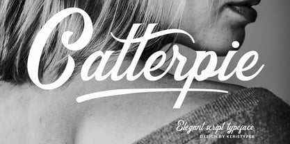 Catterpie Font is a modern classy typeface. It's a great choice for your needs, pairs perfectly with another font style. Attached them to your wedding invitations, gifts, brand, logos, tagging, and even to promote your personal business. Multilingual support: Afrikaans, Albanian, Catalan, Danish, Dutch, English, Estonian, French, Finnish, German, Icelandic, Indonesian, Italian, Malay, Norwegian, Portuguese, Spanish, Swedish, Zulu, and many more. What’s Included : Standard & Multilingual glyphs Ligature Works on PC & Mac Simple installations Accessible in Adobe Illustrator, Adobe Photoshop, Adobe InDesign, and even work on Microsoft Word. Hope you enjoy our font!
 - Lido STF by Storm Type Foundry,
$39.00Times with a Human Face: In my article of the same name which appeared in the magazine Font, volume 2000 I described the long and trying story of an order for a typeface for the Czech periodical Lidové noviny (People’s Newspaper). My task was to design a modification of the existing Times. The work, however, finally resulted in the complete re-drawing of the typeface. The assignment, which was on the whole wisely formulated, was to design a typeface which would enable “a smooth flow of information in the reader’s eye”, therefore a typeface without any artistic ambitions, from which everything which obstructs legibility would be eliminated. A year later Lidové noviny had a different manager who in the spring of 2001 decided to resume the cooperation. The typeface itself definitely profited from this; I simplified everything which could be simplified, but it still was not “it”, because the other, and obviously more important, requirement of the investor held: “the typeface must look like Times”. And that is why the above-mentioned daily will continue to be printed by a system version of Times, negligently adjusted to local conditions, which is unfortunately a far cry from the original Times New Roman of Stanley Morison. When I was designing Lido, the cooperation with the head of production of Lidové noviny was of great use to me. Many tests were carried out directly on the newspaper rotary press during which numerous weak points of the earliest versions were revealed. The printing tests have proved that the basic design of this typeface is even more legible and economical than that of Times. The final appearance of Lido STF was, however, tuned up without regard to the original assignment – the merrier-looking italics and the more daring modelling of bold lower case letters have been retained. The typeface is suitable for all periodicals wishing to abandon inconspicuously the hideous system typefaces with their even more hideous accents and to change over to the contemporary level of graphic design. It is also most convenient for everyday work in text editors and office applications. It has a fairly large x-height of lower case letters, shortened serifs and simplified endings of rounded strokes. This is typical of the typefaces designed for use in small sizes. Our typeface, however, can sustain enlargement even to the size appropriate for a poster, an information table or a billboard, as it is not trite and at the same time is moderate in expression. Its three supplementary condensed designs correspond to approximately 80% compression and have been, of course, drawn quite separately. The intention to create condensed italics was abandoned; in the case of serif typefaces they always seem to be slightly strained. I named the typeface dutifully "Lido" (after the name of the newspaper) and included it in the retail catalog of my type foundry. In order to prevent being suspected of additionally turning a rejected work into cash, Lido STF in six designs is available free of charge. I should not like it if the issuing of this typeface were understood as an “act out of spite” aimed against the venerable Times. It is rather meant as a reminder that there really are now alternatives to all fonts in all price categories. - Mathieu Sans by Borutta Group,
$39.00 I really like the moments when classic meets modern. Mathieu was inspired, by the proportions, texture and elegance of Renaissance typefaces, and by the works of Dutch typographers, in whom I have always appreciated the balance between the traditional approach and experiment. Mathieu has the features of a sans-serif typeface, but you can feel delicate notes of calligraphy through humanistic details. The whole family has several width options complemented by a slightly slanted but expressive italics – making it suitable for both longer texts and for use in visual identities. Karol Mularczyk and Małgorzata Bartosik worked on the project creatively directed by Mateusz Machalski.
 - Jute Basket by Yumna Type,
$12.00 A beautiful and easy-to-style font duo to elevate your design, Jute Basket. What sets this font duo is the display font that is made all in caps characters. This design choice is sure to give title and header text a big presence on any pages. Unlike the display style, the script font less domineering though you can use it to express a feeling of joy, cute, and serene You also get 15 illustrations as special extra that you can use as you wish. Features: Multilingual Supports Uppercase and lowercase PUA Encoded Numerals and Punctuation This font would looks great on your branding, logos, social media quotes, stickers, posters, wall art, merchandise, social media, and many more. Get more inspiration about how to use it by seeing the font preview. Thank you for purchasing our fonts. If you have any further questions, don't hesitate to contact us. Happy Designing.
 - Straight Angles by Celebrity Fontz,
$24.99Straight Angles is a precisely designed three-dimensional font with a clean and futuristic look. The predominant angles are 90 degrees and 180 degrees with parallel and perpendicular lines. Each character is surrounded by a crisp black border of even thickness throughout the font. Upper- and lower-case letters are the same, providing a constant maximum top height while the stems extending below are allowed to show off their distinct personalities in order to spice things up. The 3D extrusion effect makes text appear to stand out from the page. - Hesperides by Scriptorium,
$18.00Hesperides is based on samples of Colonial period calligraphy. Rather than being directly derived from any one sample, some common characteristics have been emphasized to give it a more coherent and distinctive look, with the accentuated single-looped strokes on many of the characters suggesting a fully flourished style, but showing a bit of restraint. The ultimate effect is really striking, in the tradition of our Queensland and Allegheny fonts, but even more distinctive. The full version includes alternate versions of many of the key characters designed to reduce loop interference and add variety.