10,000 search results
(0.035 seconds)
- Gandy Dancer NF by Nick's Fonts,
$10.00The 1912 American Specimen Book of Type Styles from ATF featured a quaint little offering called "Tabard", whose antique charm was enhanced by several rather quirky alternate characters. This version tosses out the standard characters and keeps the quirks in the works: the result is warm, engaging, slightly mischievous and a whole lot of fun. The Opentype version of this font supports Unicode 1250 (Central European) languages, as well as Unicode 1252 (Latin) languages. - Wildwest by Trustha,
$12.00 Wildwest is a dynamic and impactful brush font, giving it credence for usage as a display typeface. With a lot of movement and flow, Wildwest is a wonderful font that will give all your designs the touch they need.
 - Joopica by Okaycat,
$24.50 Joopica is cute & fun, bringing a friendly good nature to your communication. For the casual fresh look this font has lots of appeal. Joopica features extended characters, containing West European diacritics & ligatures, making it suitable for international environments & publications.
 - Perio by Aah Yes,
$12.00Perio is a small family, offering a distressed rendering of a conventional serif typeface in 4 varieties. There's Ordinary, All Caps, Small Caps, Clean and Jumbled. Many of the letters contain little bits of extra print around the body of the character, in imitation of imperfect printing, in all except the Clean version. It's especially useful for display, poster and headlines, but easily legible enough to be used in a paragraph of text. - Lagom Grotesk by S6 Foundry,
$20.00 Lagom Grotesk is a contemporary neo-grotesque sans serif typeface with strong stylistic geometric contrasts. Its distinctive wide-open stance was designed to give the right visual consistency for branding and communications, representing the shifting contemporary aesthetics. The distinctive stance gives the right visual consistency for branding and communications. Lagom Grotesk is perfectly suited for headlines, large-format prints, brand identities, social media, advertising, editorial design, posters, magazines, logos, headings, body copy, digital and more.
 - Res Publica by Linotype,
$29.99Res Publica is a workhorse. It is quite anonymous as typeface, without any distinctive marks. But it gives a harmonious text body, well suited for large amounts of text, such as official public reports, magazines based mainly on text, school books, and so on. The public" concept is part of the name. Res Publica is Latin for "public matters". The word republic has the same origin. Res Publica was released in 1992. - Motorwerk by PizzaDude.dk,
$20.00 Motorwerk has got more than 200 ligatures (including double letter and number substitution and the most common letter combinations) - a-z alternative characters, unique accented characters. You will need to use OpenType supporting applications to use the auto-ligatures.
 - Circularis by JAF 34,
$12.00 The Circularis family includes 8 styles and weights - eight uprights with eight italics. Circularis is characterized by the nice and smooth unordinary circle geometric contruction inspired at last century, nice readability, low price and finaly many variation of useful.
 - Cape Horn by Palmer Type Company,
$30.00 Cape Horn is a typeface inspired by seafarers who have perished by navigating the treacherous seas surrounding Cape Horn, which is at the southern-most tip of South America. A-Z Numbers Multi-language support Symbols Special Characters Uppercase
 - SP Reka by Remote Inc,
$39.00It was an unlikely union. Reka was a Maori maiden who made her home on the shores of Piha. I was a struggling actor who had spent the last six months in Bangkok, working as a cross-eyed prostitute. - Second Impression JNL by Jeff Levine,
$29.00Second Impression JNL is the solid version of Lasting Impression JNL by Jeff Levine. It emulates the look of ink-stamped letters and numerals. Based on a 1930s-era set of rubber stamps, there is a limited character set. - Ryden by Graphicfresh,
$18.00 Ryden - A Handwriting Display Font In making this font, I spent a lot of time thinking about handwriting with a display style. Each letter is carefully made to look as natural as possible. This font is suitable for use in brands or logos with the theme of handwriting. I hope you like the font we made. Thanks
 - Katharine by Teweka,
$20.00 Katharine is a fresh new font, Made in Upright style, Katharine Has 417 glyphs with lots of swash options. This Katharine font is very easy for you to work with, because it has automatic letter and number combinations to change the swash inside the letters. This font is suitable for: Branding, Logotype, Poster, Social Media and others.
 - Fat Ink by High Peak,
$20.00 This handwritten font is as juicy as the strokes from a fat marker! Unpredictable but harmonious, the lines and shapes give this font a fun, funky vibe. Perfect for creating logos, charts, pricing, and more. Full uppercase and lowercase, it supports several languages, lots of discretionary ligatures, and alternatives that combine with each other. Have fun! High Peak
 - Tara Bulbous NF by Nick's Fonts,
$10.00This new and improved version of this chunky classic by Paul Carlyle and Gus Oring includes the lowercase letters not found in earlier versions. Use it to add a little—or a lot of—panoramic panache to your next project. Both versions of the font include 1252 Latin and 1250 CE (with localization for Romanian and Moldovan) character sets. - Berling by Linotype,
$29.99The productivity of the Berlingska Stilgjuteriet was made possible by the development of modern typeface art in Sweden in the 1950s. The typeface Berling was designed by Karl-Erik Forsberg for the Berlingska Stilgjuteriet in Lund. It belongs to the modern text typefaces and like most of these markedly shows the influece of the Neorenaissance. Berling Antiqua appeared in 1951 with a matching italic and by 1959, it was expanded to include five weights. Linotype offers Berling in four of them, roman and bold with their respective italics. In 2004 the Swedish publisher Verbum commissioned a complete redesign of Berling for the 21st century. Linotype assisted the designers of this new typeface, which came to be called Berling Nova. - Uptown Review JNL by Jeff Levine,
$29.00 Cover art for the 1933 sheet music of Harold Arlen and Ted Koehler's "Stormy Weather" (from the musical production "Cotton Club Parade") listed the cast of the show in a condensed hand lettered sans that typified the 1930s and the Art Deco era. This served as the inspiration for Uptown Review JNL; available in both regular and oblique versions. The Cotton Club was a whites-only night club which showcased black acts, and was originally located on 145th Street in Harlem from 1923 to 1935, then existed for a short time in the New York theater district from 1936 to 1940. After the Broadway incarnation of the club closed, its space was taken over by the Latin Quarter.
 - Moot jungle by Alit Design,
$18.00 Presenting 🍃The Moot Jungle Nature Font🍃 by alitdesign. "The Moot Jungle" is an elegant serif font with a natural twist. Inspired by the beauty of nature, this font features a stunning swash of leaves that adds a touch of sophistication to any design. The serifs are delicate and refined, making it perfect for elegant, upscale designs. Whether you're creating a logo, invitations, or other design projects, "The Moot Jungle" is sure to make a lasting impression. In addition, "The Moot Jungle" has a versatile design, making it suitable for various uses such as headers, titles, body text, and more. The font supports multiple languages and includes a full set of uppercase and lowercase letters, numbers, and punctuation marks. It also comes with stylistic alternatives and ligatures, adding to its uniqueness and allowing for even more creative freedom. Embrace the beauty of nature and elevate your design with "The Moot Jungle" font. The Moot Jungle font has alternatives that you can combine between swashes and symbols that have the theme of elegant nature. Besides that this font is very easy to use both in design and non-design programs because everything changes and glyphs are supported by Unicode (PUA). The Moot Jungle Font has a total of 700 glyphs including symbol, multilingual. Language Support : Latin, Basic, Western European, Central European, South European,Vietnamese. In order to use the beautiful swashes, you need a program that supports OpenType features such as Adobe Illustrator CS, Adobe Photoshop CC, Adobe Indesign and Corel Draw. but if your software doesn't have Glyphs panel, you can install additional swashes font files.
 - Screwball Comedy JNL by Jeff Levine,
$29.00 Cary Grant was one of Hollywood’s most versatile actors, playing romantic leads, dramatic parts and showing off his impeccable timing in screwball comedies. A perfect example of this is Frank Capra’s “Arsenic and Old Lace” from 1942. The movie trailer for the film had the title hand lettered in a playful and casual slab serif style, with varying character shapes and weights. This is now available as Screwball Comedy JNL in both regular and oblique versions.
 - Gazella by Raditya Type,
$14.00 GAZELLA Displays Fonts. This font has a unique and bold typeface, making it suitable for unique design themes. The unique binding of the serifs makes this typeface cool and stands out from the usual serif fonts, perfect for headlines, logos, posters, packaging, T-shirts, coffee shops, restaurants, magazine headers, signs or gift/post cards, cafes and weddings or any kind of advertising purposes. GAZELLA comes with uppercase, lowercase, Numbers, Punctuation, Ligatures and also Multi Language Support.
 - Espinosa Nova by Estudio CH,
$- Espinosa Nova is a revival based on the types used by Antonio de Espinosa, the most important Mexican printer of the sixteenth century and very probably the first punchcutter anywhere in the American continent (1551). In 2010, its main fonts were awarded two certificates of excellence: one by TDC2 (Type Directors Club Typeface Design Competition), one by Tipos Latinos (Biennial of Latin American Typography). According to Robert Bringhurst, it is “an unusually intelligent family of type, reaching back to one of the most exciting moments in typographic history and reaching forward to the typographic future”. All of the fonts intended for setting text include small caps, five sets of figures (oldstyle and lining, both proportional and tabular, plus tabular small caps), many f and long s ligatures, and capital sharp S (U+1E9E). In addition, the Capitular fonts allow to create interesting effects by overlapping layers. This family feels very comfortable in books, but it can be used everywhere a touch of classic & elegance is required.
 - Basik by Superfried,
$32.50 As the name suggests, Basik is a simple, clean and versatile sans-serif typeface designed by Superfried. It is equally apt in both body and display scenarios. There are already numerous san-serif fonts available which is why we have tried to create some unique styles and cuts throughout the typeface. Basik has been featured on the Behance curated typography gallery TypographyServed.com. It is available in two styles, book and stencil.
 - Stout Boots by Putracetol,
$24.00 Stout Boots is a bold style serif font with strong character and soft features. Stout Boots is equipped with Swash, Stylistic and Titling alternates as well as with Standard and Discretionary Ligatures And this font Stout Boots is a stylish font that is both retro and bold font. It's thick curves give a groovy vibe with the serifs bringing it slightly back to traditional. Comes with alternatives and ligatures, helps to create stunning logos, quotes, posts, blog posts. branding projects, magazine imagery, wedding invitations, and much more. The alternative characters were divided into several Open Type features such as Swash, Stylistic Sets, Stylistic Alternates, Contextual Alternates, and Ligature. The Open Type features can be accessed by using Open Type savvy programs such as Adobe Illustrator, Adobe InDesign, Adobe Photoshop Corel Draw X version, And Microsoft Word. This font is also support multi language.
 - Fort Courage JNL by Jeff Levine,
$29.00 Fort Courage JNL is a bold slab serif wood type in the French Clarendon genre, taking its name as a tongue-in-cheek reference to the cavalry fort populated by a number of post-Civil War misfits in the 1960s television comedy "F Troop".
 - Vainest by Gatype,
$12.00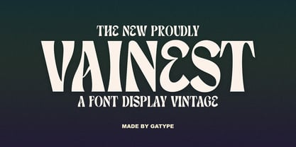 Vainest Serif vintage style font It has a modern and retro look. Comes with different styles, really helps to create amazing logos, quotes, posts, blog posts. branding projects, magazine imagery, book and billboard displays, and more. hope you will enjoy using the Vainest font and it will make a perfect addition to your font collection! Contact me with an inbox message If you have any questions. Thank you
 - Falkirk Script by Mysterylab,
$17.00 Introducing Falkirk Script, a three-font suite that is excellent for product branding, logos, t-shirts, high-end food and beverage labels, and much more. This collection includes the main letter body font (Falkirk Script Bold), an extruded shadow version, and finally a horizontal line engraving version that highlights the upper half of the letters. Stack the font variations in alignment, assign different colors, outlines, and/or gradients to each layer, and you'll see a wealth of versatile design possibilities opening up. This script has a unique topheavy wedge effect in the lower case, and lyrical old-world script detailing in the capitals. The tapered sweep and simplified ascender design works extremely well in the context of curved arc or arched word designs.
 - Urfa Rounded by Ahmet Altun,
$19.00 Urfa Rounded Font family is the rounded version of Urfa Typeface. The Urfa Rounded font family comes in nine weights of Normal and Italic. In addition, all weights contain small caps in both italic and normal. With the Urfa Rounded font family, you can create beautiful works for the web, including logos, banners, body copy, and presentations. Urfa Rounded typeface also works nicely in print formats such as posters, T-shirts, magazines, and affiches. Because of its eye-pleasing style, this font is both effective and versatile. It supports a wide range of languages, including Extended Latin and Cyrillic.
 - Agentic by Artisticandunique,
$55.00 Agentic Serif font family has 18 styles and multi-language support. It is ideal for creating your articles thanks to its easy readability. The combination of sharp corners and soft turns in the characters offers alternatives to create different moods in your projects. You can create creative and stylish designs with combinations of upper and lowercase letters in the title and text. This font helps you discover the best mood for your projects, from body text to big headlines, classic to modern and bold looks. Well suited for books and magazines, magazine covers, editorials, headlines, websites, logos, invitations, branding, advertisements and more.
 - Linotype Zootype by Linotype,
$29.99Zootype –the first original single font– was designed in 1997 by Victor Garcia of Argentina and as a winner of Linotype's Second International Type Design Contest is included in the TakeType Library. The three additional family styles –Zootype Air, Zootype Land, Zootype Water– were added in 1999. In the words of the designer, the design concept is meant to display the funny, happy joy of animal nature.’ Animal heads peek into the block forms of the letters, giving the font a unique whimsical character. - Drunk Cowboy by Chank,
$99.00 Drunk Cowboy is a bouncy version of the popular Old West type style, inspired by hand-made signage in Paducah, Kentucky. The strokes are loopy and loose. The exaggerated terminals give this font a loud, boisterous presence. Drunk Cowboy is a brutish rogue that emanates the fierce independence of Rio as played by Marlon Brando in One Eyed Jacks, but it is most like Paul Newman's Butch Cassidy—a mischievous wise-cracker. And there's gold worth mining for in this font. Dig deep enough and you'll find swash characters and special ligatures, like Th, ST, CT, NT and other popular letter combinations found in the Cowboy dialect.
 - Sweet Couple by Krafted,
$10.00 Introducing Sweet Couple - A Calligraphy Font Sweet, lovely and most beautifully crafted Sweet Couple font that can be used on different projects and promotions. Go ahead and use it on your website, for your social media branding, Pinterest banners, printed materials, and more! Inspire and give love to your audience, clients, or guests with this stylish Calligraphy font. What you’ll get: Multilingual & Ligature Support Full sets of Punctuation and Numerals Compatible with: Adobe Suite Microsoft Office KeyNote Pages Software Requirements: The fonts that you’ll receive in the pack are widely supported by most software. In order to get the full functionality of the selection of standard ligatures (custom created letters) in the script font, any software that can read OpenType fonts will work. We hope you enjoy this font and that it makes your branding sparkle! Feel free to reach out to us if you’d like more information or if you have any concerns.
 - Old Paris Nouveau by Baseline Fonts,
$24.00Old Paris Nouveau is based on letterpress stylings of modern roman alphabets from the 1920s. Adapting the nouveau sensibility to the digital age required several conventions, including several alternate glyphs for specific individual letterforms as well as creating consistent stem weights and x-heights for more effective body copy. The inherent charm of Old Paris lies in its variation in form and style -- and yet the uniformity. Organic simplicity and elegance underscore the strength and utility inherent in the family of fonts. - Saffran by CAST,
$45.00 Saffran is a project of Erasmo Ciufo and Alessio D’Ellena. Saffran is a clear sans-serif with big x-height, short ascenders and descenders, that works well both for headlines and main bodies of text. The objective of the design is to improve readability of small size texts, by clearing the junctions and enlightening the structure of each letter as a consequence. The broken junctions, inspired from the hebrew alphabet, turn into spiky endings that connect to the flat sides only under 7pt.
 - Lovely Signature by Create Big Supply,
$17.00 Discover Lovely Signature, an exquisite handwritten font that adds a touch of elegance and authenticity to your designs. With its flowing lines and natural feel, Lovely Signature resembles real handwriting, bringing a personal and charming element to your projects. Whether you're creating wedding invitations, stationary art, or eye-catching social media posts, this font is perfect for making a lasting impression. Lovely Signature offers a complete character set, including both uppercase and lowercase letters, numbers, and punctuations. This extensive range ensures versatility and compatibility, allowing you to express your creativity across various design applications. The font's multilingual support enables you to incorporate different languages seamlessly, reaching a diverse audience worldwide. With its PUA encoding, Lovely Signature grants easy access to a collection of ligatures, allowing you to enhance the visual appeal of your text. These ligatures offer beautiful connections and flourishes, adding a sophisticated and unique touch to your designs. Whether you're designing logos, branding materials, or personal projects, Lovely Signature provides endless possibilities. Capture the essence of elegance and elevate your designs with Lovely Signature. Perfect for weddings, events, branding, and more, this handwritten font will evoke emotions and create memorable experiences for your audience. Add a personal and enchanting touch to your designs with Lovely Signature, and let your creativity shine.
 - Evita by ITC,
$29.99Gérard Mariscalchi is a self-made designer. Born in Southern France of a Spanish mother and an Italian father, he has worked as a mechanic, salesman, pilot, college teacher – even a poet (with poetry being the worst-paying of these professions, he reports.) “Throughout all this, the backbone of my career has always been design,” Mariscalchi says. “I’ve been drawing since I was five, but it wasn’t until I was twenty-four that I learned that my hobby could also help me earn a living.” It was about this same time that Mariscalchi fell in love with type. He studied the designs of masters like Excoffon, Usherwood and Frutiger, as well as the work of calligraphers and type designers such as Plantin, Cochin and Dürer. With such an eclectic background, it’s no surprise that Mariscalchi’s typeface designs are inspired by many sources. Baylac and Evita reflect the style of the art nouveau and art deco periods, while Marnie was created as an homage to the great Lithuanian calligrapher Villu Toots. However, the touch of French elegance and distinction Mariscalchi brings to his work is all his own. Baylac Who says thirteen is an unlucky number? Three capitals and ten lowercase letters from a poster by L. Baylac, a relatively obscure Art Nouveau designer, served as the foundation for this typeface. The finished design has lush curves that give the face drama without diminishing its versatility. On the practical side, Baylac’s condensed proportions make it perfect for those situations where there’s a lot to say and not much room in which to say it Evita Mariscalchi based the design of Evita on hand lettering he found in a restaurant menu, and considers this typeface one of his most difficult design challenges. “The main problem was to render the big weight difference between the thin and the thick strokes without creating printing problems at small point sizes,” he says. Unlike most scripts, Evita is upright, with the design characteristics of a serif typeface. Mariscalchi named the face for a close friend. The end result is a charming design that is light, airy, and slightly sassy. Marnie Based on Art Nouveau calligraphic lettering, Marnie is elegant, inviting, and absolutely charming. Mariscalchi paid special attention to letter shapes and proportions to guarantee high levels of character legibility. He also kept weight transition in character strokes to modest levels, enabling the face to be used at relatively small sizes – an unusual asset for a formal script. Marnie’s capital letters are expansive designs with flowing swash strokes that wrap affectionately around adjoining lowercase letters. The design easily captures the spontaneous qualities of hand-rendered brush lettering. - Baylac by ITC,
$29.99Gérard Mariscalchi is a self-made designer. Born in Southern France of a Spanish mother and an Italian father, he has worked as a mechanic, salesman, pilot, college teacher – even a poet (with poetry being the worst-paying of these professions, he reports.) “Throughout all this, the backbone of my career has always been design,” Mariscalchi says. “I’ve been drawing since I was five, but it wasn’t until I was twenty-four that I learned that my hobby could also help me earn a living.” It was about this same time that Mariscalchi fell in love with type. He studied the designs of masters like Excoffon, Usherwood and Frutiger, as well as the work of calligraphers and type designers such as Plantin, Cochin and Dürer. With such an eclectic background, it’s no surprise that Mariscalchi’s typeface designs are inspired by many sources. Baylac and Evita reflect the style of the art nouveau and art deco periods, while Marnie was created as an homage to the great Lithuanian calligrapher Villu Toots. However, the touch of French elegance and distinction Mariscalchi brings to his work is all his own. Baylac Who says thirteen is an unlucky number? Three capitals and ten lowercase letters from a poster by L. Baylac, a relatively obscure Art Nouveau designer, served as the foundation for this typeface. The finished design has lush curves that give the face drama without diminishing its versatility. On the practical side, Baylac’s condensed proportions make it perfect for those situations where there’s a lot to say and not much room in which to say it Evita Mariscalchi based the design of Evita on hand lettering he found in a restaurant menu, and considers this typeface one of his most difficult design challenges. “The main problem was to render the big weight difference between the thin and the thick strokes without creating printing problems at small point sizes,” he says. Unlike most scripts, Evita is upright, with the design characteristics of a serif typeface. Mariscalchi named the face for a close friend. The end result is a charming design that is light, airy, and slightly sassy. Marnie Based on Art Nouveau calligraphic lettering, Marnie is elegant, inviting, and absolutely charming. Mariscalchi paid special attention to letter shapes and proportions to guarantee high levels of character legibility. He also kept weight transition in character strokes to modest levels, enabling the face to be used at relatively small sizes – an unusual asset for a formal script. Marnie’s capital letters are expansive designs with flowing swash strokes that wrap affectionately around adjoining lowercase letters. The design easily captures the spontaneous qualities of hand-rendered brush lettering. - Marnie by ITC,
$29.99Gérard Mariscalchi is a self-made designer. Born in Southern France of a Spanish mother and an Italian father, he has worked as a mechanic, salesman, pilot, college teacher – even a poet (with poetry being the worst-paying of these professions, he reports.) “Throughout all this, the backbone of my career has always been design,” Mariscalchi says. “I’ve been drawing since I was five, but it wasn’t until I was twenty-four that I learned that my hobby could also help me earn a living.” It was about this same time that Mariscalchi fell in love with type. He studied the designs of masters like Excoffon, Usherwood and Frutiger, as well as the work of calligraphers and type designers such as Plantin, Cochin and Dürer. With such an eclectic background, it’s no surprise that Mariscalchi’s typeface designs are inspired by many sources. Baylac and Evita reflect the style of the art nouveau and art deco periods, while Marnie was created as an homage to the great Lithuanian calligrapher Villu Toots. However, the touch of French elegance and distinction Mariscalchi brings to his work is all his own. Baylac Who says thirteen is an unlucky number? Three capitals and ten lowercase letters from a poster by L. Baylac, a relatively obscure Art Nouveau designer, served as the foundation for this typeface. The finished design has lush curves that give the face drama without diminishing its versatility. On the practical side, Baylac’s condensed proportions make it perfect for those situations where there’s a lot to say and not much room in which to say it Evita Mariscalchi based the design of Evita on hand lettering he found in a restaurant menu, and considers this typeface one of his most difficult design challenges. “The main problem was to render the big weight difference between the thin and the thick strokes without creating printing problems at small point sizes,” he says. Unlike most scripts, Evita is upright, with the design characteristics of a serif typeface. Mariscalchi named the face for a close friend. The end result is a charming design that is light, airy, and slightly sassy. Marnie Based on Art Nouveau calligraphic lettering, Marnie is elegant, inviting, and absolutely charming. Mariscalchi paid special attention to letter shapes and proportions to guarantee high levels of character legibility. He also kept weight transition in character strokes to modest levels, enabling the face to be used at relatively small sizes – an unusual asset for a formal script. Marnie’s capital letters are expansive designs with flowing swash strokes that wrap affectionately around adjoining lowercase letters. The design easily captures the spontaneous qualities of hand-rendered brush lettering. - Cora by TypeTogether,
$49.00 Cora is a sans serif with an experimental bent, offering a large x-height, some contrast of stroke weight, and capitals inspired by classical lettering. The large x-height gives it a voice with a little more volume so that those in the back of the room have no trouble hearing. Because the letters seem slightly large, Cora remains clear at smaller point sizes. It is a typeface intended to perform well on screen without losing its attraction in print and the nature of its shapes allows for condensation or expansion without becoming severely distorted. The uppercase exhibits classical proportions found in ancient Roman inscriptions, which provides opportunities for setting titles in all caps. Cora Opentype Pro has a full range of numerals for every use, small caps, the most common open type features and supports many languages that use the latin extended alphabet. It is available in a range of three weights plus Italics. CoraBasic is a reduced version of Cora. It is still an OT-font but without any particular features except of a set of ligatures, class-kerning and language support including CE and Baltic.
 - Aldus by Linotype,
$29.99 Aldus was designed by Hermann Zapf and appeared with the font foundry D. Stempel AG in Frankfurt am Main in 1954. Zapf named this font after the famous Venetian printer Aldus Manutius, whose work is among the most important of the Renaissance period as well as Zapf’s inspiration for Aldus. Linotype Aldus was introduced by Linotype Library as a text font lighter than Palatino. Zapf’s goal with his Palatino and Aldus was to create a new form of Old Face typeface. This font gives text the feeling of elegance which was typical of the Renaissance.
 - Burnt Rose by Krafted,
$10.00 Want to transport your audience to a world of wonder with your branding? Want your headings to spark happiness and engagement? Introducing Burnt Rose - A Modern Calligraphy Font. A modern and elegant handcrafted calligraphy font that’ll make your audience swoon and enhance your branding projects, printed materials, and website design. Every stroke and curve was created to capture the essence of elegance and style. Ideal for social media banners; posts, and ads, printed quotes, t-shirt designs, packaging, or even as a modern text overlay to any background image. Burnt Rose includes Ligature & Stylistic Sets as well as Multilingual Support to make your branding globally acceptable. Get ready to engage and captivate your audience with Burnt Rose. What you’ll get: Multilingual & Ligature Support Full sets of Punctuation and Numerals Compatible with: Adobe Suite Microsoft Office KeyNote Pages Software Requirements: The fonts that you’ll receive in the pack are widely supported by most software. In order to get the full functionality of the selection of standard ligatures (custom created letters) in the script font, any software that can read OpenType fonts will work. We hope you enjoy this font and that it makes your branding sparkle! Feel free to reach out to us if you’d like more information or if you have any concerns.