10,000 search results
(0.045 seconds)
- Etrusco Now by Italiantype,
$39.00 Etrusco Now is the revival of a lead typeface originally cast in lead by Italian foundry Nebiolo in the early 1920s. Heavily inspired by the design of the Medium weight of Schelter & Giesecke's Grotesk, Etrusco was, like Cairoli, an early precursor of the modernist grotesque superfamilies: a solid, multi-purpose "work-horse" typeface family that could solve a wide range of design problems with its range of widths and weights. When designing the new incarnation of Nebiolo's Etrusco, the Italiantype team directed by Cosimo Lorenzo Pancini and Mario de Libero decided to extend the original weight and width range to keep this "superfamily" approach. Etrusco Now has twenty-one styles widths in three widths of seven weights each, with matching italics; the original weights for the typeface have been collected in the Etrusco Classic subfamily. Etrusco Now new widths allowed the team to include in the design many nods and homages to other vintage classics of Nebiolo. The lighter weights of the normal width have been heavily influenced by the modernist look of Recta, while the heavy condensed and compressed widths refer to the black vertical texture of Aldo Novarese's Metropol. This infuses the typeface with a slightly vintage mood, making Etrusco at the same time warmly familiar and unexpected to eyes accustomed to the formal and cold look of late modernist grotesques like Helvetica. Contemporary but rich in slight historical quirks, Etrusco Now is perfect for any editorial and branding project that aims to be different in a subtle way. Etrusco Now's deviations from the norm are small enough to give it personality without affecting readability, while its wide range of open type features (alternates, stylistic sets, positional numbers) and language coverage make it a problem solver for any situation. Like its cousin Cairoli, Etrusco is born out of love for lost letterforms and stands like its lead ancestor from a century ago, at the crossroads between artsy craftsmanship and industrial needs.
 - 1557 Civilité Granjon by GLC,
$42.00 Living from 1545 in Lyon, France, the famous punchcutter Robert Granjon created a typeface that looked like his own handwriting. The first book printed with this font, in 1557, was probably Dialogues de la vie et de la mort by Innocent Ringhier. We offer the complete typeface. It is a charming font with historical forms (long s, final s and others) and many ligatures, enriched with accented letters and other characters that did not exist in the original (thorn, eth, lslash and others), and a lot of alternates that permit rich and varying typography. Warning: all characters appear with the 1500s manual blackletter old style, especially letters “e” “r” or “h” alternate and some ending forms, and may be difficult to read at first, but it quickly becomes very easy. The font contains all characters for Baltic, Western European (Including Celtic), Eastern European, Northern European, and Turkish languages.
 - Fountained by Ditatype,
$29.00 Fountained is a luxurious script font that beautifully marries sophistication with a touch of playful elegance. The characters in Fountained boast a generous thickness, making each stroke exude opulence and a sense of grandeur. The swinging ends, resembling graceful flourishes, bring a touch of movement and style to the font, ensuring that Fountained stands out as a distinctive script font. Enjoy the features here. Features: Ligatures Stylistic Sets Multilingual Supports PUA Encoded Numerals and Punctuations Fountained fits in headlines, logos, posters, flyers, branding materials, greeting cards, print media, editorial layouts, and many more designs. Find out more ways to use this font by taking a look at the font preview. Thanks for purchasing our fonts. Hopefully, you have a great time using our font. Feel free to contact us anytime for further information or when you have trouble with the font. Thanks a lot and happy designing.
 - Pctl4800 by Typodermic,
$11.95 Introducing PCTL4800, a technical sans-serif typeface that’s a must-have in every designer’s toolkit. This typeface is the perfect choice for those who want to achieve a modern or futuristic aesthetic without the vintage baggage or technological gimmickry. With its somber and principled design, PCTL4800 is the perfect choice for conveying a sense of technical sophistication. What sets PCTL4800 apart is its unique corner index notch, a design feature that hints at an unknown technical necessity, such as an orientation prompt like the notch on an SD card. This feature adds a touch of mystery and intrigue to your designs, making them stand out from the crowd. And if you prefer a more conservative design, PCTL9600 is the typeface for you. It has all the same great features as PCTL4800, but without the corner index notch. Both typefaces come with six weights and italics, giving you a wide range of options for any project you’re working on. Why not add PCTL4800 or PCTL9600 to your font collection today and take your designs to the next level with its technical sophistication? Most Latin-based European, Vietnamese, Greek, and most Cyrillic-based writing systems are supported, including the following languages. Afaan Oromo, Afar, Afrikaans, Albanian, Alsatian, Aromanian, Aymara, Azerbaijani, Bashkir, Bashkir (Latin), Basque, Belarusian, Belarusian (Latin), Bemba, Bikol, Bosnian, Breton, Bulgarian, Buryat, Cape Verdean, Creole, Catalan, Cebuano, Chamorro, Chavacano, Chichewa, Crimean Tatar (Latin), Croatian, Czech, Danish, Dawan, Dholuo, Dungan, Dutch, English, Estonian, Faroese, Fijian, Filipino, Finnish, French, Frisian, Friulian, Gagauz (Latin), Galician, Ganda, Genoese, German, Gikuyu, Greenlandic, Guadeloupean Creole, Haitian Creole, Hawaiian, Hiligaynon, Hungarian, Icelandic, Igbo, Ilocano, Indonesian, Irish, Italian, Jamaican, Kaingang, Khalkha, Kalmyk, Kanuri, Kaqchikel, Karakalpak (Latin), Kashubian, Kazakh, Kikongo, Kinyarwanda, Kirundi, Komi-Permyak, Kurdish, Kurdish (Latin), Kyrgyz, Latvian, Lithuanian, Lombard, Low Saxon, Luxembourgish, Maasai, Macedonian, Makhuwa, Malay, Maltese, Māori, Moldovan, Montenegrin, Nahuatl, Ndebele, Neapolitan, Norwegian, Novial, Occitan, Ossetian, Ossetian (Latin), Papiamento, Piedmontese, Polish, Portuguese, Quechua, Rarotongan, Romanian, Romansh, Russian, Rusyn, Sami, Sango, Saramaccan, Sardinian, Scottish Gaelic, Serbian, Serbian (Latin), Shona, Sicilian, Silesian, Slovak, Slovenian, Somali, Sorbian, Sotho, Spanish, Swahili, Swazi, Swedish, Tagalog, Tahitian, Tajik, Tatar, Tetum, Tongan, Tshiluba, Tsonga, Tswana, Tumbuka, Turkish, Turkmen (Latin), Tuvaluan, Ukrainian, Uzbek, Uzbek (Latin), Venda, Venetian, Vepsian, Vietnamese, Võro, Walloon, Waray-Waray, Wayuu, Welsh, Wolof, Xavante, Xhosa, Yapese, Zapotec, Zarma, Zazaki, Zulu and Zuni.
 - Alaturka by Bülent Yüksel,
$19.00 ABOUT FAMILY: What makes "Alaturka" elegant, friendly and contemporary is its very rounded curves with very open terminals. "Alaturka" has been designed with a higher "x-height" than other fonts in its class to make tiny readability more obvious in any use situation. It will be ideal for use in small sizes such as business cards or mobile applications. This typeface is also equipped with powerful OpenType features to satisfy the most demanding professionals. It has solid features like case sensitivity, small, true capitals, full ligatures, tabular figures for tables, old-style figures to elegantly insert numbers into your sentences, and more alternative characters to give personality to your projects. FEATURE SUMMARY: - 2 style: 1From 1923 To 2023 - 8 weights: Thin, Extra Light, Light, Regular, Medium, Bold, Extra Bold, and Black. - 3widths: Normal, Narrow, and Condensed. - Matching italics (12º) for all weights and widths. - Matching small caps for all weights and widths. - Lining and old-style figures (proportional and tabular). - Some alternate characters - Unlimited fractions. - Automatic ordinals (1st, 2nd, 3rd, etc.). - Extended language support: Most Latin-based scripts - Extended currency support. You can enjoy using it.
 - Lialisa by Gatype,
$14.00 Lialisa is a smooth, elegant and flowing handwritten font. It has a beautifully balanced character, goes well with many designs. Lialisa features varied baselines, smooth lines, beautiful glyphs, and stunning alternatives. Hand-drawn design elements allow you to create many beautiful typographic designs in an instant such as branding, web and editorial designs, prints, crafts, quotes, It's great for logo types, wedding invitations, romantic cards, labels, packaging, name spelling and other . Add to your most creative ideas and see how they make it happen. Lialisa is coded with PUA Unicode, which allows full access to all additional characters without having to design special software. Mac users can use Font Book , and Windows users can use Character Map to view and copy any additional characters to paste into your favorite text editor/application. Lialisa includes OpenType style alternatives, ligatures, and International support for most Western Languages. To enable the OpenType Stylistic alternative, you need a supporting program such as Adobe Illustrator CS, Adobe Indesign & CorelDraw X6-X7, Microsoft Word 2010 or a later version. How to access all alternative characters using Adobe Illustrator: https://www.youtube.com/watch?v=XzwjMkbB-wQ
 - VLNL Gindicate by VetteLetters,
$30.00 The alcoholic beverage Gin is drunk around the world, as far back as the 13th century. Originally distilled as a medicine, it draws its main flavour from juniper berries. Gin is colourless itself but – due to its smooth taste – a major ingredient in a long list of famous colourful cocktails. Gimlet, Singapore Sling, Negroni, Charlie Chaplin, French 75, Vesper, Tom Collins, White Lady, Aviation, Monkey Gland, Southside, Gin Gin Mule and New Orleans Fizz are but a few of them. That made us decide it simply cannot be missing from the Vette Letters font collection. Vette Letters designer Henning Brehm originally designed VLNL Gindicate for the 2015 action movie Hitman: Agent 47. It was specifically used for the logo and signage of the maverick ‘Syndicate International’ organisation in the film. It lay dormant in a folder for a while, when it was reworked into this flashy 5 weight family. VLNL Gindicate is a rounded modern sans serif family, suitable for a multitide of applications, corporate or otherwise. It has somewhat of a warm sci-fy feel, without being overtly techno-ish. In the family are 3 regular weights (Light - Regular - Bold), but also an Inline and Multiline weight for extra design possibilities. Company logos, brand identities, music flyers or posters, you name it. VLNL Gindicate will spice up any design. Bottom’s up!
 - MVB Diazo by MVB,
$59.00 Mundane information—the sort you might ignore—often appears in the form of very simple, utilitarian lettering, devoid of personality, the sort of industrial lettering you find on old blueprints, park restrooms, and electrical boxes. MVB Diazo is such a thing. It looks like lettering done earnestly with a plastic template. The monoline caps—constructed from straight lines and simple curves—have rounded details as if rendered by a blunt pen on a topographical survey or by a router on a rustic campground sign. The MVB Diazo fonts are compact, available in two widths: Condensed and Extra Condensed. Each width offers four weights from Light to Black. The fonts are perfect for wherever plain and boring letterforms are required. All widths and weights are also available in two distressed textures (#1 and #2) that accentuate the industrial character of the design. Rough #1 is gritty, with finer texture for use at larger sizes. Rough #2 exhibits more damage, the roughness apparent when used at smaller sizes. The Rough fonts include alternates of a number of glyphs so that variation of texture is possible when letters repeat in a word.
 - Franca by René Bieder,
$29.00 Franca is a neo-grotesk family in nine weights plus matching italics. The inspiration for the design came through the constant interest in new interpretations of the classic grotesk model and a study of "neutral“ typefaces like Helvetica, Univers or Normal Grotesk. During the studies, additional attention was given to the American representatives of the genre, resulting in the initial impetus for a reinterpretation, combining both paths into one contemporary design. This is reflected in the name, blending together the names of the most popular typefaces of each genres, (Fran)klin and Helveti(ca). Due to its large x-height and plain design, the family is perfectly suited for all kinds of text. Its mid-weights are optimized for usage in long paragraphs, while the bolder weights, due to a short descender and ascender, create a compact and confident look in headlines or short copy. In order to create strong and dynamic italics, the oblique glyph shapes come with a faint calligraphic hint, defined by a higher stroke contrast and a steeper connection between stems and arcs in, for example, h n m and u. This is followed by different standard shapes for a and y, supporting the dynamic movement of the lowercase in general. A wide range of OpenType features such as ligatures, old style figures, fractions, case-sensitive shapes and many more, are available for professional and contemporary typesetting. This is completed with eleven alternative glyph sets, enabling a quick customization of the typeface. The family supports up to 92 languages and comes with 500+ glyphs per font.
 - Avenir Next by Linotype,
$97.99 Avenir Next Pro is a new take on a classic face—it’s the result of a project whose goal was to take a beautifully designed sans and update it so that its technical standards surpass the status quo, leaving us with a truly superior sans family. This family is not only an update though, in fact it is the expansion of the original concept that takes the Avenir Next design to the next level. In addition to the standard styles ranging from UltraLight to Heavy, this 32-font collection offers condensed faces that rival any other sans on the market in on and off—screen readability at any size alongside heavy weights that would make excellent display faces in their own right and have the ability to pair well with so many contemporary serif body types. Overall, the family’s design is clean, straightforward and works brilliantly for blocks of copy and headlines alike. Akira Kobayashi worked alongside Avenir’s esteemed creator Adrian Frutiger to bring Avenir Next Pro to life. It was Akira’s ability to bring his own finesse and ideas for expansion into the project while remaining true to Frutiger’s original intent, that makes this not just a modern typeface, but one ahead of its time. Complete your designs with these perfect pairings: Dante™, Joanna® Nova, Kairos™, Menhart™, Soho® and ITC New Veljovic®. Avenir Next Variables are font files which are featuring two axis, weight and width. They have a preset instance from UltraLight to Heavy and Condensed to Roman width. The preset instances are: Condensed UltraLight, Condensed UltraLight Italic, Condensed Thin, Condensed Thin Italic, Condensed Light, Condensed Light Italic, Condensed, Condensed Italic, Condensed Demi, Condensed Demi Italic, Condensed Medium, Condensed Medium Italic, Condensed Bold, Condensed Bold Italic, Condensed Heavy, Condensed Heavy Italic, UltraLight, UltraLight Italic, Thin, Thin Italic, Light, Light Italic, Regular, Italic, Demi, Demi Italic, Medium, Medium Italic, Bold, Bold Italic, Heavy, Heavy Italic. Featured in: Best Fonts for PowerPoints
 - Bumpy Ride by Hanoded,
$16.00 I live in a small hamlet near the Rhine river. It is a sleepy little town and it doesn’t have any facilities. For groceries I need to go to the next town. The only road leading to that town has been closed for half a year, because of ‘maintenance’, so doing groceries got a lot trickier. The fastest way to travel is through yet another hamlet in the forest, on a very narrow road with extremely bumpy shoulders. Yes, you’ve guessed it: it is a Bumpy Ride. Bumpy Ride was made using a so called Brush Pen. It comes with all the accents and a sweet set of alternates for the lower case letters.
 - Birthstone by TypeSETit,
$80.00 The Birthstone Family is a set of fonts that are not only diverse but perfectly compatible to interchange styles in a single block of text. There are 3 precious gems: Script, Casual, and Formal. Plus for added luster, there's Bounce (both Medium and Light weights) plus a Titling font— A truncated version that includes caps and ending swashed forms. You won't believe your eyes. All 4 styles are uniquely compatible to one another, but distinctly different. See how easily the fonts may change according to the needs of the look. The Pro version contains the three main styles: Script, Casual and Formal plus the lighter weight version of Bounce. You will also have lots of Opentype feature options.
 - Eagle Lake Pro by Stiggy & Sands,
$29.00 A Practical Calligraphic Hand. Eagle Lake Pro is based on the calligraphic lettering style known based on the practical Running Book Hand. It has shorter capitals that create a visually taller x-height lending to high legibility and fluidity. Classic, clean, and casual, Eagle Lake Pro fits a lot of design uses. The SmallCaps and extensive figure sets only work to further expand the usefulness of the typeface across a wider breadth of applications. See the 5th graphic for a comprehensive character map preview. Opentype features include: - SmallCaps. - Full set of Inferiors and Superiors for limitless fractions. - Tabular, Proportional, and Oldstyle figure sets (along with SmallCaps versions of the figures). - Stylistic Alternates for Caps to SmallCaps conversion.
 - Joanna by Monotype,
$40.99 The English stone carver, artist, and typographer Eric Gill conceived the Joanna typeface as a personal design for use in books printed at his Joanna Press."" Gill saw his press work there as a continuation of the British Arts and Crafts Movement, pioneered in the 19th Century by William Morris. Joanna is notable for its almost vertical ""upright"" italics, and the unusally small size of its italic characters. Joanna is versatile and extremely legible. The letterforms are a bit narrow, so the face is very economic as well. A lot of text may be packed densely together onto a page with Joanna. Joanna mixes very well with other typefaces designed by Eric Gill; especially Gill Sans.
 - Sassoon Felt by Sassoon-Williams,
$48.00 Sassoon Felt’s more casual letterforms can be used either as informal text or for the teaching of reading and handwriting; having the letterforms most taught in UK schools. These fonts are an educators alternative to Comic Sans (from Microsoft) and Chalkboard (from Apple), which are more appropriate for ‘Print’ style writing in United States Elementary schools and may also be appropriate for parts of Australia, which can be identified usually by crucifix t, diagonal y downstroke, short f, two-stroke and there may be more. Free to download resources: How to access Stylistic Sets of alternative letters in these fonts
 - Sattinda by MC Creative,
$10.00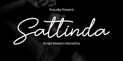 Sattinda is a thin and elegant handwritten font. It features a cute and joyful style that will take your designs to the next level! perfect for branding projects, logo, wedding designs, social media posts, advertisements, product packaging, product designs, label, photography, watermark, invitation, stationery and any projects that need handwriting taste. What’s Included : Standard Glyphs Ligature Works on PC & Mac Simple installations Accessible in the Adobe Illustrator, Adobe Photoshop, Adobe InDesign, even work on Microsoft Word. PUA Encoded Characters – Fully accessible without additional design software. Fonts include multilingual support for; ä ö ü Ä Ö Ü ß ¿ ¡
 - Flintstock by Hustle Supply Co,
$18.00 Introducing Flintstock A Vintage Industrial Display Font Family Flintstock is a strong, bold industrial display typeface that includes 8 Files. I created Flintstock as a work horse typeface that will work on a variety of different projects. Flintstock is a font that you can trust to continually use over and over throughout your Creative Career. It delivers a powerful simplicity, yet conveys the Vintage Industrial vibe without losing the versatility. Hustle Supply Co. has been delivering unique Design Products since 2013. Serving a community of Creatives, Designers, Marketers, Content Creators & Brands that appreciate Handcrafted & Vintage Typefaces.
 - Alles Kaputt by Kitchen Table Type Foundry,
$16.00 Alles Kaputt means ‘everything’s broken’ in German. I always wonder why my stuff breaks so easily, especially my mobile phones (I have had 7 in the last two years). Maybe I am careless, but I believe that there is a more or less scientific explanation that chaos and destruction are far easier than harmony and creation. I am no scientist, so don’t take my word for it! Alles Kaputt is a nice script font. I made it with a felt tip pen I borrowed from the kids. Use it for texts on product packaging, book covers and websites. Or, whatever you fancy!
 - Monckeberg by Latinotype,
$29.00 Monckeberg is an expressive font with a strong personality which is based on 15th century classic Venetian typefaces. High contrast between thin and thick strokes, calligraphic features and diagonal stress are its most striking characteristics. Monckeberg is ideal for short text and paragraphs, and specially designed for logos, branding, editorial design and web use. Monckeberg consists of 2 subfamilies of 9 weights, from Thin to Heavy, with matching italics, resulting in a total of 36 fonts. The basic family is classic and elegant while the alternative version allows for greater design freedom. Monckeberg contains 511 characters that support over 200 Latin-based languages.
 - Bitterbrush by Hanoded,
$17.00I needed a name with ‘brush’ in it and most have already been taken, so I did a little digging and found out that Purshia tridentata, a flowering plant native to the mountainous areas of western North America is called bitterbrush. It is also known as antelope brush, quinine brush and buckbrush - but I settled on Bitterbrush. There’s nothing bitter about Bitterbrush. It is actually a very sweet hand brushed font. It comes with ligatures for double letter combinations and a truck load of diacritics. And (something I am very proud of): it supports the Vietnamese language! - Voga by North Type,
$35.00 Meet Voga. Voga is a condensed modern Didone typeface with three weights: Regular, medium and bold. My aim was to create a very elegant and “sexy” typeface with some unique letterforms based on the principle of contrast - curves vs. strong straight lines - thin hairlines vs. thick stems - ball terminals vs. geometric serifs. These contrasts make it a glamourous display font for titles and large typography settings, yet readable at text sizes. Voga was inspired by iconic typefaces such as Bodoni and Didot. It has an extensive glyph set that supports languages for the Americas and most of Europe.
 - Mr Palker by Letterhead Studio-YG,
$35.00 A slab serif Mr Palker and grotesque Mr Palkerson build one superfamily together. These are blank types. In a way even the display ones. Typefaces for newspapers, announcements, cheap advertising and police posters. Mr Palker and Mr Palkerson will turn every language into a fence. And due to six types of faces one can choose what material should the fence be made from — from Thin steel rods to the Black stone blocks. In their simplest appearance Mrs P&P are intended for the solid blank composition in victorian or industrial style. They are quite decent, a bit old-fashioned slab serif and grotesque with closed aperture. All my types have layers. Walker and Palkerson also do. Besides the standard set of symbols, they have 4 add-ons. 1. Alternate glyphs, including unicase ones. 2. Ligatures with A letter. 3. Extra tall small caps. 4. Two-storey ligatures. All this options are intended for the complex composition. The additional letters are rather eccentric as their main function here is to imitate the victorian oddities. Imitate, parody, just not repeat. There are lower-case As and Es in the set in height of small caps and uppercases. They can turn every writing into the unicase. The lower-case A (as well as uppercase and small caps version of it) has deliberately by my taste grown a ludicrous tail. To compensate it I’ve built all the possible ligatures - ад, ал, ая. There are 35 of this ligatures all together. Take a closer look at the Russian letters D, L, K, Ya from the main set as well as their alternates. The additional glyphs are one more comic than the other — on purpose to imitate (not to repeat!) the victorian set. This sets have lowercase numbers. And small caps numbers as well. What a modern typeface without them. They also have an У-letter with a generously curvy tail. As if before the WWI. The Latin of course has alternates as well. It has letters to make the perfect French sound more like the russian provincial version of it. The tails of Js and Ts can be made a little bit more open — or a little bit closed. My favorite feature here, an invention of a kind - extra tall small caps. It allows to compose logos with the small caped uppercases directly from the keyboard. The small caps of this typefaces are usually much taller than the customary ones. This is the kind of small caps that Palker and Palkerson have. More to that, the strokes’ weight and the letters width are corresponded to the uppercases. Just a ready set for making a logo a la 1913 style. With a unicase, one has to mind! One more trick with the tall small caps is a possibility to make them work like lower uppercases. Their height is just in between of lower- and uppercases. Isn’t it great to have an additional set of uppercase working ponies in stock for the case of emergency. And finally — the trademark of Palkers family, two-storey ligatures. They are made in the height of uppercases and turn every writing into an ornament or a puzzle of a kind, while at the same time making them much shorter. Each face has 90 of them. Mainly those are twins: CC, BB, DD and so on. ll this things are for the unhasty compositing, even for lettering. Which means that for the things which are not there you always should have Command+Option+O and some patience. Also — among the two storey ligatures one also can find some belvedere villas. All my types are glasses from the one kaleidoscope. The P&Ps family was preliminary part of the victorian set, which already has 1 Cents and Clarendorf - optionally one can add Costro, Gordoni, Handy, Guardy, Surplus, Red Ring, Red Square, Babaev to the list. And also Sklad, Odessa, Dreamland, Romb, Platinum - here, at Letterhead’s, every second one is victorian. All together our typefaces can allow one to set advertisement of any kind, even the trickiest one, and compose everything, from the coffee place’s menu to the antiquarian magazine.
 - Mr Palkerson by Letterhead Studio-YG,
$35.00 A grotesque Mr Palkerson and slab serif Mr Palker build one superfamily together. These are blank types. In a way even the display ones. Typefaces for newspapers, announcements, cheap advertising and police posters. Mr Palker and Mr Palkerson will turn every language into a fence. And due to six types of faces one can choose what material should the fence be made from — from Thin steel rods to the Black stone blocks. In their simplest appearance Mrs P&P are intended for the solid blank composition in victorian or industrial style. They are quite decent, a bit old-fashioned slab serif and grotesque with closed aperture. All my types have layers. Walker and Palkerson also do. Besides the standard set of symbols, they have 4 add-ons. 1. Alternate glyphs, including unicase ones. 2. Ligatures with A letter. 3. Extra tall small caps. 4. Two-storey ligatures. All this options are intended for the complex composition. The additional letters are rather eccentric as their main function here is to imitate the victorian oddities. Imitate, parody, just not repeat. There are lower-case As and Es in the set in height of small caps and uppercases. They can turn every writing into the unicase. The lower-case A (as well as uppercase and small caps version of it) has deliberately by my taste grown a ludicrous tail. To compensate it I’ve built all the possible ligatures - ад, ал, ая. There are 35 of this ligatures all together. Take a closer look at the Russian letters D, L, K, Ya from the main set as well as their alternates. The additional glyphs are one more comic than the other — on purpose to imitate (not to repeat!) the victorian set. This sets have lowercase numbers. And small caps numbers as well. What a modern typeface without them. They also have an У-letter with a generously curvy tail. As if before the WWI. The Latin of course has alternates as well. It has letters to make the perfect French sound more like the russian provincial version of it. The tails of Js and Ts can be made a little bit more open — or a little bit closed. My favorite feature here, an invention of a kind - extra tall small caps. It allows to compose logos with the small caped uppercases directly from the keyboard. The small caps of this typefaces are usually much taller than the customary ones. This is the kind of small caps that Palker and Palkerson have. More to that, the strokes’ weight and the letters width are corresponded to the uppercases. Just a ready set for making a logo a la 1913 style. With a unicase, one has to mind! One more trick with the tall small caps is a possibility to make them work like lower uppercases. Their height is just in between of lower- and uppercases. Isn’t it great to have an additional set of uppercase working ponies in stock for the case of emergency. And finally — the trademark of Palkerson family, two-storey ligatures. They are made in the height of uppercases and turn every writing into an ornament or a puzzle of a kind, while at the same time making them much shorter. Each face has 90 of them. Mainly those are twins: CC, BB, DD and so on. ll this things are for the unhasty compositing, even for lettering. Which means that for the things which are not there you always should have Command+Option+O and some patience. Also — among the two storey ligatures one also can find some belvedere villas. All my types are glasses from the one kaleidoscope. The P&Ps family was preliminary part of the victorian set, which already has 21 Cents and Clarendorf - optionally one can add Costro, Gordoni, Handy, Guardy, Surplus, Red Ring, Red Square, Babaev to the list. And also Sklad, Odessa, Dreamland, Romb, Platinum - here, at Letterhead’s, every second one is victorian. All together our typefaces can allow one to set advertisement of any kind, even the trickiest one, and compose everything, from the coffee place’s menu to the antiquarian magazine.
 - Cabrito Didone by insigne,
$- A graceful kid if ever you’ve seen one, Cabrito Didone joins the Cabrito family of fonts--a family designed to provide young infants with clear recognition of letter forms. The original letters were released as part of the children’s book about fonts, The Clothes Letters Wear. Now, this latest addition brings a new Didone flavor to the table. But don’t judge the book by its cover. While Didones can be stodgy in the way they deliver a sense of luxury, this stubborn goat of a Didone bucks the stodgy stereotypes with its high-contrast, carefree, flowing fun, taking a more calligraphic direction than most. Cabrito Didone joins structure and handwriting to create a flowing balance of both characteristics. It’s a unique combination of functional and friendly. Its 42 well-designed fonts give you plenty of easy-going, highly readable options to work with as you craft your design. The typeface has unique serifs that give the sense of ink pooling slightly at the points, drawn with a sharp nib. Cabrito Didone supports OpenType features and is packaged with upright obliques, alternates, ligatures, old-fashioned figures, and compact caps. Preview any and all of these features in the interactive PDF manual. The family member font also includes glyphs for 72 languages; over 600 glyphs per font await. Cabrito Didone is an excellent choice for websites as well as flyers and packaging. Like Cabrito, which is currently used by a number of visible brands, Cabrito Didone is also a great option for defining your brand. Grab a taste of the Cabrito Didone flavor--and those of the other Cabrito members: Sans, Semi and Inverto.
 - Maged by Linotype,
$187.99Maged, a traditional-style Arabic text face, enjoyed widespread popularity as a dry-transfer typeface prior to being licensed by Letera Arabica to Linotype-Hell for font production. In consultation with the Linotype Design Studio (U.K.), the artwork was redrawn by Adrian Williams to render the typeface into a complete, unitized Arabic font with a full complement of traditional-style ligatures suitable for digitization. Maged, which has two weights, first appeared as a 202 font in 1987 before its eventual conversion to OpenType in 2005. Thus Linotype’s Maged font can be described as a trend-setting modern Naskh design that retains a sense of the fluidity of Naskh calligraphy: the letters, when composed, appear as freshly-written text characterized by rich, inky horizontals, tapering swash strokes and contrasting delicate ascenders. The Bold exploits these features of the Regular without excess, tempered by the need for clarity at smaller sizes. Maged Regular and Bold are eminently suited to text and titling in broader column work (brochures, magazines, advertising, coffee-table books etc.) and are thus able to extend the range of the Linotype Arabic library in areas of work where the more compact text and titling fonts would create a too concentrated effect. Both of the Maged fonts include Latin glyphs (from Palatino Medium and Palatino Black) inside the font files, allowing a single font to set text in both most Western European and Arabic languages. Maged incorporates the Basic Latin character set and the Arabic character set, which supports Arabic, Persian, and Urdu. They include tabular and proportional Arabic, Persian, and Urdu numerals, as well as a set of tabular European (Latin) numerals. - Spitzkant by Julien Fincker,
$29.00 About the design Spitzkant is a serif typeface family that is characterized by strong contrasts. Pointed, sharp serifs and edges contrast with round and fine forms, making it very individual and expressive. This makes it particularly suitable for branding, editorial, packaging and advertising. The high-contrast display version has been complemented by a lower-contrast text version, making Spitzkant in combination suitable for both strong headlines and extensive body text. An allrounder that can be used for many purposes. Features The Spitzkant Head and Text family has a total of 2 optical sizes, 5 weights and 20 styles, from thin to bold and matching italics. With over 850 characters, it covers over 200 Latin-based languages. It also has an extended set of currency symbols and a whole range of open type features. For example, there are alternative characters as Stylistic Sets, Small Caps, automatic fractions and many other features. Ligatures Especially the extensive selection of ligatures (standard and optional) is a special feature which was an important part during the design process. With over 95 different ligatures there are many possibilities to give headlines and logos an individual touch. Get the Variable Font here: https://www.myfonts.com/fonts/julien-fincker/spitzkant-variable/
 - ThreeDee by URW Type Foundry,
$99.99The idea for this completely new font design with overlapping characters came when Axel Stoltenberg, longtime IKARUS program developer at URW + +, visited a restaurant. As it can be seen quite often , the daily specials were offered handwritten with chalk on a blackboard applying a writing technique never been available before for digital fonts: each character is partly covered by its predecessor creating a three-dimensional effect. The implementation of this unusual notation for digital setting required a lot of programming and testing until all necessary character variants were produced and set properly always using the correct form. In order to achieve this, the OpenType Pro font ThreeDee contains about 12,400 characters and all the necessary OpenType features (GSUB ) for the automatic setting in OTF savvy application programs. The slightly playful basic design for ThreeDee was created by Anna Stoltenberg , the daughter of Axel, specially devised for the innovative representation and support of its special nature. The shadow generated with IKARUS even intensifies the 3D effect. As is well-known, making use of the embedded OTF features, i.e. the automatic access to all the 12,400 character variants , a corresponding text / layout program ( InDesign, Quark Xpress, current Open / LibreOffice or MS Word etc. ) is required. ThreeDee is a headline font that will unveil all its charisma and exceptional quality at appropriate, larger sizes. - Trafit by Nathatype,
$29.00 Finding the right fonts for your projects is a challenge because improper fonts will deliver improper messages resulting in unprofessional appearances. Therefore, Trafit is here as your problem solver. This is Trafit, a perfect font to show luxury, class, and eternity. Trafit is an outstandingly designed stylish serif font. Its soft, clean lines and indentations show elegant impressions for your prominent designs. Its letter edges have hooks like the other serif fonts. The simple shapes and even sizes help to make it legible. Due to the great legibility, this font is applicable for any text sizes and length. In addition, you can enjoy the features available here. Features: Ligatures Multilingual Supports PUA Encoded Numerals and Punctuations Trafit fits best for various design projects, such as brandings, posters, banners, greeting cards, magazine covers, quotes, printed products, merchandise, social media, etc. Find out more ways to use this font by taking a look at the font preview. Thanks for purchasing our fonts. Hopefully, you have a great time using our font. Feel free to contact us anytime for further information or when you have trouble with the font. Thanks a lot and happy designing.
 - Strawberry Junkies by Yumna Type,
$15.00 Choosing the right display font can make your designs look more attractive and stunning, so that your designs gain more popularity. This is the Strawberry Junkies for you. It is a rather circled display font of which prone circled letters express soft, fun nuances in order that the company becomes more easily recognized by customers and audience. This font’s main characters are the consistent geometry, proportion, and line thickness on every letter to make it legible for big text sizes. In addition, Strawberry Junkies provides an extra clipart as a special bonus. Furthermore, you can enjoy the available features here. Features: Multilingual Supports PUA Encoded Numerals and Punctuations Strawberry Junkies fits best for various design projects, such as brandings, posters, banners, headings, magazine covers, quotes, printed products, merchandise, social media, etc. Find out more ways to use this font by taking a look at the font preview. Thanks for purchasing our fonts. Hopefully, you have a great time using our font. Feel free to contact us anytime for further information or when you have trouble with the font. Thanks a lot and happy designing.
 - Maxengine by Ditatype,
$29.00 Maxengine is a bold script font that refuses to conform. This rebellious yet playful typeface marries boldness with a touch of whimsy, creating a dynamic and unique script that captures attention and refuses to be confined by traditional design norms. The characters in Maxengine boast a rounded shape, bringing a sense of friendliness and approachability to the bold script. What truly sets it apart is the intentionally uneven outline details, adding an element of spontaneity and creative flair to each letter. This unconventional approach results in a font that exudes personality and breaks away from the ordinary. In addition, enjoy the features here. Features: Ligatures Stylistic Sets Multilingual Supports PUA Encoded Numerals and Punctuations Maxengine fits in headlines, logos, posters, flyers, branding materials, greeting cards, print media, editorial layouts, and many more designs. Find out more ways to use this font by taking a look at the font preview. Thanks for purchasing our fonts. Hopefully, you have a great time using our font. Feel free to contact us anytime for further information or when you have trouble with the font. Thanks a lot and happy designing.
 - Magnesit Dark by Rekord,
$22.00 Sporty and brawly, Magnesit Dark creates impact everywhere it lands. Impressive headlines are its specialty, but it feels right at home used in packaging, branding and poster design. Very tall x-height, wide language support and minimalistic yet playful appearance, make it suitable on any serious typographic job. Three distinct styles expand the possibilites even further: the straight to the point Regular, the friendly Soft and the determined Hard styles share metrics across related Magnesit and Magnesit Stencil families, so you can mix and match to achieve exactly the effect you need. Magnesit Dark works great with illustrations, the generous shapes can be easily filled with strong imagery to great effect. Based on the best-selling Grim, Magnesit is a vast improvement of the concept with long awaited addition of lowercase, reworked proportions, spacing and kerning, expanded language support and useful icons to satisfy even the most demanding typographers’ needs.
 - Magnesit by Rekord,
$22.00 Sporty and brawly, Magnesit creates impact everywhere it lands. Impressive headlines are its specialty, but it feels right at home used in packaging, branding and poster design. With a very tall x-height, wide language support and minimalistic yet playful appearance, it can take on any serious typographic job. Three distinct styles expand the possibilites even further: the straight to the point Regular, the friendly Soft and the determined Hard styles share metrics across related Magnesit Stencil and Magnesit Dark families, so you can mix and match to achieve exactly the effect you need. Magnesit works great with illustrations, the generous shapes can be easily filled with strong imagery to great effect. Based on the best-selling Grim, Magnesit is a vast improvement of the concept with long awaited addition of lowercase, reworked proportions, spacing and kerning, expanded language support and useful icons to satisfy even the most demanding typographers’ needs.
 - Elegise by Nathatype,
$29.00 Elegise is a captivating script font that gracefully captures the essence of cursive handwriting with a touch of elegance. This typeface exudes an air of sophistication and refinement, making it perfect for projects that require a stylish and polished look. Each letter in this font is meticulously crafted with high contrast, adding a dynamic and eye-catching quality to the font. The combination of thick and thin strokes creates a sense of fluidity and movement, adding a touch of liveliness to your typography. The long swinging endings in some letters of Elegise bring a sense of graceful flair and drama to the font. These charming details add a touch of elegance and uniqueness, making the script come to life with a sense of poise and grace. For the best legibility you can use this font in the bigger text sizes. Enjoy the available features here. Features: Stylistic Sets Ligatures Multilingual Supports PUA Encoded Numerals and Punctuations Elegise fits in headlines, logos, movie posters, flyers, invitations, greeting cards, branding materials, print media, editorial layouts, headers, and many more. Find out more ways to use this font by taking a look at the font preview. Thanks for purchasing our fonts. Hopefully, you have a great time using our font. Feel free to contact us anytime for further information or when you have trouble with the font. Thanks a lot and happy designing.
 - Levigate by Nathatype,
$29.00 Levigate is a graceful script font that beautifully captures the essence of cursive handwriting with a touch of sophistication. This typeface exudes an air of elegance and refinement, making it perfect for projects that require a stylish and polished look. Each letter in this font is meticulously crafted with high contrast, adding a dynamic and eye-catching quality to the font. The combination of thick and thin strokes creates a sense of fluidity and movement, adding a sense of energy and vibrancy to your typography. The swinging endings in some letters of Levigate bring a touch of whimsy and personality to the font. These charming details add a flourish of creativity and uniqueness, making the script come to life with a sense of playfulness. For the best legibility you can use this font in the bigger text sizes. Enjoy the available features here. Features: Stylistic Sets Ligatures Multilingual Supports PUA Encoded Numerals and Punctuations Levigate fits in headlines, logos, movie posters, flyers, invitations, greeting cards, branding materials, print media, editorial layouts, headers, and many more. Find out more ways to use this font by taking a look at the font preview. Thanks for purchasing our fonts. Hopefully, you have a great time using our font. Feel free to contact us anytime for further information or when you have trouble with the font. Thanks a lot and happy designing.
 - Cheer Forever by Ditatype,
$29.00 Cheer Forever is a delightful display font that merges the timeless simplicity of a sans serif with playful brush-style accents. With its uppercase letterforms and unique design, this typeface adds a touch of cheerfulness and character to your projects. The defining feature of Cheer Forever lies in its combination of a clean and geometric sans serif base with brush-inspired accents. The uppercase letters maintain a sleek and straightforward appearance, while the brush-style elements bring an element of spontaneity and liveliness. This fusion of styles creates a harmonious balance, resulting in a font that is both contemporary and playful. Inspired by the joyful nature of brush calligraphy, Cheer Forever captures the essence of creativity and self-expression. The brush-inspired accents add a touch of whimsy and personality to each letter, as if they were hand-drawn with a brushstroke. This unique style injects a sense of fun and positivity into your designs. Enjoy the various features available in this font. Features: Ligatures Multilingual Supports PUA Encoded Numerals and Punctuations Cheer Forever fits in logos, titles, headlines, and any design that aims to make a bold statement with a touch of playfulness. It is also particularly well-suited for designs related to children's products, event promotions, and any theme that calls for a touch of creativity. Find out more ways to use this font by taking a look at the font preview. Thanks for purchasing our fonts. Hopefully, you have a great time using our font. Feel free to contact us anytime for further information or when you have trouble with the font. Thanks a lot and happy designing.
 - Ongunkan Arkaic Greek by Runic World Tamgacı,
$45.00 Many local variants of the Greek alphabet were employed in ancient Greece during the archaic and early classical periods, until around 400 BC, when they were replaced by the classical 24-letter alphabet that is the standard today. All forms of the Greek alphabet were originally based on the shared inventory of the 22 symbols of the Phoenician alphabet, with the exception of the letter Samekh, whose Greek counterpart Xi (Ξ) was used only in a sub-group of Greek alphabets, and with the common addition of Upsilon (Υ) for the vowel /u, ū/.[1][2] The local, so-called epichoric, alphabets differed in many ways: in the use of the consonant symbols Χ, Φ and Ψ; in the use of the innovative long vowel letters (Ω and Η), in the absence or presence of Η in its original consonant function (/h/); in the use or non-use of certain archaic letters (Ϝ = /w/, Ϙ = /k/, Ϻ = /s/); and in many details of the individual shapes of each letter. The system now familiar as the standard 24-letter Greek alphabet was originally the regional variant of the Ionian cities in Anatolia. It was officially adopted in Athens in 403 BC and in most of the rest of the Greek world by the middle of the 4th century BC.
 - Biro Script Plus by Ingo,
$50.00 An authentic script from the tip of the ball point pen. This hasn’t been seen yet: A typeface which truly looks as if it were handwritten. Calligraphy is, actually, the art of fine writing. And actually, written scripts as typeface for the computer are 100% nonsense. And yet, an obvious thought: Create a typeface which truly derives from everyday handwriting. And since we, if we write at all, utilize practically only a ball point pen anymore, then a modern cursive writing form must look like just that. As a counterpart to the artistic ”handwritings“ which have long been available as typeface, the thought of digitalizing a truly ”ugly“ handwriting is appealing. After all, time and again there is the need for a text to look ”handwritten“. Biró Script is written freehand with a ball point pen. Finally a truly individual script! Biró Script includes more than 300 authentic ligatures in addition to the customary alphabet. By the way, the most convincing effect is obtained with a font size of about 18 to 22 points, at which the thickness of the stroke is now about the same as that of a real ball point pen. There's a difference between the anglo-american forms of some characters (esp. the numerals 1 and 7, but also capitals I and F) and how it's written in the rest of the world. For those of us who aren’t used to the world-wide usual forms, Biró Script includes a US version with the appropriate characters.
 - Flyoika by Ingrimayne Type,
$9.00 Flyoika is a slab serif family with a fairly low x-height, long ascenders, and considerable contrast. The family has five weights, each with an italics and it can be used for either display or text. Flyoika was not designed to meet a particular need but rather out of curiosity. Years ago I had designed two slab serif families, FlyHigh and Euroika, that I recently noticed had a lot of similarities and I wondered what a blend of the two would look like. Several corresponding characters in the two families are considerably different and in cleaning up the results, I usually opted for simplicity. The name "Flyoika" reflects these origins.
 - Macha by Positype,
$16.00 Macha shares the same DNA as its sibling Anago, but is a completely different species than the former or any of my other sans serifs (Aaux Next, Air, Akagi Pro or Wasabi). It's no-nonsense construction bears many influences from Gill Sans and Frutiger while stubbornly blending my own humanist touch. The focus on developing Macha was just to get to the point with each letterform and discard the rest. Macha takes a little but gives a lot. A fully-loaded character set includes: Small Caps, Proportional Lining and Oldstyle Numerals, Tabular Lining and Oldstyle Numerals, Fractions, Ordinals, Inferiors, Superiors, Stylistic Alternates, Ligatures, Case-sensitive, and more.
 - Cralic coob by Popskraft,
$12.00 The Cralic Coob font is an excellent selection when you want to infuse your designs with a playful and whimsical charm. This adorable and quirky display font adds a delightful and lighthearted element to any creative endeavor. It offers a wide range of applications, making it a versatile choice for various projects. Whether you're working on branding projects, crafting unique logos, designing wedding materials, creating eye-catching social media posts, producing captivating advertisements, or even developing product packaging and labels, the Cralic Coob font is your ideal companion. This font's handwritten style adds a personal and charming touch to photography projects, while it also elevates the elegance of invitations and stationery. With its ability to convey a sense of childlike wonder and cheerfulness, the Cralic Coob font is your go-to choice for infusing character and whimsy into your creative work. Its versatility and distinctive aesthetic make it a valuable asset for designers seeking to add that extra touch of playfulness and individuality to their projects. See other fonts from Cralic family https://www.myfonts.com/collections/cralic-font-popskraft