10,000 search results
(0.052 seconds)
- Meredith by Aestherica Studio,
$9.00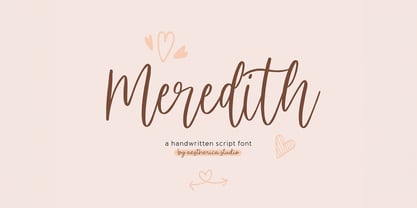 Meredith is a handwritten script typeface specially made by the hands of experts, making this font look so beautiful and natural. This font can be used for products that use a natural, beautiful, and charming handwriting feel. Meredith is perfect for branding projects, logos, wedding designs, social media posts, advertisements, product packaging, product designs, label, photography, watermark, invitation, stationery, and any projects that need handwriting taste.
 - Architype Catalogue Outline by The Foundry,
$99.00 Architype Crouwel is a collection of typefaces created in collaboration with Wim Crouwel, following his agreement with The Foundry, to recreate his experimental alphabets as digital fonts. Crouwel's most recognized work was for the Van Abbe and Stedelijk museums (1954 –72) where he established his reputation for radical, grid-based design. Architype Catalogue originates from Wim Crouwel’s Stedelijk Museum exhibition catalogue for sculptor Claes Oldenburg, 1970. The cover’s soft ‘padded’ letterforms evoke the artist’s work. Oldenburg was so taken with the design, that he asked Crouwel to complete the alphabet.
 - Parfait Script by Lián Types,
$37.00Parfait Script Pro takes its inspiration from Spencerian script and pointed brush lettering. Technical Parfait Script has more than 850 glyphs. It’s up to you to choose, it’s up to you to have fun. Parfait would love to play. The font has lots of alternates. They'll certainly either embellish your words or provide more legibility. The alternates are: Standard Ligatures; Contextual Alternates; Discretionary Ligatures; Swashes; Stylistic Alternates; Titling Alternates; Terminal Forms; Historical Alternates * ; Stylistic Ligatures; Stylistic Set 1 and 2 * ; Ornaments. (* These Alternates are only included in Parfait Script Pro). Parfait Script Pro contains everything. Advice: Use designing programs that support the OpenType features named above, so you can easily alternate glyphs. However, for those who don't have this kind of program, or for those who don't want the entire font, we offer Parfait Script Pro as several separate fonts: Parfait Script Standard (the best for text); Parfait Script Contextual (decorative); Parfait Script Stylistic (decorative); Parfait Script Swashes (for giving the last letter a nice touch); Parfait Script Titling (both decorative and more Roman); Parfait Script Endings (for giving the word the look of a signature); and Parfait Script Ornaments (a set of swirls). These versions of Parfait Script Pro are Open-Type programmed too, in order to include the Standard, Discretional and Stylistic Ligatures. Pssst!... Take a look at Parfait Script Pro’s Guide in the gallery section in order to discover this beauty! - Aseel by MAKYN,
$40.00 Aseel is a contemporary and legible typeface. It is intended to work well in the context of information and signage design. It also works well as a body text typeface as it is characterized by open counter forms and a large x-height. It is based on the Naskh calligraphic structure and has a medium stroke contrast. The letters are condensed to fit more information per line and it exists in three weights, regular, medium and bold.
 - Milanello by Mevstory Studio,
$25.00 Milanello is a strong sans serif font with medium contrast. Inspired by the High Octane Rock genre and modern-classic fashion. Carefully designed with a short ascender to give a solid look, also the sharp serif makes the letters look more strong. Milanello is a display-type which perfect for a headline, sub-headline, and short body text for magazine, books, fashion, quotes, hipster t-shirt, signboards, logo, and etc. A great choice for a brave concept!
 - Oildale by Typogama,
$19.00 Oildale is a single weight, connecting script that explores the idea of using crossed strokes as the main body of the typeface. Designed as a display font, it’s bold form and unique appearance lend it a distinctive charm that can be used in branding, headlines or other titling. Featuring an extended Latin support covering a wide range of langages, it also includes a range of Opentype options, from a choice of numerals, ligatures or decorative, swash letters.
 - Amici by Greater Albion Typefounders,
$12.00 Amici means 'friends' and the Amici family was conceived as a big friendly Roman typeface for headings, posters, signs and anywhere else that an approachable easy-reading typeface is needed. It's the sort of thing you used to see in Magazine mastheads before everything went boringly sans serif. Three faces are offered within the family, Regular - solid and clear, Bold - with that bit more body and presence and italic - bringing in script elements to its design.
 - Bokar by Pelavin Fonts,
$25.00 I am inspired by imagery that technology has rendered obsolete. I treasure anachronistic packaging and design which has somehow evaded obliteration by focus groups.I especially admire the packaging for A&P coffee brands Eight O'Clock, Red Circle and Bokar whose eccentric yet elegant typography harkens back to an earlier, less complicated era. The font Bokar is my nod of appreciation to those robust and full-bodied blends spared from the bland, tasteless scourge of corporate branding.
 - Hegemony by Akarija Studio,
$12.00 Hegemony is an energetic, modern calligraphy typeface which is composed of heavy and clean strokes. Its clean appearance will help you keep the balance of your overall design easier. It is made as a complimentary font that works well with any sans serif font and most design styles for both print and display purpose. Hegemony offers maximum flexibility by its alternates which are available for all uppercase and lowercase characters. Hegemony supports most latin-based alphabets in its Latin Extended-A character set. Its alternate characters and swashes are PUA-Encoded, which make them accessible through Windows/Mac built-in application (Character Map/Font Book).
 - Nomina by Tokotype,
$40.00 Nomina is a family of sans serif fonts for use from large to small sizes. The weights of the family itself contain 16 styles plus italic, ranging from ExtraLight to Black. The font family takes was inspired by classic Grotesk typefaces such as Venus and Akziden Grotesk. Unlike any other modern Grotesk typefaces, the details of the contrast in this font family are quite subtle and yet still harmonize while standing in between another character, the open apertures help them to increase the quirkiness accompanied by the sharp terminals on each rounded glyphs. The Nomina family is well equipped with lots of selective alternates and OpenType features, and the main usage of this font is universal, this means this can use it any design style as long as the look and feel keep match with its characteristics.
 - Yakitori Alley by Kitchen Table Type Foundry,
$16.00 My son Sam saved all his pennies for a trip to Japan with me. Hi dream came true this year and we traveled around Honshu for 10 days. One of the things on his ‘to do’ list was eating yakitori, so I took him to famous Yakitori Alley in Tokyo. The setting was legendary, the smell was great, but the yakitori, unfortuntely, was so-so.. Yakitori Alley is a fun, scribbly script font with language support and a set of contextual alternates.
 - Picky Action by PizzaDude.dk,
$17.00 Sometimes you may be picky about your choices: What’s for dinner? Where are we going for vacation? Vanilla or chocolate? Which font suits this product the best? The answers are many, but on that last question, the answer could be Picky Action - because of the super clean and smooth letters, that goes well with anything that needs a fresh, legible and loose look (without being to loose!) I have added a Regular, Italic and rounded versions of these two. Enjoy!
 - Visoko by Mostardesign,
$19.00 Visoko is a playful, geometric typeface inspired by post-modern fonts designed by Mecanorma from the 80s. This typeface has been designed on a grid of 7×6 squares but the goal was to create variations from the grid to give the character a destructured aspect. VISOKO is available in two styles : regular and italic and only in uppercase. It has aspects of Laser shapes and proportions but has modern additions that make it ideal for industrial brands and modern titles.
 - Chinoise by CastleType,
$49.00 Chinoise, a CastleType original, is based on hand lettering that is reminiscent of a style of ancient Chinese square-cut ideograms (perhaps cut in wood), and therefore the suggestive name "Chinoise" for this new design. There are alternate forms for each letter in the lowercase. Although square-cut, all corners of the letters are slightly rounded to give a more organic, weather-worn look. Uppercase only with support for most European languages, including modern Greek, and languages that use the Cyrillic alphabet.
 - Lentera Ramadhan by Dumadi,
$25.00 Hi There, Ahead of the month of Ramadan in the Hijri calendar, we have created a very amazing font. We have created the “Lentera Ramadhan” font in Hijaiya-like style and shape which is sure to make Ramadan greetings extraordinary with your best projects. equipped with Stylistic Alternate and SS01 which makes the font feel not monotonous. This font is perfect for those of you who create Ramadan poster projects, titles, banners, Instagram posts, holiday greeting cards, food menus, and other designs.
 - Pax by Linotype,
$29.99Pax is clearly a didone, using Vox classification. The contrast between the thin lines and the thicker ones is noticeable, as you would expect from a didone. The basic form is relatively narrow, therefore I designed another Pax, slightly wider and darker, and called it Pax #2. Otherwise they are more or less identical. Pax is Latin for peace, on everyone's want list in 1995 - as well as every single year before and after that. Pax was released in 1995. - Modena JW Font Duo by Jen Wagner Co.,
$16.00 Modena is a beautiful high fashion font duo that makes for gorgeous logos, posters, wedding invitations, blog posts, social media, and more! I love using them together with layer masks in Photoshop, so it looks like the script is running through the lines of the sans serif. The sans looks stunning with tracking set to 220, as well as where it falls normally at 0! Modena Script includes over 50 ligatures to make everything look totally hand-done, and alternates for each letter.
 - Movere by Supfonts,
$14.00 Movere is a modern serif family with vintage charm, fashionable appearance with a touch of retro Quick access - using the built-in OPEN TYPE functions. Just add "-" or "_" to the letter and instantly get an alternative. This feature works in most applications Font is an open type with clean shapes and precise kerning. It includes ligatures encoded by the PUA. Language support: All European languages Don't forget to subscribe so you don't miss out on the new awesome fonts Dima
 - Skyscraper by Fontop,
$12.00 Introducing the new serif and sans serif typeface SKYSCAPER. Inspired by NY city this elegant, simple, yet distinctive styles look great in posters, leaflets, books, magazines, presentations as well as logos and blog posts. The font also has two additional styles with different design of serifs. What is included in the pack of font family: Skyscraper Condensed Skyscraper Condensed Serif One Skyscraper Condensed Serif Two The font family is Latin multilingual and has uppercase letters, lowercase letters, numbers and basic punctuations.
 - Pax 2 by Linotype,
$29.99Pax is clearly a didone, using Vox classification. The contrast between the thin lines and the thicker ones is noticeable, as you would expect from a didone. The basic form is relatively narrow, therefore I designed another Pax, slightly wider and darker, and called it Pax #2. Otherwise they are more or less identical. Pax is Latin for peace, on everyone's want list in 1995 - as well as every single year before and after that. Pax was released in 1995. - Wairel by Supfonts,
$14.00 Wairel is a modern serif family with vintage charm, fashionable appearance with a touch of retro Quick access - using the built-in OPEN TYPE functions. Just add "-" or "_" to the letter and instantly get an alternative. This feature works in most applications Font is an open type with clean shapes and precise kerning. It includes ligatures encoded by the PUA. Language support: All European languages Don't forget to subscribe so you don't miss out on the new awesome fonts Dima
 - Love Shine by Ably Creative,
$12.00 Introducing the Love Shine. made with love design harmony in every single character. love Shine and a touch of the extras makes this font look great and stylist. Plus the OpenType features that allows you to mix and match pairs of letters to fit your design. and last the beautiful all will make you work easily to create : Badges, lable, greeting card , book cover, Posters, Logos, Print, Quotes, Headers, Clothing, etc. Features : Uppercase + Lowercase Numerals & Punctuations Stylistic Alternates Thank you
 - Auberge Script by Sudtipos,
$79.00 It took me a long time, but I think I now understand why people of my generation and older feel the need to frame current events in an historical context or precedents, while most of the young couldn't care less about what happened ten years ago, let alone centuries back. After living for a few decades, you get to a point when time seems to be moving quite fast, and it’s humbling to see that your entire existence so far can be summed up in a paragraph or two which may or may not be useful to whoever ends up reading the stuff anyhow. I suppose one way to cope with the serenity of aging is trying to convince yourself that your life and work are really an extension of millenia of a species striving to accept, adapt to, and improve the human condition through advancing the many facets of civilization -- basically making things more understandable and comfortable for ourselves and each other while we go about doing whatever it is we are trying to do. And when you do finally convince yourself of that, history becomes a source of much solace and even a little premonition, so you end up spending more time there. Going far back into the history of what I do, one can easily see that for the most part it was ruled by the quill. Western civilization’s writing was done with quill pens for more than thirteen centuries and with newer instruments for about two. By the mid-18th century, the height of the quill experience, various calligraphy techniques could be discerned and writing styles were arranged in distinct categories. There are many old books that showcase the history of it all. I recommend looking at some whenever the urge comes calling and you have to get away from backlit worlds. Multiple sources usually help me get a better perspective on the range of a specific script genre, so many books served as reference to this quill font of mine. Late 17th century French and Spanish professional calligraphy guides were great aides in understanding the ornamental scope of what the scribes were doing back then. The French books, with their showings of the Ronde, Bâtarde and Coulée alphabets, were the ones I referenced the most. So I decided to name the font Auberge, a French word for hotel or inn, because I really felt like a guest in different French locales (and times) when I going through all that stuff. Because it is multi-sourced, Auberge does not strictly fit in a distinct quill pen category. Instead, it shows strong hints of both Bâtarde and Coulée alphabets. And like most of my fonts, it is an exercise in going overboard with alternates, swashes, and ornamental devices. Having worked with it for a while, I find it most suitable for display calligraphic setting in general, but it works especially well for things like wine labels and event invitations. It also shines in the original quill pen application purpose, which of course was stationery. Also, as it just occurred to me, if you find yourself in a situation where you have to describe your entire life in 50 words or less, you may as well make it look good and swashy, so Auberge would probably be a good fit there as well. This is one quill script that no large bird had to die for. A few technical notes The Auberge Script Pro version includes 1800 glyphs, everything is included there. Also latin language support. We recommend you to use the latest design application to have full access to alternates, swashes, small caps, ornaments, etc. The images from the gallery uses this version. For better results use the fonts with “liga” feature on. Awards During 2014 the early develop of Auberge Script was chosen to be part of Tipos Latinos, the most important type exhibition in South America.
 - LDJ Tickled Tourist by Illustration Ink,
$3.00This font is a lot of fun and will definitely tickle your funny bone! - Backspacer by Emigre,
$39.00 Years ago, by happenstance, designers Nancy Mazzei and Brian Kelly found an old decrepit typewriter in an abandoned lot with tall grass in Brooklyn. They kept it around their apartment for two years. Then one day they decided that it was time to move and they planned to throw the old typewriter away. But it was so beautiful they wanted to keep at least a part of it. So they decided on keeping the keys. They kept the keys in a brown bag until one fine day the keys were introduced to a camera. It was a match made in heaven that resulted in some beautiful quirky images of typewriter keys. These images were the inspiration for Backspacer. They were scanned, traced and turned into a working typeface by Zuzana Licko.
 - John Davidson by Mindtype Co.,
$35.00 Introducing the John Davidson, a beautiful modern calligraphy font with handwritten, sophisticated flows. John Davidson offers beautiful typographic harmony for a diversity of design projects, including logos & branding, wedding designs, social media posts, advertisements & product designs.
 - Fashion Wacks by Nirmana Visual,
$22.00 Fashion Wacks , contemporary of serif font, Inspired by all the retro aesthetics making a comeback, Fashion Wacks offers beautiful typographic harmony for a diversity of design projects, including logos & branding, social media posts, advertisements & product designs.
 - Jutta by Spirit & Bones,
$9.00 As the basis for this new font artist and designer Lena Schmidt used an old font design by her mother Jutta. At a young age, her mother drew and illustrated a lot with pen and ink. She made beautiful illustrations and many font designs. Schmidt chose one of these drafts - delicately drawn Donovan lyrics - as the basis for this digital handwritten stencil font. What emerged from it is a stencil text and display typeface that relates to Auriol's art nouveau typefaces and the era of impressionism. More weights will be published in soon. Published by Spirit & Bones www.spiritandbonesdesign.com Designed by Lena Schmidt www.lenaschmidt.com
 - Uncanny Cat PB by Pink Broccoli,
$16.00 Inspired by the 1977 anthology horror film called "Uncanny", Uncanny Cat PB captures all the awkward fun of the film's titling sequence. Feline revenge has never looked so good. This typeface was oodles of fun to flesh out, and is true to that purposefully awkward appeal that a lot of Pink Broccoli fonts are imbued with. Loaded with a collection of ligatures that combine and nest letters against each other, lending to the unique typesetting of this "uncanny" font.
 - Pistoletto by Etewut,
$22.00 Introducing Pistoletto script. I was inspired by works of Roy Lichtenstein and Michelangelo Pistoletto. There are 4 fonts that in different combinations make interesting results: Background, Black, Highlight, Regular. Each style supports European languages. Basic latin has uppercase alternates, two lowercase alternates, many ligatures and swashes. I used for display pictures following works of Roy Lichtenstein: Pistol (1964), Engagement Ring (1961), Oh, Jeff...I Love You, Too...But... (1964), Seductive Girl, Yellow Brushstroke I (1965), Brushstroke (1965).
 - Vtc-NueTattooScript - Personal use only

- Schorel by insigne,
$29.00 Schorel commands the room and sets the audience at ease. This new Scotch Roman typeface from insigne is a confident personality with a tasteful amount of contrast. Cool, sharp, balanced, and contemporary, Schorel not only delivers well in longer texts, but can use its mass to meet the needs of subheadlines, callouts, and other similar projects. Scotch typefaces initially come from Scottish foundries, popular in the United States in the late 18th century. This beautiful genre of type grew in popularity through the Victorian era and most of the 20th century to make regular appearance in books, magazines, newspapers, and advertisements. Schorel itself, with its moderate contrast and organic design, features short ascenders and descenders and calligraphic italics. The design features a few ball terminals, but mostly touts its bracket serifs, which come to a sharp point. The typeface, ideal for medium to large sizes, is useful for both headlines and text, carefully created for both print and screen. This OpenType font supports most Latin-based languages. Schorel has nine weights and a true italic, and many special features such as small caps, fractions, old-style figures, and numerous extras complete each font. It’s every bit a delight to your reader’s eye.
 - Narrow Deco JNL by Jeff Levine,
$29.00 The hand lettered word ‘puzzles’ from the box cover of a 1940s set of metal “connected” puzzle pieces manufactured by the A.C. Gilbert Company was the initial typographic model, but some additions and changes were made. Instead of the right side of the ‘P’ being a semi-circle, it was changed to a more conservative ‘’squared’ look. After drawing out all of the necessary glyphs, the overall height of the characters was extended to make the letters and numbers appear taller and narrower. The end result is Narrow Deco JNL, which is available in both regular and oblique versions.
 - Kawara by Twinletter,
$15.00 Kawara, our newest font, is now available. We produced this display font with a Japanese theme or an Asian font to fulfill the needs of your project with a Japanese theme, but it’s impossible to use an authentic Japanese font because not everyone understands Japanese letters, therefore we present this font as an intermediate alternative. To make your project gorgeous, strong, and bold, we produced this font with the most unique shape imaginable. So, what are you waiting for? Use this font to realize your ambition of having a wonderful project. Logotypes, food banners, branding, brochure, posters, movie titles, book titles, quotes, and more may all benefit from this font. Of course, using this font in your various design projects will make them excellent and outstanding; many viewers are drawn to the striking and unusual graphic display. Start utilizing this typeface in your projects to make them stand out.
 - Kufi by Linotype,
$187.99Kufi is a traditional-style Arabic headline face available in two styles, Kufi and Kufi Outline. Both of the OpenType fonts include Latin glyphs from Kabel Heavy inside the font files, allowing a single font to set text in both most Western European and Arabic languages The two Kufi OpenType fonts incorporate the Basic Latin character set and the Arabic, which supports Arabic, Persian, and Urdu. They include tabular and proportional Arabic, Persian, and Urdu numerals, as well as a set of tabular European (Latin) numerals. - Bananas by Canada Type,
$30.00 In the history of 20th century graphic arts, the evolution of the informal sans serif has been a uniquely American phenomenon. The ongoing saga of this (still as popular as ever) sub-genre dates back to the maturity of the Industrial Age and early Hollywood film titling, runs through the prosperous times of interwar print publications, sees mass flourishing during the various media propagations of the film type era, and solidifies itself as arguably the most common design element in the latter years of the century. Fun, bouncy, playful, and highly exciting, the casual sans serif is now all over game packaging, film and animation titles, book covers, food boxes, concert posters, and pretty much everywhere design aims to induce excitement about a product or an event. The casual sans is the natural high pill of typesetting. We figured it was high time for the casual sans to adapt to 21st century technology, gain more versatility, and become as much fun to use as the emotions it triggers. So we’re quite excited to issue Bananas, a fun sans serif family in 6 weights and 3 widths that can be used anywhere your designer’s imagination can take you. Rather than being based on a single design, Bananas was sourced from multiple American film era faces, all from 1950s and 1960s, when the casual sans genre was at its popular peak. Headliners’ Catalina and its very similar cousin, Letter Graphics’ Carmel, served as initial study points. Then a few Dave West designs informed the design development and weighting process, before narrow and wide takes were sketched out and included in the family. The entire development process happened in a highly precise interpolative environment. All Bananas fonts come with a full glyph complement supporting the majority of Latin languages, as well as five sets of figures, automatic fractions, quite a few ligatures, biform/unicase shapes and other stylistic alternates.
 - Roc Grotesk by Kostic,
$40.00 Roc is a sans serif grotesk inspired by American wood types from the end of the 19th century. With nine weights in five widths, this family contains 45 fonts in total. The character set supports Western and Central European languages, as well as Turkish. Roc Grotesk comes in a range of five widths: Compressed, Condensed, Normal, Wide and ExtraWide, in order to cover a wide scope of applications. Although the styles at both ends of each range are made in their most pronounced form in terms of width and weight, they are not taken to such extremes as to become absurd, and are quite usable in display settings. The Normal width keeps all its nine styles in proportionally similar widths. The Compressed width, however, is deliberately made to be disproportionate, so that every style takes the least possible horizontal space. That is why the contrast between Compressed Thin and Compressed Heavy style is substantial. As the weights progress from Thin to Heavy, the stroke contrast becomes more prominent. It is intentionally exaggerated in heavier weights, which is particularly apparent in the uppercase E and R of the Black and Heavy style. Roc has a large x-height and relatively short descenders and ascenders. No uppercase letter descends below the baseline, so the lines of an all-caps text can be packed tightly on a poster or a headline. The Regular style is somewhat generously spaced, as it is most likely to be used for setting longer passages of text. Its Bold counterpart is spaced in such a way that the width of the text column will be similar to the text set in Regular. Tabular figures in these two styles have exact matching widths, so for example, you could emphasize one row of numbers in a data column without visually disrupting the vertical order of the table. The lowercase g and r have alternatives to accommodate what most designers expect from a typical Grotesk typeface. The single-story g and the cut-off r are accessible via the OpenType feature.
 - Teutonia by HiH,
$10.00 How can Teutonia be called “Art Nouveau” with all those straight lines? It seems like a contradiction. In fact, however, Art Nouveau embraces a rather wide variety of stylistic approaches. Five well-known examples in the field of architecture serve to illustrate the range of diversity in Art Nouveau: Saarinen’s Helsinki Railroad Station, Hoffman’s Palais Stocklet in Brussels, Lechner’s Museum of Applied Arts on Budapest, Mackintosh’s Glasgow School of Art and Gaudi’s Sagrada Familia in Barcelona. Only the last fits comfortably within the common perception of Art Nouveau. Whereas Gaudi would avoid the straight line as much as possible, Macintosh seemed to employ it as much as possible. The uniting factor is that they all represent “new art” -- an attempt to look things differently than the previous generation. Even when they draw on the past -- e.g. Lechner in the use of traditional Hungarian folk art -- the totality of the expression in new. Teutonia clearly shows its blackletter roots in the ‘D’ and the ‘M.’ Roos & Junge of Offenbach am Main in Germany produced Teutonia in a "back-to-basics" effort that has seen many quite similar attempts in the field of topography. In 1883, Baltimore Type Foundry released its Geometric series. In 1910, Geza Farago in Budapest used a similar letter design on a Tungsram light bulb poster. In 1919 Theo van Doesburg, a founder with Mondrian and others of the De Stijl movement, designed an alphabet using rectangles only -- no diagonals. In 1923 Joost Schmidt at Bauhaus in Weimer took the same approach for a Constructivist exhibit poster. The 1996 Agfatype Collection catalog lists a Geometric in light, bold and italic that is very close to the old Baltimore version. Even though none of these designs took the world by storm, they all made a contribution to our understanding of letterforms and how we use them. Teutonia is compact and surprisingly readable at 12 points in print, but does not do as well on the screen. Extra leading is suggested. Four ligatures are supplied: ch, ck, sch and tz. The numerals are tabular.
 - BMF Zodiac Pi by BuyMyFonts,
$25.00BMF Zodiac Pi is part of the BMF Symbols Collection, a gorgeous, versatile and highly original family of symbols (drawings, icons, pictograms). Zodiac Pi is probably the funniest and most playful collection of astrology-related images you’ll likely to find. The signs of the Zodiac are included in several styles, and the symbols of the planets are included in informal, hand-rendered versions. - Magritte by Molly Suber Thorpe,
$17.99 Magritte is a serif display font with surrealist sensibilities. This is an ideal font for dreamy, unexpected branding, advertising, and merch. It has uppercase and lowercase alphabets, dozens of beautiful ligatures and dingbats, and even includes support for Modern Greek. Magritte has 600 glyphs in Latin and Greek consisting of: the complete Latin alphabet (with all accent marks), the complete Modern Greek alphabet (with all accent marks), 50 ligatures and stylistic alternates, 24 fun dingbats and arrows, numerals including oldstyle figures and fractions, extensive symbols, punctuation, and diacritical markings. The OpenType ligatures are the fun part. To get the most out of Magritte, use software that supports Open Type fonts (Adobe programs, Corel Draw, Affinity Designer, etc). This type family has tons of built-in OpenType ligatures and alternates, which are what make it so customizable and decorative. You can always access the ligatures, alternates, and dingbats through your software's glyphs panel. Languages Magritte includes the Latin and Greek alphabets with all accent markings. The most common languages it supports are: English, Catalan, Danish, Dutch, French, German, Greek, Italian, Norwegian, Portuguese, Spanish, and Swedish.
