10,000 search results
(0.069 seconds)
- Lecturia by Ingo,
$42.00 Lecturia is a modern humanist sans serif typeface. Ascending dynamic movement characterizes the structure of it’s characters -- the stylistic alternates emphasize this impression. The family comprises eight weights from the most delicate "Hairline" to the strong "Bold" -- each upright and italic. Using the variable font, the intermediate levels can be controlled fluently. The forms and proportions of Lecturia have been selected to be very legible as body type for longer texts. Lecturia ist still legible from a great distance or under unfavorable conditions. In large sizes as a heading, the font is very eye-catching. The shapes of the individual characters follow the "humanistic" form language of modern faces. In addition to ligatures for problematic letter combinations, it contains stylistic alternates for some characters that make the appearance even livelier. Small caps provide a restrained opportunity for emphasis. In addition, Lecturia offers several sets of numerals: proportional standard figures, lining figures, proportional oldstyle figures, non-proportional tabular figures, superscripts and subscripts, numerator and denominator to represent fractions, circled numbers. The very good legibility of Lecturia makes it the ideal typeface for information systems -- a selection of directional arrows is included.
 - RMU Helion by RMU,
$35.00 In 1935 Schriftguss Dresden released Arno Drescher’s famous titling font Helion. This font was brought to life again and carefully extended with Baltic, Turkish and Central European character sets.
 - Naive Sans by S&C Type,
$8.00 Naïve Sans is a sans serif handwritten font designed by Fanny Coulez and Julien Saurin in Paris. Our goal was to draw a font with finely irregular lines that give a human and whimsical feeling. We drew five finely balanced weights to assure a good readability whatever the size, with contrasting upstrokes and downstrokes to add an unusual, fancy touch. We also designed five shaked versions with different lowercases and uppercases, to improve your designs and bring a more organic and playful feeling. Mixed or not, both styles can be used for various purposes, such as headings, logos, posters, wedding invitations... This font is part of our Naïve superfamily that contains lot of variations: Line, Inline, Serif, Sans Serif, and a special Art Deco one. Just click on our foundry name to see them all! We hope you will enjoy our work. Merci beaucoup!
 - Speech Bubbles by Harald Geisler,
$68.00 The font Speech Bubbles offers a convenient way to integrate text and image. While the font can be used to design comics, it also gives the typographer a tool to make text speak – to give words conversational dynamics and to emphasize visually the sound of the message. The font includes a total of seventy outlines and seventy bubble backgrounds selected from a survey of historic forms. What follows is a discussion of my process researching and developing the font, as well as a few user suggestions. My work on the Speech Bubbles font began with historic research. My first resource was a close friend who is a successful German comic artist. I had previously worked with him to transform his lettering art into an OpenType font. This allowed his publishing house to easily translate cartoons from German to other languages without the need to use another font, like Helvetica rounded. My friend showed me the most exciting, outstanding and graphically appealing speech bubbles from his library. I looked at early strips from Schulz (Peanuts), Bill Waterson (Calvin & Hobes), Hergé (TinTin), Franquin, as well as Walt Disney. The most inspiring was the early Krazy Kat and Ignatz (around 1915) from George Herriman. I also studied 1980’s classics Dave Gibbon’s Watchmen, Frank Miller’s Ronin and Alan Moore and David Lloyd’s V for Vandetta. Contemporary work was also a part of my research—like Liniers from Macanudo and work of Ralf König. With this overview in mind I began to work from scratch. I tried to distill the typical essence of each author’s or era’s speech bubbles style into my font. In the end I limited my work down to the seventy strongest images. An important aspect of the design process was examining each artist’s speech bubble outlines. In some cases they are carefully inked, as in most of the 80’s work. In others, such as with Herriman, they are fast drawn with a rough impetus. The form can be dynamic and round (Schultz) with a variable stroke width, or straight inked with no form contrast (Hergé). Since most outlines also carry the character of the tool that they are made with, I chose to separate the outline from the speech bubble fill-in or background. This technical decision offers interesting creative possibilities. For example, the font user can apply a slight offset from fill-in to outline, as it is typical to early comic strips, in which there are often print misalignments. Also, rather than work in the classic white background with black outline, one can work with colors. Many tonal outcomes are possible by contrasting the fill-in and outline color. The Speech Bubbles font offers a dynamic and quick way to flavor information while conveying a message. How is something said? Loudly? With a tint of shyness? Does a rather small message take up a lot of space? The font’s extensive survey of historic comic designs in an assembly that is useful for both pure comic purposes or more complex typographic projects. Use Speech Bubbles to give your message the right impact in your poster, ad or composition.
 - Toshiko by Thinkdust,
$10.00 Toshiko is an experimental typeface which mixes techno and traditional designs, creating a straight edged but curly serif font. The characters themselves are very carefully crafted, with precise, accurate lines and predictable forms, but the serifs, as well as the indecision between curved and square corners, gives the font an impression of unpredictability that shows off its creative freedom. Whether you’re looking to brand something technological or express rebellion, Toshiko can create the mix of conformist and nonconformist that will draw readers into interest and attentiveness.
 - Rossika by ParaType,
$25.00 Rossika is a four-style typeface designed by Oleg Karpinsky in 2002-2004 for the ParaType company. The general design and some letterforms were borrowed from antique Russian typefaces of XV-XVIII centuries. For example, the upper Cyrillic N has a diagonal stem, a tail of Ц character is attached in the center unlike major contemporary designs. Some characters have alternatives. There are several Latin and Cyrillic ligatures. Rossika is intended for logos, headlines and short text blocks: posters, calendars, post cards, diplomas, certificates and the like.
 - Lintel by The Northern Block,
$- A modern san serif typeface with a pure clean line form. The idea has been to design a font with a proportioned and balanced structure that is applicable to a wide variety of uses. Details include 8 weights with italics, 500 characters, Cyrillic lettering, 5 variations of numerals, manually edited kerning and Opentype features.
 - Monotes by Aqeela Studio,
$15.00 Monotes is an upper and lower serif font with balanced curves. Like all of my fonts inspired by letters from the good old days, but still has a strong modern look. A variety of alternative styles allow for versatile design options and work perfectly for headlines, logos, posters, packaging, T-shirts, postcards and more.
 - Nikita by Autographis,
$39.50Nikita is a very lively upright script with lots of 1950s flair. - Gans Esquinazos by Intellecta Design,
$27.00 A decorative font design of many borders, ornaments and frame like illustrations.
 - Brashee by Gerald Gallo,
$20.00 Brashee is a serif font with characters made up of straight lines.
 - Christmas Sundaylab by ahweproject,
$14.00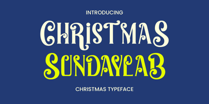 Christmas Sundaylab is a festive and very classy display font. It’s ideal for any of your winter vacation creations, so add it to your designs and bring them to life! Christmas Sundaylab is perfect for branding projects, logo, wedding designs, social media posts, advertisements, product packaging, product designs, label, photography, watermark, invitation, stationery and any projects that need handwriting taste.
 - Rhode White by Cititype,
$16.00 'Rhode White' is a natural calligraphy font. We created this font for modern brands. branding and branding only. The soft, unique and natural touch gives a different impression, it invites attention to take a closer look at your brand. This is a font favoured by agencies who like modern branding, you can make a large number of logos with one font because this font is suitable for use in web logos, personal signatures, portfolios, prints, header, magazine, book cover, t-shirt print, craft, and cosmetic packaging. Again, this is a font worthy of your collection. Thank you,
 - Kaapeli by Suomi,
$20.00 I've had mixed feelings about Kabel; It is a brilliant headline font with a lot of character, but it's the characters I have problems with. The versions of all big foundries have the same flaws (in my opinion), especially lowecase a and s. So I finally went ahead and made an all new version. It is not Kabel, but very much like it. It has unique x-height, weight and width, and many individual characters are also different from the original.
 - Maggiore by Mysterylab,
$17.00 Maggiore Font is a versatile and unique display typeface with a style all its own. The convex strokes and concave stroke ends set up a singular interplay of blade-like sharpness and plump softness. Maggiore can work very well in loads of different contexts and applications: product labeling and branding, cosmetics, fashion, social media banners, the performing arts, t-shirt logos, and even quaint vintage futurism. Combining the unique with the highly legible, Maggiore will be a great addition to any font menu.
 - Corporate S by URW Type Foundry,
$180.99 The Corporate ASE typeface trilogy was designed by Prof. Kurt Weidemann, a well-known German designer and typographer, from 1985 until 1990. This superb trilogy consisting of the Corporate A (Antiqua), Corporate S (Sans Serif), and Corporate E (Egyptian) is a design program of classical quality, perfectly in tune with each other. Weidemann says: “My ASE trilogy, quite like triplets, is in perfect harmony and covers all needs of modern typography!” Initially exclusively designed for DaimlerChrysler as a corporate font, the ASE trilogy may be now licensed and used without restriction. URW++ digitized the ASE for DaimlerChrysler and Prof. Weidemann and is the exclusive licensing agent for this outstanding and extremely popular typeface program. Meanwhile, URW++ enhanced the Corporate ASE family in regular, bold, italic, and bold italic by Greek, Cyrillic, and all additional Latin characters to cover Eastern Europe including the Baltic Rim, Romania and Turkey. Corporate ASE in regular, bold, italic, and bold italic is now available in the WGL 4 character complement.
 - Corporate S WGL by URW Type Foundry,
$210.99 The Corporate ASE typeface trilogy was designed by Prof. Kurt Weidemann, a well-known German designer and typographer, from 1985 until 1990. This superb trilogy consisting of the Corporate A (Antiqua), Corporate S (Sans Serif), and Corporate E (Egyptian) is a design program of classical quality, perfectly in tune with each other. Weidemann says: “My ASE trilogy, quite like triplets, is in perfect harmony and covers all needs of modern typography!” Initially exclusively designed for DaimlerChrysler as a corporate font, the ASE trilogy may be now licensed and used without restriction. URW++ digitized the ASE for DaimlerChrysler and Prof. Weidemann and is the exclusive licensing agent for this outstanding and extremely popular typeface program. Meanwhile, URW++ enhanced the Corporate ASE family in regular, bold, italic, and bold italic by Greek, Cyrillic, and all additional Latin characters to cover Eastern Europe including the Baltic Rim, Romania and Turkey. Corporate ASE in regular, bold, italic, and bold italic is now available in the WGL 4 character complement.
 - Corporate A WGL by URW Type Foundry,
$210.99 The Corporate ASE typeface trilogy was designed by Prof. Kurt Weidemann, a well-known German designer and typographer, from 1985 until 1990. This superb trilogy consisting of the Corporate A (Antiqua), Corporte S (Sans Serif), and Corporate E (Egyptian) is a design program of classical quality, perfectly in tune with each other. Weidemann says: "My ASE trilogy, quite like triplets, is in perfect harmony and covers all needs of modern typography!" Initially exclusively designed for DaimlerChrysler as a corporate font, the ASE trilogy may be now licensed and used without restriction. URW++ digitized the ASE for DaimlerChrysler and Prof. Weidemann and is the exclusive licencing agent for this outstanding and extremely popular typeface program. Meanwhile, URW++ enhanced the Corporate ASE family in regular, bold, italic, and bold italic by Greek, Cyrillic, and all additional Latin characters to cover Eastern Europe including the Baltic Rim, Romania and Turkey. Corporate ASE in regular, bold, italic, and bold italic is now available in the WGL 4 character complement.
 - Groovy by Krafted,
$10.00 Want to give your design a vintage look that still speaks to modern audiences today? Choosing the right font can do the trick. Introducing Groovy - A Vintage Modern Font. Use this unique font for web pages, social media, apps, ads, printed materials, clothing, packaging, and anything else your brand needs to stand out from the crowd. What you’ll get: Multilingual & Ligature Support Full sets of Punctuation and Numerals Compatible with: Adobe Suite Microsoft Office KeyNote Pages Software Requirements: The fonts that you’ll receive in the pack are widely supported by most software. In order to get the full functionality of the selection of standard ligatures (custom created letters) in the script font, any software that can read OpenType fonts will work. We hope you enjoy this font and that it makes your branding sparkle! Feel free to reach out to us if you’d like more information or if you have any concerns.
 - My Darling by Type Innovations,
$39.00 ‘My Darling’ is a stunning new typeface by Alex Kaczun. Inspired by the Didone shapes, ‘My Darling’ incorporates some Didot, a little Caslon, a splash of Scotch and a pinch of old Times. This unique display, with its high-contrast strokes is playful, formal and just a bit ‘sexy’. The swash capital terminals and lively curves, give this design a unique and distinctive look. It works well as a headline font, and because it was designed with generous counters, proportions and spacing—works equally well over a large range of text point sizes. My Darlings' character set supports most Central European and many Eastern European languages. Alex hopes to add many style variations, along with alternate glyph sets and weights to further enhance this offering. Stay tuned!
 - Jesper by Linotype,
$29.993 robbers is not a typeface family, only a collective name for three typefaces with the looks of handtexted characters: Kasper, Jesper and Jonatan. There are some common traits between them, but they are three individuals. As the three terrible" robbers in the Swedish writer Lennart Hellsing's Kamomillastad - the ones who borrowed their names to the typefaces - are three individuals. They always appear in the same order: first Kasper, then Jesper and last Jonatan. Swedish children love to sing about them and are not at all scared of them. All three robbers were released in 1995. - Jonatan by Linotype,
$29.993 robbers is not a typeface family, only a collective name for three typefaces with the looks of handtexted characters: Kasper, Jesper and Jonatan. There are some common traits between them, but they are three individuals. As the three terrible" robbers in the Swedish writer Lennart Hellsing's Kamomillastad - the ones who borrowed their names to the typefaces - are three individuals. They always appear in the same order: first Kasper, then Jesper and last Jonatan. Swedish children love to sing about them and are not at all scared of them. All three robbers were released in 1995. - Polyline by Mårten Nettelbladt,
$- Polyline is based on a small 3x5 grid giving it a rather crude and technical look, further emphasized by the monospacing. ‘Polyline’ is a command often found in CAD-software that is used to create a series of connected lines. The typeface can also be installed as an AutoCAD .shx font, included in the download along with the .shp source file and the stroke shapes for all characters as .pdf
 - Uni Sans by Fontfabric,
$29.00 Important! There is a whole new redesigned version (remake) of Uni Sans called Uni Neue . The Uni Sans font family includes 14 weights - seven uprights with seven italics. It is characterized by excellent legibility in both - web & print design areas, well-finished geometric designs, optimized kerning, excellent web-font performance and legibility etc. Inspired by the classic grotesque strong typefaces like DIN and Dax - Uni Sans has his own unique style in expressed perfect softened geometric forms. The font family is most suitable for headlines of all sizes, as well as for text blocks that come in both maximum and minimum variations. Uni Sans font styles are applicable for any type of graphic design in web, print, motion graphics etc and perfect for t-shirts and other items like posters, logos. PDF Specimen also available - click here .
 - Ohitashi by Typodermic,
$11.95 Attention all design enthusiasts! Are you tired of the same dull typefaces dominating the design world? Look no further than Ohitashi, the daring and unconventional creation by Typodermic principal Raymond Larabie. In a world where twentieth-century sans-serif typefaces reign supreme, Ohitashi breaks the mold and blazes its own trail. Larabie has masterfully infused this typeface with a unique blend of humanistic stroke contrast, spontaneous licks and curls, and incised detail, resulting in a one-of-a-kind design that defies convention. But don’t let the unconventional nature of Ohitashi fool you. This typeface offers a practical range of three weights—standard, semi-bold, and bold—making it an incredibly versatile option for any design project. Whether you’re looking to add a touch of personality to a marketing campaign, or looking to revamp your brand identity with something fresh and new, Ohitashi has got you covered. So why settle for the same boring old typefaces when you can break free from the rut favored by reductive competitors? Embrace the unconventional with Ohitashi and see your designs come to life like never before. Trust us, your audience will thank you. Most Latin-based European writing systems are supported, including the following languages. Afaan Oromo, Afar, Afrikaans, Albanian, Alsatian, Aromanian, Aymara, Bashkir (Latin), Basque, Belarusian (Latin), Bemba, Bikol, Bosnian, Breton, Cape Verdean, Creole, Catalan, Cebuano, Chamorro, Chavacano, Chichewa, Crimean Tatar (Latin), Croatian, Czech, Danish, Dawan, Dholuo, Dutch, English, Estonian, Faroese, Fijian, Filipino, Finnish, French, Frisian, Friulian, Gagauz (Latin), Galician, Ganda, Genoese, German, Greenlandic, Guadeloupean Creole, Haitian Creole, Hawaiian, Hiligaynon, Hungarian, Icelandic, Ilocano, Indonesian, Irish, Italian, Jamaican, Kaqchikel, Karakalpak (Latin), Kashubian, Kikongo, Kinyarwanda, Kirundi, Kurdish (Latin), Latvian, Lithuanian, Lombard, Low Saxon, Luxembourgish, Maasai, Makhuwa, Malay, Maltese, Māori, Moldovan, Montenegrin, Ndebele, Neapolitan, Norwegian, Novial, Occitan, Ossetian (Latin), Papiamento, Piedmontese, Polish, Portuguese, Quechua, Rarotongan, Romanian, Romansh, Sami, Sango, Saramaccan, Sardinian, Scottish Gaelic, Serbian (Latin), Shona, Sicilian, Silesian, Slovak, Slovenian, Somali, Sorbian, Sotho, Spanish, Swahili, Swazi, Swedish, Tagalog, Tahitian, Tetum, Tongan, Tshiluba, Tsonga, Tswana, Tumbuka, Turkish, Turkmen (Latin), Tuvaluan, Uzbek (Latin), Venetian, Vepsian, Võro, Walloon, Waray-Waray, Wayuu, Welsh, Wolof, Xhosa, Yapese, Zapotec Zulu and Zuni.
 - Studio Neon by LLW Studio,
$22.00 Studio Neon is an all-caps display font constructed with three rounded-end strokes; the lowercase set is included as a repeat of the uppercase to make setting type just that little bit easier. It’s a modern rendition of neon sign lettering, with a decidedly art deco pedigree, and is intended for use in larger sizes of type, upwards of 36 pt. It’s perfect for a design that wants to imitate neon — use Photoshop layer effects to light it up! I originally started this font with only a few letters, since I could not find a neon-style font made with 3 strokes that looked modern. (Once I started, I found out why. It's a LOT of work!) Most traditional neon fonts include a “bent tube” element in the design; however, not all modern neon signage is constructed with the tubes bent. I also wanted to design a fun font that would have more life than just as an imitation of signage — something to inspire designers who love the geometry of art-deco type. So I made all the corners consistent, with no references to bent tubes. Use this font for any application that needs a bold and decorative look. Studio Neon should work well for sign production and even vinyl cut applications at larger sizes.
 - Bakehouse by Vozzy,
$10.00 Introducing a curly label font named "Bakehouse". This family includes three styles - Regular, Light and Thin. Samples you can find on the preview. This font will look great on any retro design like poster, t-shirt, label, logo and more.
 - VLNL Jelly Donuts by VetteLetters,
$30.00 VLNL Jelly Donuts’ Jelly Donuts is the round sibling of VLNL Donuts. Equally funky, just round. Like its counterpart Jelly Donuts is heavily infused by hip 1970s geometric fonts like Blippo, Pump and ITC Bauhaus. It nonetheless has both feet in this modern day and age. Meticulously designed and tightly spaced, VLNL Jelly Donuts is very suitable for logos, headlines and music artwork. We especially recommend using it on big 12" album covers. VLNL Jelly Donuts is deep fried, filled with cream, custard or jam, and ometimes glazed or covered in a variety of sweetness: sprinkles, cinnamon, coconut, chopped peanuts, powdered sugar or maple syrup. As a very sweet and saturated snack should, VLNL Jelly Donuts is fitted with a full set of alternate swoosh caps that can be deployed to liven up your already ‘out there’ designs. You can’t get any more funky than this.
 - Secret Ring by Ditatype,
$29.00 Secret Ring is a captivating display font that will unravel the mysteries of the unknown in your designs. Designed in uppercase and bold, this typeface commands attention and exudes an aura of secrecy and horror. Each letter is meticulously crafted with details resembling plant roots with sharp edges, adding an eerie and enigmatic touch to the font. With its bold weight and uppercase design, Secret Ring creates a powerful and impactful presence. The root-like details in each letter of this font bring an organic and otherworldly appearance, as if the font draws its power from ancient and malevolent roots. These haunting details add an element of supernatural energy and create an atmosphere of foreboding and suspense. The combination of bold weight and sharp-edged root details gives this font a sinister and enigmatic look, evoking images of hidden rituals and occult symbols. For the best legibility you can use this font in the bigger text sizes. Enjoy the available features here. Features: Alternates Multilingual Supports PUA Encoded Numerals and Punctuations Secret Ring fits in headlines, logos, movie posters, flyers, invitations, branding materials, print media, editorial layouts, headers, and any horror-themed project. Find out more ways to use this font by taking a look at the font preview. Thanks for purchasing our fonts. Hopefully, you have a great time using our font. Feel free to contact us anytime for further information or when you have trouble with the font. Thanks a lot and happy designing.
 - ATF Poster Gothic by ATF Collection,
$59.00 ATF Poster Gothic is an expansion of a typeface designed in 1934 by Morris Fuller Benton for American Type Founders. The one-weight design was a slightly condensed display companion to Benton’s ubiquitous Bank Gothic family. This new family of aggressively rectilinear headline types expands the design’s possibilities, offering 30 fonts. The all-cap design sports square corners in the counters, creating tension between angular and curved details; this feature, and the generally rectangular shape of the whole alphabet, makes ATF Poster Gothic distinctive on the page or screen, while its relationship to Bank Gothic makes it seem somehow familiar. Vertical strokes on the C, G, J, and S, as well as on several of the numerals, are cut off at an angle, which suggest the curves those strokes might typically display if the characters were less boxy in design and more along the lines of late-19th-century headline faces. Certain weights also recall the style of lettering used on athletic team jerseys, television crime dramas, action & adventure movie titles, and engraved stationery. With three widths and five weights, ATF Poster Gothic is distinctive and versatile at the same time. The full family is also available in a “Round” version, with corners subtly rounded for a softer, more “printed” feel.
 - Tailwind by Grype,
$19.00 The world of aviation is filled with clean and iconic logotypes, yet some of the earlier logotypes were friendly and simple. The Tailwind family finds its origin of inspiration in an early Air Jamaica company logo, and from there is expanded into a small but comprehensive font family. Tailwind celebrates the typographic stylings of the 70’s, with the soft rounded terminals and open geometric feel, transcending its brand inspired origin to give birth to a family that feels both retro and modern. It inherited the friendly stylings of the mostly lowercase logo that inspired it, and goes on to include a full standard character set with expansive international support of latin based languages, small caps styles, and three weights jumping from light to regular to a heavyweight black. This family is ready to chart a course for your designs towards that of a modern, comfortable appeal. Here's what's included with the Tailwind Collection bundle: 382 glyphs per style - including Capitals, Lowercase, Numerals, Punctuation and an extensive character set that covers multilingual support of latin based languages. (see the 6th graphic for a preview of the characters included) 6 fonts in 3 weights: Light, Regular, Black . Small Caps versions available in all weights. Fonts are provided in TTF & OTF formats. The TTF format is the standard go to for most users, although the OTF and TTF function exactly the same. Here's why the Tailwind Collection is for you: You're in need of a soft rounded font with a variety of weights with small caps for your designs You're a retro airline junkie and have to have anything inspired by Air Jamaica You love VAG Rounded, but you really want something just a little different You really dig the Akademics & Bloomingdales logos, but would like a softer type in that genre You just like to collect quality fonts to add to your design arsenal
 - Baldwin by Pen Culture,
$15.00 Introducing Baldwin, a modern retro serif font that seamlessly blends contemporary design with vintage flair. With its clean lines and classic letterforms, Baldwin exudes a timeless elegance that is perfect for a wide range of design projects. Whether you're creating branding materials, editorial layouts, or web designs, this versatile font will add a touch of sophistication to your work. Featuring a distinctive, slightly geometric serif style, Baldwin offers a fresh take on traditional serifs. Its balanced proportions and subtle detailing create a harmonious look that is both refined and approachable. Available in a variety of weights and styles, this font is designed to adapt to any design setting, from headlines to body copy. I really hope you enjoy it – please do let me know what you think, comments & likes are always hugely welcomed and appreciated. More importantly, please don’t hesitate to drop me a message if you have any issues or queries. Thank you
 - Slippery Fishes by Ingrimayne Type,
$9.00 SlipperyFishes alternates two letter sets to create an undulating line of text that reminds me of a slippery fish. It resembles Undulate, another typeface that uses the OpenType feature of contextual alternatives (calt) to alternate letters, but while the tops and bottoms of letters in Undulate trace parallel paths, the tops and bottoms of letters in SlipperyFishes trace reflecting paths. SlipperyFishes is monospaced with tight letter spacing to accentuate the ripple pattern. The family has four members: regular, outlined, condensed, and condensed outlined. The outline styles that can be used in a layer with their base styles to add color.Slippery fishes is bizarre and weird and can be used in places where those attributes will create attention-grabbing lettering.
 - Mancunium by K-Type,
$20.00 Mancunium is a sans serif family with a contemporary monolinear character, though designed with the iconic proportions of Roman capitals in mind. In addition to reliable romans, the typeface includes proper, optically corrected italics. Also, uniquely, a set of ‘vertalics’ that contain the more script-like glyphs of the italics with angled stem terminals, but which are unslanted and upright in aspect, and without the slight narrowing of the italics. Each font includes a full complement of Latin Extended-A characters and additional oldstyle numerals. Mancunium is sold in two collections – a Regular/Bold package and a Light/Medium package. Each package contains six fonts - two romans, two italics, and two vertalics.
 - Moviemania by Artisticandunique,
$40.00 Moviemania - Sans Serif font Family - Multilingual - 12 STYLE Moviemania font family is a modern sans serif typeface with its sharp lines and soft turns that form its characteristic structure. It offers you two alternative concepts in your preferences with its sharp lines in upper cases and soft lines in lower cases. It has an ideal modern structure in your preferences for branding and identity creation in today's modern world. Absolutely perfect for movie titles, magazines, branding, branding identity, posters, logo designs, packaging designs, websites - all digital platforms and more! This font can meet your needs in all modern and classic creative projects. CHARACTER RANGES : Basic Latin, Latin-1 Supplement, Latin Extended-A, Latin Extended-B, General Punctuation, Currency Symbols, Letter like Symbols,Arrows, Mathematical Operators, Miscellaneous Technical, Geometric Shapes, Miscellaneous Symbols, CJK Symbols And Punctuation, Private Use Area (plane 0), Alphabetic Presentation Forms GLYPH COUNT : (543) Uppercase typeface Lowercase typeface Numbers Symbols Multilingual With this font you can create your unique designs. If you have a question, please contact me. Have a good time.
 - Schnorr Gestreckt by HiH,
$12.00 Peter Schnorr was a German artist/illustrator of Art Nouveau period (called Jugendstil in Germany and Austria). He was quite adept at calligraphy and did a variety of commercial work, including business signs. He designed at least four different alphabets and collaborated with Bruce Rogers on advertising work and title page designs for books. One of their clients was the publishing house of Houghton Mifflin. I have not been able to discover anything else about him, but I suspect he might be the grandson of the Bavarian artist Jules Schnorr von Carolsfeld, who was once commissioned to do a mural by Ludwig II of Bavaria (whose famous castle was copied by Disneyland). Schnorr did not give individual names to his fonts. Where there is no historical name, we like to follow the tradition initiated by Bauer and name fonts after their designer, with a descriptive adjective in the designer’s native language. Gestreckt is German for stretched or elongated. An interesting deign detail of this typeface is the cross bar of the “T” --it is NOT symetrical. The right hand side extends only 88% as far as the left hand side (a ratio of 9:8). I presume this was done for a more pleasing letter fit. Today Schnorr’s design is frequently offered under the name “Ambrosia.” However. close inspection will usually reveal that the serifs have been treated differently. I believe our font has a greater fidelity to the original design. Please also compare the design of the various auxiliary characters to those in other fonts. Often they are either borrowed from an inappropriate font of a different period or are missing altogether. We make every effort to design characters that are in keeping with the overall design and spirit of the typeface. For example, see the superscript Registered Trademark symbol (0174) and the Double s (0223). I think both are quite successful. Schnorr Gestreckt ML represents a major extension of the original release. In addition to the standard 1252 Western Europe Code Page with character slots up to decimal position 255, there are glyphs for the 1250 Central Europe, the 1252 Turkish and the 1257 Baltic Code Pages. There are also two alternate letter forms, one ornament and seven ligatures with Unicode codepoints (Private Use Area) and OpenType aalt, ornm & liga GSUB layout features. There are a total of 318 glyphs and 351 kerning pairs. Please note that some older applications may only be able to access the Western Europe character set (approximately 221 glyphs). This release also incorporates a redesign of several glyphs: the comma, quotes, acute accent, and grave accent.
 - Double Fresh by Rochart,
$15.00 These letters were created directly by my wife's hand, then I processed it into a vector and turned it into an aesthetic font, i.e. Double Fresh handwritten font. Handwritten like a note, this font features all caps, with three variations of each letter, and lots of ligatures for a natural imperfect look. It's perfect for that hand-lettered social media quote, logos, or adding a handwritten touch to any project. Mix & match the stylistic alternate or ligature, so that you’ll have lots of different letters for that unique look & feel! What’s included: ALL CAPS LIGATURES STYLISTIC ALTERNATE MULTILINGUAL SUPPORT NUMBER & PUNCTUATION Have fun creating with this brush font and let me know if you’ve any wish, suggestion or feedback 🙂
 - Novecento Carved by Synthview,
$22.00 Novecento Carved is a layered font family. It is designed to be paired with the 2013 version of Novecento Sans , used as base layer. Each glyph of each style of Novecento Carved (around 18.000) was manually reviewed and adjusted to overcome the limitations of an automatic interpolation algorithm. The minimalism of its construction makes it super easy to achieve a bas-relief or engraving effect just switching luminosity values among the two layers (carved and sans). Novecento Carved was selected and displaying on Typodarium 2018, the 18th of June. Webfont usage: to make Novecento Sans and Carved to align properly, please apply these settings when generating your webfonts: Hinting = native; Line Height Adjustments = native.
 - Volantene Script by Catharsis Fonts,
$- Volantene Script is a fully equipped display typeface inspired by the fine penmanship of Lady Talisa Maegyr-Stark. The lowercase letters are crafted to be as faithful as possible to the lady�s hand-written forms, while the uppercase, figures, symbols, and punctuations are original designs by Catharsis Fonts (Christian Thalmann) matching the lowercase in style. Volantene Script comes with an extensive character set and OpenType features like ligatures and contextual alternates. The common romanization of High Valyrian uses macrons (??????) to mark long vowels. Since these are difficult to type with most keyboard mappings, Volantene Script offers macron-shaped diaereses (������), which are easily accessible. Volantene Script was completed within a week�s time. The name is derived from the free city of Volantis, where Lady Talisa grew up and learned to write. This font is dedicated to Simone. Geros ilas!
 - Mayence by Isaco Type,
$39.00 Mayence is the French name of Mainz, German city where Johannes Gutenberg was born. It's a manuscript font inspired in the author's calligraphy, with an angular structure, marked by a certain impulsiveness. Besides being a continuous-line font, Mayence explores some deviations and imperfections in the calligraphy practice, as accumulations of paint and anomalies in the thickness variation, characteristics which gives it more naturality. Its main difference is the set of over 430 ligatures (Premium version), based on the research and selection of important character sequences, rather frequent in several languages. For this, a study was done about the diphthongs, triphthongs and di-tri-tetra-pentagraphs more common in languages such as English, Spanish, French, German, Italian, Portuguese, Dutch, Hungarian, Croatian, among others. Ligatures with up to 2 characters are enabled by default and with more than 2 characters are enabled by the Discretionary Ligatures option. Mayence also contains several ligatures based on common words in English and Spanish, exclusive ligatures with numbers and another standard, discretionary, historic and Unicode ligatures. It has 9 different ampersands (&), which can be chosen by the user according to the application context. When you enable the Titling Alternates (in OpenType-savvy programs), these 9 ampersand styles are converted to their forms of seal, with different purposes of use. To enrich your graphic applications, Mayence brings the Ornaments Version, for construction of impressive lines, borders, textures and the geometric shapes that you want, according to your creativity! To see the features available in each version, open or download the User Guide pdf, in the Gallery section. All text fonts are available in OpenType PS format and have extended character set to support CE, Baltic, Turkish, as well as Western European languages and additional Celtic characters.