10,000 search results
(0.044 seconds)
- Lanvier by Greater Albion Typefounders,
$12.00 Lanvier is an all capital display face, inspired by the thirties streamline era look. The family is offered in four style, Regular, Oblique, Double Oblique and Reverse Oblique, as well as two weights, Regular and bold. Bring the thirties back to life in all their chromium plated, streamlined and fast moving glory with the Lanvier family.
 - Benacio by Keristyper Studio,
$14.00 Introducing Benacio Display Font is a handmade font style dance and then traces of life to have a Grungy brush and unique calligraphic shape, the writing style is very natural and simple. Benacio Handwriting Font multilingual support: Afrikaans, Albanian, Catalan, Danish, Dutch, English, Estonian, French, Finnish, German, Icelandic, Indonesian, Italian, Malay, Norwegian, Portuguese, Spanish, Swedish, Zulu, and many more. What’s Included : Web Fonts Standard & Multilingual glyphs Ligature Works on PC & Mac Simple installations Accessible in Adobe Illustrator, Adobe Photoshop, Adobe InDesign, even work on Microsoft Word. Hope you enjoy with our font!
 - Cassandra Plus by Wiescher Design,
$49.50 Cassandra Plus is my revised version of Cassandra, it can now be used all over Europe except Greece and Russia. I changed the weights a bit to make them more distinct. The Font has two widths of letters, wide Capitals on the (shift) uppercase-keys and narrow ones on the (no shift) lowercase-keys. You can match them as you like, but you should avoid having the same letter in one word in two different widths. But if yoyu are really daring you can use one narrow S and a wide one, it might still look good. It will almost always look good! Cassandra is my “bow” to Adolphe Mouron Cassandre. Yours sincerely mixing things up for you again Gert Wiescher
 - Mayonez by Sardiez,
$29.00 Mayonez is a typeface with rational structure and axis but softened with rounded contours and cupped serifs, getting as result a balance between seriousness and friendliness. The shapes have a soft appearance but without lacking definition. A more fluid structure influenced by calligraphy is proposed for the italic variants, in this case the uppercase letters adopted a simplified semiserif structure that works better with the lowercase letters. Also the figures are very different from the roman version and follow more faithfully the italic style. In an attempt to give Cyrillic lowercase romans a fresh look, symmetrical serifs inherited from the versal tendency are mostly avoided thus getting simpler structures closer to the latin forms. This type is good for commercial and editorial uses like advertising, packaging and pages with showy headlines where a warm touch wants to be given. The character set includes a group of figures and currency symbols with standard height and another suited to match better with lowercase letters. Mayonez was selected to be part of the Communication Arts Typography annual in 2015.
 - P22 Albers by P22 Type Foundry,
$24.95 This set of typefaces was produced in conjunction with the Guggenheim Museum and the Josef Albers Foundation. Josef Albers was one of the most important artists and educators of the twentieth century. He was a member of the Bauhaus first as a student and then as a teacher from 1920 until its closing in 1933. He then moved to America, where he continued making art and teaching at numerous institutions until his death. Known principally as an abstract painter, he was also an accomplished designer, draftsman, typographer, and photographer. His works explore permutations of form, color, and perception using a restricted visual vocabulary. Created when he was at the Bauhaus, his Kombinationschrift alphabets exemplify the school's ethos. Using 10 basic shapes based on the circle and the rectangle, he created a system of lettering that was meant to be efficient, easy to learn, and inexpensive to produce. These 10 shapes in combination could form any letter or number. The letterforms of this computer version were taken directly from Albers' drawings and notes.
 - HOON Kkokkachamsae by Ziwoosoft,
$300.00 The final consonant was small designed to express cuteness. The changing writing line added a casual feeling.
 - Guitarist by SAMUEL DESIGN,
$19.00 Guitarist, a symbol of freedom and self-confidence. A good font must be enduring and of high quality. This font is simple in shape, and at the same time pays attention to changes in thickness, and strives to be classic and timeless. This font is great for music, fashion, magazines and is very eye-catching. GUITARIST can be matched with various fonts, and the visual effect is very strong. This font is modern and elegant with high-quality details. Designers like listening to jazz very much, looking for freedom, passion, independence, and change in jazz, and integrating these spirits into this font. I hope this font will help your brand be more visible.
 - Waza by Linotype,
$29.99 Reviving a handwriting style from centuries past is similar to playing antique musical instruments; the pleasure of communing with live music arranged centuries ago by brilliant composers is heightened by the use of authentic or reconstructed artifacts. A new revived" script from the Baroque epoch is the Waza typeface, developed by Polish designer Franciszek Otto. Waza is inspired by a Wilhelm Hondius (Hondt) etching. Hondius was a Dutch court engraver for the Polish king, Ladislaus IV of the Vasa dynasty. The decorative character of the script engraved in the etching is a display of Hondius's calligraphic skill. The tangle of the flourishes in the capital letters, as well as the decorative lengthening of ascenders and descenders in the lowercase, contrast ideally with the rhythmic 30-degree slant of the design. Waza includes a set of alternative capital letters that have been deprived of ornaments; these allow the setting of proper Roman numerals, e.g., Ladislaus IV."
 - Mosafin by Yukita Creative,
$12.00 The Mosafin font is a sans-serif typeface that has a modern and elegant design. This font has a very consistent and proportional letterform, and has clean and firm lines, making it easy to read and very suitable for various graphic design purposes. Made with the latest technology and excellent design, the Mosafin font has distinctive characteristics, such as very geometric letter shapes, with sharp angles and clear, thin lines. This font can be used in various media, such as poster designs, logos, business cards, banners, and various other design purposes. This font also has a proportional font size ratio, so it's easy to read at any size
 - Good Reporting JNL by Jeff Levine,
$29.00 A September 29, 1920 edition of The San Diego Union ran the headline “Cicotte Confesses Baseball Fraud; Eight White Sox Players Indicted”. The White Sox baseball scandal was the first to reveal illegal gambling on the game. However, the headline itself was set in a bold slab serif type style [likely ATF Foster] which served as the model for Good Reporting JNL; which is available in both regular and oblique versions.
 - Abril Titling by TypeTogether,
$35.00 Abril is an extension of the Abril typographic system that was engineered as a response to a very specific requirement from the editorial design community: a low contrast typeface for head- lines. Given its broad range of styles though, Abril deserves to be considered a separate font family on its own. Based on the original text styles of Abril, the letter shapes are sturdy, very legible, and deliver a newsy and trustworthy feel. The accented editorial style of the Scotch Roman finds continuity in this new type family, but some of the details have been ironed out for improved performance in headline, both in print and on screen. The family is conceived as four series of different widths, with four weights in each series plus matching italics, a total of 32 fonts. This wide range of styles allows for setting titles at almost any size. The wider series are aimed for smaller point sizes while the con- densed weights can deliver a striking and cohesive appearance as front cover headlines. Abril was designed as a versatile tool for those graphic and web designers looking for a workhorse with high impact. It is also an excellent companion for the rest of the Abril type family: Abril Titling and Abril Narrow.
 - Scion by Type Innovations,
$39.00 ‘Scion’ is an original design by Alex Kaczun. The inspiration for the typeface came from the Toyota SCION logo, which bears its name. In Alex’s own words, "I loved the simplicity, proportions and hi-tech look of the logo and decided to create an entire new design series based on its unique look". The fonts come in five flavors: thin, light, regular, bold and black. All the font weights were designed systematically on tabular widths so that the user can make adjustments to overall type color without changing the line length. In addition, Alex Kaczun has provided us with several alternate glyph substitions to further enhance the overall appeal of this contemporary new design. The large Pro font character set, which supports most Central European and many Eastern European languages, makes this typeface series ideally suited for display copy as well as text composition. In the near future, Alex plans to include a narrow, compressed and ultra expanded, along with true-drawn italic variations to further expand the possibilities of this great new display series.
 - Sanseki by Hanoded,
$20.00 The term Sanseki (Japanese for Three [Brush] Traces) is used to describe three famous Heian period calligraphers: Yaseki, Gonseki and Saseki. Not that I would ever dream of comparing my messy brush-work with theirs, but the name stuck and I kind of liked it. I used Chinese ink and a high quality brush (which I got in a sale actually) to create this font. All glyphs were hand painted in one go! Sanseki is a very detailed brush font. Upper and lower case letters mingle and there’s even an alternate for every lower case glyph. Comes with an abundance of diacritics.
 - Rotundus by dayflash,
$35.99 Rotundus is an elegant sans serif typeface based on geometric shapes. Precise lines and accurate curves with sharp corners are the main characteristics of this fresh and modern font family. While unconventional letterforms give Rotundus its distinctive appearance, a tall x-height and a condensed width provide good legibility and nice readability even at smaller sizes. With its contemporary feel, Rotundus is suitable for almost any type of analogue and digital application. A rounded sibling of Rotundus is available as Rotundus Rounded. The Rotundus font family includes unique letterforms, exclusive ligatures and extensive OpenType features. Rotundus comes in six weights with matching italics.
 - Rotundus Rounded by dayflash,
$35.99 Rotundus Rounded is a rounded sibling of Rotundus, an elegant sans serif typeface based on geometric shapes. Precise lines and accurate curves with soft edges are the main characteristics of this fresh and modern font family. While unconventional letterforms give Rotundus Rounded its distinctive appearance, a tall x-height and a condensed width provide good legibility and nice readability even at smaller sizes. With its contemporary feel, Rotundus Rounded is suitable for almost any type of analogue and digital application. The Rotundus Rounded font family includes unique letterforms, exclusive ligatures and extensive OpenType features. Rotundus Rounded comes in six weights with matching italics.
 - Raisin Rage by Missy Meyer,
$12.00 It's a weird name, but it's a weird font! Introducing RAISIN RAGE, a quirky font that expresses that feeling of when you bite into a cookie expecting it to be full of chocolate chips, but it's full of squishy, rubbery raisins instead. (Don't write to me, raisin lovers - you'll never change my mind.) Raisin Rage has some fun casual elements like varying stroke widths plus some bouncing heights which make this fun to use for branding, packaging, logos, and more; I've cleaned the letters up extensively, so the font is great for cutting and crafting as well!
 - Volgian by Letterhend,
$15.00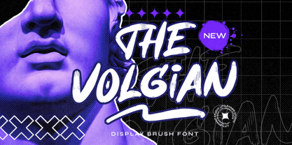 The Volgian is a brush font which is purposely made for headline, display or logotype. This type of font perfectly made to be applied especially in logo, and the other various formal forms such as invitations, labels, logos, magazines, books, greeting / wedding cards, packaging, fashion, make up, stationery, novels, labels or any type of advertising purpose. Features : uppercase & lowercase numbers and punctuation multilingual alternates & ligatures PUA encoded We highly recommend using a program that supports OpenType features and Glyphs panels like many of Adobe apps and Corel Draw, so you can see and access all Glyph variations.
 - Thunderspeed by Tigade Std,
$15.00 Thunderspeed is a futuristic and sporty look font. It is sharp yet easy on eyes of readability. It is perfect for your branding and logo, mainly in design theme related to sports, futuristic, space, etc. Thunderspeed features complete set of upper case and lower case with standard International characters. Of course come with the numbers and punctuations. The font come in format: OTF TTF WOFF/WOFF2 That's a wrap! I do really hope you like this font, and please don't hesitate to contact me if you have any questions. Also, drop by to our instagram! Tigadestd | Doli Harahap
 - Bergie Seltzer by Hanoded,
$15.00 It could be you’ve never heard of Bergie Seltzer - and neither had I. Basically, Bergie Seltzer is the fizzing sound an iceberg makes when it melts. We are having a bit of a heat wave right now, so I needed to give this font a ‘cool’ name! Bergie Seltzer font is a cool, all caps display font. It has a slightly eroded look (like a melting iceberg if you will) and a laid back attitude. Use it for your summer magazines, your ultra-cool websites and your bottles of fizzy drink! Just don’t melt the polar cap!
 - Maiolica by Struvictory.art,
$14.00 We would like to introduce a new font Maiolica. We were inspired by Italian ceramics and floral patterns on square tiles. We decorated the empty space of letters with geometric patterns. That's how this font turned out! Maiolica typeface includes three fonts: Decorative, Inline, Symbol. Mix and match them to get interesting design. The font is suitable for menu design, wedding invitations and cards, craft products branding and packaging (ceramics, floristics, soap making, natural cosmetics ect). You can create trendy lettering posters for your social media, photo overlays, printing clothes. Also use individual letters and symbols to create logos and monograms.
 - Kris by Characters Font Foundry,
$25.00 Kris is a powerful typeface based on humanistic minuscule with a touch of Uncial script. An alphabet with an unusual appearance. It is based on the paradigm of classical handwriting. Kris is handwritten with a broad nib pen and ordinary black ink. The somewhat fanciful shapes are created by lifting the pen randomly left and right. This causes unpredictable frayed edges that make the typeface exciting. It bursts with character and is very versatile. Kris is written by the Dutch calligraphy artist Corrie Smetsers. Corrie threw all basic characters in a plastic bag and René Verkaart built the typeface and created all remaining characters. “Most special about this project was collaborating with Corrie. She's an expert in handwriting and has developed writing systems for the educational sector for decades”, René says.
 - Yalta Sans by Linotype,
$29.00 Yalta Sans combines the warmth of a traditional humanist design, the clarity of a grotesque and the modernity of a square sans. Several design traits contribute to this melding of diverse typographic concepts. Characters find their foundation in stroke-based shapes rather than constructed forms. Curve stokes are also slightly squared and counters are open. Curved strokes join verticals at nearly right angles to create a strong horizontal stress, aiding the reading process. The resulting design is exceptionally legible while still inviting. Although Yalta Sans is clearly differentiated from its calligraphic ancestors, many details of the design emulate the distinctive characteristics of typefaces from the Renaissance. Tapering horizontal stokes also give Yalta Sans a dynamic relationship with linear grotesque while its angled stroke terminals echo the work of a calligraphic brush Yalta Sans italics are cursive designs that are in keeping with humanistic letterforms and are markedly narrower than the Roman characters. Lining and old style figures, small caps and a suite of ligatures also make for a remarkably versatile typeface family.
 - Serway by Hazztype,
$20.00 Serway is a captivating typeface that seamlessly blends elegance with a touch of playfulness. This font's defining characteristic is its wavy stems, which give each character a dynamic and fluid appearance. The wavy stems gracefully meander, creating a harmonious rhythm that adds a unique visual appeal to any design. The wavy stems in Serway mimic the graceful movement of gentle waves, the bending of tall grasses in the wind, or the meandering path of a flowing river. These organic shapes infuse each character with a sense of fluidity and harmony. The sans serif structure of Serway maintains a contemporary and modern aesthetic. The clean lines and smooth curves of the letterforms offer a sense of simplicity and sophistication, perfectly complementing the nature-inspired wavy stems. Serway is an ideal choice for various design projects, including editorial design, packaging, headlines, web design, logo creation, and branding. Its wavy stems add a distinct touch that sets it apart from traditional sans serif fonts, making it perfect for designs that seek to capture attention and create a memorable visual impact.
 - Fry by omtype,
$25.00 The typeface Fry was developed in 2008 specially for the Sky-Fish company (fish and seafood dealer). Type is designed for small texts, it has friendly and fairytale historic flavor. Fry takes openness and dynamism of humanistic sans serif, simple and softness of lubok's letters (primitive style) and fluidity of shallow marine fry. Despite of funny style, Fry works well even in the 5 point size. In large sizes Fry demonstrates its originality, vivacity and softness, in the small characteristics become less visible, and Fry's readability becomes more important. So this makes the typeface suitable for many tasks of typography. The typeface includes extended set of Latin, old style and lining figures, historical alternates and special local features. The combination of lubok's aesthetics and funny dynamic forms make a nature of Fry. Fry was exhibited at the Svjato Kyrylyci (Kharkov, Ukraine) festival in 2008. It was awarded for excellence in type and graphic design at Modern Cyrillic 2009 competition. Fry was selected among 50 typefaces for the Call for type exhibition in the Gutenberg museum (2013).
 - ITC Samuel by ITC,
$29.99ITC Samuel is a delicate and lively calligraphy font designed by Phill Grimshaw. Every detail has been worked to create harmony. The stroke contrast, the light brush character, the graceful forms all give ITC Samuel the spontaneity and individuality typical of handwriting. The font includes several ligatures and is legible even in smaller point sizes. ITC Samuel is perfect for invitations, greeting cards and other personal correspondence. - Grosser by Leo Colalillo,
$35.00 The design of Grosser* is inspired by the northern european modern architecture with it's rational shapes. The font was born for posters and to be used on large formats, the geometric shapes and the solid structure makes it a very good choice to do posters and graphics where you need an extra bold font with sharp lines. *Grosser (Größer) is a german word, which means "bigger/larger".
 - Sealt by Michael Rafailyk,
$9.00 Sealt Typeface is inspired by the oldest saltworks in Eastern Europe, founded in 1390 in Drohobych. Sealt means salt in Old English, so most letters are rough and sharp like salt crystals and seem to be carved out of the rock. View PDF Specimen: https://michaelrafailyk.com/typeface/specimen/Sealt.pdf Variable font: Sealt VF has weight axis and includes hundreds of weights ranging from Light (300) to Bold (700), so feel free to choose the most accurate weight that you need, using a slider. Localized Forms: 47 character substitutions for Azeri, Bulgarian, Catalan, Dutch, German, Kazakh, Moldavian, Polish, Romanian, Tatar, Turkish. Glyph Composition/Decomposition (Diacritics): Full Latin and based Vietnamese set of diacritics (561 characters). Precomposed. Ordinals: adehnorst. Superscript, Subscript, Numerator, Denominator: 0123456789. Fractions: ¼½¾⅐⅑⅒⅓⅔⅕⅖⅗⅘⅙⅚⅛⅜⅝⅞⅟ (precomposed). Any other fractions (even those typed through a slash) will also be displayed correctly, with the automatic replacement to Numerator + fraction + Denominator. Slashed Zero: All 0 figures, including Lining, Superscript, Subscript, Numerator, Denominator, and Fractions. Contextual Alternates: ΆΈΉΊΌΎΏ. Greek uppercase accented characters lose their tonos accent and retain only dieresis in All Caps mode. Turned on by default. If you need tonos accents in All Caps then turn off Contextual Alternates (calt) feature. Standard Ligatures: OO TT tt fi. Turned on by default. Language count: 480+. Kerning Class pairs: 4295. The promo images used photos of Albin Berlin, Hervé Piglowski, Karolina Grabowska, Scott Webb from Pexels and Dollar Gill from Unsplash.
 - Avita by Bykineks,
$13.00 The first version was created in 2022, Avita was again revised and improved in V.2.0 in 2024, reborn with sharper sharpness and a cosmic gaze. This geometric sans serif is not just a font; he is more than that, weaving clean forms into a dance of precision and imagination. The tall x-height and playful ascender ensure it fits perfectly into any design in its 54 styles, whispering a subtle secret or a bold statement as your design demands. Don't be limited by the ordinary. Avita embraces the future, whether it's sleek sci-fi, minimalist style, or the unexpected charm of a skincare brand. Let Avita speak to the world in 103 languages, including Cyrillic and Greek, or reach for the stars with special astrological and astronomical glyphs. Unleash your typographic art with an arsenal of OpenType alternatives, ligatures, fractions, arrows, and more. It's not just a font; this is the sculpting tool for your wildest design dreams. Avita's clean lines and limitless versatility are an invitation to push boundaries, elevate your vision, and let your creativity soar.
 - Morgan Flower Psychedelic by Nirmana Visual,
$24.00 Inspired by Psychedelic Poster Design, This font is perfect for those looking to add a unique and mind-bending touch to their designs. With its bold and fluid lines, this font will harmony for a diversity of design projects, including logos & branding, social media posts, advertisements & product designs. So why settle for boring fonts when you can use our Morgan Flower Psychedelic Typeface to elevate your designs to the next level? Give your projects a groovy touch and let your imagination run wild with this one-of-a-kind font.
 - Pacioli by MADType,
$29.00 This font is based on an alphabet published by Luca Pacioli in his 1509 mathematical treatise De divina proportione. In this book, Pacioli describes how to build the Roman alphabet geometrically using lines, squares and circles. Pacioli was not the first or the last man in his era to describe the building of letters mathematically. Felice Feliciano did this before Pacioli, and Albrecht Dürer further developed these forms years after. According to Pacioli, the thick strokes should be 1/9th of the height, and the thin strokes should have 1/2 the weight of the thick strokes. I felt that this beautiful alphabet needed to be restored to its full geometric glory and set out to construct an accurate replica using Pacioli's instructions. Included in the font you'll find the letters that have the grid overlay and also the letters without the grid. The letters J, W, U, and Z were not included in the book, so I have created my own versions of these characters that fit into Pacioli's grid. Pacioli shows two different Os in the book, so I have included the second O as well as a second J, Q, and Z as OpenType stylistic alternates. Also included in the font are border patterns and a fleuron taken from the cover of the book.
 - Narration by Pesic,
$39.00 Narration is a bright serif font with classic proportions, that is inspired by the Renaissance as well as neoclassical tradition, contemporary design with a delicate sense of rhythm, clarity and legibility. Serif fonts, although reduced and simplified geometric lines, have a role model in the Roman lapidary inscriptions. Narration is suitable for the style that requires elegance and grace of the text, publications of historical, archaeological, artistic and other cultural events, as well as fashion, labels for cosmetics, wine... Character folders correspond to all functional letterpress requirements and contain all the glyphs of Latin European languages and Cyrillic.
 - Sole Serif by CAST,
$45.00 Sole Serif is a newspaper face with features relating to book typography. Inspiration from Francesco Griffo’s romans was adapted to resist the rough usage typical of newspaper printing without any loss of quality. Sole Serif is available in an extensive range of cuts including extra bold and ultra thin. With its big x-height, short ascenders and a roundish and wide italic for text and titles, it has all the attributes of a newspaper face. Nonetheless, details like the inclined axis, calligraphic terminations, Renaissance proportions and a refined but slightly mannered design, all evoke the book rather than the daily paper.
 - Haboro Slab by insigne,
$- Haboro Slab. It’s a nose-to-the-grindstone kind of font like the first of its family. This slab serif pushes through the clutter powerfully in editorial and corporate work such as business websites and software. The Haboro hyperfamily as a whole is known for its ability to make the work clear and simple, even with the fonts’ advanced angle--and Slab is no change here. Consistent with Haboro, too, the simplified geometric features of the slab face just make sense, no matter where you use it. Its timeless wedge-molded serifs give this family the formula it needs to function flexibly in jobs from fashion to packaging. Enhance your output with the font’s wide range of ligatures and alternates, including OpenType alternates. Use Haboro Slab’s large pair of solution glyphs and various other OpenType specifics, too, to give your message the clarity it deserves. Even more, it couples well with the sophisticated didone of the Haboro hyperfamily to further expand your capabilities. Haboro Slab has every quality you need for successful lettering. Use this modification on a classy tradition to mold and shape your next layout, whether website, iPhone app, advertising, or newspaper. There is no work Haboro Slab won’t power through.
 - Pirouette by Linotype,
$40.99Pirouette is based on a logo that Japanese designer Ryuichi Tateno created for a packaging design project in 1999 (a shampoo container!). Tateno's logo experimented with complex, overlapped swash letterforms. He continued to develop these outside of the initial packaging project, until they took on a life of their own. Eventually, Tateno designed a full typeface out of the logo, Pirouette, which was the first place display face in Linotype's 2003 International Type Design Contest. The Pirouette typeface contains six different fonts. The basic font is Pirouette Regular. This is an engraver's italic lowercase paired with elaborate swash capitals. The swash capitals have two visual elements in their forms: thick strokes and thin strokes. Pirouette Text includes the same lowercase as Pirouette Regular, but the uppercase letters are much shorter and simpler. This "text" font can be used to set longer amounts of copy. Pirouette Alternate contains different lowercase glyphs and additional ligatures, which can be used as substitutes for the lowercase forms in the Pirouette Regular and Pirouette Text fonts. Pirouette Ornaments contains swashes and other knick-knacks that can either be added onto the end of a letter, or used as separate decorative elements or swooshes (accolades) on a page. Pirouette Separate 1 and Pirouette Separate 2 are two fonts that can be layered over top of one another in software applications that support layering (e.g., most Adobe and Macromedia applications, as well as QuarkXPress). Pirouette Separate 1 contains the thick stroke elements from Pirouette Regular's uppercase letters, as well as the same lowercase glyphs that can be found in Pirouette Regular and Pirouette Text. Pirouette Separate 2 contains only the thin stroke elements from Pirouette Regular's uppercase letters. By layering Pirouette Separate 1 and Pirouette Separate 2 over one another, you can give the uppercase letter's thick and thin stroke elements different colors and create unique, more calligraphic designs. The Pirouette family, Tanteno's first commercial typeface, was greatly influenced by the calligraphic and typographic work of the master German designer, Prof. Hermann Zapf, especially his Zapfino typeface. - HS Alwajd by Hiba Studio,
$50.00 Hs Alwajd is an Arabic display typeface, under “titles” category. It is useful for book titles, creative designs and modern logos. Also, it is used when a contemporary and simple look is desired that can fit with the characteristics of Kufi fatmic where horizontal parts are equal than vertical ones. It is a new style based on HS Almajd but without swirling round forms terminating in ball. The font is based on Kufi Fatmic calligraphy along with some derived ideas of decorative fonts, maintaining the beauty of the Arabic font and its fixed rates. Undoubtedly, the insertion of curved ornament in some parts adds more beauty and fascinating diversity in the flow line between sharp, soft and curved parts. This font supports Arabic, Persian, Pashtu, Kurdish Sorani, Kurdish Kirmanji and Urdu, consisting only one weight which can add to the library of Arabic Kufic fonts contemporary models that meet with the purposes of various designs for all purposes and all tastes.
 - Alabaster Antique FJ by Frncojonastype,
$39.00 fj Alabaster Antique™ is a hybrid typefamily with a 10 styles inspired of the develop and exploration of “serif” since the first half in XIX century, envolves a special influence of the slab humanist typefaces, —with a calligraphy flavor in his Italic— with the goal to generate a contrast in to texts sheets. Has a three display versions based in the universe of “woodtypes” to deliver a “unity” in all typeset, like his versions fj Alabaster Antique™ Display, Engraved & Shaded. Include Small Caps, Swashes, Modern and OldStyles figures to decimal notation that envolve to fj Alabaster Antique™ in a ideal typeface for first and second lecture in the most of the visual communication pieces. • To exclusive licenses and to follow the develop of this project please visit frncojonas.com Learn about upcoming releases, work in progress and get to know us better! WB: frncojonas.com BE: beh.net/frncojonas TW: @frncojonas ING: @frnco.jonas
 - Kronix by Hazztype,
$20.00 Introducing Kronix, a geometric, futuristic font that embodies the essence of technology in the digital age. Kronix combines sleek lines, precise angles, and contemporary design elements to create a visually striking font perfect for technology-themed projects. Its clean and minimalist letterforms embody the essence of modernity and sophistication, capturing the attention of tech-savvy audiences. With its crisp edges and precise spacing, this font creates a harmonious visual rhythm that adds a touch of elegance to any design. Kronix is versatile and adaptable, making it suitable for a wide range of applications, including websites, mobile apps, and branding materials. Its modern aesthetic aligns perfectly with the fast-paced advancements in technology, allowing your design to stay relevant and visually impactful. Whether you're designing a tech magazine cover, creating a sci-fi movie poster, or developing a high-tech product packaging, Kronix is the ultimate choice for adding a geometric, futuristic flair that captivates the imagination and elevates your design to the forefront of modern technology.
 - Destra by Isaco Type,
$26.00 Destra is a contemporary, narrow serif family, suitable to save space and legible at small sizes. Its shapes are the result of a mix of styles. "Destra" is the Portuguese word for "right hand". The font has several OT features - fractions, old style-, lining-, tabular numbers, superiors/inferiors, alternative glyphs, dozens of ligatures (standard + discretionary) and an exclusive feature to convert Arabic to Roman numerals up to 1000 (download the “OT Features Guide” pdf). Moreover, Destra has an impeccable technical finish, with a systematic review of nodes, curves, spacing and internal data, eliminating the possibility of errors when using it. The family consists of 8 styles, 4 weights - Regular, Medium, Bold and Black, plus their respective italic versions. The fonts are available in OpenType PS/TT and have extended character set to support CE, Baltic, Turkish as well as Western European languages. You can test Destra downloading the free trial font in Medium version (TT only). This trial file supports only Western languages.
 - Luxyna by Krafted,
$10.00 Wish to add a touch of luxury to your design? A deluxe font will transform the way people see your brand. Introducing Luxyna - a Luxury Serif Font. A perfect blend of luxury and modern spirit, Luxyna will appeal to all audiences, young and old. Best of all, it works great on both the web and in print. Give it a go and see how the right font choice improves your image. What you’ll get: Multilingual & Ligature Support Full sets of Punctuation and Numerals Compatible with: Adobe Suite Microsoft Office Keynote Pages Software Requirements: The fonts that you’ll receive in the pack are widely supported by most software. In order to get the full functionality of the selection of standard ligatures (custom-created letters) in the script font, any software that can read OpenType fonts will work. We hope you enjoy this font and that it makes your branding sparkle! Feel free to reach out to us if you’d like more information or if you have any concerns.
 - Kenoky Coffekan by Alit Design,
$12.00 Introducing KENOKY Coffekan font duo. Unique and fantastic duo fonts combined or they stand alone. KENOKY font family consists of 14 families, from Thin to Heavy style. The elegant modern font creates a unique design and is sure to steal the eye of the design target audience. Besides being unique, the KENOKY font also has a luxury simple character that makes the design charming and luxurious. The Coffekan font is a signature script that has cool strokes. The line shape of Coffekan is inspired by a unique monoline style. In addition, Coffekan has an altenate ligature that looks natural and not stiff. Combining the two KENOKY and Coffekan fonts will create a design that is charming, unique, elegant and cool. you can see from the design preview. These two fonts are perfect for designs with the concept of elegant, luxury, romance, fashion and so on.