10,000 search results
(0.091 seconds)
- 1845 Mistress by GLC,
$38.00 This font was inspired by Spencer’s patterns, particularly the elegant varieties called “Ladies' Hand” in some handbooks. Intelligent OTF ligatures and alternates (about 160) are included in the font, giving a closer appearance to realistic handwriting.
 - Bullseye by Crumphand,
$19.00 Hello, this is the new font "Bullseye" The font has made by Sharpie Marker. Looks bold but still Elegant and Fresh. The font have a good Readability. What's Character Included ? Uppercase Lowercase Numerals Punctuation Multilingual Support Stylistic Set. Standart Ligature Thank you, Regards!
 - Future Tense by Borges Lettering,
$30.00 Future Tense is a modern type style that is perfect for logos, film, video games, packaging, signs, and more. Charles Borges de Oliveira & Vassil Kateliev's attention to letter forms insures extreme legibility without sacrificing this modern style. The 160 alternate letters will keep your designs looking fresh and different. A unique feature included in Future Tense is the small caps have their own set of small caps. This allows 3 different looks for each letter. What’s included in Future Tense: 160 alternate letters makes designing eye catching logos rewarding! The alternates are included in the small caps and second small caps as well. Future Tense is a titling face that contains small caps as well as a second set of small caps. Multilingual: support for over 200 languages. Over 2,500 glyphs make up Future Tense. PUA encoded. Take your designs to the next level with Future Tense. Please note: artwork is not included with font purchase. The images above show how Future Tense can be used in a design setting. Future Tense was designed and created by Charles Borges de Oliveira and Vassil Kateliev. This font is dedicated to Warrel Dane.
 - RaseDowne by Graffiti Fonts,
$39.99RaseDowne is unique amoung all of our other Graffiti Fonts. This font is intended to be rotated 90 degrees clockwise so the text reads downward. This single font includes 2 alphabets with capitals that extend downwards. The RaseDowne font was created from hundreds of handwritten samples. This style was created by RaseOne & is often used to create tattoo designs, fashion designs and mountable artwork. There are actually nearly 3 full alphabets plus numbers, symbols and a variety of embellishments all included in this one font. The rough, natural style and imperfect lines help maintain a handmade look. Using the optional glyphs you can try multiple letter combinations until you get just the right configuration for whatever word or phrase you are trying to make. - Umkhonto by Scholtz Fonts,
$19.00 Umkhonto is the Zulu word for SPEAR, the traditional weapon of war that the Zulus used. The sharp points of the letters face upwards and represent the sharp points of the dangerous spears. The font includes a full 256 character set: all upper and lower case letters, as well as all numerals and punctuation. It also includes the most commonly used characters used in non-English European languages such as Spanish, French, German and Portuguese. The numerals are mono-spaced so that they will line up correctly in columns of figures. The letters of the alphabet are spaced according to their width and are carefully kerned.
 - Iwan Stencil by Linotype,
$40.99 Iwan Stencil is a new revival of an old display typeface. Based on type originally designed by Jan Tschichold in 1929, the style was revived by Klaus Sutter in 2008. The letterforms in this peculiar design are very high contrast; all of the thin bits are much thinner than the thick parts. They have a modern, upright axis. All in all, the creation has a bit of a Bodoni-gone-crazy touch. The thin elements are the unique part of the design that binds this face together. They almost naturally fade away in the stencil gaps (or pylons), making you wonder if you are really looking at a stencil face at all. These thins contribute greatly to the typeface's overall serif-style, making the design at least a semi serif typeface, if not a full serif one. The lowercase n, for instance, has no serifs of its own, but many of the other letters have clear ones, or serif-like terminals. A serif stencil face is a peculiar variety, especially in this day and age, but in the past they were much more common, if not the norm, The Iwan Stencil typeface has only one weight. Naturally, this is just for display. Use Iwan Stencil to cut real stencils, or only to create the effect of stenciled type in your design work. Ivan Stencil includes all of the characters that you have come to expect in a font. Just because this design was originally made in 1929 does not mean that is has a 1929 character set. Instead, it includes a 21st century, with extended European language support Jan Tschichold, who we have to thank for today's Iwan Stencil inspiration, was a man of many faces. A trained calligrapher who went on to codify the New Typography, would go on to become a teacher, a classical book designer, and the creator of the Sabon typeface. Like all young designers, he was occasionally in need of money. Before his emigration from Germany in 1933, he took on many kinds of commissions. In the late 1920s, a time full of waves of economic turmoil within Germany and across the world, he began designing a typefaces for different European companies, mostly display things like this. For a time during the mid-1920s, Jan Tschichold went by the name Iwan" "
 - Elizabeth Script by Kimmy Design,
$25.00 Elizabeth a script that carries the imperfections of a hand written brush script. It includes regular and discretionary ligatures, as well as stylistic alternatives and swashes. If you are working in a program that supports Open Type, I would suggest purchasing the Pro version as it includes all the features Elizabeth has to offer. If you are not working with Open Type but want to have the option of the swashes are stylistic alternatives, then you can buy both the regular Elizabeth and the swashes version. It will allow you to have most of the functions of Open Type.
 - LTC Pabst Oldstyle by Lanston Type Co.,
$24.95 Frederic W. Goudy originally designed Pabst in 1902. This lettering was used by the Pabst Brewing Company for their promotional materials. It was later developed into type for ATF. Goudy later licensed Pabst Oldstyle to the Lanston Type Library. Lanston Pabst Oldstyle features several differences from the more familiar ATF version. Some caps are narrower while some lower case characters are wider than the ATF version. The descenders are also shorter in the Lanston version. Logotypes of italic words and, of, and the are included as originally designed as well as ligatures including the unusual tt ligature.
 - Chinook by Unio Creative Solutions,
$9.00 Chinook has been designed as an homage to the iconic chunky look of the Italian movie titling from the 70s and 80s. Despite its vintage flair, our sturdy display font is perfectly adaptable for any contemporary context with its balanced and soft text typesetting. This project is obviously influenced by the everlasting classic "Cooper Black", but includes more modern letter shapes, with rounded serifs and a fluffy overall appearance. Chinook, includes a customized italic set, features an extended charset covering several languages based on the Latin Alphabet, and sports a complete set of Open type features. It's equipped with swashes, alternates as well as discretionary ligatures, old-style figures, subscript and superscript numerals, and even more special glyphs. The heavy appearance makes this font ideal for high-impact design, such as headlines, titling, branding, and logotype. Specifications: - Files included: Chinook, including Italic - Multi-language support (Central, Eastern, Western European languages) - OpenType Features (Superscript and Subscript Numerals, Fractions, Oldstyle figures, Stylistic Alternates, Discretionary Ligatures, Swashes) Thanks for viewing, Unio.
 - Cumhuriyet World by Fontuma,
$34.00 Cumhuriyet means “the form of government in which the nation holds the sovereignty and uses it through deputies elected for certain periods”. The reason why I gave this name to the font is that 2023 is the centennial anniversary of the Republic of Turkey, which was founded by Atatürk. This typeface, which is sans serif, consists of three families: ▪ Cumhuriyet: Font family with Latin letters ▪ Cumhuriyet Pro: Font family including Latin, Arabic and Hebrew alphabets ▪ Cumhuriyet World: Font family including Latin, Cyrillic, Greek, Arabic and Hebrew alphabets Cumhuriyet World is a family of multi-purpose typefaces designed in a geometric style. This font is suitable for use in printed products, media and digital media, as well as in every field that is the subject of writing.
 - Novin Shadow by Naghi Naghachian,
$105.00 Novin-Shadow is an outline Font with Shadow. It is based on Novin font family but as a separate headline font with Arabic and Latin characters. It is a typeface that gives the typographer and other graphic artists the possibility to use modern headline. It enables, moreover, the use of this typeface for decorative headlines and is suitable for manipulations in both vector-based and pixel-based graphic programs. Typographies in countries worldwide, whose alphabets derive from the Roman and Arabic, are dependent on such innovations in order to meet the increasing demands of modern communication. This typeface implies at the same time an enrichment of the possibilities for typographical design, which in turn increases the delight in such design. It gives me great pleasure to present this new typeface to my creative colleagues worldwide.
 - Altamonte NF by Nick's Fonts,
$10.00Logotype lettering from 1896 for the Italian confection company Talmone provided the inspiration for this curvy, cuddly face. Warm up your headlines today with this antique charmer. Both versions include the complete Unicode Latin 1252, Central European 1250 and Turkish 1254 character sets, as well as localization for Lithuanian, Moldovan and Romanian. - Harvest Moon NF by Nick's Fonts,
$10.00The letterforms for this unusual display face were inspired by a 1930s ad for Tanguy Crepes, by an uncredited artist. Due to the ornate nature for this font, it has a limited character set, but does include all letters, numbers and punctuation for the Unicode 1252 Latin and 1250 Central European character sets. - Bully Pulpit NF by Nick's Fonts,
$10.00This engaging headline face is based on a rather pudgy typeface named "Bullion Shadow", which was originally released somewhere on the cusp between the hippie and disco eras, and was equally at home in both. Both versions of this font include the complete Unicode 1252 Latin and Unicode 1250 Central European character sets. - Sabastian by Letterara,
$12.00 Sabastian is the perfect handwritten font: Sweet, innocent, light, and charming, this one-of-a-kind typeface will add a unique charm to any design project! Sabastian font was created to look as close to a natural handwritten script as possible by including 73 ligatures. With built-in Opentype features, this script comes to life as if you are writing it yourself. You can see it in the picture shown. This font is PUA encoded which means you can access all of the amazing glyphs and swashes with ease! It also features a wealth of special features including alternate glyphs and ligatures.
 - Amaboxi by Scholtz Fonts,
$19.00In Amaboxi the upper-case letters are all placed upon a background inspired by the cardboard boxes that many people in Africa use to carry their possessions. The box takes its shape from the character and conversely, the character is influenced by the shape of the box. All characters except the six "fractions" are included in Amaboxi. It includes all upper and lower case letters as well as all numerals, punctuation, accented and special characters. All characters have been letter-spaced and kerned in terms of the box (not the character). This improves legibility, however, the inter-character spacing has been minimized so that there is often a very slight overlap between the boxes of adjacent characters. This generates an exciting and variable "white space" around the characters. - Rameau by Linotype,
$29.99Rameau for classic elegance The type family Rameau™ was designed by Sarah Lazarevic She started with the italics; these she derived from the manuscript of the opera Les fêtes de l´hymen et de l´amour", the music for which was composed by Jean-Philippe Rameau in 1747. In the 18th century, musical compositions were published in the form of impressions from copper plates that had been hand-engraved in contrast with books and other texts, which were printed from moveable lead type. The italic letters of Rameau include many ligatures and are thus typical of the engraving style of the period. Rameau exhibits much of the harmonious rhythm associated with genuine manuscript. The marked Antiqua contrasts make the pages on which the font is used quite literally sparkle. This effect is enhanced by the excessively sharp terminals and the prominent serifs of the upper case letters. This highly legible and stylish type family can be used for printing high quality books, invitations, menus and all kinds of texts - anywhere the grace and elegance of France in the 18th century is to be invoked." - Arabetics Latte by Arabetics,
$59.00 Arabetics Latte is a Latin Serif typeface with a comprehensive support for the Arabetic scripts, including Quranic texts. While its seemingly-idiosyncratic Latin design eliminates the excessive usage of serifs and offsets the visual effects of several geometrically-intense glyphs, its Times Romanesque proportions gives a full nod to the beginnings of Latin types and produces an overall stable look-and-feel of a classical Serif style, making it suitable for both text and display applications. Liberal spacing is maintained throughout to match that of the Arabic text and is further supplemented by a careful implementation of a typical Latin kerning. The overall design of this font, including metrics and dimensions, was intended to make its Latin harmonize well with most other Arabetics foundry fonts. Arabetics Latte fully supports MS 1252 Western and 1256 Arabic code pages, in addition to all the transliteration characters required by the ALA-LC Romanization tables. Users can either select an accented character directly or form it by keying the desired combining diacritic mark following an unaccented character. For Arabic, it fully supports Unicode 6.1, and the latest Arabic Supplement and Extended-A Unicode blocks. The Arabic design of this font family follows the Mutamathil Taqlidi design style with connected glyphs, emphasizing vertical strokes to bring added harmony, and utilizing slightly varying x-heights to match that found in Latin. The Mutamathil Taqlidi type style uses one glyph for every basic Arabic Unicode character or letter, as defined by the Unicode Standards, and one additional final form glyph, for each freely-connecting letter of the Arabic cursive text. Arabetics Latte includes the required Lam-Alif ligatures in addition to all vowel diacritic ligatures. Soft-vowel diacritic marks (harakat) are selectively positioned with most of them appearing on similar high and low levels—top left corner—, to clearly distinguish them from the letters. Tatweel is a zero-width glyph. Keying the tatweel key (shft-j) before Alif-Lam-Lam-Ha will display the Allah ligature. Arabetics Latte includes both Arabic and Arabic-Indic numerals, in addition to generous number of punctuation and mathematical symbols. Available in both OpenType and TrueType formats, it includes two weights, regular and bold, each has normal, Italic, and left-slanted styles.
 - His Embrace by SSI.Scraps,
$27.00 The His Embrace is hand brush font with scratch bold natural textures. it is a rough texture script. your design will look brave, great and powerful. Fall in love with its incredibly versatile style and use it to create gorgeous and timeless designs with Dry Brush, an interesting and unique handwritten brush font. Fall in love with its incredibly stylish look and use it for logos, quotes, invitations, business cards, power point presentations, and more!
 - Mynaruse Royale by insigne,
$22.00 Mynaruse Royale is an expansion of Mynaruse Titling. It features script capitals and widely tracked and smaller titling capitals. Mynaruse Royale has plenty of character and, with its powerful and sharp serifs it draws in the eye. Mynaruse Royale is useful in settings that call for titling with an extra touch of elegance, such as a storefront, wedding program or formal invitation. Mynaruse Royale contains a number of OpenType alternates, including alternate forms for the capitals that are large, drop cap like capitals instead of the calligraphic script capitals found in the default forms. Additionally, there are non-widely tracked lowercase forms that work well with the included alternate characters and ligatures. The lowercase forms are 80% smaller in height than the Mynaruse lowercase forms, so the families are not interchangeable, but they can be used together. The calligraphic script capitals could also be used separately as drop capitals. OpenType-capable applications such as the Adobe suite or Quark can take full advantage of automatically replacing ligatures and alternates. This family also includes the glyphs to support a wide range of latin based languages.
 - Marvis by Larin Type Co,
$15.00 Marvis is a vintage collection of fonts that includes serif, true italic, script, sans serif and slab serif each of them has two style - Clean and Rough style. Also for the script includes Alternates and Swashes. This collection was inspired by vintage signage, logos and this fonts are perfectly suitable for any vintage project and will make it at a high level. This fonts is easy to use has OpenType features. Font collection includes: Full Capital alphabet A-Z for Sans and Slab Full alphabet Uppercase and Lowercase A-z for Serif, Italic, Script Numbers, fractions for Serif, Italic, Script, Sans and Slab Punctuation and symbols for Serif, Italic, Script, Sans and Slab Alternates for Uppercase for Serif and Script Alternates for Lowercase for Script Swashes for Script Ligatures for Serif and Italic "Tb, Th, Tk, Tl, ct, fb, ff, ffi, fi, fh, fk, fl, st"
 - Rumble Seat NF by Nick's Fonts,
$10.00British poster artist Cecil Wade provided the lowercase for this typeface, and his compatriot T. G. Birtles provided the uppercase. The result is a rollicking, frolicking, bouncy romp through the alphabet, not unlike a ride in the compartment for which it is named. Both versions of this font include the complete Latin 1252 and CE 1250 character sets, with localization for Romanian and Moldovan. - Recepts NF by Nick's Fonts,
$10.00Here’s a futuristic face with a neo-retro twist, based on the logotype for the 1990s tank-warfare videogame for the Mac, Spectre. Whether you're going back to the future or resurrecting a blast from the past, this face will get you there in style. Both versions of this font include the complete Unicode Latin 1252, Central European 1250 and Turkish 1254 character sets. - Old Softy NF by Nick's Fonts,
$10.00The pattern for this friendly face was found within the Keystone Type Foundry's 1884 specimen book, under the rather prosaic name of Round Gothic. This version retains all of the original's warmth and charm, while updating it to twenty-first century standards. Both versions of this font include the complete Latin 1252, Central European 1250 and Turkish 1254 character sets, along with localization for Lithuanian, Moldovan, Romanian and Turkish. - Fireside Chat NF by Nick's Fonts,
$10.00This unusual display face is another in a series of works based on the work of lettering artist Samuel Welo. The sinewy curves and radiant inline decoration give this typeface a cozy, warm and inviting charm. Named after the informal radio addresses popularized by Franklin Delano Roosevelt in the 1930s. Both versions of this font include the complete Latin 1252 and CE 1250 character sets, with localization for Romanian and Moldovan. - Rustic Printed by Edignwn Type,
$12.00 The font is called "Rustic Printed", it is sans serif display with vintage themes. The font comes with 2 style typefaces (regular and stamp). This font include different width of alternates glyphs. The Rustic Printed matches applies in some designs such as the logotype, poster, label, badge, packaging, branding, and more custom design. Rustic Printed includes : 2 style typefaces (regular and stamp) Uppercase, lowercase, numeral, symbol and punctuation Alternates Multilingual PUA Encoded Thank you for your support and choosing us.
 - Clarize by Seventh Imperium,
$25.00 Clarize is an elegant high contrast serif fonts family, with the best features of the Didone style. Designed with consideration for more functionality with smooth details and a touch of modern and luxury, this font is perfect for designers who are developing in the field of books, fashion, magazine, blog, advertising, packaging, branding, etc. The family includes 10 styles: five weights from Light to Black Multilingual Languages. Clarize includes Ligature and discretionary "ct" and "st" that can be accessed via an access feature.
 - Refinery by Kimmy Design,
$10.00 Refinery is the newest font in the Evanston Collection of square typefaces. With a similar capital structure to Tavern and Alehouse, Refinery includes both lowercase and small caps, making it an ideal typeface for paragraph text settings. It also comes in a wide array of weights and widths, with 85 font files in total. DESIGN Refinery has it’s roots in early 20th century signage and saloon typography, but has been modernized - even future-ized - to fit the 21st century digital landscape. The design was aimed at providing a type family that could work in many modern design fields, from sports, tech and military to gaming, HUD, virtual reality and augmented reality. ENGINEERING Essentially. Refinery is a simple mono-linear square design has been expertly refined into an easy-reading sans serif typeface. It was designed to be used in both display and text settings. From hairline to black in ultra-narrow or extended, the wide array of weight and width options makes it easy to find the right font for each text need. SPECS Refinery not only includes 85 font files, but each one include a wide array of Opentype Extras that allow even further customization. • Stylistic Alternatives: Letters A W Y have a styling variation that rounds the pointed apex into a square curve. The S and 2 variation straightens the spine, making all curves in the alphabet read as 90º angles. • Small Capitals: A shortened version of the capitals for alternate header settings. • Titling Alternatives: In this typeface, this feature turns on lifted small caps. Take the small capitals, raise them to level with capitals and underline at the baseline. When multiple lowercase or small capital letters are typed in a row, the underlines connect, creating unique ligatures. • Figures: There are different figure styles for different text needs. Options include, proportional lining, tabular lining (for math), old style and small capitals. • Discretionary Ligatures: A little funk to this otherwise serious typeface. Letters with a long baseline or cap height stem - F, L, T - get elongated to hug a small capital vowel. Other ligatures include Co. and No. • Catchwords: These are common words that bring emphasis to a design. In English these words include ‘and’ ‘as’ ‘by’ ‘in’ ‘of’ ‘the’ ‘to’ ‘when’, among others. Refinery also includes multilingual catchwords of ‘el’ ‘la’ ‘oder’ ‘go’ ‘para’ ‘pour’ ‘und’ ‘y’, among others. For the full list, please check out the specimen images. EXTRAS To round the typeface off, a set of over 150 ornaments, icons, arrows, patterns and line breaks is included to provide complimentary graphics. These can be found in the Ornaments labelled font, it is recommended to use the Glyphs panel to select which text glyph is needed.
 - Fascinate Pro by Stiggy & Sands,
$29.00 A soft Art Deco inspired typestyle with panache The Fascinate Pro Family, which includes both Regular & Inline styles, began as a nod to Art Deco yesteryear and typefaces like Broadway, yet they have an exaggerated x-height and softness that give them a friendly yet sophisticated vibe. Even with their high contrast weighting, the Fascinate Pro family is cleanly legible at small sizes, while the Inline style is better visible at larger display sizes. See the 5th and 6th graphics for a comprehensive character map preview. OpenType features include: - Full set of Inferiors and Superiors for limitless fractions. - SmallCaps feature. - Oldstyle (default) and Standard Tabular figure sets. - A small collection of Standard Ligatures. - A Stylistic Alternates feature for an alternate lowercase i and j style. Approx. 581 Character Glyph Set: each style of Fascinate Pro comes with a glyph set that includes standard & punctuation, international language support, and additional features.
 - Victorian Ornamentals by Celebrity Fontz,
$24.99Victorian Ornamentals is a digital revival of a lovely Victorian letterset containing initials adorned with flourishes from a vintage embroidery typeface. It is a highly ornate and delicate typestyle with an air of elegance, romance, and flair. This font contains uppercase letters, smallcap letters. and numerals in the Victorian Ornamentals typeface and, for convenience, includes punctuation in a standardized font style. Accented characters are also included. This digital format allows colorizing of type and is a perfect font for publications that want to capture the feel of the Victorian era and the delicate nature of embroidered lettering. - Dragon Heroes by Letterara,
$16.00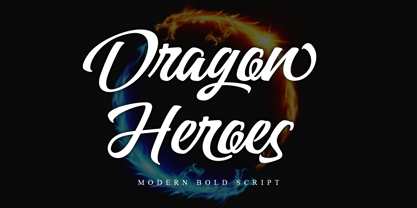 Dragon Heroes is a modern bold script font, carefully handcrafted to become a true favorite. Its casual charm makes it appear wonderfully down-to-earth, readable, and, ultimately, incredibly versatile. This font will look outstanding in any context, whether it’s being used on busy backgrounds or as a standalone headline! This font is PUA encoded which means you can access all of the glyphs and swashes with ease!
 - Blacker Script by Letterara,
$14.00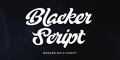 Blacker Script is a modern bold script font, carefully handcrafted to become a true favorite. Its casual charm makes it appear wonderfully down-to-earth, readable, and, ultimately, incredibly versatile. This font will look outstanding in any context, whether it’s being used on busy backgrounds or as a standalone headline! This font is PUA encoded which means you can access all of the glyphs and swashes with ease!
 - BOXDON Titling by TYDTYP,
$15.00 BOXDON is an extra heavy expanded typeface which was especially designed for VERTICAL layout. Each shape looks like a box and has minimum graphical treatment to distinguish each character. It means that the counter space is not enough to use this typeface for small font sizes, however, for titles this typeface should give incredible effects. I highly recommend using it with software that is compatible with vertical layout. (e.g. Adobe illustrator)
 - Tengwar Transliteral by Zephyris,
$- You can read more about how to use this font and how it works here. This font lets you write in accurate Tengwar (elvish) quickly and easily. While writing his Middle Earth books, JRR Tolkein invented an entire alphabet for the elves called Tengwar. His attention to detail was incredible, Tengwar is a fully functioning writing system. This is the famous Elvish writing seen all through Lord of The Rings and the Hobbit. Tengwar is an alphabet, not a language, and can be used to write many languages. Tolkein gave detailed notes on how to write English in the Tengwar alphabet. This font uses advanced font features (contextual alternates, ligatures and kerning) to automatically convert any English text, as you type, into an accurate representation in the elvish Tengwar alphabet.
 - Montauk by profonts,
$51.99 Montauk Pro is named after a small village in Suffolk County, New York on the South Shore of Long Island. It is the easternmost area in Long Island, and thus the easternmost area in New York State. It is home to Montauk Point State Park, site of the Montauk Point Lighthouse. It is named after the Montauk Indians. Montauk Pro is a casual, jaunty and quite beautiful handwriting script. It comes with six styles as light, light italic, regular, regular italic, bold and bold italic, each style with about 1.000 characters covering the complete Latin glyph set for West and East including Baltic and Turkish, including a large selection of ligatures, character combinations and alternates to make this beautiful script design a perfect font for OTF-savvy applications like e.g. InDesign or Quark Xpress 7.
 - Hip Pop NF by Nick's Fonts,
$10.00Type designer Friedrich Poppl is perhaps best known for his classic text faces and elegant scripts, but it seems he had a playful side as well. This frisky face is based on Dynamische Antiqua, which Poppl did for the Stempel foundry in 1960, but which was never released. Bright, bold and bouncy, it’s the perfect choice for headlines with impish impact. Both versions of this font include the complete Unicode Latin 1252 and Central European 1250 character sets. - Marons and Glance by Jehansyah,
$15.00 Marons and Glance This is a very charming and elegant font, very beautiful to look at and displays the impression of endless luxury, very suitable for all types of designs that want to display the impression of deep beauty. there are several characters that you can use, and combine them, very easy to use can be accessed with the glyph you are using include: numeric punctuation latin Alternate Thank you very Much
 - Gazi by Fontuma,
$24.00 Gazi is the honorary title given by the state to the commanders who defeated the enemy by showing extraordinary benefits. This title was first given to Mustafa Kemal Atatürk by the Turkish Grand National Assembly on September 19, 1921. Gazi font was designed for Mustafa Kemal Atatürk, who founded the Turkish Republic. This type face consists of two families:: ▪ Gazi: Font family with Latin alphabets ▪ Gazi Pro: Font family including Latin and Arabic alphabets The Gazi font family is ideal for those looking for a new and aesthetic serif font. This font with modern lines can be used in all broadcast and printing areas. Gazi font will meet your needs and expectations in terms of the number of glyphs and the languages it supports. The font family includes many open type features, as well as some ligatures, and many currency symbols.
 - Gazi Pro by Fontuma,
$38.00 Gazi is the honorary title given by the state to the commanders who defeated the enemy by showing extraordinary benefits. This title was first given to Mustafa Kemal Atatürk by the Turkish Grand National Assembly on September 19, 1921. Gazi font was designed for Mustafa Kemal Atatürk, who founded the Turkish Republic. This type face consists of two families:: ▪ Gazi: Font family with Latin alphabets ▪ Gazi Pro: Font family including Latin and Arabic alphabets The Gazi font family is ideal for those looking for a new and aesthetic serif font. This font with modern lines can be used in all broadcast and printing areas. Gazi font will meet your needs and expectations in terms of the number of glyphs and the languages it supports. The font family includes many open type features, as well as some ligatures, and many currency symbols.
 - Artistic Venture by Storictype,
$19.00 Artistic Venture Typeface, Inspirated those bold wide letters you see on. computer screen, movie futureistic with combine classic , Well, some of them have these strong or hooks on the ends of the letters. But, there's also this new style of font that's super cool and futuristic. It's called a Artistic Venture Typeface. There Include : All Caps Opentype Feature Alternate Character Ligature Multilanguage Thank You