10,000 search results
(0.063 seconds)
- Optimisti by Juliasys,
$26.00 Optimisti is Finnish for optimist – and it’s an optimistic, light-hearted feeling that this trio of handwriting fonts transfuses into all kinds messages and identities. Casual, playful and character-strong as they are, the three of them make a perfect team for headlines, slogans, teaser texts and brand naming. Besides the two original fonts – “Optimisti Smooth” and “Optimisti Sparkling” differing in outline structure and texture – “Optimisti Decor” now joined the game. Optimisti Decor is loaded with a multitude of artful elements that can convey a very festive atmosphere – or, on the contrary, ironically make fun of it. Its features are is especially striking when used in all-caps setting. Use the Optimists separately or together to make a humorous – or serious but always cordial impression in print, on the web, on packaging or even on your shopping bag … All Optimisti fonts have a Western European, a Central European and an Extended Cyrillic character set. They support approximately 100 languages.
 - Round Rope by Putracetol,
$28.00 Round Rope - Playful Display Font Round Rope - Playful Display Font is a fun and colorful typeface that is perfect for adding a playful touch to any design. This font was inspired by the idea of creating a font that is both playful and whimsical, perfect for children's books, branding, packaging, posters, and any design that requires a fun and lighthearted touch. The font is designed with a playful, rounded appearance and features a hand-drawn feel that adds to its charm. Round Rope is a versatile typeface that can be used for a variety of design projects. Its playful and whimsical appearance makes it perfect for use in children's books, cartoons, and other designs that require a fun and lighthearted touch. It's also great for branding, packaging, and posters, where its unique style can help your designs stand out. This font comes with a range of features that make it a versatile and functional typeface. It includes uppercase and lowercase letters, as well as Opentype features such as alternates and ligatures, which allow you to create unique designs and add even more character to your text. It also includes support for multilingual characters, making it easy to use in designs that require different languages. In the font package, you will receive three file formats: Round Rope otf, Round Rope ttf, and Round Rope woff. These formats make it easy to use the font across different platforms and devices, ensuring that your designs look great no matter where they are viewed. Round Rope is a fun and playful font that is sure to bring a smile to your face. Its unique style and playful appearance make it a great choice for a wide range of design projects. Whether you're designing for children or adults, this font is sure to add a touch of whimsy and playfulness to your work. In summary, Round Rope - Playful Display Font is a fun and colorful typeface that is perfect for adding a playful touch to any design. Its unique style and playful appearance make it a great choice for a wide range of design projects, including branding, packaging, posters, and children's books. With its range of features and file formats, it's also a versatile and functional typeface that can be used across different platforms and devices.
 - Botanical Scribe by Three Islands Press,
$39.00 The Raphael of Flowers is what they called Pierre-Joseph Redouté a couple hundred years ago. The Belgian native became famous in France, where he painted floral watercolors for both Marie Antoinnette and Empress Josephine. But what cemented his legacy was his perfection of a stipple engraving technique that brought his art to the masses. Botanical Scribe is modeled after the neat, cursive hand-inscribed legends on these antique prints. Because it simulates handlettering, the font retains a warm, organic quality not seen in fancy modern scripts while remaining both elegant and legible. (Its many ligatures lends to this authenticity.) Good for formal invitations or historical simulations.
 - Black Jack Pro by CheapProFonts,
$10.00 The talented Ronna Penner has created many beautiful script fonts, and Black Jack’s quality was very good so only a few spacing issues had to be addressed. I've added some kerning pairs, and then added all the glyphs needed for the CheapProFonts language coverage. This font was an absolute joy to rework, and with its extended character set I hope it now finds many more users! ALL fonts from CheapProFonts have very extensive language support: They contain some unusual diacritic letters (some of which are contained in the Latin Extended-B Unicode block) supporting: Cornish, Filipino (Tagalog), Guarani, Luxembourgian, Malagasy, Romanian, Ulithian and Welsh. They also contain all glyphs in the Latin Extended-A Unicode block (which among others cover the Central European and Baltic areas) supporting: Afrikaans, Belarusian (Lacinka), Bosnian, Catalan, Chichewa, Croatian, Czech, Dutch, Esperanto, Greenlandic, Hungarian, Kashubian, Kurdish (Kurmanji), Latvian, Lithuanian, Maltese, Maori, Polish, Saami (Inari), Saami (North), Serbian (latin), Slovak(ian), Slovene, Sorbian (Lower), Sorbian (Upper), Turkish and Turkmen. And they of course contain all the usual “western” glyphs supporting: Albanian, Basque, Breton, Chamorro, Danish, Estonian, Faroese, Finnish, French, Frisian, Galican, German, Icelandic, Indonesian, Irish (Gaelic), Italian, Northern Sotho, Norwegian, Occitan, Portuguese, Rhaeto-Romance, Sami (Lule), Sami (South), Scots (Gaelic), Spanish, Swedish, Tswana, Walloon and Yapese. There is no yen currency symbol is this font.
 - Fleischmann Gotisch PT by preussTYPE,
$29.00 Johann Michael Fleischmann was born June 15th, 1707 in Wöhrd near Nuremberg. After attending Latinschool he started an apprenticeship as punchcutter in the crafts enterprise of Konstantin Hartwig in Nuremberg, which ought to last six years. For his extraordinary talent Fleischmann completed his apprenticeship after four and a half years, which was very unusual. 1727 his years of travel (very common in these days) began, during which he perfected his handcraft by working in different enterprises as journeyman. First location was Frankfurt/Main where he worked for nearly a year at the renowned type foundery of Luther and Egenolff. Passing Mainz he continued to Holland, where he arrived in November 1728 and stayed till he died in 1768. In Amsterdam he worked for several type founderies, among others some weeks for Izaak van der Putte; in The Hague for Hermanus Uytwerf. Between 1729 and 1732 he created several exquisite alphabets for Uytwerf, which were published under his own name (after his move to Holland Fleischmann abandoned the second n in his name), apparently following the stream of the time. After the two years with Uytwerf, Fleischmann returned to Amsterdam, where he established his own buiseness as punchcutter; following an advice of the bookkeeper and printer from Basel Rudolf Wetstein he opened his own type foundery 1732, which he sold in 1735 to Wetstein for financial reasons. In the following Fleischmann created several types and matrices exclusively for Wetstein. In 1743 after the type foundery was sold by Wetstein’s son Hendrik Floris to the upcoming enterprise of Izaak and Johannes Enschedé, Fleischmann worked as independent punchcutter mostly for this house in Haarlem. Recognizing his exceptional skills soon Fleischmann was consigned to cutting the difficult small-sized font types. The corresponding titling alphabets were mostly done by Jaques-Francois Rosart, who also cut the main part of the ornaments and borders used in the font examples of Enschedé. Fleischmann created for Enschedé numerous fonts. The font example published 1768 by Enschedé contains 3 titling alphabets, 16 antiquacuts, 14 italic cuts, 13 textura- and 2 scriptcuts, 2 greek typesets (upper cases and ligatures), 1 arabic, 1 malayan and 7 armenian font systems, 5 sets of musicnotes and the poliphonian musicnotesystem by Fleischmann. In total he brought into being about 100 alphabets - the fruits of fourty years of creative work as a punchcutter. Fleischmann died May 27th, 1768 at the age of 61. For a long time he was thought one of the leading punchcutters in Europe. A tragedy, that his creating fell into the turning of baroque to classicism. The following generations could not take much pleasure in his imaginative fonts, which were more connected to the sensuous baroque than to the bare rationalism of the upcoming industrialisation. Unfortunately therefore his masterpieces did not survive the 19th century and person and work of Fleischmann sank into oblivion. The impressive re-interpretation of the Fleischmann Antiqua and the corresponding italics by Erhard Kaiser from Leipzig, which were done for the Dutch Type Library from 1993 to 1997, snatched Fleischmann away from being forgotten by history. Therefore we want to place strong emphasis on this beautiful font. Fleischman Gotisch The other fonts by Fleischmann are only known to a small circle of connoisseurs and enthusiasts. So far they are not available in adequat quality for modern systems. Same applies the "Fleischman Gotisch", which has been made available cross platform to modern typeset-systems as CFF Open Type font through the presented sample. The Fleischman Gotisch has been proved to be one of the fonts, on which Fleischmann spent a good deal of his best effort; this font simply was near to his heart. Between 1744 and 1762 he created 13 different sizes of this font. All follow the same principles of forms, but their richness of details has been adapted to the particular sizes. In later times the font was modified more or less sensitive by various type founderies; letters were added, changed to current taste or replaced by others; so that nowadays a unique and binding mastercopy of this font is missing. Likewise the name of the font underwent several changes. Fleischmann himself probably never named his font, as he did with none of his fonts. By Enschedé this textura was named Nederduits, later on Nederduitsch. When the font was offered by the german type foundery Flinsch in Frankfurt/Main, the more convenient name of Fleischmann-Gotisch was chosen. In his "Masterbook of the font" and his "Abstract about the Et-character" Jan Tschichold refered to it as "Duyts" again. To honour the genious of Johann Michael Fleischmann we decided to name the writing "Fleischmann Gotisch PT" (unhyphenated). Developing the digital Fleischman Gotisch I decided not to use one of the thirteen sizes as binding mastercopy, but corresponding to the typical ductus of the font to re-create an independent use of forms strongly based on Fleischmann´s language of forms. All ascenders and descenders were standardised. Some characters, identified as added later on, were eliminated (especially the round lower case-R and several versions of longs- respectively f-ligatures) and others were adjusted to the principles of Fleischmann. Where indicated the diverse characters were integrated as alternative. They can be selected in the corresponding menu. All for the correct german black letter necessary longs and other ligatures were generated. Through the according integration into the feature-code about 85% of all ligatures in the type can be generated automatically. Problematic combinations (Fl, Fk, Fh, ll, lh, lk, lb) were created as ligatures and are likewise constructed automatically. A historically interesting letter is the "round r", which was already designated by Fleischmann; it is used after preceding round letters. Likewise interesting is the inventive form of the &-character, which is mentioned by Tschichold in his corresponding abstract. Nevertheless despite all interpretation it was very important to me to maintain the utmost fidelity to the original. With this digital version of a phantastic texturfont of the late baroque I hope to contribute to a blossoming of interest for this genious master of his kind: Johann Michel Fleischmann. OpenType features: - Unicode (ISO 10646-2) - contains 520 glyphes - Basic Latin - Latin-1 Supplement - Latin Extended-A - Latin Extended-B - Central European Glyhps - Ornaments - Fractions - Standard ligatures - Discretionary ligatures - Historical ligatures - Kerning-Table
 - Things by PizzaDude.dk,
$20.00 OMG! I never thought I'd finish this font! Actually, the idea came to me in the late 1990-ies, but the sketches lied at the bottom of the "fonts I will complete one day In the future" pile ... also called "fonts I most likely won't complete...EVER" pile! :) Anyway, I started up with letters for both upper and lowercase, no numbers or punctuation. I figured if people ever purchased this font, all they would need were upper- or lowercase letters. But the rest of the glyphs seemed to miss out, so I made the numbers and some punctuation. But I still found the font incomplete...therefore I redid all the punctuation (from "standard" punctuation to "picturish" punctuation) and added two additional sets of letters. Meaning that there is 4 different versions of letters to choose from: 2 different lowercase, and 2 different lowercase. I had a lot of fun drawing this font, and some fun doing the detective work finding out how the MANY lettershapes should look! I hop you too have fun using this font! :)
 - Rahere Esoteric by ULGA Type,
$25.00 Rahere Esoteric is a gothic-flavoured, quasi-Roman display font with an eccentric persona and more quirks than a Tim Burton film. A member of the extended Rahere typeface family, it’s the enigmatic cousin of Rahere Roman Display & Rahere Sans. This is a niche display font that doesn’t try to please everyone. Rahere Esoteric revels in its mystical aura, using a bewildering array of ligatures to magically transmute itself as characters loop, curl, jerk and strut, randomly connecting and disconnecting into words like a retro-futuristic steam train clattering along a disused railway track, challenging and delighting the reader at the same time. To add more sparkle, there are alternatives, inferior and superior caps plus a [Wicca] basketful of symbols, ornaments, weird faces and even a snake-infused ampersand. Whilst Rahere Esoteric has been designed primarily as an all-caps font, the lowercase slots contain small caps with corresponding numerals. However, because this is an arcane, unpredictable font, order and regularity are frowned upon, which means there are no tabular numerals – so company reports or accounts are a solid no! Unless they’re for the Golden Circle of Alchemists PLC or Gothic Blackstar Corporation. It is ideal for all things pagan, esoteric, alchemy, other-worldly or magic-related projects and particularly useful for music genres across the Gothic / Darkwave / Ethereal spectrum. What about legibility? Hey, look into my eyes: Esoteric is all about the mystique. If a secondary font is needed for the important stuff, I recommend its cousin, Rahere Sans, which pairs beautifully with this display font and is perfect for long passages or small text. The initial idea for Rahere Esoteric came about during a visit to Whitby, a small coastal town in Yorkshire, UK and famous for its inclusion in Bram Stoker’s novel, Dracula. A Steampunk festival was in full swing and the narrow streets of the town centre were teeming with people adorned in a glorious fusion of clothing and accessories influenced by a love of 19th-century life, science fiction, horror, fashion and art. I was fascinated by the juxtapositions of colour, patterns, material and style – archaic mechanical Sci-fi, gothic, the American Wild West and romantic Victorian. But what intrigued me the most, somehow, all the disparate elements worked as a whole. Thus, like Frankenstein, this font jolted into existence. Supported languages include Western Europe, Vietnamese, Central/Eastern Europe, Baltic, Turkish and Romanian.
 - Miniver Air Raid Pro by Open Window,
$19.95 Miniver Air Raid Pro is a close relative of Miniver which was inspired by the titling from the classic movie Miniver. This font packs significantly more punch then its cousin. Give your designs a vintage blast with Miniver Air Raid Pro.
 - Gashouse Gang by Solotype,
$19.95This font was adapted from an old lettering book, circa 1900. The book got away from us many years ago, but we had made stats of all the potentially useful fonts. Original had no lowercase or numerals, so we designed them. - Masked Hero by Linecreative,
$18.00 Introducing "Masked Hero," a dynamic and commanding font that stands tall as a bold, oblique, all-cap typeface. This font is not just a collection of letters; it's a visual narrative of strength, speed, and superhero prowess. "Masked Hero" takes typography to new heights by incorporating uppercase letters adorned with intricate wing patterns, elevating your design into a powerful champions. The uppercase characters in "Masked Hero" aren't just letters; they're symbols of superheroic identity, each adorned with wing-like patterns that evoke a sense of flight and strength. These letters become the emblem of your design, embodying the essence of masked heroes ready to leap into action. To provide designers with unparalleled flexibility, "Masked Hero" is equipped with alternates for both uppercase and lowercase letters. This feature allows you to customize the appearance of your text, giving you the creative freedom to push the boundaries of typographic design. The alternates enhance the visual impact of your message, ensuring that every word becomes a statement. With a sharp and bold aesthetic, "Masked Hero" is tailor-made for projects that demand speed, strength, and a touch of superhero flair. Whether you're designing a logo for a masked vigilante, creating dynamic sports-themed graphics, or crafting the name of a superhero, this font is your ally in making a bold statement. Masked Hero offers you: 1. 4 options of letters, All Caps (All options of the characters are included in one font) 2. Numbers and Punctuation 3. Multilingual Support (Latin Western Europe)
 - Wall Scrawler by Comicraft,
$39.00 This slick, marker style font was created by our fontmeister, Mr Fontastic, based on the slick, marker style of... Well, Mr Fontastic himself! Check it out in the pages of Marvel's classic DAREDEVIL story GUARDIAN DEVIL. DD scribe and indy movie maker Kevin Smith himself told us it was the coolest font he'd ever seen in his entire life! No, sorry, that is a lie, but he did tell us he liked the design work Mr Fontastic created for the JAY & SILENT BOB trades, No, seriously, he did. We wouldn't lie to you. Well, except for that last time. By the way, this font also doubles as a dynamite sound effect font, that's why we're charging you twice as much as usual. No, sorry, lying again. About the price, not the sound effect thing.
 - Archive Garamond by Archive Type,
$59.99Archive Garamond is a typeface roughly based on the designs of Claude Garamond (ca. 1480 – 1561), a French publisher and a leading typeface designer of that period. Garamond’s influence on type design is reflected in many typefaces that are today known under different commercial names. While the majority of contemporary digital interpretations of the “Garamond types” are cleaner and more polished versions of that genre, Archive Garamond tries to keep the rough nature which was typical in the early days of printing. Archive Garamond has a rather unique, distinctive temperament which is even more emphasised with the preserved non-uniformity, such as irregular glyph shapes or a variable baseline. Although Archive Garamond was clearly made to be used for display sizes it works surprisingly well in text. Archive Garamond is availale in three versions, each containing approximately 600 glyphs (in Pro versions). Archive Garamond Pro A Professional version of the typeface contains all glyphs, including the advanced typographic forms, such as different sets of figures, small caps, swashes, historical forms, etc. The font also enables full use of the OpenType features. It fully supports the languages listed in the language list. Archive Garamond Std A Standard version of the typeface is meant to be used for the basic typographic work. It typically contains the most common glyphs. The standard figures are proportional lining. Besides kerning this version does not contain any advanced OpenType features. A Standard file type fully supports the languages listed in the Language list. Archive Garamond Exp An Expert version contains glyphs that are supposed to be used in advanced typographic works. This type of file contains uppercase and small cap glyphs with the proportional oldstyle figures as the default set. Besides kerning this version does not contain any advanced OpenType features (all OTF features have to be replaced manually). An Expert file type fully supports the languages listed in the Language list. - VLNL Bint by VetteLetters,
$35.00 Kornelis de Vries, a headmaster from the Dutch province of Friesland, cultivated new potato breeds that he named after pupils in his school. In the early 1900s he came up with the tasty Bintje (a Frisian girl’s name) and it became a big success – in Belgium and France it has remained the most popular potato for french fries to this day, more than a century since its introduction. Donald Roos took 10 kilos of fresh Bintje potatoes and cut the Bint typeface by hand with a short, sharp knife. He then inked each character once and printed it twice; the second, lighter printing is accommodated in the lower case alphabet. The Bint family offers a script to make the letters bounce up and down the baseline; with OpenType functionality the font randomly chooses each character from the upper- or lowercase alphabet. ‘Tabular lining figures’ will activate a series of negative numerals in boxes; ‘Discretionary ligatures’ activates specially designed letter combinations like ‘www’ as well as arrows and stars. Bint has a distinct, slightly rough handmade appearance, making it useful for a wide range of designs.
 - Hopfen by Sudtipos,
$39.00 During many years I have been exploring the translation from lettering or calligraphy to type design. Lately I have been designing more big sans and serif families plenty of weight. One of the main things about Hopfen is to bring back the german lettering of Bentele, who also inspired my fonts Semilla and Bowling Script, to a more versatile and useful world. Hopfen has the spirit from the past but with today's flow, it comes in 5 weights, full of swashes, endings and alternates. We imagine it being used from Breweries to book covers, from packaging to movie posters but we prefer to let our costumers to find the better use. When you license the complete Hopfen set we will include the variable version of the set so that you can find the right weight.
 - Nosegrind by Scriptorium,
$24.00Nosegrind is a bit of a departure from our usual more traditional font offerings. It's based on skate-culture graffiti gleaned from various samples of similar style found on walls in Austin and online. The font includes two character sets, one which is plain and one which is enhanced with outlines. In normal usage the characters should nest, with slight overlap from one character to the next as shown in the sample to the right, but the lower case characters in the font are spaced evenly but not pre-nested, leaving the degree of overlap up to the user - nesting is easily adjusted with the tracking option in programs like Photoshop, Quark or InDesign. Ultimately Nosegrind will be added to our Modern Fonts collection, where it ought to fit in nicely. - Favarotta by Eurotypo,
$24.00 Favarotta was a small settlement on the medieval times. in the Gulf of Castellammare near Palermo, Sicily. Favarotta font is inspired on the style of writing based on Carolingian models, which continued to be used for handwritten liturgical works in Italy. The style show close affinities with the Italian printed books of the period. It combines Roman cursive writing ideas with some of the Celtic innovations in insular writing, including four guide lines, with strokes that flow smoothly from the ascending and descending. Favarotta font family contain five weigh and its corresponding italics. The Italic style are clearly legible and attractively set out, without obvious idiosyncratic tendencies. These fonts can be read and display with pleasure. Each font of the family contain standard ligatures, small caps, old style numerals and support CE languages.
 - Devendra by Wooden Type Fonts,
$20.00 A very distinctive style of font, in a kind of art deco style form the '30s. This font is unique in that there are no open, negative spaces in glyphs such as upper and lower case o, or p, or others which would usually have them. Instead the glyphs are solid. The only letters or glyphs which have triangular sides are A and V, X, and Y. This is unusual.
 - LCT Ragnarök PE by LCT,
$29.90 The LCT Ragnarök is inspired by the cinematographic universe. Its thick and generous shape makes this typeface naturally stand out. In addition, its lines embody soft serifs thus adding elegance to it. This original font endows two styles; regular and slant. It is an asset for the creation of titles, logos or even generics. LCT Ragnarök encompasses a rich alphabet going from Latin PRO going to Greek , Polytonic Greek and Cyrillic.
 - Lovelope by Ridtype,
$10.00 Lovelope is a cute handwriten font sans serif style. This font is inspired by the expression of happiness from the activities carried out by a little girl in the expression of joy. So we created these fonts to get and feel what they feel. This font is perfect for stickers, printing, logos and other purposes. Thanks for your support of our product, and using it in your project.
 - Lycian Monolith by Thomas Käding,
$- I know what you're thinking: Where can I find a Lycian font that looks good and is easy to use? Look no further! This font has the Lycian characters both in their unicode positions, and where you can find them on the keyboard. The glyphs in this font were based on those on a Kerei monument in Lycia. I am not an archaeologist, so your feedback would be most welcome.
 - Sacred Geo by John Moore Type Foundry,
$29.90 Sacred Geo is a Dingbat font, containing the basic principles of geometry, perpendiculars, bisections, partitions of angles, curves joints aligned and asymmetric, thus the construction of the main spirals, construction of polygons as a square, rhombus, pentagon, hexagon, octagon and how to combine them into ornamental shapes. Discover the magical world of sacred geometry. Winner in the TL2012 International Biennial of LatinAmerican Typography, Tipos Latinos.
 - Bubble Rainbow by Balpirick,
$15.00 Bubble Rainbow is a Fun Monoline Handbrushed font. Bubble Rainbow is a fun and whimsical paint brushed display font. This font is perfect for children themed designs, especially when combined with bright colors. This font includes TTF, Bubble Rainbow also has multilingual support.
 - Zhivanii by Sipanji21,
$15.00 Zhivanii is a handwritten and modern display font. This enchanting font will turn any creative idea into a true standout. Get creative with its unique look, and use it to brighten up any crafting project! This includes both Latin and Cyrillic characters.
 - Hello Wishes by Good Java Studio,
$22.00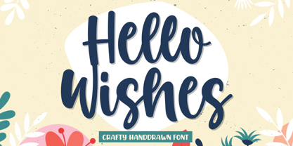 Produly Present Hello Wishes a Crafty Font Hello Wishes a Crafty Font make from handlettering ideas in typeface. This font includes full of Alphabetical glyphs, Numerals, and punctuation. This is so perfect for invitations, monograms, wedding, fashion, branding, label, handlettering or logotype.
 - Hello Mono One by Good Java Studio,
$18.00 Introducing Hello Mono with Layered Inline Hello Mono is a playfully display font make from handdrawn ideas in typeface. This font includes full of Alphabetical glyphs, Numerals, and punctuation. This is so perfect for invitations, monograms, wedding, fashion, branding, label, handdrawn or logotype.
 - Melvens by Ronny Studio,
$21.00 Melvens is an experimental combination font. includes 2 fonts that have very different styles and appearances, but make this font look unique. This font is perfect for your design needs such as poster design, logo design, branding, social media design, books, magazines, etc.
 - Sunset Trips by Maulana Creative,
$16.00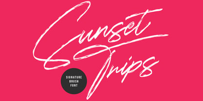 Give your designs an authentic handcrafted feel. Sunset Trips is perfectly suited for signatures, stationery, logos, typography quotes, magazines or book covers, website headers, clothing, branding, packaging design and more. This font includes: - Ligatures - Multilingual Support Thanks for use this font ~ Maulana
 - San Giuseppe by Mans Greback,
$59.00 San Giuseppe is a serif font with finesse and unique charm. Inspired by the romantic, ornate style of the Victorian era and the bold, captivating geometry of Art Deco, San Giuseppe is the perfect blend of neo-classic and vintage aesthetics. This serif font family is designed to infuse your work with an air of grace and refinement that is sure to leave a lasting impression. Ideal for wine labels, luxury branding and high-end packaging, San Giuseppe is an all-capitals font, featuring a stunning array of alternate characters that allow you to create a truly bespoke typographical experience. With its fine, intricate serifs and delicate, artistic letterforms, this font is a testament to the beauty and craftsmanship of yesteryear, created for a modern setting. The San Giuseppe font family consists of six high-quality styles: In addition to the Regular font, it is provided in both Bold and Light, and each of the weights as Italic. The font is built with advanced OpenType functionality and has a guaranteed top-notch quality, containing stylistic and contextual alternates, ligatures and more features; all to give you full control and customizability. It has extensive lingual support, covering all Latin-based languages, from Northern Europe to South Africa, from America to South-East Asia. It contains all characters and symbols you'll ever need, including all punctuation and numbers.
 - Coriander by Adobe,
$29.00Coriander is the work of British designer Timothy Donaldson. It started out as a doodle one afternoon Donaldson was bored and uninspired. He wrote the word Coriander" and was then distracted by the sun beating through an adjacent window. He taped the writing paper up on the window as a shade. He took it down a few months later, folded it up, and stuck it in his pocket. When the piece of paper fell out of his pocket a week later, he was inspied to draw the rest of the characters, two alphabets in his sketchbook. The final digitized characters were created by Donaldson using a Wacom tablet and later refined on the screen." - Plinth by Magpie Paper Works,
$42.00 Hand-drawn by an architectural renderer's daughter, Plinth is an craftsman-inspired font that leaves a strong and lasting impression. Both capital and lowercase letters have been designed for impacting display, but are also easily read in large blocks of text. Plinth includes multi-language support as well as a variety of OpenType features including decorative alternate caps, double-letter ligatures, complete fractions, currency figures, and 4 stylistic sets. Set One replaces commonly used titles (Mr., Mrs., Miss, Ms., and Dr.) with complementary hand-drawn versions. Set Two replaces 8 commonly used prepositions (and, the, to, to the, or, of, for and at) with complementary wordforms. Set Three seats counting contractions (1st, 2nd, 3rd, etc.) in their proper superscript place. And Set Four provides a fancy alternate of both ampersand and asterisk. Plinth is perfect for the designer, architect or orderly list-maker in all of us.
 - DB Journaling Boxes by Illustration Ink,
$3.00DoodleBat Journaling Boxes includes several journal squares, and includes several with inspirational words and phrases. - Yevida by insigne,
$21.99Yevida includes a number of advanced OpenType features, including alternates, ligatures, and old style figures. - Checklist by Fikryal,
$25.00 Checklist is a captivating and eccentric casual script font. Created with artistic flair and cheerfulness, this font has the ability to convey a relaxed and gentle feel in each character. With its uniqueness and beauty, Checklist is suitable for various design purposes that aim to showcase a personal touch and a casual impression. This font is perfect for design projects such as greeting cards, logo designs, invitations, merchandise, and other creative elements that require a casual script touch. Checklist comes with a wide range of characters, including uppercase and lowercase letters, as well as complete symbols and numbers. This gives you the flexibility to combine and express your creative ideas more freely. Get Checklist now and add a touch of cheerfulness and uniqueness to your designs. Use this font to create distinctive and appealing looks in every design project you undertake. Features : Checklist (OTF, TTF, WOFF) If you have any questions please don’t hesitate to contact me. Thank you best regards, Fikryal Studio
 - SF Nizar by Sultan Fonts,
$19.99 In July 2014, using my light pen, I completed the work in designing the font - Nizar, which was named in honor of the great poet Nizar Qabbani who inspired millions through poetry and prose. The font depends mainly on the characteristics of the traditional Ruq'ah handwriting, but the spirit of the letters tend to embrace the distinguished style that we knew of the poet in his hand-written poetry books. Due to the fact that I could not find all the alphabets in the great poet's handwriting, I adopted the method of measurement and prediction for structure of the missing letters, Which resulted in a new style of the Ruq'ah Typeface; a closer look at the font highlights the common characteristics of all the usual Ruq'ah writings, which are the height of the character "Alef" and spaces and formation on the line, the contextual replacement and convergence of when a letter meets another, closed and open letters, letters coming down from the baseline, and the forms of dots. That been said, hidden touches in the details of Nizar Typeface can be observed, the characters are all dependent on one pen stroke thickness, and are attracted to the baseline as much as possible when vertically and horizontally formed, and the distance between words and lines grows leading to creating both an aesthetic and typographical touch distinguishing this font from the conventional Ruq'ah – which can be found in some of my previous Ruq'ah projects. It is important to mention that after the completion of the Arabic characters and punctuation, I began drawing the Latin alphabets, punctuation and necessary symbols. I cannot fail to also note that the Arabic characters include the Persian, and the Urdu characters. This Typeface is fit to be used in lengthy texts, especially in literary works, artistic print, and diverse visual display, giving the design striking features, modernity and distinction. Sultan Mohammed Saeed
 - Cantarell - 100% free

- Kingthings Serifique Pro by CheapProFonts,
$10.00 This is what you get when you mix monoline rounded letters with some bracketed serifs and finish it off with a sprinkle of ornamental appendages. The result is very readable, rather original and quite charming. I have fixed some inconsistencies in serif designs across the weights, cleaned up the serif connections - and added a fourth weight. But I have kept all the wonky curves and slightly differing stroke thicknesses, as they are so integral to the charm. Kevin King says: "I guess all type designers at some point think 'Well, I'll just have a go at a standard text face...' There is a long story here somewhere, suffice it to say that I started with the thinnest version - typical. I wanted to make a standard serif text face - until I saw it in print and thought "Yuk! it looks like everything else!" - still does really but with twiddles and pooneys..." If you find the "twiddles & pooneys" too much you can tone them down with the OpenType Stylistic Alternate feature (which will make sure they don't appear on three consecutive letters) or remove them completely with the OpenType Swash feature. ALL fonts from CheapProFonts have very extensive language support: They contain some unusual diacritic letters (some of which are contained in the Latin Extended-B Unicode block) supporting: Cornish, Filipino (Tagalog), Guarani, Luxembourgian, Malagasy, Romanian, Ulithian and Welsh. They also contain all glyphs in the Latin Extended-A Unicode block (which among others cover the Central European and Baltic areas) supporting: Afrikaans, Belarusian (Lacinka), Bosnian, Catalan, Chichewa, Croatian, Czech, Dutch, Esperanto, Greenlandic, Hungarian, Kashubian, Kurdish (Kurmanji), Latvian, Lithuanian, Maltese, Maori, Polish, Saami (Inari), Saami (North), Serbian (latin), Slovak(ian), Slovene, Sorbian (Lower), Sorbian (Upper), Turkish and Turkmen. And they of course contain all the usual "western" glyphs supporting: Albanian, Basque, Breton, Chamorro, Danish, Estonian, Faroese, Finnish, French, Frisian, Galican, German, Icelandic, Indonesian, Irish (Gaelic), Italian, Northern Sotho, Norwegian, Occitan, Portuguese, Rhaeto-Romance, Sami (Lule), Sami (South), Scots (Gaelic), Spanish, Swedish, Tswana, Walloon and Yapese.
 - Rothorn by ROHH,
$35.00 Rothorn™ is a modern, minimalist geometric sans with its own personality derived for subtle design details, such as cut diagonal corners, pointed t, very small contrast and closed aperture. The letterforms give the typeface a lot of charisma, keeping a very minimal, clear and well balanced look at the same time. Its powerful and sharp shapes together with the variety of weights from Hairline to Black make it a perfect choice for headlines and branding. Generous x-height, careful spacing and distribution of weights give it a color and legibility great for long paragraphs of text. Rothorn is a geometric member of a large type system including such families as Montreux Grotesk (Swiss-style grotesk), Lütschine (narrow headline family) and Conthey (narrow headline unicase family). The Rothorn family consists of 10 weights with corresponding italic styles, giving a total of 20 styles. Italic styles were hand drawn to get sharp and fine letter shapes. It includes a 2-axis variable font letting you adjust the weight and italic slant to your exact needs. The family has extended latin language support, as well as broad number of OpenType features, such as, case sensitive forms, ligatures, contextual alternates, lining, oldstyle, tabular and circled figures, slashed zero, fractions, superscript and subscript, ordinals, currencies and symbols.
 - Lovingly Friends by My Creative Land,
$35.00 Introducing “Lovingly Friends” - a community of fonts that get along together as good as best friends do. All of the fonts - Sans, Serif, Notes, Script and Extras are packed with stylistic alternates and ligatures, you can combine them the way you like - they will look balanced together as well as individually. Script and Engraved fonts also have a Shadow style - to add more personality to your designs. You can download the Specimen & Instructions pdf here http://bit.ly/2x975US Since the Christmas is not that far away (time flies!), the Extras font has a set of Winter Holidays elements - so you could create and send your best wishes to your friends in no time. While all the fonts are fully unicode mapped so you can use them in ANY application, they are still best used in an OpenType aware application. If the application you are using doesn’t support OpenType features, you can use Character Map (Windows) or Font Book (Mac) to select the glyphs you need. Hope you enjoy the fonts as much as I enjoyed creating them! P.S. The flowers used in the preview images are from Liza Glanz 4 in 1 Elegant Watercolor Collection https://crmrkt.com/do4Wpb
 - Rostrum by Canada Type,
$24.95The Rostrum fonts are a revival and expansion of a type called Oleander, designed in 1938 by Julius Kirn for the Genzsch & Heyse foundry in Hamburg. Many of the original uppercase letters had some blackletter remnants tacked onto them, so in this digital version they were relegated to the Rostrum Two font, while more contemporary forms were designed for the Rostrum One font. Characters from both fonts are interchangeable via software programs' font menus and glyph palettes in the Postscript and True Type versions, while the OpenType version takes advantage of the Ligatures, Contextual Alternates and Stylistic Alternates features to perform character substitutions. Rostrum finds the middle ground between italic and brush script, which makes it quite usable in all-caps settings. Its majuscules have a very distinct curl that makes the typeface effect-ready and very appealing in packaging design. Plenty of alternates and ligatures are sprinkled throughout the character set. - Grange by Device,
$39.00 The Device interpretation of the classic “Grot” thick/thin sans style. Unlike the traditional models on which it is based, Grange takes a rational, consistent approach across wide range of weights and widths for contemporary use. The "Text" weights are designed for use at smaller sizes, and have more open character shapes and spacing for legibility. The font includes alternative curved and straighter versions of key characters, most obviously the lower-case ‘g' and capital ‘R', allowing the font to take on either a sharper or warmer, more playful appearance. These can be toggled on or off using the ‘Alts' feature in Illustrator, or ‘Stylistc Sets’ in Indesign. Contains proportional, lining and tabular numerals. Perfect for both headline and text.
