10,000 search results
(0.044 seconds)
- Oregon Dingbat by Mark Ihrig,
$10.00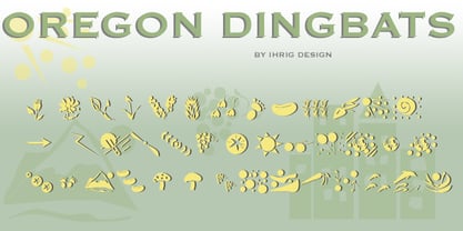 The Oregon Dingbat Font was created in 1995. It consists of various pictures including plants, footprints, a skyscraper and various forms of nature. The font has been published in Japan’s HyperLib magazine and used as artwork in a novel by Charlotte Vale Allen.
 - Blancmange by District,
$35.00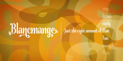 Humanist meets handwriting. Blancmange is a fun and informal face with brushy alternates for the flair when you need it. Swash mannerisms blend with structured letter shapes to give a range of personality. Includes all the requisite OpenType goodies in two weights.
 - Dash Grid by Gleb Guralnyk,
$13.00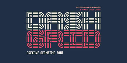 Hi there, introducing an abstract font named Dash Grid. At's a geometric display typeface made of square dashed blocks. Dash Grid font supports most of the european latin languages and includes ukrainian cyrillic alphabet (check out all available characters on the last screenshot).
 - Wavy Rounded BT by Bitstream,
$50.99Wavy Rounded is a stylized sans serif display typeface by Japanese designer Hajime Kawakami. Some of the characters possess quirky features that randomly create fun visual “waves”. There is a handful of alternate characters including an old style figure set. Catch the Wave. - LHF Spencer by Letterhead Fonts,
$42.00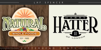 LHF Spencer exemplifies the quirkiness of late 1800's lettering. Uppercase is set below the baseline, adding a hand drawn look. Curved swashes juxtaposed with traditional thick and thin strokes make Spencer's letters stand out in a design. Includes 29 OpenType alternates.
 - TT Norms Pro Serif by TypeType,
$39.00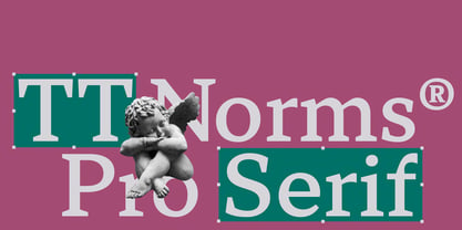 Introducing TT Norms® Pro Serif, version 1.100! The updated font now has new OpenType features and localization for the Serbian and Bulgarian languages. TT Norms® Pro Serif is a functional serif based on our studio's main bestseller—the versatile sans serif TT Norms® Pro. Together, they form an ideal font pair. Although these typefaces are made for each other, they can easily be used independently and paired with other fonts. So, TT Norms® Pro Serif is a self-sufficient and elegant serif, neutral at the same time. It is easy to recognize due to its gentle proportion dynamics, open aperture, slanted oval axis, and low stroke contrast. Another distinctive feature of this font is brutal serifs that adjust in length according to the weight of the font. As well as TT Norms Pro, there are Italic font styles in TT Norms® Pro Serif. However, for this serif, we have designed true italics instead of simple slanted font styles. Their key feature is the ability of the lowercase letterforms to change in reference to the roman font styles. They become more rounded, moving towards handwritten shapes. The nature of the italics turned out sharper than that of the roman font styles. It can be used to place accents that would attract attention without interfering with the process of reading. TT Norms® Pro Serif is capable of solving multiple design tasks. It is highly readable, which makes it convenient for small point sizes. This serif's application range is broad and diverse: it can be used for websites, printed materials, and packaging design. The font is well-suited for projects in the domains of culture, art, history, or literature and can be implemented into the designs of signs, posters, or premium products and services. TT Norms® Pro Serif, version 1.100, consists of: 24 font styles: 11 roman, 11 italic, and 2 variable fonts (one for the roman font styles and another—for italics); 1380 glyphs in each font style; 31 OpenType features, including options for localization.
 - Terrapin by Missy Meyer,
$12.00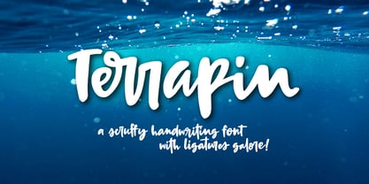 Introducing Terrapin! I named this after listening to a song called "Terrapin on a Tightrope." Considering the fact that a terrapin is a kind of turtle, it makes that song title seem pretty harrowing! This font has heavy roots in one of my favorite lettering styles. It's rough, scrappy, and likes to do its own thing. It has a full uppercase and lowercase set, numbers, punctuation, and lots of extended Latin characters for language support. It also includes alternate versions of 17 lowercase letters. Where Terrapin really shines is in the ligatures. I've written separate two- and three-letter combined forms for some of the most common letter combinations, and a few uncommon ones to boot. There are almost 100 ligatures in here, all PUA-encoded so everyone can access them (and also coded so if your software does automatic ligature replacement, they'll pop right in).
 - Wonderglast by IKIIKOWRK,
$19.00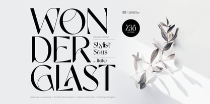 Proudly present Wonderglast - Stylist Sans, created by ikiiko. Wonderglast is a chic sans serif typeface with a seductively avant-garde vibe. This typeface effortlessly captures the spirit of elegance and sophistication thanks to its simple lines and contemporary design. Its modern, minimalist design lends an air of refinement to any project, making fashion-related projects the ideal fit for it. Wonderglast's letters have a sense of fluidity that makes them flow across the page and produce a pleasing visual effect. Its lack of serifs gives it a modern appearance, and its carefully constructed curves and proportionate design add to its allure. This typeface is perfect for an elegant logo, branding, fashion brand, luxury brand, layout magazine, beauty product, packaging product, quotes, or simply as a stylish text overlay to any background image. What's Included? Uppercase & Lowercase Numbers & Punctuation Ligature & Alternates Multilingual Support Works on PC & Mac
 - Mogguine Asturias by Delaga Studio,
$15.00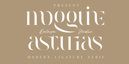 Mogguine Asturias is a modern serif with a lot of styles. A high-contrast version of the famous Didot look that has been synonymous with fashion for decades. This font has over 100 glyphs with multilingual fonts included. This font is modern and nostalgic and is perfect for logos, mastheads, and quotes. It pairs beautifully with minimal sans serif or light script fonts. Features: All caps Stylistic Alternates & Ligatures Numerals & Punctuation Accented characters Multiple Languages Supported PUA Encoded HOW TO ACCESS ALTERNATE CHARACTERS Open glyphs panel: In Adobe Photoshop go to Window - glyphs In Adobe Illustrator go to Type - glyphs Follow my shop for upcoming updates including additional glyphs and language support. And please message me if you want your language included or If there are any features or glyph requests, feel free to send me a message, I would like to update it.
 - Replay Pro by MAC Rhino Fonts,
$59.00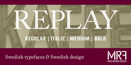 Replay is a pure hymn to the classic typeface Caslon originally made by William Caslon (1692–1766). The typeface that bears his name, was made between 1720 and 1726. In 1739 he founded the Caslon Foundry which later become a property of Stephenson, Blake & Co., but remained an independent foundry until 1937. The typeface have been popular ever since it was made and still stand proud as a classic text face. MRF made detailed research, including versions from Adobe and Justin Howes. The end result is leaning more towards the original. Some minor »imperfections« are also incorporated in order to make the typeface more lively and old fashioned.
 - Nima by Naghi Naghachian,
$64.00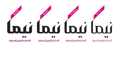 I dedicate this font family to Nima Yooshij (1896-1960), the great poet and innovator of Persian poetry. Nima is a new creation of Naghi Naghashian. Nima design fulfills the following needs: A. Explicitly crafted for use in electronic media fulfills the demands of electronic communication. B. Suitability for multiple applications. Gives the widest potential acceptability. C. Extreme legibility not only in small sizes, but also when the type is filtered or skewed, e.g., in Photoshop or Illustrator. Nima's simplified forms may be artificial obliqued in InDesign or Illustrator, without any loss in quality for the effected text. D. An attractive typographic image. Nima was developed for multiple languages and writing conventions. Nima supports Arabic, Persian and Urdu. It also includes proportional and tabular numerals for the supported languages. E. The highest degree of calligraphic grace and the clarity of geometric typography. This typeface offers a fine balance between calligraphic tradition and the Roman aesthetic common in Latin typography.
 - Front Desk by Aah Yes,
$12.00Front Desk is designed to be easily readable, its increased legibility coming from the slightly enlarged lower case letters (a greater x-height) which make it easy on the eye. Also it is slightly slanted (but a lot less than a normal italic angle) to give it a more informal and modern look than a perfectly upright font would be, which is also intended to contribute extra dynamism while reading. Five available weights give adequate variation, and there are some Condensed and Expanded varieties in the complete set. A primary feature of this font is that the serif bases and tops are not indented or concave, which gives clear straight edges to the serifs, and the removal of this complexity adds to the clean lines and crispness of the font. The package contains both OTF and TTF versions - install either OTF or TTF, not both versions of a font on the same machine. - Envisage by Type Innovations,
$39.00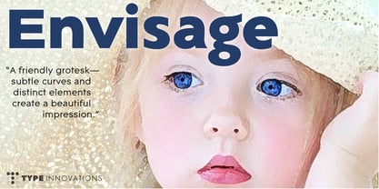 Envisage is a distinctive new grotesk design by Alex Kaczun. Characterized by distinct details throughout as particularly visable in the capitals A, H and N. There is a more organic and natural feel to the overall design as in the sutle curves introduced in many of the lower case letter forms, specifically the a, h, m and n. And, especially evident in the warm overall curves within the l‘case g. In addition, incorporating flexibility in form and function, Alex has also included alternate letter forms in this OpenType font; allowing the graphic designer a choice in the overall look and feel. Envisage has impact and zeal. It's a wonderful choice for a distinctively unique headline treatment, and works equally well in text in a large range of point sizes. Use this friendlier sans serif as an alternate to Futura and Gill Sans. We think you will like what you see. The large Pro font character set supports most Central European and many Eastern European languages.
 - DeDisplay by Ingo,
$24.99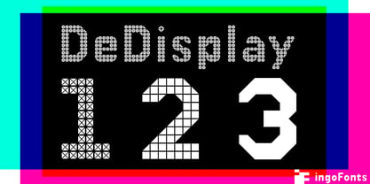 A type designed in a grid, like on display panels Type is not only printed. There were always and still are a number of forms of type versions which function completely differently. Even very early in the history of script there were attempts to combine a few single elements into the diverse forms of individual characters and also efforts to construct the forms of letters within a geometric grid system. The “instructions” of Albrecht Dürer are probably most well-known. But although designers of past centuries assumed the ideal to basically be an artist’s handwritten script, the idea which developed in the course of mechanization was to “build” characters in a building block system only by stringing together one basic element — the so-called grid type was discovered, represented most commonly today by »pixel types.« But even before computers, there were display systems which presented types with the help of a mechanical grid display, like the display panels in public transportation (bus, train) or at airports and train stations. In a streetcar, I met up with a modern variation of this display which reveals the name of each tram stop as it is approached. This system was based on a customary coarse square grid, but the individual squares were also divided again diagonally in four triangles. In this way it is possible to display slants and to simulate round forms more accurately as with only squares. The displayed characters still aren’t comparable to a decent typeface — on the contrary, the lower case letters are surprisingly ugly — but they form a much more legible type than that of ordinary [quadrate] grid types. DeDisplay from ingoFonts is this kind of type, constructed from tiny triangles which are in turn grouped in small squares. The stem widths are formed by two squares; the height of upper case characters is 10, the x-height 7 squares. DeDisplay is available in three versions: DeDisplay 1 is the complex original with spaces between the triangles, DeDisplay 2 forgoes dividing the triangles and thus appears somewhat darker or “bold,” and DeDisplay 3 is to some extent the “black” and doesn’t even include spaces between the individual squares.
 - Rummage Sale by Ingrimayne Type,
$11.95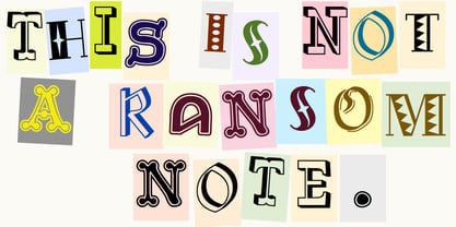 Several years ago I was asked to do a sign for a rummage sale. To print the words RUMMAGE SALE, I took letters from some of the ornate fonts I was working on at the time. I liked the results, so made them into a font. Fonts from which the letters come include HippityDippity, Tuskcandy, Letunical, OakPark, WyomingStrudel, NeuAltisch, WyomingMacroni, WyomingPastad, and Rundigsburg. The original typeface had two variants of each letter, one on the upper-case keys and the other on the lower-case keys. The name of the original font, RummageSaleOne, acknowledged that a greater selection of letters was desirable but it was only with the upgrade of 2020 that the greater selection was added. The additional variants were added in two ways: as a separate typeface (RummageSale-Two) and also as OpenType stylistic alternatives.
 - Czesko by Sharkshock,
$125.00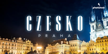 Tall, dark, and handsome; Czesko is a fancy display serif with a timeless, yet elegant look. The repetition of key features ensures contrast in line weight to provide high visibility at smaller sizes. Vertical emphasis and tight spacing make it a good choice for areas with limited workspace. Try all caps for a luxury logo or branding in the fashion industry. Other suggested uses include magazines or movie posters. Basic Latin, extended Latin, diacritics, Cyrillic, punctuation, fractions, ligatures, and kerning are all included.
 - Midan by Linotype,
$187.99Midan, designed in 2005 by Kameel Hawa, director of Almohtaraf Assaudi, is a modern Arabic typeface based on simplified Naskh with a slightly modulated stroke treatment. It is suited for text settings, especially in brochures and magazines. It is characterized by a large body height and open counters and as such can be used in small sizes. The font includes a matching Latin design and support for Arabic, Persian, and Urdu. It also includes proportional and tabular numerals for the supported languages. - Chennai by insigne,
$24.99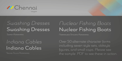 Updated in 2009, Chennai has new weights and OpenType features. Chennai is a simplified sans-serif with a full complement of OpenType alternates. The typeface is rounded, slightly extended and geometric. Over fifty OpenType alternate characters are available, including swashed lower forms, traditional caps and a traditionally formed lowercase. Chennai also includes seven style sets, oldstyle figures, and small caps. Please see the sample PDF to see these in action. Use Chennai whenever you need a contemporary and versatile sans serif.
 - Tight Spot BB by Blambot,
$12.00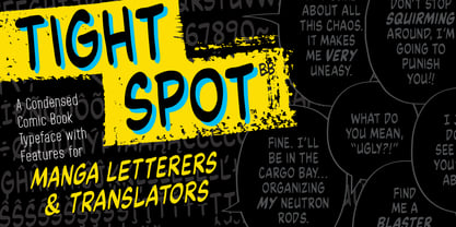 Based on the feedback provided by manga letterers and translators, Blambot's new comic book dialogue font meets their specific needs for condensed type, unique manga-related glyphs like stars, wavy dashes, and hearts. In addition, Blambot has included contextual alternates to cycle through six sets of alphabets, three sets of numerals, and various punctuation for a more organic, "hand lettered" look. The set includes for fonts: Regular, Italic, Bold, and Bold Italic, each with extensive diacritical letters for multi-language support.
 - Esm by Harvester Type,
$15.00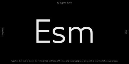 Esm is a font that tries to convey the reinterpreted aesthetics of German and Swiss typography along with a new trend of unusual shapes. The font has a different approach to the internal elements of letters-ovals that have a straight line on one side, drawing the glyph "a" example. I wanted to diversify the font with different styles to avoid the effect of triviality of machine text. The font has a large language support and contains 626 characters. And a large number of special characters. The font family is universal. It is suitable for large text, magazines, posters, logos, and headlines. Thanks to 6 different font styles and customized kerning, the font will look just fine. The thin print is incredibly elegant. The regular is great for a large amount of text. And bold for posters and headlines. Named by the French feminine name Esm. The name itself has a meaning: dear and beloved. I hope my font will convey these feelings.
 - Lovely Buttering Script by Lucky Type,
$14.00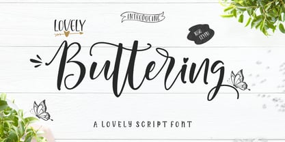 Allow me to introduce the Lovely Buttering script, which combines elements of informal, romantic, sweet, beautiful design, and hand-drawn typography design elements. Lovely Buttering script has 1000+ glyphs and 500+ alternative characters, including various language support. You can use this font for your work very easily because there are many features in it. Contains a complete set of upper and lower case letters, punctuation, numbers, and multilingual support. This font also includes several ligatures, alternative stylistic sets for those of you who have software that can work OpenType (Corel Draw / Photoshop / Illustrator / InDesign). Need help? If you need help or advice, please contact me through e-mail. Thank you for your purchase!
 - Monteya by Skinny Type,
$19.99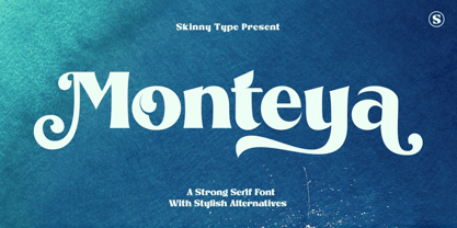 Introducing Monteya - a modern serif with vintage charm, fashion look and retro yet modern style. Work fast using integrated features. Just add PLUS (+) after any letter and get alternate instantly. This feature works on most applications (Canva, Templett, Corjl and others) Monteya Regular: Opentype Serif font with clean shapes and accurate kerning. It includes ligatures and alternates with total amount 570 PUA encoded glyphs. Monteya Draft: Modern Serif with chunky imperfect edges and shabby appearance. This font is a strict copy of everything from regular version including glyphs names, kerning and ligatures, so you are worry-free to change style on the go. Alternates appears automatically when you type plus after any letter or even ligature.
 - Blaster by Mozatype,
$19.00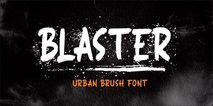 BLASTER is a casual, fun display font, created by using a brush pen. It has an urban and trendy feel and it will most definitely fit a wide range of designs. This font is perfect for brand announcements, packaging, quotes, branding, advertisements, blogs, logos, invitations, and more! This font is PUA encoded which means you can access all of the stunning glyphs and swashes with ease! It also features a wealth of special features including alternate glyphs and ligatures. What’s Included : – Works on PC & Mac – Easy to use ( Installations ) – Easy Convert to webfont – Compabilty Windows, Apple, Linux, Cricut, Silhouette and Other cutting machines Thanks for downloading, and I hope you enjoy it!
 - Volaroid by Din Studio,
$22.00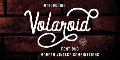 Introducing Volaroid font duo , simply font with modern and vintage style combination. This will bring a modern and vintage atmosphere together. Minimalist design for your best project. Volaroid font best use for logotype, branding, and t-shirt printing. Whats included? : - volaroid script - volaroid sans Volaroid feature : - Swash (A-Z,a-z) - SS 1 (A-Z,a-z) - SS 2 (a-z) - SS 3 (a-z) - SS 4 (a-z) - S.Alt 1&2 (b,d,h,k,l,t) - PUA encoded - Multilingual Support. --- Notes = Every swash, stylishtic set and alternates have include in Volaroid Script (ttf.otf,woff) I hope this font can meet your design needs. Feel free to contact me in the message or direct email donis4design@gmail.com.
 - Creative Vintage by BlessedPrint,
$20.00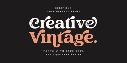 Introducing Creative Vintage - a modern serif with vintage charm, fashion look and retro yet modern style. Work fast using integrated features. Just add PLUS (+) after any letter and get alternate instantly. This feature works on most applications (Canva, Templett, Corjl and others) Creative Vintage Regular: Opentype Serif font with clean shapes and accurate kerning. It includes ligatures and alternates with total amount 669 PUA encoded glyphs. Creative Vintage Draft: Modern Serif with chunky imperfect edges and shabby appearance. This font is a strict copy of everything from regular version including glyphs names, kerning and ligatures, so you are worry-free to change style on the go. Alternates appears automatically when you type plus after any letter or even ligature.
 - Redsema by Twinletter,
$18.00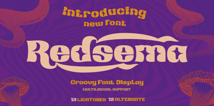 Looking for a unique, stylish, and fun font for your next project? Look no further than this one. Meet Redsema groovy font. With an anatomical shape between thin and thick lines, beautiful from any angle. It also features alternative lettering, ligatures, and decorative elements to add a unique flair to your work. Make the most of your designs using this font today! What’s Included : Standard glyphs Iso Latin 1 Simple installations We highly recommend using a program that supports OpenType features and Glyphs panels like many Adobe apps and Corel Draw, so you can see and access all Glyph variations. PUA Encoded Characters – Fully accessible without additional design software. Fonts include Multilingual support
 - MMC Insignia by MMC-TypEngine,
$30.00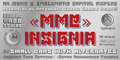 MMC Insignia, is an Iconic & Emblematic Neogothic Geometric Capitals Display… Assembled by Trivial Squares and Diagonals Symbols Pattern from a puzzled grid Aftermath!! Includes Stylistic Alternates!! +Extra Monospaced Figures. In 22 styles, with Obliques, both for single display and layer Typesetting, plus OpenType Features & Bonus Blocks Fonts! MMC Insignia is a Small Caps Typeface, which default lowercases character set is included in the Pro family, its cursive version, apart from it, has also Exclusive Stylistic Alternates… Its atmosphere stands by on both Corporative to Decorative, Modern, Fashion, Federalist, Bohemian, Romantic, Ludic, Treasured Look, Etc. This Display font-family is the result of the repeated applications of this unique infamous Icon or Symbol, of two counterpointed triangles, implicit as hourglasses, in order to compose an innovative and unprecedented typographic pattern and modulation concept through the letterforms, in an extremely Geometric style. The Graphic Sign used throughout this type, is a remarkable trend used already in Logos of different businesses, whose most famous case refers to a famous International Bank, which doesn’t need to be mentioned, as it is instantly associated! This characteristic innovation was the main motivation while creating this type. Usage Suggestions: Type Fancy Titling texts, Display Remarkable Logos, Branding Projects, Labels, Emblems, Fashion Patterns, or in everything Noble and designed for Excellence as a type of Insignia, or distinguished marks and attributes of Royalty and Power!! That’s also forwardly, the reason why it was named MMC Insignia… TIPS: 1-Combine styles into innumerous possibilities of Chromatic Typesetting, by ‘central pasting’ layers… You may dislocate layers for improvisations! 2-USE BLOCK “FREE-STYLES” 1 & 2 also to add default 3D! Change 3D directions by switching Block 1 to Block 2, that way you can Zig-Zag words and lines. *Also shift the block layer up to bottom limit, it makes the 3D direction turn upside down. Greetings! André, MMC-TypEngine.
 - HaManga Irregular by Linotype,
$29.99This unusual font was designed by Alessio Leonardi, who plays with the difference between content and impression. At first glance the font looks almost like a row of pictograms or Asiatic characters. The forms become Arabic letters when the characters are set together to form words. HaManga Irregular is a good font to use when the reader is supposed to contemplate not only the text but the form of what he or she sees. - Fargo Tuscan by Greater Albion Typefounders,
$20.00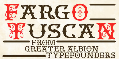 Fargo Tuscan is the first of seven typefaces exploring the decorative possibilities of the Tuscan letter form, all of which are releasing in 2017. It’s the most European of the seven- it’s a Mid-Victorian inspired display face which would have been (and is) at home on either side of the Atlantic, unlike some of the others in this batch of Tuscan faces which are distinctly ‘trans-Atlantic’ (we know, that depends on your point of view but we are Greater ALBION Typefounders after all) in flavour. Fargo Tuscan is replete with decorative features, including Swash Capitals, alternate numeric forms and stylistic alternates ideal for the beginning and ending of words. Have some mid-Victorian mid-Atlantic fun with your next design project!
 - Gernsheim by Brenners Template,
$19.00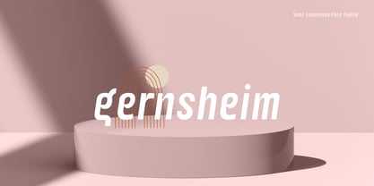 Gernsheim is a semi condensed display sans serif font family. This font family has been created for use in headlines and logo display fitted on showcase screen. 9 weights and 18 font styles make up the initial release. To increase the adoption of a wide range of display fonts, the individual glyphs' handle fluctuations were subtly applied. The compromise of disproportion between straight lines and curves improves glyphs autonomy and relieves tension. And by applying rounded corner effects to each style, it presents the reader with softness and comfort. It is designed so that the rebellious disproportion created by heavy styles transition to flat and classy tenderness as the thin style approaches. Try the uniqueness and excitement of individual styles for yourself
 - New Old English by K-Type,
$20.00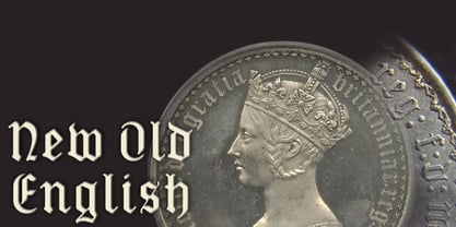 New Old English was prompted by two Victorian coins, the mid nineteenth century gothic crown and gothic florin, which featured a gothic script lowercase with quite modern looking, short ascenders and descenders enabling it to fit snugly around the queen’s head or heraldic motif. With thicker hairline strokes than normal Old English, a less sharp, warmer feel than lettering scripted with a pen, and circular instead of rhombic punctuation, this font is an attempt to capture the round-cornered softness of the die-struck lowercase blackletter. To increase harmony and homogeneity between the cases, the uppercase is narrower and simpler than is customary, without the excessive width or antiquated flamboyance of the traditional blackletter. It might even allow text set in capitals to look acceptable.
 - Heltar by The Northern Block,
$19.30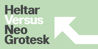 A modern neo-grotesque typeface. Having grown up in Sheffield and been completely immersed in the work of The Designers Republic I became very drawn to their treatment of Helvetica, especially the close tracking of the letter space. This visual investigation led me to the study of the font Hass Unica, a so called improvement to Helvetica. In order not to replicate and become a clone of Unica I redrew all the characters from scratch improving optical appearance, developing subtle corrections and reshaping individual letterforms. The result is a remixed neo-grotesque font that has strong general optical balance with great rhythm under close tracking. Details include 10 weights, an extended European character set, true italic, manually edited kerning and Euro symbol.
 - 1925 My Toy Print Deluxe Pro by GLC,
$42.00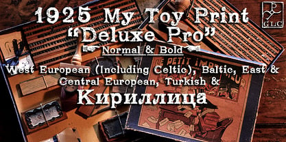 This family was created inspired from two French (one so common and a very rare large one) "toy print" boxes, named Le petit imprimeur, with rubber stamp characters from the 1920's. The big difference from our 1920 My Toy print is that this font is complete, with upper and lower cases, accented, complete punctuation and some symbols. The doubly of each usual character in each style (A-Z/a-z and numerals) allow to give a rich and variously uneven appearance, looking like the results of the real use of those old rubber stamps, with bad kernings and alignement. The font is containing West (including Celtic), Central, East European, Turkish and Cyrillic characters. The bold style may be used as a reinforcement, mixed with normal style without disadvantage, allowing finally four choices for each usual letter... The original size is 6mm (about 17 pts).
 - Art Deco Arabic by Naghi Naghachian,
$102.00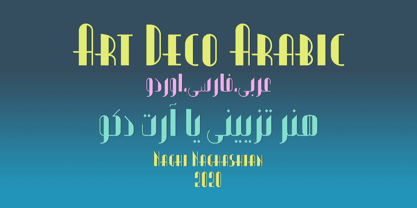 Art Deco Arabic is a sans-serif Headline font. Designed by Naghi Naghashian as a sigle weight. Art Deco Arabic is reminiscence of Art Deco style, at the beginning of 20th century. The Latin part is a new design inspired from Art Deco style. It is extremely legible even in very small size. This font is a contribution to modernisation the Arabic typography, gives the font design of Arabic letters real typographic arrangement und provides more typographic flexibility. Art Deco Arabic supports Arabic, Persian ( Farsi ), Urdu and Latin.It also includes proportional and tabular numerals for the supported languages. Art Deco Arabic design fulfills the following needs: A Explicitly crafted for use in electronic media fulfils the demands of electronic communication. B Suitability for multiple applications. Gives the widest potential acceptability. C Extreme legibility not only in small sizes, but also when the type is filtered or skewed, e.g., in Photoshop, InDesgine or Illustrator. ArtDecoArabic’s simplified forms may be artificial obliqued in InDesign or Illustrator, without any loss in quality for the effected text. D An attractive typographic image. Art Deco Arabic was developed for multiple languages and writing conventions. Art Deco Arabic supports Arabic, Persian,Urdu and Latin. It also includes proportional and tabular numerals for the supported languages. E The highest degree of calligraphic grace and the clarity of geometric typography.
 - Colamine by Gatype,
$12.00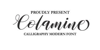 Introducing Colamine, a modern, free-flowing, hand-drawn font. Colamine has THREE COMPLETE CHARACTER SETS including uppercase and lowercase letters with full initial and final swash sets, binders, and a Stylistic Set. Characters were hand-drawn and then carefully digitized to create this modern script. Use character sets as they are, or mix them up and use additional options to create authentic-looking handwritten masterpieces. There's one amazing set of capitals that's perfect for monograms and another set of capitals that looks more like block letters. Check out the preview to see what you can do. This script is perfect for wedding suites, social media, blogs, titles, magazine layouts, monograms, businesses and anywhere else you need a script that looks modern and free flowing. To access alternative glyphs, you'll need a program that supports OpenType features such as Adobe Illustrator CS, Adobe Photoshop CC, Adobe Indesign, and Corel Draw. Thank you Gatype Adobe Photoshop : https://helpx.adobe.com/photoshop/using/glyph-panel.html Adobe Illustrator : https://helpx.adobe.com/illustrator/using/special-characters.html
 - Bu Global by Butlerfontforge,
$18.00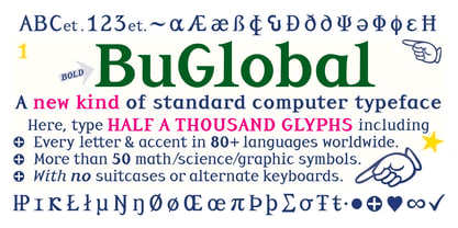 While throned before your keys, under your drumming fingers awaits the most astounding standard computer typeface ever devised: BuGlobal. In addition to all the usual alphanumeric characters and symbols, this lone font lets you type more than 400 accented letters appearing in more than 80 English-variant languages worldwide, 70 common math and science symbols, and dozens of other useful characters —more than half a thousand all told— all within the digital parameters of one standard computer typeface, without needing any alternate keyboards or other clumsy digital luggage. Here is a sample: You can add any accent appearing in more than 80 English-variant languages used around the world to any letter appearing in all these languages simply by typing ANY letter then the accent. This includes more than 400 diacritic-laden letters in all —without needing to remember several keystrokes to type any of these letters as a few of them appear in standard computer typefaces. You can type more than 50 math/science symbols that do not appear in standard computer typefaces. These new symbols include several kinds of arrows plus constants, centerlines, dimensions, and graphs and scales that when retyped create continuous scales and graphs. Common symbols such as ballot boxes, rating stars, checkboxes, hearts, fancy fleurons, and similar motifs that do not appear in standard computer typefaces. Dozens of flashy arabesques like ========= [in BuGlobal these equal signs are kerned together so when you type them you create a continuous double line]. In this typeface more than 30 symbols that never appear twice in a row are kerned together so when you continuously type them you create all kinds of flashy arabesques that will make your typing more attractive. No other standard compute typeface allows you to do this. As for Beauty, BuGlobal’s characters are designed according to several axioms of ocular perception until each profile is as iconically simple as Shaker furniture. These axioms make BuGlobal’s letters easier to read compared to other typefaces, and a few of them are: Each letter should look much like the others but for one defining detail. The letters should be as similarly wide as possible. The letters’ midbars should be the same height and thickness. The higher the lowercase letters are compared to capital letters, the more legible and easily readable are their texts. BuGlobal has a typeface user’s guide, titled A Lovely Face, in which a description of each ocular axiom compares BuGlobal with Baskerville, Georgia, Palatino, and other commonly-used standard computer typefaces so you can quickly see why the other typefaces are inferior. You can download a pdf file of this typeface user’s guide, for free, at BuGlobal’s website, butlerfontforge.com, at any time so you can learn all about BuGlobal’s many amazingly new features before possibly buying it. BuGlobal’s plain letters are perfect for texts, its italics are gracefully emphatic, its bolds are ideal for titles and headers, and its arabesques are a fancy way to make your texts look dressy —all of which will add more shimmer to your semantic plumage. One good typeface is more useful than an infinity of poor ones. Robert Bringhurst
 - Blackstripe by Mirror Types,
$15.00This font was inspired by the bricks of my wall, I stared at them all the time thinking, wouldnt be great if fonts live in cooperation with bricks, and then, it came to my mind…A font family that shows naked bricks, like it is RIGHT on the middle of design process. The main features are the informal and wired look that make it worthwhile for bands and informal invitations, flyers, for concerts or infantile designs. - Shelby by Laura Worthington,
$25.00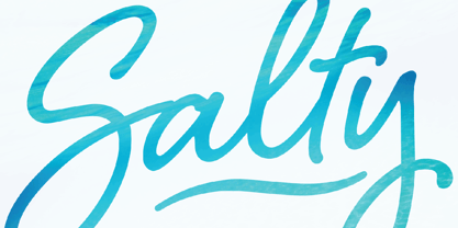 Shelby is friendly and casual; a monoline, semi-connected script typeface based on hand lettering. It has the natural appearance of handwriting, yet can be used to create appealing headlines, logos and eye catching call-outs. Shelby features ligatures, stylistic and contextual alternates, and 20 ornaments designed to complement its handwritten look. See what’s included! http://bit.ly/2bGS9S1 *NOTE* Basic versions DO NOT include swashes, alternates or ornaments These fonts have been specially coded for access of all the swashes, alternates and ornaments without the need for professional design software! Info and instructions here: http://lauraworthingtontype.com/faqs/
 - Brokman by The Northern Block,
$32.00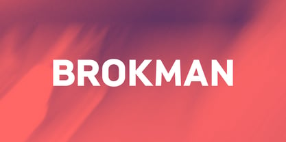 Brokman is a contemporary sans serif designed to bring clarity and originality to brand related projects. The open apertures and large x-height help provide a fresh aesthetic with an easy, fluid texture across design layouts. While it's squarish proportions are balanced with subtle rounding achieving a carefully modulated and textured feel in longer text scenarios. Its weight-range allows great flexibility, making the typefaces suitable for a variety of media applications including apps, brand identities, broadcast, gaming and the web. Details include 430 characters, seven weights each with true italics, manually edited kerning and Opentype features.
 - Blom by The Northern Block,
$29.95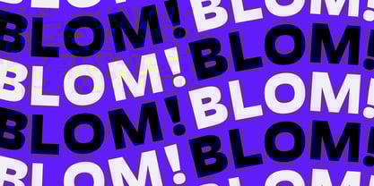 Blom is a humanist sans with subtle squarish character in reverse contrast. The combination of heavy horizontals and modern geometry give the typeface a unique visual aesthetic whilst making small text perfectly readable. Blom bucks the trend of conventional letterforms in favour of a versatile typeface with bags of originality, that is both inventive in style yet completely functional in a wide range of intended uses. Details include 463 characters, six weights with matching italics and five variations of numerals. Opentype features include inferiors, superiors, fractions, slashed zeros, case-sensitive forms, ligatures and language support covering Western, South and Central Europe.