10,000 search results
(0.039 seconds)
- ZT Grafton by Zeune Type Foundry,
$30.00 ZT Grafton is a neo-grotesque typeface based on geometric shapes with contemporary, friendly, and strong emotion. ZT Grafton was built from scratch to be calm, smooth, and clean, while subtle humanist influences add warmth to this typeface. It's available in 8 weights and includes the exciting variable font format.
 - Stringlabs by Stringlabs Creative Studio,
$25.00 StringLabs is a cute and modern script font. It maintains its classy calligraphic influences while feeling contemporary and fresh. This font is PUA encoded which means you can access all of the amazing glyphs and swashes with ease! It also features a wealth of special features including alternate glyphs and ligatures.
 - Joe College NF by Nick's Fonts,
$10.00Go, team, go! Fight, team, fight! Win, team, win! Here’s a family of typefaces based on typical athletic jersey lettering, in sans and serif styles, with inlines and an extrabold Letter Sweater treatment. Both versions of this font include the complete Unicode Latin 1252 and Central European 1250 character sets. - Aurelie by DKB,
$6.00The font 'Aurélie' is a decorative yet contemporary writing font by Daniel Keith Bale. Applications for this font may include titles, letterheads, dialogue, written works and captions. With a thin, sleek and sexy appearance, 'Aurélie' will prove to be a useful asset to any graphic or web designer or writing enthusiast. - Gamerock by Din Studio,
$29.00 Gamerock is a classic sport font. Made for any professional project especially that related to the sports. Beside that, this font can be used for printing, branding and quotes. Includes: Gamerock (OTF) Features: Alternates PUA Encoded Multilingual Support Numerals and Punctuation Thank you for downloading premium fonts from Din Studio
 - Two Lines Loop by Kaer,
$21.00 Alphabet set made of two white parallel lines. They are looked like infinite looped icons. Ideal for dynamic app, minimalism design, sports identity, technology adv. What's included? Uppercase (lowercase are the same) Numbers Symbols Punctuation Multilingual support Please feel free to request any help you need: kaer.pro@gmail.com Best, Roman.
 - Precious Memories by Epiclinez,
$18.00 Precious Memories is a cool-looking display font. Bold and a little bit quirky, this font is the perfect fit for all of your logos, branding, social media, and crafty DIY projects. So what's included : Basic Latin A-Z & a-z Numbers, symbols, and punctuations Accented Characters : ÀÁÂÃÄÅÆÇÈÉÊËÌÍÎÏÑÒÓÔÕÖØŒŠÙÚÛÜŸÝŽàáâãäåæçèéêëìíîïñòóôõöøœšùúûüýÿžß Thank you
 - Pink Blue by Rometheme,
$25.00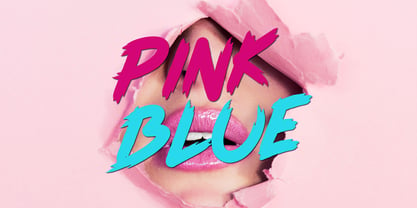 Pink Blue is a modern handdrawn font, this font looks elegant, classy, readable, stylish, catchy and easy to use. Pink Blue Font is the best choice for your professional design projects, including : quotes, album cover, business card, logo, branding, magazines, social media, advertisements, product designs, and many other design project.
 - Everleigh by Gleb Guralnyk,
$14.00 Everleigh is an elegant thin typeface inspired by antique old school fonts. It includes lots of ligatures and stylistic alternates helps to create an authentique and original lettering compositions. Also this font has multilingual support. Check out all available characters on the previews. Thank you and have a nice day!
 - Neutraface Slab Text by House Industries,
$33.00 From fine print and red ink in corporate annual reports to huge three dimensional signage, Neutraface has become the definitive designers’ workhorse. Now this geometric juggernaut boasts even more font firepower with the addition of the Neutraface Slab family. Neutraface Slab features five display weights, four text weights with italics plus a unique stencil style that work together like a typographic symphony or can stand alone like accomplished soloists. Just like its sans-serif counterparts, Neutra Slab Text includes small caps, seven figure styles and a host of other sophisticated OpenType features that have been integrated in a single seamless package. The complementary display weights afford an uncompromising statement that can range from thin and delicate to bold and bombastic. FEATURES: MORE ALTS: Neutraface Slab comes with several alternate characters, accessed through either OpenType stylistic sets or through the Stylistic Alternates feature. TITLING ALTERNATES: The distinctive lower crossbars of the original Neutraface are included in Neutraface Slab as the Titling Alternates OpenType feature. TEXT FIGURES: All variations of Neutraface Slab Text feature seven figure styles. Included are text figures for use in running text, lining figures for use with uppercase forms and small caps figures. Each of these styles is supplemented with tabular figures for use in columnar settings. Plus, superscript and subscript figures are included for use in fractions, footnotes, etc. NEUTRAFACE SLAB CREDITS: Typeface Design: Christian Schwartz, Kai Bernau, Susana Carvalho Typeface Production: Ben Kiel, Hannes Famira Typeface Direction: Christian Schwartz, Andy Cruz, Ken Barber Like all good subversives, House Industries hides in plain sight while amplifying the look, feel and style of the world’s most interesting brands, products and people. Based in Delaware, visually influencing the world.
 - Neutraface Slab Display by House Industries,
$33.00 From fine print and red ink in corporate annual reports to huge three dimensional signage, Neutraface has become the definitive designers’ workhorse. Now this geometric juggernaut boasts even more font firepower with the addition of the Neutraface Slab family. Neutraface Slab features five display weights, four text weights with italics plus a unique stencil style that work together like a typographic symphony or can stand alone like accomplished soloists. Just like its sans-serif counterparts, Neutra Slab Text includes small caps, seven figure styles and a host of other sophisticated OpenType features that have been integrated in a single seamless package. The complementary display weights afford an uncompromising statement that can range from thin and delicate to bold and bombastic. FEATURES: MORE ALTS: Neutraface Slab comes with several alternate characters, accessed through either OpenType stylistic sets or through the Stylistic Alternates feature. TITLING ALTERNATES: The distinctive lower crossbars of the original Neutraface are included in Neutraface Slab as the Titling Alternates OpenType feature. TEXT FIGURES: All variations of Neutraface Slab Text feature seven figure styles. Included are text figures for use in running text, lining figures for use with uppercase forms and small caps figures. Each of these styles is supplemented with tabular figures for use in columnar settings. Plus, superscript and subscript figures are included for use in fractions, footnotes, etc. NEUTRAFACE SLAB CREDITS: Typeface Design: Christian Schwartz, Kai Bernau, Susana Carvalho Typeface Production: Ben Kiel, Hannes Famira Typeface Direction: Christian Schwartz, Andy Cruz, Ken Barber Like all good subversives, House Industries hides in plain sight while amplifying the look, feel and style of the world’s most interesting brands, products and people. Based in Delaware, visually influencing the world.
 - Twogether Sans by Sudtipos,
$39.00 Twogether Sans builds upon the achievements of Twogether Rounded, creating a more comprehensive system and positioning itself as a suitable choice for general text usage. By removing the rounded elements from each character, Twogether Sans gains increased flexibility and a broader range of possibilities for different types of projects. It retains the essential characteristics of its counterpart, such as proportions, x-height, small caps, ligatures, numerals, and the construction of the italic variant. This version also introduces distinctive alternate characters for "T," "Y," "y," and "a." However, in this case, the position of the "a" with an old-style eye has been adjusted to enhance legibility in this context. These details maintain consistency with the Rounded version while reinforcing Twogether Sans' unique personality. It remains an excellent choice for branding, editorial design, promotional materials, packaging, and digital applications.
 - Futura by Linotype,
$42.99 First presented by the Bauer Type Foundry in 1928, Futura is commonly considered the major typeface development to come out of the Constructivist orientation of the Bauhaus movement in Germany. Paul Renner (type designer, painter, author and teacher) sketched the original drawings and based them loosely on the simple forms of circle, triangle and square. The design office at Bauer assisted him in turning these geometric forms into a sturdy, functioning type family, and over time, Renner made changes to make the Futura fonts even more legible. Futura’s long ascenders and descenders benefit from generous line spacing. The range of weights and styles make it a versatile family. Futura is timelessly modern; in 1928 it was striking, tasteful, radical — and today it continues to be a popular typographic choice to express strength, elegance, and conceptual clarity. NEW: the new Futura W1G versions features a Pan-European character set for international communications. The W1G character set supports almost all the popular languages/writing systems in western, eastern, and central Europe based on the Latin alphabet including Vietnamese, and also several based on Cyrillic and Greek alphabets Futura® font field guide including best practices, font pairings and alternatives.
 - Neue Comic by Unio Creative Solutions,
$4.00 Meet "Neue Comic," a rounded typeface making a bold entrance into the design scene, aiming to redefine the delicate balance between playfulness and practicality in typography. Crafted with the recognition that rounded aesthetics enhance information retention and legibility, Neue Comic delivers a distinct, rhythmic design that breaks through traditional design boundaries. Reflecting on the divisive legacy of Comic Sans, we pondered: Is it really deserving of all the hate? Comic Sans entered the typography scene in 1994 with the noble goal of injecting fun into casual contexts. However, it fell victim to misuse and eventually succumbed to an undeserved sense of imposter syndrome. This prompted us to create a typeface that transcends these limitations. Inspired by the non-connecting script of comic book lettering, Neue Comic seeks to recapture the charm of the '90s while acknowledging the genuine intention behind Comic Sans—offering accessibility and friendliness. Avoiding the pitfalls of overuse, Neue Comic presents itself with seven weights and corresponding obliques, showcasing the flexibility of a variable version. Specifications: - Files included: Neue Comic, including obliques - Multi-language support (Central, Eastern, Western European languages) - OpenType Features (Superscript and Subscript Numerals, Fractions, Oldstyle figures) Thanks for viewing, Unio.
 - Swish by TypeFaith Fonts,
$10.00 Swish is a contemporary geometric font with two 3D orientations that create an alienating effect. The direction is shifted around the center of the horizontal axis. The font is inspired by the change of perspective that the artist Escher used in his drawings. It is a complete Latin font in which all the accents are present. The unique thing about this font is that it is also a stencil letter. The Swish font is designed to work in any printed and on-screen contexts, including logo design, brand identities, websites, packaging, posters and headlines. Optimized for latin based languages. Leon Hulst for TypeFaith Fonts.
 - Shock & Awe by Barnbrook Fonts,
$30.00 Shock and Awe is a family of two display typefaces drawn up from lettering that has been at the centre of major historical events. Enola Gay is based upon nose art from the B-29 Superfortress bomber that dropped the first atomic bomb, on the Japanese city of Hiroshima, in 1945. Tomahawk is based upon the fuselage lettering of the original (then) General Dynamics manufactured Tomahawk cruise missile. Tomahawk missiles were introduced into military service in the 1970s and have been deployed by US and UK 'coalition' forces in a number of conflicts, including both the 1991 Gulf War and the 2003 invasion of Iraq. Aesthetic production by Marcus McCallion.
 - ITC Digital Woodcuts by ITC,
$29.99ITC Digital Woodcuts font is the work of Timothy Donaldson. Although made on a computer, each character has the look of a block of wood with a character cut into it. The forms are made entirely of lines, typical of how the result would be if they were truly cut into wood. ITC Digital Woodcuts is a capital letter alphabet including both white letters on a black background and black letters on a whitish background which looks as though the bark of the piece of wood was chiseled away for the effect. Donaldson suggests alternating the black version with the white to create a three dimensional effect. - Bechamel Roman by Andinistas,
$39.00 BECHAMEL ROMAN was born interpreting unicase letterings of the movie "Willy Wonka and the chocolate factory". Later these ideas matured with flexible tip nib and paper mixing their naive proportions with some classic ingredients of Baskerville, Bodoni, Didot, Round Hand Script, Graffiti and labels found in Venezuela and Colombia. BECHAMEL ROMAN designed to be combined with Bechamel. BECHAMEL Script, Vein, Words & Ornaments were hand drawn to design words and phrases in logos, packaging, posters, envelopes and greeting cards. BECHAMEL ROMAN 1,2,3 & 4 is an experimental font family designed by #carlosfabiancg. It includes an irregular look to communicate craftsmanship. Its multiple upper cases with condensed width and naive lines are notable for their expressive drawing with a high amount of contrast between thick and thin strokes.
 - Greycliff Hebrew CF by Connary Fagen,
$35.00 Greycliff Hebrew CF adapts Greycliff’s soft, geometric design to the Hebrew script. Both Latin and Hebrew glyphs are included, allowing for visually cohesive multiple-script applications. Greycliff’s original nine weights are covered, alongside diacritics, cantillation marks, and wide Hebrew-script language support. Greycliff Hebrew CF works as a complete, self-contained type system, with both Hebrew and Latin scripts included and designed to compliment one another. All typefaces from Connary Fagen include free updates, including new features, and free technical support.
 - 1756 Dutch by GLC,
$42.00 This family is inspired from the set of two styles, Roman normal and Italic, and the ornaments used by an unknown printer working around East Switzerland, circa 1750's. It is a Dutch style font, slightly bolder than usual Fournier's or Caslon's Roman fonts, with some emphasized serifs and finals parts and special letters as capital "U" for example. A set of initials, fleurons, ornaments and frame elements is joined to the family as a supplement. The two styles, Normal and Italic, are containing standard ligatures, a few alternative characters and titlings (who are more preferable than enlarged capitals). They are "small eye" or "Small x-eight" fonts. The standard characters set is completed with accented or specific characters for Western (Including Celtic) and Central Europe, Baltic, Eastern Europe and Turkish.
 - Simple Serenity by Set Sail Studios,
$26.00 Discover an exquisitely elegant modern typography pairing with the Simple Serenity Font Duo. This beautiful set combines a contemporary take on a classic serif with a clean & modern fine calligraphy script—creating the perfect pair for stunning logos, wedding designs, quotes, display text and more. This font family includes; Simple Serenity Script • A clean, elegant hand-drawn script font containing upper & lowercase characters, all punctuation and numerals. Contains 50 ligatures to help the text flow naturally and add a custom-made feel. Includes 9 alternate characters for d,k,f,g,h,i,j,t,y which have extra flourishes. Also includes beginning and end swashes for every lowercase letter. Simple Serenity Serif • A modern take on a classic serif font. Contains uppercase-only characters, all punctuation & numerals. Includes 14 ligatures for extra flair and uniqueness, as well as 10 alternate characters for Q,A,M,E,R,K,U,F,H,W. Using Ligatures and Alternates; Both fonts contain a number of 'Standard Ligatures' (unique double-letter pairings) and 'Stylistic Alternates' (alternative letter designs) to provide you with more customisation options. Make sure these functions are switched on in your software in order to access these characters. You can also access these characters via a Glyphs panel. This is available on most Adobe software & Affinity Designer. Language Support; Both fonts support English, French, Italian, Spanish, Portuguese, German, Swedish, Norwegian, Danish, Dutch, Finnish, Indonesian, Malay, Hungarian, Polish, Turkish, Icelandic, Slovenian
 - Caslon #540 by Linotype,
$29.99The Englishman William Caslon punchcut many roman, italic, and non-Latin typefaces from 1720 until his death in 1766. At that time most types were being imported to England from Dutch sources, so Caslon was influenced by the characteristics of Dutch types. He did, however, achieve a level of craft that enabled his recognition as the first great English punchcutter. The original Caslon specimen sheets and punches have long provided a fertile source for the range of types bearing his name. Identifying characteristics of most Caslons include a cap A with a scooped-out apex; a cap C with two full serifs; and in the italic, a swashed lowercase v and w. A few of the many interpretations from the early twentieth century were true to the source, as well as strong enough to last into the digital era. These include two from the American Type Founders company, Caslon 540 and the slightly heavier Caslon #3. Both fonts are relatively wide, and come complete with small caps, old style figures, and italics. - Poxy by Something and Nothing,
$10.00 Poxy is a black weight display font with 3 styles available. Built with particles, including circles, hexagons and stars. An Alternate Stylistic Set offers the option to make letters, numbers and symbols float away at the the top of each glyph.
 - Cinio Text by TeGeType,
$29.00 The new Cinio Text type family is a version of Cinio that can be used on screen and for text composition. The rounded corners of the glyph design increase its legibility in small size and on supports with a low resolution.
 - Revolver by Device,
$39.00 Designed for the seminal comics magazine of the same name, Revolver was one of Rian Hughes’ first typeface designs. Originally published as part of the FontFont range, it has now been remastered and includes full European glyph support and Opentype features.
 - BIENUG by Twinletter,
$17.00 Welcome to a world of elegance and grace with BIENUG, the unrivaled classic serif font. Designed specifically for projects with a classic modernism theme, this font is the perfect solution for bringing a stunning, classic touch to your designs. With ligature and alternate features, BIENUG provides unlimited creative freedom. You can combine unique character variations to create an interesting look that is different from the others. Available in a variety of styles, this font lets you explore different nuances and moods in each design. In addition, BIENUG supports multilingualism, enabling you to convey messages fluently in multiple languages. There are no limitations in reaching an international audience with this font. Enhance your designs with the beauty and elegance of BIENUG. Make an unforgettable impression with subtle details and strong characters. Add a touch of classic modernism to your project and present a stunning visual experience. Explore the BIENUG collection now and find power in the beauty of this classic serif. Let this font be your loyal partner in creating eye-catching and memorable designs. What’s Included : File font All glyphs Iso Latin 1 Alternate, Ligature Simple installations We highly recommend using a program that supports OpenType features and Glyphs panels like many Adobe apps and Corel Draw so that you can see and access all Glyph variations. PUA Encoded Characters – Fully accessible without additional design software. Fonts include Multilingual support
 - Megatype Script by Mega Type,
$16.00 Megatype Script is a handmade script that comes with a extrude effect. This font Inspired by Retro style and combination with Hand Lettering style. I hope this can make inspire you from your work. You don't need extra effort to create an extrude effect for this font. That's because we include the extrude with this font. This means you can saves your time by only adding the extrude font on the back layer. Megatype Script is great for Logotype, Branding Design, Logo Design, Digital Lettering Arts, Poster, T-Shirt/Apparel, Magazine, Quotes, Signs, Instagram Design, Advertising Design, and any Type Design needs. Megatype Script also has a standard Multilingual Support. Megatype Script features OpenType stylistic alternates, ligatures and International support for most Western Languages is included. To enable the OpenType Stylistic alternates, you need a program that supports OpenType features such as Adobe Illustrator CS, Adobe Indesign & CorelDraw X6-X7, Microsoft Word 2010 or later versions. Megatype Script is coded with PUA Unicode, which allows full access to all the extra characters without having special designing software. Mac users can use Font Book , and Windows users can use Character Map to view and copy any of the extra characters to paste into your favourite text editor/app. If you have any question, don't hesitate to contact me by email : megatype04@gmail.com Thanks so much for looking and Enjoy it!
 - Backpacker by Trim Studio,
$12.00 Backpacker is a playful display font with an incredibly cheerful theme. Perfect for any school-themed crafts!
 - Roots N Branches by Crumphand,
$16.00 Hello, Introduce the new font : Roots N Branches Roots N Branches inspired by hipster life. Handmade fonts & Sharpie marker What's Included Inside The Fonts ? Uppercase Lowercase Symbols Numerals European Multilingual Thank You, Regards!
 - Aperta by Stefano Giliberti,
$15.00 Adita is a font family that elevates the content of its characters. It supports 113 languages, features a total of 467 glyphs and includes an italicized version for each of the 5 weights.
 - Segoe TV by Microsoft Corporation,
$39.00The Segoe™ TV font family was originally developed for MSNTV. Segoe TV italic was designed with attributes for improved legibility on TV screens. Segoe TV italic includes the Latin-1 character set. - Parco by Stefano Giliberti,
$15.00 Parco is a font family inspired by the laconic way of living. It supports 111 languages, features a total of 311 glyphs and includes an italicized version for each of the 5 styles.
 - Partita 1990 by Stefano Giliberti,
$15.00 Partita 1990 is a font family to use in the initial simulation. It supports 113 languages, features a total of 482 glyphs and includes an italicized version for each of the 5 styles.
 - Grenale by insigne,
$24.00 The elegant Grenale brings a new look to the classic didone. This shimmering sans-serif family with its mild deco shades alters the typical serifs and terminals of the classic style to form a gracefully eye-catching, high-contrast font. While high-contrast, sans serif forms tend to disappear in the copy, Grenale's meticulously designed features exhibit proper balance in the spacing and in the thorough improvements of its contours. The rigorous consideration given these details leaves a delicate typeface that doesn't get washed out in certain applications. Its pure, polished, geometric structure has a glamorous sensitivity, drawing heavily from the inspiration of the haute couture influence. Grenale's thin weights are simple but vibrant--elegant forms that naturally lend themselves to high fashion journals, high-end branding, and other five star applications. With added energy and power, the thicker weights with their ink traps and optical compensation intensify the gravitas for a statelier look to the graceful forms. Grenale's upright versions are also matched by optically adjusted italics, intentionally tailored to maintain their counterparts' sharp edge, causing the font's fierce characteristics to shine through the refined face. The typeface also includes a wide variety of alternates that can be accessed in any OpenType-enabled application. The stylish features include a large group of alternates, swashes, and meticulously precise details with teardrop terminals and alternate titling caps to accessorize the font. Also included are capital swash alternates, old style figures, and small caps. Take a look at the informative PDF brochure to see these features in action. OpenType enabled applications such as the Adobe suite or Quark can take full advantage of the automatic replacing ligatures and alternates. This family also offers the glyphs to support a wide range of languages. It's time to think high-class. Graceful and confident, Grenale's carefully crafted features transfer pleasantly to each page with elegant charm. With its variety of alternate glyphs and its high, classy contrast, this five star font is a great option for bringing a more refined look to your work. Production assistance for Grenale provided from Lucas Azevedo and iKern.
 - Fragua Pro by deFharo,
$14.00 Fragua Pro is a family of 14 fonts (Latin Extended-A and the Cyrillic alphabet) Condensed Sans Serif of geometric construction inspired by the Russian constructivism of the mid-20th century; the typography has a rounded finish in all corners to avoid the coldness of the rectilinear fonts and providing warmth and docility, the ascending and descending short and a high height of the x make it very compact, all this results in a unique typeface with maximum readability due to the careful configuration of metrics and Kerning. The cursive styles have an inclination of 8 degrees and a narrower proportion than the regular ones, they also have their own letters and meticulous optical corrections to compensate for the deformations produced by the inclination. Fragua Sans has Advanced Open Type functions, several alternative letters, full support for numbers, monetary symbols and crypto currencies and more. 681 glyphs. This typography is specially designed for advertising and editorial composition, behaving correctly in both short and medium texts and headlines where horizontal space saving is needed, being an ideal typographic system for signage, editorial or corporate design. This typography is dedicated to the memory of my grandfather C·ndido (Pa), the blacksmith of my town. THE COMPLETE 14 FONTS PACKAGE INCLUDES THE REGULAR VERSION IN "VARIABLE FONT" FORMAT, compatible with Adobe CC 2018.
 - Vulpa by Eclectotype,
$36.00 Vulpa is a charming serif family in regular, italic and bold, informed by the proportions of a personal favorite, Plantin. The quirky foxtail terminals (inspired in part by my script font, Gelato Script) can be seen across all three styles. These little details make the typeface very expressive at display sizes, but practically disappear at text sizes, making for a very versatile face. Across the three styles there are a number of useful OpenType features which make Vulpa capable of demanding typographic work, even though there are only three styles. Regular, italic and bold are all you really need anyway! The regular and bold weights both include small caps, and the italic features swash capitals for most letters. The italic also features quaint discretionary ligatures, and all styles include standard ligatures, automatic fractions, proportional and tabular, lining and oldstyle figures. If this isn't enough, the Vulpa family also includes Ornaments and Drop-Cap fonts. There is an ornament for A to B, a to b and 0 to 9. These have been carefully designed to match the feel of the text fonts, and many are influenced by ornaments and fleurons from the ATF 1912 Type Specimen book. The drop-caps have an engraved look, and two color versions can be made by overlaying upper and lower case. Despite the lack of weights compared to ‘workhorse’ faces, the charm and versatility of Vulpa make it a really useful typeface, that I hope you'll enjoy using as much as I enjoyed making.
 - BF Garant Pro by BrassFonts,
$39.99 BF Garant™ Pro elegantly balances geometric design with dynamic character! (This Pro-Edition is the fully packed upgrade of the well-known Hot New Fonts #1 BF Garant.) The strict architecture is combined with open counters, tapered spurs and diagonal cut ascenders and descenders that create an open, lively character without denying the straightness of geometry. 10 weights from Thin to Black and matching (oblique) Italics ensure versatile use of the type family. BF Garant Pro’s characters include the extended Latin Unicode range (incl. Vietnamese), Cyrillic and Greek. So it is very suitable for branding and packaging. “The last modern geometric typeface you really need!” The large x-height, dynamic details and some more conventional, humanist-inspired letter alternatives (a, g, k, u, y, G, Q - some of which are grouped together in the style set “Text”), make it not only a contemporary graphic element, but a highly legible timeless design tool, is not only ideal for logotypes or contemporary branding use, but also for modern editorial design. The 1,760 characters per font include ligatures, alternates, line figures and old style figures, small caps, numerals for small caps, fractions, symbols (incl. Peace sign), currencies, different arrows etc. In addition, 23 useful OpenType features make BF Garant™ Pro a workhorse for many typographic applications. With the 11 style sets, BF Garant™ can be fully adapted to the user’s requirements without losing its unique character. And for those who ever wanted to open a bar on Tatooine, BF Garant™ Pro also includes the currency sign of Galactic Credits! Feel the Font!
 - Pantera by Lián Types,
$39.00 ROARRR! THE STYLES -Pantera Pro is the most complete style, and although its default look is mono-rhythmic it gets really playful and crazy like the examples of the posters by just activating the Decorative Ligatures button in the Open-type Panel of Adobe Illustrator. However, I recommend using also the Glyphs Panel because there you'll find much more variants per letter. Pantera Pro is in fact, coded in a way the combination of thicknesses will always look fantastic. -Pantera Black Left, and Pantera Black Right are actually “lite” versions of Pantera Pro: They have very little Open-Type code, so what you see here is what you get. Pantera Black Left has its left strokes thick, while Pantera Black Right has its right strokes thick. -Pantera White is a lovely member in this family that looks lighter and airy, hence its name. With the feature Standard Ligatures activated (liga) the font gets very playful. -Pantera Caps is based on sign painters lettering and since it follows the same pointed brush rules as the other styles, it matches perfectly. -Pantera Claws like its name suggests, is a set of icons that were done by our dear panther. THE STORY It is said that typography can never be as expressive as calligraphy, but sometimes it can get close enough. I tend to think that calligraphic trials, in order to work well as potential fonts, need first to go through very strict filters before going digital: While calligraphy is synonym of freedom (once its rules are mastered), type-design, in the other hand, has its battlefield a little tighter and tougher. When I practice pointed brush lettering, there are so many things happening on the paper. And most of them are delicious. The ones who know my work may see that although many of my fonts are very expressive, my handmade brush trials are much more lively than them. With that in mind, this time I tried to go further and rescue more of those things that are lost in the process of thinking type when first sketches are calligraphic. I wondered if I could create something wild, hence its name Panther, by understanding the randomness that sometimes calligraphy conveys and turning it to something systemic: With Pantera, I created an ordered disorder. Like it happens a lot in many kinds of lettering styles, in order to enrich the written word the scribe mixes the thickness of the strokes and the width of the letters. Like one of my favorite mentors say (1), they make thoughtful gestures Some lively strokes go down with a thick, while some do that with a thin. Some letters are very narrow, meaning some of them will need to be very wide to compensate. Why not?. The calligrapher is always thinking on the following letters, and he/she designs in his head the combination of thicks and thins before he/she executes them. He/she knows the playful rhythm the words will have before writing them. It takes time and skill to master this and achieve graceful results. Going back to the font, in Pantera, this combination of varying thicknesses and widths of letters were Open-Type coded so the user will see satisfactory results by just enabling or disabling some buttons on the glyphs panel. I'm very pleased with the result since it’s not very easy to find fonts which play with the words' rhythm like Pantera does, following of course, a strong calligraphic base. I believe that if you were on the prowl for innovative fonts, this is your chance to go wild and get Pantera! NOTES (1) Phrase by Yves Leterme. In fact, it’s the title of a book by him. EPILOGUE Esta fuente está dedicada a mi panterita
 - Thorfin by Mans Greback,
$39.00 Thorfin is a sharp serif typeface. Drawn and created between 2020 to 2022, this modern lettering has a distinct personality while maintaining a regularity of a body text. Thorfin gives any project a smart character with its geometric shapes and crisp edges. The Thorfin family consist of 14 fonts, such as Thin, Light, Regular, Medium, Bold, Black and Italic. Also includes a variable font! Only one font file, but the file contains multiple styles. Use the sliders in Illustrator, Photoshop or InDesign to manually set any weight and width. This gives you not only the predefined styles, but instead more than a thousand ways to customize the type to the exact look your project requires. More info about Variable Fonts: https://mansgreback.com/variable-fonts The font is built with advanced OpenType functionality and has a guaranteed top-notch quality, containing stylistic and contextual alternates, ligatures and more features; all to give you full control and customizability. It has extensive lingual support, covering all Latin-based languages, from Northern Europe to South Africa, from America to South-East Asia. It contains all characters and symbols you'll ever need, including all punctuation and numbers.
 - Majesty by Monotype,
$25.99 Majesty is a refined and elegant incised serif typeface designed to convey a sense of drama with any implementation of it. However, Majesty’s austerity is softened by the inherent familiarity of its letterforms. Having being inspired by classic engraved type, it has the echoes of familiar stone inscriptions over the centuries embodied within this 7-font type family. Majesty has a branding and titling focus, this is most apparent in the all cap letter combinations that are incorporated. Just activate Discretionary Ligatures and watch your type shape-shift on the fly to create interesting and appealing typography. There are a select number of Swash/Stylistic Alternates included that can also help you embellish your designs. Other features include Proportional, Tabular, and Old Style Figures, as well as Small Caps and Petite Caps, with the latter harmonising perfectly with the lowercase glyphs so that you can create unicase-style typography. You can find out more at majesty-font.com . Key features: • 5 text weights – Light to Black, plus Display and Poster weights • Small Caps, Petite Caps, Ligatures and Discretionary Ligatures • European Character Set – Latin Only • 840 glyphs per font.