10,000 search results
(0.054 seconds)
- Coomeec by Linotype,
$29.99 Although Andi AW. Masry designed his Coomeec typeface with one eye on comic books, this is more than just another cartoon font. Even in our short profile of the font below, we're sure you'll find enough to be surprised by the calligraphic aesthetic and the wide range of potential uses of Coomeec. Typography had been one of Andy AW. Masry's hobbies before he turned professional in 2008 and formed his own agency in Jakarta in Indonesia. The former construction engineer had already spent many hours of his leisure time in following his pastimes of designing, photography and Latin typography. Fascinated by the close interaction between text and image in comic books, one of his first projects was the development of his font Coomeec™. The condensed letters of Coomeec seem to have more in common with a calligraphic brush typeface than a more conventional cartoon font. With the characteristic line forms of a brush font, the not unextensive variations in line thickness and numerous small embellishments to the glyphs, Coomeec can be used to enhance your projects with animated effects. You can achieve this not just in the larger font sizes; the font is also very legible in small sizes thanks to its large x-height. There are certain unusual letter forms, such as that of lowercase 'g', 's' and uppercase 'Y', that provide Coomeec with a touch of the exotic. As Coomeec has numerous character alternatives, you can use it not only to create diverse designs but also to ring the changes with the character of the text itself. There are variants for most lowercase letters, some of which exhibit only minor differences, such as the lack of a curlicue on the 'b', a modified downstroke on the 'h' and an elongated base for the 'k'. In the case of other letters, such as the 'q' and the 'r', there are significant disparities between variants. The uppercase characters are also available in a lively swash style with significantly extended terminals. Among the range of characters of Coomeec are oldstyle and lining figures designed for proportional and tabular setting. All alternatives are available in the form of the corresponding OpenType versions. Coomeec comes in two weights; Regular and Bold, each with its Italic version. The form of the slightly inclined Italic characters is identical to that of their upright counterparts with the exception of the lowercase 'f', which has an ascender in its Italic version. As an OpenType Pro font, the glyphs available for Coomeec ensure that it can be used to set not only western European but also central European texts. Coomeec is not just at home when used to set headlines. The excellent legibility of this individual and vibrant typeface means that it's also ideal for setting shorter texts. The various alternative letters provide the designer with the opportunity to vary the textual appearance, and to choose between creating a more formal or more light-hearted effect. Coomeec is not only available in an OpenType version but is also obtainable as a web font, so that you can employ its exotic features to good effect when creating internet pages.
 - Onry Display by NicolassFonts,
$35.00 Onry Display is a modern family based on Willgray font family. It comes in 20 weights, 10 uprights, and matching italics. The ExtraBold weight is free of charge. This font family can be used as a headline or as a body copy typeface. The font features excellent legibility for print, as it does for reproduction on TV screens.
 - Guadalupana by JVB Fonts,
$30.00 On October 12th 1976 a new basilica was inaugurated in honor and in gratitude to the Patron Saint, the Virgin of Guadalupe, loved by the Mexican people. This basilica was designed by the Mexican architect Pedro Ramírez Vázquez (died on April 16th 2012). It stands out by its hug spacious interior, generously decorated with bronze elements. The aesthetic value of these items even includes many signs and text inscriptions in a particular typeface and style, of which this font is a reinterpretation. The purpose of this project is to revival this eclesiastical written letter forms in bronze and taking them to digital format. I was inspired to this on my last trip to Mexico in September of 2012.
 - Teja by Eurotypo,
$59.00 “Teja” font was inspired in the lettering styles printed on enamel advertising signs. The enameled iron signs were, from 1880s until the 1950s, amongst the most striking features of streets and railway stations in most towns and villages around the world. “Teja” was designed specially for use in logotypes, advertising and packaging. It is interesting to note the use of free-flowing lettering to perform its own eye-catching.
 - Perfume Counter JNL by Jeff Levine,
$29.00 Perfume Counter JNL was based on the hand lettered song title found on the 1938 sheet music for "At A Perfume Counter (On the Rue de la Paix)" from Billy Rose's New York revue "Casa Mañana", and is available in both regular and oblique versions.
 - Mangaled by Ingrimayne Type,
$9.00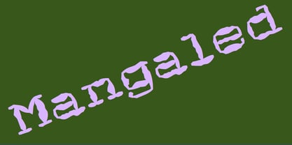 A grungy, mangled font.
 - Bloomberg Script by Vástago Studio,
$25.00 Bloomberg Script is a typeface designed from the exploration with the different tools we use to write each day on post its, notebooks, etc. But, applying the traditional handwriting repair method in the construction, spacing the glyphs, and giving it texture of fast strokes, ideal for handletters... is more organic. And finally, we have this typeface, a very comfortable letters to read on packaging, poster ads, screen and every display applications; this is Bloomberg Script.
 - Cat Talk by Okaycat,
$29.50 Okaycat Font Foundry proudly presents "Cat Talk"! An excellent illustrated picture font containing so many cute cats on the capital letters and small letters without cats to compliment, for easy cat designs. If you're looking for related fonts without cats, you might want to try our Maple Street and Maple Lane fonts.
 - Petale by LomoHiber,
$15.00 Petale is my new elegant experimental typeface I'd love to present. At the beginning, I was intended to create a bold wide font, I started sketching options and came out with the letter 'M' design first. I thought it may be interesting and had continued developing the style with letters N, O, etc., spending hours on some letters to match the design and my vision. I liked how it looked (especially digits) and added different weighs. And it came out pretty stylish. You may like it to use in magazine designs, posters, websites, packaging, branding, logo, and so on. Petale can grant your work some graceful modern touch with a brutalist-feminine note. Works well with elegant and strict serif fonts. Also try to experiment with script fonts. I used my Stormy Youth font: https://www.myfonts.com/fonts/lomohiber/stormy-youth and Bodoni 72 Smallcaps If you have some issues or questions, please let me know: lhfonts@gmail.com Hope you'll enjoy using Petale! Language support: Afrikaans, Albanian, Bulgarian, Catalan, Croatian, Czech, Danish, Dutch, English, Estonian, Finnish, French, German, Hungarian, Icelandic, Italian, Latvian, Lithuanian, Maltese, Norwegian, Polish, Portuguese, Romanian, Russian (Русский), Slovak, Slovenian, Spanisch, Swedish, Turkish, Ukrainian (Украинский), Zulu
 - FS Conrad by Fontsmith,
$50.00 Art into type In 2008, Fontsmith were approached by their friend, Jon Scott, to investigate whether a typeface could assume the aesthetic of one artist’s body of work. Jon’s not-for-profit charity, Measure, was organising an event for the artist, Conrad Shawcross, whose giant mechanical installation, entitled Chord, was going on public display in the long-disused Kingsway tram tunnel in Holborn. Chord explores the way we perceive time, as either a line or a cycle. Two enormous machines with dozens of rotating arms and moving in opposite directions, weave rope with almost infinite slowness. An unusual brief Phil Garnham visited Conrad in his Hackney studio to get a feel for his work and ideas. “Conrad is a very clever and philosophical guy. He struggled to see how typeface design had any relevance to him and his art. This was going to be a challenge.” The artist presented the type designer with a pile of rope and a huge diagram of sketches and mathematical workings. “This was, in essence, my brief.” Phil developed three concepts, the simplest of which ticked all the boxes. “The idea of the strokes in the letterforms appearing and ending at peaks or points of origin fitted perfectly with Conrad’s idea of time occurring and ending at two ends of the sculpture.” Two versions Phil planned modules for two versions of the typeface: one with five lines in the letterforms and one with seven. He then drew the modules on-screen and twisted and turned them to build the machine that is FS Conrad. “This is not a simple headline typeface,” says Phil. “It’s not a rigid structure. It has varying character widths, and it’s informed by real typographic insight and proportions so that it actually works as piece of functioning, harmonious type.”
 - Bulldog Hunter Std by Club Type,
$36.99 Slab Serif version of the Bulldog family. Hunter family lends itself to on-screen use for web design - the letterforms being legible and robust at small sizes.
 - Gloria Monoline by IM Studio,
$15.00 Gloria Monoline is a text serif with an editorial focus designed by Ikhsan Maulana. The idea for a typography job came from a design school letter-making exercise: Get a pair of scissors and some large sheets of paper, and start cutting. The resulting letters and the act of cutting them from paper inform the type design process, resulting in strong, simple shapes and open, inviting textures. The tone is crisp and straightforward. The classic letterforms, with a playful touch, give the design a personality that is both practical and spontaneous. The text weight is capable of adjusting copies at various sizes to print and render clearly on screen. Its lightest and heaviest weights work best at display sizes. Great care has been taken to save typists time with OpenType features including contextual punctuation and symbols to match case-sensitive, lower-case, and all-caps settings, as well as set images set for each use.
 - MVB Dovetail by MVB,
$79.00 MVB Dovetail is an editorially focused text serif designed by David Sudweeks. The working idea for the typeface came from a design school letter-making exercise: Take a pair of scissors and a few large sheets of paper, and start cutting. The resulting letters and the action itself of cutting them out of paper informed the type design process, producing strong, simple shapes and an open, inviting texture. Dovetail’s tone is crisp and straightforward. Its classic letterforms, set off with a touch of playfulness, give the design both a practical and spontaneous personality. The text weights capably set copy at a variety of sizes for print and render crisply on screen. Its lightest and heaviest weights perform best at display sizes. Care has been taken to save the typographer’s time with OpenType features including contextual punctuation and symbols to fit mixed-case, small-caps, and all-caps settings, as well as figure sets tuned to each use.
 - Ruth Pro by David Engelby Foundry,
$25.00 Ruth Pro is a creative work horse primarily designed to be used for typographic design of magazines, posters and books. Though roughly inspired by fonts like Mendoza and Stone Serif, it has its own distinctive look, carefully crafted following all the classic ideals of typography. If you are also looking for that special display font, you will be surprised by all the great details of Ruth Pro, including dingbats, arrows, alternative characters, special designed ligatures and small caps characters—and much more! Ruth Pro also includes a vast selection of Slavic and Scandinavian characters.
 - Cooked by Sudtipos,
$79.00 Koziupa and Paul are just as good in the kitchen as they are on the drawing board. Cooked is their choice offering of stir-fried and juicy alphabet ready to complement any visual stew you can put together. This meaty course, with even meatier OpenType programming, was designed to crank up the volume on the viewer's senses of smell and taste, and induce drooling at a mere glance. Cooked is just as suitable in packaging as it is on posters, books or music stressing the wild, adventurous and extremely pleasurable side of life. Lot of alternates of each letter are included. Enjoy!
 - Koelle Ornaments by insigne,
$21.99The Koelle Ornaments series is based on the etchings of Chris Koelle of Portland Studios. This is the second collaboration between insigne and Portland Studios; the first yielded the inky and active script Blue Goblet. Chris has a unique style where he "frames" his work with small icons related to the story or subject. These are now available as Koelle ornaments. Koelle Ornaments have a gritty, used appearance, and have a late 70's stylistic feel to them. There are 145 highly detailed illustrations in the entire pack, separated into four different fonts. These illustrations can be resized without any loss of quality, and can be easily converted to outlines and modified. Some of the ornaments have a Christian theme, while others are more generic. To view what ornaments are available and the keys they map to, please view the sample .pdf. The sample .pdf is an excellent reference guide, and we encourage you to print it out to quickly refer to your favorite ornaments. - Packing Heat by Hanoded,
$16.00 I came across a photo of Al Capone and some of his henchmen when searching the internet for something completely unrelated. We don’t have a history of notorious gangsters in Holland, so I was intrigued by Capone all of my life. Packing Heat is 1930’s slang for ‘carrying a gun’, which I thought befitted this handmade font with an early 20th century look. Packing Heat comes with multilingual support and a set of alternates for the lower case glyphs.
 - Homemade Choco by Tlatous Type,
$19.00 Introducing Homemade Choco by Tlatoustype Homamade Choco is a Monoline handwritten Font. Homemade Choco is a cute, quirky and fresh handwritten font. It is ideal for holiday-themed greeting cards and for any crafting project that requires a sweet, romantic touch. Homemade Choco also multilingual support. Enjoy the font, feel free to comment or feedback, send me PM or email. Thank you!
 - Niveau Grotesk by HVD Fonts,
$40.00 Niveau Grotesk—the companion of Niveau Serif —is a type family of six weights plus matching italics and small caps. It was designed by Hannes von Döhren in 2013. Influenced by classical nineteenth-century faces, the fonts are based on geometric forms. Because of its straight architecture, Niveau Grotesk has a “punch” in big sizes but is very legible in smaller sizes and longer texts—in print or on screen. Niveau Grotesk is equipped for complex, professional typography with alternate letters, arrows, fractions and an extended character set to support Central and Eastern European as well as Western European Languages.
 - 1543 Humane Petreius by GLC,
$42.00 The regular style of this family was inspired from the typeface used in Nuremberg, Germany, by Johannes Petreius in 1543 to print the famous “De Revolutionibus Orbium Coelestium,” the well-known mathematical and astronomical essay by Nicolaus Copernicus. Petreius was also using an original italic style, as he did for the “De Sculptura” by Gaurico Pomponio, in 1542. Unfortunately, nobody seems to know who was the punchcutter of this Jenson-style font. Also included is a title file, containing initials (without diacritics) and small caps (with diacritics). In our three styles (Regular & Italic + Titling), font faces, kerning and spacing are as closely as possible identical to the original. This Pro font is covering Western, Eastern and Central European, Baltic and Turkish languages, with standard and long-s ligatures in regular and italic styles. Both have twin-letter ligatures, but the italic style has extra (genuine) ligatures for f and t with vowels.
 - Zooth by Intellecta Design,
$23.90inspired in 1800"s journal headers typography - Foundry Gridnik by The Foundry,
$96.00 The new Foundry Gridnik typeface family features an expressive range of 10 weights – from Light to Extra Bold, each with accompanying Italics. Foundry Gridnik was developed from the single weight monospaced 'typewriter’ face, originally created by Dutch designer Wim Crouwel in the 1960s. Crouwel's devotion to grids and systems led to his affectionate nickname of ‘Mr Gridnik’, and this inspired the new typeface family name. Foundry Gridnik’s distinct geometric design has been described as ‘the thinking man’s Courier’. Crouwel said, ‘I am a functionalist troubled by aesthetics’, and although Gridnik is based on logic, rationality and strict adherence to the grid, it also has a human dimension that sets it apart.
 - Ransom Clearcut NF by Nick's Fonts,
$10.00Will Ransom designed the uppercase letters in this typeface for Barnhart Brothers & Spindler in the 1920s, under the name Clearcut Shaded Caps. The lowercase letters come from another BB&S typeface named Clearcut Italic. An elegant headline face, best used sparingly, the font includes decorative flourishes in the brace, bracket and en dash positions. - Valentine's Fleurons by Greater Albion Typefounders,
$3.95 Valentine's Fleurons is a bit of romantic (the emotion, not the era) fun!. Need a few dingbats for that special card you're making for that special person-or for others to give to their special person(s)? You'll find them here in a charming hand-drawn style.
 - AZ Union by Artist of Design,
$25.00 AZ Union font was inspired from an old vintage tin from the early 1900's This font utilizes an "old look" to the line work which is designed to have a "worn feel" to it. Ideal for use as headline or sub-head text in you design.
 - AZ Tiki by Artist of Design,
$20.00 AZ Tiki font was inspired from Polynesian pop art Ephemera of the 1950's. This font utilizes an "old look" to the line work which is designed to have a "worn feel" to it. Ideal for use as headline or sub-head text in you design.
 - Scott McCloud by Comicraft,
$39.00 Whether you're Making, Understanding or Reinventing comics, you'll need a comic book font that makes your comic book—or comic book about making, understanding or reinventing comic books—look like a, um, comic book. Yes, it's all very well writing about the Invisible Art of Making Comics, but if you can't read about the Storytelling Secrets of Comics, Manga and Graphic Novels, they'll still be secrets, won't they? That's why Scott McCloud came to us to create the official "Making Comics: Storytelling Secrets of Comics, Manga and Graphic Novels" comic book font, or as we like to call it: McComicBookFont.
 - Fantini by Canada Type,
$29.95 Fantini is the revival and elaborate update of a typeface called Fantan, made in-house and released in 1970 by a minor Chicago film type supplier called Custom Headings International. In the most excellent tradition of seriously-planned American film faces back then, CHI released a full complement of swashes and alternates to the curly art nouveau letters. Fantan didn't fare much among the type scene's big players back then, but it did spread like electricity among the smaller ones, the mom-and-pop type shops. But by the late 1980s, when film type was giving up the ghost, most smaller players in the industry were gone, in some cases along with little original libraries that existed nowhere else and became instant rarities on their way to be forgotten and almost impossible to resurrect for future technologies. Fantini is the fun and curly art nouveau font bridging the softness and psychedelia of the 1960s with the flirtatious flare of the 1970s like no other face does. Elements of psychedelia and funk flare out and intermix crazily to create cool, swirly letters packed with a lot of joy and energy. This is the kind of American art nouveau font that made its comeback in the late 20th century and is now a standard visual in the branding drive of almost every consumer product, from coffee labels to book and music covers to your favorite sugar or thirst-crunching fix. Alongside Fantini's enormous main font come small caps and three extra fonts loaded with swashy alternates and variations on plenty of letters. All available in all popular font formats. Fantini Pro, the OpenType version, packs the whole she-bang in a single font of high versatility for those who have applications that support advanced type technologies. In order to make Fantini a reality, Canada Type received original 2" film specimen from Robert Donona, a Clevelander whose enthusiasm about American film type has never faltered, even decades after the technology itself became obsolete. Keep an eye out for that name. Robert, who was computer-reluctant for the longest time, has now come a long way toward mastering digital type design.
 - Busan Garden by Ditatype,
$29.00 Busan Garden is a bold display font that brings the spirit of Busan to life. Inspired by the vibrancy of Korean aesthetics, this font exudes strength and cultural richness, making it a captivating choice for designs that demand a powerful and impactful presence. The characters in Busan Garden stand tall with a robust and thick weight, portraying a sense of confidence and solidity. The sturdy letterforms, characterized by sharp angles, create a visually striking appearance that captures the dynamic energy found in Korean design. Busan Garden is not just a font; it's a visual journey through the streets of Busan. In addition, enjoy the features here. Features: Alternates Ligature Multilingual Supports PUA Encoded Numerals and Punctuations Busan Garden fits in headlines, logos, posters, flyers, branding materials, greeting cards, print media, editorial layouts, and many more designs. Find out more ways to use this font by taking a look at the font preview. Thanks for purchasing our fonts. Hopefully, you have a great time using our font. Feel free to contact us anytime for further information or when you have trouble with the font. Thanks a lot and happy designing.
 - Groupie by Resistenza,
$39.00 The idea was to mix liberty lettering with 70’s psychedelic posters and dedicate a font to Groupies. Check out the alternative glyphs and icons included. Have fun and be a Groupie
 - Cyberhype by Alphabet Agency,
$15.00 Alphabet Agency proudly presents Cyberhype, a bold sans serif display font with a glitched look. Cyberhype works great when used in many music genres involving dance music, synth-pop, house music, dubstep, techno, electronic dance music. The font also is great for use in themes such as gaming, e sports, AI (artificial intelligence), hacking, technology, digital, cyber-security, cyber technology, robotics and cutting edge science. The font contains over 128 characters including all capital letters, numbers, punctuation and Latin international characters.
 - Kakadu by Ludwig Type,
$55.00 Kakadu is a squarish sans serif, designed to work equally well on paper and on screen. The angular curves in this typeface create a firm and dependable appearance. The square-like forms also provide an inward openness and allow large and open letterforms, adapting perfectly to the orthogonal pixel grid of the monitor. Kakadu works well in small sizes while, it appears strong and distinguished in larger ones. Play the classic snake game and see the Kakadu fonts in action here.
 - Good Bad Man by Chank,
$29.00 This historic revival font was created especially for use in the preservation and restoration of the 1916 silent film “The Good Bad Man,” starring Douglas Fairbanks. There is only one copy of the original film print in existence, and when the film was restored for a screening at the San Francisco Film Festival in 2014 the new font was created to best recreate the intent of the original lettering in the film. It is a smooth and pleasant vintage lettering style, originally designed for use on silver screens, now fully rendered in OpenType and ready for you to use in your designs or web pages today. There’s a neat story about this historic silent film font from The Atlantic magazine here: here.
 - FS Joey Paneuropean by Fontsmith,
$90.00Kangaroo FS Joey was the offspring of a project with Rudd Studio to develop a logotype for an online streaming TV service, in 2008. While under wraps, the secret project was code-named Kangaroo. The logotype led to a second project, to design a corporate typeface for the service. It was the first big project Fernando Mello had worked on with Jason Smith. “Like any designer who just joined a team, I was very excited about it, drawing and sketching lots of ideas. I remember Jason and I experimenting with lots of possibilities, for both the logo and the typeface.” Online As the font for a Spotify-style, internet-based service, FS Joey needed to be highly legible on-screen, including at very small sizes. There had to be a range of weights, and they’d have to work well in print, too. It was also important that it felt corporate, not too quirky, while still having a strong character of its own. Quirkiest “We designed three weights specifically for use on the Web,” says Jason Smith. “There was the usual fight between me and my team. I wanted at least one identifiable letter that was a quirk. As always I went straight for the lowercase ‘g’, and it was drawn numerous times with lots of variation. I got the quirkiest one accepted by the client.” But, later in 2009, the Competition Commission blocked Project Kangaroo, and Fontsmith were left with a couple of weights of an as yet unused font. From Kangaroo, Joey was born. A favourite “Straight away, people started to notice the typeface,” says Jason. “I can take the credit for pushing the art direction and standing up for the quirks. But it was Fernando who was the key to pulling it all together and adding his own distinct flavour. Now it’s one of my favourite designs in our library.” Fresh and friendly, geometric and energetic, Joey is available in five weights, all with italics, all finely-tuned for both screen and print. - FS Joey by Fontsmith,
$80.00 Kangaroo FS Joey was the offspring of a project with Rudd Studio to develop a logotype for an online streaming TV service, in 2008. While under wraps, the secret project was code-named Kangaroo. The logotype led to a second project, to design a corporate typeface for the service. It was the first big project Fernando Mello had worked on with Jason Smith. “Like any designer who just joined a team, I was very excited about it, drawing and sketching lots of ideas. I remember Jason and I experimenting with lots of possibilities, for both the logo and the typeface.” Online As the font for a Spotify-style, internet-based service, FS Joey needed to be highly legible on-screen, including at very small sizes. There had to be a range of weights, and they’d have to work well in print, too. It was also important that it felt corporate, not too quirky, while still having a strong character of its own. Quirkiest “We designed three weights specifically for use on the Web,” says Jason Smith. “There was the usual fight between me and my team. I wanted at least one identifiable letter that was a quirk. As always I went straight for the lowercase ‘g’, and it was drawn numerous times with lots of variation. I got the quirkiest one accepted by the client.” But, later in 2009, the Competition Commission blocked Project Kangaroo, and Fontsmith were left with a couple of weights of an as yet unused font. From Kangaroo, Joey was born. A favourite “Straight away, people started to notice the typeface,” says Jason. “I can take the credit for pushing the art direction and standing up for the quirks. But it was Fernando who was the key to pulling it all together and adding his own distinct flavour. Now it’s one of my favourite designs in our library.” Fresh and friendly, geometric and energetic, Joey is available in five weights, all with italics, all finely-tuned for both screen and print.
 - Zombie Sunrise by Fonts of Chaos,
$10.00 Zombie Sunrise is a hand drawn font taking inspiration from the 60's horror zombie movies. When you buy this font you receive for free 6 exclusive patterns that you can use directly in Photoshop or any other graphic software.
 - Chicago by Nestype,
$14.00 Chicago Retro is a combination font between 70's Modern or Vintage and the modern era, this font is very versatile, spanning a wide variety of projects, from bold magazine imagery, to wedding invitations, to branding, poster design, and much more.
 - Pittsbrook by Fontdation,
$15.00 Pittsbrook Family, a pack of classic typefaces that inspired by the letters used in old advertisement and packagings. Its rigid shape gives you strong, sharp and blocky feelings, no curves were harmed in the making of these typefaces. Comes in three styles; Sans, Serif and Outline, all of them are consistently mouse-crafted characters, we spent a lot of attention to every details. Suits best for any classic/vintage design project, such as E-Sport logo, liquor/food label, packaging, headline, space-filler, logotype, typographic quote writings, etc.
 - Stgotic by Latinotype,
$10.00 Stgotic, designed in 2006, was the first digital font designed by Daniel Hernández. It is a blackletter typeface designed for low resolution screen devices. Stgotic was designed to be seen at 8 pts (and multiples of 8). In the year 2006, it was recognized as the best screen font by the TipoGráfica magazine in the context of the Bienal de Letras Latinas.
 - Maracatu by Bruno de Aviz,
$5.00 The family of Tipografia Maracatu was born in 2020 when we could not leave the house because of the coronavirus epidemic. I had no idea how it would turn out. I just wanted to draw letters. When I finished the regular version, I thought it looked a lot like the art and music from the Northeast of Brazil, and that is why I came up with the name Maracatu. Maracatu is a musical-style original from the Northeast of Brazil. After I had the font style and the Regular version, I thought it would be nice to have Bold and Light.