10,000 search results
(0.061 seconds)
- Kinghawk by Putracetol,
$19.00 Kinghawk is a natural handwritten brush font. Made by writing on paper first and then scanning. Then spruce up each character so that they blend into a very natural font. Like original handwriting. Kinghawk is perfect for logo, quote, stationery, wedding designs, social media posts, advertisements, product packaging, product designs, label, photography, watermark, special events or anything.
 - Omed Brush by Alit Design,
$22.00 Presenting the Omed Brush Signature Script font by alitdesign. The Omed Brush Signature Script font is inspired by spontaneous and dynamic signature strokes with an ink texture that makes the Omed Brush Signature Script look real. The Omed Brush Signature Script font looks unique and charming which makes designs using the Omed Brush Signature Script look more prominent and cool. The Omed Brush Signature Script font is perfect for a collection of new fonts on your computer, tablet and smartphone for making unique designs or lettering. The Omed Brush Signature Script font is perfect for magazine cover designs, brochures, flyers. Instagram ads, Canva Design and so on with unique and modern concepts. besides that this font is very easy to use both in design and non-design programs because everything changes and glyphs are supported by Unicode (PUA). The Omed Brush Signature Script contains 804 glyphs with many unique and interesting alternative options. Language Support : Latin, Basic, Western European, Central European, South European,Vietnamese. In order to use the beautiful swashes, you need a program that supports OpenType features such as Adobe Illustrator CS, Adobe Photoshop CC, Adobe Indesign and Corel Draw. but if your software doesn't have Glyphs panel, you can install additional swashes font files. Thank You Alit
 - Kalidony by Arterfak Project,
$26.00 Kalidony is a wonderful wedding typeface. Inspired by the upscale wedding design and the luxury woman stuffs. Kalidony represents a classy impression with beautiful thick & thin strokes. Kalidony is perfect for elegant design which requires natural handwriting or signature style. Equipped with many alternate characters that give your design a floral touch and look calmer. You can use this typeface for wedding purposes, greeting cards, invitations, logotype, books, packaging, and more! Kalidony features: Complete standard character set, symbols & punctuations Stylistic alternates set: ss01 - ss09 PUA Encoded Multilingual support: ÀÁÂÃÄÅÆÇÈÉÊËÌÍÎÏÐÑÒÓÔÕÖ×ØÙÚÛÜÝÞßàáâãäåæçèéêëìíîïñòóôõöøùúûüýþÿĀāĂ㥹ĆćĈĉĊċČčĎ ďĐđĒēĔĕĖėĘęĚěĜĝĞğĠġĢģĤĥĦħĨĩĪīĮįİıIJijĴĵĶķĹĺĻļĽľĿŀŁłŃńŅņŇňʼnŌōŎŏŐőŒœŔŕŖŗŘřŚśŜŝŞşŠšŢţŤťŦŧŨ ũŪūŬŭŮůŰűŲųŴŵŶŷŸŹźŻżŽžȘșȚțẀẁẂẃẄẅ Thank you, bestie!
 - Roy Smith by Artisan Studio,
$20.00 Roy Smith a work that is purely handmade, has its own characteristics with the style of monoline. this is perfect for invitations, signatures, blogs, social media, business cards, product brands. Roy Smith has Stylistic standard, Stylistic Alternate, Stylistic ligatures. and includes uppercase and lowercase letters, numbers and punctuation marks. FILE INCLUDE Roy Smith (OpenType,PUA) OpenType features can be accessed by using OpenType smart programs such as Adobe Photo Shop, Adobe Illustrator, Adobe Indesign, Corel Draw and Microsoft Office. special greetings for all, all of us all smoothly in running the routin
 - Wellytonia Package by Letterhend,
$17.00 Wellytonia package is a package consist of script font, sans serif font, illustration, ready-made logos and dingbats! All made by manual hand drawing to make sure the natural looks and feel. This type of font perfectly made to be applied especially in logo, and the other various formal forms such as invitations, labels, logos, magazines, books, greeting / wedding cards, packaging, fashion, make up, stationery, novels, labels or any type of advertising purpose. Features : Wellytonia Script, Sans & Dingbats uppercase & lowercase numbers and punctuation multilingual alternates & ligatures PUA encoded
 - Marviona by Arterfak Project,
$17.00 Brighten your day with Marviona, inspired by cute handwriting and casual-minimalist design. Crafted with monoline brush with the natural flow of the letterforms. This font has a bit bouncy layout that makes it looks more playfully! Marviona has sweet looks with a medium weight that you can apply for many themes and perfect for lovely quotes, headlines, logos, merchandise, books, bottle label, and short body text. Complete with OpenType features. Cheer up with Marviona! Fonts featured : Uppercase Lowercase Numbers Symbol and punctuations Stylistic alternates Ligatures Catchwords Swashes Multilingual Thank you for visiting.
 - Mansdefia by Sealoung,
$20.00 Mansdefia is calligraphy font with a classic style and a touch of elegance, inspired by the handwriting of Italian women and ancient manuscripts. Carefully designed to work together in harmony that makes it very suitable for wedding media, book covers, greeting cards, logos, branding, business cards and certificates, even for any design work that requires a classic, formal or luxurious. Try Desirable Calligraphy, enjoy the richness of OpenType features and let her fun and elegant excitement make you happy and enhance your creativity! You can use this font very easily.
 - Hunting Object by Groen Studio,
$20.00 Hunting Object a work that is purely handwritten, has its own characteristics with the style of monoline. this is perfect for invitations, signatures, blogs, social media, business cards, product brands. Hunting Object has Stylistic standard, Stylistic Alternate, Stylistic Sets and ligatures. and includes uppercase and lowercase letters, numbers and punctuation marks. FILE INCLUDE Hunting Object (OpenType,PUA) OpenType features can be accessed by using OpenType smart programs such as Adobe Photo Shop, Adobe Illustrator, Adobe Indesign, Corel Draw and Microsoft Office. special greetings for all, all of us all smoothly in running the routin
 - Charlonka by PleasureFonts,
$22.00 I‘d like to introduce “Charlonka“ to you. When my daughter finished high school, she wanted to get rid of her entire school stuff. So I saved a few sheets of her beautiful handwriting and promised her to create a typeface out of it. That‘s how the idea of Charlonka was born, a typeface family out of Charlotte‘s handwriting (by the way: that‘s her name). Some characters of Charlonka have extended crossbars, like in upper case A or H, and reduced descenders, like in lower case g or y.
 - SK Nowatorus by Shriftovik,
$48.00 SK Nowatorus is a modern experimental display grotesque. This typeface challenges the usual ideas about the structure of symbols and harmony in the typesetting line. The typeface symbols are based on the average contrast of thicknesses and on the contrast of the shapes of the symbols themselves. The font combines both narrow characters of the main set and wide additional ones. This, coupled with a wide range of alternatives and ligatures, gives huge opportunities for creative experiments. SK Nowatorus supports a multilingual set of Latin Pro and Cyrillic Pro. This typeface is perfect for poster design and for a set of small text blocks due to the presence of a capital and lowercase set.
 - Julia Script by ITC,
$29.99Julia Script is a playful calligraphic font designed by David Harris in 1983. It takes the viewer back to the flower power of the 1970s. Generous capitals with cheerful, rounded stroke beginnings and endings contrast perfectly with the narrower, closer, but nevertheless vibrant lower case letters. Characteristic of this typeface and similar to Candice is the marked increase in stroke width in the lower third of the figures. This detail is reminiscent of the platform shoes typical of the 1970s. Julia Script suggests freedom and fun and can often be found on party fliers and retro advertisements. Used sparingly in headlines and slogans, Julia Script will be sure to attract attention. - Futura ND by Neufville Digital,
$45.25 Futura is one of the best known and most widely used of modern typefaces. Designed by Paul Renner between 1924-1927 for the Bauersche Giesserei, it remains today one of the most successful typefaces due to its simplicity of features, perfect legibility, and meticulous finish of each of its letters. Its great variety of styles and weights makes Futura particularly fit for distinguished user interfaces, information displays, smart watches, e-readers, television apps, technical appliances, and internet-related uses. Futura is a Trademark of BauerTypes SL
 - Keanister by Keristyper Studio,
$14.00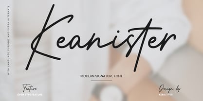 Keanister is a modern signature script with a natural & stylish flow. This collection of scripts is perfect for personal branding, greeting cards, magazine, social media, print, packaging, and many more. Keanister Font multilingual support: Afrikaans, Albanian, Catalan, Danish, Dutch, English, Estonian, French, Finnish, German, Icelandic, Indonesian, Italian, Malay, Norwegian, Portuguese, Spanish, Swedish, Zulu, and many more. What’s Included : Web Fonts Standard & Multilingual glyphs Ligature Works on PC & Mac Simple installations Accessible in Adobe Illustrator, Adobe Photoshop, Adobe InDesign, and even work on Microsoft Word. Hope you enjoy our font!
 - Mastadoni by Eclectotype,
$40.00 Mastadoni is a bold headliner/masthead typeface, with high vertical contrast in a Didone style. That's the starting point at least. There's much more to this font than another modern clone. It is a specialized (only one weight) typeface that comes in five optical grades. Use G1 at very large sizes and G5 at smaller sizes. The grades can be combined so that the thins of type set at different point sizes appear the same thickness - a very useful feature for magazine layouts. Optical grades could also be used in circumstances where a logo needs to be size-specific; the text on your bistro sign can afford to be more delicate than that on your coffee cups. This is a typeface with a big x-height, small cap-height and stubby ascenders and descenders, which contribute to an overall appearance somewhat different from must Didones, and make for some interesting layout possibilities in tight spaces. Mastadoni features a number of useful OpenType features. All fonts include standard ligatures and automatic fractions. In the discretionary ligature feature, you'll find the esoteric "percent off" glyph. Just type '%ff' with dlig engaged and there it is! Case-sensitive forms are available in all the fonts. The contextual alternates feature performs a subtle trick that resolves an optical illusion whereby two ascenders next to each other appear to be different heights. The Roman and Italic styles have a different group of stylistic sets as follows: Roman: SS01 substitutes a less decorative 4; SS02 is a different eszett; SS03 substitues the # with an attractive numero glyph; and SS04 gives an alternate K. Italic: SS01 and SS03 are the same as in the Romans; SS02 gives you more bulbous variants of v, w, and y letters; SS04 is a single storey g; SS05 changes C, G and S to non-ball-terminal varieties; and SS06 changes the swash versions of E, L, N and Q (when the swash feature is engaged). Speaking of the swash feature, the italic fonts feature swash capitals from A to Z, and swash variations for lower case h k m n v w and z. Lastly, the discretionary ligature feature in the italic fonts has vi, wi, KA and RA ligatures. Mastadoni is a typeface that would find itself immediately at home in glossy magazines, while offering a different aesthetic palette from the more standard choices of Didones.
 - Somatype by ArtyType,
$29.00 As with any attempt at a new typeface, you want to create something different. A difficult task as most legible fonts are based on something previous. Somatype isn't actually based on any particular font but it has unavoidable similarities to others. The important difference here being the distinctive quirk of the connection points going opposite to the norm; exemplified best by the lower case d & e. Once devised, the unique characteristic was applied wherever possible, keeping the rest of the characters in a sympathetic, rounded style. I first designed this in the light weight version, seeing it working best as a large open display font for magazines etc. but realized it would be too light for body copy at small scale, so, medium and bold weights were created to resolve that issue. Incidentally, the word ‘somatype’ literally means body-type.
 - HU Retroround KR by Heummdesign,
$50.00 'HU Retroround KR' is a font that captures the feel of the retro typefaces used on signboards during Korea's modernization era. This font has a variable function, allowing users to fine-tune the thickness they want. (Available only in Adobe programs.) Six basic weights are provided so that they can be used even in programs that do not apply the variable function. This font includes Hangul, Korean.
 - Sunday Evening by Typodermic,
$11.95 Welcome to Sunday Evening, a stunning display typeface that is guaranteed to elevate your designs to new heights. This typeface is not your typical typeface; it has a unique character that is sure to catch the eye of anyone who sees it. With its squarish letterforms and high-tech superelliptical style, Sunday Evening is perfect for anyone who wants to add a touch of sophistication to their designs. The reverse contrast of this soft sans-serif typeface gives it a one-of-a-kind look, while the high waistlines and curving ends are reminiscent of the Art Nouveau era. However, the elegant technical letterforms and sensual lines make this font anything but old-fashioned. It’s a perfect blend of vintage and modern design that will make your message stand out from the rest. But what truly sets Sunday Evening apart are the adorable heart symbols that have been included. Simply type [heart1], [heart2], and so on to add these sweet symbols to your designs. These little touches are what make Sunday Evening so special and unique. In summary, Sunday Evening is a display typeface that combines vintage and modern design elements to create a stunning and unforgettable font. With its unique character and squarish letterforms, this font is sure to add a touch of sophistication and elegance to any project. So why not give it a try and see how it can transform your message with exquisite accuracy and a truly unique personality? Most Latin-based European, and some Cyrillic-based writing systems are supported, including the following languages. A Afaan Oromo, Afar, Afrikaans, Albanian, Alsatian, Aromanian, Aymara, Bashkir (Latin), Basque, Belarusian (Latin), Bemba, Bikol, Bosnian, Breton, Bulgarian, Cape Verdean, Creole, Catalan, Cebuano, Chamorro, Chavacano, Chichewa, Crimean Tatar (Latin), Croatian, Czech, Danish, Dawan, Dholuo, Dutch, English, Estonian, Faroese, Fijian, Filipino, Finnish, French, Frisian, Friulian, Gagauz (Latin), Galician, Ganda, Genoese, German, Greenlandic, Guadeloupean Creole, Haitian Creole, Hawaiian, Hiligaynon, Hungarian, Icelandic, Ilocano, Indonesian, Irish, Italian, Jamaican, Kaqchikel, Karakalpak (Latin), Kashubian, Kikongo, Kinyarwanda, Kirundi, Komi-Permyak, Kurdish (Latin), Latvian, Lithuanian, Lombard, Low Saxon, Luxembourgish, Maasai, Macedonian, Makhuwa, Malay, Maltese, Māori, Moldovan, Montenegrin, Ndebele, Neapolitan, Norwegian, Novial, Occitan, Ossetian, Ossetian (Latin), Papiamento, Piedmontese, Polish, Portuguese, Quechua, Rarotongan, Romanian, Romansh, Russian, Sami, Sango, Saramaccan, Sardinian, Scottish Gaelic, Serbian, Serbian (Latin), Shona, Sicilian, Silesian, Slovak, Slovenian, Somali, Sorbian, Sotho, Spanish, Swahili, Swazi, Swedish, Tagalog, Tahitian, Tetum, Tongan, Tshiluba, Tsonga, Tswana, Tumbuka, Turkish, Turkmen (Latin), Tuvaluan, Uzbek (Latin), Venetian, Vepsian, Võro, Walloon, Waray-Waray, Wayuu, Welsh, Wolof, Xhosa, Yapese, Zapotec Zulu and Zuni.
 - Mobley by Sudtipos,
$29.00Based on ten characters found on the cover of a 1960s Blue Note jazz album. The source characters were originally designed for film-based typesetting by Wayne Stettler as part of a single typeface published by Visual Graphics Corporation (VGC) under the name Neil Bold. Mobley Sans, along with its condensed and serifed counterparts, constitute a brand new typographic whole molded around the original inspirational source. The family embodies the independent creative spirit of that era - yet manages to remain contemporary with several modern design traits - creating its own unique visual theme through the use of odd counters, generous curves and sharp corners. Mobley delivers your message in a bold, yet friendly, and subtly discerning fashion. Perfect for music artwork, packaging and book covers. Available with both sans and serif versions, in regular and condensed widths. - Mountain by Volcano Type,
$29.00Mountain is a digital revival and extension of Teutonia, an old metal typeface released by the Roos & Junge type foundry (Offenbach am Main, Germany) in 1902. Teutonia’s design was popular during both the Art Nouveau and the Constructivist eras, where similar letterforms could be seen as far away as the Soviet Union. Although it slipped under the radar during the 1930s and 40s, this style feels extremely contemporary today. Mountain’s underlying geometric feeling is reminiscent of pixels and grids, suiting it for application with music and art, as well as history. Yet this typeface is not as static as it seems at first glance; playful diagonals—like those seen on the capitals D, L, P, and W—enliven the otherwise stern horizontal and vertical motion. Teutonia was a simple upper and lowercase display type. Mountain adds upon these by adding small caps and obliqued italic companions, rounding out this typographic toolkit. - Manzello by Tour De Force,
$35.00 To start with one personal fact: I really like to listen Rahsaan Roland Kirk. He was a multi-instrumentalist, real grandmaster and unique jazz virtuoso. The way he improvised and walked through variety of different music influences are admiring. One of things he liked is to modify instruments, so he modified soprano saxophone and got an instrument called manzello. When I was looking for good name for this typeface, it came on my mind that Manzello could be the perfect one. It has the symbolic background from the instrument and theoretically in my head, it's imagined as typeface that rely on stable classic examples, but graphically designed and modified to match modern standards. Manzello contains a dose of characteristics of display typefaces with terminals that aren't perfectly rounded, high contrast between stems and good balanced Italics with elements of fine calligraphy. It's a small font family, something what I was always looking for to have as first text solution in my web and graphic projects.
 - American Uncial by Linotype,
$40.99American Uncial™ was designed by Victor Hammer in 1943. Uncial typefaces consist of letter forms of the Capitalis Monumentalis and the majescule cursive. The origins of Uncial faces date back to the 5th century. In 1953, American Uncial was expanded to include some new figures, also designed by Hammer, and was rereleased by Klingspor with the name Neue Hammer Unziale. The forms are based on old scripts in books of antiquity and the early Middle Ages and the font is a new variation of a classic. Neue Hammer Unziale font has been a favorite for certificates and diplomas and is recommended for headlines and shorter texts in a point size of 12 or larger. - HGB Info by HGB fonts,
$21.00 HGB Info is a display typeface for my Linotype Nautilus Monoline. This came about while working on the corporate design for the municipality of Weissach im Tal. Shorter ascenders and descenders and a broader letter shape result in more compact word images. The ups and downs are cut vertically. This works particularly well in large degrees. This is the area of application on signage and information systems.
 - Barosaki Script by Pointlab,
$10.00 Barosaki is a unique blend of classic and modern shapes. Imperfect style ups and downs, like dancing letters, which are smooth, clean and simple. Perfect for weddings, events, invitations, escort cards, table numbers, header menus, displays, logos, slider blogs, custom addresses, stamps, packaging, greeting cards, etc. Barosaki Script including alternate glyph and beautiful swirl in a font including stylistic sets, Ligatures etc. The OpenType features can be accessed by using OpenType savvy programs such as Adobe Illustrator CS, Adobe Indesign & CorelDraw X6-X7 and Microsoft Word. And this Font has given PUA unicode (specially coded fonts), so that all the alternate characters can easily be accessed in full by a craftsman or designer.
 - Sunbursting by RVM Creative,
$9.00 Sunbursting is the perfect, bright retro font for all of your summery needs. Great for use on book and album covers, websites, branding, clothing, and social media. It has playful, bubbly serifs on letters and alternates to give your projects all the personality they need. Glyph Count: 449 This font also has multilingual support, and supports most western languages! Comes with two styles, regular and outline.
 - Frogie by Scratch Design,
$10.00 Introducing Frogie Font! It's a Playful and Bold font. Frogie font will look great for book headers, logo design, greeting cards, stickers, Instagram posts, quotes, playful branding, kids' stuff, youtube title. We hope you get inspired by the preview designs and you can make some playful designs with Frogie font! You will get OTF file, this font also includes multi-languages and 25 ligatures to support your design more naturally and fun. So let's have fun with Frogie!
 - Darleyna by Jamalodin,
$19.00 Darleyna Script is a new classic legendary calligraphy font that is suitable for branding, wedding invitations, greeting cards, posters, name card, quotes, blog header, logo, fashion, apparel, letter, stationery and other projects. Come with 600+ glyphs. Uppercase (Two style) & Lowercase, International Language, Symbols Support Punctuation & Numeral, Alternates Stylistic Set 1-17 Character Variant Contextual. And this Font has given PUA Unicode. so that all the alternate characters can easily be accessed in full by a craftsman or designer.
 - Armstead by Larin Type Co,
$18.00 Inspired by classic calligraphy, Armstead is an elegant and sophisticated handwritten font with a classic charm. All lowercase have 8 - 9 variants, total of 203 alternates, 7 ligatures, 20 swash of which 10 are final, and there are old roman numerals from 0 to 12. This font is perfect for your wedding invitation, greeting card, certificate, branding, magazine, book cover and much more and the alternates will help you to make your design unique. Thank you!
 - Loose Pen by Pedro Teixeira,
$14.00 Do you suffer from OCD? Then this font is perfect for you. Or maybe not. Sometimes I like confusion, chaos, imperfect things, because I can often see beauty in them. In this font I drew the letters with a pen and or with just the index finger on a tablet, completely free, without improvement. The chaos ensuing. As if I was rushing notes just for me. Then, without changing the design any further, but to make the chaos minimally legible, I decided - look at this madness! - to organize the chaos. In other words, I aligned metrics and kerning, and the end result was this. I hope you like it and that it is very useful for you. Cheers.
 - Queen by Scholtz Fonts,
$19.00 Queen is based on the designer's own hand. It is a handwriting font with a difference (just like Affable). It has all the vigor and spontaneity of a hurried note, combined with a skilled and precise joining of characters to give a true cursive script. This font comes in three styles, Queen Regular, Queen Black & Queen Lite. Use Queen for: -- invitations -- advertising material where an informal and personal mood is required -- greeting cards -- menus -- book covers Queen is fully professional, carefully letterspaced and kerned, with line spacing (leading) that allows for accents for use in European languages. All upper and lower case characters, punctuation, numerals and accented characters are present.
 - Assasins by Supersemarletter,
$12.00 Assasins is a beautiful handwritten font, created with the help of a joyful brush pen. It looks lovely on invitations, thank you cards, quotes, greeting cards, logos and every other design which needs a romantic, trendy touch. This font is PUA encoded which means you can access all of the glyphs and swashes with ease! Font Features : • Regular version • Character set A-Z in uppercase and lowercase • Ligatures in Lowercase and special • Alternates option • Numerals & Punctuation • Accented Characters • Multiple Languages Supported Recommended to use in Adobe Illustrator or Adobe Photoshop with opentype feature. If you have questions, just send me a message and I'm glad to help. Best Regards, Supersemar Letter
 - Caligari Pro by Elsner+Flake,
$99.00 The silent film »The Cabinet of Dr. Caligari« (1920) is undoubtedly one of the breathtaking milestones within the German Expressionist Movement, a time of extraordinarily creative works of art as a reaction to a world in rapid change. The original intertitles of Caligari were worked out by the set designers (and painters) Walter Reimann, Walter Röhrig, and Hermann Warm, using a unique expressionistic language of form for dramatic and iconic lettering. When in 2010 KOMA AMOK’s Joerg Ewald Meißner and Gerd Sebastian Jakob were commissioned by the Institut Mathildenhöhe Darmstadt and publisher Hatje Cantz to design the catalog for the exhibition »The Total Artwork in Expressionism«—showing works of art, architecture, film, literature, theater, and dance—it was soon perfectly clear that a new typeface, inspired by the Caligari intertitles, should speak for all the expressionistic arts. An intense process of research and analysis began. The original letters of the Caligari intertitles were individuals on their own. Furthermore, each of the three title designers had added his specific approach to the basic Caligari type style. From hundreds of different As to Zs a choice had to be made, which should be THE characteristic Caligari letter for a digital typesetting font. Finally the chosen letters were cut and drawn again, missing letters were added according to the formal priniciples, all-in-all 1000 glyphs were digitised to complete a usefull OpenType font ready for use. When in the autumn of 2010 the exhibition started successfully with great media interest, the posters all over Darmstadt announced »You must become Caligari!« – set in the brandnew typeface. The font Caligari Pro offers alternative forms for every letter and a whole bunch of ligatures, thus creating an expressive, individual image of headlines and text. By using included Stylistic Alternates the image will get even more vivid. Caligari comes with a complete set of expressionist ornaments and true old style figures—thus the heyday of the Expressionist Movement and the era of the silent films can be revived typographically by the means of today: »Express Yourself!«.
 - Kheops by Tipo Pèpel,
$22.00 Kheops is a slab-serif style typeface, with a contemporary scent and designed for long texts, without giving up on big headlines, it is accompanied by an authentic cursive with a dynamic rhythm and a skeleton with humanist reminiscences, it also includes a set of ornaments based on in simple geometric shapes, and an extensive range of OpenType functionalities to meet the needs of the most demanding designer, an all-rounder that cannot be missing from your typographic palette.
 - TT Tsars by TypeType,
$39.00 TT Tsars useful links: Specimen | Graphic presentation | Customization options The TT Tsars font family is a collection of serif display titling fonts that are stylized to resemble the fonts of the beginning, the middle and the end of the XVIII century. The project is based on title fonts, that is, the fonts that were used to design book title pages. The idea for the project TT Tsars was born after a small study of the historical development of the Cyrillic type and is also based on Abram Shchitsgal’s book "Russian Civil Type". At the very beginning of the project, we had developed a basic universal skeleton for the forms of all characters in all subfamilies of the family, and later on, we added styles, visual features, artifacts and other nuances typical of the given period onto the skeleton. Yes, from the historical accuracy point of view it might be that such an approach is not always justified, but we have achieved our goal and as a result, we have created perfectly combinable serifs that can be used to style an inscription for a certain time period. The TT Tsars font family consists of 20 fonts: 5 separate subfamilies, each of which consists of 4 fonts. Each font contains 580 glyphs, except for the TT Tsars E subfamily, in which each font consists of 464 characters. Instead of lowercase characters in the typeface, small capitals are used, which also suggests that the typeface is rather a display than text one. In TT Tsars you can find a large number of ligatures (for Latin and Cyrillic alphabets), arrows and many useful OpenType features, such as: frac, ordn, sinf, sups, numr, dnom, case, onum, tnum, pnum, lnum, salt (ss01), dlig. Time-related characteristics of the subfamilies are distributed as follows: • TT Tsars A—the beginning of the 18th century (Latin and Cyrillic) • TT Tsars B—the beginning of the 18th century (Latin and Cyrillic) • TT Tsars C—the middle of the 18th century (Latin and Cyrillic) • TT Tsars D—the end of the 18th century (Latin and Cyrillic) • TT Tsars E—conditionally the beginning of the 18th century (only Latin) TT Tsars A and TT Tsars B families (both the beginning of the 18th century) have different starting points: for TT Tsars A it is Latin, for TT Tsars B it is Cyrillic. The development of the TT Tsars A family began in Latin, the font is based on the royal serif Romain du Roi. The Cyrillic alphabet is harmoniously matched to the Latin. The development of the TT Tsars B family began in Cyrillic, which is based on a Russian civil type. Characteristic elements are the curved one-sided serifs of triangular characters (A, X, Y), drops appear in the letter ?, the middle strokes ? and P are adjacent to the main stroke. Latin was drawn to pair with Cyrillic. It is still based on the royal serif, but somewhat changed: the letters B and P are closed and the upper bar of the letter A rose. This was done for the visual combination of Cyrillic and Latin and at the same time to make a distinction between TT Tsars A and TT Tsars B. TT Tsars C is now the middle of the 18th century. Cyrillic alphabet itself did not stand still and evolved, and by the middle of the 18th century, its forms have changed and become to look the way they are shown in this font family. Latin forms are following the Cyrillic. The figures are also slightly modified and adapted to the type design. In TT Tsars C, Cyrillic and Latin characters are created in parallel. A distinctive feature of the Cyrillic alphabet in TT Tsars C is the residual influence of the flat pen. This is noticeable in such signs as ?, ?, K. The shape of the letters ?, ?, ?, ? is very characteristic of the period. In the Latin alphabet, a characteristic leg appears at the letter R. For both languages, there is a typical C characterized by an upper serif and the appearance of large, even somewhat bolding serifs on horizontals (T, E, ?, L). TT Tsars D is already the end of the 18th century when with the development of printing, the forms of some Cyrillic characters had changed and turned into new skeletons of letters that we transposed into Latin. The figures were also stylized. In this font, both Cyrillic and Latin are stylistically executed with different serifs and are thus logically separated. The end of the century is characterized by the reduction of decorative elements. Straight, blueprint-like legs of the letters ?, R, K, ?. Serifs are very pronounced and triangular. E and ? are one-sided on the middle horizontal line. A very characteristic C with two serifs appears in the Latin alphabet. TT Tsars E is a steampunk fantasy typeface, its theme is a Latinized Russian ?ivil type (also referred to as Grazhdansky type which emerged after Peter the Great’s language reform), which includes only the Latin alphabet. There is no historical analog to this typeface, it is exclusively our reflections on the topic of what would have happened if the civil font had developed further and received a Latin counterpart. We imagined such a situation in which the civil type was exported to Europe and began to live its own life.
 - SwissCheese - Unknown license

- Churchward Ta Tiki by BluHead Studio,
$20.00Churchward Ta Tiki is a new font release by BluHead Studio, LLC from the exciting and unique typefaces of New Zealand designer Joseph Churchward. We will be releasing fonts from his extensive library in OpenType format on a regular basis. - HT Pizzeria by Dharma Type,
$19.99 Ht Pizzeria is strong looking script for eye-catching part. Holiday Type Project offers retro hand drawing scripts. Inspired by retro script on shopfront lettering, wall paint advertisements in Italy around 1950s. Check out the script fonts from Holiday Type!
 - Dawnora by Typomancer,
$24.00 Inspired by aurora, one of the most impressive phenomenon. Dawnora is a spirited serif font comes with various weights and many opentype features, suitable for both simple text and elegant lettering. Especially, Initials style for drop cap and special usage.
 - PS Fournier Std by Typofonderie,
$59.00 Style and elegance in 14 styles PS Fournier, created by Stéphane Elbaz, is designed in tribute to Pierre Simon Fournier. Fournier was the prolific Parisian type designer whose work is best known for its iconic representation of French transitional style. PS Fournier elegantly represents the transition to the modern era of typography. Featuring three optical sizes, PS Fournier is designed to perform in any context. The Pierre Simon Fournier heritage Pierre Simon Fournier (1712—1768) was a leading innovative type designer of the mid-18th century. Early in his career, the young Pierre Simon developed a strong aesthetic that he cultivated throughout his life. His art is representative of the pre-revolutionary “Age of Enlightenment” (Siècle des Lumières). Precursor of the Modern style, Fournier’s body of work deeply influenced his times, and created the fertile ground from which the Didot family and Giambattista Bodoni developed their own styles. During the historical period of the 18th century, Fournier exemplified the intellectual pursuits of the times with his own research on type, documenting in detail the typefounding process. He also offered a unique vision: he is the first to clearly comprehend the concept of “type family,” sorting a set of similarly styled alphabets by sizes, width, and by x-heights. In addition, Fournier is one of the earliest advocates of the point system to organize the practice of typography, the point system that contemporary typographers continue to use to this day. The refined and discreet elegance of PS Fournier With a close look at the family, one finds you’ll find that the difference between the optical sizes (Petit, standard and Grand) is more than a contrast variation between the thin and the thick; the eye can also denote a palette of distinct tones: More streamlined and robust in the smaller sizes (Petit), more refined and detailed in the larger sizes (Grand). The PS Fournier standard family is designed to adapt to any situation with its intermediate optical size, from body copy to headlines. With a bit of tracking, PS Fournier Petit will make the smallest captions perfectly readable. However, Petit family is not limited to body and captions — its “slabby robustness” will make a relevant headline choice as well. PS Fournier Grand presents a higher contrast adapted to large text sizes, displays or banners. Its refined elegance makes it a perfect choice for Design, Fashion or Luxury publications. As a “modern” type PS Fournier Grand features a larger x-height than the preexistent old style typefaces such as Garamond or Jenson. These proportions provide any basic text set in PS Fournier Grand a strong typographic texture. As a result, the PS Fournier global family is a versatile alternative to the Modern typefaces commonly used in the publishing industry. The optical sizes, the large range of weights, and the design variations make this family adaptable to captions, paragraphs, and pages, as well as to large texts and displays. A leading-edge typography in the 18th century In the spirit of modernity, Pierre Simon Fournier did not find any use for the conventional swashes still produced by peers such as Caslon or Baskerville. Nevertheless the French designer created many inventive elements to decorate the page and set delightful variations in the text itself. To this regard PS Fournier includes a large set of glyphs variations, ligatures and more than one hundred glyphs for borders, rules and ornaments or — as called in French — “vignettes.” PS Fournier: A tribute to the French modern typography era by Stéphane Elbaz
 - Camulogen by Typodermic,
$11.95 Ladies and gentlemen, it is with great pleasure that I introduce to you Camulogen, a typeface that embodies the opulent glamour of the Moulin Rouge era. Inspired by the late-nineteenth-century poster designs, Camulogen is the epitome of boldness and sophistication. Its full-bodied, rough letterforms are crafted to capture the attention of all who lay their eyes upon it. This typeface is the quintessence of style, and with it, you can effortlessly convey your message with an unmistakable tone of class and elegance. Whether you’re looking to create a stunning headline for a fashion magazine or an eye-catching logo for your luxury brand, Camulogen will elevate your designs to new heights. So indulge in the sumptuousness of Camulogen and let your creativity soar to new heights. Your message will be delivered with panache and flair, leaving a lasting impression on all who see it. Most Latin-based European writing systems are supported, including the following languages. Afaan Oromo, Afar, Afrikaans, Albanian, Alsatian, Aromanian, Aymara, Bashkir (Latin), Basque, Belarusian (Latin), Bemba, Bikol, Bosnian, Breton, Cape Verdean, Creole, Catalan, Cebuano, Chamorro, Chavacano, Chichewa, Crimean Tatar (Latin), Croatian, Czech, Danish, Dawan, Dholuo, Dutch, English, Estonian, Faroese, Fijian, Filipino, Finnish, French, Frisian, Friulian, Gagauz (Latin), Galician, Ganda, Genoese, German, Greenlandic, Guadeloupean Creole, Haitian Creole, Hawaiian, Hiligaynon, Hungarian, Icelandic, Ilocano, Indonesian, Irish, Italian, Jamaican, Kaqchikel, Karakalpak (Latin), Kashubian, Kikongo, Kinyarwanda, Kirundi, Kurdish (Latin), Latvian, Lithuanian, Lombard, Low Saxon, Luxembourgish, Maasai, Makhuwa, Malay, Maltese, Māori, Moldovan, Montenegrin, Ndebele, Neapolitan, Norwegian, Novial, Occitan, Ossetian (Latin), Papiamento, Piedmontese, Polish, Portuguese, Quechua, Rarotongan, Romanian, Romansh, Sami, Sango, Saramaccan, Sardinian, Scottish Gaelic, Serbian (Latin), Shona, Sicilian, Silesian, Slovak, Slovenian, Somali, Sorbian, Sotho, Spanish, Swahili, Swazi, Swedish, Tagalog, Tahitian, Tetum, Tongan, Tshiluba, Tsonga, Tswana, Tumbuka, Turkish, Turkmen (Latin), Tuvaluan, Uzbek (Latin), Venetian, Vepsian, Võro, Walloon, Waray-Waray, Wayuu, Welsh, Wolof, Xhosa, Yapese, Zapotec Zulu and Zuni.
 - Raymond by Typodermic,
$11.95 Introducing Raymond, the typeface that dares to be imperfect. With its rough, textured script and unevenly stamped letters, Raymond exudes a raw, unapologetic energy that will inject your message with a sense of authenticity and personality. But don’t be fooled by Raymond’s rough exterior—underneath its imperfect surface lies a sophisticated and classy design. Each letter has been carefully crafted to give your text a touch of elegance and refinement, while the worn-out edges and misaligned characters add just the right amount of character. Whether you’re looking to create a bold statement or simply want to add a touch of edge to your design, Raymond is the typeface for you. So why settle for the same old cookie-cutter fonts when you can embrace the beauty of imperfection with Raymond? Give your message the unique and candid style it deserves with this one-of-a-kind typeface. Most Latin-based European writing systems are supported, including the following languages. Afaan Oromo, Afar, Afrikaans, Albanian, Alsatian, Aromanian, Aymara, Bashkir (Latin), Basque, Belarusian (Latin), Bemba, Bikol, Bosnian, Breton, Cape Verdean, Creole, Catalan, Cebuano, Chamorro, Chavacano, Chichewa, Crimean Tatar (Latin), Croatian, Czech, Danish, Dawan, Dholuo, Dutch, English, Estonian, Faroese, Fijian, Filipino, Finnish, French, Frisian, Friulian, Gagauz (Latin), Galician, Ganda, Genoese, German, Greenlandic, Guadeloupean Creole, Haitian Creole, Hawaiian, Hiligaynon, Hungarian, Icelandic, Ilocano, Indonesian, Irish, Italian, Jamaican, Kaqchikel, Karakalpak (Latin), Kashubian, Kikongo, Kinyarwanda, Kirundi, Kurdish (Latin), Latvian, Lithuanian, Lombard, Low Saxon, Luxembourgish, Maasai, Makhuwa, Malay, Maltese, Māori, Moldovan, Montenegrin, Ndebele, Neapolitan, Norwegian, Novial, Occitan, Ossetian (Latin), Papiamento, Piedmontese, Polish, Portuguese, Quechua, Rarotongan, Romanian, Romansh, Sami, Sango, Saramaccan, Sardinian, Scottish Gaelic, Serbian (Latin), Shona, Sicilian, Silesian, Slovak, Slovenian, Somali, Sorbian, Sotho, Spanish, Swahili, Swazi, Swedish, Tagalog, Tahitian, Tetum, Tongan, Tshiluba, Tsonga, Tswana, Tumbuka, Turkish, Turkmen (Latin), Tuvaluan, Uzbek (Latin), Venetian, Vepsian, Võro, Walloon, Waray-Waray, Wayuu, Welsh, Wolof, Xhosa, Yapese, Zapotec Zulu and Zuni.
