10,000 search results
(0.058 seconds)
- P22 Klauss Kursiv by IHOF,
$29.95 P22 Klauss Kursiv is the first ever digital revival and expansion of the last face Karl Klauß designed for the Genzsch & Heyse foundry in Stuttgart before he died in 1956. Karl Klauß’s classical training in the graphic arts gave him solid chops to use as a springboard for design ideas that remained relevant among the countless trends fleeting around the turmoil of two world wars. By the mid-1950s, a kind of ornamental deco aesthetic was well on its way into mainstream design in post-war Europe, and demand was high for unique, lively and non-minimal ad faces. Klauß, a reliable designer with a proven track record of calligraphic faces, pushed the envelope on his own calligraphy and designed something that packages elegance in a boldness seldom seen before in luxury scripts. Quite a bit of talent is on display in Klauss Kursiv. In spite of the restraint this kind of design imposes on itself almost by default, the interplay between thick and thin never seems forced or challenging. Clear, natural strokes build a compact alphabet that demonstrates the wrist control of a veteran calligrapher. Creative nib angling segues into very clever start-and-stop constructs to make attractive forms that work quite well together, yet stand well to individual scrutiny. P22 Klauss Kursiv comes with a load of built-in alternates and ligatures in a font of over 470 glyphs, providing extended support for Latin languages.
 - Zapf Elliptical 711 by ParaType,
$30.00 The Bitstream version of Melior, a twentieth century modern face commissioned by Stempel and designed by Hermann Zapf in 1952. It is based on Zapf’s thoughts about the squared-off circle known as a super-ellipse. The type was originally intended as a newspaper text face by Linotype. Hermann Zapf’s Melior exhibits a robust character through classic and objective forms. Versatile and extremely legible, it can be used for a variety of texts and point sizes. Cyrillic version was developed by Natalya Vasilyeva and licensed by ParaType in 2002.
 - Mayhome by Letterhend,
$19.00 Mayhome Script is a beautiful and classy script based on manual calligraphy ink on a paper. This fnt has many swashes that allows you to create beautiful lettering instantly. it has many stylistic set alternates that you can choose from. The character of this typeface is bouncy with natural stroke which is make it looks naturally handwritten. This font perfectly made to be applied especially in logo, and the other various formal forms such as invitations, labels, logos, magazines, books, greeting / wedding cards, packaging, fashion, make up, stationery, novels, labels or any type of advertising purpose. Features : uppercase & lowercase numbers and punctuation multilingual ligatures alternates swashes PUA encoded We highly recommend using a program that supports OpenType features and Glyphs panels like many of Adobe apps and Corel Draw, so you can see and access all Glyph variations.
 - Marla Griselda by Letterhend,
$19.00 Marla Griselda is a Beautiful and classy script based on manual calligraphy ink on a paper. This fnt has many swashes that allows you to create beautiful lettering instantly. it has many stylistic set alternates that you can choose from. The character of this typeface is bouncy with natural stroke which is make it looks naturally handwritten. This font perfectly made to be applied especially in logo, and the other various formal forms such as invitations, labels, logos, magazines, books, greeting / wedding cards, packaging, fashion, make up, stationery, novels, labels or any type of advertising purpose. Features : uppercase & lowercase numbers and punctuation multilingual ligatures alternates swashes PUA encoded We highly recommend using a program that supports OpenType features and Glyphs panels like many of Adobe apps and Corel Draw, so you can see and access all Glyph variations.
 - Sodra by Harvester Type,
$20.00 Sodra is a wide-accented antiqua with sharp serifs and hints of futuristic forms. This typeface emerged from a passage in the Manifesto del Futurismo by Filippo Tommaso Marinetti. One short word was the inspiration and the guidance for the creation of this font. An attempt to create something unique and distinctive, an attempt to add a bit of futurism to something historical. The special aesthetics and expressiveness the type conveys will make you look closely at each letter and draw attention to your design. The font has been in development for a long time and painstaking work has been done on it. Large language support, about 470 characters and almost 4,000 kerning pairs. Hinting and testing the font itself in business and in a wide variety of applications. The uses of the type are very wide. Whether it's a branding, logo, identity or merch, a headline or product design. The nature of typeface is not limited to something rough and gloomy, on the contrary, it all depends on how you look at it. I've shown you my point of view, you in turn will see yours!
 - LT White Fang - Personal use only

- Espiritu by Sudtipos,
$39.00 Espíritu is the first font illustrated and designed by talented Graphic Designer, lettering artist, illustrator and musician Agustín Pizarro Maire. For this entirely made-by-hand project, Agustín pushed his limits forward, significantly improving his notions in the type field, by applying his expertise and experience as an illustrator and letterer. With Type Direction and design assist by Guille Vizzari, both joined forces to face this voyage together. The result is a peculiar font family that seeks for a free spirit, one that is imperfect and unpretentious. With its soul deeply rooted in wanderlust, just enjoying the journey, like an endless road trip. Espíritu is a type family guided by the impulse of the hand, getting lost in the details of infinite drawn letters and icons, that perfectly fit meticulous designs, achieving also great impact when needed. Espíritu consists of five styles that complement each other to get different voice tones for each kind of design piece. Espíritu Regular, the heaviest one and most versatile; Espíritu Condensed, for tall and compact compositions; Espíritu Expanded, a wide serif style that’s great for billboards and short messages; Espíritu Script, a mono-weight cursive to add softness to the family; and finally a huge set of illustrations, symbols, badges and more in Espíritu Dingbats. Each of the alphabetical fonts offer an overflowing amount of alternates, swashes, and ligatures to maximize their capabilities. To all the wild spirits out there, meet Espíritu, join the ride.
 - Advertising Gothic by Scriptorium,
$12.00Advertising Gothic is based on a style of fonts from the 1920s which was commonly used in advertising and poster design. The style is clearly influenced by the Art Deco movement. It combines deco style decorated initials with dramatic capital letters. The font comes in two different versions. Advertising Gothic Plain features initials which do not have the deco decorations and less fancy letter forms. Advertising Gothic Deo features deco embellishments on the initials and more elaborate versions of the main letter forms. - Saga by Linotype,
$29.99Saga is a rather narrow typeface designed for a typeface competition arranged by a Scandinavian graphic arts magazine. It had to be based on ancient runic characters, that's the reason of some peculiar angular shapes. Saga is not att all a new runic typeface, but a usable one when the columns are narrow. The name is taken, of course, from the Nordic mythology. But saga" in the meaning of "story" contributed to the decision about the name. Saga was released in 1992. - Cooper Black by Linotype,
$40.99 Oswald Bruce Cooper designed Cooper Black, an extra bold roman face, based on the forms of his earlier typeface Cooper Old Style, which appeared with Barnhart Brothers & Spindler Type Founders in Chicago. Copper Black was produced by Barnhart in 1922 and acquired in 1924 by the Schriftguß AG in Dresden, where it was later completed with a matching italic. Although Cooper Black appeared in the first third of the 20th century, it still looks contemporary and it can be found on storefronts in almost any city scene. The flowing outer contours create forms that are both strong and soft, making Cooper Black an extremely flexible font.
 - Foda Egypt by Fo Da,
$20.00 Foda Egypt is a sans-serif font family comes with 6 main weights and their italics, with 599 glyphs that support many languages and cover many OTF features such as accents, ligatures, kerning and more … Foda Egypt is a stylish modern sans-serif suited for headlines, newspapers and many purposes thanks to the clean lines and sharp edges that render out so clearly on screens which increases legibility for all users.
 - Moon Pretty by Forberas Club,
$16.00 Moon Pretty, Font by Forberas Modern and beautiful handwritten script font! Great for wedding greeting cards, logos, branding materials, Invitation, business cards, quotes, posters, Cricut artwork and more! • No special software is required. The fonts can be opened and used in any software that can read standard fonts! • This font works with any application Microsoft Word, Adobe Photoshop, Microsoft Paint, Corel, Adobe Illustrator, Cricut, and many others!
 - Americana by URW Type Foundry,
$35.99 Americana is a transitional typeface with very rounded, open characters. It was designed in 1967 by Richard Isbell for American Type Founders. Americana is a wide and open face with short, wedge serifs and a rather large x-height. Typical uses for this typeface are advertisements, short pieces of text, such as greeting cards and leaflets. The Americana font family is also ideal for headlines.
 - Ongunkan Wardruna Arabic Runes by Runic World Tamgacı,
$50.00 Wardruna Arabic is a method of writing Arabic with a Runic-like alphabet devised by Devin Lester. He imagined that if some vikings had settled in the Middle East, they might have started speaking Arabic and writing it with a version of the Runic alphabet. This particular alphabet is based on Tolkien's Cirth Runes. A band of vikings went to Baghdad after raiding in Europe. The markets in Constantinople were closed as the Turks had just sacked the city. These men had heard of the great market in Baghdad and went there to sell their wares, seeing that this land was warm and fertile they decided to stay. They ended up settling the land and taking Arab wives and having children, because of thier Northern European accent their Arabic evolved into a part-Arabic dialect of Iraqi arabic. This is why today you see a few Arabs with green eyes and dark blonde or red hair. The Arabic alphabet was too fluid for them and vikings disdained the use of paper as a persons writings could be burned, so the evolved their runes to fit Arabic.
 - 99 Names of ALLAH Random by Islamic Calligraphy75,
$12.00 We have transformed the “99 names of ALLAH” into a font. That means each key on your keyboard represents 1 of the 99 names of ALLAH Aaza Wajal. The fonts work with both the English and Arabic Keyboards. We call this Calligraphy "Random" because we don't follow any one principle to write the names, some overlap some don't, some letters are big and some are small. All the letters, harakat, decorative letters and symbols may differ from one name to another.(in the zip file you will find a pdf file explaining the differences in the "harakat", pronunciation and spelling according to the Holy Quran). Decorative symbols are at a minimum. Decorative letters used in this calligraphy: "Mim, Aain, Sin, HHe, He, Kaf". Purpose & use: - Writers: Highlight the names in your texts in beautiful Islamic calligraphy. - Editors: Use with kinetic typography templates (AE) & editing software. - Designers: The very small details in the names does not affect the quality. Rest assured it is flawless. The MOST IMPORTANT THING about this list is that all the names are 100% ERROR FREE, and you can USE THEM WITH YOUR EYES CLOSED. All the “Tachkilat” are 100% ERROR FREE, all the "Spelling" is 100% ERROR FREE, and they all have been written in accordance with the Holy Quran. No names are missing and no names are duplicated. The list is complete "99 names +1". The +1 is the name “ALLAH” 'Aza wajal. Another important thing is how we use the decorative letters. In every font you will see small decorative letters, these letters are used only in accordance with their respective letters to indicate pronunciation & we don't include them randomly. That means "mim" on top or below the letter "mim", "sin" on top or below the letter "sin", and so on and so forth. Included: Pdf file telling you which key is associated with which name. In that same file we have included the transliteration and explication of all 99 names. Pdf file explaining the differences in the harakat and pronunciation according to the Holy Quran. Here is a link to all the extra files you will need: https://drive.google.com/drive/folders/1Xj2Q8hhmfKD7stY6RILhKPiPfePpI9U4?usp=sharing
 - Komunikat FA by Fontarte,
$39.00 FA Komunikat is an experimental and geometrical typeface based on simple elements: a circle, it's parts and straight lines. The typeface communicate the spirit of future, dynamism and modernity. FA Komunikat design was based on the sketch of unique lettering from 1932 made by Władysław Strzemiński, Polish vanguard abstract painter, an artist and a typographer. Strzemiński claimed that modern economic letter forms should be standardized and based on lines and arches. He wrote that readability is a matter of habit and after a practice the new letter forms would be very well readable for everyone. In 2004 Artur Frankowski revived original design creating set of characters, widen up with numerals, punctuation marks and diactrics.
 - Pallada by ParaType,
$25.00 A decorative face of freestyle flowing letterforms, it is stylized a little under wide brush calligraphy. Its letterforms are characterized with one-side serifs. For use in book heading, advertising and display matter. The face designed by Natalya Vasilyeva and licensed by ParaType in 2007.
 - Diplomatic by Sudtipos,
$59.00 Diplomatic is another script from the Koziupa and Paul duo. It relies on calligraphic simplicity to reach its artistic sophistication. Prominent ascenders and descenders work alongside calculated but casual strokes to produce an unmistakably elegant typesetting. Designed by Koziupa and digitized by Ale Paul.
 - Syntax Next Paneuropean by Linotype,
$103.99Syntax was designed by Swiss typographer Hans Eduard Meier, and issued in 1968 by the D. Stempel AG type foundry as their last hot metal type family. Meier used an unusual rationale in the design of this sans serif typeface; it has the shapes of humanist letters or oldstyle types (such as Sabon), but with a modified monoline treatment. The original drawings were done in 1954; first by writing the letters with a brush, then redrawing their essential linear forms, and finally adding balanced amounts of weight to the skeletons to produce optically monoline letterforms. Meier wanted to subtly express the rhythmical dynamism of written letters and at the same time produce a legible sans serif typeface. This theme was supported by using a very slight slope in the roman, tall ascenders, terminals at right angles to stroke direction, caps with classical proportions, and the humanist style a and g. The original foundry metal type was digitized in 1989 to make this family of four romans and one italic. Meier completely reworked Syntax in 2000, completing an expanded and improved font family that is available exclusively from Linotype GmbH as Linotype Syntax. In 2009 the typeface family was renamed into a more logical naming of "Syntax Next" to fit better in the Platinum Collection naming." - Miramonte by Ascender,
$29.99 Miramonte Pro was designed by Steve Matteson in 2006 as a friendly sans serif design suitable for user-interface design, corporate branding and publishing. The name means 'behold the mountains' in Spanish, suggesting the rustic, unrefined type design. Miramonte is based on Stanislav Marso's humanist sans serif released by Grafotechna in 1960. This revival includes a cursive style italic rather than a sloped roman. Miramonte Pro includes an extensive character set for publishing Central and Eastern European languages. Its OpenType features include proportional figures, and tabular figures.
 - Churchward Tua by BluHead Studio,
$25.00 Churchward Tua and Churchward Tua Italic are two more OpenType font releases by Bluhead Studio from the exciting and unique library of Joseph Churchward type designs. The Tua fonts sport an Old West, cattle drive sort of look. One can imagine Tua being used on the swinging front doors of the local saloon or jailhouse. These fonts are perfect for headlines, posters or wherever you want to express your inner cowboy. Giddy-up!
 - Theatre by Jeremia Adatte,
$39.00 Display typeface originally created by French graphic designer Marcel Jacno in 1950. Digitised, designed and expanded by Jeremia Adatte with Małgorzata Bartosik from original source material and typeface specimens. THEATRE is inspired by stencil letters found on cargo warehouse wooden crates. "With this unexpectedly-shaped alphabet, I wanted the words to take center stage and create an image in the printed matter" said Mr. Jacno. THEATRE has a second version of each of its letters, painted by hand by Jeremia Adatte and meticulously vectorised and implemented in the font to create words with a hand-made and random effect with no two letters alike, thanks to an opentype feature (enable CALT feature in your favourite design program). Carefully designed ultra detailed letters, for ultra large headlines use without the cheap made-on-a-computer look, but painted-by-hand look, just as it was originally made. THEATRE has more than 50’000 kerning pairs and speaks more than 80 languages. Use THEATRE in your packaging design, like roasted coffee, natural wine or craft beer labels, film or cultural posters and anything you like that needs a unique graphic design voice.
 - Tierra Script by Corradine Fonts,
$15.00 Tierra Script is a connected script typeface with a simple structure and organic contour. Its naivety and fluency makes it easy to read and close to everyone. The system has two main styles, one more formal than the other, then could be used in a wide diversity of designs applying the appropriate look. Also has other features, like swashes, alternative characters and contextual replacements. All that features are supported by a careful Open Type programmation, then is just needed to play a little with the font to obtain lovely words and phrases. Some features are present in all the fonts but the "Plus" version contains all of them.
 - Ongunkan Phrygian by Runic World Tamgacı,
$50.00 Phrygia is the Greek name of an ancient state in western-central Anatolia (modern Turkey), extending from the Eskişehir area east to (perhaps) Boğazköy and Alishar Hüyük within the Halys River bend. The Assyrians, a powerful state in northern Mesopotamia to the south, called the state Mushki; what its own people called it is unknown. We know from their inscriptions that the Phrygians spoke an Indo-European language. Judging from historical records supported by ceramic evidence, settlers migrating from the Balkans in Europe first settled here a hundred or more years following the destruction of the Hittite empire (ca. 1200 B.C.). Most of what is known about Phrygian archaeology and its language derives from excavations at the capital city Gordion, located about 60 miles southwest of the modern Turkish capital of Ankara (also a Phrygian site). Gustav and Alfred Körte first excavated Gordion in 1900. The excavators did not reach Phrygian levels, but they did reveal burials dated to the late eighth century B.C. with Phrygian ceramic, metal, and wooden artifacts. From 1950 to 1973, Rodney S. Young of the University of Pennsylvania led excavations at Gordion. Archaeological work at the site resumed in 1988 and continues to the present.
 - Marrakesh Express NF by Nick's Fonts,
$10.00This unusual headline font is based on lettering found on a travel poster, advertising passage to Morocco on the Paris-Lyon-Méditerranée line, designer unknown, circa 1930. Both versions of this font include the complete Unicode Latin 1252 and Central European 1250 character sets. - Springrood by Teweka,
$17.00 Introducing Springrood Font, This Font is carefully crafted and balanced on script typefaces with a unique Retro style. Also with Extrude Version. You can use them as logos, badges, emblems, packaging, titles, posters, t-shirts, greeting cards, wedding invitations, etc. Alternative characters in this font are divided into several OpenType features such as Stylistic Alternates, Stylistic Sets, and Ligatures. OpenType features can be accessed using OpenType programs such as Adobe Illustrator, Adobe Photoshop, and Adobe InDesign.
 - Sentex by Harvester Type,
$20.00 Sentex is a font from the Cyberpunk universe, inspired by the logo and created by order of the corporation itself. The font conveys the spirit of cyberpunk and its atmosphere. The font has many alternative characters and contains a basic set of letters, punctuation and numbers. The font is perfect for prints on clothes. For logos, posters and titles. A lot of alternative symbols and language support gives great freedom to creativity!
 - Summer Loving by Nicky Laatz,
$17.00 Throw on some shades and get summer ready with the new Summer Loving Font Family! Summer Loving consists of 3 fonts, 2 of which are brush scripts, one textured and a solid version, and a smooth-edged all caps sans serif font. Packed with opentype ligatures and handy alternate letters, the script fonts have natural hand brushed strokes to give your project that ultra-realistic and natural look. 4 Handy Swashes can by created simply by typing out bracket pairs with your opentype ligatures setting active : () {} []
 - Chequers by Greater Albion Typefounders,
$15.00 Chequers was inspired by the all-capitals lettering seen on a 1920s magazine cover. It is a family of six small-serifed display faces, including a selection of stylistic alternates. Use it for a comfortable period feel in your design work. Article abstract: Chequers was inspired by the all-capitals lettering seen on a 1920s magazine cover. It is a family of six small-serifed display faces, including a selection of stylistic alternates. Use it for a comfortable period feel in your design work.
 - Yoga Dingbat by Beewest Studio,
$30.00 The typeface “YOGA Dingbats Symbols Set” is designed at 2022 for the font foundry Beewest Studio by B Wisudyantoro. The Basic Icons Set is a display typeface that inspired by the Yoga poses such as : Adho Mukha Shvanasana, Ardha Chandrasana, Astavakrasana.Baddha Konasana. Ankusasana from Sritattvanidhi. Bharadvajasana. Bhekasana. Bhujangasana. Bhujapidasana. Bidalasana. Marjariasana. Chaturanga Dandasana. Dhanurasana.Backbend. Durvasasana. Garbhasana . Vrikshasana,Tree pose,Garudasana, Eagle pose, Parsvakonasana, Side angle pose,Trikonasana, Triangle pose, Utkatasana, Chair pose,Ardha Chandrasana, Half moon pose, Viparita Virabhadrasana, Warrior Pose. For use in logos, magazines, posters, advertisement plus as webfont . This YOGA Dingbat Font is best in display size. Thank You for Use this Font.
 - Costa Std by Typofonderie,
$59.00 A mediterranean style sanserif in 4 styles The original idea of Costa was to create a contemporary mediterranean typeface style. Costa is a synthesis of the purity, as found on Greek capitals, and softness, found in Renaissance scripts. First thing was the design concept that take its roots on the Chancery script. Such writing style appeared during Italian Renaissance. Later few typefaces have been developed from such cursive models. Today most serifed typeface italic take their roots on such triangular structure we can find on gylphs like the n, p, or d. The Costa capitals remains close to pure sanserif models when the lowercases features an ending serif on many letters like the a, n, d, etc. This ending serif being more like a minimal brush effect, creating a visual contrast and referencing the exoticness of the typeface. Knowing that the Costa typeface family began life in the 90s as a bespoke typeface for Costa Crociere, an Italian cruise company — it suddenly makes sense and explains well why Jean François Porchez focused so much on Italian Chancery mixed to a certain exotism. The curvy-pointed terminals of the Costa n can obviously get find on other glyphs, such as the ending of the e, c and some capitals. So, the sanserif looks more soft and appealing, without to be to pudgy or spineless. The general effect, when set for text, remains a sanserif, even not like Rotis Semiserif. Costa is definitly not a classical typeface, or serif typeface which convey past, tradition, historicism as Garamond does beautifully. Because of the Costa crocieres original needs, Costa typeface was designed to be appropriate for any uses. Anytime you’re looking for good mood, qualitative effects, informal tone, cool atmosphere without to be unconvential or blowzy, Costa will convey to your design the required chic and nice atmosphere, from large headlines sizes, brands, to small text sizes. It’s a legible typeface, never boring. A style without neutrality which doesn’t fit comfortably into any typeface classification! Does it proves the novelty of its design and guarantees as well as its originality? Its up to you to be convinced. Barcelona trip Originally not planned, this need appeared because of a trip to Barcelona at the time of the project, where Jean François was giving a lecture. He wanted to pay an homage to that invitation to create something special. So, he designed during his flight some variations of the Spanish Ch, following ideas developed by the Argentinian type designer Rubén Fontana for his typeface called Fontana ND (published by the Barcelona foundry Bauer). Then, he presented during his lecture variations and asked to the audience which design fit the best to their language. They selected the design you can find in the fonts today. Read more about pairing Costa Type Directors Club 2000 Typographica: Our Favourite Typefaces 2004
 - Brisa Pro by Sudtipos,
$59.00 The dynamic design duo of Koziupa drawing and Paul digitizing strikes again. This time they cover the space from light nonchalance to eerie darkness, and everything in between. Quicker than lightning and just as poignant, Brisa Pro shows unprecedented determination, presence of spirit, and finality of confidence. Brisa Pro is the teenager leaving home, the lover leaving one last note on the refrigerator door, the prophet announcing the imminence of doom, the rebel scratching anger on the wall, the bereaved clawing torment into life, and the bogeyman dropping a line to keep your eyes wide open through the night.
 - Highills by Grontype,
$14.00 Highills is awesome bold decorative font. created in rounded corner that give this font a tough and calm feel. this font has s good looking as header and as text both. Highills is fit perfectly for branding projects, movies, logos, social media posts, posters, books, and many more. Features: Basic Latin Glyphs Bold Uppercase and Lowercase Letters Alternates & Ligatures Numeral and Punctuation Multilingual Support Thankyou for picking up this font, hope you enjoy it. Regard. Grontype
 - Staincool by Viaction Type.Co,
$12.00 Staincool is a layered Font, with a retro style, and is inspired by the artist's sign painter style. There are 6 layers that are easy to use. Staincool developed from the Stengkol 04 font (https://www.myfonts.com/font/viaction-type/stengkol/) that is added to 3D fonts. This font is perfect for various design purposes such as labels, merchandise, packaging, logotype, sign and more. The Staincool font is perfect for modern & vintage themes by adjusting the desired color on the 3D layer. This font can be used in Adobe Illustrator & Adobe Photoshop. If you have questions & need help please contact us via message or email.
 - Shaltai by ParaType,
$25.00 Decorative font Shaltai was developed by young Russian designer Katya Galuyan. The letters slightly resemble rolling, falling and broken eggs. Egg-shaped appearance of the characters determines the name of the font. Shaltai Boltai is a Russian cousin of English Humpty Dumpty, French Boule Boule and Swedish-Norwegian Lille Trille. The font can be used for advertising and display works, children books and so on. Released by ParaType in 2008.
 - Tom's Headache - Unknown license

- Finger Stamp by Mvmet,
$16.00 Finger Stamp is an unique display font with fingerprint texture on it. You can use it for anything ranging from t-shirts and clothing, for your kids book designs, kids party needs, greeting cards, stickers, posters, banners, or anything that needs a bold and fun touch. Try it to create fabulous designs and feel the fun and cheering vibes with it!
 - Sidesakey by Aminmario Studio,
$20.00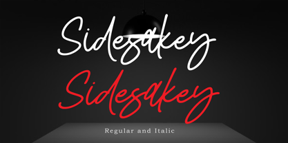 Sidesakey simplifies elegance into one truly stunning handwritten font. With its relaxed feel, Sidesakey is incredibly versatile, suitable to each of the design projects you may have in mind! Use it to create beautiful greeting cards, wedding invitations, logos, website titles and much more! Comes in Regular and Italic styles. Thank you for your purchase! Hope you enjoy with our font
 - Golden Dates by Balpirick,
$15.00 Golden Dates is a Modern Calligraphy Font. Golden Dates is a stylish and trendy script font. It looks stunning on wedding invitations, thank you cards, quotes, greeting cards, logos, business cards and every other design which needs a handwritten touch. Golden Dates also multilingual support. Enjoy the font, feel free to comment or feedback, send me PM or email. Thank you!
 - Bowen Script by Ashton,
$9.00 The font was inspired by the persistent demands of editors for scripts which actually looked like real handwriting, a lot of historical fiction projects and a love of maps. While making a map for a prequel to Treasure Island I decided to make a font from the lettering of some Caribbean maps of the period. The glyphs are all hand drawn vector outlines which although very legible and consistent in style carry the variation and irregularity you expect from handwriting. This font has been featured on maps for books by authors such as Peter V. Brett, Mark Lawrence and Michael Crichton.

