10,000 search results
(0.104 seconds)
- Siruca by FSD,
$60.27Siruca is a font created specifically for the Al Hamra Complex, in Kuwait City, which includes the extraordinary Al Hamra Tower, one of the tallest skyscrapers in the world. Siruca is a stencil font designed to be used both by the classical forms, both for possible use with neon tubes. Indeed, the rounded ends and the total absence of sharp corners to prevent abrasion during the use of masks and, simultaneously, provide a realistic neon circuit designer. The typeface is accompanied by a series of pictograms (designed following the same guidelines described above) to be used on signs inside the building. The originality and versatility of the font Siruca™ makes it particularly suitable for the characterization of tainted brands from the strong recognizable. - Crassula by ParaType,
$30.00 Crassula is a versatile display font. Like the plant of the same name (Crassula, jade tree, money plant), which has thick juicy leaves, the font is distinguished by rounded contours and smoothed out forms of elements. Stylistic Alternates offer more traditional letter shapes and make Crassula more readable in long texts. Six weights allow a broad range of applications - from informal book and magazine headlines to emotional marketing ads. The font was designed by Natalia Vasilyeva and released by ParaType in 2018.
 - Wholecar by Mans Greback,
$59.00 Wholecar is a train graffiti typeface. The letters are fun and friendly, with a happy personality and cartoonish quirkiness. A street style, Wholecar is drawn and created by Mans Greback, and is the perfect combination of cool and childish typography. This hip-hop styled comic typeface family comes in eight styles: Black, Inline, Invert, Regular and White. Additionally, the Wholecar Color, consisting of Noir, Pink and Silver, specifically created for Photoshop and Illustrator. Use characters [ ] { } ¤ # _ for train parts fitting the letters. Examples: [¤#¤_¤_¤#¤] [¤Graffiti¤] The font is built with advanced OpenType functionality and has a guaranteed top-notch quality, containing stylistic and contextual alternates, ligatures and more features; all to give you full control and customizability. It has extensive lingual support, covering all Latin-based languages, from North Europe to South Africa, from America to South-East Asia. It contains all characters and symbols you'll ever need, including all punctuation and numbers.
 - DM PopCap by DM Founts,
$20.00 DM PopCap is the third typeface released by DM Founts. It was created to accompany a 2013 LEGO-based project, which itself was inspired by the music video for Scream by Michael and Janet Jackson. I had to create the typeface in order to make title cards, as no such typeface appeared to exist. Although the resulting typeface looks similar to the text appearing in the music video, I also set myself the challenge of creating the remaining characters of the alphabet, as well as others that some would find useful. As suggested by the music video, the typeface would be ideal for a futuristic or technological setting, particularly concerning space travel. In the project I had paired this typeface with Myriad Pro. As with my other offerings, this font is intended for use heading or standalone title use - but it also appears to work on its own for small paragraphs of text.
 - American Presidents by Celebrity Fontz,
$19.99The American Presidents font is a collection of the signatures of all 44 U.S. Presidents. A must-have for autograph collectors, desktop publishers, lovers of history, or anyone who has ever dreamed of sending a letter, card, or e-mail to a friend or family member “signed” as if by one of America’s Presidents. This unique font puts the signatures of America’s Presidents at your fingertips in the form of a high-quality Open Type font. Our fonts behave exactly like any other font on your system and are installed and selected the same way. No special software is needed. Just as with any True Type or Open Type font, you can resize the signature, change its color, etc. Each signature contained in our fonts is mapped to a regular character on your keyboard. Open any Windows application, select the installed font, and type a letter, and you will see the President’s signature appear right there on your page where you placed your cursor. Painstaking craftsmanship and an incredible collection of hard-to-find signatures go into this one-of-a-kind font. We're confident you will enjoy it. Please note that this font is intended for entertainment purposes only. - Celestial by My Creative Land,
$18.00 Have you ever struggled while creating a quote with all ascenders/descenders getting on the way? When you can't find a perfect placement for a word because the letters on the upper line crossing the ones on the lower one? Well, I have :) If you want to reduce this struggle to a minimum, the Celestial brush font is for you. Full of open type features and alternates it won't stand on your way to get the job done ;) Most of the font's letters have "longer" or "shorter" alternates. Celestial brush font is fully unicode mapped.
 - Cherubina by Hanoded,
$15.00 Cherubina means ‘Blessed’. It is a name derived from the Akkadian “karabu / kuribu”, meaning “blessing, blessed”. A cherub is a type of spiritual being mentioned in the Hebrew Bible, often depicted as a baby with wings. This font was based on the hand lettering I found on a 1962 Japanese poster for the movie “Mother Joanna Of The Angels”. The poster was designed by Hiroyoshi Oshima. Cherubina font is an all caps font (upper and lower case differ and can be used together) with a medieval feel to it. I tried to keep the ‘spirit’ of Hiroyoshi Oshima’s lettering, but changed the glyphs and designed most of them myself, as I had nothing but the title of the poster to work with. I have added some ligatures as well. Comes with my blessing and an eternity of diacritics.
 - Oliviar Sans by Adam Fathony,
$10.00 Oliviar Sans Variable is a modern sans serif with Grotesque touch. It's my experimental to study the new trends for the future fonts that is Variable Fonts. Inspired by a Geometrical fonts and also Humanist Sans serif. Created with 8 Masters that export to the traditional OTF to 28 Styles!. On the Applications that support variable fonts such as Adobe Illustrator & Photoshop, you can get more than only 28, you can customize the Weight, Width and Slant. Weight created from Thin (100) to Bold (900), Width created from Standard (100) to Expanded (900) and Slant based on degree angle from 1˚ to 10˚. There is a new slider icons for accessing this features Check on Last Display Image. Another advantage on the Variable fonts are you just need 1 files to install to your computer and it will install all the styles available. All of the Fonts are support for Multilanguage, Carefully Crafted.
 - Daytona Variable by Monotype,
$209.99The Daytona™ typeface family grew out Jim Wasco’s desire to design a readable and legible typeface for video and on screen use. Because of its high levels of legibility, the Daytona family is additionally an ideal design for display usage in digital user interfaces and a wide range of print applications. Wasco drew each character with legibility as a primary goal, some of the letters having unique attributes to minimize the ambiguity. Daytona Variables are font files which are featuring two width axes and have a preset instance from Thin to Fat. - Vasarely by B2302,
$33.00 VASARELY has famous roots, its name is related to optical arts own Victor Vasarely. Dropping the field of Op-Art, you already know where we have been aiming at. The REGULAR and LIGHT cuts of VASARELY are quite ordinary, rectangular, but legible typefaces, but with the BOLD and EXTRABOLD versions you will be able to build diverse illusive type illustrations and layouts. Being build on a strict grid with same dimensions, the eye-affecting black-and-white contrast should trigger different optical effects. As an extra we build an EXTRUDED version as well. Have fun!
 - Chubby Elephant by Putracetol,
$25.00 Chubby Elephant - Bold Playful Display Font. This font is very bold and playful. With a childish style, it will be very suitable for your project, which is related to children. Such as story books, illustrations, comic books, t-shirts, posters, greeting cards, logos, branding, stickers, svg, crafting. This font can be installed on MAC OS and Windows OS, it can also be installed in the procreate and cricut applications. Come with lot of ligatures character, its help you to make great lettering. This font is also support multi language.
 - Creaty by Dilbadil,
$14.00 Hi, introduce my new font Creaty. This is a simple and sweet script font. Suitable for various designs such as t-shirt designs, quotes, weddings, business cards and more. This font supports multiple languages and also alternates. For alternates y, g, j, z you can use them easily, by typing: y2, g2, j2, z2 Hope you enjoy it Thank you
 - Cursivo Saxonio by Intellecta Design,
$21.90 Cursivo Saxonio is a typeface inspired in the famous book The Case of Charles Dexter Ward, by H P Lovecraft. It shows better than I get with my studies the authentic "Insularis" or "Cursivo Saxonio" handlettering of the VIII and XI centuries used by some people in Britain. The text on the accompanying poster reads: “Corwinus necandus est. Cadaver aq(ua) forti dissolvendum, nec aliq(ui)d retinendum. Tace ut potes”
 - Belizio by Font Bureau,
$40.00 The eight-part Belizio series updates the first Font Bureau typeface. David Berlow’s family is based on Aldo Novarese’s Egizio, designed in 1955 for Nebiolo. It was first prompted by the popularity of Haas Clarendon, designed by Hoffmann and Eidenbenz, an impeccably Swiss revival of the traditional English letterform. Aldo Novarese was among the first to investigate a true italic designed in the Clarendon style; FB 1987–98
 - Ray Johnson by K-Type,
$20.00 The Ray Johnson font was inspired by the Father of Mail Art. It's based on the block lettering style used by Ray to add the names of his correspondents to their bunny head portraits (the film How to Draw a Bunny is a superb introduction). The font includes blank bunny heads and other Ray Johnson graphics as scalable vector images, and separate bitmap images are also provided as jpegs and gifs.
 - Toy Decals JNL by Jeff Levine,
$29.00 For decades, cereal companies have included premiums [promotional gifts] inside their packages, printed on the cartons or to send for with a special coupon and redemption instructions. During the 1940s, Pep cereal [a long-discontinued Kellogg's brand] offered a series of water-applied decals within its boxes. Most likely made by the Meyercord Company (one of America's largest transfer decal manufacturers at the time), one decal in particular had an alphabet in gold letters with black outlines. (One can only presume the marketing strategy was to have kids bug their parents to buy more Pep cereal if the child needed more than one letter of the alphabet for his or her initials!) Those decal letters have inspired a digital version as the outline character font Toy Decals JNL, which is available in regular oblique, solid and solid oblique styles.
 - Pantographia by Intellecta Design,
$9.00Pantographia Collection is a Intellecta digitization, in facsimile style, without artistical interpretation of any kind, of the work of Edmund Fry (monumental book), Pantographia , a work on languages containing over 200 alphabets. We just are collecting in digital way these alphabets. Each alphabet has a short pdf description (see in the gallery). For example, in the pdf brochure of the "Saracen One" font, according to Edmund Fry, "This characters, according to Theseus Ambrosius, was used by the Saracens at the time of their conquests. Claude Duret, p. 475." Ambrosius, Theseus: Introductio in Chaldaicam lingua, Syriaca, atque Armenicam, [et] dece*. - 1539. Theseus Ambrosius or AMBROGIO, was an Italian orientalist, which born in 1469, and died in 1539 - He wrote his Introduction to the Chaldean, Syrian, Armenian, and ten other tongues, with the alphabetical characters of about forty different languages, 4to." The Pantographia font have only the original characters showed in Fry's book. There are instructions in the PDF files to get them. These fonts have no philological (or linguistic) academic pretentions. They are digitized and faithful versions of the original, like first published at Fry's book. - Mrs Eaves XL Serif by Emigre,
$59.00 Originally designed in 1996, Mrs Eaves was Zuzana Licko’s first attempt at the design of a traditional typeface. It was styled after Baskerville, the famous transitional serif typeface designed in 1757 by John Baskerville in Birmingham, England. Mrs Eaves was named after Baskerville’s live in housekeeper, Sarah Eaves, whom he later married. One of Baskerville’s intents was to develop typefaces that pushed the contrast between thick and thin strokes, partially to show off the new printing and paper making techniques of his time. As a result his types were often criticized for being too perfect, stark, and difficult to read. Licko noticed that subsequent interpretations and revivals of Baskerville had continued along the same path of perfection, using as a model the qualities of the lead type itself, not the printed specimens. Upon studying books printed by Baskerville at the Bancroft Library in Berkeley, Licko decided to base her design on the printed samples which were heavier and had more character due to the imprint of lead type into paper and the resulting ink spread. She reduced the contrast while retaining the overall openness and lightness of Baskerville by giving the lower case characters a wider proportion. She then reduced the x-height relative to the cap height to avoid increasing the set width. There is something unique about Mrs Eaves and it’s difficult to define. Its individual characters are at times awkward looking—the W being narrow, the L uncommonly wide, the flare of the strokes leading into the serifs unusually pronounced. Taken individually, at first sight some of the characters don’t seem to fit together. The spacing is generally too loose for large bodies of text, it sort of rambles along. Yet when used in the right circumstance it imparts a very particular feel that sets it clearly apart from many likeminded types. It has an undefined quality that resonates with people. This paradox (imperfect yet pleasing) is perhaps best illustrated by design critic and historian Robin Kinross who has pointed out the limitation of the “loose” spacing that Licko employed, among other things, yet simultaneously designated the Mrs Eaves type specimen with an honorable mention in the 1999 American Center for Design competition. Proof, perhaps, that type is best judged in the context of its usage. Even with all its shortcomings, Mrs Eaves has outsold all Emigre fonts by twofold. On MyFonts, one of the largest on-line type sellers, Mrs Eaves has been among the 20 best selling types for years, listed among such classics as Helvetica, Univers, Bodoni and Franklin Gothic. Due to its commercial and popular success it has come to define the Emigre type foundry. While Licko initially set out to design a traditional text face, we never specified how Mrs Eaves could be best used. Typefaces will find their own way. But if there’s one particular common usage that stands out, it must be literary—Mrs Eaves loves to adorn book covers and relishes short blurbs on the flaps and backs of dust covers. Trips to bookstores are always a treat for us as we find our Mrs Eaves staring out at us from dozens of book covers in the most elegant compositions, each time surprising us with her many talents. And Mrs Eaves feels just as comfortable in a wide variety of other locales such as CD covers (Radiohead’s Hail to the Thief being our favorite), restaurant menus, logos, and poetry books, where it gives elegant presence to short texts. One area where Mrs Eaves seems less comfortable is in the setting of long texts, particularly in environments such as the interiors of books, magazines, and newspapers. It seems to handle long texts well only if there is ample space. A good example is the book /CD/DVD release The Band: A Musical History published by Capitol Records. Here, Mrs Eaves was given appropriate set width and generous line spacing. In such cases its wide proportions provide a luxurious feel which invites reading. Economy of space was not one of the goals behind the original Mrs Eaves design. With the introduction of Mrs Eaves XL, Licko addresses this issue. Since Mrs Eaves is one of our most popular typefaces, it’s not surprising that over the years we've received many suggestions for additions to the family. The predominant top three wishes are: greater space economy; the addition of a bold italic style; and the desire to pair it with a sans design. The XL series answers these requests with a comprehensive set of new fonts including a narrow, and a companion series of Mrs Eaves Sans styles to be released soon. The main distinguishing features of Mrs Eaves XL are its larger x-height with shorter ascenders and descenders and overall tighter spacing. These additional fonts expand the Mrs Eaves family for a larger variety of uses, specifically those requiring space economy. The larger x-height also allows a smaller point size to be used while maintaining readability. Mrs Eaves XL also has a narrow counterpart to the regular, with a set width of about 92 percent which fulfills even more compact uses. At first, this may not seem particularly narrow, but the goal was to provide an alternative to the regular that would work well as a compact text face while maintaining the full characteristics of the regular, rather than an extreme narrow which would be more suitable for headline use. Four years in the making, we're excited to finally let Mrs Eaves XL find its way into the world and see where and how it will pop up next.
 - Rimeland by Letterhend,
$19.00 Introducing, Rimeland Script - A beautiful modern calligraphy script based on manual hand writing. The natural flow with the swashes make this font looks even more prettier. This type of font perfectly made to be applied especially in wedding invitation, labels, logos, magazines, books, greeting / wedding cards, packaging, fashion, make up, stationery, novels, labels or any type of advertising purpose. Features : uppercase & lowercase numbers and punctuation multilingual swash and ligature alternates PUA encoded We highly recommend using a program that supports OpenType features and Glyphs panels like many of Adobe apps and Corel Draw, so you can see and access all Glyph variations.
 - Captivate by Letterhend,
$19.00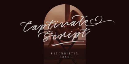 Introducing, Captivate Script - A beautiful modern calligraphy script based on manual hand writing. The natural flow with the swashes make this font looks even more prettier. This type of font perfectly made to be applied especially in wedding invitation, labels, logos, magazines, books, greeting / wedding cards, packaging, fashion, make up, stationery, novels, labels or any type of advertising purpose. Features : uppercase & lowercase numbers and punctuation multilingual swash and ligature alternates PUA encoded We highly recommend using a program that supports OpenType features and Glyphs panels like many of Adobe apps and Corel Draw, so you can see and access all Glyph variations.
 - Creamy Bubble by Balpirick,
$15.00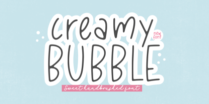 Creamy Bubble - a Sweet Handbrushed Font that's clean, elegant and perfect for a range of design projects! With its smooth, effortless lines and understated sophistication, this font is the perfect choice for those who want a modern look that's still timeless in its appeal. Crafted with precision and care, this font is incredibly versatile and can be used for a range of design projects, including logos, branding, invitations, packaging, and more. With its simple yet refined aesthetic, it's sure to make a lasting impression on anyone who sees it. - also multilingual support Enjoy the font! Feel free to comment or feedback! Thank you!
 - Malliandra Script by Letterhend,
$19.00 Introducing, Malliandra Script - A beautiful modern calligraphy script based on manual hand writing. The natural flow with the swashes make this font looks even more prettier. This type of font perfectly made to be applied especially in wedding invitation, labels, logos, magazines, books, greeting / wedding cards, packaging, fashion, make up, stationery, novels, labels or any type of advertising purpose. Features : uppercase & lowercase numbers and punctuation multilingual swash and ligature alternates PUA encoded We highly recommend using a program that supports OpenType features and Glyphs panels like many of Adobe apps and Corel Draw, so you can see and access all Glyph variations.
 - Chordette for Mandolin by Ukefarm,
$10.00 Chordette Mandolin Chord Fonts are tuned GDAE and support Mandolin, Irish Tenor Banjo and Irish Bouzouki. Create a Mandolin Chord Chart quickly and easily. Mandolin Chord Fonts Chordette contains high quality Mandolin chord fonts. Each mandolin chord is mapped to a specific key on the keyboard, so you can type out chords. It’s a lot easier than dealing with images to create a Mandolin chord chart and song sheets. It’s a favorite tool for teachers, music therapists, and musicians. What instruments are supported? Chordette for Mandolin is tuned GDAE and supports Mandolin, Irish Tenor Banjo, and Irish Bouzouki. Chordette is available in multiple tunings for most stringed instruments. Most versions of Chordette support multiple instruments. App / Instruments Supported / Tuning Chordette for Guitalele / Guitalele, Baritone Guitar / ADGCEA Chordette for Ukulele / Concert Ukulele, Banjolele / GCEA Chordette for Soprano Uke Soprano Ukulele ADF#B Chordette for Baritone Uke / Baritone Ukulele / DGBE Chordette for Mandolin / Mandolin, Irish Tenor Banjo, Irish Bouzouki / GDAE Chordette for Banjo / Banjo /gDGBD Chordette for Tenor Banjo / Tenor Banjo, Tenor Guitar, Mandola / CGDA Chordette for Guitar / Guitar / EADGBE Each version of the Chordette font uses the same chord sets and keyboard mappings. If you play multiple instruments, you can create a chord sheet for one, then use another Chordette font to transpose the song to another. For example, you can create a song for Mandolin, then instantly transpose it for Guitar and Ukulele. Simply by changing fonts! Chordette for Mandolin is priced at $10, which includes the Mandolin chord font sets for both Mac and Windows. For help and support, please visit https://ukefarm.com/chordette/help.html
 - Hardal MF by Masterfont,
$59.00 A unique semi geometric type that is inspired by natural round forms that flow in a sweet harmony.
 - Heima by Earlyfair Studio,
$12.00 Heima is a sweet and simple handwritten font with a cool charm. Get inspired by its unique charm!
 - Setting Fires by Ahmad Jamaludin,
$12.00 Setting Fires is a beautiful, sweet font, a vintage monoline with movement and grace. This is a unique script for you. This font contain ligatures, many stylistic alternate, swashes. It is also support multi language. Setting Fires has an elegant and stunning effect as display font which makes it perfect for branding projects, logos, wedding designs, social media posts, advertisements, product packaging, product designs, labels, photography, watermark, invitation, stationery and any projects that needs a handwriting touch. What's Included? - More than 100 of glyphs - Ligatures & Stylistic Alternate - Works on PC & Mac - Simple Installations - Accessible in the Adobe Illustrator, Adobe Photoshop, Adobe InDesign, even work on Microsoft Word. - PUA Encoded Characters - Fully accessible without additional design software. - Multilingual Support
 - Romper by DearType,
$29.00 Romper is a slightly narrow handwritten sans in four weights and it is perfect if you want to convey a casual and friendly feel. It was designed with the idea to be used on comic books, mobile applications and children’s books, thus it has a Dancing Baseline version (Romper DB) and a Slanted version (each of them in four weights as well). The family is equipped with 450+ glyphs, has Latin Extended and Cyrillic Support (both Russian and Bulgarian) and a lovely set of extras. The family includes a lot of discretionary ligatures and alternate letters for more variety in the design. Overall, Romper is cute, amiable and really versatile, so it will fit most applications - think greeting cards, menus, merchandise, books, packaging, websites, etc.
 - DT Skiart Serif Mini by Dragon Tongue Foundry,
$9.00 ‘Skiart Serif Mini’ is now available online. Originally inspired by the san serif font ‘Skia’ by Mathew Carter for Apple. ‘Skiart’ was designed to feel more like a serifed font, but without any serifs. It took a step between sans serif and serif fonts. Next on the path towards a serif font comes Skiart Serif Mini, with tiny serifs added. This is a true serif font, all be it on the small side. It remains fully readable and feels as clean and normal as any of the best body copy serifs, and yet still has the strong solid bones of all the other Skiart font familys. If compared to one of the more commonly used serifs like ‘Times New Roman’, the ‘Skiart Serif Mini’ lowercase is more open with a taller x-height, increasing its readability and friendliness. The serifs are smaller and less distracting. They are not pretending to be ligatures. Where ‘Times’ makes its p q b d forms out of a barely touching oval and stem, the ‘Serif Mini’ forms are much more firmly attached, appearing clearly as single letters. The standard setting for the g’s are round single storied, (the italic a’s are also), feeling warmer and more inviting in the ‘Serif Mini’ font. Much more friendly than the stuffy double storied versions in fonts such as ‘Times’ etc.
 - Norton - Unknown license

- Brer Rabbit by Kitchen Table Type Foundry,
$15.00 Brer Rabbit (or Brother Rabbit) is the central figure in an oral tradition passed down by African-Americans. Brer Rabbit is a trickster, just like the other popular trickster character in African stories called Anansi the spider. Brer Rabbit was based on an old font of mine called Rabbit On The Moon. It is a nice, cute children’s book font that comes with extensive language support and Brer Rabbit himself, in the shape of the alternative asterisk glyph.
 - Titanium by Ascender,
$29.99 Titanium is a geek-ed out, über-technoid specimen of plasma-type. Designed by Steve Matteson, this typeface is the perfect display font for your star cruiser or the weekend interplanetary lander. Like its namesake, Titanium is the strongest design for its weight capable of withstanding the jump to lightspeed without paradoxical distortions. Titanium is now available for use on home world computing devices to capture the essence of galactic travels.
 - Rennie Mackintosh Scotland St by CRMFontCo,
$20.00Derived from the world famous Rennie Mackintosh Font, the Scotland St. version gives an outline form of the genius of Charles Rennie Mackintosh. The "Scotland St." name comes from one of Mackintosh's most famous architectural works - the Scotland St. School in Glasgow, Scotland. This wonderful legacy of Mackintosh's genius can be visited daily FREE OF CHARGE, as it has been classed as a museum by Glasgow City Council. - Bertie by ITC,
$29.99Bertie was designed by Alan Meeks in 1986, an ornamented typeface with a light and elegant look. Such typefaces were at their peak in the middle of the 19th century, when they were created for the advertisements of booming industries. The sophisticated Bertie is based on forms of the transitional period and is best used in headlines with point sizes of 18 or larger to highlight its unique details. - Nouveau Fashion JNL by Jeff Levine,
$29.00 A pleasant Art Nouveau hand lettered title is featured on the sheet music cover for "You Brought A New Kind of Love to Me". The song is from the 1930 Paramount film "The Big Pond" featuring Maurice Chevalier and Claudette Colbert. The original lettering was done with a round point pen nib, and showed a lot of small inconsistencies. For the digital version it has been "tightened up" a bit and is now available as Nouveau Fashion JNL, in both regular and oblique versions.
 - Harlem Text by Solotype,
$19.95This bold blackletter is rather wide, which enhances its readability. In Victorian job printing it was not unusual to find one line of blackletter in a card or handbill, just for contrast. This one came on the scene sometime in the 1880s. - Les Bonbon Boutique PW by Patty Whack Fonts,
$29.98Reminiscent of vintage Paris. Think Tea Parties, Sweet Treats, Candy Shoppes, Boutiques, Fine China, Couture, Cakes and Pastries. This font is perfect for cards, menus, signage, and much more. Les Bonbon Boutique PW is intended and suitable for Display use and Titles. It's not suitable for long paragraphs of text. This font is meant for display, titles, beautiful signage, cards, etc. Les Bonbon Boutique PW is available in OpenType, and TrueType format. - Glass Light by Wiescher Design,
$49.50 Glass Light was designed in 1912 by Franz Paul Glass for the Genzsch & Heyse foundry. The font is stylewise related to the "Lo types" of the same period. Glass designed a lot of decorative elements to go along with the font. I added Swashes, endletters and smallcaps to the set to make it complete. Since this type of font will probably not be used by many professionals, I did not put all the letters into one big OTF-version since most people don't have OTF-savy software. These fonts can and should be mixed for optimal results. Your decorative designer Gert Wiescher
 - Troback regular by Alit Design,
$20.00 Introducing Troback - A Vintage Display Font Step into a realm of timeless elegance with Troback, a meticulously crafted vintage display font that pays homage to the design aesthetics of the past. With its distinctive retro charm, Troback encapsulates the spirit of a bygone era, where every letter tells a story. Inspired by the ornate typography of vintage signage, Troback is a masterful blend of boldness and sophistication. Its characters are imbued with intricate details, from the delicate serifs that harken back to a more refined age, to the captivating curves that dance along the baseline with a sense of purpose. This font conjures nostalgia with every stroke, summoning memories of old cigar box labels, antique shop signage, and classic posters that once adorned bustling city streets. Troback isn't just a font; it's a journey through history, a bridge between the craftsmanship of yesterday and the creativity of today. Ideal for branding that craves a touch of vintage authenticity, for designs seeking to recapture the allure of a vintage era, Troback stands as a testament to the enduring power of timeless typography. Let your words resonate with the elegance of a bygone time - let them speak through Troback.
 - Tazugane Info by Monotype,
$187.99 Tazugane Info is a screen-ready Japanese font family, that follows on the debut of Monotype's first original Japanese typeface – Tazugane Gothic. It offers a more restrained personality, with calligraphic design details pared back to create a geometric letterform – a good alternative for designers looking for a matter-of-fact alternative to the warmer Tazugane Gothic tone of voice. Tazugane Info was updated to support the “Reiwa” new era symbol. Reiwa can be written as two kanji: 令和. This update to Tazugane Info includes Reiwa designed as a single ligature and is encoded as U+32FF. “While Tazugane Gothic fits perfectly when your job requires an organic and friendly tone of voice, Tazugane Info provides a more solid look,” says Kobayashi. “I hope that having two options will make it easier to choose an appropriate tone of voice to convey information or brand messaging.” Its strokes create a smooth uninterrupted flow that's designed for use on-screen. Although books, newspapers and magazines are traditionally set vertically in Japan, smartphones, information panels and car navigation systems are all set horizontally – and Tazugane Info has been tailored to this environment, featuring a new set of kana phonetic symbols. Tazugane Info is available in 10 weights, and includes the complete set of kanji and latin found in Tazugane Gothic.
 - Rollik by Alit Design,
$19.00 Presenting the ✨Rollik Typeface✨ by alitdesign. Inspired by music posters of the 70s and 80s, the Rollik font was created in a calm and simple style but still gives it a uniquely retro and playful feel. Besides that, combined with a dynamic serif style makes the Rollik font more stylish and retro elegant, especially if the design to be made uses swash on alternative fonts for creativity, for example lettering or logotypes designed to make your design look cool and different. The Rollik font is very suitable for making designs with retro concepts, simple and playful designs, for example making magazine cover designs, music covers, YouTube thumbs, text headers, logotypes and so on with an elegant retort theme. Besides that this font is very easy to use both in design and non-design programs because everything changes and glyphs are supported by Unicode (PUA). The Rollik font has a total of 940 glyphs including symbol, multilingual and alternative glyphs. We really enjoyed the process of making the Rollik font, we hope you are also happy when using the Brolike font.
