10,000 search results
(0.058 seconds)
- Balthasar by Fine Fonts,
$29.00 Balthasar is a very distinctive, stencil-type display font. Its letterforms originally appeared on a lettered book jacket by Michael Harvey. Its highly condensed letterforms being very economic in the use of space. The augmented, Balthasar Plus version has many alternative characters and ligatures, together with Opentype features for their automatic substitution where the application in which they are used permits.
 - Annabelle Matinee NF by Nick's Fonts,
$10.00A charming headline font, bold yet feminine, based on Lilith, designed by Lucien Bernhard for Bauersche Gießerei in 1930. Some of the fussier elements of the original have been removed in order to create an elegant exercise in typographic chiaroscuro. Both versions of this font contain the Unicode 1252 (Latin) and Unicode 1250 (Central European) character sets, with localization for Romanian and Moldovan. - Bit Part JNL by Jeff Levine,
$29.00 Bit Part JNL is an extra condensed monoline sans serif typeface that's well suited for movie credits, disclaimers and other forms of tight-fit word copy. Inspired by just the numbers "65" on the cover of a 1965 high school yearbook, this retro font will fit a lot of copy into a small area. The typeface is available in regular and oblique versions.
 - Idle Fancy NF by Nick's Fonts,
$10.00This elegant yet playful offering is based on the typeface Domino designed by Alfred Riedel for the German foundry Ludwig & Mayer in 1954. Its large x-height and subtly sinuous curves make it a natural choice for headlines which are both warm and compelling. Both versions of the font include 1252 Latin, 1250 CE (with localization for Romanian and Moldovan). - Bergell by ITC,
$29.00Inspired by the work of famed Swiss artist Alberto Giacometti, the German designer Thomas Finke created Bergell, a lively and natural script face. Bergell's calligraphic style is both dynamic and elegant, like the kind of special, festive handwriting many desire, but few ever manage to achieve. Why spend so much time at your drawing table when there are great fonts like this one? - Boomerang JY by JY&A,
$39.00Based around the Australian boomerang, Greg Bastin’s design originally appeared on private Christmas cards and individual projects. It was formalized into a font in 2002 by David Philpott (JY Circles) and brings a quirky antipodean style to the JY&A Fonts range. This display family is available in Solid and Outline forms, the latter containing patterns that parody those of Aboriginal culture. - White Rabbit - Unknown license

- Blacker Mono by Zetafonts,
$39.00 Blacker mono was developed out of a brief by Isabella Ahmadzadeh, by Cosimo Lorenzo Pancini and Francesco Canovaro for the editorial project "A beautiful mistake" by OFFF Tlv in 2022. It is a monospaced version of our typeface Blacker, bringing its "evil serif" aesthetics in the realm of typewriter and coding typefaces. In designing these, usually the letterforms are deformed to better fill the space, but in Blacker Mono only the serifs are modified to balance letters, while letter skeletons are kept consistent with the ones of the original Blacker family. This gives the typeface an uneven, unexpected rhythm, underlined by the unusual choice of providing three optical sizes and some extreme display weights - both uncommon choices in monospaced fonts. The resulting typefamily is thought for use in editorial situations where readability must be married by a strong personality, and is complemented by all the wide array of Open Type features that are present in all Blacker variants, from positional numerals to small case letters and alternates.
 - Fourteen64 by Grummedia,
$24.00Inspired by 15th century Venetian italic book texts and based on examples from volumes on the history of type. Fourteen64 has a rugged charm and lots of character featuring 'Roman' capitals with italic lowercase. Includes alternate characters, extra ligatures and a small selection of medieval ornaments. - Moneta by Monotype,
$35.99 Moneta is an elegant transitional serif with high contrast. Its morphology is based on the study of traditional broad-edge pen script. It comes in 4 different weights (Light, Regular, Bold and Black) and has variable features. Designed by Santi Rey and launched on January 2020.
 - Aanaar by Letterjuice,
$66.00 This typeface comes from a self initiated project called Sápmi, which aims to contribute to keep a group of minority languages alive through solving issues in the education environment. This re-thought edition takes the name of Aanaar and joins our library with a bigger character set and two new weights which complete the typeface providing a big typographic palette as well as adding stylistic two-story a and g for more advanced readers as well as to enable the typeface to be used in other environments. The typeface was originally designed for children’s text books. Analysing kid’s typeface design, we identified some important problems and solved them within the boundaries we had. The main concern in a typeface which will be used by children is letter recognition, as they have not yet fully develop their reading skills. For example, letters like “a” and “g” share a very similar structure in this particular kind of typefaces, where the only distinctive part is the descender of the “g”. It is known that the lower part of the letter is the less important feature when reading, therefore we decided to make a clear distinction between them by having an “a” with a spur on the top right. This also helped distinguishing “a” and “o”. Children typefaces usually have one story “a”, making “a” usually too close to “o”. Additionally we moved the joint in “a” upwards and narrowed very slightly the “a” to make sure they cannot be mistaken. More generally, the x-height is fairly tall and the typeface has a bit of movement which give it a good rhythm helping moving along nicely when reading. Aanaar consists of 5 weights (Light, Regular, Medium, Bold and Black) plus two Italics (Light Italic and Italic).
 - Windshield Massacre - Personal use only

- Bear Club by Pink Broccoli,
$19.00 Another offbeat typeface inspired by the lettering on a design by Patrick Owsley for the Chicago Bears. There's nothing more lively than animated text, and Bear Club has that flavor in two ways. With counter inspirations drawn from fonts like Ad Lib and Nightclub, an automatic alternating caps and alternate caps feature, as well as a contextual alternates set that creates a true animated bounce, just like Hip Hopper. Let the fun begin with this spunky, lighthearted and heavy-weighted comic typeface.
 - Quadrat Grotesk New by ParaType,
$30.00 Designed for ParaType in 2004 by Vladimir Pavlikov. It is a new version of popular type Quadrat Grotesk by the same author. Letters of the new version in contradistinction to the old one are clean and have no traces of exploitation. Quardat Grotesk New due to its rectangular proportions is extremely readable in small sizes and can be successfully used in Web pages and in documents with long lists where critical aspect is a number of lines rather then length of a line.
 - Madrone by Adobe,
$29.00Madrone is an Adobe Originals typeface designed by Barbara Lind in 1991. Madrone was digitized from proofs of the woodtype collection in the National Museum of American History of the Smithsonian Institution in Washington, D.C. A fat face roman, Madrone is typical of popular early nineteenth-century styles. Fat face types are characterized by their squatness and extreme letter width. One familiar version of this design is Bodoni Ultra Bold. Madrone is eye-catching for display uses in advertising and packaging. - Config Rounded by Adam Ladd,
$25.00 Config Rounded is a condensed geometric sans with rounded corners. Config’s sibling, this typeface was influenced by geometric sans with circular forms on the tops and bottoms of characters, but the proportions have been condensed by incorporating straight sides for a design that is efficient yet friendly. Use it for a subtle softness that still looks modern and strong. With 10 weights, there are options to fit the need—black and thin for extreme uses and intermediates for more common needs.
 - Core Sans DS by S-Core,
$20.00 Core Sans DS is a rounded version of Core Sans D and a modern interpretation of condensed sans-serif typeface designed by S-Core and the whole family consists of 2 widths (Condensed, Normal), 7 weights (Thin, Light, Regular, Medium, Bold, Heavy, Black) with their corresponding italics. Core Sans DS features a condensed geometric construction and has a large x-height which enhances legibility. The family is ideal for signage, headline as well as body text. Core Sans DS is a part of the Core Sans Series such as Core Sans N SC, Core Sans N, Core Sans NR, Core Sans M, Core Sans G,Core Sans A, Core Sans GS and Core Sans ES. Letterform in this type family is simple, clean and highly readable. The spaces between individual letter forms are precisely adjusted to create the perfect typesetting. Core Sans DS supports complete Basic Latin, Cyrillic, Central European, Turkish, Baltic character sets. Each font includes proportional figures, tabular figures, numerators, denominators, superscript, scientific inferiors, subscript, fractions and case features.
 - Indulta SemiSerif - Personal use only

- Disoluta - Personal use only

- Minea by Bistatype,
$35.00 A characteristic of the Minea font family is the achievement of the calligraphic handwriting effect. In addition to basic, simple letter forms, it contains a large number of additional stylistic alternatives and ligatures that, by combining and changing without repetition, give the effect of calligraphic writing. Some of these characters can be changed by automatically turning on a particular OpenType function, when ligatures replace the combination of letters that are part of them, the letter is replaced by a certain alternative when found in a given context, and capital letters are replaced with decorative initials. Letter swap functions can be used in all programs that support OpenType programming. Minea is an attractive font that is sleek, clean, feminine, sensual, glamorous, simple and very easy to read. The Minea font family, based on original calligraphic sketches, contains a total of six weights. Thin, regular and medium weights have ligatures and alternate letter shapes, which help make the syllable look like an authentic calligraphic print. Semi-bold, bold, and black weights contain only basic letter shapes. The font family contains Latin and Cyrillic. Includes Russian and Serbian alternative letter forms. The family of calligraphic fonts Minea can be used on various occasions, and is intended for use in print and online. Can be used in the realization of certain tasks, unusual advertisements, packaging and invitations, diplomas ... as well as for all purposes where this type of letter is needed.
 - Ladoga by ParaType,
$30.00 Ladoga — one of the most beautiful Russian designs from the soviet period. The type family was developed in Polygraphmash in 1968 by Anatoly Shchukin on the base of his own lettering for book covers and titles. It was one of the first attempts in Cyrillic typography to create text face in a style of renaissance antiqua. Stylization to broad pen calligraphy resembles early forms of Latin types that were based on handwritten humanistic minuscule. Unique in its character set digital version of Ladoga was designed by Viktor Kharik on the base of artworks of Shchukin for ParaType. The family consists of roman and italic styles in text and display versions. Character set includes characters of original shapes as well as more modern alternatives. Besides there are a set of additional characters, old style figures and small caps. The fonts cover all modern languages based on Latin and Cyrillic scripts, Greek alphabet (including polytonic extension), Hebrew and historical Cyrillic letters. Ladoga is gorgeous in display sizes and pretty readable in texts. It’s well suitable for fiction literature, historical books, art criticism, religious and philologist works. It will be extreme helpful for multilingual issues and for inclusions into body text historical passages in original orthography. The family was released in 2010.
 - Sheaff by Typodermic,
$11.95 Introducing Sheaff—the perfect display typeface to add a touch of retro sophistication to your graphic designs. This unique typeface merges the iconic, interlocking styles of the early 1970s with the soft, plastic forms of the Y2K era, resulting in a font that is both nostalgic and contemporary. Sheaff’s interlocking characters are truly something to behold. When certain letters combine, they create an exquisite and intricate interlock that is guaranteed to catch the eye of any viewer. You can fully experience this effect in all its glory by turning on your application’s “standard ligatures” function. With its delicate curves and playful shapes, Sheaff is the perfect choice for any display project that requires a touch of elegance and flair. Whether you’re designing a logo, creating a poster, or even working on a book cover, Sheaff’s unicase style will add a unique and sophisticated touch to your work. So why wait? Try out Sheaff today and experience the beauty of interlocking characters in all their glory. Whether you’re a seasoned designer or just starting out, this font is sure to impress and elevate your design projects to the next level. Most Latin-based European writing systems are supported, including the following languages. Afaan Oromo, Afar, Afrikaans, Albanian, Alsatian, Aromanian, Aymara, Bashkir (Latin), Basque, Belarusian (Latin), Bemba, Bikol, Bosnian, Breton, Cape Verdean, Creole, Catalan, Cebuano, Chamorro, Chavacano, Chichewa, Crimean Tatar (Latin), Croatian, Czech, Danish, Dawan, Dholuo, Dutch, English, Estonian, Faroese, Fijian, Filipino, Finnish, French, Frisian, Friulian, Gagauz (Latin), Galician, Ganda, Genoese, German, Greenlandic, Guadeloupean Creole, Haitian Creole, Hawaiian, Hiligaynon, Hungarian, Icelandic, Ilocano, Indonesian, Irish, Italian, Jamaican, Kaqchikel, Karakalpak (Latin), Kashubian, Kikongo, Kinyarwanda, Kirundi, Kurdish (Latin), Latvian, Lithuanian, Lombard, Low Saxon, Luxembourgish, Maasai, Makhuwa, Malay, Maltese, Māori, Moldovan, Montenegrin, Ndebele, Neapolitan, Norwegian, Novial, Occitan, Ossetian (Latin), Papiamento, Piedmontese, Polish, Portuguese, Quechua, Rarotongan, Romanian, Romansh, Sami, Sango, Saramaccan, Sardinian, Scottish Gaelic, Serbian (Latin), Shona, Sicilian, Silesian, Slovak, Slovenian, Somali, Sorbian, Sotho, Spanish, Swahili, Swazi, Swedish, Tagalog, Tahitian, Tetum, Tongan, Tshiluba, Tsonga, Tswana, Tumbuka, Turkish, Turkmen (Latin), Tuvaluan, Uzbek (Latin), Venetian, Vepsian, Võro, Walloon, Waray-Waray, Wayuu, Welsh, Wolof, Xhosa, Yapese, Zapotec Zulu and Zuni.
 - Journal by ParaType,
$25.00 Journal type family is a low-contrast text face of the Ionic-Legibility group. It was designed at the Polygraphmash Type Design Bureau in 3 styles in 1951–53 by Lev Malanov and Elena Tsaregorodtseva. The fonts were based on Cyrillic version of Excelsior that was developed in 1936 in Moscow by professor Michael Shchelkunov, Nikolay Kudryashev et al., that in its turn was based on Excelcior by Chauncey H. Griffith, 1931, Mergenthaler Linotype. Digital version was developed in ParaGraph (ParaType) in 1991. In 2012–13 designer Natalia Vasilyeva made some corrections in original digital data, extended character set and add bold italic style. The family was rereleased in ParaType in 2013.
 - Air Superfamily by Positype,
$29.00 In B-movie awesomeness, Air began as Grotesk vs. Grotesque. I was trying to unify the prevailing traits of German and English Grotes(que/k)s in order to make something different but familiar. I am NOT trying to reinvent Helvetica (snore), so get that out of your system. From the onset, I intended this typeface to be a true workhorse that offers infinite options and flexibility for the user. At its core, it is the maturation of the Aaux Next skeleton I developed years ago. I worked out Aaux Next to settle my issues and love for Akzidenz. With Aaux Next, I strove to be mechanical, cold and unforgiving with it. I was single, young, cocky and it fit. Now I'm married, kids, dog and have found that I've turned into a big softy. When I look at Aaux Next (and have for the past few years) I see another typeface trying to eek out. I wanted it to avoid the trappings of robotic sans, quick tricks and compromises. The typeface’s DNA needed to be drawn and not just generated on a screen — so I set aside a year. I love type. I love working with type. I hate when my options for a slanted complement is only oblique or italic. I set out to produce both to balance usage — there are more than enough reasons to prepare both and I want the user to feel free to consciously choose (and have the option to choose) the appropriate typeface for print, web, etc. That flexibility was central to my decision-making process. The Oblique is immediate and aggressive. The Italic was redrawn at a less severe angle with far more movement and, as a result, is far more congenial when paired with the Uprights. Condensed and Compressed. Yep, why not? I know I would use them. There are nine weights currently available. The logical progression of weights and the intended flexibility demanded I explore a number of light weights and their potential uses — this has produced a number of ‘light without being too light’ options that really work based on the size. The result is a robust 81-font superfamily that is functional, professional, and highly legible without compromising its personality. Pair that with over 900 characters per font that includes ligatures, discretionary ligatures, stylistic alternates, fractions, proportional/tabular lining and proportional/tabular oldstyle figures, numerators, denominators, ordinals, superiors, inferiors, small caps, case-sensitive functionality and extensive language support and you have a versatile superfamily well-suited for any project.
 - Margarita Ville NF by Nick's Fonts,
$10.00A whimsical monoline slab-serif font with understated elegance, based on lettering from an old ad discovered by a friend in Spain. Both versions of this font contain the complete Unicode 1252 (Latin) and Unicode 1250 (Central European) character sets, with localization for Romanian and Moldovan. - Verismo by Martin Verstraaten,
$20.00 Verismo (Italian for ‘realism’, from vero, meaning ‘true’) is a genre of operas with scenarios based on contemporary everyday life. This font is inspired by old school sign painting techniques. In addition, the font has a contemporary look and can therefore be used in many different designs.
 - Poppy JT by JAM Type Design,
$15.00 Poppy JT is a brush script typeface that contains three exciting weights which simulate the shapes created by a brush pen. Boasting over 800 glyphs, with its multiple ligature sets and alternatives, this is a wonderful typeface to use in packaging, magazines and on promotional messages!
 - Verismo Inline by Martin Verstraaten,
$20.00 Verismo (Italian for ‘realism’, from vero, meaning ‘true’) is a genre of operas with scenarios based on contemporary everyday life. This font is inspired by old school sign painting techniques. In addition, the font has a contemporary look and can therefore be used in many different designs.
 - Estro by profonts,
$39.99Estro was originally designed by Aldo Novarese in 1961 for the foundry Nebiolo. Estro can maybe be classified a combination of Egyptienne and script.Ralph M. Unger redrew and digitized this font exclusively for profonts in 2003. His work is based on artwork taken from old font catalogues. - Mollen Crispy by Asd Studio,
$12.00 Mollen Crispy - Sweet Handwritten Introducing the new font Mollen Crispy - Sweet Handwritten. This font suitable for use in a variety of design fields, such as event advertisements, product promotions, book titles, activity titles, logos, adventure, and others. This font can when paired with serif font types will make your design project more beautiful and perfect. Features: - Uppercase - Lowercase - Number & punctuations - Multilingual - Ligatures - PUA encoded I highly recommend using a program that supports OpenType featuresand Glyphs panels such as Adobe Illustrator, Adobe Photoshop CC, Adobe InDesign, or CorelDraw, so you can see and access all Glyph variations. This font is encoded with Unicode PUA, which allows full access toall additional characters without having special design software. Mac users can use Font Book, and Windows users can use Character Map to view and copy one of the extra characters to paste into your favorite text editor / application. I hope you enjoy the font, thank you.
 - Geetype by G-Type,
$46.00 Inspired by a piece of cigarette pack lettering designed by the renowned poster and type designer A.M. Cassandre (perhaps best known for his Peignot typeface), Geetype evokes a 1920s & 30s mood and is an unusual, eye-catching single weight display face. Think vintage hand lettered poster campaigns, Hollywood's golden era and a time when smoking was positively encouraged. Think Greta Garbo, another 'g' with strong, emotional screen presence.
 - Sada by Arabetics,
$45.00 Sada is a text font designed with hand held devices and ebooks in mind. Glyphs are designed to be larger than usual and very clear with soft visual characteristics and many traditional Arabic calligraphic transitional features incorporated to improve legibility. The word “sada” means “echo” in Arabic. Even though Sada is a cursive style font it offers clearly distinguished and visually unified letter shapes in every position of a word. Sada supports all Arabetic scripts covered by Unicode 6.1, and the latest Arabic Supplement and Extended-A Unicode blocks, including support for Quranic texts. It comes with three weights, regular, bold, and ultra-light. Each weight has normal and left-slanted “italic” styles. The script design of this font family follows the Arabetics Mutamathil Taqlidi style and utilizes varying x-heights. The Mutamathil Taqlidi type style uses one glyph per every basic Arabic Unicode character or letter, as defined by the Unicode Standards, and one additional final form glyph, for each freely-connecting letter in an Arabic text. Sada includes the required Lam-Alif ligatures in addition to all vowel diacritic ligatures. Sada’s soft-vowel diacritic marks (harakat) are only selectively positioned with most of them appearing on similar lower or upper positions to emphasize they are not part of letters. Kashida is zero width glyph.
 - Futura BT by Bitstream,
$39.99 Futura is the fully developed prototype of the twentieth century Geometric Sanserif. The form is ancient, Greek capitals being inscribed by the Cretans twenty-five hundred years ago at the time of Pythagoras in the Gortyn Code, by the Imperial Romans, notably in the tomb of the Scipios, by classical revival architects in eighteenth century London, which formed the basis for Caslon’s first sanserif typeface in 1817. Some aspects of the Geometric sanserif survived in the flood of Gothics that followed, particularly in the work of Vincent Figgins. In 1927, stimulated by the Bauhaus experiments in geometric form and the Ludwig & Mayer typeface Erbar, Paul Renner sketched a set of Bauhaus forms; working from these, the professional letter design office at Bauer reinvented the sanserif based on strokes of even weight, perfect circles and isosceles triangles and brought the Universal Alphabet and Erbar to their definitive typographic form. Futura became the most popular sanserif of the middle years of the twentieth century. Ironically, given its generic past, Futura is the only typeface to have been granted registration under copyright as an original work of art, and, further irony, given the key part played by the Bauer letter design office, the full copyright belongs to Renner and his heirs. This decision in a Frankfurt court implies that a further small group of older typefaces may also be covered by copyright in Germany, particularly those designed for Stempel by Hermann Zapf. This situation appears to be limited to this small group of faces in this one country, although protection of designers’ rights in newer typefaces is now possible in France and Germany through legislation deriving from the 1973 Vienna Treaty for the protection of typefaces. Mergenthaler’s Spartan is a close copy of Futura; Ludlow’s Tempo is less close. Functional yet friendly, logical yet not overintellectual, German yet anti-Nazi... with hindsight the choice of Futura as Volkswagen’s ad font since the 1960s looks inevitable.
 - Salamat by Sudtipos,
$59.00 Since the release of his first typeface, Zulia Pro, Joluvian has spent his time dedicatedly experimenting with an array of calligraphic styles and typography, before starting on his second typeface, Salamat. The journey began on a trip to Asia, where Joluvian was inspired by his time in the Philippines. After a series of discarded type sketches, the first stroke of what is now Salamat was then born. What at first was a quick sketch, over time, evolved into a stylized typography; that lends to humanistic-expressive calligraphy, optimized with wide variety of swash capitals, contextuals ligatures, ascending and descending, starting and ending letters and a wide range of characters for each glyph. Salamat provides the user absolute freedom to play, create words, sentences and even very stylized paragraphs. Giving one the freedom with type, the way the Philippines gave Joluvian the freedom to explore calligraphy and typography. Joluvian considers Salamat a new benchmark in his career. He now possesses more typography maturity, and a refined focus to put into practice all the knowledge acquired in his recent years of study, for this and much more salamat ('thank you' in Tagalog) to the Philippines.
 - Algol by Typodermic,
$11.95 Get ready to be transported back in time with Algol—the low-resolution display typeface that takes inspiration from classic computer pixel fonts. But don’t be fooled, Algol is not just your typical pixel typeface– it adds a touch of elegance to the digital age. By overlapping intersections with rounded corners, Algol creates a softened effect that sets it apart from other pixel fonts. Say goodbye to the sharp, precise pixel junctions and hello to a font that works perfectly for vinyl-cut signage systems and other cases where a more gentle look is desirable. With Algol, you have the choice of three members of the family—Algol Regular, Algol VII, and Algol IX. For a truly dramatic look, layer Algol Regular and Algol VII in inventive color combinations that will leave an impact on anyone who lays their eyes on it. Algol IX, on the other hand, is more relaxed in its spacing, allowing the spectator to look directly through it. But don’t be fooled by its simplicity—hidden alternate letters with closed counters open up a whole universe of design options for you to explore. So what are you waiting for? Let Algol take you on a journey to the past, all while creating stunning designs that are sure to impress. Most Latin-based European, Greek, and some Cyrillic-based writing systems are supported, including the following languages. Afaan Oromo, Afar, Afrikaans, Albanian, Alsatian, Aromanian, Aymara, Bashkir (Latin), Basque, Belarusian (Latin), Bemba, Bikol, Bosnian, Breton, Bulgarian, Cape Verdean, Creole, Catalan, Cebuano, Chamorro, Chavacano, Chichewa, Crimean Tatar (Latin), Croatian, Czech, Danish, Dawan, Dholuo, Dutch, English, Estonian, Faroese, Fijian, Filipino, Finnish, French, Frisian, Friulian, Gagauz (Latin), Galician, Ganda, Genoese, German, Greek, Greenlandic, Guadeloupean Creole, Haitian Creole, Hawaiian, Hiligaynon, Hungarian, Icelandic, Ilocano, Indonesian, Irish, Italian, Jamaican, Kaqchikel, Karakalpak (Latin), Kashubian, Kikongo, Kinyarwanda, Kirundi, Komi-Permyak, Kurdish (Latin), Latvian, Lithuanian, Lombard, Low Saxon, Luxembourgish, Maasai, Macedonian, Makhuwa, Malay, Maltese, Māori, Moldovan, Montenegrin, Ndebele, Neapolitan, Norwegian, Novial, Occitan, Ossetian, Ossetian (Latin), Papiamento, Piedmontese, Polish, Portuguese, Quechua, Rarotongan, Romanian, Romansh, Russian, Sami, Sango, Saramaccan, Sardinian, Scottish Gaelic, Serbian, Serbian (Latin), Shona, Sicilian, Silesian, Slovak, Slovenian, Somali, Sorbian, Sotho, Spanish, Swahili, Swazi, Swedish, Tagalog, Tahitian, Tetum, Tongan, Tshiluba, Tsonga, Tswana, Tumbuka, Turkish, Turkmen (Latin), Tuvaluan, Uzbek (Latin), Ukrainian, Venetian, Vepsian, Võro, Walloon, Waray-Waray, Wayuu, Welsh, Wolof, Xhosa, Yapese, Zapotec Zulu and Zuni.
 - Kade by Re-Type,
$45.00 Kade is a display/semi display sans family of fonts based on vernacular lettering photographed over the last ten years in and around the harbors of Amsterdam and Rotterdam. Hence the name Kade that translates into English as ‘quay’, also the name of its designer. Kade grew slowly from many different ideas and elements. The letters reflects the industrial method in which they are cut for the side of ships from large steel plates. Frequently subtleties of curves are compromised due to the cutting tools and the fact engineers are in control. Kade’s italics have an experimental character and were produced in an unorthodox manner by rotating 8 degrees, rather than slanting the roman characters, a method sometimes employed in shipyards. Kade constructed character is ideal for contemporary editorial works, architecture magazines, museums communication and posters. The six distinct styles are published in OpenType format, featuring small caps and four sets of numbers (proportional old style, tabular old style, proportional lining and tabular lining), as well as matching currency symbols and a complete set of fractions.
 - Minnak by Esintype,
$18.00 Minnak, as a whole geometric display type is our take on Square Kufic (Makili) style Latin script fonts, comes in eleven weights with linear progression. It is an Uniwidth typeface at the core. From Hairline to Black, all multiplexed weights take up the same space in width and can be used interchangeably. Supports wide range of Open Type features, with many stylistic alternates in 12 context. Minnak is also have a close relation with pixel fonts, because in spite of its based on Makili forms, it all started as a pixel font in the drawing stage before further steps came into play. The key difference between Minnak and Makili style is that the latter must have the exact square counters with no diagonal strokes, and any other components of a letterform must conform to be proportional. Such style-specific requirements determine the overall dimensions of the glyphs and therefore, there can be only minor differences between the typefaces. In Minnak, counters are rectangular because of its narrow and condensed proportions, but the Makili form influence is still manifest. This impression is best confirmed with Medium weight where negative spaces and stem thickness are equal. Contrast and virtually no optical correction were presented, as characteristic of its genre had to have equal horizontal and vertical line thicknesses. As per the minimal and authentic look of the type, all glyphs are drawn as straight or only as 45-degree diagonal strokes. The representation of the ‘diagonalless’ approach is preserved by stylistic alternatives, making its similarity in visual aesthetics clearly visible. Marks and punctuation is another feature that doesn’t follow the strict rules of the origin style. Although not a pixel font, all building parts of the glyphs in Minnak share the same unit precision as they are designed with pixel equivalents in mind. Even space characters are designed to match glyph widths, meeting the demands of certain typesetting or multi-line lettering compositions. With its Pseudo Ancient and Runic alternates, extention parts and ornaments included in all weights, Minnak is suitable for branding, logo and monogram designs, the screen titles and headlines, packaging, posters, book covers and more, where it shines at big sizes. Its pixel font-like appearance makes it a significant choice for the modern compositions. Thanks to mostly uniform width design, it is possible to use Minnak also as a system for lettering. This feature can be used as vertical fitting of the letters between the lines. As a casual expression in Turkish, “Minnak” is one of the seven typeface designs in Esintype's ancient scripts of Anatolia project, Tituli Anatolian series — representing Seljuk period in the medieval Anatolia and their tradition of architectural stone ornamentation.
 - Sakura by MKGD,
$13.00 Early in my career as a graphic designer I purchased a book on Japanese packaging. With it, I came to notice that Japanese characters used mostly a modicum of strokes. This font was my attempt at trying to balance the familiarity of a Latin alphabet with the unfamiliarity of Kanji and Kana. It was more of a typographical challenge than usual; since going too much in either direction would defeat the purpose. I would like to think that, for the most part, I got the balance right. Sakura has a glyph count of 389 and supports the following languages Afrikaans, Albanian, Asu, Basque, Bemba, Bena, Bosnian, Catalan, Chiga, Colognian, Cornish, Croatian, Czech, Danish, Embu, English, Esperanto, Estonian, Faroese, Filipino, Finnish, French, Friulian, Galician, German, Gusii, Hungarian, Icelandic, Indonesian, Irish, Italian, Kabuverdianu, Kalaallisut, Kalenjin, Kamba, Kikuyu, Kinyarwanda, Latvian, Lithuanian, Low German, Lower Sorbian, Luo, Luxembourgish, Luyia, Machame, Makhuwa-Meetto, Makonde, Malagasy, Malay, Maltese, Manx, Meru, Morisyen, North Ndebele, Norwegian Bokmål, Norwegian Nynorsk, Nyankole, Oromo, Polish, Portuguese, Romanian, Romansh, Rombo, Rundi, Rwa, Samburu, Sango, Sangu, Scottish Gaelic, Sena, Shambala, Shona, Slovak, Slovenian, Soga, Somali, Spanish, Swahili, Swedish, Swiss German, Taita, Teso, Turkmen, Upper Sorbian, Vunjo, Walser, Zulu
 - Angel Cry by Stefani Letter,
$12.00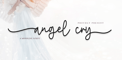 Angel cry is a beautiful monoline script font that will effortlessly add a perfect look to any craft! Your imagination and this font will make a perfect combination. Get inspired by its unique charm and create amazing greeting cards, Weddings, books, logos, stationery, and much more! This font is PUA encoded which means you can access all of the cute glyphs with ease! It also features a wealth of including ligatures.
 - Fadella by Stefani Letter,
$12.00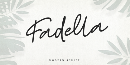 Fadella is a beautiful monoline script font that will effortlessly add a perfect look to any craft! Your imagination and this font will make a perfect combination. Get inspired by its unique charm and create amazing greeting cards, Weddings, books, logos, stationery, and much more! This font is PUA encoded which means you can access all of the cute glyphs with ease! It also features a wealth of including ligatures.


