10,000 search results
(0.057 seconds)
- Nauman by The Northern Block,
$- A modern humanist sans serif made for the screen. Broad open letter forms are combined with precise geometry to create a functional and legible font that’s ideally suited to the web and on-screen applications. To reinforce readability and create more distinction at small point sizes serif like details have been drawn into uppercase ‘I’, ‘J’ and lowercase ‘i’ and ‘j’. Other characters of distinction include a serifed number 1 and a crossed out zero. Nauman is a highly legible font family aimed at large interface based projects. Details include over 800 characters with alternative lowercase a, e, I and M. 7 variations of numerals, true small caps with accents, manually edited kerning and Opentype features.
 - Pickfair JNL by Jeff Levine,
$29.00Pickfair JNL is based on the vintage wood type Vandenburgh Tuscan (circa 1867), and gets its name from the mansion owned by Douglas Fairbanks and Mary Pickford—two of the founding partners of United Artists movie studios. - Alterhard by Popskraft,
$19.00 The Alterhard typeface combines the inimitable craftsmanship of the great condensed styles of the early twentieth century and at the same time looks organic and even unusual among modern ones. A distinctive feature of the Alterhard typeface is the smooth transition from the geometrically strict extremely compressed shapes of the bold typefaces to the classic sparse shape of the compressed typeface in light weights. Also unusual for vertical fonts are oblique elements in lowercase letters, which give uniqueness, liveliness and originality to the classic type of font. This allows the Alterhard typeface to be used in any design field such as corporate identity, typography, posters, web design, and other design areas. The set comes in 9 font sizes for rich typography.
 - Buffet Script by Sudtipos,
$99.00 Buffet Script is based on fantastic calligraphy by Alf Becker, arguably the greatest American sign lettering artist of all time. The Alf Becker series of nameless alphabets published by Sign of the Times magazine in 1941 has attracted letter digitizers for a few years now, so it’s really a wonder that a few of those alphabets are still in the non-digital realm. It is understandable, though, that the basis for Buffet Script was not digitally attempted until now. The page presenting this alphabet shows a jungle of letters running into each others and swashes intertwining. The massive amount of work involved in digitizing such lettering, where scanning is nowhere near being an option, is quite obvious at a mere glance. If anyone was going to commit this particular alphabet to a digital form, it would have to be redrawn stroke by stroke and curve by curve on the computer. And don't we love a challenge! But seriously, the challenge was not the main attraction. In a way, the Becker approach to lettering is so far from digital that the imagination is almost forced to work out possibilities and letter combinations to solve problems presented by the scant showings in that magazine. After a few imaginative visualizations, the digital potential becomes clear in the mind, and the eye and hand follow. The result with Whomp (another Alf Becker-inspired work) was an enormous font with a lot of alternates and ligatures. With Buffet Script the imaginative process was no different, but the result particularly shines here, because this is some of the most fascinating flowing calligraphy ever seen. Calligraphy is where the accountability of all the little extra touches, such as alternates and swashes and ligatures, is raised to a higher level than in most other type categories. Buffet Script’s OpenType programming contains discretionary ligatures, stylistic and contextual alternates, interacting with each other to allow the composition of just the right word or sentence. This font is best used where lush elegance is one of the design’s requirements.
 - Stilson by Carter & Cone Type Inc.,
$35.00 Since 1997, The Washington Post’s iconic headlines have been distinguished by their own sturdy, concise variation on Bodoni, designed by Matthew Carter. For the 2009 redesign, Richard Lipton, Jill Pichotta, and Dyana Weissman expanded the family with more refined Display and Condensed styles for use in larger sizes. Originally called Postoni, the fonts were renamed in honor of The Post’s founder, Stilson Hutchins
 - Strangelove by FaceType,
$12.00 Strangelove is inspired by the title sequence of Stanley Kubrick’s movie Dr. Strangelove. The original titles were designed by Pablo Ferro, who is one of the most acclaimed film title designers, especially famous for his hand-drawn lettering. With the Bombs also come illustrations referring to scenes from the film. Looking for a serif version? Have a look at Strangelove NextSlab!
 - Astronaut Jones by Pink Broccoli,
$14.00 A light hearted comic and clumsy typestyle inspired by an old pulp novel called "The Astronaut". Several fun ornament characters can be accessed by turning on Discretionary alternates and typing "jones" for the Astronaut Head in an O, "atom" for a spirograph atom symbol, "little dipper" and "big dipper" for the constellations, as well as alternate "the", "and", and stacked "and the" characters.
 - Xtencil by John Moore Type Foundry,
$15.00 Xtencil is a typeface inspired by the shapes of the drawing templates letters, based on the letter forms from my teacher Milton Glaser who at the same time was influenced by the modernism of Paul Renner. Xtencil is a round letter to create funny signs, ideal for posters and headlines. Xtencil not come as a drawing template, but as OpenType typography.
 - Xtencil lc by John Moore Type Foundry,
$25.00 Xtencil is a typeface inspired by the shapes of the drawing templates letters, based on the letter forms from my teacher Milton Glaser who at the same time was influenced by the modernism of Paul Renner. Xtencil is a round letter to create funny signs, ideal for posters and headlines. Xtencil not come as a drawing template, but as OpenType typography.
 - Carolline by Cititype,
$19.00 Carolline is a romantic and stylish handwritten font. It features a varying baseline, smooth lines, gorgeous glyphs and stunning alternates. Carolline looks beautiful on a variety of designs requiring a personalized style, such as wedding invitations, thank you cards, weddings, greeting cards, logos and so on.
 - 99 Names of ALLAH Linear by Islamic Calligraphy75,
$12.00 We have transformed the “99 names of ALLAH” into a font. That means each key on your keyboard represents 1 of the 99 names of ALLAH Aaza Wajal. The fonts work with both the English and Arabic Keyboards. We call this Calligraphy "Linear" for obvious reasons. The first "Alef" has a "fatha", this indicates that the name can be pronounced only one way, "AR-RAHMAAN". (in the zip file you will find a pdf file explaining the differences in the "harakat", pronunciation and spelling according to the Holy Quran). This calligraphy is very clear and no letters overlap. Decorative letters used in this calligraphy: "Mim, Aain, Sin, HHe, He, Kaf, Ta & Saad". Purpose & use: - Writers: Highlight the names in your texts in beautiful Islamic calligraphy. - Editors: Use with kinetic typography templates (AE) & editing software. - Designers: The very small details in the names does not affect the quality. Rest assured it is flawless. The MOST IMPORTANT THING about this list is that all the names are 100% ERROR FREE, and you can USE THEM WITH YOUR EYES CLOSED. All the “Tachkilat” are 100% ERROR FREE, all the "Spelling" is 100% ERROR FREE, and they all have been written in accordance with the Holy Quran. No names are missing and no names are duplicated. The list is complete "99 names +1". The +1 is the name “ALLAH” 'Aza wajal. Another important thing is how we use the decorative letters. In every font you will see small decorative letters, these letters are used only in accordance with their respective letters to indicate pronunciation & we don't include them randomly. That means "mim" on top or below the letter "mim", "sin" on top or below the letter "sin", and so on and so forth. Included: Pdf file telling you which key is associated with which name. In that same file we have included the transliteration and explication of all 99 names. Pdf file explaining the differences in the harakat and pronunciation according to the Holy Quran.
 - Geometa Rounded Deco by Wiescher Design,
$39.50 Geometa is based on Paul Renners Futura Classic, the one that he designed before he had to soften it to make it more appealing to the broad public. I thought the normal rounded fonts needed a decorative sister. Here they are! Your type-designer for decorative solutions, Gert Wiescher
 - Makenn01 by giftype,
$20.00 Font Makenn01 is inspired by Asen Petrov’s Perfograma font , based on in the IBM Harvard Mark 1 machines the first electromagnetic computer presented by Howard Aiken this november 84 years ago ,in fact this basic technology received its instructions and data trough punched tapes . It is therefore an interpretation in wich circumferences have been used instead of circles linked with a line , and the name used also refers to Mark 1 calling it Makenn 01 , giving a touch of identity since this name resembles , Carmen my name , the 01, is like a restart of 0 , with the 1 of the Mark 1. It has Greek and Cyrillic characters.
 - ITC Cinderella by ITC,
$29.99Some typefaces are staid, somber design tools. Then again, there's ITC Cinderella from Patricia Lillie: a typeface that's light-footed as a ballerina and joyful as a child at play. “There is a group of display faces that I simply love. Type that just seems to dance, type that makes me smile, designs that, when I see them, I say, "Boy, do I wish that was one of mine" says Lillie. “Although I never wanted to imitate these designs, when Cinderella started to emerge, I felt like it was the closest I've come to that quality.” ITC Cinderella projects gaiety and freedom. Capitals harmonize with a lowercase that bounces along with a lively, carefree attitude. Stroke weight stress is, well, all over the place. Curlicues abound. This delightful design is just that: brimming with delight. - Rukou by DizajnDesign,
$39.00 Rukou originated as a logo for a fashion designer. The idea was to make a fusion of a geometric typeface with the flavour of childish features. Rukou was inspired by school hand-writing models, but adds very specific and interesting features to it. Rather than focusing on readability, the primary goal was to have a unique type texture. This is the reason why lowercase is disconnected. The disconnected letters opened the possibility to create the special shapes for individual letters. The typefaces consist of two different styles inside one font. You can choose to set your titles in uppercase, or lowercase/titlecase. As each style has a slightly different texture, there is the opportunity to combine them in interesting ways. The uppercase can even be set in small paragraphs
 - Magic Lantern by Nick's Fonts,
$10.00One in the series of fonts celebrating the Halcyon Days of Handlettering. Magic Lantern is a caps and small caps font based on an untitled design by Samuel Welo, whose Studio Handbook for Artists and Advertisers appeared in six editions between 1927 and 1960. Both versions of the font include 1252 Latin, 1250 CE (with localization for Romanian and Moldovan). - Springsteel by Paragraph,
$21.00 Introducing Springsteel, a new display sans serif with an unusual construction: curved lines on the outside with only a few straight lines on the inside. The resulting typeface shows a great deal of tension and dynamics. Preferably, it should be used at larger sizes, at smaller sizes only for special effects. It was spaced and kerned by Igino Marini/iKern.
 - Yin Yang Messages by Ingrimayne Type,
$9.00 YinYangMessages contains two sets of letters, those on the upper-case keys that fit on the left side of a yin-yang symbol and those on the lower-case keys that fit on the left side of a yin-yang symbol. One can alternate the two sets manually but the OpenType contextual alternatives feature does this automatically in any program that supports this feature. The family contains two fonts. In one the filled half is on the left and in the other the filled half is on the right. The slash and backspace keys contain blank halves of the symbol, which are useful for completing words with an odd number of letters. The two styles can be used in layers. YinYangMessages is a fun and playful family that every once in a while may be the ideal typeface for some unusual situation.
 - Loventha by Arkrist Letter,
$14.00 Loventha font is the latest script written by Arkrist Letter studio. A font inspired by a very romantic thing. Designed with great care so as to produce very neat and elegant letter lines, it looks beautiful and romantic. Loventha is very suitable for greeting cards, t-shirt designs, logos, etc. Loventha is a masterpiece created with love!
 - Diediedie - Unknown license

- Delm by Typesketchbook,
$39.00 Delm font family is one of those large and useful families that you really can’t miss if you are looking for typeface combining originality and legibility. Delm is one of these – a sans serif with geometric modern look designed very smart with soft round look and very specific inktraps that complement its uniqueness. It is developed in 9 separate weights ranging from Hairline to Black, each coming with corresponding slanted version (called ‘Oblicua’). The light weights look more elegant, gentle and with more sensible feeling for geometry while the black versions are more soft, friendly even puffy and the geometric skeleton of the family is dominated by the overall roundness. The mid-weights are strong and prominent setting right the middle point in the contrast range of the family. Delm is a font with dedication – with so many options for different character contrast combined with slanted styles, it is perfect for editorial design where it could be easily used either for text or display font. Editorial is not of course the only application – you could successfully rely on this typeface if create brand or corporate identity, typographic posters, signboards, instruction plates, etc. Very diverse and original, this font will not leave you unsatisfied – moreover – it will surely make you try it in more and different designs be it printed or designed for screen. Web sites, banners, applications and e-books are places where Delm will show its best because of its originality, finely tuned contrast and its enhanced legibility. Fully equipped with OpenType features like ligatures and multilingual support, Fontmatters highly recommends to get the whole Delm font family for maximum results and satisfaction.
 - Crystal Angles by Balpirick,
$12.00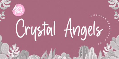 Crystal Angles is a Modern Monoline Font. Crystal Angles is a sweet and relaxed handwritten font. It is perfect for product packaging, branding projects, magazines, social media, wedding designs, or just used to express words on a background. This font includes, Crystal Angles also multilingual support.
 - Letterhear by FallenGraphic,
$20.00 Letterhear a modern script with a feminimst calligraphy style, decorative characters . in this font script there are many alternative choices of characters Support Ligature, and Stylistic set. So beautiful on invitation like greeting cards, branding materials, business cards, quotes, posters,wedding invitations and more!! Thank you!
 - Summer Knock by Seemly Fonts,
$14.00 Summer Knock is a unique and interesting display font. A little bit quirky, this font is a great choice for a wide variety of contexts! It looks stunning on thank you cards, quotes, greeting cards, logos, business cards, and every other design which needs a creative spark.
 - American Christmas by Mans Greback,
$79.00 American Christmas is a funky and decorative season's typeface. As a cozy winter script, it brings a festive touch to every word, with letters that seem to dance joyously across the page. Its bold flow is reminiscent of retro holiday signage, evoking a sense of nostalgia and warmth. This typeface is adorned with stars that twinkle like lights on a tree, adding a sparkle to your seasonal greetings. This typeface family is provided in three starry versions and one clean, and also comes with an extra symbol font for beautiful Xmas icons. Use parenthesis symbols () [] {} to make stars around any word. Example: {Xmas}[Songs] Use underscore _ after any word to make a swash. Example: Santa_ Multiple underscores make longer tails. Example: Yuletide____ The font is built with advanced OpenType functionality and guaranteed top-notch quality, containing stylistic and contextual alternates, ligatures and more automatic and manual features; all to give you full control and customizability. It has extensive lingual support, covering all Latin-based languages, from North Europa to South Africa, from America to South-East Asia. It contains all characters and symbols you'll ever need, including all punctuation and numbers. With American Christmas, Mans Greback has crafted a typeface that captures the essence of the holiday spirit. Each character is designed to convey the excitement and heartfelt connection of the season, making it an ideal choice for those moments when you want your message to be wrapped in the warmth of the holidays.
 - MVB Embarcadero by MVB,
$79.00 MVB Embarcadero lies in a space between grotesque sans serifs and the vernacular signage lettering drawn by engineers. It’s a style that happens to convey credibility and forthrightness without pretense—it’s anti-style, actually. All of this makes for the most versatile of typefaces, capable of delivering any kind of message while staying out of the way. As is often the case with a type design that develops over several years, Embarcadero isn’t the realization of a specific concept. In the ’90s Mark van Bronkhorst began digitizing a blocky slab serif from the Victorian era, which was then set aside for many years. He later revisited the design, paring it down to its bare essentials, and as more time passed, it evolved from a grid-based outline to curves that echoed the rigid skeleton of the original. Eventually it became a complete family with all the readability requirements of a text sans serif, yet maintaining the subtle eccentricities of its inspiration. Functionally, the Embarcadero family is as adaptable as its design. The OpenType Pro set of 20 fonts contains two widths and five weights, each with italics, small caps, a full set of figures, bullets and arrows, and support for most Latin-based languages. In all, Embarcadero is suitable for headlines or text. And—thanks to its simple, square form—it’s ideal for type on screen too.
 - Giulia by HVD Fonts,
$30.00 Giulia is a sweet type family consisting of 12 Fonts. It was created by Hannes von Döhren and published by HvD Fonts. Besides a fancy curly version there is a second version with a more straight architecture, still owning the same soft and friendly character. Informal and easy going at first sight and perfect for display settings, however the straight architecture of Giulia Plain also makes it nice for shorter to medium texts. This contemporary type family is ideal for use in retail, packaging, games, food, kids applications and advertising.
 - Olbrich Display NF by Nick's Fonts,
$10.00Based on lettering on a poster for an 1907 art exhibition by Joseph Maria Olbrich. Use uppercase characters for headlines, and lowercase letters for text use. For “dotted” spaces, use the underscore, and brackets or braces for framing characters. Both versions of the font include 1252 Latin, 1250 CE (with localization for Romanian and Moldovan). - Snowky Brush by Letterara,
$10.00 Snowky Brush is a simple layered font inspired by the uniqueness of the snow. It includes 2 fonts. Snowky Brush is great in any branding, posters designs, and your upcoming winter stuff. Get inspired by its snow look & feel! Features : - Uppercase - Numerals - Punctuations (OpenType Standard) - Accents (Multilingual characters) - Works on PC & Mac - Simple installations - Accessible in the Adobe Illustrator, Adobe Photoshop, Adobe InDesign, even works on Microsoft Word. don't wait anymore, put it in your shopping basket :) and follow me, because there will be many promos!
 - Blizes by Negara Studio,
$19.00 Introducing BLAZES Typeface is a solid brush font written with a brush and slightly thick ink. written slowly so that it produces a solid brush. Then they are scanned and drawn one by one until they become vector format. BLAZES are perfect for branding project designs, Logo designs, product packaging, Quotes - or simply as a stylish text overlay on any background image BLAZES Features: -Uppercase -Lowercase -Numeral -Multilingual Support -Punctuation Thanks a lot regards, Anugerah Negara
 - Ferocious by Arendxstudio,
$15.00 Predator - Brush Font is a free style font that has the characteristics of street art that shows freedom and is filled with unique characters Features : • Character Set A-Z • Numerals & Punctuations (OpenType Standard) • Accents (Multilingual characters) • Ligature • Alternate There it is! I really hope you enjoy it
 - Enforcer by Tour De Force,
$25.00 Modern simple typeface expressing sharp and bright words without need for writing something really smart. Made by Dusan Jelesijevic one day when he left without anything smart to say or write, so he just grabbed a pencil and forced the paper to be cooperative. Someone said that this typeface looks like the ancient Greeks went in present future and used contemporary equipment for writing those letters. It is ideal for branding and avantgarde identities.
 - Clockwork Lemon by IKIIKOWRK,
$19.00 Proudly present Clockwork Lemon - Fat Type, created by ikiiko. This typeface is adapted from one of Stanley Kubrick's masterpiece films, Clockwork Orange. Clockwork Lemon has a similar character shape to the movie logo but is more raw, rougher and is a hand-drawn style font. A wilder impression is shown in the curves of the letters, with alternates in the form of a dirty texture. You can play with this font with 2 alternative styles : solid and rough. Clockwork Lemon is very suitable for making a poster or magazine layout, quotes, or simply as a stylish text overlay to any background image. What's Included? 2 Styles : Solid & Rough Uppercase & Lowercase Numbers & Punctuation Alternates Multilingual Support Works on PC & Mac Enjoy our font and if you have any questions, you can contact us by email
 - Breathe by Lián Types,
$20.00 ATTENTION COSTUMERS! A new version of this font was released in 2019. Take a look: Breathe Neue Reaching a total of more than 1000 glyphs, Breathe Pro is Maximiliano R. Sproviero’s gift of the year. The aim of the designer was once more to give the user the chance to play and travel from very formal and conservative letterforms to the amazing world of swashes and flourishes. Possibilities of alternating and ligating characters in this font are absolutely fantastic. After his last creation, Parfait Script, Lián wanted to make a more universal font. Delighted by typographic works of Didot and his followers of the beginnings of 1800, Maximiliano R. Sproviero started what became another obsessive project, which is now named Breathe, “cuando las letras respiran...” what could be translated as “when letters breathe”, due to the feeling that you are reading letters that are alive. Breathe comes in two styles which have a significant difference as regards to the quantity of glyphs available inside. If you want to get the most complete style, with over 1000 glyphs, (including contextual alternates, stylistic alternates, swashes, terminal forms, titling alternates, historical forms, stylistic sets, standard ligatures, stylistic ligatures, decorative ligatures and frames) then your choice should be Breathe Pro. On the other hand, if you are interested in having a less decorative font with the nice touch of Lián’s style, then your choice should be Breathe Standard, a more limited version of Breathe, including terminal forms (leaves) and frames. With Breathe Pro you will surely have fun at the same time you are designing and that is not an unimportant thing. The world of type-designers is growing each year, and the features of Open-Type are letting them think their creations as if they were truly pieces of art. At least, Breathe Pro is inspired in the Art of our predecessors, those who with a pen loaded of ink would decorate each letter, each page in such a lovely way. Yes, -lovely- is the word. We would not have the amazing lettering artists, calligraphers, typographers of nowadays if that -love for letters- had not traveled from generation to generation. Breathe Pro is an example of this love. An example of what Maximiliano R. Sproviero feels about typography and letters. Pssst... Look for more images and the User’s Guide at the gallery section to see it in use! http://origin.myfonts.com/s/aw/original/89/0/46067.pdf
 - Iva by Type-Ø-Tones,
$40.00 Ivà by Joan Barjau / OpenType, 2 styles. Ivà, a very personal script based on the handwriting of the cartoonist called Ramón Tosas "Ivà, digitised by Joan Barjau in two plain weights. These fonts were set for the credit titles of a film in 1994 and remain in our collection as an icon of those times.
 - Droid Sans - 100% free

- Bestowens by Letterara,
$12.00 Bestowens is the perfect handwritten font: Elegant, Sweet, innocent, light and charming, this one-of-a-kind typeface will add a unique charm to any design project! Bestowens was created to look as close to a natural handwritten script as possible by including 44 ligatures. With built in OpenType features, this script comes to life as if you are writing it yourself. You can see it in the pictures shown. A wide range of swashes (a-z) and alternates (A-Z, a-z) are included so that you can give your logo or name a custom, hand-calligraphy look. This font is available in 10 Styles in 1 typefaces: Thin, Light, Regular, Semi Bold, Bold, Thin Italic, Light Italic, Italic, Semi Bold Italic, Bold Italic and most importantly, Bestowens is perfect for you! don't wait anymore, put it in your shopping basket :) and follow me, because there will be many promos!
 - Linotype Zensur by Linotype,
$29.99Linotype Zensur is part of the Take Type Library, chosen from the entries of the Linotype-sponsored International Digital Type Design Contests of 1994 and 1997. This fun font was created by French designer Gérarld Alexandre and contains one weight. The characters look as though parts of each of them were censored or removed, leaving just enough left over to know what was meant. The basic forms of this font are sans serif and the rounded corners give it an almost soft character. Linotype Zensur is a distinctive typeface which is especially good for headlines in larger point sizes. - Under Storm 3d Graffiti by Sipanji21,
$15.00 "Under Storm" is a graffiti font with three unique layers: regular, inner shadow, and outer shadow. This font is designed to add depth and dimension to your typography, creating a captivating and dynamic look. The regular layer provides a bold and impactful appearance, while the inner and outer shadow layers add a 3D effect, giving your designs an edgy and urban vibe. With its layered style, "Under Storm" is perfect for creating eye-catching street art, posters, and other urban-themed projects. Embrace the storm of creativity with this versatile and dynamic graffiti font.
 - Stronger by MlkWsn,
$25.00 Stronger is a supercharged, street-wise brush font bursting with energy. With extra attention to quick strokes and sharp details, Stronger is ideal for logos, apparel, quotes, product packaging, or anything which needs a typographic turbo-boost. What's Included: Stronger Regular - The standard version of the font. Perfect for titles and logos. Stronger Swash - Need a cool underline under your text or a splash of paint? This font set has you covered. Type any letter a-z using this font, and you'll get a unique swash to accompany the font

