10,000 search results
(0.184 seconds)
- Holingston by HansCo,
$12.00 Holingston is a Handwritten brush script that is written casual and naturaly. the letters are made with brushes on paper and then scanned carefully drawn into vector format. This typeface is ideal for use in any professional project, such as blog titles, posters, wedding elements, t-shirts, clothing, book covers, business cards, greeting cards, branding, merchandise etc. It has 4 styles, regular, regular slant, clean and clean slant variations, this package is also has many alternatives underlines that make your text and design more interesting. Tutorial how to Install & use Alternate / Special Character : https://hanscostudio.com/tutorial/ Enjoy !
 - Telling Stories by Fidan Fonts,
$22.60 Telling Stories is a handwritten classy script font. It includes full set of uppercase and lowercase basic characters, multilingual symbols, numerals, punctuation and ligatures (check the previews in order to see them all). It's works perfectly for wedding stationery, elegant branding, book cover designs, packaging, album covers, handwritten quotes, greeting cards, social media posts, and many more. Latin-based Language Support. If you want to type with stylistic ligatures make sure you have them turned on (use a capable software like Photoshop, Illustrator, InDesign, Word, Pages etc). Note: If you don't use this font with these programs stylistic ligatures won't work. Happy creating!
 - PF Isotext Pro by Parachute,
$79.00 This typeface is based on ISO 3098, a technical documentation issued in 1974 by ISO (International Organization for Standardization), which proposed a set of characters for use on technical drawings and associated documents. Isotext is based on the original standards but is completely redesigned to fit typographic requirements. This new ‘Pro’ version is further improved and now comes with a complete set of redesigned true-italics. Furthermore, the width of the glyphs has increased in order to establish a more balanced and readable text. The result is a contemporary font which works well in small sentences as well as long texts. Isotext Pro is loaded with all the good stuff a designer needs to create documents with attitude. It supports 19 special OpenType features like small caps, fractions, ordinals, etc. and offers multilingual support for all European languages including Greek and Cyrillic. Finally, every font in this family has been completed with 270 copyright-free symbols, some of which have been proposed by several international organizations for packaging, public areas, environment, transportation, computers, fabric care and urban life.
 - Modulate by Stiggy & Sands,
$24.00 A Blocky Geometric Techical typestyle Modulate began as a digitization of a film typeface from LetterGraphics in the early 70's known as "Cadence". The original specimen included standard Capitals and Lowercase, Numerals and minimal Punctuation, a bare bones character set, previous only available on film and only in an upright stance. We've fleshed out the Modulate typeface to include a full standard character set, an extended international set, and a handful of alternate character styles. We've also added an oblique style that suits its techno design. Both vintage and modern feeling, with a dynamic techno presence, Modulate draws attention without being outlandish. See the 5th graphic for a comprehensive character map preview. Bare Bones Opentype features include: - Standard fi and fl ligatures - Stylistic Alternates Letterforms for: EFLTZ and ftz characters - Approx. 411 Character Glyph Set: Modulate comes with a glyphset that includes standard & punctuation, international language support, and minimal additional features.
 - Mashq by Arabetics,
$29.00 The Mashq script is the oldest documented Arabic Jazm calligraphy style. It was invented by the early Muslims in the Arabian cities of Mecca and Medina, exclusively for writing the Quran and other Islamic religious texts. The Mashq style employed complex ligature and multi-level baseline rules, and therefore it went through a continuous simplification process. Around the time period Mashq was developed, the early Arab Muslims experimented with another short-lived Mashq-like style with heavily slanted vertical stems, which closely resembled the common Ḥijazi style. This style is commonly referred to as the Ma’il (slanted) style. Eventually, the early complex Mashq style was replaced as the main Islamic Arabic script, by a more simplified Mashq-derived calligraphy style that was developed in the city of Kufa, modern day Iraq, which was commonly referred to as Kufi. The Kufic style became the official Arabic script style for centuries before it was replaced by the more developed Naskh, the modern Arabic script style used today. The Mashq font family by Arabetics includes three styles of Mashq. The first is Mashq regular, which closely follows the script style of Musḥaf ‘Uthman (currently displayed in the Topkapi Museum in Turkey) with only the initial and final Haa’ baselines shifting. The second is Mashq Maail, which emphasizes the features of the Ma’il style shared with Mashq. The third is Mashq Kufi, which closely follows the script style in an adequate sample from the Quran manuscripts of the Bergstraesser Archive. All three fonts include two styles, with and without Tashkeel (dots). The Mashq and Mashq Kufi fonts include two more styles, with and without Harakat (soft vowels), and Hamza. Only three soft vowels are implemented along with their Tanween (double) forms. The Sukoon vowel is the default shape before inserting a soft vowel. Hamza was treated as a vowel in the Mashq and early Kufi manuscripts. Kashida is a zero width character. In the Mashq fonts, inserting one Kashida before the final ‘Ayn glyph group will trigger alternative shapes. In the Mashq Kufi fonts, inserting one Kashida (or two) before the final Yaa’, ‘Ayn, and Ḥaa’ glyph groups will trigger alternative shapes. The Mashq font family by Arabetics was designed to be as compatible as possible with the Arabic keyboard and Unicode alphabet used in computers today. Calligraphic variations were implemented only when they marked significant and permanent script features.
 - Boement by Prioritype,
$19.00 Boement - Chic Script Font. Beautifully textured script fonts to complement and beautify your designs. With the additional alternative characters make it look richer. It is suitable for branding, logos, quotes, cover and so on. Features: Uppercase, Lowercase, Numeral, Punctuation, Multilingual, Ligatures & Alternates. Multilingual contained: Afrikaans, Albanian, Asu, Basque, Bemba, Bena, Breton, Catalan, Chiga, Cornish, Danish, Dutch, English, Estonian, Filipino, Finnish, French, Friulian, Galician, German, Gusii, Indonesian, Irish, Italian, Kabuverdianu, Kalenjin, Kinyarwanda, Luo, Luxembourgish, Luyia, Machame, Makhuwa-Meetto, Makonde, Malagasy, Manx, Morisyen, North Ndebele, Norwegian Bokmål, Norwegian Nynorsk, Nyankole, Oromo, Portuguese, Quechua, Romansh, Rombo, Rundi, Rwa, Samburu, Sango, Sangu, Scottish Gaelic, Sena, Shambala, Shona, Soga, Somali, Spanish, Swahili, Swedish, Swiss German, Taita, Teso, Uzbek (Latin), Volapük, Vunjo, Zulu. For any questions please contact me :) Thanks!
 - Type Maestro by VP Creative Shop,
$39.00 Type Maestro is an exquisite ligature serif font that exudes creativity and elegance. With over 100 meticulously crafted ligatures, this font is the perfect choice for designers looking to elevate their projects to new heights. One of the key features of Type Maestro is its extensive language support, boasting compatibility with 87 different languages. This makes it an incredibly versatile font that can be used for a wide range of projects, no matter where your audience is located. But what truly sets Type Maestro apart are its alternate glyphs. These unique characters add a touch of individuality and personality to your text, allowing you to create truly one-of-a-kind designs. Whether you're designing a logo, a website, or a social media post, Type Maestro has the flexibility and style to help you stand out from the crowd. Language Support : Afrikaans, Albanian, Asu, Basque, Bemba, Bena, Breton, Chiga, Colognian, Cornish, Czech, Danish, Dutch, Embu, English, Estonian, Faroese, Filipino, Finnish, French, Friulian, Galician, Ganda, German, Gusi,i Hungarian, Indonesian, Irish, Italian, Jola-Fonyi, Kabuverdianu, Kalenjin, Kamba, Kikuyu, Kinyarwanda, Latvian, Lithuanian, Lower Sorbian, Luo, Luxembourgish, Luyia, Machame, Makhuwa-Meetto, Makonde, Malagasy, Maltese, Manx, Meru, Morisyen, North Ndebele, Norwegian, Bokmål, Norwegian, Nynorsk, Nyankole, Oromo, Polish, Portuguese, Quechua, Romanian, Romansh, Rombo, Rundi, Rwa, Samburu, Sango, Sangu, Scottish, Gaelic, Sena, Shambala, Shona, Slovak, Soga, Somali, Spanish, Swahili, Swedish, Swiss, German, Taita, Teso, Turkish, Upper, Sorbian, Uzbek (Latin), Volapük, Vunjo, Walser, Welsh, Western Frisian, Zulu Ligatures : IS, FO, OD, FA, TY, EX, NN, EY, SS, LL, FU, US, UT, AS, AN, AM, CI, LO, ES, RO, ET, TE, CK, OH, OO, OE, OC, KO, KE, KC, CH, SE, EA, UR, RS, KS, TH, TU, TT, TK, TL, HE, RG, EP, ER, RE, RC, LE, ND, ED, OF, HA, EN, CT, ST, NT, ON, ME, MO, NG, NC, UG, UC, OU, GH, OR, OP, EE, YO, VE, IT, WE, TI, VO, WO, SA, MA, OL, VA, YP, YR, OX, XO, BA, OT, TO, BE, RU, KU, TW, EN, NT, FAS, FAST, CKS, OOD, FOOD, FOO, TEE, TOR, TOP, TWE, NTY, TYP, OUT, UST, URS, WAS, THE, WES, EST, EEN, ERS, EAS, LES, ENT, FOR, OUG, ERE, TER, YOU, VER, HER, THER, THA, AND, ITH, THI, MENT, WERE, WER, ROM, THE, ERG, ERE, ERC, ERU, ERO, NTH, FOU, HRO, HRE, HRC, HRU, TWO, GHT, OUR, OUP, STO, VEN, ORT, MEN How to access alternate glyphs? To access alternate glyphs in Adobe InDesign or Illustrator, choose Window Type & Tables Glyphs In Photoshop, choose Window Glyphs. In the panel that opens, click the Show menu and choose Alternates for Selection. Double-click an alternate's thumbnail to swap them out. Mock ups and backgrounds used are not included. Thank you! Enjoy!
 - Pragmatica Slab Serif by ParaType,
$30.00 Pragmatica Slabserif was designed as a complement to the popular type family Pragmatica by Vladimir Yefimov and Isabella Chaeva (1989-2004) by addition of square serifs. Inspired by Helserif (Phil Martin, 1978) which was formed in the same way by addition of square serifs to Helvetica (Eduard Hoffman and Max Miedinger, 1957). First sketches of Pragmatica Slabserif were created by Vladimir Yefimov in 1988 during development of Pragmatica. Olga Umpeleva designed the whole slabserif type family of six weights basing on those sketches. All styles of Pragmatica Slabserif coordinate with corresponding Pragmatica styles on metrics, proportions, weights and design. The new family can be used together with Pragmatica and separately. It’s convenient for technical texts, for magazines of general nature, for business applications as well as for advertising and display matter. Pragmatica Slabserif was released by ParaType in 2011.
 - MVB Sirenne by MVB,
$39.00A rare natural history book from the early 18th century served as inspiration for the MVB Sirenne typefaces. The artisan who engraved the book—likely a map engraver—had a distinctive style of lettering that was used on the descriptive captions for the many tropical fishes depicted in the book. The plates used to print the illustrations would have been copper, the letterforms hand-engraved. The designers at MVB Fonts found the distinctive quirks of the roman letterforms and the eccentric stress of the italic interesting enough to embark on developing digital fonts based on the engraved samples. As the captions were hand-lettered, there was a great degree of variation, making a direct “revival” impossible, so Alan Dague-Greene interpreted the characteristics of the letterforms into a workable typeface design. The challenge was to retain a rustic quirkiness to the forms, yet have a typeface that was useful for more than display. The solution was to make optical sizes. The “Six” faces are full of character, but strong and open for clarity at small sizes. The design of the “Text” faces is more subtle, so that they can be used for passages of text, but retain the feel of their model. MVB Sirenne “Eighteen” and “Seventy Two” are intended for display use. - Mister Arigato by Colllab Studio,
$19.00 "Hi there, thank you for passing by. Colllab Studio here. We crafted best collection of typefaces in a variety of styles to keep you covered for any project that comes your way! Mister Arigato is a modern, unique calligraphy font inspired by traditional Japanese and Korean brush lettering. It gives you that little extra something you always been looking for. We do more than just type, we help you show how much you care in your most precious brand. This font is a great option for any project that involves sending letters as a decorative piece of artwork (attach it to a mug, or place on a greetings card), or for use for branding purposes(headline, logo, etc.). Though it is not double-width, the letters easily tailor to any word-spacing. A Million Thanks www.colllabstudio.com
 - Grotesca Negra by MAC Rhino Fonts,
$59.00 Grotesca Negra is a charming sans serif with a flirt towards the Jugend era. Still its modern enough not to feel outdated. It is briefly inspired by a local typeface named Grotesca chupada negra, found in a Spanish edition of a type specimen book from the German Bauer type foundry. It has an angle on the horisontal strokes on many of the letters. It is one of many display face derived from book cover designs. Intended to work as a display typeface.
 - Friendly Monster by Putracetol,
$24.00 Friendly Monster - Character Monster Font. Friendly Monster funny font is a kid's friendly spooky monster for your projects. When we talk about monster, it's not always the one that really scary. We can all have a cute, adorable, and friendly monster as well. Friendly Monster comes just like that. Friendly Monster has a strict style, but still gives a cheerful impression, making it very easy to read and apply in all design projects such as poster designs, clothing, logos, quotes, album covers, books, business cards, product designs, and many more design projects The alternative characters were divided into several Open Type features such as Swash, Stylistic Sets, Stylistic Alternates, Contextual Alternates, and Ligature. The Open Type features can be accessed by using Open Type savvy programs such as Adobe Illustrator, Adobe InDesign, Adobe Photoshop Corel Draw X version, And Microsoft Word. This font is also support multi language.
 - HWT Van Lanen by Hamilton Wood Type Collection,
$24.95 In 2002 Matthew Carter was commissioned to create a new design to be cut in wood by the then nascent Hamilton Wood Type Museum. This was significant in that this was the one format for which Carter had not yet designed type. The new design emerged as a two-part chromatic type to be cut specifically in wood. Originally called Carter Latin, the font was renamed Van Lanen after one of the Museum's founders. The first cutting and printing of the type took place in late 2009 and although it has been available through the Museum, contemporary wood-type production is expensive and few have acquired this font in wood. The digital version of the pair of Van Lanen fonts is now available. The design recalls Antique Latin wood type, but with a refined sensibility and intentional quirks (like the sideways ampersand). It is a wonderful addition to Carter's oeuvre, and to the ongoing history of wood type.
 - Galea Display by Letra Type,
$50.00 Galea is a slightly condensed serif typeface with long extenders. Its elongated proportions and graceful terminals seek to bring femininity and elegance to any layout. It is a display face that works well at large sizes in editorial contexts as a headline, titling or introduction to a text. Galea was designed by Isabel Urbina Peña while at Cooper Union’s Type@Cooper Extended Program, 2012 and released on May, 2014. Galea obtained an Honorable Mention from the Fine Press Book Association in the Text Family Category, 2013. Also, it is featured in the book "Playing with Type: 50 Experiments" by Lara McCormick, Rockport Press, on Parenthesis Magazine, Autumn 2013 on Behance's Typography Served and will appear on "Typography Magazine", Japan (Nov 2014).
 - Dirty Numbers by Coniglio Type,
$9.00 DIRTY NUMBERS LTD At $1 US dollar each: Dirty Numbers - Provides (9) individual sets of unique numerals [0 thru 9] and nothing else. That is all. Very limited character sets integrated into one font by Coniglio Type -and- a very inexpensive set of marketing numerals. They are revivals from type crafted images and they are monospaced, easy to use and to kern the way you wish. You will have to review your glyphs to locate them and they were pasted in the most logical and accessible places and made economical to you for your special design and crafts needs. Dirty Numbers by Joseph Coniglio, Coniglio Type 2021.
 - Tatty by Scrowleyfonts,
$- Tatty is a sans serif, monoline font that is distinguished by the gentle, rounded, backward curves on the ascenders. I created it because I had a picture in my mind of a font that I wanted to use when designing images and logos for clients' websites but I could never find one that was just exactly right. Many years ago I worked for a sign-writing company. My job was to copy and enlarge letter sets from printed copy and then cut masks for airbrushing. One morning I arrived at my desk to find that the airbrush artist had written on a rough, rubbed out, scribbled on drawing of the letter ‘a’ - “make a letter happy, make it beautiful”. That was the brief I set myself in the design of Tatty - to make every letter happy and beautiful. The result is a flowing, elegant yet simple type which I believe works particularly well for poetry.
 - Connected Neon by Ditatype,
$29.00 Connected Neon is a mesmerizing display font that encapsulates the vibrant glow of neon lights, fusing it with a unique twist of connected letterforms. With its bold and uppercases design, this typeface commands attention, drawing the viewer into a captivating visual experience. The defining feature of Connected Neon lies in its elegant lines that seamlessly connect each letter, creating a unified and harmonious composition. These delicate lines flow effortlessly from one character to the next, accentuating the connectivity between them. As a result, the letters appear to dance with an electric energy, forming an enchanting tapestry of illuminated artistry. The neon-inspired style of Connected Neon is a nod to the retro-futuristic aesthetics of the 80s, reminiscent of the vibrant signage that adorned the bustling city streets. The font's luminous glow radiates with an otherworldly aura, casting a vivid hue that is both nostalgic and contemporary, evoking a sense of vibrant energy and modernity. Each character in Connected Neon has been meticulously crafted to strike the perfect balance between legibility and decorative flair. The bold letterforms boast a sleek, sans-serif design, ensuring clarity even in the midst of the dynamic interplay of lines. The seamless connections between letters create a sense of continuity and fluidity, enhancing the visual appeal without compromising readability. Enjoy the various features available in this font. Features: Multilingual Supports PUA Encoded Numerals and Punctuations Connected Neon is ideal for a range of creative projects that demand a touch of charismatic flair. From eye-catching headlines on posters and advertisements to striking branding elements, this font adds a touch of electrifying allure to any design. Whether you're designing a captivating logo, crafting an attention-grabbing title, or bringing a digital artwork to life, Connected Neon will effortlessly infuse your creations with a radiant glow and a sense of interconnectedness. Find out more ways to use this font by taking a look at the font preview. Thanks for purchasing our fonts. Hopefully, you have a great time using our font. Feel free to contact us anytime for further information or when you have trouble with the font. Thanks a lot and happy designing.
 - Imagine a font that struts in with a leather jacket flung over its shoulder, slides a comb through its slick-back hair, and orders a milkshake with an extra cherry on top. That's the 50's Headline DS...
- Materia Pro by Elsner+Flake,
$79.00 Minimal, modular, modern—at first glance, Materia shows a contemporary flair, combining pure, strong geometrical form with a subtle, distinct appearance. Actually, the design was inspired by lettering from the turn of the 19th to the 20th century that still can be found in the East of France. While its formal origins date back as far as this, revived e. g. by the constructivists into the nineteen twenties and later on by Dutch information designer Wim Crouwel in the nineteen-sixties, the visual language of Materia still speaks of the »future«. Following a minimalistic concept the font is formally built on a grid. Wherever optical curves are needed for a smoother, more comfortable shape of letters than a simple rectangular block, diagonals cut off the egdes – like a diamond is cut to achieve more beauty. Thus headlines and texts set in Materia are given a certain »egdy« feeling, whereas their tonality is still kept well-balanced, keeping concentation all on information in a nonconfomist way. Materia comes in eight styles, from elegant Thin to attention-forcing Ultra. Even a regular Italic is available, following the classic type-set-principle. Two of the styles are explicitly designed for display use, Shadow and Code. Both are ready for combinations with Bold or each other respectively, the layering of Shadow and Code e. g. allows astonishing effects or highlighting within the letters. For OpenType-users Materia is a real Pro, containing accented Latin letters for over 70 languages, small caps, old style, tabular and lining figures and special condensed titling all caps for cases in which space is all that counts. How useful all of the above mentioned is may be seen in the book David Lynch – Lithos, designed by Koma Amok, published in 2010 by item éditions, Paris, and Hatje Cantz, Germany, which was typeset completely in Materia.
 - Gramma by CAST,
$45.00 Gramma is a compact sans with big x-height, a robust and balanced typeface that work well both for headlines and main bodies of text. The initial constructions, assembled from a few well-defined geometric modules, were later polished into more organic forms; the letters’ arches are quite squared, and the counters and other internal negative spaces push outward, creating a tension that balances the forms’ compression. Gramma’s most evident characteristic is its “bird-beak” terminals (present in many letters, including the c, e, f, s...) that replicate the unconnected junctures between stem and curve, visible in the a,b,d,g,h.
 - Marli by URW Type Foundry,
$36.99 Marli is an adaption of a face designed by F. Schweimanns and issued by the Stempel Foundry from 6 to 48 point, as “Korso”, in 1913. In 1936 the American Intertype issued their version for the line composing machines in 12 and 14 point as “Camera”. It is a very suitable type face for personal stationery, announcements, greeting cards and the like. The font is updated with a full Open Type character set, while also a Cyrillic has been added.
 - Fragtude by Letterhend,
$20.00 "Old is Gold".. Perhaps that's the best words to represent this typeface called Fragtude - a pair of vintage display typeface consist of bold script and serif. One of our finest typeface, crafted carefully to make sure its quality. Inspired by 40s 50s lettering and signage, the nostalgic feels will bring you back to the good ol' days. This typeface is perfectly made to be applied especially in logo, and the other various formal forms such as invitations, labels, logos, magazines, books, greeting / wedding cards, packaging, fashion, make up, stationery, novels, labels or any type of advertising purpose. Features : uppercase & lowercase numbers and punctuation multilingual swash and ligatures alternates PUA encoded We highly recommend using a program that supports OpenType features and Glyphs panels like many of Adobe apps and Corel Draw, so you can see and access all Glyph variations. How to access opentype feature : letterhend.com/tutorials/using-opentype-feature-in-any-software/ Email us to letterhend@gmail.com if you need something! Happy Designing!
 - ITC Souvenir Monospaced by ITC,
$34.99The Souvenir typeface was originally drawn by Morris Fuller Benton in 1914 as a single weight for the American Type Founders company. It was revived in 1967 by Photo-Lettering and optimized for phototypesetting equipment. ITC was formed in 1971 and, with the help of Photo-Lettering, introduced ITC Souvenir as one of its first font families. ITC Souvenir was designed by Ed Benguiat and comes in four weights, each with a matching italic. In 1983, Ned Bunnel's ITC Souvenir Monospaced was released; this is a monospace version of ITC Souvenir. - Basim Marah by Hiba Studio,
$59.00 Basim Marah is an Arabic display typeface and is useful for titles and graphic projects. The font is based on the simple lines of free style calligraphy. A collaborative effort, Basim Marah was designed and drawn by Basim Salem Al Mahdi from Iraq and then digitalized as a typeface by Hasan Abu Afash from Palestine. In November, 2008, Basim Marah was upgraded by working with Mirjam Somers an award-winning Arabic type designer to the DecoType font format for use in WinSoft Tasmeem which is now bundled with InDesign CS4.
 - Visoko by Mostardesign,
$19.00 Visoko is a playful, geometric typeface inspired by post-modern fonts designed by Mecanorma from the 80s. This typeface has been designed on a grid of 7×6 squares but the goal was to create variations from the grid to give the character a destructured aspect. VISOKO is available in two styles : regular and italic and only in uppercase. It has aspects of Laser shapes and proportions but has modern additions that make it ideal for industrial brands and modern titles.
 - Dimelike by Balpirick,
$15.00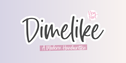 Dimelike is a Modern Handwritten Font. Dimelike feels equally charming and elegant. It looks stunning on wedding invitations, thank you cards, quotes, greeting cards, logos, business cards and every other design which needs a customized touch. - also multilingual support Enjoy the font, feel free to comment or feedback, send me PM or email. Thank you!
 - Vala by Monotype,
$29.99 Vala™ dances across printed pages and shines on screen. This is a high-energy design that blends the grace of an English Roundhand script with the gravitas of an extra bold Bodoni. There is even a bit of romance in the design. Vala speaks with a resonant voice – and knows few bounds. The typeface enhances print headlines, subheads, cover art and packaging. The design also brings its distinctive melding of verve and poise to banners, headings, navigational links and branding in web sites, blog posts, games and apps. Oscar Guerrero found inspiration for Vala in shop window lettering near his home in Bogotá, Colombia. “The capital A, R and V caught my attention and I photographed the window for future reference,” he explains. “Later I started to draw more letters inspired by the ones in the window.” Guerrero admits that he has always admired the work of Giambattista Bodoni and allowed his classic Didone designs to infuse Vala. Striking contrast in stroke weights, lively ball-terminals and a large x-height give Vala the grace and force of a Waikiki wave. Not satisfied with just a basic character set, Guerrero also took advantage of OpenType’s capabilities and drew a complete set of swash capitals, a bevy of fancy ligatures, and a suite of lowercase alternative designs. The result is that Vala easily emulates custom lettering in posters, headlines and logotypes. The “romantic” part of Vala? Guerrero dedicated the design to his girlfriend, Valentina, and named it after her.
 - Atto Sans by Wilton Foundry,
$29.00I set out to design a contemporary font that is condensed with thick and thin strokes. The highly structured forms of this condensed font was made more interesting and softer by giving it a slightly calligraphic tone and by adding round corners. Atto's express purpose is to be both utilitarian, compact and technical but with a friendly face. The name "atto" was adopted since it refers to the measurement of "smallness" or detail. You will no doubt discover all the many pleasant nuances within Atto. Adopted in 1964, "atto" comes from the Danish "atten", meaning eighteen. Atto - (symbol a) a SI prefix to an unit and means that it is 10 to the power- 18 times this unit. Examples are one attosecond or one attometer/attometre. Atto is available in for Mac and Windows in Postscript, Truetype and Opentype. - Tricorn Mono by System2084 Type,
$19.00 Tricorn Mono is a monospaced font with two styles – regular filled for uppercase and an outline version for the lowercase. Tricorn Mono was first hand drawn (sketched) as an exploration for a headline font and also developed on from a previously unreleased font. It was then expanded to feature multi language support and custom symbols. Tricorn Mono contains unique forms that explores the use of a rigid grid that is tested with negative form to provide legibility and balance. The conceptual design is focused on a modern, futuristic design aesthetic around the gaming, e-sports markets and future technology. Tricorn Mono typeface has been tightly monospaced and intended for use at larger sizes as a display typeface. The font can be tightly stacked to create strong, impactful typographic forms. This 612 glyph font has language support for 87 languages: Afrikaans, Albanian, Asu, Basque, Bemba, Bena, Catalan, Cebuano, Chiga, Cornish, Corsican, Danish, Dutch, English, Estonian, Faroese, Filipino, Finnish, French, Friulian, Galician, German, Gusii, Icelandic, Ido, Indonesian, Interlingua, Irish, Italian, Javanese, Jju, Kabuverdianu, Kalenjin, Kinyarwanda, Lojban, Low German, Luo, Luxembourgish, Luyia, Machame, Makhuwa-Meetto, Makonde, Malagasy, Malay, Manx, Morisyen, North Ndebele, Northern Sotho, Norwegian Bokmål, Norwegian Nynorsk, Nyanja, Nyankole, Occitan, Oromo, Portuguese, Romansh, Rombo, Rundi, Rwa, Samburu, Sango, Sangu, Sardinian, Scottish Gaelic, Sena, Shambala, Shona, Soga, Somali, South Ndebele, Southern Sotho, Spanish, Swahili, Swati, Swedish, Swiss German, Taita, Taroko, Teso, Tsonga, Tswana, Vunjo, Walloon, Welsh, Western Frisian, Xhosa and Zulu.
 - Cirulis Display by Asketic Design Studio,
$40.00 Cirulis is a display sans family of two weights. Inspired by the lettering of Ansis Cīrulus (1883-1942) one of the first Eastern European designers. The artist’s heritage is characterized by letters with asymmetric widths, sliced cuts and various intrinsic features. By carefully studying forms and origins of the letters Asketic designed a new typeface that in a contemporary fashion relives early 20th century national romanticism of Eastern Europe.
 - Ningsih Script by Bexxtype,
$15.00 Hello! This font is a challenge from my future wife. Ningsih Script a new fresh & modern script with a handmade calligraphy style, decorative characters and a dancing baseline! So beautiful on invitation like greeting cards, branding materials, business cards, quotes, posters, and more!! Ningsih Script come with 520 glyphs. The alternative characters were divided into several Open Type features such as Swash, Stylistic Sets, Stylistic Alternates, Contextual Alternates. The Open Type features can be accessed by using Open Type savvy programs such as Adobe Illustrator, Adobe InDesign, Adobe Photoshop Corel Draw X version, And Microsoft Word. And this Font has given PUA unicode (specially coded fonts). so that all the alternate characters can easily be accessed in full by a craftsman or designer. Foreign Languages Support: ÀÁÂÃÄÅÇÈÉÊËÌÍÎÏÐÑÒÓÔÕÖØÙÚÛÜÝßàáâãäåæçèéêëìíîïðñòóôõöøùúûüýÿ Ningsih Script : Uppercase & Lowercase International Languange & Symbols Support Punctuation & Number PUA Unicode Range Standard Stylistic Alternates Stylistic Set 1-21 Character Variant Contextual. If you don't have a program that supports OpenType features such as Adobe Illustrator and CorelDraw X Versions, you can access all the alternate glyphs using Font Book (Mac) or Character Map Windows). If you have any question, don't hesitate to contact me by email bexxtype@gmail.com Thanks and happy designing :-) Thank You for purchase!
 - Foundry Fabriek by The Foundry,
$99.00 Foundry Fabriek was inspired by the concepts behind industrial fabrication, where and how parts of materials or structures are united. The systematic grid, formed by stencil shapes, is indicative of the work of Wim Crouwel, consultant on the development of this typeface. The compact character widths of Foundry Fabriek are consistent over the five weight progression, giving flexibility for a variety of applications. The characteristic letterforms have an extra dynamic in large scale, perhaps in cast concrete or laser cut metal, to form integrated components in architectural or signage projects.
 - Nutty Noisses by Gassstype,
$25.00 Here comes our new font Nutty Noisess Inspired from old skool graffiti tagging, street art, we created this Typeface, drawn in Procreate app, then vectorized and crafted carefully. Nutty Noisess Suitable for many design project, branding, packaging, logo, wall art, headline, template, banner, poster, and many more projects. These include all caps, punctuation, and numerals.
 - Kigali by Monotype,
$50.99Designed by Arthur Baker in 1994 for URW, Kigali is a wide-bodied display type with bold, uneven, pen-drawn strokes that taper dramatically downward. This unusual theme creates a unique, recognizable look. Furthering the effect, the Kigali typeface family contains additional decorative design fonts, one with a zigzag pattern filling the spacious strokes, and another with the letters in black squares for use as ornamental initials. The regular and italic versions include two alternate faces: one with long, tall ascenders and regular-length descenders, and one with shortened ascenders and descenders that allow it to fit where its companion might not. Use Kigali sparingly in display advertising, labels, flyers, and other incidental work. - Dyna Pro by Anatoletype,
$33.00 Elena Albertoni on Dyna: “While studying in Paris, I worked for a design studio specialized in packaging. French supermarkets are full of lettering with a handwriting flavor, which seems to go very well with a wide range of very different products. With the aim to analyze and summarize the qualities of these letterings in one typeface, I faced choices and limits similar to the ones encountered with handwriting. The letters are sloped at different angles, which gives them rhythm; their open shapes suggest movement and gesture. Letters want to dance!” Dyna Pro’s extended character set provides support for a wide range of European languages that share the Latin and Cyrillic scripts. Cyrillic characters designed by Elena Novoselova
 - Biyenka Signature by Tebaltipis Studio,
$12.00 Biyenka Signature with a handmade Signature style, decorative characters and a dancing baseline! So beautiful on invitation like greeting cards, branding materials, business cards, quotes, posters, and more!!
 - Jesdial Signature by Tebaltipis Studio,
$12.00 Jesdial Signature with a handmade Signature style, decorative characters and a dancing baseline! So beautiful on invitation like greeting cards, branding materials, business cards, quotes, posters, and more!!
 - Risoluto by Jawher Matmati,
$39.99 Risoluto is an italic font made to mimic the beautiful italic typefaces used in the 19th and 20th century by music publishers. It was based on an italic typeface found in a publication by Max Eschig from the 1950s. Hundreds of specimen for each glyph were studied and carefully drawn in a way to have a sharp rendering without losing any of the old charm. The oblique "g" is one of the characteristics of such old typefaces. Risoluto covers a large range of languages and symbols and offers stylistic alternates for numerals, contextual ligatures and music accidentals.
 - Circe Slab by ParaType,
$40.00 Circe Slab is a slab version of the popular geometric sans serif Circe . It contains variations in weight and contrast, including three regular styles that range from non-contrasting geometric to almost typical book serif contrast ones. In addition, all text styles have narrowed versions. The character set of the font includes small caps, minuscule figures and a wide variety of alternative capitals and small caps. Regular styles of Circe Slab are suitable for long texts and the light and bold ones for headlines. The font was designed by Alexandra Korolkova with the assistance of Olexa Volochay and released by Paratype in 2018.
 - Midsole SC by Grype,
$16.00 Geometric/Technical style logotypes have been developed for car chrome labels since the early 1980’s, but automobile companies don't monopolize the style by any means. Shoe companies have a foothold in the geometric sans serif styles as well, and range from straightforward to full of techno styled play. Nonetheless, these logotypes all lack an expansive family which shows off all the logotypes are and what they "could" be and do. And that's where we come in. The Midsole SC Family finds its origin of inspiration in the CONVERSE shoe company logo, or an older version of their logo, and from there we expanded it into a 40 font family of weights, widths, and obliques. Midsole pays homage to the styling of the earlier logotype, including unicase variations to match the original look, while further evolving beyond the brand inspiration to yield a family that pulls on modern and historical styles. It adopts a sturdy yet approachable and recognizable style with its uniform stroke forms and curves, and goes on to include smallcaps, numerals, and a comprehensive range of weights, creating a straightforward, uncompromising collection of typefaces that lend a solid foundation and a broad range of expression for designers. Here’s what’s included with the Midsole SC Family bundle: 489 glyphs per style - including Capitals, SmallCaps, Numerals, Punctuation and an extensive character set that covers multilingual support of latin based languages. (see the 10th graphic for a preview of the characters included) Stylistic Alternates - alternate characters and unicase variants for a less standardized text look. 4 weights in the family: Light, Regular, Medium & Bold. 4 obliques in the family, one for each weight: Light, Regular, Medium & Bold. Here’s why the Midsole SC Family is for you: - You’re in need of stylish sans font family with a range of weights and obliques. - You’re love that older CONVERSE letter styling, and want to design anything within that genre. - You’re looking for an alternative to Eurostile & Handel Gothic. - You’re looking for a clean techno typeface for your rave poster designs. - You just like to collect quality fonts to add to your design arsenal.