10,000 search results
(0.056 seconds)
- Dauntea by IKIIKOWRK,
$17.00 Introducing Dauntea - Modern Serif Typeface, created by ikiiko. Dauntea is a bold serif typeface with a unique decorative shape. The form is inspired by the shape of leaf with the unique tail character on uppercase. Dauntea is a simple font with calm impression. This typeface is perfect for an elegant logo, branding, layout magazine, home & decor layout, beauty product, packaging product, quotes, or simply as a stylish text overlay to any background image. What's included? Uppercase & Lowercase Number & Punctuation Multilingual Support Works on PC & Mac Enjoy our font and if you have any questions, you can contact us by email : ikiikowrk@gmail.com
 - ITC Garamond Handtooled by ITC,
$34.99Claude Garamond (ca. 1480-1561) cut types for the Parisian scholar-printer Robert Estienne in the first part of the sixteenth century, basing his romans on the types cut by Francesco Griffo for Venetian printer Aldus Manutius in 1495. Garamond refined his romans in later versions, adding his own concepts as he developed his skills as a punchcutter. After his death in 1561, the Garamond punches made their way to the printing office of Christoph Plantin in Antwerp, where they were used by Plantin for many decades, and still exist in the Plantin-Moretus museum. Other Garamond punches went to the Frankfurt foundry of Egenolff-Berner, who issued a specimen in 1592 that became an important source of information about the Garamond types for later scholars and designers. In 1621, sixty years after Garamond's death, the French printer Jean Jannon (1580-1635) issued a specimen of typefaces that had some characteristics similar to the Garamond designs, though his letters were more asymmetrical and irregular in slope and axis. Jannon's types disappeared from use for about two hundred years, but were re-discovered in the French national printing office in 1825, when they were wrongly attributed to Claude Garamond. Their true origin was not to be revealed until the 1927 research of Beatrice Warde. In the early 1900s, Jannon's types were used to print a history of printing in France, which brought new attention to French typography and the Garamond" types. This sparked the beginning of modern revivals; some based on the mistaken model from Jannon's types, and others on the original Garamond types. Italics for Garamond fonts have sometimes been based on those cut by Robert Granjon (1513-1589), who worked for Plantin and whose types are also on the Egenolff-Berner specimen. Linotype has several versions of the Garamond typefaces. Though they vary in design and model of origin, they are all considered to be distinctive representations of French Renaissance style; easily recognizable by their elegance and readability. ITC Garamond? was designed in 1977 by Tony Stan. Loosely based on the forms of the original sixteenth-century Garamond, this version has a taller x-height and tighter letterspacing. These modern characteristics make it very suitable for advertising or packaging, and it also works well for manuals and handbooks. Legible and versatile, ITC Garamond? has eight regular weights from light to ultra, plus eight condensed weights. Ed Benguiat designed the four stylish handtooled weights in 1992." In 1993 Ed Benguiat has designed Handtooled versions. - Meilleur by Heinzel Std,
$16.00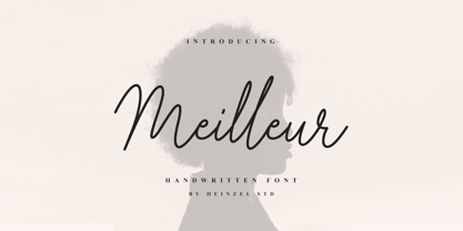 Meilleur is a flowing handwritten font, described by an elegant touch, perfect for your favorite projects. It looks stunning on wedding invitations, thank you cards, quotes, greeting cards, logos, business cards and every other design which needs a handwritten touch. Fall in love with its incredibly distinct and timeless style and use it to create spectacular designs!
 - Busted Soul by Heinzel Std,
$17.00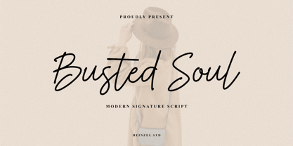 Busted Soul is a flowing handwritten font, described by an elegant touch, perfect for your favorite projects. It looks stunning on wedding invitations, thank you cards, quotes, greeting cards, logos, business cards and every other design which needs a handwritten touch. Fall in love with its incredibly distinct and timeless style and use it to create spectacular designs!
 - Gazpacho by Monotype,
$29.00 Gazpacho is inspired by the serif typefaces used in editorial media in the 70s and 80s. The morphology of the letterforms makes this typeface ideal for display purposes like logos and big, bold headlines. Also, thanks to its large x-height it works perfectly on headlines with tight leading. On the other hand, its high contrast and very simple and recognisable shapes makes it highly readable, so it works on small, long texts as well. It comes in 7 different weights and 2 styles (Standard & Italic).
 - Karlo by The Northern Block,
$28.95 Karlo is a super family of several branches, originating in the same lightweight skeleton. The lightweights are based on a pen of an even stroke-width. Inspired by the writings of calligrapher Edward Johnston, the family moves on in two directions in the heavier weights. Johnston demonstrated that the broad nib pen can produce different writing styles. Following this, one heavy weight has a humanistic low stroke contrast (KarloSerifBold and KarloSansBold), and another has a high stroke contrast of vertical axis with references to the 19th century jobbing typefaces (KarloOpen). The latter is inspired by Johnston’s demonstration of the broad nib pen, where he suggested fastening two pencils together. With each pencil representing an edge of the pen, it becomes more evident how the pen works in writing. The friendly informal look makes KarloSans and KarloSerif usable for both running text and for display sizes. KarloOpen, on the other hand, is solely designed for display purpose showing few words at a time. In Denmark, a guy named Karlo would typically be an old fellow with a slick hairstyle that makes an effort with his appearance. He is a handyman who can do a bit of this and that when needed. He is a happy go lucky kind of guy that takes one day at a time. To me, the typeface family has some of the same qualities. Check out Pyke which is a great pair for Karlo.
 - Wonderful JNL by Jeff Levine,
$29.00 A little bit of thick-and-thin Art Deco hand lettering is offered up in Wonderful JNL, based on some promotional text found on an old piece of sheet music.
 - New Icon by Set Sail Studios,
$34.99 Introducing the New Icon Font Duo. This luxury script and timeless serif are perfectly designed for one another-not only are they strong standalone fonts, but will pair beautifully when placed side by side. Feeling creative? They can even be mixed together within the same word for a more eye-catching layout, giving you a versatile set of fonts which can be used & loved across a range of design projects. Included in this family; New Icon Serif • A classic, all caps serif font with nostalgic notes. Contains alternate large-width O,G,Q,C characters in the ‘uppercase’ set. New Icon Serif Condensed • A thinner version of the New Icon Serif. New Icon Script • A luxury, cursive script font containing upper & lowercase characters. A beautiful letter set inspired by traditional calligraphy, which can be used on it’s own or paired effortlessly with the serif font. Contains alternate lowercase y & g with elongated tails, accessible by turning on ‘Stylistic Alternates’ or via a Glyphs panel. Language Support • English, French, Italian, Spanish, Portuguese, German, Swedish, Norwegian, Danish, Dutch, Finnish, Indonesian, Malay, Hungarian, Polish, Croatian, Turkish, Romanian, Czech, Latvian, Lithuanian, Slovak, Slovenian.
 - Unikled by Ingrimayne Type,
$12.95 Unikled a decorative calligraphic family inspired by the uncial style. The upper and lower cases are largely different and can be treated as two separate alphabets. It is available in two weights, plain and bold.
 - Misha Gergoval by Rotterlab Studio,
$15.00 Misha Gergoval Script is a new and fresh font script that comes in a vintage and neat style. This font can be used easily, even in mixing and matching with other fonts so that it can provide alternatives and new sensations for designers or craftsmen, in working on various projects. Misha Gergoval comes with uppercase letters, lowercase letters, numbers, punctuation, and so many variations on each character including OpenType alternatives to allow you to customize the design. This font is perfect for all your projects such as wedding invitations, greeting cards, branding materials, business cards, quotes, posters, badges, greeting cards, or you can use these fonts for various (vintage) logo projects and more. The characters are ideal for creating interesting messages, mixing and matching Misha Gergoval with a group of alternative characters that are suitable for your project.
 - Thai Foon NF by Nick's Fonts,
$10.00One in the series of fonts celebrating the Halcyon Days of Handlettering. Thai Foon, a fun-loving, freewheeling script, is based on a font presented in the book "Lettering of Today" (today being 1933), by W. Ben and Ed C. Hunt. - Whoopee Cushion NF by Nick's Fonts,
$10.00One in the series of fonts celebrating the Halcyon Days of Handlettering. Whoopee Cushion is a slightly wacky headline font, based on a work by lettering artist Samuel Welo from the 1931 version of his "Studio Handbook for Artists and Advertisers." - Quietism Variable by Michael Rafailyk,
$150.00 A smooth contemplative Antiqua with aspiring to the sky ascenders, inspired by the Quietism philosophy. Clarity of the mind is achieved by bringing the body into a state of calm and contemplation, and this is reflected in the design – the quiet horizontal serifs (body) are opposed to the peaky soaring ascenders (mind). The design also features four optical size subfamilies with different x-height and contrast, oldstyle diagonal stress, oldstyle figures by default, smooth details and slightly dark texture. Variable axes: Weight, Contrast, X-Height. Scripts: Latin, Greek, Cyrillic. Languages: 480+. The complete list of supported languages: michaelrafailyk.com/quietism Kerning: 4553 class-to-class pairs. Hinting: Not applied. Format: TTF – OpenType with TrueType outlines. Variable Font: Quietism Variable provides more options than static versions, and has three axes: Weight (Thin–Black), Contrast (Low-High), and X-Height (Low-High). Variable fonts includes thousands of styles that you can access using a sliders on graphic editor or via CSS on web browser. Mixing different axes gives you extra styles not represented by static fonts. Optical Size: The typeface is represented by four subfamilies: Text (low contrast, high x-height – for paragraph 10-20 pt), Deck (medium contrast, medium x-height – for subheading 20+ pt), Display (high contrast, medium x-height – for heading 72+ pt), Poster (high contrast, low x-height – for big size 120+ pt). Small Caps: Lowercase letters and Oldstyle Figures are replaced with Small Capitals forms. Capitals to Small Caps: Uppercase letters, all figures, and some punctuation are replaced with Small Capitals forms. Case Sensitive Forms: ()[]{}‹›«»-–—•·#%‰@ and Arrows are centered on capitals. Oldstyle figures are replaced with Lining figures. Oldstyle Figures: 0123456789 #%‰. Designed to work with lowercase letters. Used by default. Lining Figures: 0123456789 #%‰. Figures are the same height as uppercase letters (cap height). Proportional Figures: Lining, Oldstyle, Small Caps, Capitals to Small Caps. Tabular Figures: Lining, Oldstyle, Small Caps, Capitals to Small Caps. Ordinals: adehnorst. Superscript, Subscript, Numerator, Denominator: 0123456789. Fractions: ¼½¾⅐⅑⅒⅓⅔⅕⅖⅗⅘⅙⅚⅛⅜⅝⅞⅟ (precomposed). Any other fractions (even those typed through a slash) will also be displayed correctly, with the automatic replacement to Numerator + fraction + Denominator. Slashed Zero: All 0 figures. Contextual Alternates: Number sign character (#) before uppercase letters is replaced by its version centered on capitals. Hyphen character (-) between two uppercase letters is replaced by its version centered on capitals. First of two TT letters is replaced by its alternate form. Letters vwy before the letters fijmnprtuvwxy are replaced with an alternate shorter versions that fits better in the context. Contextual Alternates (Greek): ΆΈΉΊΌΎΏ. Greek uppercase accented characters lose their tonos accent and retain only dieresis in All Caps and Small Caps modes. Turned on by default. If you need tonos accents in All Caps then turn off Contextual Alternates (calt) feature. Stylistic Alternates: FTГТИЦЩцщ and their versions with diacritical marks. Stylistic Set 01 “Arrows”: Left <- Right -> Up Left Right <-> Up Down North West South East \> South West Stylistic Set 02 “Round-Square Cyrillic”: ДИЙЍЛФвгджзийѝклнптцчшщьъю characters are replaced with its Bulgarian or Russian forms. Stylistic Set 03 “Cyrillic Tse Shcha short tails”: ЦЩцщ characters are replaced with its alternate form with short tail. Stylistic Set 04 “Cyrillic I full serifs”: ИЙЍӢ characters are replaced with its alternate form with inner serifs. Stylistic Set 05 “FT bent inward serif”: FTГ characters and their versions with diacritical marks are replaced with its alternate form with right head serif that bent inside. Stylistic Set 06 “Small Caps centered on Capitals”: Small Caps are vertically centered on uppercase letters. Standard Ligatures: fi fl fb ff fh fj fk ffb ffh ffi ffj ffk ffl. Discretionary Ligatures: Th ct st. Localized Forms: 52 character substitutions for Azeri, Bulgarian, Catalan, Dutch, German, Kazakh, Macedonian, Moldavian, Polish, Romanian, Serbian, Tatar, Turkish. Glyph Composition/Decomposition (Diacritics): Full Latin and based Vietnamese set of diacritics (571 characters). Precomposed.
 - Daytona by Monotype,
$50.99 The Daytona™ typeface family grew out of a desire to provide improved fonts for use in televised sporting events. Jim Wasco drew the design as sturdy squared letters based on humanist shapes and proportions. Letters were kept narrow for economy of space, and inter-character spacing was established for easy reading. While televised sporting events may have initially been his target, the design considerations he incorporated into the Daytona family also enabled it to perform well in a variety of other video and on screen environments. Daytona Variables are font files which are featuring two width axes and have a preset instance from Thin to Fat.
 - Black Witcher by Ditatype,
$29.00 Black Witcher is a spine-chilling display font that will cast a spell of fear on your designs. With its big letters and bold weight, this font demands attention and exudes an aura of dread. The horror theme is brought to life with meticulously crafted tree root details on each letter, adding a nightmarish and eerie touch to the font. Each letter in this font is bold and impactful, making a powerful statement in your designs. The large size of the letters enhances the font's haunting presence. The tree root details in Black Witcher give the font a sinister and otherworldly appearance, as if the letters are entangled with ancient and malevolent roots. These haunting details add a sense of mystery and foreboding, immersing the viewer into a world of dark and chilling horrors. For the best legibility you can use this font in the bigger text sizes. Enjoy the available features here. Features: Alternates Multilingual Supports PUA Encoded Numerals and Punctuations Black Witcher fits in headlines, logos, movie posters, flyers, invitations, branding materials, print media, editorial layouts, headers, and any horror-themed project. Find out more ways to use this font by taking a look at the font preview. Thanks for purchasing our fonts. Hopefully, you have a great time using our font. Feel free to contact us anytime for further information or when you have trouble with the font. Thanks a lot and happy designing.
 - Mojodelic by Mysterylab,
$21.00 Looking for a font with that certain... umm... special mojo? Mojodelic might just be the niche font that you need to create that unique statement — one that really pops off the page. While this typeface certainly grooves with the 1960s – 1970s vintage psychedelic and pop art look, it's also a perfect fit with retro 1990s party-way-too-hard youth culture graphics. With its ultra-bold reverse-contrast design and whimsical little curlies, this one's got equal parts silliness and swagger. Try it on skateboard graphics, retro message t-shirts, apparel logos, beverage labeling, candy packaging, teen/tweener marketing, greeting cards... you name it. Enjoy.
 - DreamTeam by Resistenza,
$43.00 Lining up on the start line is Resistenza’s DreamTeam! This fit font’s long limbs, nimble movement and shifting weight make the multiline-display (inspired by bestseller Afrobeat ) perfect to grab attention on signage, print advertising and editorial applications like book covers. DreamTeam’s distinctive forms also make it ideal for branding applications and obviously with its directional movement and the suggested speed DreamTeam’s 4 styles would be DreamSolutions on athleisure apparel and clothing lines. Check out also “Voguing” & “Afrobeat”
 - Steamfunk by MKGD,
$13.00 The font Steamfunk is based on Steampunk. A form of science fiction that couples Victorian era style with futuristic devices operated by early industrial age technology. Each Steamfunk letter is constructed in two symbolic parts. A thick stroke, for the machine’s outer shell, and a second, wire-like, stroke for that machine's delicate inner workings. The result is a look that is Steampunk in appearance, without it being exclusively so. Steamfunk has a glyph count of 398 and supports the following languages; Afrikaans, Albanian, Asu, Basque, Bemba, Bena, Bosnian, Catalan, Chiga, Colognian, Cornish, Croatian, Czech, Danish, Embu, English, Esperanto, Estonian, Faroese, Filipino, Finnish, French, Friulian, Galician, German, Gusii, Hungarian, Icelandic, Indonesian, Irish, Italian, Kabuverdianu, Kalaallisut, Kalenjin, Kamba, Kikuyu, Kinyarwanda, Latvian, Lithuanian, Low German, Lower Sorbian, Luo, Luxembourgish, Luyia, Machame, Makhuwa-Meetto, Makonde, Malagasy, Malay, Maltese, Manx, Meru, Morisyen, North Ndebele, Norwegian Bokmål, Norwegian Nynorsk, Nyankole, Oromo, Polish, Portuguese, Romanian, Romansh, Rombo, Rundi, Rwa, Samburu, Sango, Sangu, Scottish Gaelic, Sena, Shambala, Shona, Slovak, Slovenian, Soga, Somali, Spanish, Swahili, Swedish, Swiss German, Taita, Teso, Turkmen, Upper Sorbian, Vunjo, Walser, Zulu.
 - Ginolac by Avortic Type Studio,
$25.00 Ginolac is a unique, and creative font made by Avortic. Wrapped in a unique concept, this font is feasible and suitable for testing on several works in the form of posters, advertisements, crafts, and others. Don't forget that this font is already available in Russian, making this font not only usable by British or American people but also by Russians and surrounding areas.
 - Seaside Resort NF by Nick's Fonts,
$10.00Lettering on a 1933 booklet about certain facilities in Italy -- can you guess what they might be? -- by the Bertarelli Design Studio of Milan inspired this decidedly different and engaging monocase face. If you're looking for something that says "casual elegance," this is it. This font contains the complete Latin language character set (Unicode 1252) plus support for Central European (Unicode 1250) languages as well. - Trebuchet MS by Microsoft Corporation,
$49.00Trebuchet™ Family, designed by Vincent Connare in 1996, is a humanist sans serif designed for easy screen readability. Trebuchet Family takes its inspiration from the sans serifs of the 1930s which had large x heights and round features intended to promote readability on signs. The typeface name is credited to a puzzle heard at Microsoft, where the question was asked, 'could you build a Trebuchet (a form of medieval catapult) to launch a person from the main campus to the consumer campus, and how™' The Trebuchet fonts are intended to be the vehicle that fires your messages across the Internet. 'Launch your message with a Trebuchet page'. Character Set: Latin-1, WGL Pan-European (Eastern Europe, Cyrillic, Greek and Turkish). - Metafora by Dirtyline Studio,
$17.00 Metafora Sans is a contemporary display family with multifunctional workhorse designed to work best in any printed and on screen contexts, including logo design, brand identities, websites, packaging, poster and headline. The Typeface come in 13 weights, with Upright and Oblique each, for a total of 26 styles.
 - Hopferian by 2D Typo,
$28.00 This font has been developed based on the engraving by the German artist Daniel Hopfer (1470-1536) listing the Latin ABC. While creating the font I tried to preserve the archaism and certain imperfection characteristic for the prototype to accentuate its charm. Fanciful convolution on the serif make it a bit fairy-tale like and cheerful. The font is also available with decorated dots as in the original version. All the letters in the font are capital.
 - Andrew Typewriter by Andrew Tomson,
$10.00 Greetings, friend. I created this font for personal use on a YouTube themed channel about old things. The comments often ask what font I use, so I decided to share it with the community. You can use it in your commercial projects and for personal use. The font is great for creating a vintage text feel. The font is perfectly readable and scalable because I chose the most comfortable DPI for scaling when creating it. I wish you good luck and enjoy using this font!
 - Suctenss by Ronny Studio,
$19.00 Suctenss Inspired by the realistic calligraphy marking style in many big cities. This style is bolder and easier to read, perfect for your "street art" design style. I incorporate real graffiti experience into computer fonts, I think it will be different to other fonts if you can feel it, because I draw graffiti, mark and throw up since I was in high school. Features : - All Caps - numbers and punctuation - Alternate & Ligature - multilingual - Swash / Ornament - PUA encoded Please contact us if you have any questions. Enjoy Crafting and thanks for supporting us! :) Thank you
 - Snikers by Ronny Studio,
$15.00 Snikers Inspired by the realistic calligraphy marking style in many big cities. This style is bolder and easier to read, perfect for your "street art" design style. I incorporate real graffiti experience into computer fonts, I think it will be different to other fonts if you can feel it, because I draw graffiti, mark and throw up since I was in high school. Features : All Caps numbers and punctuation ligature and alternate multilingual Swash / Ornament PUA encoded Please contact us if you have any questions. Enjoy Crafting and thanks for supporting us! :) Thank you
 - Wildside by Ronny Studio,
$19.00 Wildside Inspired by the realistic calligraphy marking style in many big cities. This style is bolder and easier to read, perfect for your "street art" design style. I incorporate real graffiti experience into computer fonts, I think it will be different to other fonts if you can feel it, because I draw graffiti, mark and throw up since I was in high school. Features : All Caps numbers and punctuation multilingual Swash / Ornament PUA encoded Please contact us if you have any questions. Enjoy Crafting and thanks for supporting us! :) Thank you
 - Future Bugler by Breauhare,
$35.00 Future Bugler is a font based on the second logo created by Harry Warren in early 1975 for his sixth grade class newsletter, The Broadwater Bugler, at Broadwater Academy in Exmore, Virginia, on Virginia’s Eastern Shore. This font can convey several perspectives or moods. It can suggest a space-age vision of the future, or an art-deco perspective of the future as in the movie “Sky Captain and the World of Tomorrow”. It also communicates the idea of high performance, or extreme sports, without the grunge. Also be sure to check out the upright version of this font, Future Bugler Upright, available separately. Digitized by John Bomparte. Additional tags: NFL, NFL Network, NFLN
 - Dahaut by Scriptorium,
$12.00Dahaut is a stylized, modernistic uncial variation. The idea for this font came from a small sample of hand lettering in a title on a book by Peter Tremayne. The idea of a bolder, more angular variation on uncial script seemed intriguing, so we developed it into a full font. It should work very well for titles and catches the eye by presenting traditional uncial letter forms in an almost futuristic style. For those who care about such things, the name comes from a princess in a Breton folk story. - Scalactic J - Unknown license

- Conium by MKGD,
$13.00 I designed Conium to be a sister font to Nightshade. It was meant to have the appearance of the hemlock plant without being too derivative; it’s thin drooping stems conjure images of Hamlet’s mad Ophilia clutching sickly weeds while thinking them to be flowers. It also projects the appearance of an ice cold, wrought iron, cemetery gate. The sort that one might pass on a damp overcast day. A fitting compliment to an Edward Gorey illustration from top, right down to the frigid ground from which it sprang. Conium has a glyph count of 388 and supports the following languages Afrikaans, Albanian, Asu, Basque, Bemba, Bena, Bosnian, Catalan, Chiga, Colognian, Cornish, Croatian, Czech, Danish, Embu, English, Esperanto, Estonian, Faroese, Filipino, Finnish, French, Friulian, Galician, German, Gusii, Hungarian, Icelandic, Indonesian, Irish, Italian, Kabuverdianu, Kalaallisut, Kalenjin, Kamba, Kikuyu, Kinyarwanda, Latvian, Lithuanian, Low German, Lower Sorbian, Luo, Luxembourgish, Luyia, Machame, Makhuwa-Meetto, Makonde, Malagasy, Malay, Maltese, Manx, Meru, Morisyen, North Ndebele, Norwegian Bokmål, Norwegian Nynorsk, Nyankole, Oromo, Polish, Portuguese, Romanian, Romansh, Rombo, Rundi, Rwa, Samburu, Sango, Sangu, Scottish Gaelic, Sena, Shambala, Shona, Slovak, Slovenian, Soga, Somali, Spanish, Swahili, Swedish, Swiss German, Taita, Teso, Turkmen, Upper Sorbian, Vunjo, Walser, Zulu
 - Cunaeus by George Tulloch,
$21.00 Cunaeus is intended primarily for use in running text. It brings together the types of two renowned sixteenth-century punchcutters: the roman is an interpretation of a pica font cut by Ameet Tavernier (c.1522–1570), and the italic that of a pica font of Robert Granjon (1513–1589/90). Granjon’s italics have inspired a number of revivals in the past, but usually of his more slanted styles; the present digitization features the lesser slant of his so-called ‘droit’ style typical of the mid 1560s. Cunaeus provides wide support for west, central, and east European languages that use the roman alphabet. Among its OpenType features are ligatures, small caps, several sets of numerals, contextual alternates, intelligent implementation of long ‘s’, and fractions. For more detail, please see the pdf available in the Gallery.
 - Faith And Glory by Set Sail Studios,
$12.00 Thanks for checking out Faith and Glory! These 2 hand-painted brush fonts are designed to perfectly combine with one another and allow you to create beautiful rustic typography with a personal touch. Ideal for; Logos, printed quotes, invitations, image overlays, greeting cards, product packaging, text headers, & whatever else your imagination holds! Faith and Glory One Is a script font which includes upper & lowercase characters, punctuation, numerals, and multilingual support. Alternates are available for several lower case characters, these are accessible by turning on 'Stylistic Alternates', or via any software with a Glyphs panel. Faith and Glory Two is a condensed brushed font containing uppercase only characters, punctuation, numerals, and multilingual support are also included. Alternates are available for key characters, you can access these simply by switching between upper & lower case glyphs within the 2 fonts (e.g. typing 'A' and 'a' will give you 2 alternate characters).
 - TwentyFourNinetyOne by steve mehallo,
$19.91 TwentyFourNinetyOne [2491] is a reinterpretation of the alphabet of 1919 by Theo van Doesburg; the original a true rendering of the thinking of the Dutch-based art movement “de Stijl.” Jump forward to 1980 and prop lettering used on the Buck Rogers in the 25th Century television series; a vernacular typeface that was a utilitarian mix of geometry and pixel-based forms, used to symbolize the futuristic universe of 2491. At times it would appear on spaceships, laser guns, signage at space ports or in one episode, a Spandex tapestry. It only seemed logical to combine and rethink the letterforms, add ligatures + other extras, and see what the results would be. Futuristic, fun and bold to read! 2491: In the future, all type will look like this.
 - TT Ricordi Allegria by TypeType,
$29.00 Please note! If you need OTF versions of the fonts, just email us at commercial@typetype.org TT Ricordi Allegria useful links: Specimen | Graphic presentation | Customization options TT Ricordi Allegria is a sleek and intelligent contemporary Florentine grotesque inspired by the half-erased lettering in Basilica di Santa Croce, Florence. TT Ricordi Allegria was drawn by Antonina Zhulkova and reflects in its graphics the transitional stage between the classic serif with varying proportions, gravitating towards the Roman capital type, and the Florentine sans serif. The font is characterized by variability in the proportions of characters, contrast between strokes, wedge-shaped triangular characters, and the absence of traditional serifs. The main visual feature of the typeface is its diversity and the ability, using different stylistic sets, to completely change the character and perception of the typeface. The drawing of the characters from the main set is strict, thanks to which the font looks stern, as if the inscription in the font was really carved out of stone. And with the help of another set, we can add roundness, or even smoothness, to the font. This is due to the fact that the letters (E R K Q J Y in Latin, and Л К Ж Э in Cyrillic) from the second set have either very noticeable "curls" or smooth, rounded "legs". In addition, the typeface includes a set of beautiful ligatures for use in display inscriptions, such as large headlines. An interesting moment when working on the typeface was the creation of the Cyrillic typeset, since the Cyrillic alphabet does not so easily fit into the concept of the Florentine grotesque and stressed semi-serif. The most difficult thing in working on the Cyrillic alphabet was to create a system of spacing for characters, as it was done in the Latin alphabet, and to make sure that when typing in Cyrillic, the drawing of the text remained beautiful. That is why the letters Д Л У Ы appearing in the font family are somewhat unusual to the eye, and the proportions of other characters in Cyrillic are not quite “classic” either. In general, the Cyrillic set looks more display than its Latin prototype, but at the same time it lacks the sense of historicity or legacy of the Soviet past, which often comes to the foreground when working on the design of the Cyrillic alphabet in this type of serifs. TT Ricordi Allegria consists of two weights (Regular and Bold) and one variable font. Each style includes over 750 characters, as well as 19 OpenType features. Interesting features of the typeface include three stylistic sets that greatly change the perception of the font, a set of bright display ligatures, a few neat icons that are suitable for breaking text and will emphasize the visual language of the font. Please note! If you need OTF versions of the fonts, just email us at commercial@typetype.org FOLLOW US: Instagram | Facebook | Website
 - Artemisia NF by Nick's Fonts,
$10.00A crisp, geometric semiscript, based on the font Adonis, originally released by American Type Founders. - Hand Stamp Gothic Rough by TypoGraphicDesign,
$25.00 “Hand Stamp Gothic Rough” is based on real vintage rubber stamp letters from Germany. A classic american gothic face mixed with a modern condensed sans serif type. Rough & dirty with a authentic hand stamped look for a warm analogue vintage charm. It started analogous with only a few rubber stamps and finally it was digital 776 glyphs. With 4 × A–Z, 4 × 0–9, 4 × a–z and many other alternative glyphs like @. Plus modern OpenType Features like contextual alternates (automatic generated loop for letter variation). The different variations from the dynamic pressure by hand intended to show the hand-made nature and creates a liveliness in the display font. The font has 80 decorative extras in the form of symbols & dingbats like arrows, hearts, smileys, stars, further numbers, lines & shapes. A range of figure set options like oldstyle figures, lining figures, superiors & inferiors. Additionally standard ligatures, decorative ligatures (type the word “show” for ☛ and “love” for ❤ … ), Versal Eszett (German Capital Sharp S) and many emojis & symbols. Example of use It’s your turn … for example everywhere where it makes sense. The hand stamped font would look good at headlines. Advertising (big headlines), Corporate Design (type for logos & branding), Editorial Design (magazine or fanzine headlines), Product Design (typographical packaging) or Webdesign (headline webfont for your website), flyer, poster, music covers or web banner … How To Use – awesome magic OpenType-Features in your layout application: ■ In Adobe Photoshop and Adobe InDesign, font feature controls are within the Character panel sub-menu → OpenType → Discretionary Ligatures … Checked features are applied/on. Unchecked features are off. ■ In Adobe Illustrator, font feature controls are within the OpenType panel. Icons at the bottom of the panel are button controls. Darker ‘pressed’ buttons are applied/on. ■ Additionally in Adobe InDesign and Adobe Illustrator, alternate glyphs can manually be inserted into a text frame by using the Glyph panel. The panel can be opened by selecting Window from the menu bar → Type → Glyphs. Or use sign-overview of your operating system. For a overview of OpenType-Feature compatibility for common applications, follow the myfonts-help http://www.myfonts.com/help/#looks-different ■ It may process a little bit slowly in some applications, because the font has a lot of lovely rough details (anchor points). Technical Specifications ■ Font Name Hand Stamp Gothic Rough ■ Font Weights Regular & Dirty (Bold) ■ Font Category Display for headline size ■ Font Format.otf (OpenType Font for Mac + Win) ■ Glyph Set 776 glyphs ■ Language Support Basic Latin/English letters, Central Europe, West European diacritics, Turkish, Baltic, Romanian, OpenType Features, Dingbats & Symbols ■ Specials Alternative letters, stylistic sets, automatic contextual alternates via OpenType Feature (4× different versions of A–Z & 0–9 + a–z), Euro, kerning pairs, standard & decorative ligatures, Versal Eszett (German Capital Sharp S), 80 extras like Dingbats & Symbols, arrows, hearts, emojis/smileys, stars, further numbers, lines & shapes. ■ Design Date 2016 ■ Type Designer Manuel Viergutz ■ License Desktop license, Web license, App license, eBook license, Server license
 - Coffee and Danish JNL by Jeff Levine,
$29.00 In the collection of vintage and historic images available online from the Library of Congress is one of the exterior of the Town Talk Diner in Minneapolis, Minnesota. Regrettably, on May 28, 2020, the Town Talk Diner was damaged by vandalism, and subsequently destroyed by a fire that engulfed the building early on the morning of May 29th due to civil unrest following the death of George Floyd. The restaurant first opened in 1946, closed in 2011 and subsequently re-opened under new ownership in 2014 with French cuisine, then from 2016 until its demise as an American bistro. While this was not known at the time of selecting the image for a typographic model, subsequent research on the diner turned up these facts. The large vintage sign above the entrance was in big, bold Art Deco letters with rows and rows of bulbs for illuminating the name at night. Coffee and Danish JNL, modeled from the image of that sign, is available in both regular and oblique versions. Perhaps, in a way, the type design will serve as a bit of historic recognition for a popular eating spot.
 - LiebeDoris by LiebeFonts,
$29.00 Inspired by a workshop with iconic American sign painter Mike Meyer, Ulrike of LiebeFonts set out to create a versatile, lovely typeface for sign painting that looks not at all like a font but rather like the letters on a unique, hand-painted storefront sign. LiebeDoris combines the best of two worlds: the beauty of all-American sign painting and the meticulous craft of German engineering. Each and every letter in each of the four different styles in LiebeDoris was hand-painted on large sheets of paper with a brush and ink, then carefully transferred for digital typesetting. So rather than being one typeface with different weights, think of LiebeDoris as a package of four individual designs that go together very well. Advanced OpenType features enable this font to really shine: every letter in this all-caps font comes in four variations, so that two of the same letters typed in a row won’t look the same, giving a truly handmade charm. (This feature requires layout software or a word processor with OpenType support.) And if you do have a storefront or a restaurant menu to prettify with LiebeDoris, you will love the integrated collection of store-themed catch words like “FREE”, “NEW”, and “SALE”. If you fall in love with LiebeDoris, you may also like our other best-selling fonts, LiebeErika and LiebeGerda, or our whimsical pictogram fonts such as LiebeMenu.
 - Futura Next by Neufville Digital,
$45.25 Our most up-to-date Futura adapted to the new times. Its peculiarity lies in the curved endings of three of its letters (“j”, “l” and “t”), which gives the typeface a more dynamic and modern look, making it easier to visualize on small and low-resolution screens. The original designs of these characters are also included. Futura is a Trademark of BauerTypes SL
