10,000 search results
(0.063 seconds)
- Campcraft by Our House Graphics,
$- Remember those plastic Popsicle sticks that clicked together and you could make things from them with your sticky little fingers? Things like... camp crafts. Well, no� Of course you don't. You were too young. That�s why there is Campcraft. This is a fun loving dot-matrix font, or it would be a fun loving dot-matrix if the vertical and horizontal grid lines didn't pile up at the intersections. Then again, it wouldn't be any fun if they didn't pile up at the intersections, would it? Strictly a display type... Campcraft is excellent for what the name suggests. I goes well with Christmas sweaters, beaded jackets and purses and that time when we were all happy children with sticky little fingers.
 - ITC Tyfa by ITC,
$29.99 Some words from the designer, Frantisek Storm... Designed by Josef Tyfa in 1959, digitalized by F. Storm in 1996. This Roman and Italic are well-known perhaps to all Czech graphic artists and typographers ever since their release. Although this type face in some details is under the sway of the period of its rise, its importance is timeless, in contradistinction to other famous types dating from the turn of the sixties which were found, after some time, to be trite. The italics live their own life, only their upper-case letters have the same expression as the basic design. Thin and fragile, they work excellently, emphasizing certain parts in the text by their perfect contrast of expression. When seen from a distance they are a little bit darker than the Roman face. Tyfa Roman was released in 1960 by Grafotechna in Prague for hot setting. Later on, Berthold produced letter matrices - "rulers" for Staromat devices, used for manual photosetting of display alphabets. In the eighties it was available on dry transfers of Transotype and today it is offered also by ITC. The meticulously executed designs of the individual letters in the 288 point size are arranged into a set of signs on a cardboard of about B2 in size. The yellowed paper reveals retouches by white paint on the ink. Blue lines mark the baseline, the capital line, the ascender and descender lines and the central verticals of the letters. With regard to the format of the flat scanner, the designs had to be reduced, with the use of a camera, to the format A4, i.e. to the upper-case letter height of about 30 mm. These were then scanned in 600 dpi resolution and read as a bitmap template to the FontStudio programme. The newly created bold type faces derive from Tyfa's designs of the letters "a", "n", "p", the darkness of which was increased further, approximately by 3%, to enhance their emphasizing function. The text designs have hairstrokes thickened by one third; the contrast between thin and thick strokes has been modified, in order to improve legibility, in sizes under 12 points. We have used electronic interpolation to produce the semi-bold designs. Josef Tyfa himself recommends to choose a somewhat darker design than the basic one for printing of books.
 - Psychomachy by Gassstype,
$27.00 Hello Everyone, introduce our new product Font Psychomachy Handmade Scary Font with ligature and Multilanguage support.Introducing of designs look modern, unique and fun. It’s perfect for labels, quotes, posters, DIY projects, branding, packaging, greeting cards, websites, photos, photography overlays, signs, window art, scrapbooking, tags and so much more!our new product that inspired by Street Tagging, graffiti style with a fun theme very good for graffity poster, flyer, childrenbook, cartoon, comic etc . That is has charming, authentic and relaxed characteristic more natural look to your text You can activate 15 Alternates glyphs and 10 Ligatures glyphs OpenType panel.
 - Beauty Retro by Gloow Studio,
$16.00 Product Description Beauty Retro Font is a Retro Script Font with a Bold style. It's perfect for branding, wedding invitations, photography, Neon Sign, bloggers, logos, greeting cards, Logo, Quotes,Poster and more. Font Features : - Uppercase - Lowercase - numeric & Multilingual support - Stylistic Alternates with (Ss01, SWASH and Ligatures) All of features and special characters of this font are included in one file. So it is easy to accessed by using program or software that support the opentype like Adobe Illustrator, Adobe Photosop, and Adobe Indesign).
 - Driveway Stencil JNL by Jeff Levine,
$29.00We've all seen the informational markings on commercial driveways or roadways instructing us which way to turn, where to park, etc. They are usually in stencil lettering 16 inches or taller, with compressed letters that make the horizontal strokes look slightly thicker than the vertical ones. By condensing the lettering in Narrow Stencil JNL by 20 percent, the result is Driveway Stencil JNL - a digital emulation of those painted road markings. - Swarha by Gumpita Rahayu,
$18.00 Built in 1930 - 1935 by Dutch architect Wolff Schoemaker, the Swarha Islamic Building was originally used as a lodging for the honoured guest country and the journalists for Asia-Africa Conference in 1955. This building has an important role as one of Bandung historical art deco heritage, with the art deco typefaces styles on it's singage in this building, giving it a more classic west and east taste. Wolff Schoemaker was trying to combine the elements between eastern and western culture in design. One of his works was the Swarha Islamic Building in a circular design with rounded and high dynamic angle. Unfortunately the Swarha Islamic Building has been abandoned and and less attentioned by the local people itself to preserve this historic building. So I'm trying to raise the value of the historical heritage by creating this typefaces. This typefaces was inspired by the Swarha Building characteristic itself with its solid construction and dynamic, by adding classic taste on each characters. Available in two styles, Neue and Rounded represents the classic architectural Swarha Islamic Building styles with tropical Bandung Art Deco taste. This typeface is highly usable as a display type for your designs, and will fit with movie titles, magazines, your classic shops logo and signage designs, or you can use this typefaces as your web pages headlines. The characters of this typefaces are only in uppercase style, but it built with small caps on the lowercase featured, and additional Opentype Features were loaded, some stylistic alternates, accessible catchwords in the discretionary ligatures, and standard ligatures.
 - Millar by The Northern Block,
$16.70 An elegant monoline typeface with smooth corner detailing. The simple linear design is best suited to identity, editorial and on screen uses. Details include 7 weights, a complete character set, manually edited kerning and Euro symbol.
 - Wakefield by Galapagos,
$39.00A gentle breeze caressed his face as his body took on the easy posture of a dancer on break. Flickering sparklets of light sprinkled the glass-smooth surface of the aqua liquid on which he floated. His mind wandered; he was only days away from his scheduled departure date. This day was no different from a hundred other days he had spent melded to his windsurfer, skittering along the breadth of the modest lake, soaking up the sun's rays and forgetting about the entire rest of the world. Lake Quannapowitt, and the town of Wakefield, Massachusetts, were familiar to Steve, a long-time resident of the picturesque New England town. This is where he grew up; this is where he married and lived for many years; and this is the place he was preparing to leave, not one week hence. Not generally prone to nostalgia, it was in just such a state he nonetheless found himself once Zephyrus retreated, as was his custom, periodically, while patrolling the resplendent lake. Steve was going to miss the lake, and he was going to miss the town. How many hours of how many days had he spent exactly like this, standing on his motionless board, waiting for his sail to fill, and staring at the lake's shores, its tiny beach, the town Common with its carefully maintained greenery, and equally well-tended gazebo, the Center church - its spire shadow piercing the water's edge, like a scissor-cut the better to begin a full-fabric tear? Yes, he was going to miss this place - this town which all of a sudden had become a place out of time, just as he was about to become a person out of place. Once this idea struck him, he couldn't shake it. He was transported back in time four score years, now watching his ancestors walk along the shore. Nothing in view belied this belief - not the church's century old architecture, not the gazebo frozen in time, nor the timeless sands of the beach, nor the unchanging Common. Everything belonged exactly where it was, and where it always would be. This, he decided, was how he would remember his hometown. And this is when it occurred to Steve to design a typeface that would evoke these images and musings - a typeface with an old-fashioned look, reflected in high crossbars, an x-height small in size relative to its uppercase, and an intangible quality reminiscent of small-town quaintness. Wakefield, the typeface, was born on Lake Quannapowitt in the town for which it was named, shortly before Steve moved away. It is at once a tribute to his birthplace and a keepsake. - Busky by Craft Supply Co,
$20.00 Urban Graffiti Font Busky Introduction Meet Urban Graffiti Font Busky, a vibrant display font inspired by street art. This font captures the essence of graffiti culture. It’s perfect for adding a playful touch to your designs. Busky’s bold and lively appearance is sure to grab attention. Design and Style Busky features bubble letter forms, giving it a fun and bouncy feel. Each character is crafted to resemble graffiti bubbles. The font’s rounded edges convey a sense of movement and fluidity. This style is ideal for projects needing a touch of urban flair.
 - Trauville by Eurotypo,
$22.00 Inspired by Beauville Script, Trauville is a handmade, modern, joyful and elegant pen font with a vintage touch. Its informal appearance, the bouncy baseline, the round forms and bumpy stems, the good connection between the letters and the large number of ligatures that create more authentic and varied connections between the letters, refer to the fluent handwriting. With its 830 glyphs, the Trauville font is equipped with contextual and stylistic alternatives, many stylistic alternatives, swashes, initial forms and ligatures. This font contain a Central European language support to adapt to your design. Trauville works perfectly on greeting cards, invitations, weddings, posters, magazines, fashion world, brands and logos, packaging, etc. He is friendly and kind, fresh and fun to work with.
 - 1592 GLC Garamond by GLC,
$38.00 This family was inspired by the pure Garamond pattern set of fonts used by Egenolff and Berner, German printers in Frankfurt, at the end of the sixteenth century. All the experts said it was the best and most complete set of the time. The italic style used with it was Granjon’s, as in 1543 Humane Jenson. A few fleurons from the same printers have been added. It can be used variously for web-site titles, posters and flyers design, publishing texts looking like ancient ones, or greeting cards, various sorts of presentations, as a very elegant and legible font... This font supports very large sizes as easily as small sizes, remaining very smart, elegant and fine. Its original cap height is about five millimeters. Decorated letters like 1512 Initials, 1550 Arabesques, 1565 Venetian, 1584 Rinceau from GLC Foundry, can be used with this family without anachronism.
 - Handmade Headline JNL by Jeff Levine,
$29.00 Hand lettered titling on the 1945 sheet music for “Don’t Forget To-Night, To-Morrow” is in a simple, condensed sans serif style with a slight hint of Art Deco influence. This is now available as Handmade Headline JNL, in both regular and oblique versions.
 - Ondemande by Stefani Letter,
$14.00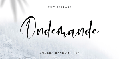 Ondemande feels equally charming and elegant. It looks stunning on wedding invitations, thank you cards, quotes, greeting cards, logos, business cards, and every other design which needs a handwritten touch. This font is PUA encoded which means you can access all of the glyphs.
 - Art School by AVP,
$25.00 Faithfully reproduced from my father’s design drawings made at The Municipal School of Arts and Crafts, Wolverhampton in 1939. Strong nostalgic influences of Art Nouveau and Art Deco. What caught my eye was the consistency with which each particular character was formed: every ‘R’ like every other, every ‘S’ the same. Tight letter spacing and loose word spacing characterised his titling but he didn’t trust himself to print without first ruling guidelines, a hint of which remain in this font.
 - HRKtKAI - Unknown license

- Museo Slab by exljbris,
$- Museo Slab is a robust slab serif with Museo 's friendliness. It is a perfect match for Museo Sans .
 - Afrikana by Mina Arko,
$18.00 Afrikana is based on various African letters and signs. The main inspiration for making this typeface was the book by Saki Mafundikwa, Afrikan Alphabets. Letters were designed based on signs and characters from African alphabets. They were than cut out of cardboard, scanned, traced and put in a font. You are free to modify the font in any way and have fun with it.
 - Rodeo Clown by FontMesa,
$25.00 Rodeo Clown is a revival of an old classic font that you may have known under the name of Carnival. The Rodeo Clown family includes Fill fonts that you may layer behind the letters to add color or set to white so any background image doesn't show through the letters. The half fill should be layered on top to change the color of the top inlay design. The fill font for Rodeo Clown may also work as a stand alone black weight. In our sales images you'll see a sample of the fill font being used, we've intentionally offset the fill font to give it a misaligned printed look which was common to see with fill fonts in the 1800's
 - Cranach by profonts,
$41.99 This picturesque, beautiful German Blackletter typeface was originally released by Benjamin Becker Succ, Frankfurt am Main, then named ?K�nstlergotisch?. Ralph M. Unger redesigned, digitally remastered and completed the font based on old catalogues/specimen. In honor of the famous Cranach family, German artists in medieval times, we renamed the font after them. The shadowed version was added for even more eye-catching purposes, e.g. in headlines.
 - Tendencies by HIRO.std,
$22.00 Tendencies – Graffiti Font This font describes culture, hip-hop, gravity, style, spray, road, travel, is easy to use and will bring good harmony when the letters are connected with alternate styles and paired with each other Tendencies has more than 489 Glyphs FEATURES - Ligatures - Stylistic Alternates - Uppercase - Lowercase - Numbering and Punctuations - Multilingual Support - Works on PC or Mac - Simple Installation USE Tendencies works great in any branding, board, logos, apparel, produk pagaking, magazines, label, films, stationary, poster, etc. and any projects that need street art taste.
 - Tropical by Sudtipos,
$49.00 The single-named, multi-talented designer Joluvian now lives in Madrid. But he grew up in the “Caribe” of Venezuela, where thick jungles meet endless beaches, and fecund trees bear juicy fruit – a tropical paradise where music and dance vibrate in the humid air. The Tropical pack, designed by Joluvian and digitized by Ale Paul, echoes the spirit of his birthplace. Its three faces are casually stylish – a bold, wet-looking display script, an inky, textured brush script, and hand-penned capitals with a felt-tip look. Like a fruit cocktail, each ingredient is tasty on its own, but they combine even more deliciously. Sprinkle the included catchwords, shapes, and bursts in your layout to complete the easygoing, Carribbean vibe. Each face includes alternates and support for multiple Latin languages.
 - Zzzap by Comicraft,
$19.00 Run your hand under the tap and then thrust your fingers in the electrical outlet nearest to you* and you'll get the same effect that our latest release, ZZZAP will have on comic book readers everywhere when Electro, The Shocker, Black Lightning, Storm and Darth Sidious turn the dark side of the force on them. *The management accepts no responsibility for any adverse effects experienced by comic book font users who stick moistened digits into the power supply after installing this font for the purposes of comparison (it's probably best to just take our word for it). Batteries not included, void where prohibited.
 - Leipziger Antiqua by profonts,
$41.99 The original typeface was designed by Albert Kapr between 1971 and 1973 for Typoart in Dresden. Kapr was the font designer and teacher as well as book author on type design of former East Germany. He also was an expert on this kind of type design, and thus, it is no surprise that he created Leipziger Antiqua, a design combining features of both Latin and broken scripts. The result is a stunning and unique gem from earlier times although it does not come along too distinguished or artsy. The digital version of Leipziger Antiqua was developed by Ralph M. Unger exclusively for profonts in 2005. During the work, Unger fell so deeply in love with this typeface that he couldn't help but add an expert font with small caps etc.
 - Maiandra by Galapagos,
$39.00The Maiandra family of typefaces were inspired by an early example of Oswald Cooper's hand-lettering, as seen in an advertisement for a book on home furnishing, circa 1909. Although many of Oz Cooper's letterform designs were cast in metal type, this particular one was not. Cooper's design itself was inspired by examples of letterforms he had admired in his study of Greek epigraphy (inscriptions). Cooper combined those ancient forms with the flair characteristic of design styles of his time. The result was an attractive design possessing subtle, purposeful irregularities, or "meanders" in his skilled brushwork. The Cooper design exhibits a unique warmth and harmony in text, while presenting a compelling rhythm, color and texture on the page. "Realizing the presence of this uniform warmth and readability," notes Dennis, "I decided to expand the design into a family of three weights with companion italics." The weights for the Maiandra family were selected for their versatility in usage over a broad range of output device resolutions. Indeed, "the consideration of eventual display resolutions, be they for screen or printer, provided the greatest challenge in the design of this typeface family," explains Dennis. Creating shapes that conform to the rigors of digital letterforms and modern rendering environments, without losing the unique characteristics of Oz Cooper's original design, is what Dennis has accomplished with his tribute to this great designer of the past. Maiandra, whose name derives from the Greek 'maiandros', meaning 'meander,' is intended for extended text use, as well as for informal subject matter, such as business correspondence, brochures and broadsides. "An example of a good use for Maiandra," notes Dennis, "is in printed matter relating to the turn-of-the-century art period known as the Arts and Crafts Movement. It can stand alone or be used with designs that complement its shape and color." - Austin Antique by HiH,
$10.00 “More is better” may have been the motto of Richard Austin of Austin and Son’s Imperial Letter-Foundry on Worship Street at Finsbury Square in London when he designed and cut his Antique typeface. The year it was created is uncertain, but it is known to have appeared in a specimen book produced in 1827. At first glance, the upper case letters of Austin Antique look very much like Figgins Antique. But, upon examination, one will note that the Austin face is much darker. In general, the letters designed and cut by Richard Austin have fatter strokes, larger serifs and smaller counters -- more metal and less daylight. The premise was that the darker the letter, the more attention an ad using the typeface would receive. In old pictures of London and Paris one may see walls crowded with posters and “bills” -- competing for the attention of the passerby. Morris and Updike aside, the early nineteenth century marked the beginning of a commercial as well as industrial revolution. Patterns of commerce were changing. With new methods of marketing came the need for new typefaces to support the new methods. Foundries found the display types were very profitable and competed most energetically and creatively for the trade. There was a lot of trial-and-error. Some ideas faded away. Others, like the Antiques or Egyptians, were refined and developed. From them came the Clarendons that were to prove both popular and long lasting -- because they worked. Their job was to sell goods, not please the aesthetic sensibilities of the critics. They did their job well. Austin Antique has a full Western European character set, plus the following ligatures: ct, st, fi, fl, ff, ffi and ffl. Tabular numbers. Surprisingly readable.
 - Oh Claristta by Sulthan Studio,
$12.00 Oh Claristta - is a new calligraphy font, which is elegant and soft, attractive, cute with a heart that can be connected.perfect for your design and craft projects, including greeting cards, product labels, invitations, logos, and so much more Oh Claristta - includes many alternative characters. Coded with Unicode PUA, which allows full access to all additional characters without having special design software. Mac users can use Font Book. Windows users can use the Character Map to view and copy one of the additional characters to paste into your favorite text editor. For people who have opentype-capable software: Alternatives can be accessed by turning on the "Alternative Style" and "Ligature" buttons on the Photoshop Character panel, or through any software with the glyph panel, e.g. Adobe Illustrator, Photoshop CC, Inkscape.
 - SK 1980 Unicase by Salih Kizilkaya,
$2.50 SK 1980 Unicase is a font that emerged with a modern interpretation of the 80's design concept. It was specially designed to create structural forms. Each character is the same size, so you can create structural designs without any difficulty. Includes 7 different versions and 2464 glyphs.
 - Cabrito Inverto by insigne,
$- Life’s always more fun when you reverse the stress. The same goes for the new member of the Cabrito family. Cabrito itself is a recently developed slab serif made for the kid’s book The Clothes Letters Wear. Cabrito proved to be more popular than I thought, and I promised I would create an inverted style for this new addition to the font world--a variant that would pair well with the original or even stand well on its own. And so now, here it is. Cabrito Inverto, which features the reversed stress of the strokes from a font’s “normal” traits. Inverted stress fonts are most often associated with cowboys and the Old West. The inverted stress gives it a happy-go-lucky appearance, not to be taken too seriously. It’s a pleasantly rounded, not-so-strictly geometric typeface with handwriting-inspired forms. Whew, that’s a mouthful! Inverto’s bundle of alternates is accessible in any OpenType-enabled program. It contains a workforce of alternates, swashes, and alternate titling caps to embellish the font. Also bundled are swash alternates, aged design and style figures, and compact caps. Peruse the PDF brochure to examine out these solutions in action. OpenType-enabled purposes such as Adobe suite or Quark will allow ligatures and alternates. This font family also includes the glyphs for 72 different languages. Cabrito Inverto does pair well with Cabrito. There is even an extra font weight, Black, for when you want to punch it up a bit. Jeremy Dooley designed Inverto to be a welcoming, day-to-day font family. Use it to express friendliness on just about anything, from candy to food to children’s toys. Cabrito Inverto’s one-of-a-kind visual appearance brings a bundle of fun to the party. Buy Cabrito Inverto to give a boost to your designs every day of the week.
 - Mr Cyrk by Hipopotam Studio,
$18.00 Hand drawn typeface designed for one of our books. You can layer different styles over the background style to achieve lots of colorful effects. Use just one style to get a single color letter or set the fillOne and fillTwo over the background style to get a full, tree color mode. Mr Cyrk has only uppercase characters with alternate glyphs in place of lowercase letters. You can have one style for $18 or all of them for $30.
 - Nouveau Moderne JNL by Jeff Levine,
$29.00 The cover of the 1904 sheet music from the Tibetan comic opera “The Forbidden Land” had the title hand lettered in an unusual Art Nouveau style. Mostly squared with rounded corners, many of the characters twisted, turned and extended in ways that took on the look of the Far East. This became the design model for Nouveau Moderne JNL, which is available in regular and oblique versions.
 - Southwest Serenade JNL by Jeff Levine,
$29.00 The 1940s-era hand-lettered title on vintage sheet music for the song hit "Donkey Serenade" had an interpretation of the classic typeface "Broadway" used in a Mexican/Southwest motif with wavy lines cutting through the letters. Adapting Playwright JNL (itself, a hand-lettered interpretation of "Broadway") to this style, the festive design is now a digital typeface called Southwest Serenade JNL.
 - Nouveau Display JNL by Jeff Levine,
$29.00 Vintage sheet music for the 1920s song "Where Did Robinson Crusoe Go with Friday on Saturday Night?" yielded the hand lettered Art Nouveau alphabet for Nouveau Display JNL. Because the Art Nouveau movement was so influential in the graphic designs of the 1960s "Love Generation" counter culture, this typeface blends itself well with projects crossing many decades and varying styles.
 - Neoland by Josstype,
$16.00 Neoland is a round Comic display font, a very unique trendy font with a combination of modern character bindings, and I think this product suits the teaser display theme in every headline design, business cards, leaflets, magazines, children's events, and brand screen printing. Available Fonts: Neolan Font File. Come on, take a look and be happy to hear the review. If you have suggestions about this product, please let your work environment know whether this product is good for them. Thank you so much for everything!!
 - Mercato VF by Borutta Group,
$79.00 MERCATO is a headline family of typefaces inspired by hand-painted price tags. The idea for this family was born a few years ago in South America. I wanted to create a typeface that is written, expressive and organic on the one hand, and thrown into a geometric frame on the other. Co-designers: Karol Mularczyk & Małgorzata Bartosik.
 - Duepuntozero Pro by Zetafonts,
$39.00 Created as a logo typeface in 2004 by Francesco Canovaro, Duepuntozero is one of Zetafonts classic typefaces. A monolinear sans serif typeface with rounded corners and condensed proportions, strictly based on modular geometric design, it was at first designed in five weights to be used as a condensed companion typeface to the rounded display family Arista. In 2019 the family was completely redesigned by the Zetafonts Team, expanding the original character set to include cyrillic and greek glyphs and adding four extra weights and italics to the original weight range. This restored and revamped version, named Duepuntozero Pro, also includes full Open Type features for positional figures, fractions and Small Caps. With his rounded, minimal aesthetic, Duepuntozero embodies the desire for simplicity and playfulness of contemporary mobile applications, making it a perfect choice for gaming and app interface design. Its compact design allow for maximum space saving on mobile screens when used as a text typeface, while the strictly geometric design and the extreme range of weights (including thin and black) make it excel in display, logo and editorial use. A complementary set of free icons in the same range of weights of the font is provided to help designers build consistent branding through pictograms in infographics, interfaces and editorial products.
 - Harry Plotter by ParaType,
$25.00 An original typeface designed for ParaType in 2003 by Zakhar Yaschin. Extravagant letterforms were inspired by the style of books about young wizard on the one hand, and purblind regiments of scripts from Halloween cards on the other hand. Its classical nature is successfully hidden behind the giant triangular serifs. For use in advertising and display typography.
 - Otago by Hanoded,
$15.00 Otago is a classic all caps Art Deco font. Clean, crisp and very, very legible. I took my inspiration for this font from a 1920's postcard. Otago comes with a bagful of diacritics.
 - Jumping World by Seemly Fonts,
$14.00 Jumping World s an incomparable display font. It can easily be matched to an incredibly large set of projects, so add it to your creative ideas and notice how it makes them stand out!
 - La Coupole NF by Nick's Fonts,
$10.00Lettering on a 1927 menu by prominent poster artist Razzia provided the inspiration for this decidely Deco typeface. The restaurant itself was the setting for one of Georges Simenon’s many Inspector Maigret novels. Both versions of the font include 1252 Latin, 1250 CE (with localization for Romanian and Moldovan). - Franky by Hasta Type,
$25.00 Franky is a retro, bold handwritten font with an 80’s style. This font is PUA encoded which means you can access all of the glyphs and swashes with ease! It features a varying baseline, smooth lines, gorgeous glyphs and stunning alternates. Fall in love with Franky's incredibly versatile style and use it with your favorite design projects!
