10,000 search results
(0.052 seconds)
- Informational Gothic JNL by Jeff Levine,
$29.00 The Wood-Regan Instruments Company (Wrico) of New Jersey manufactured for decades a line of lettering kits called the Wrico Sign Maker. With only special ink pens, plastic templates and a template guide anyone could letter clean, clear signs, posters and notices. Based on the same principles of architectural templates, the lettering was [for the most part] utilitarian and functional. Few templates were of stylized or decorative lettering. Informational Gothic JNL and its oblique version are based on the four inch high lettering templates from one of those kits.
 - Niemeyer by Latinotype,
$36.00 Oscar Niemeyer is one of the greatest architects of our time—his unique way of mixing straight lines and abstract curves gives rise to an unmistakable and characteristic style. This typeface is my own tribute to Brazilian architect Oscar Niemeyer. The design process started when my wife and I visited Brazil while she was running a series of workshops on calligraphy. In my spare time, I would walk through the streets of beautiful cities like Rio de Janeiro or São Paulo, enjoying the local architecture and urban life. I had also the opportunity to attend to some of the workshops during which I was able to observe the organic of calligraphy and people. Then, I started to draw some shapes that reflected everything about this beautiful place: Niemeyer’s architecture and work and, in his own words ‘the curves on the body of the beloved woman’. This versatile typeface comes in 8 weights with matching italics, alternative characters, oldstyle figures and much more! Niemeyer is well-suited for logotypes, advertising, publishing, branding and corporate use. Special thanks to everyone in the Latinotype Team (especially to César Araya) for their support, help with corrections and digital editing.
 - Therok by Twinletter,
$12.00 Introducing our newest font named Therok. We design this san serif family font with attention to the combination of each letter to create an elegant impression and appearance so that it makes it easy for you to use it according to what you need, both formal and non-formal needs. This font is powerful for your very extraordinary project. This font is perfect for games, sporting events, branding, banners, posters, movie titles, food and beverage, technology, quotes, clothing, logo types and more. of course, your various design projects will be perfect and extraordinary if you use this font because this font is equipped with a font family, both for titles and subtitles and sentence text, start using our fonts for your extraordinary projects.
 - Grafita by Slava Antipov,
$29.00 Grafita is a typeface pair where one font is a strict geometric grotesque and the other is more playful and display. The first typeface is good for typing large amounts of text. The second is for headlines, logos, posters, covers, spectacular presentations, and more. The combination of these two fonts would be great for branding, websites and other tasks. Each of the fonts has extensive language support, OpenType features such as ligatures, alternate characters, fractional numbers and more.
 - Rayid by Kapak and Kadoo,
$38.00 Rayid (رائد): Pioneer. “What if we remove the curves?” This was the whole idea. Rayid could be used at its best for names, titles, headings and other large size contexts. It has the ability to catch the eyes of the target. It is a modern font which respects the traditions by futurism. *Arabic marks (Tashkeel) are included but if your design needs them, first check if they work properly for you.* Please DO NOT HESTITATE to tell me if you saw any bugs.
 - Dainty Lady by Solotype,
$19.95You will see this in the old type catalogs as Dainty. Late in the nineteenth century, type founders developed a number of fonts with a "pen-drawn" look. They wanted to complete with the work of the hand lettering artists who were coming into their own, thanks to the new art of photoengraving - Isabel Condensed by Letritas,
$30.00 Isabel Condensed and Isabel were made out of necessity to create a new font for children and teenagers, that could be enough friendly and versatile for text in words or even easy-to-read long texts. The purpose of Isabel is to combine all the nice and friendly features of the simple letters that the teachers teach to the pupils at primary school, as they starting to learn to read, together with the normal editorial fonts we read every day. In this way it generates a very joyful serif font, or even friendly font, with some conservative aspects. In other words, Isabel is a font that, despite of being a “classic features” typography, is proud to show its innocent and ingenuous elements, this gives to the font a new point of view. The family is composed of 3 parts: the regular version, the italic version and the unicase version. Each one of them has 5 weights. The italic version has 825 characters; the regular and unicase have 739 and are composed for 220 latin languages, plus cyrilic.
 - Isabel SemiCondensed by Letritas,
$30.00 Isabel SemiCondensed, together with Isabel condensed and Isabel were made out of necessity to create a new font for children and teenagers, that could be enough friendly and versatile for text in words or even easy-to- read long texts. The purpose of Isabel is to combine all the nice and friendly features of the simple letters that the teachers teach to the pupils at primary school, as they starting to learn to read, together with the normal editorial fonts we read every day. In this way it generates a very joyful serif font, or even friendly font, with some conservative aspects. In other words, Isabel is a font that, despite of being a “classic features” typography, is proud to show its innocent and ingenuous elements, this gives to the font a new point of view. The family is composed of 3 parts: the regular version, the italic version and the unicase version. Each one of them has 5 weights. The italic version has 825 characters; the regular and unicase have 739 and are composed for 220 latin languages, plus cyrilic.
 - Hokagata Brush by Fargun Studio,
$12.00 Hokagata is a casually and quickly written brush script. Letters are made with brush pen on a paper. Then scanned and carefully drawn into vector format. There is just a right amount of texture left so it looks good in small and big sizes. These elements gives Hokagata its organic, authentic and laid-back characteristics. The Hokagata Family includes 2 font files: 1. Hokagata • A handwritten script font containing upper & lowercase characters, numerals and a large range of punctuation. 2. Hokagata Swashes • A set of 64 hand-drawn swashes, the perfect finishing touch to underline your Hokagata text. Simply install this as a separate font, select it from your font menu and type any A-U character to create a swash.
 - Glaciar by TripleHely,
$16.00 Glaciar is a script typeface based on brush handwriting and inspired by old-style bas-reliefs. All contours were carefully cleaned of brush roughness, but at the same time, minor imperfections were left to create the unique character of this font Glaciar has a built-in auto replacement for lowercase letters without connecting strokes (in the case of word ends) and for ligatures (in the case of letter pairs that do not fit well together). In addition, there are alternates glyphs with starting and ending swashes - the last ones can be used with any OpenType software. And finally, the font has wide multilingual support and can be used in texts in 195 languages Glaciar is a good choice for branding and design projects as well as a cute text overlay to any background image
 - Carilliantine by Device,
$39.00 Carilliantine updates the organic curves of Art Nouveau typefaces typified by John F. Cumming's Desdemona, designed around 1886. A contemporary monoline sans reinterpretation rather than a more traditional serif, its high-waisted emphasis lends it an elegance and class. Carilliantine is replete with hundreds of two- and three-letter ligatures that bring a customised uniqueness to any headline. These are on by default, and can be toggled on or off in the Opentype palette of Adobe apps, or chosen individually according to taste from the Glyphs menu. Suitable for upmarket food packaging, wine labels, restaurants, folk bands, sword and sorcery trilogies, cosmetics and fashion brands that nod to the refinement of yesteryear, but are very much of today.
 - Bodoni Classic Inline by Wiescher Design,
$49.00 Bodoni Classic Inline is a very elaborate extension of my Bodoni Classic family. The font has 5 different swashes for each capital letter, diverse swashes for lowercase letters and a full set of ligatures, oldstyle and normal numerals, all together 669 glyphs. This Inline font is good for all kind of official looking documents and of course goes together well with my forever growing Bodoni Classic family. Your Bodonian type-designer Gert Wiescher
 - Dranskof by PintassilgoPrints,
$29.00 Dranskof is a light-hearted, cheery font. It is inspired by a page from an extraordinary serbian publication for children by the writer, poet and journalist Duško Radović. Dranskof whimsical letterforms are full of joie de vivre, consisting of different glyphs on upper and lower case slots for added flexibility.The contextual alternates feature will instantly alternate glyphs. To literally add a twist here and there, Dranskof is equipped with a spirited set of stylistic alternates, easily accessible through stylistic alternates feature or by the glyphs palette. This is definitely a 'make feel good' font. Enjoy!
 - Ring Neck by Ochakov,
$9.00 Ring Neck incredibly elegant and at the same time effortless. Another graceful set of Ring font family! Introducing Ring Neck is a condensed sans serif which has styles from thin to black to make your design more variative and unique. Good for bold branding, titling and headline who has come to be seriously and fun. This typeface can be so serious, fun, and bold it depends on for what purpose. Ring Neck like an other fonts of Ring family is still ready to meet the challenges of everyday life.
 - Processual by letra Um,
$2.00After readings and reflections about the process-poem,“anti-literary” movement, contemporary of concretism, a font of simple form that could provide directions and sense of reading demanded its creation. So we have done the labor of the processual, modulate by consequence and not by option, born with autonomy and authority. The process demanded soon two things: first, to not be one more “hard to read pixelfont” used only by its creators; second, to attend to the requirements of the poem-process, not like a good daughter but like a modern and comprehensive grandchild (the generations understand themselves to the jumps). - Tango Silver by Letterara,
$16.00 Tango Silver is a Bold serif font family with a unique style. It has a modern and strong look. this font is suitable for many projects, for modern or even retro vintage design, branding, crafting, sticker, sublimation, wedding invitation, advertising, vintage mood boards, logotype, packaging, titles, editorial design, and many more. This font is PUA encoded, which means you can easily access all of the glyphs and swashes!
 - Great Warrior by Letterara,
$16.00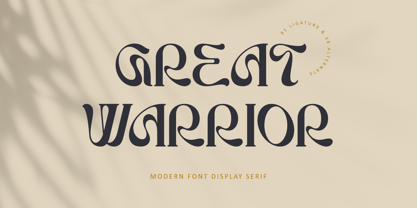 Great Warrior is a modern serif font family with a unique and classy style. It has a modern and vintage look. this font is suitable for many projects, for modern or even retro vintage design, branding, crafting, sticker, sublimation, wedding invitation, advertising, vintage mood boards, logotype, packaging, titles, editorial design, and many more. This font is PUA encoded, which means you can easily access all of the glyphs and swashes!
 - Art Gothic HiH by HiH,
$10.00 Art Gothic was attributed to the Central Type Foundry of St. Louis, Missouri, USA by Henry Lewis Bullen, writing in INLAND PRINTER in 1907, with a reproduction shown in Kelly’s American Wood Type. The typeface appears on the cover of an issue of “The Superior Printer” pictured in Typology by Heller and Fili dated in the 1870s. Art Gothic was designed in 1884 by Gustav Schroeder and proved to be one of the more popular and enduring of the American-designed Victorian display faces of the period, appearing frequently in ads in various publications. The Hamilton Mfg. Co showed a very similar wood type, No. 232, with a modified and rather heavy-handed upper case in 1892. As late as 1897, it may be found in the advertising section of The Ivy of Trinity College of Hartford, Connecticut and was included in the Norwood Press 1902 Specimen Book. Our font includes a complement of five upper case and four lower case alternatives as follows: 123=C, 125=E, 135=H, 137=S, 172=c, 175=e, 215=m and 247=s. Great for period pieces. ART GOTHIC HIH is clean, readable, and surprisingly modern-looking; unlike so many overly complex Victorian display fonts, it can be used in text sizes.
 - Divine Right by Comicraft,
$29.00 When the Adventures of Max Faraday began in the pages of Wildstorm Comics' DIVINE RIGHT in the mid-'90s, this chapter title font materialized, eventually reappearing on the covers of WOLVERINE. Delicately crafted by Mister Fontastic himself, John Roshell claims this font was the product of Divine Inspiration. When told he'd been looking at the work of too many French Poster Artists, he dismissed such allegations as Mucha do about nothing.
 - Nature Product by Serebryakov,
$25.00 Nature Product it's single weight display font with ideology defines of healthy lifestyle and nutrition. Pure curves based on calligraphy method. Font perfect for use in organic foods, cosmetics, medication package design & identity projects, food editorial prints and web blogs. Enjoy!
 - Frambuesa by Sudtipos,
$39.00 Organic versus geometric are two different universes that converges on nature systems and has its reflection on this new sans serif typeface. Frambuesa is a half humanist-half geometric sans that merges decorative curves with straight lines looking for a balance. The result: a solid but somewhat romantic, nostalgic type program that go ahead harmoniously, dancing to the rhythm of a naturally imperfect melody. Frambuesa can’t hide its family genetics. Structure and proportions come from Elisetta, her older sister they so both have a really good text performance. Regular variables and italics feel comfortable in a lot of contexts and are useful for little words or big title compositions. All seven weights are carefully adjusted to achieve soft transitions between one and the other resulting in high readability levels on program combinations and complex uses. This new font family name is a tribute to Lucia’s childhood, a very happy one. Frambuesa honors this sweet intense red fruit that her grandpa’s Coco gave to his grandchildren every Sunday in the summer.
 - Imperial Granum by Greater Albion Typefounders,
$18.00 Imperial Granum is designed primarily as a Roman Title and lettering face, combining formality and dignity with a delightful touch of 'Arts and Crafts' like hand drawn design. The regular form of Imperial Granum (which is inspired by a beautifully hand-lettered early 20th century food advertisement) offers two sizes of capitals, in order to provide true 'small-capitals' lettering. Similarly, the Ornamental form consists exclusively of capitals and is designed to be able to mix and match with the regular form. The miniscule form can, of course, be used in its own right, but is primarily intended to complement the regular and ornamental forms. All three faces are offered in regular and bold weights. Explore some Edwardian Arts and Crafts typographical fun today!
 - K&T Heidi by K and T,
$70.00 This is a well-built, functional (all caps) typeface, which is very modern in character. The use of diagonal corners in this angular typeface is inspired by the pennant numbers on British Royal Navy warships, which adds an military quality to this typeface. The gaps, which form the Stencil divisions, follow pre-established horizontal and vertical lines, they help to achieve both geometric and proportional harmony. The direction of the gaps is always at a right angle to the stroke.
 - Zing Script Rust by Fontfabric,
$29.00 Zing Script Rust is created to add extra vitalness in your designs, highlighting it’s unique charm. It is being fully programmed with OpenType features—including the smart Contextual Alternatives, Swashes and Standard Ligatures — in order to visualize the characteristics of a true script. Zing Goodies As a dessert we serve you Zing GoodiesTM that tops off the whole package, making it the extraordinary delicacy! It has 4 basic forms—Bakery, BBQ, Banners and Words —with two style each, which contain plenty of adorable icons for any food and taste, elaborated banners, ribbons and ornaments, and even beautiful selection of useful words accentuating your design.
 - Ossuary by Wundes,
$13.00Ossuary is a font in which each letter is formed using a uniquely arranged pile of skulls. The font was originally designed to be caps only, but small caps were added for convenience. There is now a character for each typeable letter of the American English keyboard. The font was inspired by images from the Kostnice ossuary in Sedlec, Kutna Hora near Prague. (Google it.) Whether you are fascinated or repulsed, such images have a mystery about them. They demand your attention. That is the feel this font was intended to capture. - Rockinstead by PintassilgoPrints,
$35.00 Rockinstead counts 1, 2, 3, 4, 5, 6, 7, 8... Eight variations per letter, plus alternates for numbers and even for punctuation marks! It is equipped with some clever OpenType programming to make substitutions on-the-fly: the Contextual Alternates feature, with the help of a very careful kerning table, takes care of cycling the alternates in an amazing random-like way, impressively mimicking a true handwritten text. The Discretionary Ligatures feature manages the substitution of handy cursive catchwords, adding that charming twist. To put it more bluntly, this font AUTOMATICALLY alters your typing so that it substitutes glyph variations while you do nothing but type away! No need to use PopChar here to do the substitutions manually, the font itself takes care of that for you. This typeface was originally painted on paper, drawing inspiration from Ralph Steadman’s seminal lettering style. On a first glance it may look quite wild - and it proudly is, indeed. But look again: it is stylishly wild, it is strong, unpredictable, full of attitude and good energy. This multifaceted font will certainly strike its way for free-spirited design applications. Just please be warned: it’s seriously addictive!
 - Hearst Italic by Solotype,
$19.95Carl Schraubstadter of the Inland Type Foundry probably had more to do with the design of this italic than he did with the roman. Great for Craftsman Era projects. - HWT Tuscan Extended by Hamilton Wood Type Collection,
$24.95 Tuscan wood types cover a fairly wide range of styles, and there is sometimes confusion over what is classified as a Gothic Tuscan and what is considered an Antique Tuscan. HWT American Chromatic and P22 Tuscan Expanded are more precisely faces of the Antique Tuscan variety. Gothic Tuscans are generally absent of the heavy serifs typically associated with their Antique Tuscan brethren (although decorative bifurcation of terminals can imply serifs). Additional internal decoration with spikes along the stems gives some Tuscans their distinctive look, these faces are often described as “Circus Types.” Tuscan Extended is an extremely wide design, with a distinctive slab crossbar running through the center of most characters. Each letter is a complex system in its own right. This typeface is best used very large in short headline work. The style defies falling clearly into either the Antique Tuscan or Gothic Tuscan category. The new HWT version of Tuscan Extended has been meticulously redrawn by Frank Grießhammer. During production, he also incorporated a number of new letterforms, bringing the font to over 300 characters (including a full ASCII character set and Central European accented characters).
 - Brevia by HVD Fonts,
$40.00 Type designer Hannes von Döhren created Brevia, a soft sans-serif type family consisting of seven weights plus matching italics. The fonts have a hint of a brushed feeling and come across as casual and friendly. Nevertheless Brevia’s architecture is straight, making it perfect for longer texts. Because of its large x-height, it also performs well in very small sizes. Brevia’s heavier weights are slightly more curved and have an eye-catching appearance. They unfold their strength especially in greater sizes. This contemporary type family is intended to be used in applications like Cosmetics, Service, Food and Advertising–basically everywhere a pleasant feeling should be conveyed. Brevia is equipped for highly professional use. The OpenType fonts have an extended character set to support Central and Eastern European as well as Western European languages. Each font includes small caps, fractions, old style-, lining-, tabular numbers, scientific superior/inferior figures and a set of arrows.
 - Sign Sans JNL by Jeff Levine,
$29.00 The original source of design for Sign Sans JNL was an image online of an old New York drinking establishment called the Lenox Lounge. The metal channels encasing the neon had an unusual "feel" to some of the letters. While the original E,G and U of the sign looked "interesting", they didn't quite fit the font's layout. Those letters were scrapped for more traditional versions of them.
 - Unusually Deco JNL by Jeff Levine,
$29.00 The hand lettered words “Pere Noel” under a vintage French magazine’s photo of Santa with two bikini-clad beauties inspired the digital version of this quirky, condensed type style. Unusually Deco JNL is available in both regular and oblique versions From Wikipedia: “Père Noël “Papi Christmas”, sometimes called ‘Papa Noël’ (“Daddy Christmas”), is a legendary gift-bringer at Christmas in France and other French-speaking areas, identified with the Father Christmas and/or Santa Claus of English-speaking territories. Though they were traditionally different, all of them are now the same character, with different names, and the shared characteristics of a red outfit, workshop at the North Pole/Lapland, and a team of reindeer.”
 - Anselm Sans by Storm Type Foundry,
$63.00One of the good practices of today’s type foundries is that they release their type families as systems including both serif and sans serif type. Usually, the sources of inspiration need to be well tried with time and practice, since production of a type family is such a laborious and complex process. From the beginning, it needs to be clear that the result will be suited for universal use. Such systems, complete with the broad, multi-lingual variations permitted by the OpenType format, have become the elementary, default instrument of visual communication. Non-Latin scripts are useful for a wide scope of academic publications, for packaging and corporate systems alike. And what about outdoor advertisement designated for markets in developing countries? Cyrillics and Greek have become an integral part of our OpenType font systems. Maybe you noticed that the sans serif cuts have richer variety of the light – black scale. This is due to the fact that sans serif families tend to be less susceptible to deformities in form, and thus they are able to retain their original character throughout the full range of weights. On the other hand, the nature of serifed, contrasted cuts does not permit such extremes without sacrificing their characteristic features. Both weights were drawn by hand, only the Medium cut has been interpolated. Anselm Ten is a unique family of four cuts, slightly strengthened and adjusted for the setting in sizes around 10 pt and smaller, as its name indicates. The ancestry of Anselm goes back to Jannon, a slightly modified Old Style Roman. I drew Serapion back in 1997, so its spirit is youthful, a bit frisky, and it is charmed by romantic, playful details. Anselm succeeds it after ten years of evolution, it is a sober, reliable laborer, immune to all eccentricities. The most significant difference between Sebastian/Serapion and Anselm is the raised x-height of lowercase, which makes it ideal for applications in extensive texts. Our goal was to create an all-round type family, equally suitable for poetry, magazines, books, posters, and information systems. - Anselm Serif by Storm Type Foundry,
$63.00 One of the good practices of today’s type foundries is that they release their type families as systems including both serif and sans serif type. Usually, the sources of inspiration need to be well tried with time and practice, since production of a type family is such a laborious and complex process. From the beginning, it needs to be clear that the result will be suited for universal use. Such systems, complete with the broad, multi-lingual variations permitted by the OpenType format, have become the elementary, default instrument of visual communication. Non-Latin scripts are useful for a wide scope of academic publications, for packaging and corporate systems alike. And what about outdoor advertisement designated for markets in developing countries? Cyrillics and Greek have become an integral part of our OpenType font systems. Maybe you noticed that the sans serif cuts have richer variety of the light – black scale. This is due to the fact that sans serif families tend to be less susceptible to deformities in form, and thus they are able to retain their original character throughout the full range of weights. On the other hand, the nature of serifed, contrasted cuts does not permit such extremes without sacrificing their characteristic features. Both weights were drawn by hand, only the Medium cut has been interpolated. Anselm Ten is a unique family of four cuts, slightly strengthened and adjusted for the setting in sizes around 10 pt and smaller, as its name indicates. The ancestry of Anselm goes back to Jannon , a slightly modified Old Style Roman. I drew Serapion back in 1997, so its spirit is youthful, a bit frisky, and it is charmed by romantic, playful details. Anselm succeeds it after ten years of evolution, it is a sober, reliable laborer, immune to all eccentricities. The most significant difference between Sebastian/Serapion and Anselm is the raised x-height of lowercase, which makes it ideal for applications in extensive texts. Our goal was to create an all-round type family, equally suitable for poetry, magazines, books, posters, and information systems.
 - HT Arcadia Grotesk Expanded by Hype Type,
$34.00 The versatile neo-grotesk typefamily, inspired by the swiss academia with a contemporary mood. The shape of the letters are more pliable compered to classic grotesk typefaces. The Expanded series enlarges horizons... and type! -- Taking inspirations from classic grotesk letterforms, both from the European tradition (specifically the Swiss school) and the American tradition, HypeType's Arcadia Grotesk is modernized with its shorter ascenders and descenders to give more compact blocks of text and with more contemporary and dynamic forms. -- hype-type.com // kidstudio.it
 - President by Linotype,
$29.99In 1952, Charles Peignot made a bold and fortuitous move: he invited a young Swiss designer to Paris to be the art director of the Deberny & Peignot type foundry. This started the professional type design career of Adrian Frutiger; and since then he has designed an astonishing range of masterful typefaces. One of the earliest for Deberny & Peignot was Président, a sharp-seriffed Latin titling face. Latin" is a typographic designation for roman typefaces with wedge or triangular-shaped serifs, a stylistic form that Frutiger would return to later with his beautiful typeface Méridien. Président™ has wide, solid shapes; very little contrast between thick and thin strokes; and an air of assurance. Use this titling font for business cards, announcements, or artistic signage." - Libertat by Elyas Beria,
$9.00 In a not-too-distant future, humanity was ruled by a powerful, technologically advanced empire known as the Synod. The Synod controlled all forms of communication, and through this, they controlled the minds of the people. But a small group of rebels, known as the Resistance, had managed to evade the Synod's surveillance and formed a secret underground movement. They were determined to overthrow the Synod and restore freedom to the people. One of the Resistance's key members was a young artist named Trystån. He had a unique talent for creating powerful, visually striking posters that captured the spirit of the Resistance's message and spread it to the masses. Trystån had just completed a new poster, one that would be critical to the Resistance's plans. It depicted a single, outstretched hand holding a traditional Kimarii laser staff, with the words "Libertat!" emblazoned across the top. The poster featured a striking and powerful font that perfectly captured the spirit of the Resistance's message. The font was a combination of bold lines, elegant confident curves, and strong angles, giving it a sense of strength and determination. The lettering was large and prominent, filling up much of the poster, making it hard to miss. The letters seemed to be almost carved into the surface, giving the impression of something that was permanent and unshakable. The font was colored in dark shades, and was a sans serif typeface, that gives the message a very modern and current feel yet also feels vintage and retro, connecting the present with the struggles of the past. And with multilingual support, the typeface ensured that the message of the Resistance could be disseminated in every language on the planet. The background was minimalistic and in contrast, with a neutral palette, with just a hint of a sand-like color, representing the harsh conditions of the land that the people were fighting for their rights. The focus was all on the lettering, and how it conveyed the message. The poster was indeed a moving piece of graphic design, with its strong, striking font, and powerful imagery. It was clear that Trystån had put a lot of thought and care into its design. The poster, he hoped, would connect with people on an emotional level and inspire them to rise up against the oppression of the Synod Empire. The poster was set to be distributed at a major rally in the capital, where the Resistance was hoping to gain the support of thousands of citizens. But the Synod was not about to let this happen. They had long suspected the existence of the Resistance and had been working to infiltrate their ranks and discover their plans. The night before the rally, the Synod launched a surprise raid on the Resistance's hideout, capturing Trystån and several other members of the Resistance. Trystån was thrown into sand pits and interrogated by the Synod's top agents. They wanted to know everything about the Resistance's plans, including the details of the poster and the rally. Trystån, knowing the importance of the poster, refused to give in, even under the harshest of conditions. Meanwhile, the rally was drawing near, and the Resistance was desperate to get the poster out to the public. They knew that it was their only hope of gaining the support they needed to overthrow the Synod. They came up with a plan to smuggle the poster out of the hideout, but it would be a risky endeavor. As the rally began, the Resistance made their move, slipping the poster into the hands of the crowd. Trystån's poster had made a big impact in the rallies, and soon it became the symbol of hope for the resistance, and the visual representation of their struggle for freedom. The poster had become the catalyst for the revolution, and it would be remembered for many years to come as the symbol of the fight for freedom and democracy. The image of the outstretched hand holding the Kimarii laser staff struck a chord with the people, and they began to rise up against the Synod's oppression. Trystån, still locked away in the sand pits behind a stasis feild, could only imagine the scene unfolding outside. But he knew that his work had helped to spark a revolution, and he felt a sense of pride and accomplishment. The Resistance, with the help of the rally, was able to overthrow the empire, and Trystån was released, celebrated as a hero and hailed as the artist who helped to bring about the new era of freedom and democracy. The poster Trystån had designed had become the symbol of a new era, and it would hang in museums and public places as a reminder of the power of resistance and art, in the face of oppression. Features: regular and light weights numbers and punctuation multilingual characters
 - Fructosa by Typo5,
$14.95This unique type treatment was born after working in a mixture between a pixel based font and a retro logo. With lot of details it looks great a bigger sizes, but you can also apply it to write long sentences or even as body text! This font was chose as the official online font of our favorite band Foo Fighters some time ago, when it was just a work in progress. - Allerton by Jeff Levine,
$29.00 Presenting a condensed Art Deco sans serif font with rounded corners and squared inner lines, based on the hand lettered title on the cover of the sheet music for 1944’s “Just A Little Fond Affection”. Allerton JNL is available in both regular and oblique versions, and was named after a neighborhood in the Bronx, New York.
 - Daguin by Konstantine Studio,
$18.00 Introducing DAGUIN, inspired by the medieval look and feel in fashion visual, fusion up with the contemporary modern serif to reach the wider range of visual trend possibilities. From past to the future. Perfectly fit for your logo, magazine, look book, social media branding and content, beauty blog, fashion branding, website, clothing, merchandise, mood board concept, etc.
 - Crostini by Scholtz Fonts,
$19.00 Crostini was designed as a fun-filled, vigorous brush script, originally intended for restaurant logos and menus. As it evolved, I realized that it was more versatile than I'd thought - great for feminine, girly media as well as for more “in your face” marketing. While the characters are bold and dramatic, they are also feminine and rounded. Crostini contains all the accented characters used in the major European languages. Use Crostini for invitations, scrap-booking, advertising media, fashion media, restaurant media, food media, greeting cards - it’s great fun!