10,000 search results
(0.064 seconds)
- Bona Nova by Borutta Group,
$- ☞ Bona Nova is a collective revival project of Bona typeface designed in 1971 by the author of polish banknotes Andrzej Heidrich. Besides giving the project a digital font form the aim was to expand the base character set: preparation of small caps, designing the alternative glyphs and multiple opentype features. Working together with the author we designed two new text versions: regular and bold – to give the family a form of a classic script triad. ☞ It is accompanied by three title versions and three contour styles under the name of Bona Sforza. All styles contains over 1200 glyphs. ☞ Bona Nova is an unprecedented typographic adventure for our team. We hope that our work will allow the cultural heritage of Bona and the work of Andrzeja Heidricha to gain new followers and fans. This project connected three generations of graphic designers who graduated the same school – the Academy of Fine Arts in Warsaw. ☞ Bona Nova isn’t only a typeface. We have also prepared a book about the project (including an interview with Andrzej Heidrich, my text about the digitalisation and a font specimen). The Bona Nova release party was a big exhibition (over 1000 guests). I’ve invited 26 graphic designers to prepare their own initials of Bona Nova – they were presented as posters on exhibition too. LINKS Bona Nova WEB Bona Nova FP Bona-Nova-(FREE-FONT) Bona Nova Book BONA NOVA IN THE MEDIA Typeroom Typography Guru Slanted Designalley Stgu Typografie Info Wikipedia Bona Nova is a non-profit project, all founds that we raise we reinvest to develop the Bona Nova project (new styles, Cyrillic & Greek, extend character set).
 - Taco by FontMesa,
$25.00 Taco is a new Mexican style font family based on our Tavern and Algerian Mesa type designs. When I finished the extra heavier weights for Tavern I decided to play around with a decorated version, the extra bold letters allowed for much more room to work with an inlay pattern. After experimenting with several designs I decided on a Mexican pattern because the original base font is very popular in Mexican restaurant logos and menus plus it's frequently used on Tequila bottle labels. I originally planned three weights for the Taco font family, however, after completing the bold weight I've decided to release it now so you may put it to use while the regular and extra bold are being produced, sorry I can't estimate a release date for the two other weights. To use the fill font layers you'll need an application that allows you to work in layers such as Adobe Creative Suite products. The Taco Fill Uno font may be used as a stand alone font, however, we recommend searching for our Tavern font family where you'll find three different bold weights of this same design. Opentype features aware applications are also needed for accessing the many alternate glyphs in Taco, all the alternates that you love in our Tavern fonts are also available in Taco. While the fill font layers are in registration with one another some applications may throw them out of alignment by changing the spacing. Custom inter letter spacing in Adobe Creative Suite may also throw the fill fonts out of alignment. We recommend doing your custom spacing first then duplicate the type layer and change to the next fill font and color. The inspiration for the Taco name of this font family was from a homemade Taco dinner I made for a guest at my house, after dinner I searched to see if there was a commercial font named Taco. There was no such font named Taco and the rest is history. The old Stephenson Blake Algerian font has come a long way since 1908, and we're not done with it yet. We hope you enjoy our Taco font family, we're looking forward to see it in use.
 - Baltra by Galapagos,
$39.00After researching the type styles contemporary graphic designers have been using over the past few years, I noticed a consistent use of Copperplate Gothic, and its derivative designs, for various corporate advertising campaigns. That level of usage gave me the inspiration to design a display font possessing subtle characteristics of Copperplate Gothic, and various Latin Condensed designs. The font I ended up designing was semi-condensed, with more contrast between thicks and thins than in Copperplate. Baltra also has a subtle flair in its otherwise traditional lowercase, while possessing a larger than average lowercase x-height. Copperplate Gothic, on the other hand, has minimal contrast and uses small capitals for its lowercase. After examining extensive type specimens from wood type, metal type, phototype and digital type, I was not able to find a single design possessing a majority of Baltra's characteristics. Consequently, I consider Baltra to be a truly unique design, sharing with Copperplate Gothic only its flairs on stems, and having only subtle characteristics in common with traditional Latin designs. - Neue Swift by Linotype,
$50.99 The original Swift (1985) proved its worth in corporate identities, magazines and newspapers and occasionally in books. It is a versatile type and can be used in a wide range of circumstances. It is a striking type, with large serifs, large counters and letters that produce a particularly strong horizontal impression. This means that words and lines in Neue Swift are easily distinguished, even where there are large spaces between words, as can occur in newsprint. Neue Swift's large, robust counters were designed to improve legibility particularly in newspapers. It was designed in the early eighties, when papers were less well printed than they are today, and its special features help it survive on grey, rough paper printed on fast rotary presses. Today it is used more often outside newspapers than in them. Neue Swift (2009) is the newest version of the Swift concept. It has been improved by technical and aesthetic enhancements, and has been expanded into a family of twelve variants. Featured in: Best Fonts for Logos, Best Fonts for Websites, Best Fonts for PowerPoints
 - Albertina by Monotype,
$29.99Albertina was a typeface ahead of its time. It was in the early 1960s when designer Chris Brand, an accomplished calligrapher, aspired to draw a typeface based on the principles of calligraphy. Unfortunately, typesetting machines of that era put many restrictions on designers. Characters had to be drawn within a very coarse grid, which also defined their spacing. Technological limitations meant that italic designs often had to share the same character widths as the romans. Designers were forced to draw italic faces much wider and with more open spacing than what would be typical in calligraphic lettering or hand-set type. Not surprisingly, production of the first Albertina fonts went very slowly. Brand would submit his character drawings, and the Monotype Drawing Office would modify them to be compatible with the company's typesetting equipment. The new drawings would then be sent back to Brand for approval or rework. Most were reworked. The process took so long, in fact, that by the time the face was completed it was once again out of phase with the times: instead of being released as metal type for the Monotype composing machines it had been tailored for, Albertina debuted as phototype fonts for the Monophoto typesetter. The design's first use was for a catalog of the work of Stanley Morison, exhibited at the Albertina Library in Brussels in 1966. Sales of the design were not remarkable. With the advent of digital type technology, Albertina's story took a far happier turn. Frank E. Blokland, of the Dutch Type Library, used Brand's original, uncompromised drawings as the foundation of a digital revival. The Monophoto version had taken a considerable battering from the limitations of Monotype's unit system," recalls Blokland, "but there was no need for me to incorporate these restrictions in the digital version." With the full backing of Monotype and original designer Brand looking over Blokland's shoulder, a new design for Albertina emerged, displaying all the grace and verve of Brand's original drawings. The basic family drawn by Brand also grew into three weights, each with an italic complement and a suite of small caps and old style figures." - Caravan by Linotype,
$29.99Caravan was designed in 1938 by William Addison Dwiggins and consists of a variety of ornaments. He based the forms of the ornaments on the same lines and curves found in his font Electra. He wanted printers and designers to have the chance to combine the two fonts for a more attractive or outstanding overall picture. Caravan is particularly popular for advertisements in newspapers. Caravan can be easily mixed with other fonts designed by Dwiggins. - Arthur Sans by SIAS,
$34.90 Arthur Sans is a new font design in the spirit of the Art Deco era, the age of elegance, stylishness and refinement. Use this unique typeface for distinctive personal stationary, outstanding business papers, captivating brochures and invitations; for marvellous posters, wonderful menus, hotel leaflets, exciting ads … for outstanding designs. You’ll find out that Arthur Sans is your friend for more than just fine typography. Five weights plus Italics – all equipped with a comprehensive Euro-Latin character set – will hardly leave anything to be desired. Additionally, the font Arthur Sans Regular contains an outstanding extra range of 70 ornamental characters, carefully designed to the very tone of the typeface, to give you a very special kick of extra value to enchant your designs. Alternatively, you can get this set of ornaments seperately, look at the Arthur Ornaments! Arthur Sans is but one part of a greater suite of exciting fonts: you may wish to also check out the sister fonts of the gorgeous Arthur Cabinet family, which will offer you another wonderful scope of fascinating typographic possibilities. For a matching Greek font go to Artemis. And finally, Arthur’s Irish friend is the fabulous Ardagh. __________________________________________________________________________________________
 - Aestetik by The Letter Builder,
$10.00 This font is specially made for use in your various works. We created this font with its own uniqueness, such as the feel of writing with a brushpen, a simple yet elegant style, and beauty of brushpen handwriting. Besides being able to stand alone, you can combine this font with various other typefaces, such as Serif, Sans Serif, and Script. This font is ready for you to use to make your products and services look more unique because of the basic concept of making this font is "unique".
 - ThreeDee by URW Type Foundry,
$99.99The idea for this completely new font design with overlapping characters came when Axel Stoltenberg, longtime IKARUS program developer at URW + +, visited a restaurant. As it can be seen quite often , the daily specials were offered handwritten with chalk on a blackboard applying a writing technique never been available before for digital fonts: each character is partly covered by its predecessor creating a three-dimensional effect. The implementation of this unusual notation for digital setting required a lot of programming and testing until all necessary character variants were produced and set properly always using the correct form. In order to achieve this, the OpenType Pro font ThreeDee contains about 12,400 characters and all the necessary OpenType features (GSUB ) for the automatic setting in OTF savvy application programs. The slightly playful basic design for ThreeDee was created by Anna Stoltenberg , the daughter of Axel, specially devised for the innovative representation and support of its special nature. The shadow generated with IKARUS even intensifies the 3D effect. As is well-known, making use of the embedded OTF features, i.e. the automatic access to all the 12,400 character variants , a corresponding text / layout program ( InDesign, Quark Xpress, current Open / LibreOffice or MS Word etc. ) is required. ThreeDee is a headline font that will unveil all its charisma and exceptional quality at appropriate, larger sizes. - Chalk Cowboys by Learning Kiddos,
$18.99 Chalk Cowboys is a vintage chalk font, handwritten by me. It has a real chalkboard feel and is a: textured font handwriting font has bonus shape elements and full Latin support As a bonus you will get real chalkboard shapes (as seen in preview pic three). Get creative and use this retro font for: a menu food branding as a display font for invites chalk lettering (of course =)) shirt designs magazine layout Instagram posts or any Social Media posts, really This font also works great as a running text, too. =) Don't forget to check out my two other fonts: Casual Crew Signsurfers Script
 - Sassoon Infant by Sassoon-Williams,
$48.00 An upright typeface family developed to meet the demand for letters to produce pupil material for handwriting as well as for reading. Upright letters with extended ascenders and descenders are ideal on screen. They facilitate word recognition. The exit strokes link words together visually, and in handwriting they lead to spontaneous joins along the baseline leading logically to a joined-up hand. Teachers can print desk strips, charts of letter families and alphabet friezes, as well as consistent material across the curriculum. Together these typefaces provide a valuable resource for special needs teachers. When starting point and stroke direction has been learned, the arrow font (Tracker B) can be dropped and the simpler Tracker font used. Tracker B font, with its direction arrows helps pupils to start in the correct place. Motor movements can be refined by keeping inside the line. When starting and direction is no problem, the arrow can be dropped and the plain Tracker font used. When starting point and stroke direction have been learned, the arrow font (Dotted B) can be dropped and the simpler Dotted font used. Free to download resources How to access Stylistic Sets of alternative letters in these fonts Purchasers of this font package may use their Order Number to receive a free Copybook PDF by Rosemary Sassoon recommended for effective teaching
 - Botaky by Alit Design,
$9.00 Introducing BOTAKY Romellast fontduo Unique and fantastic duo fonts combined or they stand alone. BOTAKY font family which consists of 10 families, from Thin to Black style. The funky, swaying font creates a unique design and is sure to take the eye off the design target audience. Apart from being unique, the BOTAKY font also has a luxury simple character that makes the design charming. The Romellast font is a signature script that has cool strokes. The line shape from Romellast is inspired by the brushes on Instagram when creating stories. This brush is very cool and is often used by netizens who are not designers or designers. In addition, Romellast has an altenate ligature that looks natural and not stiff. There are 2 styles of the Romellast font, namely the Thin style which is thinner and the regular style which is thicker, so you have several options to suit your taste. Combining the two BOTAKY and Romellast fonts will create a design that is charming, unique, elegant and cool. you can see from the design preview. These two fonts are perfect for designs with the concept of elegant, luxury, romance, fashion and so on.
 - Bordonaro Spur by Estudio Calderon,
$35.00 Bordonaro Spur - Bordonaro Script’s partner - is a typography strongly influenced by old beer labels and includes some serifs based on Frederic W. Goudy’s Copperplate, but with some softened spurs adding an elegant and soft texture to the text. It is ideal to be used on large bodies and has a set of special ligatures ideal to be used in branding. Psss...Check out the NEW Bordonaro Spur with Rounded corners , same version but soft! FEATURES Co = company1 Co = company2 Estd = established Inc = incorporated Ltd = limited Mc = mac Rd = Road St = street And also from Adobe CC you can activate Style Sets (SS) and get ideal ligatures for ordinal numbers: 1st = st 2nd = nd 3rd = rd 4th = th Bordonaro Script and Bordonaro Spur are two typographic styles that were designed under the same characteristic features with the idea of combining them to obtain better results, for that reason, we recommend merging them in a creative way and you will realize everything you can design with them. The banners designs are based on old brands of beer labels, coffee packaging, sports logos and in some cases we use Copperplate Gothic but only as a complementary font in order to harmonize the layout of the elements in each banner.
 - Victorina by John Moore Type Foundry,
$35.00 Victorina is a fantasy sans letter or display, inspired by the Victorian letters whose stylistic influence dominated the scene graph of the nineteenth and twentieth century. Victorina has a perfect structure of rigorous geometry. Victorina comes in several versions in both Black and Condensed, in italics with a varied repertoire of styles, besides providing small caps and ornaments. Victorina lets you work fine fantasy headlines when they overlap in layers of different styles. Victorina is a letter designed to recreate, with a contemporary vision, the spirit of those days of the industrial revolution and the early days of modernism.
 - Satisfice by Mevstory Studio,
$25.00 Satisfice is alteration of satisfy, influenced by Latin satisfacere. The formal use dates from the 1950s and I hope that with this font you as a user of this font can feel satisfied using this font. Satisfice is a modern serif typeface. Clean, delicate, classic and has a characteristic. Please let me know if you have any questions. Lettercorner Studio
 - Chamberí by Extratype,
$40.00 Chamberí is designed to be Vogue España's bestpoke typeface. An ambitious typographic branding project made for one of the most iconic magazine headers of the world, it defines the Spanish edition’s personality through a blending of the functionality of XIX Century Modern Romans (also known as “Scotch" typefaces) and the gestural expressiveness of typographic Baroque. Chamberí is a peculiar combination of the rational and the delicate, the sturdy and the feminine. The family is organised in a broad spectrum of 56 variants in which the transition from the restrained text version to the flamboyant, elegant display is modulated by contrast. The family is organised in seven weights: from Extra Light to Black, plus four optical sizes : Text, Headline, Display and Superdisplay. All this with its own Italics, Small Caps and Old Style Figures, besides the due refinement to resolve any editorial and communicative requirement.
 - Cute Squishy by Gassstype,
$23.00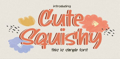 Hello Everyone, introduce our new product Cute Squishy This Is Simple Font with a natural feel. It is perfect for any design project as Invitation,logo, book cover, craft or any design purposes. Cute Squishy is Inspired by Food Logo style and combination with Unique Craft style. that will fulfill your design needs for quotes,sporty theme, logotype, wordmark, etc. This has many opentype features and support multi language.
 - Titla by ParaType,
$25.00 The name of the font Titla emphasizes it heading and display functionality. At the same time low contrast, narrow proportions, wide variety of weights and clear glyph constructions make it possible to use it for long texts as well. Combination of modern serifs with flexing stems (see n, p,…) brings to the font fresh, informal and noticeable appearance. The character set includes alternative variations and specific 'vertical ligatures' for paired letters that are built with the help of diacritical forms of letters placed above basic ones. This feature also was reflected in the name of the font as Greek 'titlos' means diacritical mark. The font was designed by Oleg Karpinsky and released by ParaType in 2009.
 - Austral Sans by Antipixel,
$15.00 Austral Sans is a hand-drawn layered font designed by Antipixel. Based in the Slab version, it is part of the Austral type family. This sans makes your work unique & noteworthy, because the possibilities of combinations of textures & styles create distictive results. Austral Sans comes in three weights, Regular, Light & Thin, which all share the same crooked look with irregular strokes and outlines. For these reasons this font can be used in a vast variety of projects, such as logos & branding, stationery, book covers, magazine design, clothing prints & tags, packaging, animated videos, and many more! Austral Sans has three sets of alphabets in uppercase and lowercase to avoid repeating the same character pattern, and giving the font a more natural handwritten feel. This is included in the Open-Type Contextual Alternates, which applies an automatic substitution of glyphs as long as the Open-Type features are activated. Also, Austral Sans offers other Open-Type features such as Stylistic Alternates, Ligatures, Discretionary Ligatures, Fractions, Superscript, Subscript, Denominator, Numerator, Scientific Inferiors & Kerning. This font has a very large glyph coverage and can be used in a wide range of languages, including English, Spanish, Italian, French, German, Polish, Czech, Vietnamese, Finnish, Icelandic, among many others. The style Maplines Thin is offered Free for commercial & personal use! Check Austral Slab!
 - Red Border Labels JNL by Jeff Levine,
$29.00 In the pre-computer, pre self-adhesive label era of office supplies a number of companies (including Dennison, Maco and Denny-Reyburn) manufactured a wide variety of gummed labels for just about any use or purpose. Blank labels, specialty labels and decorative holiday seals were just a part of this line. One popular style was that of labels with parallel thick-and-thin borders of red lines and corners chamfered, rounded or straight cut. Occasionally, one could find similar labels with blue, green or gold borders but red was the mainstay, hence naming this typeface Red Border Labels JNL. Presented in this font is a collection of twenty-six standard and specialty shape label borders on the capital (A-Z keys) and twenty-six solid panel versions on the lower case (a-z) keys which can be used as backfills for the borders or as stand-alone labels.
 - LifeAfterCollege by Ingrimayne Type,
$13.95 The LifeAfterCollege family began as a set of four fonts based on two styles of Ranger, which are slab-serif, geometric fonts with no curves. Two of the four are outlines with hollow insides, and two have-filled insides. The two fonts that are outlined have been taken apart and made into three typeface that can be layered. This allows one color for the inside, another for the middle ring, and a third for the outside outline.
 - Badlands JNL by Jeff Levine,
$29.00 A vintage piece of sheet music for "Waitin' at the Gate for Katy" (from the 1934 movie "Bottoms Up") provided the hand-lettered, Western-influenced lettering which is now available as Badlands JNL. Some of the characters originally had overly-thick vertical strokes which stood out from the rest of the letters, so they were "standardized" in order to provide a more aesthetically pleasing overall design. Available in both regular and oblique versions to fit your design needs.
 - Archive Garamond by Archive Type,
$59.99Archive Garamond is a typeface roughly based on the designs of Claude Garamond (ca. 1480 – 1561), a French publisher and a leading typeface designer of that period. Garamond’s influence on type design is reflected in many typefaces that are today known under different commercial names. While the majority of contemporary digital interpretations of the “Garamond types” are cleaner and more polished versions of that genre, Archive Garamond tries to keep the rough nature which was typical in the early days of printing. Archive Garamond has a rather unique, distinctive temperament which is even more emphasised with the preserved non-uniformity, such as irregular glyph shapes or a variable baseline. Although Archive Garamond was clearly made to be used for display sizes it works surprisingly well in text. Archive Garamond is availale in three versions, each containing approximately 600 glyphs (in Pro versions). Archive Garamond Pro A Professional version of the typeface contains all glyphs, including the advanced typographic forms, such as different sets of figures, small caps, swashes, historical forms, etc. The font also enables full use of the OpenType features. It fully supports the languages listed in the language list. Archive Garamond Std A Standard version of the typeface is meant to be used for the basic typographic work. It typically contains the most common glyphs. The standard figures are proportional lining. Besides kerning this version does not contain any advanced OpenType features. A Standard file type fully supports the languages listed in the Language list. Archive Garamond Exp An Expert version contains glyphs that are supposed to be used in advanced typographic works. This type of file contains uppercase and small cap glyphs with the proportional oldstyle figures as the default set. Besides kerning this version does not contain any advanced OpenType features (all OTF features have to be replaced manually). An Expert file type fully supports the languages listed in the Language list. - Supertuba by Tipos Pereira,
$10.00 Supertuba is a :) geometric sans vernacular humanist :) display type family with 6 weights. There's literally dozens of ligatures in this font so It works very well for flyers, package, stickers and posters, also you can use it as a text font if you're looking for something slightly bold. Supertuba has multilingual support and useful open type features. Letter boards that used to be seen in churches, dive bars and butcher shops are the main inspiration for this typeface. The name Supertuba came from an old supermarket that no longer exists in the city of Indaiatuba , I just believe this name is super fun (at least in Portuguese) and wanted to keep it alive. I was in Indaiatuba when I get started designing this typeface so this is fair enough. Supertuba the third piece of a particular trilogy of fonts that Stubby and Stubby Rough take part, from the lazy vernacular drawing to an unusual geometry. Enjoy!
 - Molista Script by Letterfreshstudio,
$15.00 Hello everyone, I would like to introduce my newest font Molista Script is a beautiful modern calligraphy typeface, I hope you will be interested in this font, if you want to use it for your work. This font can be used easily and simply because there are many features in it. contains a complete set of lowercase and uppercase letters, assorted punctuation, numbers, and multilingual support. font also contains multiple ligatures and many contain alternative Style Stylistic Sets such as a heart swash alternative. You can see an example in the image above. Molista Script is very suitable for market designs being developed today, this font has a stylish, trendy, natural and soft font, with this font you can take advantage of opportunities every moment is a great way to highlight the celebration of the best of the party, because this font will be an advocate for the purposes such as wedding invitations, branding, parties, graduations, birthdays, gatherings, etc. Thank you, LetterFresh
 - Bentley Floyd by Differentialtype,
$10.00 Bentley Floyd is a display font family designed to enhance the appearance of any document or presentation you create. This font can also be used for logo fonts, brochures, pamphlets, billboards, book covers, magazine covers, or product promotions. This font will support the appearance of every product promotion that you make. This font consists of 18 styles from thin to black, which will add more options to your mix.
 - Dark Light by Twinletter,
$15.00 DARK LIGHT is a graffiti-style display font with individuality in each letter. Use this font to create a unique style that will pique the interest of many people. Not only that, but your project will look more attractive and natural if you use it. This graffiti font is great for product logos, poster titles, headlines, packaging, film titles, logotypes, gorgeous writing, and trendy graffiti designs, among other things. Of course, if you utilize this font in your numerous creative projects, they will be perfect and outstanding. Use this typeface right away for your one-of-a-kind and remarkable projects.
 - Decorretro by Sorriso Design,
$18.80 Introducing a stunning geometric Art Deco style typeface, inspired by the retro aesthetics of 1930s Shanghai posters. This font design boasts clean, crisp lines and a modern look while still honoring the classic design elements of the past. Its carefully crafted curves and angles create a perfect balance between simplicity and sophistication, making it an excellent choice for a wide range of design projects. This typeface is sure to captivate and engage your audience, adding a touch of timeless elegance to any design.
 - LTC Globe Gothic by Lanston Type Co.,
$24.95 This series of faces was designed initially by Morris Fuller Benton, circa 1900. The design is a refinement of Taylor Gothic from 1897. It features a sans serif thick and thin design with angular stems. Pre-dating art deco, this design feels quaint, yet it still has a touch of modernism. Frederic Goudy designed a bold version of Globe Gothic in 1905 for ATF. The Bold and Bold Italic digital versions have been added to the LTC library in early 2007.
 - Kidcut by Malgorzata Bartosik,
$29.00 Kidcut is a typeface created by cutting glyphs out of paper with scissors. The shapes are irregular, giving the impression of being cut out by a child. The typeface contains upper and lower case letters of the Latin alphabet (basic, Eastern, Western and South Western Europe, Vientamese and Pinyin) and three contextual alternates from each glyph, which is very important when there are three identical letters in one word - then we have the impression of handmade, not repetitive.
 - Hailea by Fateh.Lab,
$15.00 This font family is perfect for those who want to make their designs stand out. It has a modern style with soft but firm characters, making it different than most other fonts you'll see on the market today! This fresh and cheerful theme will work well in any project - whether its posters or social media posts- as long as they have large print formats available (or anything else). With 5 choices of typeface styles, plus some cool free vector bonuses thrown into the mix too; there's no reason why anyone shouldn't give this amazing font bundle a try!
 - Gallazzi by Twinletter,
$15.00 Gallazzi is a fun display typeface with a lovely and attractive appearance. Start using this font in your project since it is smooth, cool, and cute to the eye. Then you’ll have a project that is truly distinctive and cheerful in comparison to others because the harmony and harmony will make your project bolder and bolder and look different. Let’s construct an awesome project using this typeface, and make it one of a kind. This font is perfect for games, sporting events, branding, banners, posters, movie titles, book titles, quotes, logotypes, and more. Start using our fonts for your amazing projects.
 - Ionic No 5 by Monotype,
$51.99 Ionic No5 is a refresh of a classic Linotype Clarendon-style serif, another restored classic from the Monotype library, much like the recent updates to Walbaum and Helvetica Now. The original typeface was designed to be printed and read at small sizes, popular with newspapers in the 20th Century at its birth. The restoration and refinement of this typeface has bestowed a greater sense of clarity and directness, smartly stylish, and an utterly captivating appeal. Because these styles were so popular for books and newspapers for so long we associate them with being editorial or bookish, not dull, but thoughtful. Designers today can use that association to their advantage as a visual shortcut to convey similar meaning and tone. More attention was given on modernising the typeface with precious use and the introduction of sharp edges & finishes. The thinnest weights can give a dancing typewriter aesthetic, being low stroke contrast. The heavy weights have an unquestionable presence on the page. Overall, the typeface has a richness and almost illustrative quality about it. The true depth of Ionic No.5 could enable each weight to be a poster by itself. Ionic N°5™ font field guide including best practices, font pairings and alternatives.
 - Sleeve Notes by Wing's Art Studio,
$12.00 Sleeve Notes: A font from the analogue age. Inspired by album covers and hand-written song lyrics. Sleeve Notes is an experimental script font and all-caps pair with a loose hand-written style that explores the golden-age of record stores, vinyl albums, cassettes and CDs. It imagines our teenage selves kicking back with a coke (oversized headphones on) discovering a new band and studying the notes on their latest album. Besides production credits, the best sleeves (otherwise known as liner notes) included photos, cool artwork and hand-written song lyrics that gave the listener a human connection to the mind of the artist. This font embraces it's subtle ink blotches and rough edges; all imperfections that build to create a sense of a hastily written lyric, set-list or just a fun little scribble. The package includes six fonts in total; the regular script with two complete sets of alternatives, then two sets of all-caps, and finally the special characters font that features a decorative alphabet plus symbols and underlines. For authentically retro, hand-made looking lettering, it's a great choice and offers the flexibility few other fonts can match. Check out all the visuals to see it action!
 - Plinc Italiano by House Industries,
$33.00 Dave West’s Italiano is a smooth and sensuous typographic dish with a few extra savory dashes. The silky semi-serif combines ingredients from eighteenth-century engraved italics and nineteenth-century Italian Modern, softened by fine stroke endings and plump dolloped terminals. Preserve Italiano’s subtle flavors by maximizing its size in headlines, advertising captions, and identity campaigns, or capitalize on its swash characters to sweeten package and poster designs. However you use it, Plinc Italiano is a tasty typographic treat—non ci piove! Drawn in the late 1960s for Photo-Lettering, Inc., Italiano was digitized by Steve Ross with Ken Barber in 2015. Like all good subversives, House Industries hides in plain sight while amplifying the look, feel and style of the world’s most interesting brands, products and people. Based in Delaware, visually influencing the world.
 - M Kai PRC by Monotype HK,
$523.99 M Kai is a design inspired by the popular Kaiti developed in contemporary China. MKai adopts many features of Kaishu, one of the many Chinese writing scripts and calligraphic style. Yet writing style and constructions have been well-unified to meet quality as typeface. Its strokes has relatively heavier stroke beginning and finishing, as well as thinner middle part. It is catered for fine print with little conglutination. Its medium weight makes it more visible at distance and pretty versatile in use. Zhonggong are tightly built with ample character spacing for good individual character recognition. It is best suited for formal body text, set upright (non-slanted), non-condensed.
 - Dream Reacher by Asenbayu,
$14.00 Reacher is a creative stylish ligature serif font. Each letter is beautifully crafted which has an elegant look that attracts a tall, minimalist and slender shape. Reacher font is a typeface that combines the elegance of a serif with a unique and decorative binding, creating a more harmonious and visually appealing look. This font has alternate and ligature features, perfect for using it in creative and artistic designs, such as logos, branding, headlines, titles, invitations, posters and more. Reacher font features: kerning, standard glyphs, stylistic alternates, stylistic ligatures, symbol, punctuation and multilanguages supported. Note: To use the alternate and ligature features, please look in the Glyph Panel / Character Map in your software to be able to access all the glyphs in this font. The ligature style in this font is simply "Standard Ligature", meaning it appears automatically. To set your desired letter binding, you can block letters or add them from the glyph panel. Thank you!
 - Art Techno JNL by Jeff Levine,
$29.00 The simple song title "May I", found on the sheet music from the 1934 Bing Crosby-Carole Lombard film "We're Not Dressing" was hand lettered in a blocky, ultra-bold Art Deco design that foreshadowed the techno look of the 1970s and 1980s. This became the basis for Art Techno JNL.
 - Schwabacher by RMU,
$25.00 One of my favorite blackletter fonts - Schwabacher - redrawn and redesigned, whereby I took care to stick to the original forms as close as possible. This font which has its roots in the 15th century represents at the most the uprising humanism in this period. To get access to all ligatures, it is recommended to activate both Standard and Discretionary Ligatures. By using the OT feature Stylistic Alternatives you get the historical German umlauts which are small e above a, o, u, A, O, and U. This font contais also oldstyle figures.
 - PR Mapping by PR Fonts,
$10.00 This font provides a variety of symbols for decorating maps simulating those of the sixteenth to nineteenth centuries. For fans of piracy, there is a range of skull and crossbones imagery. The font also includes cartouches, scrolls and symbols for mountains, hills and castles of various sizes.