10,000 search results
(0.035 seconds)
- Beaufort by Shinntype,
$59.00 Engaging the issue of scalability, Beaufort® is configured so that serifs render with great sharpness, independent of type size, limited only by device resolution. This scale of effect empowers the typographer with a design axis stretching from awesomely huge to preciously tiny, further enhanced by weights from Light to Heavy, small caps, and alternate figure styles. In style, Beaufort has a number of affinities. In particular, the bold romans recall a kind of “grotesque with small serifs” style popular with sign painters and package lettering artists in the early 20th century, and still going strong. In proportion, the basic Beaufort is in the vein of the classic oldstyle types that descend from Granjon , via the French Oldstyles, or Elzevirs, to Plantin and Times in the early twentieth century. Designed for optimum clarity, readibility, and word count, these types have a pronounced angle of stress in the lower case, which is quite large and fairly narrow in relation to the caps. None of the caps are exceptionally narrow, and both cases have an evenness of width that makes for a no-nonsense, orthodox appearance. The strength of the capitals distinguishes these types from those of another “optimizing” era, the 1970s and ’80s, when puny caps made for monotonous text. However, strong though they may be, Beaufort’s caps are not as obtrusive in text as those of Times or Plantin.
 - Winning Team JNL by Jeff Levine,
$29.00 The second volume of the Robbins Music Corporation's "Hollywood Song Folio" features the word "Hollywood" lettered in a condensed block style with inline, strongly reminiscent of sports or college-themed typography. This was the inspiration for Winning Team JNL.
 - DF Ariënne by Dutchfonts,
$33.00 The Etalage-script has been drawn for the first time in the year 2000, based on a early 20th century lettering stencil with what farmer Boelema at Lalleweer stenciled his grainsacks. Eventually the script letter was developed as a typeface with a wink to the ‘lost’ displaytypes for the ‘display window’ of graphic designer Ariënne Boelens, who in exchange made the website www.lalleweer.nl. What originated the Ariënne should be evident now.
 - Belwe by ITC,
$29.99The typeface Belwe, created in 1926 by German typographer and teacher Georg Belwe, has an uncommon style that is difficult to describe. It is a synthesis of many different genres: it is a slab serif with Art Nouveau style but also with many blackletter influences. The angled serifs on the ascenders and the calligraphic flourishes on the the upper and lowercase V, W, and Ys reference marks made by pens. There are also many other special characters that are unlike any other designs. Have a look at the fun lowercase a, the quirky lowercase f and g, and the unique C, F, L, and R for the uppercase. This design works especially well for display sizes, but is also good for short amounts of text. The mood and image suggested by this typeface is great for menus, invitations, and signs when you want to send a personal and friendly message. It's Art Nouveau roots also give it a place in history for designs from the Victorian period up through the 1920's and 30's - Belwe Mono by ITC,
$29.99 The typeface Belwe, created in 1926 by German typographer and teacher Georg Belwe, has an uncommon style that is difficult to describe. It is a synthesis of many different genres: it is a slab serif with Art Nouveau style but also with many blackletter influences. The angled serifs on the ascenders and the calligraphic flourishes on the the upper and lowercase V, W, and Ys reference marks made by pens. There are also many other special characters that are unlike any other designs. Have a look at the fun lowercase a, the quirky lowercase f and g, and the unique C, F, L, and R for the uppercase. This design works especially well for display sizes, but is also good for short amounts of text. The mood and image suggested by this typeface is great for menus, invitations, and signs when you want to send a personal and friendly message. It's Art Nouveau roots also give it a place in history for designs from the Victorian period up through the 1920's and 30's
 - FastFingers by ParaType,
$25.00A set of signs designed by Andrey Belonogov. It includes representation of gestures used by left- and right-handed people in different countries to enhance the power of speaking. The typeface (under the name Handmade) was awarded a diploma at the ATypI International Type Design Contest “Bukva:raz!”, 2001. Released by ParaType in 2008. - Sweetie Autumn by Balpirick,
$15.00 Sweetie Autumn is a Beautiful Calligraphy Font. Sweetie Autumn is an elegant script font with a contemporary atmosphere and impeccable form, inspired by timeless classic calligraphy. Not too thin and not too thick, balanced and varied, this font was designed to enhance the beauty of your projects. Sweetie Autumn also multilingual support. Thank you!
 - Rama Gothic Rounded by Dharma Type,
$19.99 Rama Gothic Rounded is an antiqued sans serif designed inspired by 1800s-style wood type. All glyphs had been designed carefully to be retro-looking of the old time and to fill all with nostalgia. This condensed font family with 42 styles will be the best solution for posters, titles and anywhere you need impact. To complete your work perfectly, Gothic Extras family is ready for free. They include borders, ornaments and frames designed using vintage catalog of Hamilton in 1800's as a model. Be sure to check out the slab serif style of this Rama series named Rama Slab.
 - Spindletop NF by Nick's Fonts,
$10.00One in the series of fonts called Whiz-Bang Wood Type, intended to be set large and tight. Spindletop’s ultra-condensed letterforms allow a lot of information to be packed into little horizontal space. Named for a famous East Texas oil field that made a lot of people rich in the early part of the twentieth century. Both versions of this font include the complete Unicode 1252 Latin and Unicode 1250 Central European character sets. - Shibui by Artisticandunique,
$38.00 Shibui is a Japanese word that expresses a certain aesthetic of simple, subtle and inconspicuous beauty. Shibui - Sans serif font, character structure is simple alphabet style. It has an elegant appearance with rounded folds. It offers the best solutions in your digital projects with this font which is highly readable in the smallest dimensions. With its modern minimalist stance, this font can meet your needs in all modern or classic creative projects. Absolutely perfect for titles, websites, magazines, books, invitations, logos, packaging design, branding and more! Character Ranges: Basic Latin, Latin-1 Supplement, Latin Extended-A, Latin Extended-B, General Punctuation, Currency Symbols, CJK Symbols And Punctuation, Private Use Area (plane 0), Glyph Count: 463 With this font you can create your unique designs. If you have a question, please contact me. Have a good time.
 - Discolicious by Hanoded,
$15.00 Put the needle in the groove and jive baby! Discolicious brings back the golden age of moustaches and sideburns, psychedelic tie-dyes and bell bottoms. Use this ‘bubblegum’ disco font for your product packaging, magazines and party posters and they’ll look off the hook! Comes with a primo amount of diacritics, so you can let it all hang out! Word!
 - Wittenberger Fraktur by Monotype,
$29.99One of the earliest Monotype faces, issued about 1906 in two weights, normal and semibold. Based on Schelter & Giesecke's School Fraktur which was in turn based on type favored by early 16th century printers in Wittenberg. It was the door of the Schlosskirche in Wittenberg on which Luther nailed his 95 theses. For this reason, types similar to Wittenberger Fraktur are particularly associated with Lutheran theology. There are two s versions in the DFR-layout. They enable you to typeset the old way, where the long s with the form like an f is used in the beginning and middle of a syllable or word and the typical round s, also called final s, is used at the end of syllable and end of words. - Goldtext by Attractype,
$10.00 f you like being creative with bold serif fonts, then the BOLDTEXT font could be your choice. The thick and sharp shape will direct the eye to your special design. A legible letter style will form words that are easy to read. You can use this font to design logos, titles, magazines, comics, text effects, banners and more. Feel free to contact me about this font.
 - Caribe by Andinistas,
$37.00 Caribe is an expressive typefamily like the blue sky and bright Caribbean sun, designed by CFCG @andinistas. We love to design experimental fonts with a large amount of ligatures and swashes, drawn with special respect and study for what is handmade by ancient artisans. In this context, Caribe is an impressive typefamily of 5 fonts to create logos, posters, book covers, menus, labels, packaging, etc. The 5 Caribbean fonts add up to more than 1500 glyphs that serve to be mixed or independent, functioning as a springboard to encourage your creativity in the design of words, phrases or remarkable headlines of the elements that appear around them. Caribe Script has lowercase letters such as "b d f g h i j k l p q y z" with extremely short ascending and descending strokes achieving generous height x in: "a c e m n o r s u v w x". Caribe Script Produces visual attraction in words and phrases that need lowercase letters with sparing horizontal space width and bold stroke thickness, producing exceptional legibility in headlines or advertising texts. Caribe Script & Caps are based on ancient and multiple letterings from the 40s and 50s that were useful inspiration tools to produce visual pleasure. Caribe Words has more than 60 script words drawn diagonally generating greater intensity within a sentence. Caribe Shields & Digits has more than 50 designs each and they have containers and numbers designed to accompany words, phrases or drawings that serve to harmonize different writings. ENJOY more than 1500 glyphs: + Caribe Script: 743 glyphs + Caribe Caps: 507 glyphs + Caribe Words: 71 glyphs + Caribe Shields: 230 glyphs + Caribe Digits: 40 glyphs
 - Old Thunder by FontMesa,
$25.00Old Thunder is a revival of an 1800’s Tuscan style font called Lavinia, we've expanded the original font to include a lowercase, an Open faced version, a very attractive Black face and last this set just wouldn't be complete without a Fill font. When you see the word Fill in a fonts name this describes its purpose which means the font is intended to be used for filling in the open space of its parent font or the Open faced shadowed version from that font family or group. Some Fill fonts look as if they may be used as stand alone fonts but others simply do not look good used as a plain font. The Fill font for Old Thunder was designed to work as both a fill and a regular font, although when used as a regular font the letter spacing will appear a little wide. If needed the spacing can be adjusted in some applications font settings, check the help file in your application for further information on spacing. You will need an application that allows layering of your fonts in order to take advantage of FontMesa Fill fonts. - Zeitgeist by Monotype,
$29.99With Zeitgeist, designer Michael Johnson explored the limitations of early digital technology: the letters are built up in the style of low resolution bitmaps. The design was completely carried out on-screen. In additional to the standard lettershapes, the Zeitgeist family comes with a range of engaging and colorful alternative letters and swash characters for enhanced attention. - Royal Wedding by Nirmana Visual,
$22.00 Introducing our new gorgeous calligraphy font, Royal Wedding A beautiful script for those who wish to enhance their designs with elegance and style. Royal Wedding suitable for many projects related to the wedding industry (stationery, logo, etc.)
 - Calla Script by Great Lakes Lettering,
$30.00 Calla is a scripted typeface with an interesting personality. Each letter was created many times so you can get a truly distinctive look to your designs. Notice when you type with open type feature switched on, your letters will bounce around and change as you type? This feature ensures you get a new version of each letter throughout the words you use! Want to get even more custom? Pair all caps words with your lowercase words to create hierarchy!
 - P22 Numismatic by IHOF,
$24.95 This set of letters and ornaments is loosely based on on a typeface that was offered by the DeVinne Press at the turn of the century. We can speculate from its name that this type was used as a display font to try to equate the look of letters on 15th and 16th century heraldic cartouches, seals, stamps, medals and other inscriptional lettering. The sample was digitized with an “antiqued” outline to further enhance this ancient inscriptional theme. The letters were then grouped in the font with the more traditional Roman letters as the capitals and the Lombardic forms as the miniscules. The original type sample contained some unusual 15th century inscriptional numbers which have been included as extras in the font so the user the has the option to create an authentic looking design.
 - Mati by Sudtipos,
$19.00 Father's Day, or June 17 of this year, is in the middle of Argentinian winter. And like people do on wintery Sunday mornings, I was bundled up in bed with too many covers, pillows and comforters. Feeling good and not thinking about anything in particular, Father's Day was nowhere in the vicinity of my mind. My eleven year old son, Matías, came into the room with a handmade present for me. Up to this point, my Father's Day gift history was nothing unusual. Books, socks, hand-painted wooden spoons, the kind of thing any father would expect from his pre-teen son. So you can understand when I say I was bracing myself to fake excitement at my son's present. But this Father's Day was special. I didn't have to fake excitement. I was in fact excited beyond my own belief. Matí's handmade present was a complete alphabet drawn on an A4 paper. Grungy, childish, and sweeter than a ton of honey. He'd spent days making it, three-dimensioning the letters, wiggle-shadowing them. Incredible. A common annoyance for graphic designers is explaining to people, even those close to them, what they do for a living. You have to somehow make it understandable that you are a visual communicator, not an artist. Part of the problem is the fact that "graphic designer" and "visual communicator" are just not in the dictionary of standard professions out there. If you're a plumber, you can wrap all the duties of your job with 3.5 words: I'm a plumber. If you're a graphic designer, no wrapper, 3.5 or 300 words, will ever cover it. I've spent many hours throughout the years explaining to my own family and friends what I do for a living, but most of them still come back and ask what it is exactly that I do for dough. When you're a type designer, that problem magnifies itself considerably. When someone asks you what you do for a living, you start looking for the nearest exit, but none of the ones you can find is any good. All the one-line descriptions are vague, and every single one of them queues a long, one-sided conversation that usually ends with someone getting too drunk listening, or too tired of talking. Now imagine being a type designer, with a curious eleven year old son. The kid is curious as to why daddy keeps writing huge letters on the computer screen. Let's go play some ball, dad. As soon as I finish working, son. He looks over my shoulder and sees a big twirly H on the screen. To him it looks like a game, like I'm not working. And I have to explain it to him again. This Father's Day, my son gave me the one present that tells me he finally understands what I do for a living. Perhaps he is even comfortable with it, or curious enough about that he wants to try it out himself. Either way, it was the happiest Father's Day I've ever had, and I'm prouder of my son than of everything else I've done in my life. This is Matí's font. I hope you find it useful.
 - Monoline Fighter by Nathatype,
$29.00 Are you looking for a way to enhance your copy? Looking for a way to stand out from your competition? Maybe you are missing that “something”. Monoline Fighter-A Script Font Monoline Fighter was fully thought out to easily meld inside your designs. These fonts make a good foundation of what you want it to be! Discover the beauty in your own imagination while this font gives you a quick kickstart to what it can be. Wait no more, this beautiful font can be yours right now! This custom made font was specifically designed to fit whatever you need! Perfect for social media posts and ads, printed quotes, t-shirt designs, packaging, or even as a modern text overlay to any background image. Monoline Fighter includes Multilingual Options to make your branding globally acceptable Features: Stylistic Sets Swashes Bonus Ornament PUA Encoded Numerals and Punctuation Thank you for downloading premium fonts from Nathatype
 - Fitriyah by Din Studio,
$29.00 Are you looking for a way to enhance your copy? Looking for a way to stand out from your competition? Maybe you are missing that “something”. Introducing Fitriyah-A Display Font Fitriyah was fully thought out to easily meld inside your designs. These fonts make a good foundation of what you want it to be! Discover the beauty in your own imagination while this font gives you a quick kickstart to what it can be. Wait no more, this beautiful font can be yours right now! This custom made font was specifically designed to fit whatever you need! Perfect for social media posts and ads, printed quotes, t-shirt designs, packaging, or even as a modern text overlay to any background image. Fitriyah includes Multilingual Options to make your branding globally acceptable. Features: Standard Ligatures Alternates Stylistic Sets Swashes Multilingual Support PUA Encoded Numerals and Punctuation Thank you for downloading premium fonts from Din Studio
 - Cisalpin by Linotype,
$29.99 The ideal typeface for cartography The Swiss designer/typographer Felix Arnold designed Cisalpin during the late 1990s, after he had challenged himself to create a contemporary typeface that could be used for cartographic uses. Arnold came to the subject of cartographic typefaces after analyzing many maps and atlases, and discovering that there was no standard typeface for these types of documents. Like any good cartographic type, Cisalpin is very legible at small sizes. While he was drawing this typeface on his computer, Arnold used a reduction glass to refine his design, making it work in these situations. Cisalpin is a linear sans serif face, with slight resemblance to renaissance serif types. The various weights are all clearly differentiated from one another. And because space is often a premium on maps, Cisalpin runs narrow. Words close in around themselves to help them become more identifiable. The letterforms in Cisalpin are durable, and can maintain their readability when placed over complex backgrounds. They have open interior forms, flattened curves, tall x-heights, and a capital height that almost reaches the tops of the ascenders. Cisalpin also has pronounced Italics, with a very clear angle of inclination. Each letterform in the family has been optimized so that they cannot be easily mistaken for another. This again helps minimize the misunderstandings that often occur because of illegibility. Although Cisalpin was developed for use in cartography, it may be used for countless other purposes; any font that can work well in small sizes on a map could be used almost anywhere else!
 - David Aubert by TeGeType,
$29.00 The name of this typeface, David Aubert, comes from the calligrapher of Philippe Le Bon and Charles Le téméraire, both Dukes of Burgundy who worked and lived in Brussels in the 1500s. This revival of his writing is a good example of the bâtarde bourguignonne style.
 - Kompot by VP Creative Shop,
$19.00 Introducing Kompot - This is the Greatest Font... actually typeface with 4 styles Kompot is swirly, vintage typeface with 4 styles to enchant your next project. They are loaded alternate glyphs, ligatures and multilingual support. Very versatile fonts that works great in large and small sizes. Basic latin, advanced latin, basic Cyrillic and advanced Cyrillic character sets are supported! Kompot is perfect for branding projects, home-ware designs, product packaging, magazine headers - or simply as a stylish text overlay to any background image. Uppercase numeral, punctuation & Symbol Regular Styled Outline Styled Outline Alternate glyphs Ligatures Multilingual support Basic and Advanced Cyrillic support How to access alternate glyphs? To access alternate glyphs in Adobe InDesign or Illustrator, choose Window Type & Tables Glyphs In Photoshop, choose Window Glyphs. In the panel that opens, click the Show menu and choose Alternates for Selection. Double-click an alternate's thumbnail to swap them out. Feel free to contact me if you have any questions! Mock ups and backgrounds used are not included. Thank you! Enjoy!
 - Chalk Perio by Prioritype,
$15.00 Introducing a new font that is unique, cute and textured like chalk. You can apply this font in projects such as packaged products, crafts, video previews, food products, logos, clothes, food menus, quotes and much more to explore. To see a few examples of the preview above. Features: -Uppercase -Lowercase -Numeral -Punctuation -Multilingual Thanks.
 - Hyper Fatos by Bisou,
$15.00 Crafted with passion in La Chaux-de-Fonds, Switzerland, the Hyper Fatos typography was born in a moment of pure delight as the creator (Bisou) indulged in a delicious pizza. Inspired by the excitement and satisfaction that come from the most indulgent culinary pleasures, he designed this unique typography to capture the essence of gluttony and the irresistibility of the most appetizing dishes. Hyper Fatos was meticulously crafted to evoke an undeniable sense of indulgence. Its boldness and rounded forms bring to mind juicy hamburgers, crispy fries, and donuts overflowing with icing. It's the perfect typography for fast-food restaurant signs, tantalizing menus, or even advertising campaigns for giant burgers and decadent milkshakes. Picture Hyper Fatos in bright letters above a hot dog stand, and you'll see lovers of greasy food rushing to satisfy their most voracious cravings. This typography is the ultimate choice to whet your customers' appetites and encourage them to indulge in culinary delight.
 - Tello Mallo by Greentrik6789,
$9.00 Just write, I just want to write, I took a pen, I write the words with punctuation, I write the numbers, symbols and some currencies. No matter about My writing is ugly or very ugly, but sharing this handwriting to the world is my best wish. Tello Mallo comes in regular and italic style for every word you type. Do you like it? Hope you enjoy this, if you have problems or questions, please don't hesitate to contact me. Thank you and have a nice day :) ;)
 - Skill by Lián Types,
$49.00 DESCRIPTION With Skill I wanted to create something wild. Something that splashed the letters with life. To do this, I knew I'd have to break the barrier between analog and digital, so I took my best brush and started to play. Throughout the years as a type-designer I've met and become fan of many calligraphers. My belief that only a good calligrapher can make good typography (1) has become even stronger. I'm now absolutely sure that only practice improves the skill, especially in this field. So, with this in mind, I started a font which was a challenge for me because sometimes the gap between paper and screen can be gigantic. Skill is another of my attemps (2) to capture the spirit of the pointed brush, its expressiveness, the passions and fears of the artist. This font is about freedom. Freedom everywhere. Movement, velocity, passion. To achieve this, many alternates and ligatures per glyph were designed. Use it on magazines, posters, book covers, music albums, t-shirts, skates, tattoos. NOTES (1) This is mostly referred to script fonts, though text fonts made by designers with a deep calligraphic background have at least to me, an extra charm. (2) See my fonts Live and Indie. TIPS Thanks to Open-Type, the font gives the user the chance to play and get many wonderful results: In example, using the font with “discretionary ligatures” activated will give more life to the written word. Some letters will jump of the base, while others will ligate or not with the following (typical of gestural calligraphy). Adobe Illustrator is recommended. STYLES Skill is the most complete style. It has all the alternates and ligatures that can be seen in the posters and more! Skill Standard is a variant with no decorative glyphs. It has the basic alphabet and some ligatures for better legibility.
 - Childwood by Arterfak Project,
$12.00 Childwood is a typeface inspired with a sense of wood and kids. Recommended for your headline such as the children book cover, coloring book, interior murals, poster, t-shirt, mug & other merchandise. Available in Normal & Rough style. The playful font that you can combine the uppercase & lowercase to get the children taste!
 - NailsNStaples by Ingrimayne Type,
$14.95 In NailsNStaples the letters are made up of nails and staples. (The staples are not the staples one uses to join paper, but the kind one hammers into wood.) It is not often that one needs a typeface made of nails and staples, but if one does, there is a font for that.
 - Broadletter JNL by Jeff Levine,
$29.00Modern digital typography pushes many designers to try and achieve visual perfection with their lettering. In the days of wooden type, the premise was more in creating a font that "sold" the message (possibly, in part due to the lack of advanced tooling to achieve uniformity). In many styles of wood type (such as the one used as a model for Broadletter JNL), there are vast differences within the character design, weight and symmetry from letter to letter. This is now looked upon as "old fashioned" and "charming" - part of the appeal of this typeface. - Hametts by Olivetype,
$18.00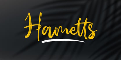 Hametts is a dazzling brush script font. This font is nearly crafted and highly detailed. The texture looks cool and authentic, suitable to enhance the quality of each of your posters, flyers, or print Features : Basic Latin A-Z, a-z, numbers, symbols, and punctuations Hametts is supporting 66 Languages: from Afrikaans Albanian Catalan Danish to Dutch English Spanish Swedish Zulu. Accented Characters : ÀÁÂÃÄÅÆÇÈÉÊËÌÍÎÏÑÒÓÔÕÖØŒŠÙÚÛÜŸÝŽàáâãäåæçèéêëìíîïñòóôõöøœšùúûüýÿžß Thank you
 - Super Blaster by Gatype,
$10.00 Super Blaster is the original Comic Font typeface enhanced with smoothed corners to give the typeface a more playful charisma. Super Blaster font if you want to use this font for your work can be used easily and simply because there are many features in it contains a complete collection of lowercase and uppercase letters, a wide range of punctuation, numbers, and multilingual support.
 - Galaksie by Balpirick,
$15.00 Galaksie is a Modern Calligraphy Font. Galaksie is a stylish script font with a contemporary atmosphere and impeccable form, inspired by timeless classic calligraphy. Not too thin and not too thick, balanced and varied, this font was designed to enhance the beauty of your projects. Galaksie also multilingual support. Enjoy the font, feel free to comment or feedback, send me PM or email. Thank you!
 - Horizone by Timurtype,
$14.00 Introducing by Timurtype Studio! Horizone is a Display Handwritten Font This font resembles handwritten elegance meets versatility. Unique style and shape to elevate your designs with the perfect blend of regular and outline styles, ideal for crafting captivating titles, logos, and more Horizone Font also supports multilingualism. Enhance your designs with our original fonts, feel free to comment or provide feedback, Enjoy the fonts 😊
 - Anthurea by Invasi Studio,
$19.00 Anthurea is a modern classy serif typeface. Featuring an elegant and classic all-caps style, this font reflects the elegance and style of the past. With its modern and minimal treatment, it makes a great starting point as well as an enhancement for your design. It is perfect for Logotype, printed quotes, invitations, cards, product packaging, headers, Letterhead, Apparel, Web design, magazines, books, etc.
 - Casual Deco JNL by Jeff Levine,
$29.00 The hand lettered sans serif title on the1931 sheet music for “(Potatoes are Cheaper-Tomatoes are Cheaper) Now’s the Time to Fall in Love” presented another opportunity to create a typeface from the wealth of unusual alphabets found on the covers of vintage and antique song sheets. However, it seems that even as late as the 1930s, song writers had the urge to pen long-worded titles for their musical compositions. This thirteen word verbal excursion became the model for Casual Deco JNL, which is available in both regular and oblique versions.
 - Timesky by Nathatype,
$29.00 Experience the timeless allure of Timesky, a serif font that effortlessly blends classic elegance with a modern sensibility. The generous spacing between characters ensures that your text breathes, This ample spacing not only enhances legibility but also lends a feeling of modernity to your design. On the other hand, the inline style brings a sense of depth and dimension to the font, creating a captivating visual. Timesky fits in headlines, branding materials, print media, and many more.
 - YT basic Latin by Yangtype,
$9.00 The reason you should buy this font is simple and clear. This is because we have accumulated experience in realistic typography. This typeface exists as a unity with diversity. The intuitive form of letters and the subtlety of letter spacing create artistic value in the combination of words and sentences.