10,000 search results
(0.064 seconds)
- Caltons Typeface by Tacikworks,
$16.00 Proudly present Caltons Typeface. This font is inspired by vintage designs with clean and rough lines. Make the classic impression of this font stand out more. This font has approximately 600 glyph characters including uppercase, lowercase, discretionary ligatures and standard ligatures alternatives. It is suitable for creating vintage designs such as logo posters, merchandise, clothing, brochures, business cards and others. It can be accessed by using Open Type savvy programs like Adobe Illustrator and Adobe InDesign. features can be accessed by using Open Type save programs such as Adobe Illustrator, Adobe InDesign, Adobe Photoshop, Corel Draw X version and Microsoft Word. And this has given PUA unicode font (specially coded fonts). So that all the alternate characters Easily can be accessed in full by a Craftsman or designer. Features: Uppercase Lowercase Numbers Punctuations Stylistic Alternates & Ligatures Multilingual Languages Supported Format File: TTF,OTF, Web HOW TO ACCESS ALTERNATE CHARACTERS Open Glyphs Panel: In Adobe Photoshop go to Window - glyphs In Adobe Illustrator go to Type - glyphs Please contact us if you have any question!
 - Grantig by Julien Fincker,
$19.99 Grantig is a bold serif display typeface. Inspired by the opening titles of old western movies, the genre of western slab serifs has been translated into a modern context and adapted to today's needs. As a result, it breaks free from the chains of its genre and opens up to many themes. Grantig is the german word for grumpy. With its massive serifs and strictly rounded curves, it comes particularly close in character to the grumpy Western heroes of days gone by, always in the presence of his two leaning companions, Slant and Backslant. With Grantig, it is particularly easy to create eye-catching and type-accentuated headlines. Its expressive nature makes it particularly suitable for editorial, packaging and advertising. With its 482 characters, Grantig covers the language usage for many Latin-based languages. At the same time, it has the most important open type features, such as lining and oldstyle figures, alternate characters, and arrows.
 - Gridiot by Peter Bain,
$10.00 Gridiot is a constructed, semi-serif, two-weight stencil family that expands an approach taken by Josef Albers. Intended for display or headline setting, it features chamfered or bevel-cut corners, used instead of curves. The individual letter components sometimes vary in depth, avoiding a strictly modular approach, while the widths are kept consistent. The lining figures provide a standard set of numbers, and the oldstyle figures align with the lowercase, encouraging lowercase-only setting. Currency and other useful numerical symbols are provided in both versions. The zero is intentionally lighter, following early Renaissance types; there are filled versions as stylistic alternates. While horizontal scaling distorts the relationship between verticals and horizontals in a typeface, since every chamfer in Gridiot is at 45°, changing the horizontal scaling of the type will affect all diagonals equally. When used at a large size, or for a just few words, Gridiot can be very tightly spaced. Remember, any idiot can design a typeface on a grid: Gridiot.
 - Spry Roman by Stephen Rapp,
$49.00 Handmade, expressive, lively, organic— …words typically used to describe a script font or a casual sans. Spry Roman opens up new possibilities. It’s origin is handwritten letters created using a pointed nib on slightly toothy paper. While based on a Roman form, the letters are designed to break out of the mold and dance along the baseline. Spry Roman Pro is a fully featured opentype font. Among the 964 glyphs are loads of alternate characters and swash letters; a full set of small caps; simple fractions; case sensitive punctuation; and a variety of ornaments, border elements, and flourishes. It also includes a full dose of language support for not only main characters, but also for alternates and small caps. Ligatures have been kept to a minimum to allow users the option of tracking text. **Please note that the Pro version has all the glyphs of the others combined. The smaller versions are for those who don't have opentype savvy apps like Adobe Illustrator.
 - Cyceon Pro by DBSV,
$90.00 Fluted pillars… As for the name of "Cyceon", it is a "juice-drink" that they made in ancient Greece...! In this font the straight lines are not vertical but inclined like something from the Doric columns!!! There are two versions of letters. In the first version, it is of a normal character, while in the second version I have mixed some capitals with lower case letters. I have given them the acronym Msc "miscellaneous". I tried in this way to give another version of the small capitals and I think they show a different view from the purely small capitals… And in this family, the “Strap”/“Strap Msc”/“StrapIt”/ and “Strap MscIt” with “Solid”/“Solid Msc”/“SolidIt”/ and “Solid MscIt” engage in the same way like… “Layered font families” as the previous series. This series is composed and includes twenty-four fonts with 642-658 glyphs each, with true italics and supports Latin, Greek and Cyrillic.
 - Natalisa by Sabrcreative,
$15.00 Introducing Natalisa, a sophisticated sans serif font that brings a perfect balance of elegance and versatility to your design projects. With its clean lines and modern aesthetics, Natalisa is ideal for creating sleek logos, captivating headlines, engaging advertisements, and eye-catching branding materials. Crafted with meticulous attention to detail, Natalisa offers a harmonious blend of uppercase and lowercase letters that seamlessly complement each other. Its refined letterforms lend a timeless appeal, making it suitable for a wide range of applications. Whether you're designing for print or digital platforms, Natalisa will elevate your projects with its sleek and professional look. Not limited to its visual appeal, Natalisa is packed with essential features. The font includes a comprehensive set of numbers and punctuations, ensuring seamless integration into your designs. Its multilingual support allows you to effortlessly communicate your message in various languages, making it a versatile choice for global projects. With PUA encoding, Natalisa provides easy access to special characters and glyphs, expanding your creative possibilities. Additionally, the font offers ligatures that enhance the fluidity and elegance of your typography.
 - Anselm Sans by Storm Type Foundry,
$63.00One of the good practices of today’s type foundries is that they release their type families as systems including both serif and sans serif type. Usually, the sources of inspiration need to be well tried with time and practice, since production of a type family is such a laborious and complex process. From the beginning, it needs to be clear that the result will be suited for universal use. Such systems, complete with the broad, multi-lingual variations permitted by the OpenType format, have become the elementary, default instrument of visual communication. Non-Latin scripts are useful for a wide scope of academic publications, for packaging and corporate systems alike. And what about outdoor advertisement designated for markets in developing countries? Cyrillics and Greek have become an integral part of our OpenType font systems. Maybe you noticed that the sans serif cuts have richer variety of the light – black scale. This is due to the fact that sans serif families tend to be less susceptible to deformities in form, and thus they are able to retain their original character throughout the full range of weights. On the other hand, the nature of serifed, contrasted cuts does not permit such extremes without sacrificing their characteristic features. Both weights were drawn by hand, only the Medium cut has been interpolated. Anselm Ten is a unique family of four cuts, slightly strengthened and adjusted for the setting in sizes around 10 pt and smaller, as its name indicates. The ancestry of Anselm goes back to Jannon, a slightly modified Old Style Roman. I drew Serapion back in 1997, so its spirit is youthful, a bit frisky, and it is charmed by romantic, playful details. Anselm succeeds it after ten years of evolution, it is a sober, reliable laborer, immune to all eccentricities. The most significant difference between Sebastian/Serapion and Anselm is the raised x-height of lowercase, which makes it ideal for applications in extensive texts. Our goal was to create an all-round type family, equally suitable for poetry, magazines, books, posters, and information systems. - Anselm Serif by Storm Type Foundry,
$63.00 One of the good practices of today’s type foundries is that they release their type families as systems including both serif and sans serif type. Usually, the sources of inspiration need to be well tried with time and practice, since production of a type family is such a laborious and complex process. From the beginning, it needs to be clear that the result will be suited for universal use. Such systems, complete with the broad, multi-lingual variations permitted by the OpenType format, have become the elementary, default instrument of visual communication. Non-Latin scripts are useful for a wide scope of academic publications, for packaging and corporate systems alike. And what about outdoor advertisement designated for markets in developing countries? Cyrillics and Greek have become an integral part of our OpenType font systems. Maybe you noticed that the sans serif cuts have richer variety of the light – black scale. This is due to the fact that sans serif families tend to be less susceptible to deformities in form, and thus they are able to retain their original character throughout the full range of weights. On the other hand, the nature of serifed, contrasted cuts does not permit such extremes without sacrificing their characteristic features. Both weights were drawn by hand, only the Medium cut has been interpolated. Anselm Ten is a unique family of four cuts, slightly strengthened and adjusted for the setting in sizes around 10 pt and smaller, as its name indicates. The ancestry of Anselm goes back to Jannon , a slightly modified Old Style Roman. I drew Serapion back in 1997, so its spirit is youthful, a bit frisky, and it is charmed by romantic, playful details. Anselm succeeds it after ten years of evolution, it is a sober, reliable laborer, immune to all eccentricities. The most significant difference between Sebastian/Serapion and Anselm is the raised x-height of lowercase, which makes it ideal for applications in extensive texts. Our goal was to create an all-round type family, equally suitable for poetry, magazines, books, posters, and information systems.
 - Technical SCRIPTURE by MMC-TypEngine,
$19.00 ‘Technical Scripture’ 2015-2021 A manuscript look, Pixel labyrinthine Display Type System… Plus, an Optical “Layered Game”, Retro Futuristic Sci-Fi Digital interface evolving placeholder… Now with 3D Styles! It was designed as a pair to its brother font ‘Technical Signature’ a Small Caps Font, both inspired by antique Greek, mosaics zig-zag ornaments “ancient times computer” intentionally as a Romanic variation with same metrics... Searching for Technical Solutions, it resulted in many combined styles by matching the primary ones so there’s plenty variations for multi-purpose texting like layered typesetting or simply monochromatic designs… Plus got accurate streaming resolution, therefore some sub-families like Stamp and Texture implicates greater points for minimum size as Regular and Light is appropriated to Small Optical Text reductions. *The New 3’s Upgraded Edition Improvements consisted of Correct ‘Font Info’ (verified data-debugging) rescaled glyphs, quick design review, better style linking with correspondent renamed fonts, addition of automatic OT features encoding, 3D Styles and Italics. Ps. This actual Typeface was quickly re-edited for technical reasons and hasn’t yet reached the intended design, it will soon receive a more tangible redesign upgrade, mainly in lowercases to enhance cursive style. Due to other priorities. Tip: Give preference to THE LYSERGIC UPPERCASES! Multilanguage Support: Western & Eastern European, Baltic, Turkish, Greek, and Cyrillic. This Type is pleasant to Technician Compositions, Such as Briefs layouts manuscript, Old Engineering & Crafts Logos or Support Text, Op-Art Posters, Stamps, Labels, movies and Cartoons Ludic Scripts, sites and of course Video Games! Try ‘Technical Scripture’ & Have some Power to the Pixel! Padang!
 - Libertat by Elyas Beria,
$9.00 In a not-too-distant future, humanity was ruled by a powerful, technologically advanced empire known as the Synod. The Synod controlled all forms of communication, and through this, they controlled the minds of the people. But a small group of rebels, known as the Resistance, had managed to evade the Synod's surveillance and formed a secret underground movement. They were determined to overthrow the Synod and restore freedom to the people. One of the Resistance's key members was a young artist named Trystån. He had a unique talent for creating powerful, visually striking posters that captured the spirit of the Resistance's message and spread it to the masses. Trystån had just completed a new poster, one that would be critical to the Resistance's plans. It depicted a single, outstretched hand holding a traditional Kimarii laser staff, with the words "Libertat!" emblazoned across the top. The poster featured a striking and powerful font that perfectly captured the spirit of the Resistance's message. The font was a combination of bold lines, elegant confident curves, and strong angles, giving it a sense of strength and determination. The lettering was large and prominent, filling up much of the poster, making it hard to miss. The letters seemed to be almost carved into the surface, giving the impression of something that was permanent and unshakable. The font was colored in dark shades, and was a sans serif typeface, that gives the message a very modern and current feel yet also feels vintage and retro, connecting the present with the struggles of the past. And with multilingual support, the typeface ensured that the message of the Resistance could be disseminated in every language on the planet. The background was minimalistic and in contrast, with a neutral palette, with just a hint of a sand-like color, representing the harsh conditions of the land that the people were fighting for their rights. The focus was all on the lettering, and how it conveyed the message. The poster was indeed a moving piece of graphic design, with its strong, striking font, and powerful imagery. It was clear that Trystån had put a lot of thought and care into its design. The poster, he hoped, would connect with people on an emotional level and inspire them to rise up against the oppression of the Synod Empire. The poster was set to be distributed at a major rally in the capital, where the Resistance was hoping to gain the support of thousands of citizens. But the Synod was not about to let this happen. They had long suspected the existence of the Resistance and had been working to infiltrate their ranks and discover their plans. The night before the rally, the Synod launched a surprise raid on the Resistance's hideout, capturing Trystån and several other members of the Resistance. Trystån was thrown into sand pits and interrogated by the Synod's top agents. They wanted to know everything about the Resistance's plans, including the details of the poster and the rally. Trystån, knowing the importance of the poster, refused to give in, even under the harshest of conditions. Meanwhile, the rally was drawing near, and the Resistance was desperate to get the poster out to the public. They knew that it was their only hope of gaining the support they needed to overthrow the Synod. They came up with a plan to smuggle the poster out of the hideout, but it would be a risky endeavor. As the rally began, the Resistance made their move, slipping the poster into the hands of the crowd. Trystån's poster had made a big impact in the rallies, and soon it became the symbol of hope for the resistance, and the visual representation of their struggle for freedom. The poster had become the catalyst for the revolution, and it would be remembered for many years to come as the symbol of the fight for freedom and democracy. The image of the outstretched hand holding the Kimarii laser staff struck a chord with the people, and they began to rise up against the Synod's oppression. Trystån, still locked away in the sand pits behind a stasis feild, could only imagine the scene unfolding outside. But he knew that his work had helped to spark a revolution, and he felt a sense of pride and accomplishment. The Resistance, with the help of the rally, was able to overthrow the empire, and Trystån was released, celebrated as a hero and hailed as the artist who helped to bring about the new era of freedom and democracy. The poster Trystån had designed had become the symbol of a new era, and it would hang in museums and public places as a reminder of the power of resistance and art, in the face of oppression. Features: regular and light weights numbers and punctuation multilingual characters
 - Orqquidea by PeGGO Fonts,
$29.00 Low contrast and clean Roman Sans with capitals based on the classic Capitalis Monumentalis proportions with uniform and modern SmallCaps, with a subtle script touch on some curved strokes, that give it a less hard feel, more organic and friendly look. The design idea born on 2013 from Roman Schemme studies, where new version of Legan and other roman typeface projects was based on too. Orqquidea was developed in 12 sizes with 659 glyphs each enhanced with professional opentype features (aalt, ccmp, locl, subs, sups, numr, dnom, frac, ordn, lnum, pnum, tnum, onum, c2sc, smcp, case, dlig, liga, zero, salt, calt, ss01, ss02, ss03, ss04), plus a complementary Orqquidea Framed version with 226 glyphs and a Orqquidea Garden version that include floral ornaments and related dingbats with 102 glyphs. It can easily adapt to print and digital environments ideal for fashion branding and corporate purposes, magazine and book headlines and titles, cosmetic label design and even on contents with a modern and artistic air.
 - Aspira by Durotype,
$49.00 Aspira: the legible geometric typeface. Aspira is a multi-purpose typeface. It is suitable for both text and display use — for graphic design, corporate identity design, magazines, newspapers, books, reports, advertising, signage, etc. Aspira is a versatile typeface. It offers 112 styles consisting of 8 weights and 7 widths. It offers 56 upright fonts and 56 italic fonts. It offers lining and oldstyle figures (proportional and tabular). It offers small caps, ligatures, arbitrary fractions, and extensive language support. Aspira is a geometric typeface. It offers a fresh geometric personality which is pleasant and not too conspicuous. Aspira is a multi-width typeface. It offers 7 widths — much more than what is currently usual. Aspira is a legible typeface. Many of its details, like its open apertures and subtle variations in stroke width, are designed to enhance its legibility. Free demo font available. Aspira in use: 1 2 3 4 5 6 7 8 9 10. For more information about Aspira, download the PDF Specimen Manual.
 - Seventies by Lián Types,
$37.00 'Meeeeoooow'! Seventies is another of my 'funkadelic' attempts (1) to fill the existing gap of seventyish looking fonts. In my opinion, that decade has a hidden treasure regarding type that remains unexplored: Only very few fonts rescue its 'groovy' essence, its ‘colourful’ qualities. But, don't have a cow man , and keep on truckin! With Seventies, my new foxy mama , your projects will stand out among the rest. Since there’s not much information available about this kind of lettering I had to get ideas from other styles: Nowadays it’s easy to find all kind of books or guides to understand and practice how different styles of calligraphy and lettering should be done. However, for some reason, 60s and 70s letters seemed to ignore/be free of rules... Was this suggesting the birth of postmodernism? I incorporated some ideas of the copperplate style of calligraphy: The ductus of its forms may be compared to the way letters are made in snell/engrosser’s script. Obviously, this is just the idea behind; the delicacy of thins is replaced here with the graceful imprint of really thick thicks with a brushy look and tons of good vibe . Seventies will work awesome in posters, brands, magazines, book-covers of any kind, due to its modern look adapted to our century. Well, catch you on the flip~side ! STYLES To make you more psyched , Seventies is a layered font! See examples in the posters using Seventies Shade, Seventies Shine and Seventies Printed. NOTES (1) My first one was with Beatle in 2014.
 - Calluna by exljbris,
$- Calluna was born more or less by accident. When I needed a little break from designing Museo I was just fiddling around a bit to see if maybe a full slab serif would be something to have a look at. The first thing I did, of course, was to put slab serifs on the stems of Museo. When I did, something nice happened. Slab-serifs with a direction! I ended up using the idea for something I always wanted to do: making a rather serious text face. The goal was to make a text font, but one with enough interesting details. In the end it all came down to finding the balance in a typeface between the robustness needed to function as a text face and enough refinement to look good as a display font. Check out Calluna Sans™ which is a great pair for Calluna™.
 - Grrr by ParaType,
$30.00 Grrr is a headstrong modular display typeface with a large amount of alternative glyphs. It consists of eight weights ranging from Thin to Black. A variable font is also available. The typeface is designed on a modular grid and it proudly ignores the rules of optical compensations: the horizontal and vertical strokes have identical thickness, and round and triangular letters have no overshoots at all! All these peculiarities are making the typeface usable at sizes from 21pt and larger in print and approximately from 24px on non-retina screens. Grrr is especially good at extremely large sizes. The typeface includes three stylistic sets with even more bizarre letterforms. These sets activate a cyclic pseudorandom substitution of letters from a range of alternates — the letterforms keep changing as you type! The typeface was designed by Dmitry Goloub and Alexandra Korolkova and released by Paratype in 2019.
 - Finador Slab by Julien Fincker,
$24.00 Finador Slab is a soft slab-serif family. It has a strong character and can be used for a lot of cases, especially for editorial, branding, packaging and logos. The Slab version is based on the Finador Sans version. It matches perfectly and can be used easily together. The Finador Slab family includes 8 weights, from thin to heavy + their matching italics. With 900+ glyphs per style it supports over 200+ latin based languages, includes an extended currency symbol set and a lot of Open Type Features like small caps, ligatures, fractions, alternates and many more. The lightest and boldest weights are good for display usage, while the middle weights can be also used for body text. Finador Slab supports almost every of your needs. It meets all the requirements to become your next favorite workhorse family. So just give it a try. The Medium weight is for free.
 - Glorious Song by Stiggy & Sands,
$24.00 A type from vintage Hollywood to your computer screen. Glorious Song is a display serif typestyle that was inspired by the poster lettering for the 1948 movie "Words and Music". It's an all capitals typeface that has alternate caps in the lowercase slots to convey all of the spunk and visual dance of the original inspiration. See the 5th graphic for a comprehensive character map preview. Glorious Song comes with features for customisation options: - An all capitals typeface with alternate capitals in the lowercase slots - A Ligatures feature that alternates between Capital and Alt Capitals characters. - A SmallCaps feature just to mix things up a little. - A Full set of Inferiors and Superiors for Limitless Fractions - Tabular and Proportional figure sets Approx. 546 Character Glyph Set: Glorious Song comes with a glyphset that includes standard & punctuation, international language support, basic ligatures, alternate numeral styles, subscript and superscript, and Small Cap letters.
 - Jolie by Scholtz Fonts,
$22.00 Jolie personifies romance. With its dramatic swashes, generously curved lines, and full, richly fashioned upper case characters, it evokes floral perfumes, roses, violin music and romantic evenings. The richly complex uppercase characters provide a backdrop and a contrast for the simple elegant and readable lowercase characters. The font is perfect for wedding stationery, clothing branding, packaging, music posters and all other romantic possibilities Jolie introduces a simple method for applying the elegantly beautiful end-of-word or end-of-sentence swashes. Simply type in a three-character code and [hey presto] the swash suddenly appears. Clear and readable, Jolie has all the features usually included in a fully professional font. Language support includes all European character sets, Greek symbols and all punctuation. Jolie makes use of OpenType features to avoid the mechanical look caused by two identical characters that are placed side by side.
 - Microbrew Unicase by Albatross,
$19.00 Microbrew Unicase is the latest addition to the Microbrew family, a versatile retro display family. Microbrew Unicase has 14 individual styles plus a very functional set of catchwords, and a fresh and eclectic set of retro-style ornaments. Microbrew Unicase sports a nice mix between wood type poster style, and vintage letterpress. The more detailed styles work well at large sizes, and the cleaner styles add legibility at smaller sizes. Microbrew Unicase is an all caps display font, but the lowercase act as alternates. The uppercase are all uppercase letter forms, while the lowercase is mixed. Type in all caps to be a buzz-kill. Mix upper and lowercase to have a little fun. Or type in all lowercase to have a party! (more informal) For super-easy alternates, just mix uppercase and lowercase letters. To add to the realism, Microbrew Unicase includes double-letter ligatures. Microbrew Unicase also includes a set of extremely intentional and eclectic ornaments and symbols. Designed to give a vintage feel, the ornaments and symbols compliment Microbrew nicely to round off the family. The ornaments also include old style numbers, and lots of retro symbols. Don't let the name fool you, Microbrew Unicase is very versatile and works great for almost any subject matter, including weddings, birthdays, restaurants, coffee shops, music, and many more. Opentype features include automatic fractions, subscript numbers, superscript numbers, and double-letter ligatures.
 - Evoque by Monotype,
$40.00 Evoque is a humanist serif type family designed for both text and display purposes. Its appearance is crisp and modern while echoing a classical Garamond heritage. The inspiration for Evoque came after reminiscing over Apple’s advertising of the eighties and nineties that utilised incredibly tightly-spaced headlines set in Apple Garamond. I wanted to create a typeface that evoked nostalgia of those times and that distinctive typographic style. A number of swash alternates and discretionary ligatures enhance Evoque, giving you the opportunity to add more flair and personality to your title and branding designs. Simply activate Stylistic Sets to start adding these flourishes to your typography. Other useful features include Small Caps at the click of a button, and Old Style Figures are an option to the default proportional figure style. There are 36 fonts altogether, with 6 weights in roman and italic from Thin to Heavy weights across Condensed, Narrow, and Regular widths. Evoque has an extensive character set (900+ glyphs) that covers every Latin European language. Please also take a look at Evoque Text which is specifically designed for the publishing sector. Key features: 6 weights in both roman and italic 3 widths – Regular, Narrow, Condensed 80 Alternates 26 Ligatures Small Caps Full European character set (Latin only) 900+ glyphs per font.
 - Medallion by Unicode Studio,
$20.00 Medallion is a new and fresh font script that comes with a vintage and neat style. so this font can be used easily, even in mix and match with other fonts. so it can provide new alternatives and sensations for designers or craftsmen, in working on various projects. This font is perfect for all your project like the wedding invitation, greeting cards, branding materials, business cards, quotes, posters, insignia, badge, greeting cards, vintage logo, or you can use this font for various logo project (logotype) and more! The following characters are ideal to make an attractive message, mix and match Medallion with a bunch of alternative characters to fit your project Medallion comes with 318 glyphs totally. The alternative characters were divided into several Open Type features such as Swash, Stylistic Sets, Stylistic Alternates, Contextual Alternates, and Ligature. The Open Type features can be accessed by using Open Type savvy programs such as Adobe Illustrator, Adobe InDesign, Adobe Photoshop Corel Draw X version, And Microsoft Word. And this Font has given PUA Unicode (specially coded fonts). so that all the alternate characters can easily be fully accessed by a craftsman or designer through either Windows or Mac computer without any requirement for fancy design software. Mail support: If you have any question, please contact me Via e-mail "unicodestudio@gmail.com" Thank You!
 - Buffet Script by Sudtipos,
$99.00 Buffet Script is based on fantastic calligraphy by Alf Becker, arguably the greatest American sign lettering artist of all time. The Alf Becker series of nameless alphabets published by Sign of the Times magazine in 1941 has attracted letter digitizers for a few years now, so it’s really a wonder that a few of those alphabets are still in the non-digital realm. It is understandable, though, that the basis for Buffet Script was not digitally attempted until now. The page presenting this alphabet shows a jungle of letters running into each others and swashes intertwining. The massive amount of work involved in digitizing such lettering, where scanning is nowhere near being an option, is quite obvious at a mere glance. If anyone was going to commit this particular alphabet to a digital form, it would have to be redrawn stroke by stroke and curve by curve on the computer. And don't we love a challenge! But seriously, the challenge was not the main attraction. In a way, the Becker approach to lettering is so far from digital that the imagination is almost forced to work out possibilities and letter combinations to solve problems presented by the scant showings in that magazine. After a few imaginative visualizations, the digital potential becomes clear in the mind, and the eye and hand follow. The result with Whomp (another Alf Becker-inspired work) was an enormous font with a lot of alternates and ligatures. With Buffet Script the imaginative process was no different, but the result particularly shines here, because this is some of the most fascinating flowing calligraphy ever seen. Calligraphy is where the accountability of all the little extra touches, such as alternates and swashes and ligatures, is raised to a higher level than in most other type categories. Buffet Script’s OpenType programming contains discretionary ligatures, stylistic and contextual alternates, interacting with each other to allow the composition of just the right word or sentence. This font is best used where lush elegance is one of the design’s requirements.
 - Orange Flower by Anastasia Kuznetsova,
$18.00 Say hello to 'Orange Flower'!! A bold and beautiful font with a brush and a lot of additions! I am very pleased to present 'Orange Flower' - a versatile and artistic set of handmade fonts with a brush! The font comes with alternative uppercase and lowercase characters. Thanks to the very clear contrast in weight and authentic style made with a brush, 'Orange Flower' is guaranteed to give your text an individual, individual feeling - ideal for logos, printed quotes, invitations, postcards, product packaging, headlines and everything your imagination is capable of, use in ink-based drawings or watercolors or independently in the form of bold handmade inscriptions!! :) The font comes with a lot of great features to keep you busy :) Each character has its own alternative version, which allows you to create unique words and layouts. There is also a second font brush 'Orange Flower Brush', which contains brush strokes, underscores and brush splashes. This gives you the opportunity to create an artistic image of your text, which will give your design a sloppy realistic look :) Both fonts have a large selection of characters, including ligatures. 'Orange Flower' includes ligatures and stylistic alternatives for those who have software with opentype support (for example, Photoshop/Illustrator). I really hope you enjoy it, and please feel free to write me a message if you have any questions or concerns! :) Font Features: - A-Z; a-z character set; - 1 language (English); - numbers and punctuation marks, symbols. Fonts can be opened and used in any software that can read standard fonts, even in MS Word. No special software is required to get started. It is recommended to use it in Adobe Illustrator or Adobe Photoshop. Made with love and magic ♡ Thank you for reading it, and do not hesitate to send me a message if you have any questions! ~ Anastasia
 - Istanbul Type by Bülent Yüksel,
$19.00 "Istanbul Type" has a modern streak which is the result of a harmonization of width and height especially in the lowercase letters to support legibility. "Istanbul City" has the modernity of the west and the orientalist texture of the east as the city that unites the Asian and European continents. "Istanbul Type" also includes these features. It is a unique character that reflects the spirit of "Istanbul City". Many letter alternatives prepared with care have been created for all letters. You can make dozens of combinations from a word using these alternative letters. "Istanbul Type" is an effective set for creating identities for branding, posters, book covers, headlines, logotypes, restaurants, menu cards, wedding invitations and so on. "Istanbul Type" provides advanced typographical support for Latin-based languages. An extended character set, supporting Central, Western and Eastern European languages, rounds up the family. The designation “Istanbul Type 500 Regular” forms the central point. The first figure of the number describes the stroke thickness: 100 Thin to 900 Bold. "Istanbul Type" 5 weights and italics total 10 types. The family contains a set of 2.200+ characters. Case-Sensitive Forms, Classes and Features, Fractions, Superior, Inferior, Denominator, Numerator, Old Style Figures just one touch easy In all graphic programs. Attention! "Typography Line" is not suitable for use. When using it for special effects, it may be necessary to "Convert / Create Outlines" it first and then "Pathfinder Unite" it. You might have a crush on this typeface :) Do not hesitate to consult me for information about fonts before, during and after purchasing. You can contact me at "buyuksel@hotmail.com". Enjoy using it.
 - Istanbul Type Variable by Bülent Yüksel,
$69.00 "Istanbul Type Variable" has a modern streak which is the result of a harmonization of width and height especially in the lowercase letters to support legibility. "Istanbul City" has the modernity of the west and the orientalist texture of the east as the city that unites the Asian and European continents. "Istanbul Type Variable" also includes these features. It is a unique character that reflects the spirit of "Istanbul City". Many letter alternatives prepared with care have been created for all letters. You can make dozens of combinations from a word using these alternative letters. "Istanbul Type Variable" is an effective set for creating identities for branding, posters, book covers, headlines, logotypes, restaurants, menu cards, wedding invitations and so on. "Istanbul Type Variable" provides advanced typographical support for Latin-based languages. An extended character set, supporting Central, Western and Eastern European languages, rounds up the family. The designation “Istanbul Type Variable 500 Regular” forms the central point. The first figure of the number describes the stroke thickness: 100 Thin to 900 Bold. "Istanbul Type Variable" 5 weights and italics total 10 types. The family contains a set of 2.200+ characters. Case-Sensitive Forms, Classes and Features, Fractions, Superior, Inferior, Denominator, Numerator, Old Style Figures just one touch easy In all graphic programs. Attention! "Typography Line" is not suitable for use. When using it for special effects, it may be necessary to "Convert / Create Outlines" it first and then "Pathfinder Unite" it. You might have a crush on this typeface :) Do not hesitate to consult me for information about fonts before, during and after purchasing. You can contact me at "buyuksel@hotmail.com". Enjoy using it.
 - Pliego by Huy!Fonts,
$35.00 Pliego is a textface designed to offer a comfortable continuous reading, with humanist proportions, an even texture, and informal calligraphic details noticeable only at big sizes, that gives it a contemporary feeling. Pliego has been named after Pliegos de Cordel, the Spanish word for the popular books that were common during the XVI, XVII and XVIII centuries. These were rough, cheap books that basically consisted in a folded sheet attached to a string, hence the name. Their content was varied, from popular tales to ballads and songs, but also crimes and mysteries. They were cheaply made, roughly printed and bound. The name Pliego evokes the idea of a rough look, angular edges, informal taste, but classical look. To cover today’s needs, Pliego includes five weights with matching italics. Designed and engineered for continuous reading, the Book, Regular and Medium weights will perform at their best under 14 points. However, don’t be scared to use for headlines and titles: because of its quirky details and calligraphic flavour, Pliego’s personality is accentuated when enlarged. With an extensive Latin character set, Pliego covers a wide amount of Latin-based languages, including Latin Plus encoding and Vietnamese support.
 - Etnier by Ahmad Jamaludin,
$17.00 Introducing Etnier – A brand-new modern family with a unique! Etnier is a modern variable font. Essentially, it's a sans-serif font with a sturdy and squared appearance, ensuring excellent legibility. It offers various widths and italics that provide versatility for your designs. The bolder, the stronger – this defines Etnier. Its bold and robust qualities, especially in the italic version, make it ideal for UI/UX-related designs. In total, there are 14 font styles available, or even more if you use the single files variable. You have the flexibility to slide through the weight and width options to find the sweet spot for Etnier. shape! What's Included? Etnier Main File 14 fonts family with Weight and Oblique options Instructions (Access special characters in all apps, even in Cricut Design) Accessible in Adobe Illustrator, Adobe Photoshop, Microsoft Word even Canva! PUA Encoded Characters. Fully accessible without additional design software Language Support: Danish, English, Estonian, Filipino, Finnish, French, Friulian, Galician, German, Gusii, Indonesian, Irish, Italian, Luxembourgish, Norwegian Bokmål, Norwegian Nynorsk, Nyankole, Oromo, Portuguese, Romansh, Rombo, Spanish, Swedish, Swiss-German, Uzbek (Latin) Come and say hello over on Instagram! https://www.instagram.com/dharmas.studio/ Have a great day! Dharmas Studio
 - Blood Orange by Fenotype,
$25.00 If you need to say something weighty, say it with Blood Orange. Blood Orange is a hearty rounded serif font with an easygoing confidence and a delightful nostalgic feeling, without the dusty burden of actual fonts from the last century. Blood Orange works great as a logotype, in magazines, headlines, posters, advertising and packaging. It’s at its best in short sentences since it’s so bold, but can be used for a bit longer text passages too, with some spacing added. As a product of modern era, Blood Orange is fully equipped with plenty of OpenType goodness: Contextual Alternates and Standard Ligatures do their usual trick in smoothing certain letter combinations, and they’re automatically on. In addition it has a wide range of Discretionary Ligatures, Stylistic, Swash and Titling Alternates that you can trigger on from OpenType controls in any OpenType savvy program, or manually select the suitable variations from the character window. Try these alternates for more eloquent designs, but remember to treat them like you would treat you would treat really strong spices: just a bit at a time. See the full range of the alternative glyphs on the specimen posters.
 - Densit by Adtypo,
$32.00 Densit is a display mega black typeface, containing 6 styles. It aims for a ultimate density with a maximum weight on a minimum place. Glyphs therefore balances on a slim border of touch. The typeface is designed for expressive and short texts at big sizes and is suitable for photography or other visual materials underlaying. The 3 basic styles parodies ordinary type styles. They only differents from each other lays in the lenght of straight thin lines. The stencil style without these lines is intended especially for spray stencils, the sans style is imitating linear sans types and the serif style having stronger contrast and indicated serifs. The typeface contains a large set of special ligatures for playing with aesthetic qualities of text and obtain maximum space saving. Densit contains 34 special forms for members and frequently used short words in various languages. Very short terminals offer compact setting of multi-lines captions. Densit can be used for music posters, eye-catching headlines of art articles and everything in which is possible graphic impression from legibility prefered. • 6 styles (2 alternatives, 3 kinds) • 12 OT features • 1313 glyphs • sophisticated system of ligatures • support of latin languages
 - Conspired Lovers by Harald Geisler,
$39.00 Conspired Lovers is based on five years of love-letter writing. A font to capture the intentions of love letters more than any other font. How did the Project start? In the last five years I wrote love letters with two persons. I became used to the joy of handwriting with ink and nib on fine paper. Through practice a experimentation my style continuously refined. As life moves on, suddenly I found myself with no one to write love letters to. It's a luxury to have someone to write letters to. Missing the joy of writing and listening to Gregory Porter’s “Be Good”, the decision was made to take this 5 years of writing and make this dance on paper a font. A handwritten typeface for everyone to use. This font was created in July, 2012 and named Conspired Lovers. A font to capture and convey your message in a special way to the beloved one close to your heart. With a long practice of writing crafted into the unique design I hope that you and the recipient of your writing will soon enjoy this design. The Open-type version features 350+ glyphs including alternates and ligatures. All lowercase and most uppercase letters are connected, to create a realistic hand-writing-calligraphy on your creations. Conspired Lovers is international and supports a wide range of eastern european languages with accented letters to reach everyone in Sweden, France, Hungary and almost everywhere around the globe. A trailer for Conspired Lovers can be seen here: http://vimeo.com/haraldgeisler/conspired-lovers If you're looking for more heart related fonts also check out my other fonts.
 - Bauer Bodoni by Linotype,
$45.99 Giambattista Bodoni (1740-1813) was called the King of Printers; he was a prolific type designer, a masterful engraver of punches and the most widely admired printer of his time. His books and typefaces were created during the 45 years he was the director of the fine press and publishing house of the Duke of Parma in Italy. He produced the best of what are known as "modern" style types, basing them on the finest writing of his time. Modern types represented the ultimate typographic development of the late eighteenth and early nineteenth centuries. They have characteristics quite different from the types that preceded them; such as extreme vertical stress, fine hairlines contrasted by bold main strokes, and very subtle, almost non-existent bracketing of sharply defined hairline serifs. Bodoni saw this style as beautiful and harmonious-the natural result of writing done with a well-cut pen, and the look was fashionable and admired. Other punchcutters, such as the Didot family (1689-1853) in France, and J. E. Walbaum (1768-1839) in Germany made their own versions of the modern faces. Even though some nineteenth century critics turned up their noses and called such types shattering and chilly, today the Bodoni moderns are seen in much the same light as they were in his own time. When used with care, the Bodoni types are both romantic and elegant, with a presence that adds tasteful sparkle to headlines and advertising. The Bauer Bodoni was done by Heinrich Jost for Bauer Typefoundry in 1927. This version has finer details of the original Bodoni types. It works well for headlines, logos, advertising.
 - P22 Operina by IHOF,
$24.95 Operina is based on a 16th-century lettering model of the scribe Ludovico degli Arrighi (Vicentino Ludovico degli Arrighi) used in his 1522 instructional lettering book, "La Operina da Imparare di scrivere littera Cancellarescha." This book contains what is considered to be the earliest printed examples of Chancery Cursive. Rather than try to reproduce a perfect, smooth, type-like version of Ludovico's hand, which has been attempted in the past, the designer opted to leave in some rough edges and, thereby, create a look that mimics the endearing artifacts of quill and ink lettering on parchment. When reviving an old style, a designer is faced with many challenging decisions, such as whether to aim for ultimate authenticity or to modify the alphabet for modern use. The decision here was to create a font that resembles the 16th-century Italian hand-lettering master's, but is also useful to the contemporary user. Because the letters U u W w J j and our modern Arabic numerals were not in use during the advent of these original letterforms, these had to be interpolated. To make a complete and useable font set, we also had to fashion many of the extra and diacritical characters to match the look of the alphabet. There are three fonts in this set: Romano(simple), Corsivo(more complex), and Fiore(swash). Romano is the most subdued, it contains Roman looking caps and has lining figures. Corsivo is more elaborate, it has more decorative capital letters and an alternate version of the lowercase with longer ascenders and descenders, and old style figures. Fiore, the swash font, is the most elaborate with the longest ascenders and descenders. You may not wish to use the Fiore version on its own, especially as all caps; it is meant to enhance the other two alphabets because it contains the most elaborate capitals and has many extra ligatures. P22 Operina Pro is an OpenType version that contains over 1200 characters. It features Small Caps, Old Style Figures, full European, Cyrillic and Greek character sets and a new OpenType first with automatic Roman Numerals. Just type any number and with the feature, it will convert to Roman Numerals!
 - Yugoslavia - Personal use only

- Bambina by Ivan Rosenberg,
$16.00 Bambina is a stylish retro font inspired by 19th century architecture and decoration. It looks amazing at display sizes and is easily readable in text size. There are two versions of this font : REGULAR and OUTLINE. Bambina Font is a display font made mainly for headlines, titles, and other short texts and is well-suited for advertising, vintage mood board, branding, logotypes, packaging, titles, editorial design and modern and vintage design.
 - Floyal Rush by PizzaDude.dk,
$18.00 Floyal Rush is 100% handmade, it’s organic looking and super friendly in a funky wobbly way! Although inspired by grafitti, Floyal Rush has got this cartoon and whimsical vibe to it. I don’t know about using Flyal Rush for massive text, but I would suggest short words and shout-outs - but I dare you! Go ahead and challenge me! I have added 3 versions, which fit together: Solid, Shine and Regular.
 - Migelia by Romie Creative,
$12.00 Migelia is a beautiful script font with perfect alternatives. This font will add a romantic and elegant feeling to your design. Migelia can be used for various applications, such as wedding designs, logos, invitations, posters, social media posts, and others. Additional characters are coded by PUA with a love accent Can be used in any software, such as Adobe Photoshop, Illustrator, Microsoft Word, PowerPoint, and others. Multilingual glyphs.
 - Black Bamboo by Hanoded,
$15.00 Black Bamboo is a beautiful plant. My father in law, who recently passed away, loved it and had a prized specimen growing in his garden. This font was named in his honour. Black Bamboo font is a bold typeface, created using a good brush and quality paint. It is all caps, but upper and lower case differ and can be freely interchanged. Of course, Black Bamboo comes with all diacritics.
 - Ramadan Elegant by Marmara,
$23.00 If you are a graphic designer, magazine editor, fashion stylist, industrial designer, publisher, printer or have a creative business, this font is for you, I believe it is a font that should be in your font folder for all your work.. Make awesome logotypes; When you write any word, it almost gives a logotype effect, I enjoyed working on it very much, I'm sure you will like it too...
 - Monisha by Rotterlab Studio,
$12.00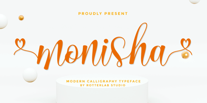 Monisha is a beautiful script font with perfectly perfect alternates. This font will exude a romantic and elegant feeling of your design. Monisha can be used for various applications, such as wedding designs, logos, invitations, posters, social media posts, and others. Features: - Additional characters encoded by PUA with a love accent - Can be used in any software, such as Adobe Photoshop, Illustrator, even Microsoft Word, PowerPoint, and others. - multilingual glyphs
 - NorB Comic by NorFonts,
$28.00 NorB Comic fonts are handwritten text fonts inspired from my childhood comic comic-books, they can be used with any word processing program for text and display use, print and web projects, apps and ePub, Comic Books, graphic identities, branding, editorial, advertising, scrapbooking, cards and invitations … or even just for fun! NorB Comic fonts come with 6 weights each with their matching italics and in a Normal and Condensed version.
