10,000 search results
(0.125 seconds)
- Dave Gibbons Lower by Comicraft,
$49.00 Other guys may imitate him, but the original is still the greatest! Get in with the In Crowd and check out the font created by Mister Fontastic for Dave Gibbons Original Graphic Novel, The, ah, The Originals. Yes, Dave Gibbons now comes in lower case, it's not just what he does when he gets back from the off license. Be sure and pick up The Originals from Amazon -- now available in paperback, and probably still available as a hard case, much like Dave. After the crack about the case of beer above, I'm guessing you'll find me with a broken spine in the remainder pile. See the family related to Dave Gibbons Lower: Dave Gibbons Journal & Dave Gibbons .
 - Vaudevillian JNL by Jeff Levine,
$29.00 The place for a family to be entertained by comedians, dancers, acrobats, animal acts, singers and just about any other acts that fit the bill at the time was the vaudeville theater. Prior to radio becoming the major source of entertainment for the American public, popular songs were introduced on the stages of these entertainment venues. One such song from 1916 with a World War I patriotic sentiment was "A Yankee Doodle Boy Is Good Enough for Me". The sheet music featured the title hand lettered in Art Nouveau style. This became the design source for Vaudevillian JNL, available in both regular and oblique versions.
 - Pista by Typedepot,
$14.00 Pista is a unique decorative typeface which is applicable for web, print especially for magazines, brochures, posters, flyers and motion graphics. Pista has six weights - regular, bold, outline, rounded, rounded bold and rounded outline. The weights are perfect for logos - regular size has an elegant look, the bold and outline gives a unique feel.
 - Intropol by The Northern Block,
$18.00 A modern journalistic style typeface. The subtle condensed characters create great economy of space best suited to brochure, editorial and magazine layouts. Also using the contrasting weights you can add great dimension across headline and body copy. Details include 6 weights with italics, an extended European character set, manually edited kerning and Euro symbol.
 - Lucemita - Personal use only

- Eurostile by URW Type Foundry,
$89.99 Eurostile Display Caps The Eurostile font family was designed (by Novarese and Butti in 1952) to complement the titling font, Microgramma, by offering a lowercase alphabet. Issued by the Nebiolo foundry, the rather square sans serif Eurostile became popular for display and advertising use. The linear nature of Eurostile suggests modern architecture, and its attraction is technical and functional. Eurostile is commonly misspelled Eurostyle.
 - Mooncat by VladB,
$32.00 Mooncat is a modern sans serif geometric font with rounded edges, includes upper and lower case characters, Latin, Cyrillic, Latin Eastern Europe, Turkish, Baltic and other. Mooncat family consists of 8 fonts, divided into 2 subgroups (according to the type of style - Op, Rg), and have the 4 types of thickness in each subgroup. Mooncat fonts will be useful in developing a brand, creating posters and other graphic products, and for word processing.
 - Vintage Stencil Motifs JNL by Jeff Levine,
$29.00 Vintage Stencil Motifs JNL is a collection of charming and decorative designs re-drawn (as the name indicates) from vintage source material. For decades, home decorators and do-it-yourself hobbyists embellished furniture, chests, walls and other areas with thematic stencils in both borders and topical vignettes. Today's digital designers can use these stencil patterns to embellish text set in other stencil alphabets or by themselves to evoke the feeling of rustic Americana.
 - Yin Yang Messages by Ingrimayne Type,
$9.00 YinYangMessages contains two sets of letters, those on the upper-case keys that fit on the left side of a yin-yang symbol and those on the lower-case keys that fit on the left side of a yin-yang symbol. One can alternate the two sets manually but the OpenType contextual alternatives feature does this automatically in any program that supports this feature. The family contains two fonts. In one the filled half is on the left and in the other the filled half is on the right. The slash and backspace keys contain blank halves of the symbol, which are useful for completing words with an odd number of letters. The two styles can be used in layers. YinYangMessages is a fun and playful family that every once in a while may be the ideal typeface for some unusual situation.
 - Colombine by Linotype,
$29.99Colombine is based on the handwriting of Gudrun Zapf von Hesse. The dynamic forms of Gudrun Zapf von Hesse's Colombine express the dance, the lightheartedness and the liveliness of Commedia dell'Arte. The type is an excellent choice for artistic as well as festive applications. The different weights make Colombine perfect for certificates and other celebratory texts. - Burst My Bubble Pro by CheapProFonts,
$10.00 This font has been described as "one of the cutest fonts I've ever seen. I can imagine a beautiful, young 22-year-old fashion design student from Los Angeles, CA with this handwriting as she's writing in her journal." I have cleaned it up a bit, increased the size of all the dots slightly and then designed all the diacritics and expanded the character set. The lowercase "f" has a big overhang and the lowercase "j" goes really far to the left - I have programmed automatic (OpenType) Contextual Alternate versions that automatically substitute with shorter variants when letters collide. These alternate letters can also be switched on using the OpenType palette's Stylistic Alternates or Stylistic set 01 ("j") and 02 ("f"). ALL fonts from CheapProFonts have very extensive language support: They contain some unusual diacritic letters (some of which are contained in the Latin Extended-B Unicode block) supporting: Cornish, Filipino (Tagalog), Guarani, Luxembourgian, Malagasy, Romanian, Ulithian and Welsh. They also contain all glyphs in the Latin Extended-A Unicode block (which among others cover the Central European and Baltic areas) supporting: Afrikaans, Belarusian (Lacinka), Bosnian, Catalan, Chichewa, Croatian, Czech, Dutch, Esperanto, Greenlandic, Hungarian, Kashubian, Kurdish (Kurmanji), Latvian, Lithuanian, Maltese, Maori, Polish, Saami (Inari), Saami (North), Serbian (latin), Slovak(ian), Slovene, Sorbian (Lower), Sorbian (Upper), Turkish and Turkmen. And they of course contain all the usual "western" glyphs supporting: Albanian, Basque, Breton, Chamorro, Danish, Estonian, Faroese, Finnish, French, Frisian, Galican, German, Icelandic, Indonesian, Irish (Gaelic), Italian, Northern Sotho, Norwegian, Occitan, Portuguese, Rhaeto-Romance, Sami (Lule), Sami (South), Scots (Gaelic), Spanish, Swedish, Tswana, Walloon and Yapese.
 - Beta Dance - Unknown license

- Boister Black Pro by CheapProFonts,
$10.00 I loved the look of this font so much that I couldn't resist reworking it - although it probably had the most basic character set I've ever used as a starting point. But here it is in its complete, professional, multilingual state. I hope this wonderful swashbuckling font now finds many new users and uses. Celebrate! ALL fonts from CheapProFonts have very extensive language support: They contain some unusual diacritic letters (some of which are contained in the Latin Extended-B Unicode block) supporting: Cornish, Filipino (Tagalog), Guarani, Luxembourgian, Malagasy, Romanian, Ulithian and Welsh. They also contain all glyphs in the Latin Extended-A Unicode block (which among others cover the Central European and Baltic areas) supporting: Afrikaans, Belarusian (Lacinka), Bosnian, Catalan, Chichewa, Croatian, Czech, Dutch, Esperanto, Greenlandic, Hungarian, Kashubian, Kurdish (Kurmanji), Latvian, Lithuanian, Maltese, Maori, Polish, Saami (Inari), Saami (North), Serbian (latin), Slovak(ian), Slovene, Sorbian (Lower), Sorbian (Upper), Turkish and Turkmen. And they of course contain all the usual "western" glyphs supporting: Albanian, Basque, Breton, Chamorro, Danish, Estonian, Faroese, Finnish, French, Frisian, Galican, German, Icelandic, Indonesian, Irish (Gaelic), Italian, Northern Sotho, Norwegian, Occitan, Portuguese, Rhaeto-Romance, Sami (Lule), Sami (South), Scots (Gaelic), Spanish, Swedish, Tswana, Walloon and Yapese.
 - Sancoale Slab by insigne,
$32.00 The contemporary feel of the Sancoale superfamily takes a bolder turn with this futuristic slab. Built from Sancoale's successfully simple geometry, Slab's serif elements and tall x-height give the face an energetic, yet clean figure that easily complements its cousins: Sancoale Softened--a sans with blunted terminals; Sancoale Narrow; and, of course, the original Sancoale itself. The weights of each member have been balanced carefully to ensure compatibility with the others, and when used together, the combination creates a powerful design that is easy to identify. With weights ranging from the classier Thin to the authoritative Black, Slab opens the door to a range of applications. Used in different text sizes, its tech image is legible and neutral enough for longer bodies of copy--both in print and on the web. Have a more prominent need? The web font also stands out well in a headline or even as a display face. Slabís great personality puts a strong foot forward without giving its reader a kick in the teeth. Whatever the task, this font's one to capture the Zeitgeist into your work. All Insigne fonts are fully loaded with OpenType features. Sancoale Slab is also equipped for complex professional typography, including alternates with stems, small caps and plenty of alts, including "normalized" capitals and lowercase letters. The face includes a number of numeral sets, including fractions, old-style and lining figures with superiors and inferiors. OpenType-capable applications such as Quark or the Adobe suite can take full advantage of automatically replacing ligatures and alternates. You can find these features demonstrated in the .pdf brochure. Included are small caps, fractions, old-style and lining numbers, scientific superior/inferior figures, complete ordinal and inferior alphabet, and a set of symbols and arrows. The Sancoale family also includes the glyphs to support a wide range of languages, including Central, Eastern and Western European languages. In all, Sancoale Slab supports over 40 languages that use the extended Latin script, making the new addition a great choice for multi-lingual publications and packaging.
 - Rosewood by Adobe,
$29.00Rosewood font, like its relatives Zebrawood, Pepperwood and Ponderosa, was created by the designer trio K.B. Chansler, C. Crossgrove and C. Twombly, and has its roots in the slab serif style. The first weight displays the simplicity typical of display typefaces at the end of the 18th century. The other weights are playful variations on this theme. The tendency toward display and ornametal typefaces began with the English Industrial Revolution. The introduction of new machines made mass production possible in the print industry, a technique meant to constantly produce new and unusual products to sell to more and more consumers. Many of the typefaces created in this time were meant simply to catch attention and to advertise products. The two ornamental weights of Rosewood reflect this tendency and never fail to catch the reader's eye. Rosewood, like Zebrawood and Schwennel, is a bicolor font, meaning that the weight Rosewood fill can be used as a decoration for the inner spaces of Rosewood regular. - Beynkales by Scriptorium,
$18.00Now here's a font with an unusual backstory. You may recall that a while ago we discovered that Tim Burton was using an outdated version of one of our fonts for the interior titles in his The Corpse Bride. Well, our quest to get hold of him didn't bear any immediate fruit, but in a totally unrelated event we were contacted by the graphic arts company working with the overseas distributors for The Corpse Bride and it turned out that they needed a font based on the main title of the movie so they could keep the same style when they retitled it into other languages. The original title was either hand lettered or a heavily modified font, bearing some resemblance to our Ligeia and Tuscarora fonts, so we had to create a whole font more or less from scratch and extrapolate most of the letters from the very limited sample in the original title by identifying certain consistent characteristics and building new characters around them. It was a lot of work, but the good news is that they didn't want exclusivity, so we've got the font to add to our collection. We ended up calling it Beynkales which means 'Bone Bride' in Yiddish, which makes sense given the context of the movie. So here it is, in all its tattered glory, and bound to end up in our Halloween font selection later this year as well. Beynkales Alternate is a companion font that includes a full set of alternative upper and lower case characters which can be used on their own or in combination with the characters from Beynkales to create a more varied and handwritten look. - Fangs ALot by Ingrimayne Type,
$9.00 FangsALot is a bizarre typeface family that was designed to alternate two character sets. These sets are alternated automatically in applications that support the OpenType feature Contextual Alternatives (calt). The template used to design characters is a distorted triangle that resembles a curved tooth or a fang. This shape can be flipped horizontally, vertically, and both horizontally and vertically to give four orientations. Two of these orientations are used in the regular style and two in what is called the italic style. I thought the fang motif did not come through clearly in the regular and italic styles. Rather the impression they give is more like graffiti lettering. To emphasize the fang motif I added two more members to the family by filling fang outlines with unadorned sans-serif characters. Then to allow more color in lettering, I added two more styles with letters on black. I then had six styles based on triangles skewed left and right. Why not fill the family out with three more styles based on an isosceles triangle? The end result is a family of nine. All members of the family are monospaced and are hard to read. The three graffiti-like styles have some alternative letters that can be accessed with the OpenType feature Stylistic Sets. Also, for each style it is possible to use only one set of characters by adding a space after each letter and then adjusting the character spacing. The graffiti-like styles can be useful in situations where the hard-to-read property is not important but where a menacing and vicious touch is needed, such as topics of sharks, teeth, biting, and vampires.
 - Eurydome by Emboss,
$30.00 Eurydome is one of Jupiter's many moons, and was named after Eurydome, the mother of the Graces in Greek mythology. Eurydome was inspired by the Grotesque face Venus, with an additional flair added to the lowercase a, b, d and g. Eurydome was designed to complement any display face that may be used in your project. Add grace to your layout, with Eurydome.
 - Geminian by Sudtipos,
$49.00 Geminian is a set of fonts that started as a simple idea based on a theoretical level and developed during a long time, to be able to take shape under a creative impulse inspired by the need to communicate, today more than ever. From an astrological point of view, it celebrates and contributes to this practice, the study of stars position and movement and their influence on people's destiny. As a good Gemini, this set revives the main features of the opposite twins sign. Gemini is associated with thoughts, creativity, and communication. Its ruler Mercury (Hermes for the ancient Greeks), messenger of the Gods, and spokesman of the divine word, gives the natives of this sign intelligence, wit, eloquence and poetry. Geminian aims to be a medium to carry different messages from one end to the other. And this is because when using words, Geminis always surprise. Thanks to this gitf (and language and communication), they are able to bring up the most ingenious ideas, to solve any problem and to contribute new perspectives. These qualities may be the secret of its magnetism. The Geminian set comes in 5 styles including a script with multiple ligatures and alternates, 3 sets of caps and dingbats. In addition the complete font family supports a wide variety of Latin alphabet-based languages.
 - Oceanwide Pro by California Type Foundry,
$47.00 A font perfect for not just one, but many projects! Introducing Oceanwide Pro, a sans that loves to be used in just about any situation! Designed with ultra clean lines and versatility in mind, Oceanwide wants to be your new favorite sans! Oceanwide’s ultra clean letters work anywhere you want to communicate orderliness and competence, and designed to build trust and rapport with your audience. Its wide proportions make it ideal for display and logo use. Oceanwide especially shines for white/bright letters on black/dark backgrounds! That’s because the inside shapes are nearly perfect circles in many weights. Here's a quick video tour of Oceanwide Pro by Dave Lawrence, including all the great things Oceanwide can be used for! We've tested Oceanwide for these industries, with stunning results!: Tech Arts Fashion & Style Business & Branding Corporations Logistics Architecture Food and many more... Oceanwide can be used for: Headers Subheadlines Logos Even body text, if tracked. Print & Screen The styles it can take are also many. It's great for: Modern/minimalist design Flat design Cut out design User Interface (UI) Technical designs In combination with text effects, even for grunge and other situations. And many others... DESIGN FEATURES Simplicity Tall x-height Hand-sloped obliques (italics) Narrow spacing Semi-wide proportions Expert kerning Well proportioned, usable lights & extra lights Large caps Great ALL CAPS MODE Uppercase punctuation Uppercase spacing with California Type Foundry’s Smart Tracking™ Advanced fraction support Proportional lining figures Thick joins Smooth curves Sturdy—great for textures and effects Variable font available Latin Pro character set for Central European languages. That's the writing for over 782 languages and transliterations worldwide! DESIGN STORY—THE FORGOTTEN SANS by Dave Lawrence, Lead Designer, California Type Foundry Adrian Frutiger was the 20th century master of sans, but I didn't realize he had made—not one—but TWO geometric sans! It wasn't until I had purchased the book “Adrian Frutiger: Typefaces”. I had hoped to someday meet Adrian Frutiger, but he passed away that very same year. Here is the story of Frutiger's forgotten sans. Back in 1968, Frutiger was approached by Pentagram to make a design for British Petroleum. They wanted a "new version of Futura". However, they wanted him to make a couple adjustments. First, they felt that Futura was "too fiddly." By this, they meant that it narrowed too much at the joins. (Joins are for example where the round and straight parts of the 'd' meet.) This is something that is necessary for small print text (to prevent ink clogging), but is not necessary at large sizes. Second, they wanted it to be entirely geometric, using the circular shape with minimal optical corrections. Unfortunately this font was not even used very consistently in the BP brand. A haphazard mix of Futura and Frutiger's BP font ensued. It was then replaced by another font design very soon after. My design is different in several ways. First, the commas and quotes are a more modern style. I tried his original commas, but these just didn’t work to 21st century eyes. Second, in his drawings, Frutiger went for a more standard u with a downstroke on the right. However, Oceanwide has a simpler u. Third, I made more optical adjustments. At the direction of his employer, Frutiger reluctantly put no font optical corrections into the letters. So I think my optical adjustments are similar to what Frutiger would have wanted. Fourth, I extended the weight into the light and extra light ranges. Fifth, the rest of the font I created according to the principles of Adrian Frutiger, but with no sources for inspiration. Here is Frutiger’s design philosophy, in his own words: “If you remember the shape of your spoon at lunch, it has to be the wrong shape. The spoon and the letter are tools; one to take food from the bowl, the other to take information off the page... When it is a good design, the reader has to feel comfortable because the letter is both banal and beautiful.” The words about the spoon were the ones I kept in my mind as I tried to make the curves ultra smooth, and the shapes ultra simple. Hopefully this font is a worthy successor to the font that inspired it. Released on the 93rd birthday of Adrian Frutiger, to celebrate the life and achievements of this amazing designer. ——————— Simplicity. Versatility. Oceanwide.
 - Sunrise Till Sunset by Comicraft,
$19.00 Between twilight and daybreak it is said that the dark side of the human psyche eclipses the sun that shines from the depths of our souls. Certainty turns to doubt, clarity becomes confusion, man turns into wolf, the dead wake, vampires seduce the young are restless and milk boils over on the stove. Those that seek only to bathe in the light of a romantic new moon often end their tragic lives soaked in nothing other than their own blood, and the milk spilt on the stovetop has no one left to cry over it. There are fifty shades of grey during those hours after sunset and I think just as many in my porridge this morning. Yes, okay, I admit it, I spoiled the milk! This porridge tastes like it was left in a graveyard overnight. Death warmed over. Gothic and lumpy. Just like the Buried weights of this font.
 - Jealous Punk by Bogstav,
$15.00 Here's a font that would love to play with your designs! Especially the ones where kids toys or packaging is involved - but feel free to play around with the 5 different versions with your other designs!
 - La Quinta by Jonahfonts,
$42.00La Quinta is a display font for some small text and logo applications as well as branding, invitations, stationery, packaging, fliers, gaming texts and book jackets. Plus many other applications at the discretion of the designer. - Caltic by Ingrimayne Type,
$12.95 Caltic-Holiday, Caltic-Festival, and Caltic-Straight are three eye-catching, very bold typefaces that are suitable for posters and signage. Caltic-Holiday and Caltic-Festival base letter shapes on trapezoids with curved sides but with curves that are reversed going from one to the other. Caltic-Straight has letters based on trapezoids with straight sides. None are suited for text and with their built-in spacing will not work as all upper-case or all lower-case. All three come in two widths, regular and wide, giving the Caltic family six members. Caltic has nothing to do with Celts. The Calt refers to the calt or contextual alternative OpenType feature that makes this typeface work. When the letters on the upper-case keys alternate with the letters on the lower-case keys, they fit snuggly together. As long as the user has a word processor that supports the contextual alternatives feature, there is no need for the user to alternate letters; the calt feature does it automatically. Although the fonts seem similar to hand-drawn lettering that was done on posters and signs during the hippie era of the 1960s and 1970s, I can find nothing quite like them. My inspiration for them is older, in a newspaper from 1932 that led to the typeface family PoultySign. Caltic (and Lentzers) are the result of seeing what else I could do with the inspiration that sprang from that 1932 newspaper.
 - Metromedium #2 by Linotype,
$29.00American graphic designer William Addison Dwiggins' (W.A.D. for short) first typefaces were the Metro family, designed from 1927 onward. The project grew out of Dwiggins' dissatisfaction with the new European sans serif typefaces of the day, such as Futura, Erbar, and Kabel, a feeling he expressed in his seminal book Layout in Advertising. Urged by Mergenthaler Linotype to create a solution for the problem, Dwiggins began a professional relationship that would span over the next few decades. The first Metro family typeface to be released was Metroblack, brought to market by Linotype in 1929 (Metroblack #2™ the only one of the two versions that Mergenthaler Linotype eventually put into production which is available in digital form). With more of a humanist quality than the geometric styles popular in Europe at the time, Dwiggins drew what he believed to be the ideal sans serif for headlines and advertising copy. Metroblack has a warmer character than the Modernists' achievements, and the type is full of mannered curves and angled terminals (Metroblack also has an astoundingly beautiful Q). The other weights of the Metro family, Metromedium #2™ and Metrolite #2™, were designed by Mergenthaler Linotype's design office under Dwiggins' supervision. Despite having been created more than three-quarters of a century ago, the Metro family types have aged well, and remain a popular sans serif family. Although spec'd less often than other bestsellers, like Futura, Metro continues to find many diverse uses. The typeface has appeared throughout Europe and the North America for decades in newspapers and magazines, and can even help create a great brand image when used in logos and corporate identity. Dwiggins ranks among the most influential graphic designers and typeface designers of the 20th Century. He has several other quality fonts in the Linotype Originals, including the serif text faces Electra™ and New Caledonia™, as well as Caravan™, a font of typographic ornaments." - Dusty Hands by Bogstav,
$18.00 Dusty Hands - my crunchy legible comic font, originally with a fat marker and then digitally manipulated. I've made 3 versions for you, and they all fit like a glove - use them as they are, or do some layered effects. All versions have the "contextual alternates magic" - and in this case it means 4 slightly different versions of each lowercase letter.
 - Urban Dope 3d Graffiti by Sipanji21,
$15.00 "Urban Dope" is a graffiti font characterized by its bold letterforms and rounded corners. This font is ideal for a wide range of design projects, including headlines and various other creative endeavors. With its edgy and dynamic style, "Urban Dope" adds an urban flair to your typography, capturing the essence of street culture.
 - Maidern by Aliptype,
$15.00 Maidern is a gore and death metal typeface style. Maidern is perfect for logotype death metal brands, products, merchandise death metal band, death metal band covers, rock events, rock posters, rock magazine covers, branding, product design, labels, and other creative project. Make your artwork more gore with the deadly style of this font.
 - Miracle Script by Din Studio,
$22.00 Miracle Script is modern logo typeface. This font will be suitable for t-shirt printing, name-card design, branding projects, product packaging, quotes, logos, book covers, and all other lovely projects. Miracle Script will further power your design with the included extruded weight. For more information you can contact me : donis4design@gmail.com
 - Pinky Dime by Aisyah,
$12.00 Pinky Dime Handwriting Font is a cute and playful typeface that mimics the look of handwritten notes. It features slightly slanted characters with thin strokes, giving a casual and informal vibe to any design project. This font is perfect for greeting cards, invitations, logos, and other creative projects that require a personal touch.
 - Ceriburn by Typeskets,
$18.00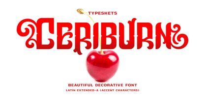 Ceriburn is inspired by the sweetness and richness of cherries. It easily evokes impressions of nature, elegance, and romanticism. You can use this stunning decorative font for logos, packaging, business cards, crafts, books, labels, headlines, invitations, print templates, and a multitude of other design ideas! Letter, Number & Punctuation, Accent Characters, Alternates Features.
 - Ghoist by Canden Meutuah,
$20.00 is a fun and unique display font, a cool scary font for Halloween and other scary themed activities. Add this unique and spooky display font to any of your creative ideas and watch how it makes it stand out! Enjoy, I hope you are satisfied with the results of my font. thank you
 - Katerlin by Muksal Creatives,
$12.00 Katerlin is a handwritten font which feels incredibly elegant and flowing. It looks stunning on wedding invitations, thank you cards, quotes, greeting cards, logos, business cards and every other design which needs a handwritten touch. This font is PUA encoded which means you can access all of the glyphs and swashes with ease!
 - Mushmellow by Ingrimayne Type,
$10.95 An informal, rather bold typeface without serifs, Mushmellow looks like it might have been written with a marker pen. In addition to the plain and bold weights, it comes with outline and “cactus” variants.
 - User Stencil by DSType,
$30.00 User is a monospaced type family with 30 styles, from Hairline to Bold, divided in Regular, Upright and Stencil, with five weights (Hairline, ExtraLight, Light, Medium and Bold) all with Cameo versions. Complexity and versatility are the keywords for this type family. Despite being a monospaced font, which means there's no kerning, all the glyphs were designed in order to sit comfortably in the 600 points width, a hard task because some glyphs are too narrow ('i' and 'l'), while others are too wide ('m' and 'w'), but they must fit the same width. The desire for keeping a comfortable readability in User was one of the key elements, therefore we designed several ligatures that fit both single and double space width, allowing to maintain a certain idea of proportional design. In this digital booklet you will find a detailed vision of the anatomy of the typefaces, the amount of characters available, the styles and weights, along with a series of features, specially designed to make User a very versatile and usable type system.
 - User Upright by DSType,
$30.00 User is a monospaced type family with 30 styles, from Hairline to Bold, divided in Regular, Upright and Stencil, with five weights (Hairline, ExtraLight, Light, Medium and Bold) all with Cameo versions. Complexity and versatility are the keywords for this type family. Despite being a monospaced font, which means there's no kerning, all the glyphs were designed in order to sit comfortably in the 600 points width, a hard task because some glyphs are too narrow ('i' and 'l'), while others are too wide ('m' and 'w'), but they must fit the same width. The desire for keeping a comfortable readability in User was one of the key elements, therefore we designed several ligatures that fit both single and double space width, allowing to maintain a certain idea of proportional design. In this digital booklet you will find a detailed vision of the anatomy of the typefaces, the amount of characters available, the styles and weights, along with a series of features, specially designed to make User a very versatile and usable type system.
 - User by DSType,
$30.00 User is a monospaced type family with 30 styles, from Hairline to Bold, divided in Regular, Upright and Stencil, with five weights (Hairline, ExtraLight, Light, Medium and Bold) all with Cameo versions. Complexity and versatility are the keywords for this type family. Despite being a monospaced font, which means there's no kerning, all the glyphs were designed in order to sit comfortably in the 600 points width, a hard task because some glyphs are too narrow ('i' and 'l'), while others are too wide ('m' and 'w'), but they must fit the same width. The desire for keeping a comfortable readability in User was one of the key elements, therefore we designed several ligatures that fit both single and double space width, allowing to maintain a certain idea of proportional design. In this digital booklet you will find a detailed vision of the anatomy of the typefaces, the amount of characters available, the styles and weights, along with a series of features, specially designed to make User a very versatile and usable type system.
 - Globe Grotesk Display by Jan Charvát,
$26.50 Globe Grotesk is modern art deco inspired sans serif. Its root goes to beginning of last century into Czechslovakia. The design is inspired in Universal Grotesk – font made by unknown designer. There are some really unique details in the font, especially letters a, g, u, E, F, R, & and many more. It primary intended for display usage or rather shorter texts. The original is extended with full latin support, ligatures, small caps, alternates, inktraps, oldstyle figures and many more features necessary for contemporary type design. Also true italics are no doubt in this font.
 - Adorn Garland Smooth by Laura Worthington,
$29.00 Adorn Garland is a script face that runs along a somewhat “vintage” direction. Rather than deriving its strength from a heavy skeleton or structure, it uses its sense of contrast, its light touch upon the page, and its elongation to provide a visual break – it can function as a long string, rule, or dividing line. With 166 swashes. See what's included! http://bit.ly/1rYDcmQ This font has been specially coded for access of all the swashes, alternates and ornaments without the need for professional design software! Info and instructions here: http://lauraworthingtontype.com/faqs/
 - Avone by Almarkha Type,
$29.00 Introducing AVONE is a Stylish modern serif font with a stylish touch inspired by the famous minimalist logo and AVONE has 2 Regular and Stencil styles is perfect for the purposes of designing templates, brochures, videos, advertising branding, logos and more. What’s Included : Standard glyphs Web Font Multilingual Accent Works on PC & Mac , Simple installations Accessible in the Adobe Illustrator, Adobe Photoshop, Adobe InDesign, even work on Microsoft Word. PUA Encoded Characters – Fully accessible without additional design software. Fonts include multilingual support Image used : All photographs/pictures/vector used in the preview are not included, they are intended for illustration purpose only. Thank’s Cheers!

