10,000 search results
(0.038 seconds)
- Raniscript by Stephen Rapp,
$59.00 Raniscript started out as an idea for a bold and strongly structured ronde style script with some contemporary touches. As I tinkered with various forms it took on a life of its own. Having an old world feel, it makes me visualize faded shop signs from India written in English. The name comes from a series of colorful vintage matchbook designs advertising the Flying Rani. You'll find Raniscript ideal for packaging, book titles, brochures or anything requiring a robust display treatment. It comes fully loaded for OpenType savvy applications. Three full sets of caps are included. By clicking the Titling button in Illustrator you can type using an all caps set that includes ligatures, case sensitive punctuation and language coverage. Other features include oldstyle figures, Central European language support, fractions, contextual letter substitution, swash characters, and ornaments.
 - 2009 Primitive by GLC,
$38.00 This is not an historically accurate font but rather one intended capture the spirit of ancient Roman manual type. It was inspired by various patterns used in documents and books created by Latin scribes between the second and fourth centuries. They used either calamus and ink on papyrus, or a pointed metal stick on wax tablets. We have created the font for contemporary use; distinguishing between U and V, I and J, which had no meaning for ancient Latin scribes, and adding thorn, Oslash, Lslash, W, Y and common accented characters that did not exist at the time. A lot of titlings and contextual alternates complete the set. Available only in TTF and OTF format.
 - Billy by SparkyType,
$19.00The Billy family contains three individually useful and fun fonts. When combined, the energy and strengths of the different weights play off each other creating an essential family. - Scriptuale by Linotype,
$29.00The Scriptuale family, which contains eight styles, is a contemporary upright calligraphic face. Designed by German designer Renate Weise in 2003, this family of typefaces speaks to the present, while at the same time reflecting on a lyrical past. The letterforms of the Scriptuale family are romanticized, they reference German calligraphic styles from the 19th and early 20th Centuries. For instance the design of Scriptuale's uppercase strays from the canon of classical proportion into romantic idealism. While the C and O are drawn according to the ancient quadratic proportions - almost twice as wide, optically, as the E or the L - the letter A is wider than would be expected, and the D narrower. These subtle differences introduce a different rhythm into text set in Scriptuale than Italic styles of calligraphy may offer. Scriptuale's Gs merit special notice: both the upper and lower case G lunge slightly forward, further enhancing the dynamic quality of the text. Also unique in Scriptuale's design is the lowercase width: the letterforms appear slightly condensed; they have large x-heights to compensate for this. In a delightful twist, the number 2's beak has been closed by drawing it full-circle, back into the stem: this references a style of letter design that was practiced, among other places, by artists from the old Klingspor foundry in Offenbach Germany. Typefaces constructed there easily captured the zeitgeist of the romantic period, but are less calligraphic than Scriptuale (e.g., Rudolf Koch's Koch Antiqua). A semi-serif face (like Prof. Hermann Zapf's Optima or Otl Aicher's Rotis Semi), some of Scriptuale's letters have serifs (D), and some do not (A). And although both the B and the E normally have the same "structure" on their left side, Weise has drawn them differently in Scriptuale. These strengthen the calligraphic-like quality of the family. Traces of the pen are easy to see in Scriptuale's design; it is a thoroughly calligraphic face. The eight typefaces in the Scriptuale family include Light, Regular, Semi Bold, and Bold weights. Each weight has a companion italic. Scriptuale is similar to one other contemporary calligraphic family in the Linotype portfolio, Anasdair , from British designer - Love Paradise by Putracetol,
$18.00 Love Paradise is a quirky love font with 6 different versions of the font, the difference between each version is in the shape of the heart decoration. This font is basically soft and fun, and coupled with heart decorations of various shapes and choices, will make this font suitable for the projects you are working on, especially those themed on love, valentine, children, babies, weddings, etc. In addition, this font is also suitable for invitation cards, greeting cards, logos, branding, posters, crafting, stickers, social media, packaging, headers, merchandise and others. This font is also support multi language.
 - Madiffure by Ridtype,
$25.00 Madiffure is a modified neo-grotesk gothic font; this font basically has no consistency in several letter styles, so this font looks unique and bolder in its application of letter development. And this font is suitable for bolder and more modern design themes to apply to certain design uses. On the other hand, we also paid attention to making this font more pleasing to the eye so that it is more comfortable to read even at the smallest size. The Madiffure font is also equipped with Cyrillic as an addition to the basic language style, namely Latin 1 and 2.
 - Eutopia by Tipofil,
$- I was inspired by the letters of the mythical “Ideales” tobacco package, designed in 1936 in Barcelona by Carlos Vives, director of the designers studio of the Rieusset graphical industry. We have also studied other geometrical models from the 1920s, to be highlighted among them the alphabet drawn by Cornelis André Vlaanderen at Amsterdam in 1928, which would have been very probably the inspiration for the famous tobacco package. Eutopia has been born with the aim to be useful for the current graphic communications. For that purpose almost 400 glyphs have been designed and more than 2200 kerning pairs have been defined. The multiple diacritic signs have been prepared to allow a multilingual use in most of the languages based on Latin alphabet. The OpenType features have been used to get alternate characters of “A” and “g”, and also ligatures, lowercase numbers and other typographic refinements.
 - Privilege Sign Two JNL by Jeff Levine,
$29.00 Unique and decorative signage for many drive-ins, motels, food stores and other businesses of the 1940s had what was referred to as “privilege signs” provided by one of the major cola brands. Consisting of the brand’s emblem on a decorative panel, the remainder of the sign would carry the desired message of the storekeeper (such as “Drive-In”) in prismatic, embossed metal letters. Inspired by the Art Deco sans serif style of those vintage signs, Privilege Sign Two JNL recreates the type design in both regular and oblique versions. The typefaces are solid black, but adding a selected color and a prismatic effect from your favorite graphics program can reproduce the look and feel of those old businesses. This is a companion font to Privilege Sign JNL, which recreates the condensed sans serif lettering of other privilege signs from the 1950s and early 1960s.
 - Moving Headlines JNL by Jeff Levine,
$29.00 For decades, visitors to Times Square could look up and read the up-to-the-minute news flashes that moved across a giant electric sign on the face of the old New York Times Building (now known simply as One Times Square). According to Wikipedia's article on OneTimes Square: "On November 6, 1928, an electronic news ticker known as the Motograph News Bulletin (colloquially known as the "zipper") was introduced near the base of the building. The zipper originally consisted of 14,800 light bulbs and a chain conveyor system; individual letter elements (a form of movable type) were loaded into frames to spell out news headlines. As the frames moved along the conveyor, the letters themselves triggered electrical contacts which lit the external bulbs (the zipper has since been upgraded to use modern LED technology)." An example of this was seen in the 1933 Warner Bothers film "Picture Snatcher" starring James Cagney. This example inspired Moving Headlines JNL.
 - Reporter No. 2 by Linotype,
$29.99 Carlos Winkow designed Reporter in 1938 for the Wagner foundry. The strokes of this interesting script have the texture of dry brushwritten letters. The alignment is slightly irregular, giving it a spontaneous feeling. Reporter No. 2 is a slightly simplified version of the original Reporter, without the numerous small white strokes inside its stems, which gave the original a scribbly effect. The font is bold and informal. It works well in signs, posters, and other display uses.
 - Colorado by Juliasys,
$- Nature is fond of stripes. Animals have them, plants have them and the rainbow has them. Besides being beautiful, stripes in nature have various origins and functions. But only Homo sapiens gave them symbolic meaning. In the American flag, the 13 stripes symbolize the 13 colonies that declared independence from Britain. In the French “Tricolour” flag, they represent Paris and the king of France. And in Russia’s “Georgiyevskaya lenta,” they symbolize the death and resurrection of St. George, the dragon-slayer. The font family COLORADO , named after the beautifully striped Colorado potato beetle, can be used to construct all kinds of symbolic or just beautiful messages. And thankfully, you need no OpenType diploma to do this. To get your texts multi-striped and multicolored, follow this simple procedure: Write the message with one of the COLORADO fonts and apply a color. Then copy and paste in place, and apply a second font and color. Repeat this again if wanted – and the masterpiece is done. COLORADO ’s language support covers about 100 languages. It has a Western European, a Central European and an Extended Cyrillic character set.
 - Quirky Notes by Insan Perkasya,
$12.00 Introducing the "Quirky Notes" font, which is a handwriting font made specifically for notes, but even though it is specifically for notes, this font is also very suitable for other things, such as quotes, lesson schedules, branding, logos and others. Quirky Notes font is made by handwriting so it produces natural strokes but is still beautiful to use. If you have any questions, don't hesitate to contact us. Thank You
 - CYRON by Tadiar,
$27.00 CYRON Tech Serif is unique serif font combines hi-tech cyberpunk and futuristic atmosphere and classic serif's style. There are Uppercase and Lowercase letters done the way they ideally connect with each other. Multilingual support (Latin extended). It is designed for header and text both. Use it in your projects in such areas as robots & androids, cyberpunk, hi-tech, future, virtual reality, space, army, games and many others.
 - Sidewalker by FSD,
$50.00In Sidewalker we can see pieces of OCR-A, letters and of other fonts; letters pressed over metallic supports with too much ink and then redesigned on a computer. Reminiscent of how different materials in Burri or Rauchenberg's paintings are used. Some numbers have the same shape of some letters (J=2, 6=G=9, I=1=l ...) and many pieces of letters are copied into others. Very experimental... - Balissha by Yoga Letter,
$15.00 "Balissha" is a natural and elegant handwritten font with butterfly and flower decoration on the alternate letters. This font is perfect for mothers day, autumn, valentine, wedding, engagement, christmas, stickers and more. Equipped with uppercase letters, lowercase letters, numerals, punctuations, swash, titling, uppercase alternates, ligatures and multilingual support.
 - Vicenza by Almarkha Type,
$29.00 Introducing Vicenza – Elegant Serif a Luxury serif font with a stylish touch inspired by the famous minimalist logo and Vicenza has 2 regular and Italic styles is perfect for the purposes of designing templates, brochures, videos, advertising branding, logos and more.
 - Quakiez by Almarkha Type,
$20.00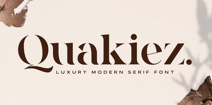 Quakiez is a luxury modern serif font with a stylish touch inspired by the famous minimalist logo. Quakiez includes 2 styles (regular and display) and is perfect for the purposes of designing templates, brochures, videos, advertising branding, logos and more.
 - Blocking by Gassstype,
$27.00 Introducing Blocking is a Handmade Display Font with a stylish touch inspired by the famous minimalist logo and Blocking has 2 Regular and Stencil styles is perfect for the purposes of designing templates, brochures, videos, advertising branding, logos and more.
 - Bonus Jerk by PizzaDude.dk,
$17.00 Serifs gone crazy! They are legible and recognisable and at the same time jumpy, skewed and random! What makes it really cool is that every letter has 5 different versions - and they automatically cycle as you type. That will make your text look quite random and more authentic (rather than obviously repeating letters!) Bonus Jerk also comes with a complimenting Box version - a handdrawn background layer, made to make the letters stand more out!
 - Aront by BaronWNM,
$14.00 Aront is a font with a modern and simple style. Having round and triangular geometric shapes adds a simple and stable impression to this font, plus a slight curve at each corner so that this font doesn't look stiff. The Aront font is perfect for logos, branding, film titles, games, and other techno-themed projects. Not only limited to techno themes, this font is also suitable for use in other themes that seem clean and simple. Aront font has multilingual support, alternate, and several ligatures as a plus.
 - Deco Holiday JNL by Jeff Levine,
$29.00 A hand lettered Art Deco ‘stencil’ design used in various ads for “Holiday” and other Pathé films was found in the July 22, 1930 issue of “The Film Daily”. Similar in style to Futura Black and other like designs, it is now available as Deco Holiday JNL in both regular and oblique versions.
 - 1479 Caxton by GLC,
$38.00 This family was inspired by the two fonts used by the famous William Caxton in Westminster (UK) in the late 1400s. There is only one (Normal) style. We have added the accented characters and others not in use in the early time of printing, but the ligatures and the few abbreviations for the Old English language and Latin were present in the original fonts. The original cap height is about five to seven millimeters. Decorated letters like 1495 Lombardes, 1512 Initials, 1550 Arabesques, 1565 Venetian, and 1584 Rinceau can be used in complement with this font without anachronism.
 - Ringo by typoland,
$9.00 Whassup y’all! Me and my bros got this li’l gang together: we is Ringo, and we got da bling, yo! We is da typeface family for ya all! We got some real sweet stuff for ya, some nice characters. We got all ’em OpenType features like fractions and proportional figgers, we even got da cubic root, man! And check out da question mark, man, is real sweet. And the ampersand, yeah! I luv ’em ampersands. Now my brothers over here got some light action for ya, and they got some real bold action for ya. We got some nice foxy curves goin’ on, some nice tension, and some nice relaxation. My bro Light over here is kind of like the subtle guy, ya know. He’s in for the female fans, ya know. Heh! Hell, yeah! And man, we speak like 84 languages: we speak the German, and the French, and the Spanish, and we speak the Polish, and the Czech, and the Hungarian, and we even speak Shambala and Swahili and Rundi, and we got some Esperanto thing as well for ya. And check out my bro Black right over here, he’s like the action superhero, man! He’s got impact, man! Yeah yeah, but you know, my bros Regular and Bold are the real deal. Them is like da word of da street, man! Like da word of you, and you. And we got a message for y’all: life is hard, life is real, but you should work your mojo, be smooth, be nice, chill. We got all them kerning pairs, and all them weights, and we got ’em alternate letters. So check us out, yo!
 - Arkaim by Dima Pole,
$22.00 Arkaim is a modern typeface in traditional East-Slavic and GreatRussian style in typography. This style is not like any other style in the world. It combines elegance and brevity, depth and modernity, originality and convenience. This unique font is certainly eye-catching. Arkaim font is named after the ancient Slavic-Aryan city located in the South of Russia, which is a symbol of antiquity, wisdom, as well as the unexplored ancient world. Arkaim is not only a historical place, but also a place of Spiritual power. The font Arkaim has many Opentype features that will help to create interesting and unique compositions. An interesting and non-trivial solution is a kind of mixture of all caps and upper/lowercase characters. Arkaim contains symbols of all Slavic and European languages. There are fractions, superscripts and subscripts, and many others. There is a standard number and the old-style number, also Slavic numbers. There are all the historical characters Of the ancient Slavic script called Bukvitsa, today mistakenly called Cyrillic. In addition, here is a free demo font (only with Russian, Belarusian, Ukrainian, Bulgarian, Macedonian and Serbian characters) without Opentype features and other symbols. You can try it.. and love it.
 - Konscript by Michael Browers,
$25.00Konscript is a distressed typewriter face developed from analog samples from papers Mary Browers typed in the 1950s for her high school coursework. The model and age of the typewriter are not known. Additional characters were developed based on the analog samples to complete the character set. - Chocolate Bar JNL by Jeff Levine,
$29.00 Chocolate Bar JNL emulates hand-lettering on the sheet music for a song selection called "Shoe Shine Boy" from Connie's Hot Chocolates of 1936 (an all-black musical revue). The lettering was not found in the song's title, but rather in the name of the show itself.
 - Faberge by Larin Type Co,
$18.00 FABERGE This is elegant logo serif font. It has a light weight and playing forms, the uppercase are more elongated and the lowercase are compressed but they have the same height as the uppercase, with this you can play with space and mix them, with this you will expand the boundaries of your ideas for your project. This font has 44 ligatures ( use uppercase to get them ), 124 alternatives for uppercase and 88 alternatives for lowercase, they will add a touch of playfulness and elegance and make your design unique.
 - Benedicta by Krafted,
$10.00 Whether you wish to add some elegance to your brand or create beautiful wedding invitations, the font you choose makes all the difference. Introducing Benedicta - A Modern Calligraphy Font. It’s stylish, eye-catching, and combines perfectly with other fonts. Thanks to this, it leaves a very strong impression and makes your brand memorable.
 - Hasan Enas by Hiba Studio,
$59.00 Hasan Enas is an Arabic text typeface. This font is designed for reading texts and inspired in the simple lines of Naskh calligraphy. It supports Arabic, Persian and Urdu. The characteristic of its design is easily recognizable and very stable to use for extended texts in magazines, newspapers, books, and other publications.
 - DejaVu Sans Condensed - Unknown license

- DejaVu Sans - Unknown license

- Arzachel by CAST,
$45.00 Arzachel is a humanistic sanserif with a big x-height and a specific organic look. Its design is scientifically sharp and efficient in small type sizes as well as rugged and dramatic in headlines. Arzachel’s essential feeling comes from several features: all the letters are slightly sloped, stem terminations are flared at the top, and the terminals in letters a, c, e, f… are widening with the inside parts completely flat. The stroke contrast is low in the regular weight while it increases in the black; finally the capitals have an inscriptional flavor. Despite being a sanserif (thus a product of recent typography) Arzachel’s roots stretch back to the Renaissance tradition: Olocco took inspiration from some of the early and rather weird types cut in Venice in the 15th century. Arzachel was conceived during Olocco’s MA in Reading to provide a companion for his Zenon for use in small type sizes. But instead of expanding the Zenon family with optical sizes, the designer decided on a sans with its own personality rather than a sanserif version of Zenon with chopped-off serifs.
 - Journal Hand by Typadelic,
$9.95 Journal Hand was inspired by a 45-year-old travel diary I bought at an estate sale. The carefully constructed all-uppercase letters indicated that this traveler cared about style and legibility. Each picture, postcard and brochure that was glued into the diary had a neatly written caption and I admired the care this day tripper took to record his European trek. While the pages are now yellowed and falling apart, the handwriting is still legible and stylish. Because his handwriting totally suits today's uses, I re-created it in modern journalistic style that looks like it was written with a technical pen. Use this typeface when you need a neatly handwritten style. Uppercase only!
 - NOW YOU SEE ME - Personal use only

- Only Fools & Horses - Personal use only

- LIGHT EMITTING DIODES - Personal use only

- Calligraphy Double Pencil - Personal use only

- New Kakuji by Edomoji Type,
$15.00 New Kakuji is designed from the Kakuji style of characters originating during the Edo period of Japan. New Kakuji has expanded the historical character set to include the surnames from the ancient Chinese text: Hundred Family Surnames, as well as the most common surnames in Japan, in addition to many other historically and culturally significant words, going well beyond the scope of characters that were used in the Edo period. No other font has expanded the character set of the Kakuji Style to the same extent as New Kakuji. A Latin alphabet expansion inspired by the old Kakuji style has also been included for western audiences and designers. New Kakuji contains over 500 Chinese/Japanese characters along with over 200 additional Latin characters or symbols. The solid and blocky style of New Kakuji is ideal for seal designs or other branding designs and should be used at larger point sizes.
 - Broodim by Twinletter,
$18.00 The Broodim Groovy font is unique, stylish, and fun. Having an anatomical shape between thin and thick lines makes it beautiful and visually unique from most other fonts. Your project can be made more stunning by adding this font. Not only that, but this font also features cool alternative letters and ligatures to add a unique flair to your projects. Make the most of your designs by using this font today.
 - Andes Condensed by Latinotype,
$29.00 Andes, designed by Daniel Hernández, is a display typeface that has neo-humanist characteristics. Its different terminals, among other elements, give it a look of mixed typography. Andes is a typeface with 10 Upright weights ,10 Italics & Condensed version, ranging from Ultra Light to Black, each of the same x-height. This typeface contains additional italic glyphs (a, y, z, g) that help to emphasise text or words. Andes is based on the design of Merced and both of them share several features.


