10,000 search results
(0.087 seconds)
- Trigomy by Markus Reiter,
$24.90 Trigomy is a proportional pixel font designed on a 5 pixel grid. It is intended for either very small text or as huge display font for posters and the like. To get a crisp look this font should be used at 10 pt or multiples of 10 pt. (A tip for Adobe Creative Suite applications is to change the standard anti-aliasing method from “sharp” to “crisp” and to align the text to whole pixels. Also avoid centered text.) To get started with type design I thought it was best to start with a pixel font because you don't have to focus much on the design itself, but rather have to focus on how kerning and spacing works and the various features you can implement with OpenType. And of course I wanted to have a pixel font that had all that I was missing from other pixel fonts. We were learning trigonometry at the time I started designing Trigomy, and most of the time I misspoke it “trigometry”. So, when I had to come up with a name for my first font I thought: "Why not go with Trigomy?"
 - Budare by fragTYPE,
$14.00 Budare is a geometric font family that rebelled to find its own identity within an ocean of other typefaces of the same style. Its design is based on the shape of the wrought iron plate used in Venezuela and other countries to make arepas and other foods. Its appearance is strongly defined by basic geometric shapes such as the circle and its upright style is accompanied by rotated italics "rotalics" that complement its rebellious spirit. Because of its strong display characteristics, its best uses are focused on posters, branding, titles and anything that needs a strong graphic emphasis.
 - Doge's Venezia by Greater Albion Typefounders,
$15.00 Doge’s Venezia is one of a set of four typefaces, the others being Doge’s Delight, Doge’s Darker and Doge’s Banner. Together they make up a splendid family of Victorian inspired Tuscan faces, allowing for an integrated design approach.
 - Doge's Darker by Greater Albion Typefounders,
$15.00 Doge’s Darker is one of a set of four typefaces, the others being Doge’s Delight, Doge’s Banner and Doge’s Venezia. Together they make up a splendid family of Victorian inspired Tuscan faces, allowing for an integrated design approach.
 - Summer Sugar by Selvia Design,
$15.00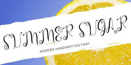 "Summer Sugar" is a unique, curly handwritten font. This font is equipped with uppercase, lowercase, numerals, punctuation, and multilingual support. It is suitable for summer, graduation, Christmas, the 4th of July, memorials, banners, branding, stickers, ornaments, and others.
 - Vegan Food by Goodigital13,
$20.00 This font perfectly made to be applied especially in logo, and the other various formal forms such as invitations, labels, magazines, books, greeting / wedding cards, packaging, fashion, make up, stationery, novels, labels or any type of advertising purpose.
 - Doge's Delight by Greater Albion Typefounders,
$15.00 Doge’s Delight is one of a set of four typefaces, the others being Doge’s Darker, Doge’s Banner and Doge’s Venezia. Together they make up a splendid family of Victorian inspired Tuscan faces, allowing for an integrated design approach.
 - Sereno by Robert Corseanschi,
$19.99 This font family includes six very unique font styles & weights. The font styles are applicable for any type of graphic design - web, print, motion graphics, etc. and perfect for t-shirts and other items like posters and logos.
 - Beautiful Easter by Yoga Letter,
$14.00 "Beautiful Easter" is a quirky and cute handwritten font. This font is decorated with bunny ears in the uppercase. Equipped with uppercase, lowercase, numerals, punctuation, and multilingual support. It is suitable for Easter, spring, wedding moments, and others.
 - Doge's Banner by Greater Albion Typefounders,
$15.00 Doge’s Banner is one of a set of four typefaces, the others being Doge’s Delight, Doge’s Darker and Doge’s Venezia. Together they make up a splendid family of Victorian inspired Tuscan faces, allowing for an integrated design approach.
 - Yaa Type by artill,
$20.00 Yaa! Type is a hand-sketched headline font. The family contains a light and bold weight; both complement each other perfectly. Created solely by me from sketch by hand and then digitized, yaa! Type makes a perfect font to create the hand-made character look, or to supplement illustrations with typography.
 - Llawysgrifen by Evermore Type,
$- Llawysgrifen (Welsh for Handwritten) is a custom handwritten font created by Michael Kalber. It is unique from other script fonts because each character was created by hand, meaning no two characters are alike. This font is available in the Latin, Greek, and Cyrillic alphabet, with the Hebrew and some Arabic characters.
 - Dollar Days JNL by Jeff Levine,
$29.00 The National Show Card Writer sign making set contained many different sizes and styles of lettering stencils, and additional type designs could be purchased as add-ons. This product was one of the many economical ways merchants, religious organizations, schools and others could make their own signs at low cost.
 - Eutheric by Typotheticals,
$10.00This plain serif can be used for a variety of purposes. Good for headlines and larger text usages. Hulbert is a comical look at the Eutheric family. It is useful for those moments where no other font will fit. Eutheric is a serif style look at the Cooper type of fonts. - Invincible Duo Script by Prestige Artsy Studio,
$19.00 Introducing Invincible Duo, a sleek, modern, and clean font package designed to elevate your creative projects. This dynamic duo consists of two fonts that perfectly complement each other, offering endless possibilities for your designs. The first font, a beautiful script, exudes elegance and charm. With an abundance of ligatures — over 170 ligatures, with every word becomes a work of art. Its flowing strokes and intricate details add a touch of sophistication, making it ideal for invitations, logos, branding, and other projects where a touch of beauty is desired. The second font, a bold sans, brings a contemporary edge to the table. With its clean lines and strong presence, it grabs attention and exudes confidence. Perfect for headlines, titles, and bold statements, this font adds a bold and modern touch to your designs, creating impact and visual appeal. Invincible Duo is carefully crafted to ensure seamless harmony between the script and sans font. When used together, they create a stunning visual contrast that captivates the audience. Whether combined or used individually, these fonts make a lasting impression and deliver a powerful, cohesive message.
 - Hailea by Fateh.Lab,
$15.00 This font family is perfect for those who want to make their designs stand out. It has a modern style with soft but firm characters, making it different than most other fonts you'll see on the market today! This fresh and cheerful theme will work well in any project - whether its posters or social media posts- as long as they have large print formats available (or anything else). With 5 choices of typeface styles, plus some cool free vector bonuses thrown into the mix too; there's no reason why anyone shouldn't give this amazing font bundle a try!
 - Gallazzi by Twinletter,
$15.00 Gallazzi is a fun display typeface with a lovely and attractive appearance. Start using this font in your project since it is smooth, cool, and cute to the eye. Then you’ll have a project that is truly distinctive and cheerful in comparison to others because the harmony and harmony will make your project bolder and bolder and look different. Let’s construct an awesome project using this typeface, and make it one of a kind. This font is perfect for games, sporting events, branding, banners, posters, movie titles, book titles, quotes, logotypes, and more. Start using our fonts for your amazing projects.
 - Melodia by PintassilgoPrints,
$29.00 This one may look rather strange at a first sight, but it has the true power of coolify written pieces. (Please don’t use it to say “Attorneys’s Conference”, nor “Annual Statement of Accounts”, unless you mean them to be cool, which is very unlikely.) Melodia has 3 glyph drawings for each uppercase letter, 3 more for each lowercase and 2 for the numerals. There are even alternates for punctuation, go figure: there are 3 commas and 3 periods. Surprising. To activate the automatic cycling of all these alternates, simply turn on the Contextual Alternates feature in your application. And it doesn’t hurt to remind: use it only on cool stuff.
 - Genesis by Canada Type,
$29.95Genesis is a digitization and expansion of a Frank Riley metal typeface called Grayda, originally published to much applause by ATF in 1939. The concept for this disconnected script is quite novel and original among cursives and calligraphic fonts: The minuscules are mostly made with slightly clubbed strokes, which becomes clearly visible in the ascenders and descenders. This alone gives the face a bubbly appearance unlike any other. The formula is completed with two sets of beautiful calligraphic majuscules and a few alternates. The character set of Genesis boasts full support for Western, Central and Eastern European languages, as well as Baltic, Celtic/Welsh, Esperanto, Maltese, Turkish and Vietnamese. Genesis is available for all platforms and in all popular formats. Genesis Pro, the OpenType version, is where the caps and a few other variations alternate stylistically at the push of a button in OT-savvy applications. Genesis Pro also contains class-based kerning. - Bitstream Vera Sans - Unknown license

- Acuta by Anatoletype,
$27.00 Acuta is a new all-purpose text serif with a good readability and a contemporary, robust look thanks to its low-medium contrast. The differences between thicks and thins are less strongly marked than in oldstyle text faces; yet the diagonal stress needed to facilitate reading is partly provided by the letter shape itself: sharp angles and italic construction give the right dynamism to the text. Acuta becomes very distinctive as a headline, while its big x-height makes it suitable for texts at rather small sizes too. The family consists of seven weights & correspondent italics, with a large character set. The Book and Medium weights, relatively close to each other, can both be used as “plain” weight depending on the size of the text, background color or backlighting. Small caps, oldstyle and tabular figure alternates, superiors and inferiors and ligatures are available in all styles through OpenType features. The real italics include unobtrusive swash alternates to emphasise the written feeling. Please find a specimen of Acuta (PDF) in the Gallery section.
 - Saihat by Alit Design,
$19.00 The Saihat font is inspired by Arabic or Middle Eastern style calligraphy. This font is made with Latin characters so that it can be read internationally which does not have to be able to read Arabic characters. This font is perfect for Middle Eastern or Muslim designs. In addition, the Saihat font can also be used for other decorative design concepts.
 - Mohawcs Note by Galapagos,
$39.00Friendly. Open. Self-confident. Generous and inclusive. Intellect and libido guided by the measured tension and release patterns of a well-validated ego. So might a graphologist characterize the handwriting reflected in this useful script typeface. Designed for penning short notes and other informal correspondence, this attractive design could easily become one's most-used font, regardless of how large a library is available. - Ussr by Indian Summer Studio,
$20.00 The main 20-th century handwritten display font in the USSR, usually performed with a flat brush or a wide poster pen for all kinds of signage during 1920-1990s. It had also many analogues in other countries, but never was that popular as in the Soviet Union, used everywhere.
 - Fd Artheria Script by Fortunes Co,
$23.00 Artheria is a script font with a classic vintage style. The classic style of this font is suitable for retro/vintage-themed designs but can also be used for designs with other styles. This font is equipped with 130+ stylistic sets, Ligatures, and multi-language support.
 - Ramisa Faux by Twinletter,
$15.00 Ramisa is a Japanese-style font that is designed as uniquely as possible to create a beautiful and easy-to-read combination of sentences. Of course, this font is also very flexible for you to use in your various projects, ensuring that your project has a fantastic and appealing appearance that will be remembered by all audiences. Logotypes, food banners, branding, brochure, posters, movie titles, book titles, quotes, and more may all benefit from this font. Of course, using this font in your various design projects will make them excellent and outstanding; many viewers are drawn to the striking and unusual graphic display. Start utilizing this typeface in your projects to make them stand out.
 - Classic Grotesque by Monotype,
$40.99 Classic Grotesque by Rod McDonald: a traditional font with a modern face. The growing popularity of grotesque typefaces meant that many new sans serif analogues were published in the early 20th century. Setting machines were not compatible with each other but all foundries wanted to offer up-to-date fonts, and as a result numerous different typeface families appeared that seem almost identical at first glance and yet go their separate ways with regard to details. One of the first fonts created with automatic typesetting in mind was Monotype Grotesque®. Although this typeface that was designed and published by Frank Hinman Pierpont in 1926 has since been digitalised, it has never achieved the status of other grotesque fonts of this period. But Monotype Grotesque was always one of designer Rod McDonald’s favourites, and he was overjoyed when he finally got the go-ahead from Monotype in 2008 to update this “hidden treasure”. The design process lasted four years, with regular interruptions due to the need to complete projects for other clients. In retrospect, McDonald admits that he had no idea at the beginning of just how challenging and complex a task it would be to create Classic Grotesque™. It took him considerable time before he found the right approach. In his initial drafts, he tried to develop Monotype Grotesque only to find that the result was almost identical with Arial®, a typeface that is also derived in many respects from Monotype Grotesque. It was only when he went back a stage, and incorporated elements of Bauer Font’s Venus™ and Ideal Grotesk by the Julius Klinkhardt foundry into the design process, that he found the way forward. Both these typefaces had served as the original inspiration for Monotype Grotesque. The name says it all: Classic Grotesque has all the attributes of the early grotesque fonts of the 20th century: The slightly artificial nature gives the characters a formal appearance. There are very few and only minor variations in line width. The tittles of the ‘i’ and ‘j’, the umlaut diacritic and other diacritic marks are rectangular. Interestingly, it is among the uppercase letters that certain variations from the standard pattern can be found, and it is these that enliven the typeface. Hence the horizontal bars of the “E”, “F” and “L” have bevelled terminals. The chamfered terminal of the bow of the “J” has a particular flamboyance, while the slightly curved descender of the “Q” provides for additional dynamism. The character alternatives available through the OpenType option provide the designer with a wealth of opportunities. These include a closed “a”, a double-counter “g” and an “e” in which the transverse bar deviates slightly from the horizontal. The seven different weights also extend the scope of uses of Classic Grotesque. These range from the delicate Light to the super thick Extrabold. There are genuine italic versions of each weight; these are not only slightly narrower than their counterparts, but also have variant shapes. The “a” is closed, the “f” has a semi-descender while the “e” is rounded. Its neutral appearance and excellent features mean that Classic Grotesque is suitable for use in nearly all imaginable applications. Even during the design phase, McDonald used his new font to set books and in promotional projects. However, he would be pleased to learn of possible applications that he himself has not yet considered. Classic Grotesque, which has its own individual character despite its neutral and restrained appearance, is the ideal partner for your print and web project.
 - Amateur Typewriter by Ana's Fonts,
$12.00 Amateur Typewriter is a monospaced typewriter font, sampled from a real vintage typewriter, that is so much fun to use. Each letter and number includes 3 versions that are slightly different from each other and appear “randomly” through the contextual aternates OT feature. This gives this typewriter font an extra dose of realism. The alternative versions of the font (strikethrough, crossed and underlined variations) make it perfect for any design that needs a quirky but very legible typewritten feel, in both titles and longer texts. Use Amateur Typewriter in: logotype design, postcards and tags, editorial and website designs, projects that need a retro look, such as digital collages, among others. What you will get in this set: - A regular version of the Amateur Typewriter font with an Italic variation - Strikethrough, Crossed-out and Underlined versions of the font, with Italic alternatives, for a total of 8 fonts
 - Art School by AVP,
$25.00 Faithfully reproduced from my father’s design drawings made at The Municipal School of Arts and Crafts, Wolverhampton in 1939. Strong nostalgic influences of Art Nouveau and Art Deco. What caught my eye was the consistency with which each particular character was formed: every ‘R’ like every other, every ‘S’ the same. Tight letter spacing and loose word spacing characterised his titling but he didn’t trust himself to print without first ruling guidelines, a hint of which remain in this font.
 - Berliana Monoline by Junanobi,
$14.00 Berliana Monoline is typeface was inspired by handwriting using markers. While the name is a word other than Diamonds, namely jewelry worn by many women in the world. Diamond jewelry is so expensive and full of luxury. As regards with diamonds, this font was created to present the luxury of very beautiful diamonds. This font is suitable for wedding invitations, design, logo or branding, or as the font for the typography. Many features in this font such as ligatures, stylistic alternate, fina, swashes, etc with a total more than 370++ Glyphs.
 - Kilometro Display by Hueso,
$20.00 Kilometro Display is a Font Family inspired by the chrome car emblems of the auto industry. In the early 1950s Car manufacturers started using this sort of joint-lettering (script) to write their brand or model on their cars. The trend quickly made it’s way to other industries like electric appliances and it lasted for a good 30 plus years. Today only a handful of brands still uses this font style for their products. This geometric script re-lives a bold past all the way through 5 styles to a thin future.
 - Umbrella Man by Hanoded,
$15.00 Some time ago, I read an article about the Kennedy assassination. In that article, a person dubbed ‘the umbrella man’ played a rather bizarre role: apparently an innocent bystander with an opened umbrella was thought to be in cahoots with Kennedy’s killer. I immediately thought that the name ‘Umbrella Man’ was a good title for a horror movie, so when I created this rough brush font, I named it Umbrella Man.
 - Black Memory by Dumadi,
$25.00 Black Memory is a Brush-style font created with the App. The natural stroke texture makes this font look more perfect to use. Black Memory consists of capital letters and lowercase letters with different shapes so that you have a choice that fits the design you make. This font is perfect for Movie Titles, horror movie titles, action, murder, spooky, ghost, and other movie titles. You can see the sample preview above for comparison, stay the center of attention and classy!
 - Andron 2 by SIAS,
$44.90 The sister fonts Andron 2 English and Andron 2 Deutsch provide a groundbreaking new possibility to render literature text bodies in a sophisticated traditional and yet modern way of type. In German typographic history there has once been a long-lasting struggle called the Frakturstreit (the blackletter quarrel). It was about wether German text ought to be composed in blackletter or rather in Roman type, a question upon which even Goethe, Schiller and other period celebrities got grey over time. However, blackletter type remained alive and has just recently seen an astonishing renaissance. This is not about a blackletter revisionism or some ‘mixture’ concept arguably bridging the gap between either worlds. Andron 2 English and Andron 2 Deutsch offer a new approach to circumvent that old antagonism. As for the lowercase letters I applied certain features of blackletter type onto the glyphs – but entirely abandoned the principle of the broken stroke as such. The result is a lowercase alphabet in the classical Andron style which may be considered an attractive alternative for text in English, German or even other languages. So it’s no longer entirely about choosing between ‘modern’ Roman or ‘ancient’ blackletter only. Andron 2 English Regular and Andron 2 Deutsch Regular feature the same lowercase glyphs but differ in the majuscules (Andron 2 English has normal Latin capitals). ++++ 2012 + NEW! +++ In response to its growing popularity we now present five new fonts as part of the Andron 2 series. Andron 2 English is completed by an Italic and a Bold font. Andron 2 Deutsch now contains three interesting alternative fonts: Italic, Scriptive and Laendlich. Last but not least – A new set of wonderful classical typographic ornaments is part of the Italic and Scriptive fonts. – You can also purchase these ornaments separately as “Andron Ornamente”.
 - Malkiya by IM Studio,
$19.00 Malkiya is a strange font that stands out for its versatility. His personality develops through his particular modulation, which grows with load; making it a rather jovial typeface that doesn't abandon the more whimsical characteristics of the classic. With five styles available: Regular, italic, distort, bold, outline as well as a variety of exquisite variations, this font offers incredible flexibility for your designs.
 - Ardalos by Dhan Studio,
$19.99 Ardalos is a modern brush font, a contemporary approach to design, rather having a slight texture on the edges of the letters and this font also has an underline that makes your design more attractive. Suitable for use in title designs such as clothing, invitations, booklets, stationery designs, quotes, branding, logos, greeting cards, t-shirts, packaging designs, posters and more.
 - Off Yer Trolley by Hanoded,
$10.00 I really like the UK and I quite enjoy the British slang. Off Yer Trolley is one such expression. It means ‘behaving in an unusual way or doing something silly’. It just popped in my head when I was looking for a name for this rather silly font. Off Yer Trolley is a handmade cartoon or kids font. As the name implies, this font certainly behaves in an unusual way and you can use it for something silly as well!
 - Tinkuy Patterns by Sudtipos,
$29.00 Meaning of Tinkuy. Tinkuy is a Quechua word that means a meeting of opposing forces that complement each other. A meeting of opposites and differences. A meeting point where different thoughts, interests, feelings and aspirations confront and converge, providing the resurgence of new ways of thinking and that are embodied in confrontational actions, in mobilizations that seek change. Tinkuy patterns is born from the analysis of different archaeological pieces of native cultures of the Andes, where the visual signs that are recorded on them are related to the concept of encounter. It is part of the research project Crónicas Visuales del Abya Yala by designer Vanessa A. Zúñiga Tinizaray. — The Tinkuy Patterns. The Tinkuy Patterns system is divided into six files containing a total of more than 2650 modules that can be combined together creating an infinite range of possibilities. The digitization of the typeface family has been carried out by Ale Paul, through the Sudtipos foundry. An infinite number of possible combinations can be accessed by using the letters on the keyboard. Although a certain shape predominates in each set, they can be combined with each other.
 - Engravure by Monotype,
$40.99Robert Wiebking based the Engravure face on the Engravers faces developed by American Type Founders around 1903. Engravure can be used as a titling font for magazines, brochures, and book covers. It is also suitable for packaging and stationery. - Sevil alias Esra Lite - Unknown license


