10,000 search results
(0.062 seconds)
- Classification JNL by Jeff Levine,
$29.00 Sometimes it's easy to find a name to fit a font design, other times it's a struggle because of the sheer number of digital fonts available and the number of names already taken. Classification JNL stretches a point to arrive at its name. The attractive sans design was found as a hand-lettered title on a piece of vintage sheet music called "My Hawaiian Souvenirs". During the 1940s, the popular mode of travel to other countries was by steamship. Steamship passengers were assigned their accommodations by the type of passage they booked (such as First Class and Tourist), thus they were in various levels of classification. This aside, Classification JNL is a nice alternative to "standard" condensed fonts for design projects.
 - Vullkan NF by Nick's Fonts,
$10.00 Live long and prosper. Barnhart Brothers and Spindler. 1884. Originally named Vulcan. Enough said. Both versions support the Latin 1252, Central European 1250, Turkish 1254 and Baltic 1257 codepages.
 - Algorisma Heart Font by IbeyDesign,
$17.00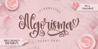 Algorisma Heart Font inspires friendliness and elegance. It is perfect to use for any of your wonderful creations such as branding projects, logos, brochures, business cards, wedding invitations, and many others.
 - Miss Dottie NF by Nick's Fonts,
$10.00 The 1897 specimen book from Barnhart Brothers and Spindler showed a enchanting little face called Dotted Roman. Here's a faithful revival, ready to warm up the 21st century. Both versions support the Latin 1252, Central European 1250, Turkish 1254 and Baltic 1257 codepages.
 - Cabrito Semi by insigne,
$24.00 Relax. Deep breath. And step away to font nirvana with Cabrito Semi. Like its Cabrito relatives, Semi’s handwriting-inspired feel is mellow and care-free. But don’t misunderstand us. Even with its fun-loving peculiarities, this free spirit will command whatever party you invite it to. It’s a perfect blend of unique and functional. So what’s the secret of this little one’s strength? It’s pure balance. Cabrito Semi’s energy surges from deep within the relaxed, balanced tones of its humanist structure and calligraphic crafting. The 36 fonts of this well-crafted semi serif originate from the popular Cabrito, an insigne design slab serif developed for the kid’s book, The Clothes Letters Wear. Along with its other amigos, Inverto and Sans, Cabrito Semi rounds out this easy-going household of fonts. The four fonts play well together on anything from meals and candy to toys and cars. With the support of the other three, Semi makes a great choice for titles and moderately long text like you would use for websites, flyers, and packaging. Semi’s complete pack of alternates is accessible in any OpenType-enabled system. This kiddo has loads of alternates, swashes, and alternate titling caps to add a bit of sweetener to the balance. Also bundled are swash alternates, old style figures, and compact caps. Preview any and all of these features in the interactive PDF brochure. This font members of the family also consists of your glyphs for 72 languages. So who says you can’t love quirky? Take a look at Cabrito Semi--and any of the other members of the Cabrito family. You’re bound to find yourself loving fun all over again.
 - Quickflio by Brenners Template,
$19.00 A font family with excellent visibility and aesthetic originality was developed after years of troubleshooting. It will be the best choice for designers as it contains a variable font with two axes. A variety of styles, including stem widths from 10pt to 220pt, will be an exciting attempt for unique typography. And, 44 beautiful and amazing ligatures will make your imagination deeper and richer. On the Typographic Foundation, it makes sense to break most of the ligatures used here into discretionary ligatures. However, in view of the trend of modern typography, in which the essential boundary between function and decoration is increasingly blurred, it may be meaningful to use them together. All ligatures of this font family are included in Standard Ligatures. Your choices become easier and clearer. Its name is Quickflio. OpenType Features 44 Ligatures : Am, An, Br, Cr, Gr, Le, Lo, Op, ad, am, an, at, ba, ck, ct, da, de, do, er, es, ff, fo, fi, fl, gh, ha, hn, hs, in, le, ll, lo, ma, ns, oe, om, on, re, sh, st, um, un, ve, wa Ordinals Oldstyle Figures Tabular Figures Fractions Scientific Inferiors Superscrpt
 - "She Paints Me Blue" is a captivating font designed by Kimberly Geswein, a font designer renowned for her wide range of expressive and unique typography. This particular font is an embodiment of crea...
- Solarica by Struvictory.art,
$14.00 Solarica is a linear font decorated with tribal patterns. The typeface includes Decorative, Regular and Symbol versions. Combine fonts with each other to get a unique design! Solarica is suitable for lettering posters and cards, tourist brochures, photo overlays, music album and book covers. The font works great both for printing, clothes and craft products, branding and packaging (herbal tea, handmade soap, organic food). Also use individual letters to create logos and monograms.
 - McKellar Borussian NF by Nick's Fonts,
$10.00This unusual Gothic face was found in the 1882 McKellar, Smiths and Jordan specimen book under the name Borussian, a then-current variant of “Prussian”. This version is true to the original, so please note: a few of the uppercase characters—notably E and G—are rather unusual, so proceed with caution. All versions of this font include the Unicode 1250 Central European character set in addition to the standard Unicode 1252 Latin set. - Garten House by Letterhend,
$19.00 Garten House is a sophisticated high contrast display serif typeface. The ligature character makes this typeface unique and stands out rather than the regular serif font. Very suitable for logo, headline, tittle, and the other various formal forms such as invitations, labels, logos, magazines, books, greeting / wedding cards, packaging, fashion, make up, stationery, novels, labels or any type of advertising purpose. Features : Numbers and punctuation Multilingual Ligatures Alternates PUA encoded We highly recommend using a program that supports OpenType features and Glyphs panels like many of Adobe apps and Corel Draw, so you can see and access all Glyph variations.
 - Tarocco by MAC Rhino Fonts,
$18.00 Tarocco is a typical book face with good readability and rather tall x-height. The origin for this typeface is found in Nordisk Antikva. A typeface especially constructed with attention for the Swedish language. Waldemar Zachrisson was determined to realize his ideas and in 1906 he began to cooperate with the foundry Genzsch & Heyse, based in Hamburg. Some influences of Jugendt can be found and the typeface were released in 1910. It became rather popular until around 1930. The MRF version includes 7 weights all together.
 - Lille Snemand by Hanoded,
$15.00 Lille Snemand, in Danish, means Little Snowman - like the Little Mermaid, but then colder… Lille Snemand is kin to the original Snemand font, which is an all caps typeface, but unlike its big brother, Lille Snemand comes with lowercase glyphs. It is a very legible font and has that 'unevenish' look - making it a great typeface for packaging and books.
 - Delysian NF by Nick's Fonts,
$10.00If you wanted to send out a party invitation in 1923, Barnhart Brothers & Spindler recommended this typeface, which was originally called, simply, "Greeting Card". It also appears to be suitable for greetings from Mars. Available in two weights, regular and bold. Both versions of the font include the 1252 Latin and 1250 CE character sets (with localization for Romanian and Moldovan). - Angelist Heart Font by IbeyDesign,
$18.00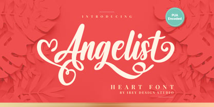 Angelist Heart Font that inspires friendliness and elegance. It is perfect to use for any of your wonderful creations such as branding projects, logos, brochures, business cards, wedding invitations, and many others.
 - Hakigai Heart Font by IbeyDesign,
$17.00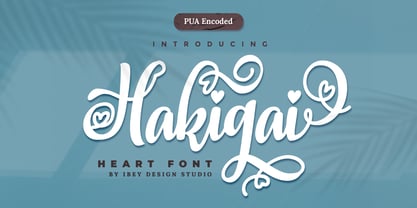 Hakigai Heart Font that inspires friendliness and elegance. It is perfect to use for any of your wonderful creations such as branding projects, logos, brochures, business cards, wedding invitations, and many others.
 - Brillo by Alessandro Pivetta Type,
$15.00 Brillo Typeface stems from the effort of combining the modern look of a grotesque sans serif font with the elegance of the calligraphic copperplate's swashes. The result is a typeface that is perfectly suitable for modern graphic applications, such as publishing, branding and web, but which has some ornamental features that differentiate it from all the other grotesque families. Brillo doesn't want to be a neutral typeface. It's a font with a strong personality, which can give outstanding aesthetic and conceptual relevance to the graphic projects which will be used in. Brillo is a typeface thought for titling rather than for texts. For this reason it works better with character sizes bigger than 16 points.
 - Tabwa by Scholtz Fonts,
$19.00The design of the Tabwa font was inspired by the font Neuland designed by Rudolf Koch in 1923. Rather than attempting to re-create his font in a digital form as so many others have done, I have tried to capture the "spirit" of his font and merge this with the spirit of Africa. As a result the characters differ markedly from Koch's original styles and have much less of an "Art Deco" look to them. To further modernize the font I have included all the characters missing in Koch's original (a full lower case, as well as all punctuation, diacritics, special characters etc). The result is a thoroughly modern re-interpretation of the original "Neuland". The numbers (0 to 9) bear no relation to Koch's originals but, I believe, are far more in keeping with the alphabetic characters in the font. The triangles that decorate the characters of this African font are typical of the patterns found in the Tabwa culture of central and west Africa (in the Congo region). - Loose Pen by Pedro Teixeira,
$14.00 Do you suffer from OCD? Then this font is perfect for you. Or maybe not. Sometimes I like confusion, chaos, imperfect things, because I can often see beauty in them. In this font I drew the letters with a pen and or with just the index finger on a tablet, completely free, without improvement. The chaos ensuing. As if I was rushing notes just for me. Then, without changing the design any further, but to make the chaos minimally legible, I decided - look at this madness! - to organize the chaos. In other words, I aligned metrics and kerning, and the end result was this. I hope you like it and that it is very useful for you. Cheers.
 - Timesquare by Campotype,
$25.00 The initial idea of timesquare typeface inspired by Helvetica when presenting the board information on a subway escalator in Time Square, Manhattan, New York. This confirms strength the legend of Helvetica is not lost amid rampant nice fonts in the site. Therefore it should not appropriate that this timesquare fonts come to rival the greatness of Helvetica. Fonts timesquare thrive (since 2008 for self used) of the basic forms of Helvetica to timesquare born in different shapes and sizes. The greatest challenge during development timesquare is both shape similarity to Helvetica directly, as well as to other fonts inspired by Helvetica. Timesquare's main characteristics are the wide character, modern touch and individually, can work well on a wide variety of applications in books, brochures and magazines as well as applications in advertising. This typeface has been developed on the Latin character sets. Hopefully useful.
 - P22 Dwiggins by IHOF,
$24.95 Dwiggins Uncial is based on calligraphy by William Addison Dwiggins that he created for a self-penned short story, which appeared as an insert in the book-arts publication The Dolphin in 1935. This self-described “experimental uncial” lettering features rather unusual treatments of letterforms which combine manuscript calligraphy with modern idiosyncrasies. Dwiggins Extras is a set of decorative extras features 62 stencil and woodblock motifs adapted from abstract and representational Dwiggins designs. Although Dwiggins illustrated a number of books using conventional media, he is best known for his method of illustration that uses a series of hand-cut celluloid stencils or what he called “machine ornaments.” With these stencils Dwiggins (and other designers who use his ornaments) build-up repeated motifs and patterns into abstract designs and/or representational images which have a look that is uniquely Dwiggins’ own. Unlike other illustrators, Dwiggins’ style has not been commonly imitated and therefore his style is as distinctive today as it was 70 years ago.
 - CA Saygon by Cape Arcona Type Foundry,
$40.00 CA Saygon was originally conceived for a large corporate design project, but as this was never implemented, the way was free to make a public font. As a striking corporate typeface, it transports the fractions of a society after the post-modernist phase. After hundreds of sketches a bunch full of letters were selected, some of them quite twisted, others rather conventional. The combination of these letters reflects a rebellion of individuality but also leads to a coherent typeface. Additionally there are alternative letterforms in the Stylistic Sets or in the glyphs palette, which keeps the font always exciting to the designer. Thanks to the Cyrillic and Latin Extended character sets, a huge language area is covered that even extends to Vietnam! Numerous OpenType features make life easier for the professional typographer: There are fractions, superscript and subscript numbers, as well as proportional and tabular numbers.
 - Ying by Wiescher Design,
$39.50 Ying is a new Serif typeface that has a little bit of Yang in it. This combination makes it a very versatile Serif font. Just give it a try and you will see. Ying goes together very well with Yang its brother-font. Yours working on the "Yong", Gert Wiescher
 - VakaDi by Tadiar,
$15.00 vakaDi is stylish futuristic tech font designed for such areas as hi-tech, future, sport, space, army, games and many others. In the process of creating the font, we faced the choice of which letters are better - this or that... Each of them was beautiful in its own way and so we decided to include them all!:) Some you will find in upper case, others in lower case. Multilingual support (Latin extended). It is designed for header and text both.
 - Bellagio NF by Nick's Fonts,
$10.00This family, in normal and bold weights, is based on Advertisers Gothic, designed by Robert Wiebking for Barnhart Brothers & Spindler in 1917. The original might be considered a transitional design between Art Nouveau and Art Deco; this version accentuates the Deco traits, adding a thick-and-thin treatment not found in the original. The large x-height and short descenders allow for compact, commanding headlines with a carefree charm, a.k.a. bell'agio. Both versions of the font include 1252 Latin, 1250 CE (with localization for Romanian and Moldovan). - Akumaru Japanese Style by Twinletter,
$15.00 Akumaru, our newest font, is now available. In every area of the eye, there are typefaces made with unique and appealing shapes. if you want your unique project to be charming, unique, gorgeous, and sophisticated enough to hypnotize the entire audience. Then this font should be used in your project. because the letters and words in this typeface have a gorgeous, elegant, and pleasant appearance. Logotypes, food banners, branding, brochure, posters, movie titles, book titles, quotes, and more may all benefit from this font. Of course, using this font in your various design projects will make them excellent and outstanding; many viewers are drawn to the striking and unusual graphic display. Start utilizing this typeface in your projects to make them stand out.
 - Shade Blue, designed by DM Letter Studio, stands as an epitome of elegance and versatility in the realm of typography. This font embodies a harmonious blend of contemporary design with a hint of clas...
- Vida Pro by Storm Type Foundry,
$55.00 The new typeface family Vida was specifically designed for Czech Television in the framework of a competition for a new logo in summer 2006. The drawing of each letter form differs finely in its logic, which is a feature invisible at first. It is constructed on a puristic base, but it doesn't reject the natural anomalies already known from ages of experience with latin alphabet. That's why e. g. upper left section of 'n' is constructed differently from that of 'r', similarly as 'd' doesn't repeat right-bottom ending after 'u', '9' is not inverted '6'. Such details improve reading in continuous text. The behavior of all weights is consistent on CRT, plasma or LCD screens due to monolinear design; the lightest weight doesn't fade, the darkest isn't blurred, all is legible and clear in smallest sizes. Stem connections and endings were adjusted to avoid undesirable optical darkening. The goal we desired was to achieve balance appearance in both electronic and printed form.
 - Clear Prairie Dawn by Quadrat,
$25.00Clear Prairie Dawn is an original humanist sans serif family based on the designer's own printing. Designed for use as a text face, as a humanist sans it shares some of the characteristics you might notice in other such faces as Optima, Gill Sans or Stone Sans. The italic is a designed italic, rather than merely a slanted roman, and incorporates many of the ideas that the designer found too lively for the roman fonts. The complete CPD package consists of three weights with italics, and a set of original ornaments. - Ongunkan Iberian Script by Runic World Tamgacı,
$50.00 The Iberian scripts are the Paleohispanic scripts that were used to represent the extinct Iberian language. Most of them are typologically unusual in that they are semi-syllabic rather than purely alphabetic.[1] The oldest Iberian inscriptions date to the 4th or possibly the 5th century BCE, and the latest from end of the 1st century BCE or possibly the beginning of the 1st century CE. The characters in this font do not contain all the characters of the Iberian script. If there are friends who need all the characters, contact me so that I can install the font on the system.
 - Fruitygreen by Linotype,
$29.99 Fruitygreen is Indonesian designer Andi AW. Masry's second typeface following Coomeec™. Idiosyncratic but appealing forms are the signature feature of Fruitygreen™ and provide this new typeface with its truly distinctive character that you can utilize for your projects - and not just in headlines. The unique forms of fruits are not only individually fascinating, but are just as captivating when they are brought together, for example as decoration on a dining table. For Masry, these can be compared with an alphabet whose letters spell out in combination different words and with this as his inspiration, he based his designs for Fruitygreen on the versatile forms of fruits. However, it was not the whole fruits as such but rather small sections of their curves and ends that he decided to use. It is not only because of the characteristic line terminals that the rounded characters of Fruitygreen seem at first glance reminiscent of a brush-written calligraphic typeface; these are traces of the creation process, in which Masry used a digital brush. At the same time, Fruitygreen is by no means simply a brush font. Its dynamic characters reference biological forms and there is definitely something amoeba-like about them, particularly in the bolder variants, and they exude the same serenity and harmony that is inherent to organic structures. The many unconventionally shaped characters also provide for optical contrast. There is, for example, the very scaled down g", the open "q" and the lowercase "r", which has the form of the capital letter. Other letters, such as the sinuous "k" and the rounded uppercase "F" impart an exotic touch to Fruitygreen. Similarly remarkable is the "@", that has only a semi-circle. Available to the designer are other characters that can be used to accentuate a design, such as swash capitals and numerous ligatures. And, last but not least, there are also various numeral sets with oldstyle and lining figures for setting proportional text and table columns together with a selection of symbols, such as arrows and, appropriately, fruits. "
 - Vilanovas by IbeyDesign,
$17.00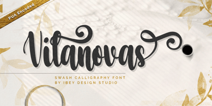 Vilanovas Modern Calligraphy Font that inspires friendliness and elegance. It is perfect to use for any of your wonderful creations such as branding projects, logos, brochures, business cards, wedding invitations, and many others.
 - PTT by TYDTYP,
$20.00 PTT typeface has very rounded outlines. They are extremely overlapping each other like packed potatoes. The face will be very strong and give your design extraordinary spice! Basically, main characters are consist of two different shapes, one is initial form which is only used at the beginning of a word, the other is medial form which is used for the rest. To use this function, I highly recommend to use appropriate layout application (e.g. Adobe illustrator, InDesign, QuarkXpress).
 - Factually Handwriting by Mans Greback,
$69.00 Factually Handwriting is a stunning signature-style font that conveys a sense of expressive hand-lettering with a genuine touch. Its effortless strokes and wild curves make it perfect for adding a personal touch to your projects. Designed with a focus on authenticity, Factually Handwriting captures the beauty of natural handwriting, and consists of eight styles, including Regular, Italic, Bold, Alternate, Alternate Italic. Each style of Factually Handwriting offers a unique aesthetic, giving you the freedom to experiment with different looks and create truly personalized designs. This font is perfect for everything from logos and branding to social media posts and invitations. With its natural charm and expressive strokes, Factually Handwriting adds a touch of warmth and personality to any project. Use undercore _ anywhere in a to make a swash. Example: Hand_Signature Use multiple underscores to make different swashes. Example: Candy___Bars Use * to make flowers! Beautiful*Spring Blue***Roses The font is built with advanced OpenType functionality and has a guaranteed top-notch quality, containing stylistic and contextual alternates, ligatures and more features; all to give you full control and customizability. It has extensive lingual support, covering all Latin-based languages, from Northern Europe to South Africa, from America to South-East Asia. It contains all characters and symbols you'll ever need, including all punctuation and numbers.
 - Pinel Pro by URW Type Foundry,
$39.99 The characteristic ‘French face’ was originally made in 1899 under the supervision of Joseph Pinel. Thus, what was originally French 10 pt. Nº 2, got its present name. The Frenchman Joseph Pinel called himself a "typographical engineer", but was at the time employed as a type draughtsman at the Linotype Works in Altrincham. It appears that this and some other faces that he supervised, were, except for use on the Linotype, also meant for manufacturing matrices for the Dyotype. This composing machine was an invention of Pinel. The Dyotype was a rather complicated machine and consisted, like the Monotype, of two separate contraptions, a keyboard which produced a perforated paper ribbon and a casting machine which produced justified lines of movable type. Unlike the Monotype which has a square matrix carrier, the Dyotype had the matrices on a drum (in fact two drums, hence the name of the machine). A Pinel Diotype company was founded in Paris and a machine was built with the help of the printing press manufacturer Jules Derriey. As is often the case, a lack of sufficient capital prevented the commercializing of this ingenious composing machine. Coen Hofmann digitized the font from a batch of very incomplete, damaged and musty drawings, which he dug up in Altrincham. He redrew all characters, bringing up the hairstrokes somewhat in the process. The result is a roman and italic, while the roman font also includes Small Caps
 - Ocean Sans by Monotype,
$29.99Released in 1993, Ocean Sans is a sans serif design created for Monotype by the talented Malaysian designer, Ong Chong Wah. The Ocean Sans font family has a distinct contrast between thick and thin strokes which sets it apart from the rather austere Grotesques with their more monotone appearance. Ocean Sans italic is an unusual design for a sans face, a strong cursive influence gives it a flowing rhythm not generally associated with sans serif italics. Ideal for text and display setting, the freshness of the Ocean Sans font family will give the user further scope in the design of catalogues, brochures, advertisements and flyers. - YT Deal Latin by Yangtype,
$9.00The concept of this letter is calmness. I created a variety of sans-serif fonts, and when I listed the fonts I had created, I was surprised that their shapes were not very different from each other. Among them, this font calmly caught my eye. The power of quiet progress is felt in this unremarkable form. - VLNL Melk by VetteLetters,
$29.99 At VetteLetters we like food but we also appreciate our drinks. Yes, of the non-alcoholic kind as well. Like milk. Contrary to what Arnold Schwartzenegger once said, Milk is not just for babies. It contains a whole lot of stuff that is genuinely good for you. Like proteins, carbohydrates, minerals (calcium a.o.) and many vitamins. One time visiting The Hague, Donald DBXL spotted a tile tableau on a brick wall, advertising a dairy factory called ‘De Sierkan’. Yellow sans serif letters on a bright blue background, dating back to the late 19th century, immediately grabbed DBXL’s attention. Especially because the tableau showed both regular and bold letters with some lovely peculiarities here and there. De Sierkan appeared to have been a milk factory solely operating in The Hague from 1879 until 1961. A number of these wall adverts are still to be seen in The Hague streets today. Photos were taken for later reference. Later is now, the lettering has been digitized, missing characters added, and VLNL Melk sees the light of day. VLNL Melk is an all-caps geometric display sans serif family of three weights, Regular, Bold and Black. The basic shape of the letters is a rectangle with rounded corners, leaving a sturdy no-nonsense look and feel. It has a distinct historic aura, but with both feet in this digital day and age. It can equally well be used for the logo of a hipster coffee place, as the cover of a historic novel. Actually, VLNL Melk kan be applied in a wide range of designs like logos, posters, flyers, book covers and magazine headlines.
 - Jutta by Spirit & Bones,
$9.00 As the basis for this new font artist and designer Lena Schmidt used an old font design by her mother Jutta. At a young age, her mother drew and illustrated a lot with pen and ink. She made beautiful illustrations and many font designs. Schmidt chose one of these drafts - delicately drawn Donovan lyrics - as the basis for this digital handwritten stencil font. What emerged from it is a stencil text and display typeface that relates to Auriol's art nouveau typefaces and the era of impressionism. More weights will be published in soon. Published by Spirit & Bones www.spiritandbonesdesign.com Designed by Lena Schmidt www.lenaschmidt.com
 - Bernhard Brushscript SG by Spiece Graphics,
$39.00 This extremely heavy informal script was created in the early 1920s by Lucian Bernhard. Like so many of his designs, this typeface has its roots in his earlier poster work. Bernhard Brushscript invokes a rather warm, pleasant feeling despite a number of quirky characters. Originally created for the Bauer Foundry of Frankfurt, Germany, the face looks as though it’s been drawn with a brush and contains looping ascenders and descenders. Perfect for situations where a quaint and casual lettering effect is desired. The Bernhard Brushscript is also available in the OpenType Std format. Some new characters have been added to this OpenType version. Advanced features currently work in Adobe Creative Suite InDesign, Creative Suite Illustrator, and Quark XPress 7. Check for OpenType advanced feature support in other applications as it gradually becomes available with upgrades.
 - "Fish in the Bathroom" is a whimsical and playful font that immediately evokes a sense of quirky underwater adventure. Picture this: each character of the font seems to have been thoughtfully designe...