10,000 search results
(0.064 seconds)
- Leipziger Antiqua by profonts,
$41.99 The original typeface was designed by Albert Kapr between 1971 and 1973 for Typoart in Dresden. Kapr was the font designer and teacher as well as book author on type design of former East Germany. He also was an expert on this kind of type design, and thus, it is no surprise that he created Leipziger Antiqua, a design combining features of both Latin and broken scripts. The result is a stunning and unique gem from earlier times although it does not come along too distinguished or artsy. The digital version of Leipziger Antiqua was developed by Ralph M. Unger exclusively for profonts in 2005. During the work, Unger fell so deeply in love with this typeface that he couldn't help but add an expert font with small caps etc.
 - Jonze by KC Fonts,
$19.00 Jonze & Jonzing from KC Fonts is an all uppercase based font that resembles a rubber stamp; Jonze being more on the saturated side and Jonzing on the rather dry. Both fonts each have four glyphs for each letter & two per number, which are accessed by uppercase, lowercase & Contextual Alternates. The Jonze family takes the grungy look that you love one step further by creating a handmade look for you by randomly cycling through Contextual Alternates & Double Letter Ligatures for a unique and authentic look to your creative. When not using the Contextual Alternates feature, you can still alternate between uppercase and lowercase letters to change it up or by accessing the Stylistic Alternates feature. The Jonze family has an extended character set for multilingual support.
 - Nidex by Aah Yes,
$10.50Nidex is a caps-only industrial distressed font, ideal for titles, display and headlines, rough and ready, and coming with all the usual accented characters and an extensive set of punctuation. The misprinted effect is central to the font’s design and is built-in, simplifying the work for posters and flyers, and the example above is made with Regular and Condensed. Upper and Lower Case present 2 different sets of characters, and just a few letters are distinguishably more misprinted. Also there’s a full set of ligatures to make double-letter combinations print two different letters rather than the same one twice, from upper case A to lower case z. The zips contain both OTF and TTF versions - install either OTF or TTF, not both. - Keratine by Zetafonts,
$39.00 The letterforms that we now accept as the historical standard for printing latin alphabets were developed in Italy around the end of 1400. Deriving from Roman capitals and from italic handwriting, they soon replaced the blackletter letterforms that were used a few years before by Gutenberg for his first moveable types. Between these two typographical traditions there's an interesting and obscure middle ground of historical oddballs, like the Pannartz-Sweynheym Subiaco types, cut in Italy in 1462. Keratine is the result of Cosimo Lorenzo Pancini's exploration of that territory. Like our Kitsch by Francesco Canovaro it explores the impossible territory between antiqua and blackletter, not as a mere historical research, but rather as a way to re-discover and empower an unexpected and contemporary dynamism. Using contemporary digital aesthetics to combine the proportions of humanistic type with the gestural energy of Fraktur letterforms, Keratine develops a "digitally carved", quasi-pixelated appearance (clearly stressed in Keratine's italics) that allows an unexpected balance between small-size readability and display-size personality. Keratine also relies heavily on a variable identity as the letterforms change dynamically with weight, developing from a contrasted, text-oriented light range to more expressive and darker display range, for a total of 8 weights with italics. Open type features and glyph alternates further enrich the usage possibility of this typeface that embodies our contemporary swap culture by embracing the contradictory complexity at the crossroads between Gothic and Humanist styles, while playfully empathising with a digital, brutalist spirit.
 - Rainesta by Digitype Studio,
$22.00 Rainesta comes with 7 unique font styles, you can use them according to your project, whether for headlines or taglines. This font is very suitable to be applied to various other formal forms such as websites, ebooks, labels, logos, magazines, books, packaging, fashion, make-up, stationery, labels, or all kinds of advertising purposes. Features: 7 styles uppercase & lowercase numbers and punctuation multilingual ligatures PUA encoded Thank you.
 - Neuzeit Office Soft Rounded by Linotype,
$29.99 Every year, more and more text is read directly on a computer screen in office applications, or from freshly printed sheets from a copier or laser printer. Clear, legible text faces are more imperative to office communication than ever before. Yet every worker desires a small bit of personality in the corporate world. Most office environments are only equipped with a few basic fonts that are truly optimized for use in text, with laser printers, and on screen. The Linotype Office Alliance fonts guarantee data clarity. All of the font weights within the individual family have the same character measurements; individual letters or words may have their styles changed without line wrap being affected! All numbers, mathematical signs, and currency symbols are tabular; they share the same set character width, ensuring that nothing stands in the way of clear graph, chart, and table design. In addition to being extremely open and legible, the characters in this collection's fonts also share the same capital letter height and the same x-height. The production and reading of financial reports is duly streamlined with the Linotype Office Alliance fonts. The Neuzeit Office family is designed after the model of the original sans serif family Neuzeit S, which was produced by D. Stempel AG and the Linotype Design Studio in 1966. Neuzeit S itself was a redesign of D. Stempel AG's DIN Neuzeit, created by Wilhelm Pischner between 1928 and 1939. Intended to represent its own time, DIN Neuzeit must have struck a harmonious chord. DIN Neuzeit is a constructed, geometric sans serif. It was born during the 1920s, a time of design experimentation and standardization, whose ethos has been made famous by the Bauhaus and De Stijl movements in art, architecture, and design. Upon its redesign as Neuzeit S in the 1960s, other developments in sans serif letter design were taken into account. Neuzeit S looks less geometric, and more gothic, or industrial. Separating it from typefaces like Futura, it has a double-storey a, instead of a less legible, single-storey variant. Unlike more popular grotesque sans serifs like Helvetica, Neuzeit S and especially the redesigned Neuzeit Office contain more open, legible letterforms. Neuzeit Office preserves the characteristic number forms that have been associated with its design for years. After four decades, Neuzeit has been retooled once again, and it is more a child of its age than ever before. Akira Kobayashi, Linotype's Type Director, created the revised and updated Neuzeit Office in 2006. His greatest change was to retool the design to make its performance in text far more optimal. Additionally, he created companion oblique to help emphasize text. The other three families in the Office Alliance system include Metro Office, Times Europa Office and Trump Mediaeval Office.Some weights of the Neuzeit Office are availabla as soft rounded versions. "
 - Thermal by TipoType,
$35.00 Thermal is an exploration of balance and contrast. Combining the elegance of classical typography with the sharpness of contemporary design. It was conceived to be a variable font with two axes: weight & optical size, providing a wide range of options for texts & display applications. The regular and italic text weights breathe a warm atmosphere, their design inspiration is a relaxed interpretation of the work of 16th-century French type designer Robert Granjon, evoking a comforting rhythm and a sense of familiarity that makes reading enjoyable. On the other end of Thermal's design spectrum lie the extreme weights – thin and heavy –, specifically designed for larger sizes. These weights borrow stylistic cues from several distinct influences: the characteristic woodtype from the 19th century, the sharp lettering styles from the 70s, and the bold work of Oscar Ogg. One of Thermal's disctint features is its italic's 20° inclination, an significant inclination by all standards, this design choice finds its roots in the "Ascendonica Cursive" of 1571, but is a contemporary interpretation that generates a captivating contrast with the regular version. Thermal studies the past and analyzes the present to create a unique blend, bringing a dictint dichotomic identity.
 - PTx Flowers by Pedro Teixeira,
$15.00 PTx Flowers Font Family 2 fonts: regular and silhouette each font - 6 glyphs TTF format Bear in mind that each glyph of the font PTx Flowers Regular is close to the maximum limit of points possible in ttf, which means that despite being tested in several programs, illustrator, photoshop, among others including word, some bugs may occur, depending on the rendering capability of the program you are working on. I found however that most of the time, that by the way the bugs, when tested, were only verified in word, that changing the size of the letter/glyph or even the zoom of the document, the letter/glyph was rendered correctly. These fonts have a very limited number of glyphs because, due to the glyphs having too many points, it can take some time to render. This will depend on the capacity of the machine's graphics card (computer, tablet, mobile phone). Hence a low number to take as little time as possible. See at work in word: https://youtu.be/PIMBlja2I5k See ar work in illustrator: https://youtu.be/RJp9X9TQ4so See at work in photoshop: https://youtu.be/yvrBmCJ80pc
 - Dynamique by PizzaDude.dk,
$15.00 I wouldn't recommend that you use this font for massive text, or text written in CAPS ... but then again, go ahead and try - I even kerned all the capital letters ... just in case that you would do something so crazy! :) Dynamique is a kind of a "straight out of the highway" grid-font. But then again, not ... if you use the lowercase alone, you have this almost monospaced font - try starting every word with a capital letter, and let it end with the alternate ligature, your words suddenly got even more power! If you want to go lightspeed - then use the same technique, but only with the italic version!
 - CAL Bodoni Ferrara by California Type Foundry,
$47.00 Bodoni Ferrara™ Fashionable, Luxury Heritage: The Original Bodoni Ferrara Sculpted from hi-res photos and scans of Bodoni's original Ferrara Font—his 1818 Manuale Tipografico and 1768 specimens. It has never before been available. This cut of Bodoni specially selected by Dave Lawrence from rare book specimens. Part of the California Type Foundry Origin Series. 3 Display Fonts in One!! And 6+ style mixes. Bodoni's 1st Draft - Transitional Serif Bodoni was often inspired by French type designs. His first draft of Ferrara was inspired by Pierre Simon Fournier. But Bodoni added his own Italian sensibilities. Bododni’s first, transitional style can pair with humanist sans, and transitional fonts. Bodoni's Rework - Modern Serif Later, Bodoni reworked Ferrara to match the later neo-classic style or modern serif of Firmin Didot¹. Bodoni’s modern style can pair with geometric sans, grotesque sans, neo-grotesque sans, gothic sans, copperplate script, . Informal On™ - Informal Mode by CAL Type Foundry This can pair with “infant” fonts. Geometric sans, and other sans or serifs with one-storied a’s. + Bodoni’s Tivoli a for another option! Works great with Fournier¹ fonts and grotesques, since the terminals will match. Font Pairing Guide This font includes a 78 page Ferrara Pairing Guide. This book shows you 131 pairings with text fonts. 47 pairings with subheader fonts! We want to help you get more out of your font collection. Design Features • Subtle forward angle (0.5-1.5°) makes Ferrara more lively and engaging than most Bodoni or Didot fonts. • Round curves make this font feel letter-pressed. • Bodoni's original tall x-height and slightly condensed proportions: great for headlines, where space is at a premium. • Better uppercase. Uppercase punctuation for design apps. • Proportional oldstyle and lining figures, both modern style and transitional numbers. Every pair of numbers is kerned for display sizes: no unsightly gaps! • Multiple special symbols for whenever you need a design to pop, including 3 of Bodoni’s amazing ampersands. Language Features Latin standard for western European and other languages. +Advanced support for: German, French, Spanish, Portuguese, Italian, and French. Special, uppercase umlauts for titles! Compare to metal Bauer¹ Bodoni! Special context kerning for French, Spanish, Portuguese, Italian, and French, to allow better better words like L'Angelique & “¿Nosotros?”. This kerning gets rid of unsightly gaps between “¿ and other combinations. Can’t Find the Pairing Guide? Can't find the pairing guide? Google “California Type Foundry” and grab the pairing guide. Get another free pro font while you’re there! Ferrara: many sizes, styles, moods and situations. It's a classic, fashionable font for display, headlines, and titles. Grab Ferrara today! ----------- ¹Trademarks of their respective owners. Ferrara™ is a trademark of the California Type Foundry.
 - Minotaur by CastleType,
$59.00 Minotaur is an original monoline design based on an Oscan (http://en.wikipedia.org/wiki/Oscan_language ) votive inscription from the second century B.C.E. The letterforms immediately caught my eye in the wonderful book, Lettering by Hermann Degering, and I decided to create a typeface based on them with only enough compromises to make it usable as a modern alphabet. Not quite as straightforward as I had hoped. For example, the Oscan language (the predominant language in the Italian peninsula before the ascendance of Latin), has no letter "O", so the distinctive curve of the "D" was used as the model for the rounded letters "C" and "G" and more subtly for "O" and "Q"; this shape is also echoed in the original design of "B", "P" and "R". Also, the Oscan letterforms for A, K, L, M, N, S, and U are rather quaint, so I've included modern forms as alternates. Minotaur offers the best of both worlds: Just as the mythical Minotaur is half man and half bull, the font Minotaur is half modern and half ancient. Thanks to OpenType features (stylistic sets), you can easily switch from ancient letterforms to modern (if you have an OpenType-savvy application such as Adobe InDesign) for Latin, Greek, and Cyrillic alphabets. Minotaur supports all modern European languages, including Modern (monotonic) Greek and those that use the Cyrillic alphabet. And, yes, it supports Oscan, both right-facing and left-facing. Minotaur includes 3 OpenType Stylistic Sets: 1 - converts ancient (default) letterforms (A, K, L, M, N, S, and U) to modern alternates; 2 - converts Latin letterforms to equivalent left-facing (standard) Oscan letterforms; 3 - converts Latin letterforms to equivalent right-facing Oscan letterforms.
 - FS Rufus by Fontsmith,
$80.00 Ligatures FS Rufus is an outgoing, likable sort of font with an eccentric streak. Wide letterforms and curious ink-traps make for an engaging personality, and a set of discretionary ligatures make FS Rufus irresistible to designers wanting to play. Not a small set, either: there are some 80 different options available. Wide The decision was made early on to make the letterforms of FS Rufus luxuriously wide. This generates a distinctive visual texture when the font is used for text. With other weights available for headlines, FS Rufus brings a curiously engaging look to editorial, magazine covers and advertising. Just look at my ink traps Ink traps are normally the preserve of fonts intended for printing at small sizes, in newspapers or directories – extra notches necessary to prevent ink from pooling. FS Rufus turns the ink trap into a beautiful eccentricity, flaunting it in both its lowercase and capitals. Take a look at the “h”, “a” and “k”, and the “B” and “N”. Attention-seeking? Moi?
 - Mica Valo by Jolicia Type,
$19.00 Mica Valo is a sophisticated serif font that exudes timeless elegance and refinement. Its graceful curves and meticulous detailing make it the perfect choice for projects that demand a touch of class. The inspiration for Mica Valo is drawn from the seamless marriage of classic serif aesthetics and a modern sensibility. The result is a font that transcends time, adding a touch of grace and poise to any visual composition. What sets Mica Valo apart is its Alternate version, which introduces a unique twist to the classic serif style. The alternates offer a subtle variation in letterforms, providing designers with the flexibility to experiment and create distinct, personalized looks. This feature makes Mica Valo an ideal choice for branding, editorial design, and other creative projects where a touch of individuality is desired. Incorporate Mica Valo into your creative toolkit and let its elegant vibes and alternate options elevate your designs to new heights, leaving a lasting impression on your audience.
 - Rally Symbols 2D by 2D Typo,
$24.00 The Rally Symbols 2D font family has been developed for integrated graphical motor racing design. First of all that includes rally, rally raid, cross-country rally and hill climb. With the Rally Symbols 2D - Signs font one can create quality road maps with rally routes and various symbol books. The font also includes symbols that can serve as workpieces to create competition logos and other design solutions. The Rally Symbols 2D - Arrow font has been specially developed for building tulip diagram road books. It includes various ready-made combination of traffic direction indicators and individual elements that can be combined together. The Rally Symbols 2D - Picto font can be used for the same purposes but also contains a range of convention that can help to find one’s bearings on the ground. This is a a wide range of icons or pictograms of various scenery, for example: different buildings, churches, cemetery, bridges, tunnels, different types of trees, posts, etc.
 - Academica by Storm Type Foundry,
$44.00 Josef Týfa first published the Academia typeface in 1967-68. It was the winning design from competition aimed at new typeface for scientific texts, announced by Grafotechna. It was cut and cast in metal in 1968 in 8 and 10 point sizes of plain, italic and semi-bold designs. In 2003 Josef Týfa with František Štorm began to work on its digital version. During 2004 Týfa approved certain differences from the original drawings in order to bring more original and timeless feeling to this successful typeface. Vertical stem outlines are no more straight, but softly slendered in the middle, italics were quietened, uppercase proportions brought closer to antique principle. Light and Black designs served (as usual) as starting points for interpolation of remainig weights. The new name Academica distinguishes the present digital transcription from the original idea. It comprises Týfa’s rational concept for scientific application with versatility to other genres of literature.
 - Capitolina by Typefolio,
$39.00 Capitolina is a family of 10 typefaces with a contemporary design style, based on different historical models. The original shape of serifs was a reference to 19th century’s Clarendon types though this inspiration remains as a subtle feature of the final design. Even subtler are the calligraphic influences, better noticed in the italics. The result is a set of typefaces that look more ‘constructed’ than ‘written’, referring to a rationalist style. However, it has a distinct approach to the aesthetic treatment of typographic forms that resembles the humanist tradition. Available in five weights of roman and italic types, Capitolina has a wide glyph palette that contains 800 glyphs in each font. Besides supporting basic Latin, western, central, and southeastern European sets, it has several OpenType features, such as case-sensitive forms, small capitals, ligatures, localized forms, number forms, fractions and more. Capitolina is, therefore, a great choice for projects in editorial design and other related applications.
 - Secca by astype,
$42.00 Secca is a fresh and versatile typeface series. With its workhorse qualities, Secca is perfectly suited for a wide range of applications - especially where legibility and economy are important factors. Secca is rooted in the tradition of early German Grotesk typefaces, but is tailored for the needs of today, with a wide language support and many typographic features and extras. » pdf specimen « The core family comes in nine weights from Thin to Ultra Black plus another three Hairline weights - each with italics, small caps and italic small caps. While the weights from Light to Bold perform well in text sizes, the more extreme styles give extra freedom for Headlines & Signage. For setting tables and charts, Secca offers tabular figures, fractions, currency signs and mathematic operators which share the same fixed width throughout the entire range of weights. This special feature is called “weight duplexing” and is a time saver for designers of annual reports and other figure-heavy texts.
 - Bright Gabbemy Cyr Gr by Ira Dvilyuk,
$20.00 The Bright Gabbemy Cyrillic Greek is handwritten monoline signature script font and additional symbols font with extras. It is the font pair with will be the best option for branding, logos, wedding invitations, social media, packaging, business cards, DIY projects, social media, and many others. Bright Gabbemy Symbols is the font with 36 lovely hand-drawn flourishes and illustrations. Bright Gabbemy Cyrillic script font contains the Cyrillic and Greek glyphs too. Bright Gabbemy script Latin part contains a full set of uppercase letters and 2 full sets of lowercase letters, (standard, and final forms with flourishes or teils. To make a needed form just type a letter with a number such as a1, b1, c1...after that select the word and apply the Open Type Features in programs such as Adobe Illustrator, Photoshop, and others) And 53 ligatures - which can be used to create a handwritten calligraphy look. The Cyrillic part of the font contains uppercase letters and 2 full sets of lowercase letters, (standard, initial and final form. To make a needed form just type a letter with a number such as a1, б1 в1... After that select the word and apply the Open Type Features in programmes such as Adobe Illustrator, Photoshop, and others) Bright Gabbemy Symbols is a font with over 36 hand-drawn elements, floral illustrations, and swashes and can help to make your design unique and matchless. Combine and merge swashes and illustrations to create your own designs and make borders, frames, dividers, logos, and more (just use A-Z or a-z and 0-9 keys in the included Bright Gabbemy Symbols font). A different symbol is assigned to each uppercase or lowercase standard character, so you do not need graphics software, just type the letter you need. Multilingual Support for 33 languages: Latin glyphs for Afrikaans, Albanian, Basque, Bosnian, Catalan, Danish, Dutch, English, Estonian, Faroese, Filipino, Finnish, French, Galician, Greek, Indonesian, Irish, Italian, Malay, Norwegian Bokmål, Portuguese, Slovenian, Spanish, Swahili, Swedish, Turkish, Welsh, Zulu. And Cyrillic glyphs support Russian, Belorussian, Bulgarian, Ukrainian, and Kazakh languages.
 - CA Normal by Cape Arcona Type Foundry,
$40.00 CA Normal is a typeface aiming for beauty without ostensible effects, merely relying on clarity and well balanced proportions. True beauty is not to be found in perfect geometry, so slight irregularities and inconsequences are spread throughout the typographic image. That’s perfection through imperfection. CA Normal merges influences from European grotesques and American gothics, breeding an experimental mongrel. The underlying concept stays in the background, giving the design a great self-evidence. Although it is doubtful if there can be such thing as neutrality, CA Normal comes pretty close to what people mean when speaking of a neutral font. Nevertheless it’s not faceless, anonymous or confound able. It’s just that the charm comes from subtle details rather than obvious design features. As good text typefaces must not be too smooth nor too agitated, CA Normal is smuggling little uneven details into the typographic image, that keep the readers eye awake. The well crafted oblique follows the grotesque tradition which knows no individually drawn italics. A rather unexpected addition is the reverse oblique, a style mainly used for maps. Under the classic surface lies a modern well equipped font, featuring small caps, a Central European character set and numerals in all kinds of flavors. Numerous ligatures round up the overall impression. By default CA Normal will set numbers as proportional lining figures. But if you prefer oldstyle figures, or tabular figures, just use the OpenType functions of your layout program. These allow access to the small caps as well, which feature a complete central European character set, brackets, punctuation and lining figures in small caps height.
 - Abaddon™ - Unknown license

- Geometris Semi Condensed by NicolassFonts,
$25.00 Geometris Semi-Condensed is a modern versatile sans-serif typeface. What differentiates Geometris Semi-Condensed from the other fonts is its exceptionally distinctive design. Brilliantly suited for graphic design and display use and perfect for logotypes, t-shirts, packaging, brand identity, books, magazines, newspapers, posters, billboards, and advertising.
 - Stargild by Sinfa,
$14.00 Stargild is the perfect typeface for any type of your project with alternative fonts in both lowercase and uppercase and several types of underlines, such as advertisements, branding, quotes, wedding designs, graphic design, logos for online or offline businesses, photography, and more. -other. Make your business more beautiful!
 - Chicago Doodles by Outside the Line,
$19.00 Armchair travel to the Windy City with Chicago Doodles. 31 illustrations of buildings, skylines, transportation, food, Chicago landmarks, signs and a script word Chicago. For other city, state and country doodles take a look at Paris, London, Waikiki and New Orleans Doodles. Also Cowboy and Lake Vacation Doodles too.
 - Mancino by JCFonts,
$15.00 Mancino is an all caps family of 4 fonts, inspired by hand painted signs and advertising. Uppercase and "lowercases" are slightly different, for a more natural look. You can also turn on discretionary ligatures to replace the second letter of any pair (EE, LL, OO) by its other variant.
 - Arbordale by Aerotype,
$49.00 OpenType users benefit from an array of alternate glyphs for lowercase characters including non-connecting contextual alternates for word endings. Other features include crossbar ligatures for common letter pairings, case-sensitive quotes and smart apostrophes. Arbordale Pro extends the character set to support Eastern European and Baltic languages.
 - Turber by Artyway,
$19.00 Awesome sport font with italic wide letters, modern letter cutout and dynamic slant. Ideal for sports headline of speed car race, logo and monogram of automotive game or other modern dynamic text Font "Turber" compares favorably with its readability and massiveness, creates the effect of power and speed.
 - Grand Amoura by Reyrey Blue Std,
$14.00 Grand Amoura is a romantic and smooth handwritten font. It looks stunning on wedding invitations, thank you cards, quotes, greeting cards, logos, business cards and every other design which needs a handwritten touch. Grand Amoura is here to elevate your work to the highest level. Includes: Ligatures Swash
 - Aranekie by Differentialtype,
$10.00 Aranekie is a modern sans serif font inspired by the bold and thin serif fonts. Aranekie comes in 4 styles, regular and italic styles that are perfect for documents, and Aranekie Dxy which can be used for display fonts such as logos, pamphlets, book covers and many other projects.
 - Conqueror Text by Letterhead Studio-YG,
$45.00 Conqueror Text consists of 12 faces and is a part of a super family Conqueror. It is intended for big text blocks. Someone considers that the Conqueror Text — not so text font, because it too bright and unusual. But others, more courageous, use ConText and are quite happy.
 - Bingo Player JNL by Jeff Levine,
$29.00Bingo Player JNL is a thorough reworking of Jeff Levine's old freeware font - cleanly redrawn with fresh glyphs and a set of "alphabet balls" for creating short headlines. To match the fonts in these dingbats for other text applications, use Shopkeeper JNL, Trade Journal Wide JNL and Market JNL. - Black Dolphin by Mr. Typeman,
$14.00 Introducing the new and tasteful Black Dolphin Multilingual Font Duo. Black Dolphin is a stunning pair of luxury signature script and a hand-drawn brush font, designed to contrast and complement each other with elegant beauty and contemporary style, making it an excellent fit for projects of all types.
 - Better Memories by TM Type,
$12.00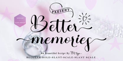 Better Memories feels equally charming and elegant. It looks stunning on wedding invitations, thank you cards, quotes, greeting cards, logos, business cards, and every other design which needs a handwritten touch. It is also PUA encoded which means you can access all of the glyphs and swashes with ease!
 - Azariel by Scriptorium,
$18.00Azariel is a decorative calligraphic script font designed to have linking characters in the lower case and elaborate swashed capital letters which overlap and nestle with adjoining characters. It's very elegant - excellent for invitations and other decorative uses where you want something a bit less formal but very stylish. - Jaquizaca by Lamatas un Slazdi,
$19.00 Jaquizaca is hand drawn type to go well with vector illustrations. Jaquizaca was created in 2001 to make inter-titles for a TV-programme. After twelve years it was revised and updated with ligatures, contextual alternates and other OpenType features. It supports all the European languages using Latin alphabet.
 - Gineso by insigne,
$- Michaelangelo. da Vinci. Bellini. Rafael. Masters of Italian art whose names have dwarfed those of many other great Italian artists. Yet relics from these other artists remain, though often unnoticed because of their practical nature. These unknowns are the Italian Masters of vernacular sign painting, and insigne now gives a nod to their work with its new sans serif, Gineso. Based on its inspiration, Gineso was created for posters, headlines and logotypes. (It does well in apps, too, though the sign painters probably weren’t thinking about that at the time.) Aesthetically remedied, yet still with an uncut charm, Gineso’s condensed qualities make it especially nice for signs and titling where horizontal space is at a premium. The tight, narrow forms of its geometric design leave you with a robust flavor that will remind you of mamma’s spaghetti. But don’t worry; the font’s ample counters ensure your audience won’t be reading through a bowl of pasta. These condensed forms look great on their own or when their seven different weights and matching italics are utilized together. With the included OpenType features, fractions and superior/inferior positions are also available to broaden your palette. Even more, this font is ready for complex, professional typography with OpenType features like alternate letters and a large character set including Central and Eastern European Languages. So when you find yourself (or your project) in a tight space, stir in Gineso to get the right taste for your copy. It may just make all the difference.
 - Action Jackson - Unknown license

- Hydrogen - Unknown license

- I suck at golf - Unknown license

- Mirenath by Arterfak Project,
$13.00 Introducing Merinath Typeface a rounded vintage monoline. Merinath is clean modern-vintage display font which inspired from old school letterpress and rounded sans serif shapes. This font was created and explored become 3 styles with over 500 glyphs on each font. Also with many features that give you many options in your design project. You can access the open type features by accessing Font Book (Mac) and Character Map (Win) or you can get it in design software like Photoshop, Illustrator, CorelDraw, InDesign etc. Here's what you'll get : - Merinath Normal : Looks good for a headline, editorial, body text, and other formal styles. - Merinath Rounded : With the inky effect, this style is awesome for old school, hipster, vintage, typographic, sign board, logo design and letterpress effect. - Merinath Bold : Suitable for food, kids, logotype and other joyful designs. TTF & OTF format features : - Uppercase - Lowercase - Numbers - Symbols - Ligatures - Stylistic alternates - Contextual alternates - Swashes - Stylistic set 01 - Stylistic set 02 - Multilingual characters : Afrikaans, Albanian, Catalan, Croatian, Czech, Danish, Dutch, English, Estonian, Finnish,French, German, Hungarian, Icelandic, Italian, Lithuanian, Maltese, Norwegian, Polish, Portugese, Slovak, Slovenian, Spanisch, Swedish, Turkish, Zulu Thank you for visits and enjoy!
 - Hodgepodge by Outside the Line,
$19.00 Hodgepodge is a confused mixture of letters that somehow work together. While I know this has been done before I create fonts that I need. And I occasionally have found a need for this. And it was not there, so now it is. There is a mixture of light and dark, bold and regular, caps and lower case but not where you would expect them to be. Since this is a headline font you can set the headline and then easily go back and change a letter here or there to get the best-looking combination. Hodgepodge was in the 2011 Typodarium Page-A-Day Calendar on 7-17-2011.


