10,000 search results
(0.241 seconds)
- GUI Design Icons by upirTYPO,
$17.00 GUI Design Icons is pack of about 200 icons for every possible user interface (GUI). What makes this font special is combinations. There are background and foreground objects which you can combine any way you like. Imagine you have an icon of shopping cart. By just adding another symbol, you can make an icon for adding that item to shopping cart, removing the item, showing favorites or any other possible combination. See image example for some fresh ideas!
 - Edberd by Juliawan90,
$15.00 Edberd is a beautiful font. This font perfectly made to be applied especially in logo, and the other various formal forms such as invitations, labels, logos, magazines, books, greeting / wedding cards, packaging, fashion, make up, stationery, novels, labels or any type of advertising purpose. We highly recommend using a program that supports OpenType features and Glyphs panels like many of Adobe apps and Corel Draw, so you can see and access all Glyph variations. Happy Designing!
 - Killviners by Letterhend,
$19.00 Introducing, Killviners - A modern blackletter typeface. This type of font perfectly made to be applied especially in logo, and the other various formal forms such as Logo, Clothing, Fashion, Headline, or any type of advertising purpose. Features : uppercase & lowercase numbers and punctuation stylistic alternate multilingual PUA encoded We highly recommend using a program that supports OpenType features and Glyphs panels like many of Adobe apps and Corel Draw, so you can see and access all Glyph variations.
 - Thurkle by Grontype,
$15.00 Thurkle is bold new serif font, look tough and playable. Comes with sharp edges, inspired by sword making dynasty in British History. This display typeface is semi condensed and included some extra unique ligatures. Thurkle is perfect for any project such as magazine header, flyer header, logotype, invitation card name, and some any other design. Features: All Caps and Small Caps Character Numbers and Punctuation Special Characters Ligatures. Multilingual Support Thankyou For Picking The Font, Enjoy. Grontype
 - Shaliya by Juliawan90,
$15.00 Shaliya is a beautiful font. This font perfectly made to be applied especially in logo, and the other various formal forms such as invitations, labels, logos, magazines, books, greeting / wedding cards, packaging, fashion, make up, stationery, novels, labels or any type of advertising purpose. We highly recommend using a program that supports OpenType features and Glyphs panels like many of Adobe apps and Corel Draw, so you can see and access all Glyph variations. Happy Designing!
 - Rostley by Mans Greback,
$69.00 Rostley is a stunning serif font that blends classic elegance with ornamental charm. The uppercase design is bold, retro and proper, making it perfect for elegant and decorative designs. The font is perfect for projects that need a touch of beauty, such as logos, wedding invitations, and other formal designs. With its floral and leafy accents, Rostley adds a touch of cuteness and sophistication to any design. Designer Mans Greback has combined traditional serif design with modern style to create a unique and timeless font. The decorative alternates of Rostley allow you to add a personal touch to your designs, making them truly one of a kind. Whether you're creating something for fashion, beauty, or any other industry, Rostley is the perfect choice for a font that is both beautiful and functional. Use parenthesis symbols ( ) { } [ ] to make floral elements. Example: (Flower Style] The Rostley family consists of Regular and Italic. The font is built with advanced OpenType functionality and has a guaranteed top-notch quality, containing stylistic and contextual alternates, ligatures and more features; all to give you full control and customizability. It has extensive lingual support, covering all Latin-based languages, from Northern Europe to South Africa, from America to South-East Asia. It contains all characters and symbols you'll ever need, including all punctuation and numbers.
 - LFT Etica Mono by TypeTogether,
$35.00 Milan-based Leftloft studio has produced a third leg to its hit Etica font family: LFT Etica Mono. Meant to be a coder’s go-to font for everyday use as much as a designer’s way to invoke a certain genre, it is part of a broader and more versatile family that already contains almost 80 sans and serif fonts. LFT Etica Mono’s ten weights carry the same modern, recognisable DNA of the Etica family while hewing to the defined requirements of a coding typeface: space, density, distinct forms, and clarity. It uses the same instroke on the ‘c’ and open form of the ‘a’ for which the Etica family is famous, but adds something new in the form of an additional italic style. Monospaced fonts usually incorporate slanted letters as italics, as does LFT Etica Mono, but its default italics have warmer, cursive shapes while the alternate italics are simply slanted. The default ‘a’ is a simplified bowl and stem instead of a two storey shape; the ‘d, f, i, l, t, y’ and others gain an outstroke tail; the ‘e’ is one smooth stroke; and the default ‘k’ is looped. These characters have basic, slanted alternates if the cursive look isn’t desired, and includes a set of arrows and geometric shapes. The monospaced design, by nature, makes the typeface useful in coding and in low readability situations. And how does LFT Etica Mono work from the designer’s perspective? The starting point was the need for a monospaced Etica companion intended for technical applications: captions in graphic layouts, small text, confined or predefined space, and overall tone. Flat terminals and counters maintain the colour and versatility of the original typeface, but choosing between the organic cursive or blunt slanted alphabet will give every layout its own character. Of particular aesthetic interest may be the & and % symbols. Designed to be applied to the common visual environment, the new LFT Etica Mono font family completes a more complex system. One benefit is to give an expressive tone — less serious and more friendly — to something inherently technical, to bytes and bots, to encode the beautiful life.
 - PF Beau Sans Pro by Parachute,
$79.00 The design of Beau Sans was inspired by Bernhard Gothic which is considered one of the first contemporary American sans serifs and was designed by Lucian Bernhard in the late 1920s. Panos Vassiliou came across this font while attempting to reduce the design elements of a text typeface, by introducing Bauhaus-like minimal forms to the characters. The first version was completed back in 2002 and introduced one year later in Parachute’s 3rd catalog, under the name PF Traffic. Some time later it was decided to make a few improvements but the project was so carried away that the new typeface which emerged needed urgently a new name. Beau Sans Pro is a modern sans-serif family of 16 fonts which includes true-italics. Just like all other Parachute fonts, it covers a broad range of languages by incorporating 3 major scripts i.e. Latin, Greek and Cyrillic in one font. Furthermore, every font in this family has been completed with 270 copyright-free symbols, some of which have been proposed by several international organizations for packaging, public areas, environment, transportation, computers, fabric care and urban life. This typeface is totally recommended for titles and/or body text when you want to give a distinct and contemporary identity to a product or service.
 - Schorel by insigne,
$29.00 Schorel commands the room and sets the audience at ease. This new Scotch Roman typeface from insigne is a confident personality with a tasteful amount of contrast. Cool, sharp, balanced, and contemporary, Schorel not only delivers well in longer texts, but can use its mass to meet the needs of subheadlines, callouts, and other similar projects. Scotch typefaces initially come from Scottish foundries, popular in the United States in the late 18th century. This beautiful genre of type grew in popularity through the Victorian era and most of the 20th century to make regular appearance in books, magazines, newspapers, and advertisements. Schorel itself, with its moderate contrast and organic design, features short ascenders and descenders and calligraphic italics. The design features a few ball terminals, but mostly touts its bracket serifs, which come to a sharp point. The typeface, ideal for medium to large sizes, is useful for both headlines and text, carefully created for both print and screen. This OpenType font supports most Latin-based languages. Schorel has nine weights and a true italic, and many special features such as small caps, fractions, old-style figures, and numerous extras complete each font. It’s every bit a delight to your reader’s eye.
 - Sweetie Darling by Nathatype,
$29.00 Finding a perfect font for your designs may be tough work and time-consuming. Definitely, you never want to have a too plain, common font, but you have trouble finding the one to express your creativity and visions precisely. For that reason, Sweetie Darling is here to meet your needs. Sweetie Darling is a cursive-style handwriting script font. Like other cursive font designs, the letters are interconnected, but another character of this font is that the letters have high contrasts in curved edges to beautify the display. Due to the seemingly complex font style details to add the font’s legibility, it is suggested to apply this font for big text sizes. Additionally, you can enjoy the available features here. Features: Alternates Ligatures Multilingual Supports PUA Encoded Numerals and Punctuations Sweetie Darling fits best for various design projects, such as brandings, headings, magazine covers, quotes, invitations, greeting cards, printed products, merchandise, social media, etc. Find out more ways to use this font by taking a look at the font preview. Thanks for purchasing our fonts. Hopefully, you have a great time using our font. Feel free to contact us anytime for further information or when you have trouble with the font. Thanks a lot and happy designing.
 - Shinn Kickers JNL by Jeff Levine,
$29.00 Conrad X. 'Cobb' Shinn (Sept. 4, 1887- Jan. 28, 1951) was a Fillmore, Indiana-born post card illustrator who sold a series of successful novelty postcard lines which included (among others) Charlie Chaplin, automobiles and the Dutch culture in the beginning years of the 20th Century. After serving in World War I, Shinn found the market for novelty postcards dwindling, and he also lent his artistic skills to cartoon features and illustrating many children's books [including his own, under the nickname 'Uncle Cobb'] which taught easy step-by-step drawing methods. Some time in the 1920s, he eventually migrated into the field of supplying electrotypes and stereotypes of 'stock cuts' of photos and line art to the printing trade. In the days of letterpress printing, this was the forerunner of paper clip art and its successor, electronic clip art. Purchasing many of his designs from 'journeyman' artists of the time, the diversity of Cobb Shinn's stock cuts library grew with the passing years, reflecting changing times, styles and topics. Some of the illustrators whose signed works were presented in Shinn's 'CUTalogs' [as he called his stock cuts catalogs] include Mary Clemmitt, Louis H. Hippe, E.C. Klinge, Nelson White, Harvey Fuller, Bess Livings, Lois Head, Harvey Peake and Van Tuyl. Upon his passing in 1951, it's not known how long the Indianapolis-based company existed before finally closing its doors. One of the more popular series of cartoons were the line illustrations of men and women affectionately called 'little big head guys' by many modern fans of these cuts because the heads of the characters were drawn somewhat larger than the rest of their bodies. Shinn Kickers JNL is a collection twenty-six of these illustrations, and just like a kick in the shin (as the pun in the name implies), these charming cartoons get your attention.
 - Sitcom by GroupType,
$19.00 If there was an American Typeface Hall of Fame, Bank Gothic, designed by the great Morris Fuller Benton would hold a place of special distinction considering this design has survived so many trends in typographic fashion since being introduced in 1930. It's just as desirable today as it was over eighty years ago; arguably more. Today, Bank Gothic is a very popular choice as a titling face for science fiction books, posters and countless television and movie titles. It is also a popular typeface for use in computer games and digital graphics. GroupType’s 2010 revival of this American classic is true to the design, the period, and Benton’s aesthetic. GroupType worked with some of the most talented and experienced type designers that were historically grounded and sensitive to this design project. Fortunately, Mr. Benton has left us a large selection of other great typefaces for insight and guidance. GroupType’s new revival includes the original three weights in regular and condensed style but also a new small cap and lowercase in each font necessary for 21st century typography.
 - Bank Gothic by GroupType,
$29.00 If there was an American Typeface Hall of Fame, Bank Gothic, designed by the great Morris Fuller Benton would hold a place of special distinction considering this design has survived so many trends in typographic fashion since being introduced in 1930. Its just as desirable today as it was over eighty years ago; arguably more. Today, Bank Gothic is a very popular choice as a titling face for science fiction books, posters and countless television and movie titles. It is also a popular typeface for use in computer games and digital graphics. GroupType’s 2010 revival of this American classic is true to the design, the period, and Benton’s aesthetic. GroupType worked with some of the most talented and experienced type designers that were historically grounded and sensitive to this design project. Fortunately, Mr. Benton has left us a large selection of other great typefaces for insight and guidance. GroupType’s new revival includes the original three weights in regular and condensed style plus two new distressed fonts. All have a new small cap and lowercase in each font necessary for 21st century typography.
 - Cactus Flower SG by Spiece Graphics,
$39.00 Cactus majestically blooming in the desert is truly a wondrous event! As the landscape cools, nature blossoms into a beautiful rainbow of colors. These same harmonies and contours, plus a dash of ruggedness and legibility, help to make Cactus Flower Open a superb choice for display work. This cowboy boot style is an old Speedball favorite originated by lettering artist Ross F. George. It’s especially useful for creating distinctive headlines and titles where a Tuscan look is desired. The engraved appearance of the open style adds a delightful touch to this Old West typeface. A solid version is also available. You will find small caps, petite figures, and various alternates included for your convenience. Cactus Flower Open is also available in the OpenType format. Some new characters have been added to this OpenType version including stylistic alternates, discretionary f-ligatures, and initials. These advanced features work in current versions of Adobe Creative Suite InDesign, Creative Suite Illustrator, and Quark XPress. Check for OpenType advanced feature support in other applications as it gradually becomes available with upgrades.
 - Pacific Clipper SG by Spiece Graphics,
$39.00 Pacific Clipper has its roots in an old 1930s showcard lettering style. An extra bold version of this sign painter’s relic is shown in Carl Holmes' wonderful book on lettering. It may be described as what happens when Rudolf Koch's Kabel Heavy meets ATF's Novel Gothic. Also known as Sam’s Tune, Pacific Clipper’s noteworthy features include wedged crossbars in the capital A, E, F, and H. Overcurving is present in the capital B, D, P, and R while vertical strokes in the lowercase b, d, h, k, l, and t are chopped off obliquely. Figures in Pacific Clipper are also refreshingly different, particularly the number 4. This lettering favorite turned retro typeface has been extended to include a variety of weights. Pacific Clipper is now available in the OpenType format. Some new characters have been added to this OpenType version as Stylistic Alternates and Historical Forms. These advanced features work in current versions of Adobe Creative Suite InDesign, Creative Suite Illustrator, and Quark XPress. Check for OpenType advanced feature support in other applications as it gradually becomes available with upgrades.
 - Infantometric Pro by CheapProFonts,
$10.00 The unicase height, condensed forms and playful mix of geometric construction and childish letterforms gives these fonts a naïve and charming expression. Part infantile, part geometric - it's Infantometric! ALL fonts from CheapProFonts have very extensive language support: They contain some unusual diacritic letters (some of which are contained in the Latin Extended-B Unicode block) supporting: Cornish, Filipino (Tagalog), Guarani, Luxembourgian, Malagasy, Romanian, Ulithian and Welsh. They also contain all glyphs in the Latin Extended-A Unicode block (which among others cover the Central European and Baltic areas) supporting: Afrikaans, Belarusian (Lacinka), Bosnian, Catalan, Chichewa, Croatian, Czech, Dutch, Esperanto, Greenlandic, Hungarian, Kashubian, Kurdish (Kurmanji), Latvian, Lithuanian, Maltese, Maori, Polish, Saami (Inari), Saami (North), Serbian (latin), Slovak(ian), Slovene, Sorbian (Lower), Sorbian (Upper), Turkish and Turkmen. And they of course contain all the usual "western" glyphs supporting: Albanian, Basque, Breton, Chamorro, Danish, Estonian, Faroese, Finnish, French, Frisian, Galican, German, Icelandic, Indonesian, Irish (Gaelic), Italian, Northern Sotho, Norwegian, Occitan, Portuguese, Rhaeto-Romance, Sami (Lule), Sami (South), Scots (Gaelic), Spanish, Swedish, Tswana, Walloon and Yapese.
 - Allerlei Zierat by Intellecta Design,
$14.90 Ornaments family with four different sets plus a decorative capitals font from the rare, valuable and amazing Allerlei Zierat book from Schelter & Gieseck (1902). A research and free interpretation by Intellecta Design. This encyclopedic specimen book of the Leipzig, Germany type foundry and printing supply house J.G. Schelter & Giesecke features, as the title indicates, all kinds of decoration for supplying printing of every type. On the title page, the firm boasts winning grand prize in 1900 in Paris (presumably at the Exposition Universelle). It is hard to do justice in a short description to the variety of styles (traditional, Jugenstil, etc.) and categories (certificates, letterheads, borders, ornaments, exotic motifs, flowers, animals, silhouettes, menus, greeting cards, vignettes humorous and otherwise, images of bicyclists, occupational symbols, portraits, Classical figures, religious art, heraldry, ships, trains, athletes, etc., etc.) offered in this volume. Some of the examples are printed in color, most are in black-and-white. The Jugenstil cover of this copy shows minor wear and soiling. The plate of “Gust. Carlsson & Co., Stockholm” is attached to the front pastedown. A small fraction of pages show minor soiling, a pencil notation or a short closed tear. Two of the fold-outs at the back have a little more damage-one is missing a 1x2 inch piece along the margin, the other has a 3-inch closed tear and an edge which is crumpled. A rare specimen from the Intellecta rare books library.
 - Yesterday Time by Putracetol,
$15.00 Yesterday Time - Vintage Script Display Font. In this font I try to combine vintage with luxury/aesthetics. So that this font can be used in various projects with retro/vintage and luxury themes. Such as logos, branding, posters, packaging, book covers, clothes/apparel, quotes, titles and others. This font come with clean and rough font version. Come with Opentype feature with a lot of alternates, its help you to make great lettering. This font is also support multi language. To access the alternate glyphs, you need a program that supports OpenType features such as Adobe Illustrator CS, Adobe Photoshop CC, Adobe Indesign, Corel Draw, Microsoft Office.
 - Harmony Vintage by Putracetol,
$15.00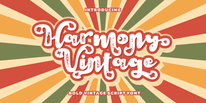 Harmony Vintage is a bold vintage script font. In this font I try to combine vintage with luxury/aesthetics. So that this font can be used in various projects with retro/vintage and luxury themes. Such as logos, branding, posters, packaging, book covers, clothes/apparel, quotes, titles and others. This font come with clean and rough font version. Come with Opentype feature with a lot of alternates, its help you to make great lettering. This font is also support multi language. To access the alternate glyphs, you need a program that supports OpenType features such as Adobe Illustrator CS, Adobe Photoshop CC, Adobe Indesign and Corel Draw.
 - Classic Ribbon by Putracetol,
$28.00 Introducing a new Display Typeface called "Classic Ribbon". Inspired from music poster, carnival, typography and tatto from classic culture with inline style. This Inline style font works great as a headline for music promotion, film titles, Youtube tutorials and gig posters, and when combined with the included graphic presets and achieves a truly realistic classic look. This font is suitable for your projects such as logos, wedding invitations, branding, landing pages, apparel, posters, headlines, greeting cards, invitation cards, social media, crafting, quote and more. This font can be used and supported in various programs and OS, such as procreate, cricut, windows, macOS and others. This font is also support multi language.
 - Retro Summer by Putracetol,
$24.00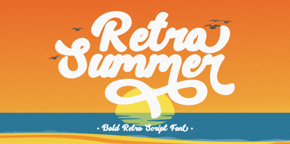 Retro Summer - Bold Retro Script Font. In this font I try to combine vintage with luxury/aesthetics. So that this font can be used in various projects with retro/vintage and luxury themes. Such as logos, branding, posters, packaging, book covers, clothes/apparel, quotes, titles and others. This font come with clean and rough font version. Come with Opentype feature with a lot of alternates, its help you to make great lettering. This font is also support multi language. To access the alternate glyphs, you need a program that supports OpenType features such as Adobe Illustrator CS, Adobe Photoshop CC, Adobe Indesign, Corel Draw, Microsoft Office.
 - Summer Roadtrip by Putracetol,
$20.00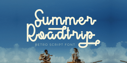 Summer Roadtrip - Retro Script Font. In this font I try to combine vintage with luxury/aesthetics. So that this font can be used in various projects with retro/vintage and luxury themes. Such as logos, branding, posters, packaging, book covers, clothes/apparel, quotes, titles and others. This font come with clean and rough font version. Come with Opentype feature with a lot of alternates, its help you to make great lettering. This font is also support multi language. To access the alternate glyphs, you need a program that supports OpenType features such as Adobe Illustrator CS, Adobe Photoshop CC, Adobe Indesign, Corel Draw, Microsoft Office.
 - Rotis Sans Serif Paneuropean by Monotype,
$98.99Rotis is a comprehensive family group with Sans Serif, Semi Sans, Serif, and Semi Serif styles. The four families have similar weights, heights and proportions; though the Sans is primarily monotone, the Semi Sans has swelling strokes, the Semi Serif has just a few serifs, and the Serif has serifs and strokes with mostly vertical axes. Designed by Otl Aicher for Agfa in 1989, Rotis has become something of a European zeitgeist. This highly rationalized yet intriguing type is seen everywhere, from book text to billboards. The blending of sans with serif was almost revolutionary when Aicher first started working on the idea. Traditionalists felt that discarding serifs from some forms and giving unusual curves and edges to others might be something new, but not something better. But Rotis was based on those principles, and has proven itself not only highly legible, but also remarkably successful on a wide scale. Rotis is easily identifiable in all its styles by the cap C and lowercase c and e: note the hooked tops, serifless bottoms, and underslung body curves. Aicher was a long-time teacher of design with many years of practical experience as a graphic designer. He named Rotis after the small village in southern Germany where he lived. Rotis is suitable for just about any use: book text, documentation, business reports, business correspondence, magazines, newspapers, posters, advertisements, multimedia, and corporate design. - Ability by Scholtz Fonts,
$15.00 Ability is a family of stylish and contemporary handwriting fonts that combine the vigor of hand-drawn fonts such as Affable with the elegance of fonts such as Blythe. What is unusual about Ability is that it enables a word to be formed from a group of letters in a variety of ways: not only the conventional linking of letters as in a cursive script or the placing of letters close to each other on a common baseline, but it uses the overlapping of the swashes and swirls that contribute to the individuality of the characters to integrate the letters into a single word. Ability comes in a number of styles: Legacy - Regular (medium weighted and the basic type of the other styles); - Black (a vigorous and dramatic version of Regular); - Condensed Medium - Condensed Light - Linear 45 (medium-weight font made from a mono-width line) - Linear 25 (light-weight font made from a mono-width line) Suggestions for use: - wedding stationery - greeting cards - valentines day media - beauty products media - lingerie tags - women’s magazine pages - classical music media - award certificates - magazine pages The font is fully professional: carefully letterspaced and kerned. It contains over 235 characters - (upper and lower case characters, punctuation, numerals, symbols and accented characters are present). It has all the accented characters used in the major European languages.
 - Habana Deco ML by HiH,
$12.00 Habana Deco ML was inspired by a hand-lettered sign on the stucco exterior of a small pharmacy in modern-day city of Havana, Cuba. It, in turn, was based on the fat-faced Art Deco lettering of the late 20s and early 30s, especially the Futurismo posters out of Italy, as well as alphabets designed in The Netherlands, France, USA and even the Soviet Union. There are 24 stylistic alternate glyphs (SALT), many inspired by a variety of these sources, including a couple from the sign in the front of the Congress Hotel in South Beach, Miami. The others features of the Habana Deco include 363 glyphs, 184 kerning pairs (KERN), 14 ornaments and shapes (ORNM) and 15 discretionary ligatures (DLIG). This is a font with which you can have fun. The zip package includes two versions of the font at no extra charge. There is an OTF version which is in Open PS (Post Script Type 1) format and a TTF version which is in Open TT (True Type)format. Use whichever works best for your applications.
 - Tavern by FontMesa,
$25.00 Tavern is a super font family based on our Algerian Mesa design, with Tavern we've greatly expanded the usability by creating light and bold weights plus all new for 2020 with the introduction of extra bold and black weights Tavern is now a five weight family. The addition of the bold weight made it possible to go further with the design by adding open faced shadowed, outline and fill versions. Please note, the fill fonts are aligned to go with the open faced versions, they may work with the outline versions, however you will have to apply them one letter at a time. The Tavern Fill fonts may also be used a stand alone font, however, the spacing is much wider than the regular solid black weights of Tavern. In the old days of printing, fill fonts rarely lined up perfect with the open or outline font, this created a misprinted look that's much in style today. To create that misprinted look using two different colors, try layering the outline fonts offset over the top of the solid black versions. Next we come to the small caps and X versions, for a font that's mostly seen used in all caps we felt a small caps would come in handy. The X in Tavern X stands for higher X-height, we've taken our standard lowercase and raised it for greater visibility in small text and for signage where you want the look of a lowercase but it needs to be readable from the street. In August of 2016 I started the project of expanding this font into more weights after seeing the font in use where someone tried creating a bold version by adding a stroke fill around the letters. The result didn't look very good, the stroke fill also caused the shadow line to merge with the serifs on some letters. This lead me to experiment to see if a new bold weight was possible for this font and I'm pleased to say that it was. After the bold weight was finished I decided to type the regular and bold weights together in a first word thin second word bold combination, however the weight difference between the two wasn't enough contrast. This lead me to wonder if a lighter weight was possible for this font, as you can see yes it was, so now for the first time in the history of this old 1908 type design you can type a first word thin second word bold combination. So why the name change from Algerian to Tavern? Since the original font was designed in England by the Stephenson Blake type foundry I decided to give this font a name that reminded you of the country it came from, however, there were other more technical reasons. During the creation of the bold weight the engraved shadow line was sticking out too far horizontally on the bottom right of the serifs dramatically throwing the whole font off balance. The original font encountered this problem on the uppercase E, L and Z, their solution was a diagonal cut corner which was now needed across any glyph in the new bold weight with a serif on the bottom right side. In order to make the light and regular weights blend well with the bold weight diagonal cut offs were needed and added as well. This changed the look of the font from the original and why I decided to change the name, additional concerns were, if you're designing a period piece where the font needs to be authentic then this font would be too new. Regular vs. Alt version? The alternate version came about after seeing the regular version used as a logo and secondary text on a major product label. I felt that some of the features of the regular version didn't look good as smaller secondary text, this gave me the idea to create an alternate version that would work well for secondary text in an advertising layout. But don't stop there, the alternate version can be used as a logo too and feel free to exchange letters between both regular and alternate versions. Where are the original alternates from Algerian? Original alternates from Algerian are built into the regular versions of Tavern plus new alternates have been created. We're excited to introduce, for the first time, all new swash capitals for this classic font, you're going to love the way they look in your ad layout, sign or logo. The best way to access alternate letters in Tavern is with the glyph map in Adobe Illustrator and Adobe InDesign products, from Adobe Illustrator you can copy and paste into Photoshop as a smart object and take advantage of all the text layer style features Photoshop has to offer. There may be third party character maps available for accessing alternate glyphs but we can't advise you in that area. I know what you're thinking, will there be a Tavern Condensed? It takes a lot of hours to produce a large font family such as this, a future condensed version will depend on how popular this standard version is. If you love Tavern we're happy to introduce the first weathered edge version of this font called Bay Tavern available in February 2020.
 - East by Tarallo Design,
$22.99 East is a simple and confident typeface. It is timeless and current, but with a subtle nostalgia of vintage Jazz albums, film credits, newspapers, and signage. The light weight has excellent legibility at small sizes. The Extra Bold weight will capture attention. Its condensed width allows a lot of text in little space. East is versatile, but would be a good choice for film titles, labels + packages, posters, publications or any design where space is limited. It has six weights between Light and Extra Bold. A variable font with weight and slant axes is available and included in a full family purchase. The OpenType features include; stylistic sets, a one story ‘a’, hooked letters, seriffed uppercase I and 1, a slashed zero, raised colon and punctuation (Spanish), several German eszetts, ligatures, diverse bullets, and vertically stacked pre-built fractions. It will support western and central European languages as well as other Latin-based written languages. Read on if you are not familiar with variable fonts. What makes a variable font special is that all font weights are inside of one file and you can incrementally control the width and italic slant between Light (300) and ExtraBold (800). These changes are commonly made with slide controls in the font/type palette of the software. Variable fonts are also smaller in file size, which benefit both web and software performance. Currently variable fonts are supported by Adobe, Sketch, Corel Draw, and most web browsers. Check for your software support here: www.v-fonts.com/support.
 - Chubby Cheeks - Unknown license

- Campcraft by Our House Graphics,
$- Remember those plastic Popsicle sticks that clicked together and you could make things from them with your sticky little fingers? Things like... camp crafts. Well, no� Of course you don't. You were too young. That�s why there is Campcraft. This is a fun loving dot-matrix font, or it would be a fun loving dot-matrix if the vertical and horizontal grid lines didn't pile up at the intersections. Then again, it wouldn't be any fun if they didn't pile up at the intersections, would it? Strictly a display type... Campcraft is excellent for what the name suggests. I goes well with Christmas sweaters, beaded jackets and purses and that time when we were all happy children with sticky little fingers.
 - Trevor by TypeTogether,
$36.80 Teo Tuominen’s Trevor took its first breath as a revival of an 18th century antiqua, but culminated in an entirely new and good-natured family. Trevor is an affable slab serif in nature: both heavy and kind. Known for their familiarity and their dark colour, the terminals of slab serifs put additional weight along the line to maintain an inky presence. Their clunky forms reveal slight immaturity and arouse the reader’s sympathy for the subject at hand. Trevor connects with others by consciously riding the line between being personal and commanding. One goal with Trevor was to pair the robust nature of a low contrast slab serif with more sophisticated elements, such as the ball terminals. So wherever one looks in Trevor, rounded corners rule the day, softening the overall appearance by mimicking ink spread made by old metal type. The easygoing look is tempered by very few inktraps and sharp corners, mostly to the inside of characters and in acute angles. Whatever Trevor is paired with, it has an altruistic outlook in that it sees the best in others. It’s the neighbourly type family — the neighbour you actually want. Trevor’s almost monolinear weight and high x-height give it a typewriter look in the extralight and light weights, but the whole family was made to work with many other font styles, design work, and information structures. It certainly finds its home in packaging and advertising, its sturdy verticality and narrowness fit the needs of headlines and intro text, and its seven weights are primed for plays and involved text needing many layers of distinction. The black weight is treated like a separate display style with altered ball terminals and serifs to capitalise on the added heft. Trevor’s seven roman weights cover the Latin A Extended glyph set to bring its kindly and commanding outlook to your projects. Along with alternate version of the ‘R’ in the black weight, its OpenType features include both tabular and proportional lining and oldstyle figures, ligatures, and fractions. The complete Trevor family, along with our entire catalogue, has been optimised for today’s varied screen uses.
 - Ambicase Fatface by Teeline Fonts,
$48.00 Most fonts include uppercase and lowercase letters. Some experimentally-minded designers have proposed unicase typefaces as well: rather than having two different forms for a given letter, unicase fonts have one, chosen from the upper- or lowercase forms. Ambicase Fatface takes the next step, offering not "either/or", but rather "both/and". Each letter in Ambicase Fatface is a combination of its traditional upper- and lowercase forms, in an extra-bold style. Its inventive, hybrid forms are a bolder take on those of its 2010 sibling typeface, Ambicase Modern. Ambicase Fatface stands out as a carefully crafted experimental font: its eccentric forms do not hinder its readability. It is suitable for high-style display settings. Ambicase Fatface offers a large character set and extensive OpenType features. Most notably, in modern OpenType-aware applications, Ambicase Fatface can be set in swash mode, which features sophisticated decorative flourishes that differ depending on whether the letter is at the beginning, middle, or end of a word. Ambicase Fatface is available in two optical sizes: Regular and Poster. At very large sizes, the Poster cut, with its finer details, is recommended.
 - Bali Script by Eclectotype,
$40.00 Inspired by the Indonesian island’s laid back feel and easy going culture, Bali Script is a tribute to the hand-lettered signage on beach bars, surf shacks and cafes. The swell of the stroke endings and the bolder-than-your-average gooey look convey a cool, contemporary take on baseball scripts. Overlay Bali Script Highlight for a cartoonish, glossy finish. Perfect for logos. This font is jam-packed with OpenType features that make smooth flowing text a doddle. Contextual alternates and ligatures are best left on by default. The alternates especially work a subtle magic that helps letters connect with an even rhythm, and automatically substitutes letters with the best fit alternatives based on their context, such as at the end of words, or adjacent to certain other letters. There are four stylistic sets (or all grouped together in the stylistic alternates feature for those without easy access to them) which do the following: SS01 - changes the r to a script form SS02 - makes certain caps more ‘scripty’ SS03 - capital I (and accented versions of it) get serifs SS04 - underline function. typing two or more underscores extends on underline beneath the previous word. Also included for your pleasure - oldstyle figures, automatic fractions, superior and inferior numbers, ordinals, some discretionary ligatures, swash alternates and extended language support.
 - Farao by Storm Type Foundry,
$21.00Originally designed in 1998 as a 3-font family, updated in 2016 by new italics, small caps and many OpenType functions, resulting in a set of highly visible poster typefaces. If a text is set in a good Egyptienne, we can observe a kind of sparkle in the lines. Slab-serifs are cheerful typefaces, possibly due to the fact that they developed simultaneously with Grotesque typefaces. The design principle originating from the first half of the 19th century does not have such firm and long-established roots as for example, the Venetian Roman typefaces, hence it’s much more prone to a “decline”. We know of Egyptiennes with uneven color, with letters falling backwards (this often happens in the case of “S”), and especially with slightly bizarre modeling of details. In the course of time, however, it was realized that such things could be quite pleasant and tempting. After a century and a half, we find that such Egyptiennes could refresh uniform computer typography. The forms of many twisted letters resemble the gestures of a juggler: others, rectangularly static ones, reflect the profile of a rail or a steel girder – things which, in their times, were new and were observed by the first creators of Egyptiennes. These typefaces are ideal for circus posters and programs for theatre performances, just as for printing on cement sacks. - Kari Display by Positype,
$49.00 Kari Display is the product of a long standing idea I had to give the well-received Positype typeface, Kari, plastic surgery. Just referring to giving a typeface plastic surgery, or letter lipo, stuck in the back of my head until I was able to pick the project up. The ultimate objective was to refine Kari Display to a point where each glyph was expressed as simple as possible... and in that simplicity a sexiness would appear. Kari is a beautiful script, but it is very 'controlled' and orderly and I wanted Kari Display to break that mold with much more movement, curviness, greater modulation and a more elegant feel on the page. I did not want to take it too far, limiting the use of the typeface, but rather opted for a delicate balance of thick and thin against the added movement of the glyphs. The wealth of sketches and proposed variants during the concepting phase was encouraging and I really pushed to add as many alternate characters, ligatures, swashes (and more) as I possibly could. Just about every character has at least one or more alternates AND the complete offering of alternates completely covers a wide range of Latin-based language groups including Central European diacritics. If you are using any type of OpenType enabled application, then the Kari Display Pro typefaces are the way to go. They include everything found in the 3 separate variants for each style as well as entirely expanding offering of additional swash and ligature sets.
 - SF Old South Arabian by Sultan Fonts,
$9.99Historical Background Old South Arabian Script (OSA) was used before the Islamic era not only in the southwest corner of the Arabian Peninsula, but actually in the entire Peninsula. In addition, samples of OSA have been found as far as Uruk in Mesopotamia, Delos in Greece, and Giza in Egypt. Archaeological finds show that as far back as the 8th century BCE, OSA was used in trade, religious writing, and in civil records. Following the spread of Islam in Yemen, the decline of OSA began in the 7th century CE as it was gradually supplanted by Arabic script. OSA was typically known by the name of the then-dominant peoples in the Southern Peninsula. At various times, it was known as Sabaean, Qatabani, or Hadramite, among others. Although it was used for a variety of languages, OSA is most strongly associated with Sabaean. Many Peninsular languages borrowed OSA before introducing further changes of their own. Prime examples are the Thamudic, Safaitic, and Lihyanite scripts which eventually developed into independent scripts. The westward migration of the Sabaean people into the Horn of Africa introduced the South Arabian consonantal alphabet into the region. The transplanted script formed the roots of the Geez script of Ethiopia, which, in time and under presumably external influences, developed into a rich syllabary unlike any other Semitic script in history. Even a cursory examination of the letter forms of Modern Ethiopic writing reveal a striking similarity to South Arabian Script. OSA inscriptions typically reveal a dominant right-to-left directionality, although there are also many cases of alternating directions, known as boustrophedon writing. Figure 1 is a fine example of this style of writing. OSA inscriptions were discovered early in the 19th century. Soon thereafter, two orientalists, Gesenius and Rödiger, made great strides towards deciphering the script. Styles of Writing Old South Arabian inscriptions have survived primarily on stone, ceramic, and metallic surfaces. Hundreds of artifacts have been found and, to this day, continue to be discovered. Some of the best examples number of inscriptions on softer materials, such as wood and leather, have also been discovered. Although there is a significant difference between the styles of letters on the hard surfaces and those on the soft. Old South Arabian (Musnad) is composed of 29 letters , that is one letter more than the Arabic alphabet, which is between “S” and “Sh”, and names “Samekh”. Aspects of difference between Musnad and the present Arabic writing is that Musnad is written in separate letters, and the shape of the letters do not change according to its place in the word. However, some letters change according to the beginning of the writing. Musnad is either prominent, or deep. Prominent writings are for important writings and deep writings are for ordinary. The material on which the Musnad was written were stones, rocks, wood, and metal. In the course of its development the Musnad use appeared in the “Lehyanite’, “Thamudic”, “Safaitic”, pen to which many changes and amendments were made. And from it “Habashi’ writing was born. As regards his place among the Arabs of the Peninsula , when we look at the internet and its role in cultural dialogue , the Arabs of the Peninsula considered Musnad inscription which was indisputably their national writing until the dawn of Islam. It was used by people in all parts of Arabia in their homeland and abroad . It was their means of chronology and record of their glories and history.2- Features of Musnad Script: 1. It is written from right to left and vice versa. 2. Its letters are not joined. 3. Shape of letters are uniform despite their positions in the word. 4. Words are separated by vertical lines. 5. A letter is doubled in case of assertion. 6. No points and punctuations. 7. Easy to be learned by beginners. My OSA Musnad Font My design and technical work is only a treatment of the OSA Musnad as a symbol of writing. And it is possible to use in computer.. My design is not aimed at demonstrating the linguistic and intellectual structure of the Old South Arabian (Musnad). It is so simple that it could be easy to learn by learners and those who are interested in the OSA Musnad letters in computer. The basis of such importance is that it spares a lot of time and effort for researchers and students in this field. Formerly they used to write the Musnad texts either by handwriting or scan them , But now they can easily write its texts in OSA Musnad by using keyboard directly, so that they can change , amend and fulfill easily and accurately . So, we made use of speed, easiness and accuracy. And anyone interested in the South Arabian history in any part of the world can due to this design read and write OSA Musnad letters most easily. This design will also be used by historians and archeologists. , as well as specialist linguistics . The design also demonstrates the aesthetics of the Himyarit writing. About this font family Old South Arabian is An Arabic, Old South Arabian and Latin typeface for desktop applications ,for websites, and for digital ads. Old South Arabian font family contains two types: Old South Arabian and Old South Arabian serif. The font includes a design that supports Arabic, Old South Arabian and Latin languages. Old South Arabian typeface comes with many opentype features. - Ongunkan Brahmi by Runic World Tamgacı,
$60.00 The Brāhmī alphabet is the ancestor of most of the 40 or so modern Indian alphabets, and of a number of other alphabets, such as Khmer and Tibetan. It is thought to have been modelled on the Aramaic or Phoenician alphabets, and appeared in India sometime before 500 BC. Another theory is that Brāhmī developed from the Indus or Harappa script, which was used in the Indus valley until about 2,000 BC. The earliest known inscriptions in the Brāhmī alphabet are those of King Asoka (c.270-232 BC), third monarch of the Mauryan dynasty. Brāhmī was used to write a variety of languages, including Sanskrit and Prakrit.
 - Rockids by Surotype,
$20.00 Rockids is a bold display typeface, Comes in two styles sharp and softed with bold characters, this font is perfect for headlines, posters, movie titles, Games, branding and others.
 - Hardy Mind by Seemly Fonts,
$12.00 Hardy Mind is a simple, organic and bold display font. Simple but with a strong visual effect, this font will instantly make your creation more appealing than any others.
 - Pirouette by Linotype,
$40.99Pirouette is based on a logo that Japanese designer Ryuichi Tateno created for a packaging design project in 1999 (a shampoo container!). Tateno's logo experimented with complex, overlapped swash letterforms. He continued to develop these outside of the initial packaging project, until they took on a life of their own. Eventually, Tateno designed a full typeface out of the logo, Pirouette, which was the first place display face in Linotype's 2003 International Type Design Contest. The Pirouette typeface contains six different fonts. The basic font is Pirouette Regular. This is an engraver's italic lowercase paired with elaborate swash capitals. The swash capitals have two visual elements in their forms: thick strokes and thin strokes. Pirouette Text includes the same lowercase as Pirouette Regular, but the uppercase letters are much shorter and simpler. This "text" font can be used to set longer amounts of copy. Pirouette Alternate contains different lowercase glyphs and additional ligatures, which can be used as substitutes for the lowercase forms in the Pirouette Regular and Pirouette Text fonts. Pirouette Ornaments contains swashes and other knick-knacks that can either be added onto the end of a letter, or used as separate decorative elements or swooshes (accolades) on a page. Pirouette Separate 1 and Pirouette Separate 2 are two fonts that can be layered over top of one another in software applications that support layering (e.g., most Adobe and Macromedia applications, as well as QuarkXPress). Pirouette Separate 1 contains the thick stroke elements from Pirouette Regular's uppercase letters, as well as the same lowercase glyphs that can be found in Pirouette Regular and Pirouette Text. Pirouette Separate 2 contains only the thin stroke elements from Pirouette Regular's uppercase letters. By layering Pirouette Separate 1 and Pirouette Separate 2 over one another, you can give the uppercase letter's thick and thin stroke elements different colors and create unique, more calligraphic designs. The Pirouette family, Tanteno's first commercial typeface, was greatly influenced by the calligraphic and typographic work of the master German designer, Prof. Hermann Zapf, especially his Zapfino typeface. - Dodo by Indian Summer Studio,
$49.00 Modern antiqua (Victorian, Scotch Roman) «Dodo», 2008–2019. Named so as a portmanteau of Bodoni – Didot. XIX-th century fonts, especially Victorian antiquas, were almost excluded from the modern use by their XX-th century's descendants. And these new books had lost too much of their former beauty, elegance. Their old noble spirit. This project, «Dodo» was started in 2008 year as the first then modern revival for the Old Imperial Russian book scotch antiqua, used 120–170 years ago in almost every printed book. Still keeping the spirit of the Steam æra.
