10,000 search results
(0.046 seconds)
- Calfine by Letterhend,
$17.00 Introducing, Calfine, a Bold and strong serif with high contrast weight. This font very suitable to be used as a title or display, make it looks great and stands from the crowd. This font perfectly made to be applied especially in logo, and the other various formal forms such as invitations, labels, logos, magazines, books, greeting / wedding cards, packaging, fashion, make up, stationery, novels, labels or any type of advertising purpose. Features : uppercase & lowercase numbers and punctuation multilingual PUA encoded We highly recommend using a program that supports OpenType features and Glyphs panels like many of Adobe apps and Corel Draw, so you can see and access all Glyph variations.
 - Heater Bellamore by Create Big Supply,
$15.00 Introducing Heater Bellamore, a stunning Script Signature Handwriting Font that adds a touch of elegance to your designs. With its graceful curves and fluid strokes, this font captures the beauty of handwritten script. Whether you're creating a signature, logo, or any other project that requires a personalized touch, Heater Bellamore is here to impress. It features both uppercase and lowercase letters, numbers, and punctuations, offering versatility in your designs. This multilingual font ensures your message can reach a global audience, while ligatures and PUA encoding make accessing unique glyphs a breeze. Explore the full character set of Heater Bellamore and infuse your projects with a touch of sophistication.
 - Biscuit Boodle Ornaments by insigne,
$5.00 Biscuit Boodle Ornaments are the ornament complement to Biscuit Boodle, a fun and uplifting brush-drawn script. Biscuit Boodle Ornaments offers a total of 72 vignettes, crests, fleurons, frames and many other useful ornaments. These ornaments were brush-drawn by Portland Studios‚ Illustrator Justin Gerard and have just a slight amount of natural texture. These energetic and lively ornaments can be resized and rotated easily without any loss of quality and can easily be converted to outlines and modified. Combine them to form unique compositions or insert them into text to add some excitement to your designs. Please see the sample .pdf to see all 72 ornaments in action.
 - Browess Sovar by Ronny Studio,
$19.00 Hundreds of handwritten custom letter combinations make this font look like it was scrawled with a pen, not typed with a computer. These characters belong next to each other... that's how the natural flow and messy style is achieved. You won't see many duplicate letter styles here. Add it with confidence to your projects, and you'll love the results. This typeface is perfect for logos, branding, promotions, book covers, magazine layouts, or simply as a stylish text overlay onto any background image. Features : Lowercase & Uppercase ( All Caps ) numbers and punctuation multilingual alternates PUA encoded Please contact us if you have any questions. Enjoy Crafting and thanks for supporting us! :) Thank you
 - Bike Jam by PizzaDude.dk,
$17.00 I love my bike, and I couldn't dream of not using it on a daily basis - I use my bike in rain, sun, snow, and windy days...all year, in other words! This font is dedicated to my bike, and is the second in a series of handmade fonts! Play around with the 5 layers and your favourite colours, for awesome effects. All versions comes with Contextual Alternates, which means several versions of each letter. In this case, every letter has 7 different versions that automatically cycles as you type! A quite awesome thing, because it makes your text more lively and natural looking!
 - Huyton by Letterhend,
$17.00 Introducing, Huyton- a unique display script with reverse contrast, comes with extrude. The unusual reverse contrast make this typeface one of a kind. This type of font perfectly made to be applied especially in logo, and the other various formal forms such as invitations, labels, logos, magazines, books, greeting / wedding cards, packaging, fashion, make up, stationery, novels, labels or any type of advertising purpose. Features : extrude version uppercase & lowercase numbers and punctuation multilingual alternates and ligatures PUA encoded We highly recommend using a program that supports OpenType features and Glyphs panels like many of Adobe apps and Corel Draw, so you can see and access all Glyph variations.
 - Whimsies by Typephases,
$25.00The Whimsies series goes further in our fixation with invented little people: the three dingbats of this series contain mostly imaginary situations, drawn first with ink on paper. All but a tiny fraction of the illustrations (a total of 114) have been drawn from one's imagination, with no previous models. The themes depicted here are varied and often humorous, though the humour is on the darker side, you are warned. The themes have a definite retro - victorian feel, with top hats, moustaches, long coats, walking canes and the like. Together with their close relatives, our Illustries, Bizarries, Ombres, Absurdies and Genteta dingbats (we give this bizarre collective the common name of Whimbats) you can use the Whimsies in an endless variety of projects, ranging from small spot illustration to whole pages, page spreads or posters applications. You can use them as they come in the digital font, or customize them easily in your favourite graphics program. A touch of texture or color will give them a completely new look. The vectorial nature of digital fonts means you can enlarge them to any size, with no loss of crispness in their outlines. - 99 Names of ALLAH Clear by Islamic Calligraphy75,
$12.00 We have transformed the “99 names of ALLAH” into a font. That means each key on your keyboard represents 1 of the 99 names of ALLAH Aaza Wajal. The fonts work with both the English and Arabic Keyboards. We call this Calligraphy "Clear" because of how clear and easy to read the design is. The first "Alef" has a "hamzit wasel", this indicates that you can pronounce it as both "AR-RAHMAAN" or "R-RAHMAAN" (in the zip file you will find a pdf file explaining the differences in the "harakat", pronunciation and spelling according to the Holy Quran). The "Ye" in this calligraphy doesn't have the two dots, nor does it have a decorative "Ye", just like the Holy Quran. Also, we went for the traditional "soukoun" instead of the Quranic "soukoun" & decorative symbols are at a minimum. Decorative letters used in this calligraphy: "Mim, Aain, Sin, HHe, He, Kaf, Tah & Saad". Purpose & use: - Writers: Highlight the names in your texts in beautiful Islamic calligraphy. - Editors: Use with kinetic typography templates (AE) & editing software. - Designers: The very small details in the names does not affect the quality. Rest assured it is flawless. The MOST IMPORTANT THING about this list is that all the names are 100% ERROR FREE, and you can USED THEM WITH YOUR EYES CLOSED. All the “Tachkilat” are 100% ERROR FREE, all the "Spelling" is 100% ERROR, and they all have been written in accordance with the Holy Quran. No names are missing and no names are duplicated. The list is complete "99 names +1". The +1 is the name “ALLAH” 'Aza wajal. Another important thing is how we use the decorative letters. In every font you will see small decorative letters, these letters are used only in accordance with their respective letters to indicate pronunciation & we don't include them randomly. That means "mim" on top or below the letter "mim", "sin" on top or below the letter "sin", and so on and so forth. Included: Pdf file telling you which key is associated with which name. In that same file we have included the transliteration and explication of all 99 names. Pdf file explaining the differences in the harakat and pronunciation according to the Holy Quran. --------------------------------------------------------------------------------------------------------------------------- Here is a link to all the extra files you will need: https://drive.google.com/drive/folders/1Xj2Q8hhmfKD7stY6RILhKPiPfePpI9U4?usp=sharing ---------------------------------------------------------------------------------------------------------------------------
 - 99 Names of ALLAH Attached by Islamic Calligraphy75,
$12.00 We have transformed the “99 names of ALLAH” into a font. That means each key on your keyboard represents 1 of the 99 names of ALLAH Aaza Wajal. The fonts work with both the English and Arabic Keyboards. We call this Calligraphy "Attached" because the "alef" and "lam" are attached together. The first "Alef" has a "fatha", this indicates to pronounce the first letter. So instead of saying "R-RAHMAAN" you say "AR-RAHMAAN" (in the zip file you will find a pdf file explaining the differences in the "harakat", pronunciation & spelling according to the Holy Quran). You will also notice that the decorative letters in this font are bigger than usual, we also used the traditional "soukoun" instead of the "Quranic soukoun" & we were a little bit more generous than usual with the decorative symbols. Decorative letters used in this calligraphy: "Mim, Aain, Sin, HHe, He, Kaf, Alef, Tah & Saad". Purpose & use: - Writers: Highlight the names in your texts in beautiful Islamic calligraphy. - Editors: Use with kinetic typography templates (AE) & editing software. - Designers: The very small details in the names does not affect the quality. Rest assured it is flawless. The MOST IMPORTANT THING about this list is that all the names are 100% Error Free, and you can use them with your eyes closed. All the “Tachkilat” are 100% Error Free, all the "Spelling" is 100% Error Free, and they all have been written in accordance with the Holy Quran. No names are missing and no names are duplicated. The list is complete "99 names +1". The +1 is the name “ALLAH” 'Aza wajal. Another important thing is how we use the decorative letters. In every font you will see small decorative letters, these letters are used only in accordance with their respective letters to indicate pronunciation & we don't include them randomly. That means "mim" on top or below the letter "mim", "sin" on top or below the letter "sin", and so on and so forth. Included: Pdf file telling you which key is associated with which name. In that same file we have included the transliteration and explication of all 99 names. Pdf file explaining the differences in the harakat and pronunciation according to the Holy Quran. --------------------------------------------------------------------------------------------------------------------------- Here is a link to all the extra files you will need: https://drive.google.com/drive/folders/1Xj2Q8hhmfKD7stY6RILhKPiPfePpI9U4?usp=sharing ---------------------------------------------------------------------------------------------------------------------------
 - Mr Foodie by Hipopotam Studio,
$30.00 Mr Foodie is a set of 825 icons divided into 7 groups – 109 fruit icons, 157 kitchen icons, 120 animal products icons, 100 veggie icons, 107 desserts icons, 127 beverages icons, and 105 other food related icons. You can find a full, multi-color list of every icon with its name and corresponding character on a dedicated website or in a pdf manual. It’s a multilayer font so every group consists of 4 fonts – Regular, Back, Front, and 3rd Color. The Regular style is for single color use only and the Back, Front, and 3rd Color styles are necessary if you want to achieve a multicolor effect. Position three identical text boxes exactly on top of each other, apply layer font styles, and choose whatever colors you like. You’ll quickly discover that some icons don’t have 3rd Color style. This is not a mistake – a lot of things look good with just two colors. Use it to make logos, illustrations, games, app icons, t-shirts, mugs, cooking books, restaurant menus, interior decorations, invitations, balloons, and any other project where fine crafted food drawing is needed.
 - Avenir Next Variable by Linotype,
$328.99 The Avenir Next Variable Set font is a single font file that features three axes: Weight, Width and Italic. For your convenience, the Weight and Width axes have preset instances. The Weight axis has a range from Ultra Light to Heavy. The Width axis provides a range from condensed to regular width. The Italic axis is a switch between upright and italic. Variable fonts act as a complete family of fonts in a single file. The new Variation font feature is supported by a growing number of desktop design applications, and more importantly by all the major web browsers. Variable fonts provide a variety of benefits to web and print designers and developers including flexible, responsive typography.
 - Crispbake by Hanoded,
$15.00 A crispbake is a kind of cracker or rusk you eat for breakfast. At least, in Holland we do. They are called 'beschuit', they are round and they come in a pack of 13 (which is a baker's dozen). It turns out that this odd number of crispbakes in a pack comes from the fact that the ovens they were baked in held 13 crispbakes in a row and it was easier to pack them like that. So, should this question pop up during a game of trivial pursuit, you now know the answer! Crispbake font is a crunchy brush font. Completely handmade using a brush and Chinese ink. This fresh all caps font comes with a set of alternate glyphs and extensive language support, including Vietnamese and Greek.
 - Amerika Pro - 100% free

- Cíclope by Andinistas,
$19.95 Cíclope is a typeface family designed by Carlos Fabián Camargo in 2012 and used to write the headlines. Its idea is based on an army of stone soldiers that with their size and strength cause earthquakes. Under this concept he obtained stencil and sans serif letters with monstrous shapes and torn counterforms. Its usefulness as well as readability consists in imitate rocks with scars and cracks. For that reason, Cíclope family has three sizes, each with their respective italics distributed at different levels of corrosion. In addition, each file contains 260 glyphs useful for designing words and phrases with systematically eroded treatments for advertisement material. Thus Cíclope works as a raw material in the exploration of new graphic design. Finally, Cíclope concept has grotesque, geometric and humanistics letters roots that seem disastrous but each and every detail has been planned with high definition drawing. Most importantly, it expresses a big amount of grunge style with cracked edges and medium contrast between thin and thick strokes. In that sense, the writing seems impaired and special for design of logos, posters, flyers, brochures and worn, crusty or demolished graphic design.
 - Fingerfood by Hanoded,
$15.00 I made this font using my index finger and Chinese ink. I thought the ink would come off easily, but I can tell you: it doesn’t. I have been walking around with a black stained finger for a week now and I do get strange looks from people every so often… Fingerfood, of course, is hand made. It is a rather playful font - all caps, but lower and upper case differ and like to mingle. Comes with a full diacritics palette.
 - Haboro Slab by insigne,
$- Haboro Slab. It’s a nose-to-the-grindstone kind of font like the first of its family. This slab serif pushes through the clutter powerfully in editorial and corporate work such as business websites and software. The Haboro hyperfamily as a whole is known for its ability to make the work clear and simple, even with the fonts’ advanced angle--and Slab is no change here. Consistent with Haboro, too, the simplified geometric features of the slab face just make sense, no matter where you use it. Its timeless wedge-molded serifs give this family the formula it needs to function flexibly in jobs from fashion to packaging. Enhance your output with the font’s wide range of ligatures and alternates, including OpenType alternates. Use Haboro Slab’s large pair of solution glyphs and various other OpenType specifics, too, to give your message the clarity it deserves. Even more, it couples well with the sophisticated didone of the Haboro hyperfamily to further expand your capabilities. Haboro Slab has every quality you need for successful lettering. Use this modification on a classy tradition to mold and shape your next layout, whether website, iPhone app, advertising, or newspaper. There is no work Haboro Slab won’t power through.
 - Wayfinding Sans Pro by FDI,
$49.00 Ralf Herrmann, the designer of Wayfinding Sans, started this project with extensive field studies, driving tens of thousands of miles to explore the legibility of road signage typefaces in dozens of countries around the world. After building his own theoretical framework of relevant legibility parameters, the design process used a unique custom real-time simulation software, which could simulate difficult reading conditions (distance, fog, halation, positive/negative contrast) while the letters were actually being designed. This process made it possible to optimize even the tiniest details of each letter for maximum legibility. Being made specifically for wayfinding purposes, this type family does not compromise on any aspect of legibility — and yet, the typeface is a beautiful, clean and modern sans serif. With its broad language support and the large number of available styles it is perfectly suitable for any possible signage project anywhere in the world. In an independent empirical study at the University of Applied Sciences “htw” in Berlin different typefaces were recently tested when used on signs and Wayfinding Sans Pro was the winner in all conducted tests, being significantly more legible and therefore superior to all other styles of the tested typefaces. Check out the PDF specimen for more information: wayfinding-sans-pro.pdf
 - Nukman Tsabit by Doeltype,
$19.00 Nukman Tsabit a modern serif. This "Nukman Tsabit" is well suited for various design projects, such as logos, advertising, quotes, packaging design and others.
 - Redwinger by Ditatype,
$29.00 Redwinger is a captivating display font designed with a games theme, featuring different proportions of letters and sharp, uneven borders. This font showcases different proportions in its letterforms, adding a sense of variety and excitement to the font. Each uppercase letter has its own distinct width and height, creating a visually engaging composition. This design choice adds a playful and dynamic element to the font, reflecting the diversity and unpredictability of the gaming world. The sharp and uneven borders of Redwinger enhance its edgy and adventurous aesthetic. The jagged edges and irregular shapes give the font a distinctive and daring look, evoking a sense of action and intensity. This unique feature adds a touch of excitement and captures the spirit of gaming. For the best legibility you can use it in the bigger text. Enjoy the available features here. Features: Stylistic Sets Multilingual Supports PUA Encoded Numerals and Punctuations Redwinger fits in headlines, logos, posters, titles, branding materials, print media, editorial layouts, website headers, and any other projects that aim to transport players into thrilling virtual worlds. Find out more ways to use this font by taking a look at the font preview. Thanks for purchasing our fonts. Hopefully, you have a great time using our font. Feel free to contact us anytime for further information or when you have trouble with the font. Thanks a lot and happy designing.
 - Judger by Twinletter,
$15.00 Judger is a graffiti typeface that we created with the purpose of producing unique works that can be applied to a number of your projects, prioritizing high flexibility in order to make it easier for you to respond to your diverse needs. This typeface is not only versatile, but it will also make your project look appealing, attractive, and cool. When you use this font, viewers will perceive your project as high quality, professional, and well-designed, and your project will be highly rated. This graffiti font is great for product logos, poster titles, headlines, packaging, film titles, logotypes, gorgeous writing, and trendy graffiti designs, among other things. Of course, if you utilize this font in your numerous creative projects, they will be perfect and outstanding. Use this typeface right away for your one-of-a-kind and remarkable projects.
 - Thoriq by Cititype,
$17.00 Introducing our new font which is signature style. monoline looks like writing with a 'Rollerball pen'. We give the name this font "Thoriq". Thoriq means path, pattern or way. its analogized from the way people write with bold and definite strokes. The font consists of a lowercase, uppercase and swash with a strong character so it is suitable for use for brand logos, you can print it on t-shirts, cards, posters and other merchandises. We also created a special font that consists of a beginning and ending swash only, uppercase is a beginning swash while lowercase is an ending swash, this is so that you can easily apply it to online media, such as web banners and digital signatures. Also equipped with ligatures to add a natural writing impression. You want to write a quick note or quote, come on… this is the right choice
 - QARVIC by Alit Design,
$12.00 Introducing QARVIC TYPEFACE, a simple and beautiful font made with persistence and passion. QARVIC has a unique character when compared with the others sans serif font, it has two types of letters (plain type and type grunge) and there also has an outline QARVIC icon characters. QARVIC typeface is suitable for simple logo design, website header, wedding design, badges, menu fonts for website, to design fashion and others that have a minimalist and simple concept. Thank you and enjoy :)
 - School Fiesta by Mvmet,
$12.00 School Fiesta is a cool font that will be perfect for your school festival theme or other event displays. The fun, festive, and happy vibe will be there when you use it. You can use it for anything ranging from t-shirts, other merchandise, kids’ book designs, and greeting cards to stickers and posters, or anything that needs a casual touch. Fall in love with its incredibly versatile style, and use it to create lovely designs!
 - Golden Class Font Duo by Subectype,
$9.00 The Golden Class is a font duo between a serif and two modern script fonts. Golden Class is good for logo branding, wedding invitation, typography wedding, quotes text, magazine, or anything you want to do. Golden Class Serif includes numbers punctuation, alternates, and it also supports other languages. Golden Class script was built with OpenType features and includes ligatures, beginning and ending swashes (lowercase alternate), numbers, punctuation, alternates, and it also supports other languages. Thank you!
 - Charpentier Classicistique Pro by Ingo,
$41.00 An unconventional classicistic Roman typeface This Roman typeface has a livelier effect than is typical of the epoch of classicistic style. In the lower case letters, an echo of the smoother forms of historically early scripts is identifiable. Typical of a classicistic Roman typeface are the emphasized and clear contrast in the weight of the strokes, the fine serifs and the accentuation of the vertical bold stem. Charpentier Classicistique is pleasantly legible. Its effect is much less harsh than other classicistic fonts. The pointed forms of M and N are uncommon. At 30°, the italic version of Charpentier Classicistique is unusually strongly slanted. The italic lower case letters refer, in part, to English handwriting, which also falls under classicism. Especially the curves show forms influenced by writing. Charpentier Classicistique supports all European languages including Turkish, Greek and Russian. It includes lots of ligatures, also discretional ones, as well as tabular figures and cap-height figures.
 - Wonder Brush by Canada Type,
$29.95 Wonder Brush is a display typographer's guilty pleasure. It's one of very few fonts ever made that can take intense abuse and still look natural. Partly based on a 1969 Friedrich Poppl design called Poppl Stretto, but considerably fused with ideas found in interwar magazine ad lettering and signage, Wonder Brush caters to the idea that most graphic designers would rather use design elements they can enjoy. When you spend your days being "challenged" and "creatively tested" and "communicating the message," you can definitely use a little bit of playtime. And this font gives you just that, playtime on the job. Wonder Brush appears to be a straightforward narrow upright brush script. But it really is made of malleable rubber. Take it into a program like Adobe Illustrator, set something, stretch or squeeze, shear or warp, slant or transform… just play with it like they used to do in the 70s and 80s. You will soon discover that this font really is a big old top hat, and it's up to you and your mischief to pull rabbits or geese out of it. A single font that allows you to emphasize content or manage space mechanically without affecting the integrity of the type setting. And if your playtime includes fiddling with OpenType features, you're in for a bonus treat: Wonder Brush comes with over 800 characters, including a lot of alternates and extended language support. So tweak away until your eyes cry with joy. The only rules are the ones you set, and even those are meant to be broken.
 - Campeno by Craft Supply Co,
$20.00 Geometric Precision Let’s step into the world of Campeno, a Geometric Sans Serif font that embodies precision and order. This font is the epitome of geometric perfection, making it an ideal choice for various editorial applications. Editorial Excellence Campeno’s geometric form is what sets it apart and makes it a top choice for editorial needs. Whether you’re working on magazines, long-form text, or other editorial projects, its geometric precision enhances readability and offers editorial excellence. Versatile Typography What makes Campeno even more exceptional is its versatility. It seamlessly adapts to diverse design contexts, ensuring that it can be used for a wide range of projects, from magazines to websites and beyond. Engaging Readability Beyond its geometric aesthetics, Campeno excels in providing engaging readability. It guides the reader through the content, focusing on the message while maintaining a visually appealing design. In Conclusion In summary, Campeno – Geometric Sans Serif is the font that brings precision and clarity to your editorial projects. Its geometric form ensures that your content is not only engaging but also visually appealing, catering to a broad readership while maintaining a high standard of clarity. Whether you’re working on magazines, websites, or other editorial endeavors, Campeno stands out as a font that combines aesthetics with functionality, offering editorial excellence for your projects.
 - Roves by Andrew Footit,
$12.00 Roves is a font family dedicated to exploration, adventure and the early merchants of history. The word rove means “a journey, especially one with no specific destination; an act of wandering”. the family consists of three Stencil versions each with a Regular and Bold weight as well as two Sans versions each also with a regular and bold weight, this is a total of 10 different options to work with. When combined these two fonts create great looking typography that compliment each other but each also strong enough to be used on their own. The Roves family is a display font with a great rust vintage feel to it which gives the user an authenticity when working with typographic projects. Roves has been created with the designer in mind, to create with and explore the different options with in the family.
 - Black Junkiest by Aminmario Studio,
$30.00 Introducing - Black Junkiest SVG Font Collections Black Junkiest font preserves all the high definition detail of the original handwritten letters. Combine uppercase, lowercase, and alternative fonts to find great-looking creativity for your designs. Take your design to the up level with a hyper-realistic font that truly looks hand painted. Black Junkiest uses brand new technology that makes way for more authentic looking fonts and is sure to grab the attention of customers and designers alike. Uses actual images and transparency effects in order to get the quality that you see. This is all made possible thanks to the latest developments of the OpenType-SVG format, and the integration of that technology into Photoshop CC 2017 and Illustrator CC 2018 (or newer). Black Junkiest installs like any other font, and can be used in any color, on any background.
 - Gustatory Delight by Ali Hamidi,
$12.00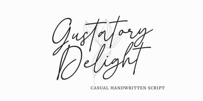 Gustatory Delight is a perfect handwritten script font that has a modern and authentic look, this font has a simple and unique character in both lowercase and uppercase, this font is perfect for branding, signature, logo, packaging, presentations, planners, resumes, business card, brochures, fashion, t-shirt, wedding invitations, yard signs and more.
 - VLNL Neue Sardines by VetteLetters,
$35.00 Sardines is a project by Jacques Le Bailly aka Baron von Fonthausen. It first saw the light as a student project for a monospaced font and eventually grew into Vette Letters’ largest font family. We saw its potential and expect it to be a million seller, just like our other typefaces. VLNL Sardines comes in 42 different variations, like rough and clean cuts, regular and condensed widths (condensed is the exactly half of the regular width). Sardines is an eclectic mash of classic curves and mathematical measurements, leaving a very distinct typographic flavor. While most of our type is market-fresh, this one comes out of the can, but it’s delicious nonetheless. And it’s great for adventurous BBQ-ing!
 - Roby Soho by Alit Design,
$14.00 Introducing Roby Soho Typeface The Roby Soho font is inspired by today's simple styles, the Roby Soho font is a serif typeface with alternative support that can make your designs more interesting and unique than others. In addition, the Roby Soho font also has multi-language that is easy to use. This is a versatile font that works great in both small and large sizes, for body text or header text. The Roby Soho font is also supported with a variety of families from thin version to Black version. It is suitable for editorial design projects, logo designs, branding, product packaging, magazine covers, Instagram posts, social media text stories, and so on.
 - Waters Titling by Adobe,
$35.00Waters Titling is the work of lettering artist Julian Waters, a multiple master typeface of classical calligraphic roman capitals. This broad-tipped pen design is related to other historically-based titling alphabets but offers a wider range of weights and widths, making it extremely versatile for movie titles, book jackets, posters, banners, calendars, etc. Waters Titling is based on the timeless Roman monumental inscription forms of almost 2000 years ago, but also has a touch of contemporary vigor and flair. The design displays a strong calligraphic thick/thin stroke weight contrast and flowing, subtly bracketed serifs. In lighter weights, Waters Titling is elegant and delicate, while the bolder weights offer a more substantial sparkle. - Sispectly Harmonies Italic by suhadidesign,
$15.00 Sispectly Harmonies classic and nostalgic serif Hi ladies and gentlemen! In accordance with market demand for classic retro design fonts, I created a serif font that suits your views. The Sispectly Harmonies font is a classic nostalgic serif font. is here to become a market favorite. We made this font look elegant, classy, easy to read, stylish, attractive and easy to use. Sispectly Harmonies Font is a great choice for retro designs, logos, magazines, classic, classy designs, newspapers, modern, books, brand names, branding, and other projects. The Sispectly Harmonies font is here to enhance the quality of your designs. Follow us for the next classy font creation :) Feature: • Uppercase • Lowercase • Regular version • Italicized version • Multilingual Support • Numbers and punctuation
 - Lincoln Road by District 62 Studio,
$29.00 Introducing our new Lincoln Road Font Collection. Deco, but not too Deco. A Lincoln Road is a family of 9 fonts including 2 weights of Deco and 6 weights of a coordinating Sans and an Elements font that contains the frames and elements you see used in the previews. Each Deco weight has a corresponding Sans weight. Lincoln Road was inspired by art Deco styles, but is a modern interpretation - in other words - not too deco. It works for modern projects that need a hint of a decorative look and can also be used for a more vintage vibe. Check out the previews to see some of the ways you can use this family.
 - FP Dancer Tango by Fontpartners,
$29.00 FP Dancer Tango is a humanist-influenced techno-like font, designed 2012-14 by Morten Rostgaard Olsen & Ole Søndergaard. FP Dancer Tango will be a useful tool, helping you to create wonderful headlines and text-columns in magazines and so. The font is surprisingly readable, even in small point sizes. Among other things as a result of the smooth transitions between the angular shapes. In addition, the condensed shapes saves a lot of space.
 - Blaq by Resistenza,
$39.00 Inspired by Henry W. Troy, BLAQ is a new version of Trojan Text not available as font. Is an ornamental blackletter alphabet. Works great in headlines and other ‘masculine’ like design settings. The Victorian Gothic or Neo-Gothic is an architectural movement that began in the 1740s in England. Its popularity grew rapidly in the early nineteenth century. The revived Gothic style was not limited to architecture. We recommend to combine Blaq with: Turquoise Nautica
 - Nadah by Nantia.co,
$12.00 Nadah Grunge Handwritten Greek font is a decorative font. Of course, the font supports Greek character set and a full extended Latin character set with diacritics. The raw, organic feeling of the font it makes it ideal for the food industry. Also, it’s ideal for creating social media content, for branding, poster design, wedding invitations, or any other packaging. So with your purchase, what is included? Extended Latin Characters Greek Characters Numerals
 - Shad by Ingo,
$27.00 The Shad is the almost illegible cousin of the >> Chiq. As the name suggests - it consists of the shadows of the letters. And the bolder the font style, the stronger it is. The “Light” only has a thin shadow, while the “Black” casts a very deep, broad shadow. Shad only consists of the letter shadows, the corresponding letter remains transparent, i.e. without filling. The “metrics”, i.e. the spacing and character widths, correspond to those of Chiq, so that both fonts can be placed congruently on top of each other. When you combine and play with the two fonts, very attractive effects quickly emerge. Shad brings a bit of 3D into typography.
 - ITC Caslon No. 224 by ITC,
$40.99 The Englishman William Caslon (1672-1766) first cut his typeface Caslon in 1725. His major influences were the Dutch designers Christoffel van Dijcks and Dirck Voskens. The Caslon font was long known as the script of kings, although on the other side of the political spectrum, the Americans used it as well for their Declaration of Independence. The characteristics of the earlier Renaissance typefaces are only barely detectable. The serifs are finer and the axis of the curvature is almost or completely vertical. The overall impression which Caslon makes is serious, elegant and linear. Next to Baskerville, Caslon font is known as the embodiment of the English Baroque-Antiqua and has gone through numerous new interpretations, meaning that every Caslon is slightly different. ITC Caslon 224 was designed by Edward Benguiat and appeared with ITC in 1982. It is the text font which expanded upon the title font ITC Caslon 223. The alterations in the proportions of the letters make this Caslon 224 a noticeable departure from the original, but make the font overall more legible.
