10,000 search results
(0.069 seconds)
- Malaga by Emigre,
$59.00 Why do we need another typeface? This is a prickly question often asked of typeface designers. Depending on who you ask, the answer in simplified form is usually one of two: 1. As the basis of written communication, type design carries social responsibility, so we must continue to improve legibility. 2. Type design is a form of artistic expression. Without art, life is not worth living. The best work, of course, accomplishes both. Xavier Dupré, the designer of the Malaga typeface family, has at least one leg securely planted in the latter notion. He believes, like others, that within typeface design most legibility needs have been worked out and that today we are satisfying aesthetic desires. We design typefaces to differentiate our communications. Type design is primarily a formal exercise reflecting our personal quirks, technological obsessions, and cultural heritage. In case of Dupré’s work, issues of cultural heritage and personal quirks are of particular consequence. An incessant traveler, he visited the following countries during the development of the Malaga type family: Thailand, Malaysia, Indonesia, Myanmar, Cambodia, Vietnam, France, Belgium, and finally, Spain, where his choice for the name Malaga originates (Malaga is a port city in southern Spain). Dupré’s home is where his laptop is. He travels with a 12- or 15 inch PowerBook, without a printer, and with sporadic access to his reference books and other historical documents. All he needs is a table and chair. He even learned to design without a mouse since hotel and cafe tables are often too small to also fit a mousepad. Dupré is the new global designer who can take disparate influences and fluidly process the information into a coherent whole. Malaga is a case in point. It is inspired by ideas ranging from blackletter to Latin fonts, and from the Quattrocento’s first Venetian antiquas to brush stroke types. This makes Malaga a richly animated font saturated with unorthodox detail. Its black and bold weights are particularly suited for headlines and short texts, while the subtle modulation and moderate contrast in the regular and medium weights makes it perfectly readable in extended text settings. While Malaga doesn’t claim to resolve any particular legibility issues, it is nonetheless perfectly readable and will impart any design with a healthy dose of visual character.
 - Leomarle by Alit Design,
$20.00 Presenting the LEOMARLE typeface from alitdesign. Leomarle is inspired by the classic blackletter font. The leomarley font is designed with an elegant combination of scripts that is very cool when combined with a simple blackletter style. This font looks unique and elegant when used for making designs. LEOMARLE is perfect for magazine cover designs, brochures, flyers. Instagram ads, Canva Design and so on with unique and modern concepts. besides that this font is very easy to use both in design and non-design programs because everything changes and glyphs are supported by Unicode (PUA). The "LEOMARLE"contains 591 glyphs with many unique and interesting alternative options. Language Support : Latin, Basic, Western European, Central European, South European,Vietnamese. In order to use the beautiful swashes, you need a program that supports OpenType features such as Adobe Illustrator CS, Adobe Photoshop CC, Adobe Indesign and Corel Draw. but if your software doesn't have Glyphs panel, you can install additional swashes font files.
 - DINfun Pro Plain by CheapProFonts,
$10.00 This is my version of the classic DIN 1451 Mittelschrift, complete with a large multilingual character set. I have made it primarily because I want to have a bit of fun with it by experimenting with giving it some very different expressions - far removed from its serious and no-nonsense roots. Time to spice up that DIN profile! Check out the "Buying choices" tab for all the themed variants! :) ALL fonts from CheapProFonts have very extensive language support: They contain some unusual diacritic letters (some of which are contained in the Latin Extended-B Unicode block) supporting: Cornish, Filipino (Tagalog), Guarani, Luxembourgian, Malagasy, Romanian, Ulithian and Welsh. They also contain all glyphs in the Latin Extended-A Unicode block (which among others cover the Central European and Baltic areas) supporting: Afrikaans, Belarusian (Lacinka), Bosnian, Catalan, Chichewa, Croatian, Czech, Dutch, Esperanto, Greenlandic, Hungarian, Kashubian, Kurdish (Kurmanji), Latvian, Lithuanian, Maltese, Maori, Polish, Saami (Inari), Saami (North), Serbian (latin), Slovak(ian), Slovene, Sorbian (Lower), Sorbian (Upper), Turkish and Turkmen. And they of course contain all the usual “western” glyphs supporting: Albanian, Basque, Breton, Chamorro, Danish, Estonian, Faroese, Finnish, French, Frisian, Galican, German, Icelandic, Indonesian, Irish (Gaelic), Italian, Northern Sotho, Norwegian, Occitan, Portuguese, Rhaeto-Romance, Sami (Lule), Sami (South), Scots (Gaelic), Spanish, Swedish, Tswana, Walloon and Yapese.
 - Celtic Garamond Pro by CheapProFonts,
$10.00 A classical proportioned text font - with a Celtic twist! Perfect for that oldstyle look, but still very readable. I have cleaned up the outlines, improved the spacing and kerning, modified a few letterforms - and then expanded the character set by 440%! A bolder weight has now also been created, and a rough version for a more antique look. ALL fonts from CheapProFonts have very extensive language support: They contain some unusual diacritic letters (some of which are contained in the Latin Extended-B Unicode block) supporting: Cornish, Filipino (Tagalog), Guarani, Luxembourgian, Malagasy, Romanian, Ulithian and Welsh. They also contain all glyphs in the Latin Extended-A Unicode block (which among others cover the Central European and Baltic areas) supporting: Afrikaans, Belarusian (Lacinka), Bosnian, Catalan, Chichewa, Croatian, Czech, Dutch, Esperanto, Greenlandic, Hungarian, Kashubian, Kurdish (Kurmanji), Latvian, Lithuanian, Maltese, Maori, Polish, Saami (Inari), Saami (North), Serbian (latin), Slovak(ian), Slovene, Sorbian (Lower), Sorbian (Upper), Turkish and Turkmen. And they of course contain all the usual "western" glyphs supporting: Albanian, Basque, Breton, Chamorro, Danish, Estonian, Faroese, Finnish, French, Frisian, Galican, German, Icelandic, Indonesian, Irish (Gaelic), Italian, Northern Sotho, Norwegian, Occitan, Portuguese, Rhaeto-Romance, Sami (Lule), Sami (South), Scots (Gaelic), Spanish, Swedish, Tswana, Walloon and Yapese.
 - Squaripeg by Andy Peat,
$9.00 About this font family Squaripeg is a funky square typeface with geometric shapes to create impactful headlines and web banners. This typeface was designed so that it takes up less horizontal space but still has a lot of prominence on the page. Some letters have been combined into one unit to save further space. Features 8 weights (from thin to black) Multi language Ligatures To be able to access alternative fonts, make sure the software you use can support opentype features such as Microsoft Word, Paint, Adobe, Corel draw, Cricut and other applications. Designed and published by Andy Peat. Released April 2022
 - Summer Vacation by PandAE86,
$12.00 Introducing Summer Vacation. Summer Vacation font is a simple and classy font, comes with opentype features such as stylistic alternates,swash and ligatures. We make this font looks classy, readable, stylish, catchy and easy to use. Summer Vacation is the great choice for photography, signature or signature logo design, quotes, album cover, business card, and many other design project. From business cards to photo watermarks, Summer Vacation is here to elevate your work to the highest level. What is include : · Numeral and Punctuation · Ligatures and Alternate · Multilingual Support I hope you enjoy this font. Thank You, Dedi T
 - Uncia Black by Greater Albion Typefounders,
$12.00 Greater Albion Has been toying with thoughts of a “unicase” typeface for a while. On the other hand we’ve always wondered just what practical use they are. It is also a while since we’ve introduced a ‘handwritten’ design. Therefore, It struck us that one answer was something ‘hand-lettered’. These days many people do write in a sort of informal unicase don’t they? But, at the same time, we wanted it to have a little character. So here it is, a bit calligraphic, with a touch of black-letter and a cunning mix of upper- and lower-case forms Uncia Black!
 - Bhortead by Vultype Co,
$29.00 Bhortead that has a vintage theme that you can use for your project. This font has 2 styles, Clean and Rough, and so you can use that style according to the type of project. This font has many OpenType features so you can combine each font to be more dynamic. Special features include: stylistic alternates, ligatures and swashes. Bhortead includes western European characters (multilingual support). All characters have an imperfect shape that gives a natural look in design. It cooperates well for creating the traditional style logos, labels, package design, lettering for t-shirts and much others.
 - Rosterine by Letterhend,
$19.00 Rosterine is a condensed display typeface with the touch of nostalgic and vintage feel . This typeface has unique looks and strong characters. This font perfectly made to be applied especially in logo, and the other various formal forms such as invitations, labels, magazines, books, greeting / wedding cards, packaging, fashion, make up, stationery, novels, labels or any type of advertising purpose. Features : Uppercase & lowercase (alternates) Numbers and punctuation Stylistic alternates multilingual PUA encoded We highly recommend using a program that supports OpenType features and Glyphs panels like many of Adobe apps and Corel Draw, so you can see and access all Glyph variations.
 - Ganiser by Letterhend,
$17.00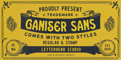 Ganiser Sans is a vintage display typeface with the touch of nostalgic feel. This typeface has unique looks and strong character. This font perfectly made to be applied especially in logo, and the other various formal forms such as invitations, labels, magazines, books, greeting / wedding cards, packaging, fashion, make up, stationery, novels, labels or any type of advertising purpose. Features : Uppercase & lowercase (alternates) Numbers and punctuation Stylistic alternates multilingual PUA encoded We highly recommend using a program that supports OpenType features and Glyphs panels like many of Adobe apps and Corel Draw, so you can see and access all Glyph variations.
 - Meridian Beauty by Letterhend,
$17.00 Meridian Beauty is a handwritten with clean and chic looks. The natural flow make this font looks like a real hand writing. This font perfectly made to be applied especially in logo, and the other various formal forms such as invitations, labels, logos, magazines, books, greeting / wedding cards, packaging, fashion, make up, stationery, novels, labels or any type of advertising purpose. Features : Uppercase & lowercase Numbers and punctuation Alternates & Ligatures Multilingual PUA encoded We highly recommend using a program that supports OpenType features and Glyphs panels like many of Adobe apps and Corel Draw, so you can see and access all Glyph variations.
 - Rolling by Gatype,
$14.00 Introducing Rolling - a typeface inspired by classic style script. This font has many alternative styles, and ligatures, so you can play around with it using the OpenType feature and create letters with a natural touch. This type of font is perfectly made to be applied especially to logos, and various other formal forms such as invitations, labels, logos, magazines, books, greeting/wedding cards, packaging, fashion, make-up, stationery, novels, labels, or whatever. type of advertising objective. The script includes a set of uppercase characters, numbers, Alternates, etc. Thank you very much for viewing and Enjoying it.
 - Fathom by Device,
$39.00 Fathom is a refined flared-serif face that is elegant and robust, modern yet suggests a legacy. The generous lower-case x-height make it worm and readable. Seven weights, plus matching italics, cover all headline and text requirements. The addition of old-style numerals and tabular numerals for charts make it a versatile family for brochures, corporations, heritage projects, packaging, book covers, reports, signage, magazines and more.
 - Kabusi by Twinletter,
$15.00 Kabusi San Serif is a premium font family with 18 different styles to choose from. Designed to aid you in the creation of visually stunning projects of all types. It is the most widely used typeface on the internet, in printed materials, and in other design projects. This Kabusi San Serif font embodies both modernity and classicism while remaining simple and clean in appearance. Apart from their great looks, this premium font family will assist you in giving your company a more unique look that will pay off! of course, your various design projects will be perfect and extraordinary if you use this font because this font is equipped with a font family, both for titles and subtitles and sentence text, start using our fonts for your extraordinary projects.
 - ITC Cancione by ITC,
$40.99ITC Cancione is the inspired work of California calligrapher and illustrator Brenda Walton. She gave a rough texture to her tall, thin all caps alphabet and its ornaments, making them look as though they were drawn with a brush on stone and then left to withstand years of weather and wear. The graceful letters are complemented by a variety of ornaments and flourishes as well as alternates and even stylized words making ITC Cancione perfect for greeting cards and stationery. - Rodia by Monotype,
$25.00 Rodia is an Oddball Geometric Sans Typeface consisting of nine weights in both roman and oblique. It’s a geometric sans with a twist that’s perfect for branding and identity projects – it will also give your body text a unique voice. Inspiration came from the iconic “RADIO” signage that was once in place at 5041, Pico Boulevard, Los Angeles in 1985 (documented at https://tinyurl.com/y2krt2ox). With its distinctive leg, the /R/ provides a personality trait to define the style of the character set. You can clearly see how this characteristic separates Rodia from other geometric sans families – the /k/v/w/x/y/K/R/V/W/X/Y/ glyphs all display the distinctive ‘feet’ and ‘hands’ as terminals to legs and arms. Then there is the /A/ with its triangular crossbar – this triangular motif has been used to embellish alternates in Stylistic Set 1 for /A/E/F/G/H/Q/S/ glyphs. These will add another layer of versatility for your typographic projects. Rodia features an extensive character set covering all Latin European languages. Key features: 9 weights in Roman and Oblique Full European character set (Latin only) 400+ glyphs per font.
 - Molliquam by Garisman Studio,
$20.00 Molliquam font starts from a brush stroke with a script style and also follows the times. Molliquam is very suitable for use in various media such as; packaging, logos, labels, posters, shirt design, quote of wisdom, hand-lettering, typography and many other media. - Ligature - Natural brush touch - PUA Encoded open - Support for MAC or PC - Simple installation for Adobe Illustrator, Corel Draw, Photoshop, or other software design Thanks Garisman Studio
 - Antique by Storm Type Foundry,
$26.00The concept of the Baroque Roman type face is something which is remote from us. Ungrateful theorists gave Baroque type faces the ill-sounding attribute "Transitional", as if the Baroque Roman type face wilfully diverted from the tradition and at the same time did not manage to mature. This "transition" was originally meant as an intermediate stage between the Aldine/Garamond Roman face of the Renaissance, and its modern counterpart, as represented by Bodoni or Didot. Otherwise there was also a "transition" from a slanted axis of the shadow to a perpendicular one. What a petty detail led to the pejorative designation of Baroque type faces! If a bookseller were to tell his customers that they are about to choose a book which is set in some sort of transitional type face, he would probably go bust. After all, a reader, for his money, would not put up with some typographical experimentation. He wants to read a book without losing his eyesight while doing so. Nevertheless, it was Baroque typography which gave the world the most legible type faces. In those days the craft of punch-cutting was gradually separating itself from that of book-printing, but also from publishing and bookselling. Previously all these activities could be performed by a single person. The punch-cutter, who at that time was already fully occupied with the production of letters, achieved better results than he would have achieved if his creative talents were to be diffused in a printing office or a bookseller's shop. Thus it was possible that for example the printer John Baskerville did not cut a single letter in his entire lifetime, for he used the services of the accomplished punch-cutter John Handy. It became the custom that one type founder supplied type to multiple printing offices, so that the same type faces appeared in various parts of the world. The type face was losing its national character. In the Renaissance period it is still quite easy to distinguish for example a French Roman type face from a Venetian one; in the Baroque period this could be achieved only with great difficulties. Imagination and variety of shapes, which so far have been reserved only to the fine arts, now come into play. Thanks to technological progress, book printers are now able to reproduce hairstrokes and imitate calligraphic type faces. Scripts and elaborate ornaments are no longer the privilege of copper-engravers. Also the appearance of the basic, body design is slowly undergoing a change. The Renaissance canonical stiffness is now replaced with colour and contrast. The page of the book is suddenly darker, its lay-out more varied and its lines more compact. For Baroque type designers made a simple, yet ingenious discovery - they enlarged the x-height and reduced the ascenders to the cap-height. The type face thus became seemingly larger, and hence more legible, but at the same time more economical in composition; the type area was increasing to the detriment of the margins. Paper was expensive, and the aim of all the publishers was, therefore, to sell as many ideas in as small a book block as possible. A narrowed, bold majuscule, designed for use on the title page, appeared for the first time in the Late Baroque period. Also the title page was laid out with the highest possible economy. It comprised as a rule the brief contents of the book and the address of the bookseller, i.e. roughly that which is now placed on the flaps and in the imprint lines. Bold upper-case letters in the first line dramatically give way to the more subtle italics, the third line is highlighted with vermilion; a few words set in lower-case letters are scattered in-between, and then vermilion appears again. Somewhere in the middle there is an ornament, a monogram or an engraving as a kind of climax of the drama, while at the foot of the title-page all this din is quietened by a line with the name of the printer and the year expressed in Roman numerals, set in 8-point body size. Every Baroque title-page could well pass muster as a striking poster. The pride of every book printer was the publication of a type specimen book - a typographical manual. Among these manuals the one published by Fournier stands out - also as regards the selection of the texts for the specimen type matter. It reveals the scope of knowledge and education of the master typographers of that period. The same Fournier established a system of typographical measurement which, revised by Didot, is still used today. Baskerville introduced the smoothing of paper by a hot steel roller, in order that he could print astonishingly sharp letters, etc. ... In other words - Baroque typography deserves anything else but the attribute "transitional". In the first half of the 18th century, besides persons whose names are prominent and well-known up to the present, as was Caslon, there were many type founders who did not manage to publish their manuals or forgot to become famous in some other way. They often imitated the type faces of their more experienced contemporaries, but many of them arrived at a quite strange, even weird originality, which ran completely outside the mainstream of typographical art. The prints from which we have drawn inspiration for these six digital designs come from Paris, Vienna and Prague, from the period around 1750. The transcription of letters in their intact form is our firm principle. Does it mean, therefore, that the task of the digital restorer is to copy meticulously the outline of the letter with all inadequacies of the particular imprint? No. The type face should not to evoke the rustic atmosphere of letterpress after printing, but to analyze the appearance of the punches before they are imprinted. It is also necessary to take account of the size of the type face and to avoid excessive enlargement or reduction. Let us keep in mind that every size requires its own design. The longer we work on the computer where a change in size is child's play, the more we are convinced that the appearance of a letter is tied to its proportions, and therefore, to a fixed size. We are also aware of the fact that the computer is a straightjacket of the type face and that the dictate of mathematical vectors effectively kills any hint of naturalness. That is why we strive to preserve in these six alphabets the numerous anomalies to which later no type designer ever returned due to their obvious eccentricity. Please accept this PostScript study as an attempt (possibly futile, possibly inspirational) to brush up the warm magic of Baroque prints. Hopefully it will give pleasure in today's modern type designer's nihilism. - Tenterhooks by Hanoded,
$15.00 I like the expression ‘being on tenterhooks’. Not that I’m on tenterhooks very often! Tenterhooks was made with a broken satay skewer (see poster 2 for the actual thing) and Chinese ink. It came out rather rough, but it does have a nice flow and a certain ‘wild elegance’. Comes with double letter ligatures and a whole bunch of diacritics.
 - Felt Noisy by PintassilgoPrints,
$24.00 Counting four variations for each letter and two for the numbers, Felt Noisy delivers a cool organic feel with a strong and spontaneous attitude. The typeface was drawn with a bad felt tip pen and resulted in two rather nice fonts that will stylishly fit many visual projects out there that don't look for any transparency at all. Give it a go!
 - Duwal Pro by Volcano Type,
$76.00 The careful balance between the emotional swings and shapes set in strong contrast such as the burly serifs, or generally vertical and orderly appearance within the Duwal Pro determine the special look of this Antiqua typeface. All characters of the Duwal Pro are designed to be open and accessible. The lowercase letters are designed with a large x-height, which is why they are ideal for small font sizes. Many striking details give Duwal Pro a defined and firmer appearance with increasing font size so it is also suitable for use in headlines and work marks. The deliberately constructed and emphasized design of the serifs give the font a strong position and at the same time force the reading direction. Using Duwal Pro in Bold weight, the serifs look clearly striking, the design language is concise and the typeface receives an additional sympathetic force. The Italic weight draws on the expressive but not intrusive design of the Regular, but appears sharper and is ideal for text passages. The font family contains italics, small caps, lots of ligatures, swashes, another format set, contextual alternatives and special characters as well as other open-type features which allow the use of Duwal Pro in 48 languages.
 - Atrament by Suitcase Type Foundry,
$75.00The Atrament font family was originally conceived in 2003 as the corporate display type family for Suitcase Type Foundry. Its original source of inspiration is the front cover of the Devetsil - Revolucni slovn’k almanac (1922), designed by Karel Teige. The lettering on this cover is a condensed sans serif with rounded stroke terminals. Atrament is significantly broader than the model and its characters are better balanced, reflecting the evolution of semi-condensed sans serifs throughout the 1960s. The horizontal strokes of both lower and upper case are less stressed than the vertical stems. Noteworthy are the unusual tiny gaps in the apex and vertex of letters with diagonal strokes, designed to prevent ink from spreading and smudging the letter shapes. This detail is one of the main features of the font's character. The general feel of the italics closely matches the strictly vertical, parallel character of the regular cut. When converting the family to OpenType the alternate character shapes from the Alternator weights were incorporated in the regular cut, which allows the user to switch selected characters from one shape to another within the same font. A number of glyphs and accents were corrected, and all the glyphs missing in the Suitcase Standard character set were added, along with the relevant kerning pairs. The individual weights of Atrament Std thus contain accented upper and lower case, small caps, alternate glyphs for most European languages, nine types of numerals, superscript characters, caps glyph versions, and much more. Its narrow proportions make Atrament the perfect choice whenever economy of space is a must. It is however not very well suited for setting long texts. Ideal for headlines and display use, it is perfect for situations where the text needs to make a great impact in a little space. - Vintage Galore by Letterhend,
$12.00 Vintage Galore is a handmade blackletter font font with casual & classic feels. This font will bring you back to 90s feel.This font perfectly made to be applied especially in logo, and the other various formal forms such as invitations, labels, logos, magazines, make up, stationery, novels, labels or any type of advertising purpose. Features : Uppercase & lowercase, Numbers and punctuation, Alternates & Ligatures, Multilingual & PUA encoded
 - LTC Halloween Ornaments by Lanston Type Co.,
$24.95 Halloween is a time when perfectly reasonable people choose to reenact some lost pagan rituals. No one seems to know why exactly, but Halloween has been celebrated in its present form for a little over one hundred years. This set of ornaments dates back to the early 20th century and depicts a “classic” Halloween collection of black cats, pumpkins, witches, and other indispensable Halloween ornaments.
 - Bellamy by Calamar,
$12.00 Bellamy is a hand-drawn calligraphic script with dancing baseline and lots of possibilities. This expressive font will look awesome on your cards, wedding invitations, headings, branding materials, quotes, t-shirt and any other amazing projects you are working on. Bellamy includes Upper and Lowercase Basic Characters, Alternates Lowercase Characters, Standard Ligatures, Numbers and Punctuation. Bellamy has multilingual support for the Western and Central European Languages.
 - Fagetone by Prioritype,
$15.00 Dating back to the 60s 70s, this retro script font comes in bold bold and thin, perfect for your projects and supports multilingualism and other character additions. Can be applied to various print and digital media such as food packaging, clothing stores, accessories, clothing, creative goods, antique workshops, sports, entertainment and even logos. For reference, see preview. Features: -Uppercase -Lowercase -Numeral -Punctuation -Ligature -Multilingual
 - Roicamonta by Aga Silva,
$24.99 Roicamonta font looks very feminine and delicate. Perfect fit for invitations, greeting cards and other printing where soft and elegant writitng is required. The design stems from Copperplate calligraphy and comes in two styles - upright and italic. This family consists of six font files overall, each file contains over 1200 glyphs. Complete with variety of swashes and fancy ligatures. All engineered and included in handy otf format.
 - Vulgary by Etewut,
$24.00 Vulgary is a script family that includes 4 fonts. They match each other but can be used separately as well. It supports all euro languages based on Latin alphabet. To use swashes you have to open glyphs panel in menu Window. The font is compatible on both Windows and Mac. You can use it in all popular apps like Adobe, Corel Draw, Microsoft, Final Cut etc.
 - Waiting Awakmu by RGB Studio,
$16.00 Waiting Awakmu is a classy handwritten font, This is a truly versatile font combining sophisticated, casual and even fun sides depending on the style you use. Files Include : Basic Latin A-Z and a-z Numbers Symbols PUA Encode Multilanguage Support Thanks and have a wonderful day, If you have any questions, please get in touch with us Don't forget to check out our other products.
 - Nightlong by RagamKata,
$14.00 New retro display font, Nightlong! Nightlong is a strong and bold sans serif with a touch of vintage look and feel. This type of font perfectly made to be applied especially in logo, headline, signage and the other various formal forms such as invitations, labels, logos, magazines, books, greeting / wedding cards, packaging, fashion, make up, stationery, novels, labels or any type of advertising purpose.
 - Royalty Opulence by Letterhend,
$14.00 Introducing, Royalti Opulance - a standout bold script with simple sans in one typeface. This type of font perfectly made to be applied especially in logo, headline, signage and the other various formal forms such as invitations, labels, logos, magazines, books, greeting / wedding cards, packaging, fashion, make up, stationery, novels, labels or any type of advertising purpose. Features : Uppercase & lowercase Numbers and punctuation Alternates & Ligatures Multilingual PUA encoded
 - Kathira by Awan Senja,
$14.00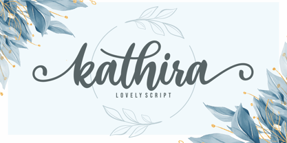 Kathira is a lovely script font. It has a modern and elegant look and is perfect for logos, branding, invitations, photography, wedding stationary, labels, and every other design which needs an unique and luxurious touch. This font is PUA encoded which means you can access all of the cute glyphs and swashes with ease! It also features a wealth of special features including alternate glyphs and ligatures.
 - Sentra by Letterhend,
$17.00 Sentra Display is a handmade font duo with wide characters. This type of font perfectly made to be applied especially in logo, and the other various formal forms such as invitations, labels, logos, magazines, books, greeting / wedding cards, packaging, fashion, make up, stationery, novels, labels or any type of advertising purpose. Features : - Two type of style - Uppercase & lowercase - Numbers and punctuation - Multilingual - Alternates & ligatures - PUA encoded
 - Brighton vintage by Dealita Studio,
$18.00 Brighton Vintage is a stylish font that is both retro and bold font. Its thick curves give a 70s groovy vibe with the serifs bringing it slightly back to traditional. This font is perfectly made to be applied especially in logos, and other various formal forms such as invitations, labels, logos, magazines, books, greeting/wedding cards, packaging, fashion, makeup, stationery, novels, labels, or any advertising purpose.
 - Naturallus by MJB Letters,
$17.00 Naturallus is a Casual display font which is very perfect for branding, signature, wedding designs, social media ads, logos and others Naturallus includes full set of uppercase and lowercase letters, numeral, punctuations and ligatures. Included in this set: Works on PC & Mac Simple installations Accessible in the Adobe Illustrator, Adobe Photoshop, Adobe InDesign, even work on Microsoft Word. PUA Encoded Characters Fully accessible without additional design software
 - Alayla by Ghuroba Studio,
$15.00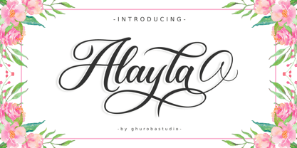 Alayla is modern calligraphy. It's feels both magical and elegant. It looks stunning for your design such as on wedding invitations, thank you cards, quotes, greeting cards, logos, business cards and every other design. This font is PUA encoded which means you can access all of the glyphs and swashes with ease! It features a varying baseline, smooth lines, gorgeous glyphs and stunning alternates.
 - AT Borsnery by Amera Type,
$15.00 Borsnery is a decorative font that can be a great choice for your visual needs. With a modern vintage style, it can be more ideally used for posters, signage, and other visual branding needs And now we provide a different work than before, the first time for our fonts combined with well and carefully crafted illustrations. If you like and want this, please visit ameratype.com
 - Ajuslly by Stringlabs Creative Studio,
$29.00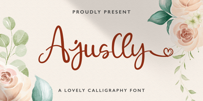 Ajuslly is an incredibly distinct, delicate and timeless handwritten font. It looks stunning on wedding invitations, thank you cards, quotes, greeting cards, logos, business cards and every other design which needs a handwritten touch. This font is PUA encoded which means you can access all of the glyphs and swashes with ease! It features a varying baseline, smooth lines, gorgeous glyphs and stunning alternates.
 - Tiffany Laurence by Ronny Studio,
$24.00 Tiffany Laurence Serif is a classy eighties magazine-inspired font - with complementary italic versions. Both come in two versions one with more contrast and sharper than the other. In true Eighties style. This font looks premium and is very suitable for your design needs such as invitations, labels, logos, magazines, books, greeting / wedding cards, packaging, fashion, make up, stationery, novels, labels or any type of advertising purpose.
 - Mustank by Rochart,
$18.00 Mustank Casual lettering script is a font collection that contains three font family there are script, display and sans. The collection of fonts that are designed to complement each other in their use. Mustank is perfect for logo design, t-shirts, flyers, apparel, packaging, advertising etc. This typeface contain of Uppercase, Lowercase, Alternate, Swash, Number, Symbol, Punctuation, Ligature etc. Also support multilingual and already PUA encoded.